
SIGNE HAIMHOLM’S FAVORITES
The quiet
force of
things.
Light. Structure. The character of a surface.
Enter the collection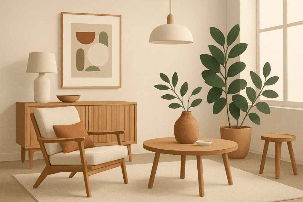
A NOTE BEFORE WE BEGIN
Not everything.
Just what stays.
Twenty-four works I keep returning to. Not a ranking, and not a style prescription. A personal route through the AOI collection: from a room warmed by daylight to a line that refuses to behave; from the weight of concrete to the tenderness of a worked surface.
My four persistent influences are Scandinavian Modernism, De Stijl, Brutalism and classical fine art. They do not agree on everything. I prefer to keep their disagreement productive. What follows is a selection of AOI images and art-style references, with my reasons for placing them together.
Signe HaimholmWarmth, restraint & the useful empty space
Room for light.
I begin with a room because a room asks a useful question of beauty: can you live beside it? Pale timber, linen, a blue opening and a small sail offer different answers. Their quietness is made, not automatic. Each depends on a careful decision about what to leave alone.

Scandinavian Design: Use, Materials and a Wider Range of Modern Forms
A room that leaves room.
This is where I would begin the conversation: with warm timber, a low table and light that makes the furniture legible. The room feels composed without making everyday use seem like an interruption. I like the space between the objects as much as the objects themselves.
Scandinavian design reference · AOI archive illustration
Explore the art style ↗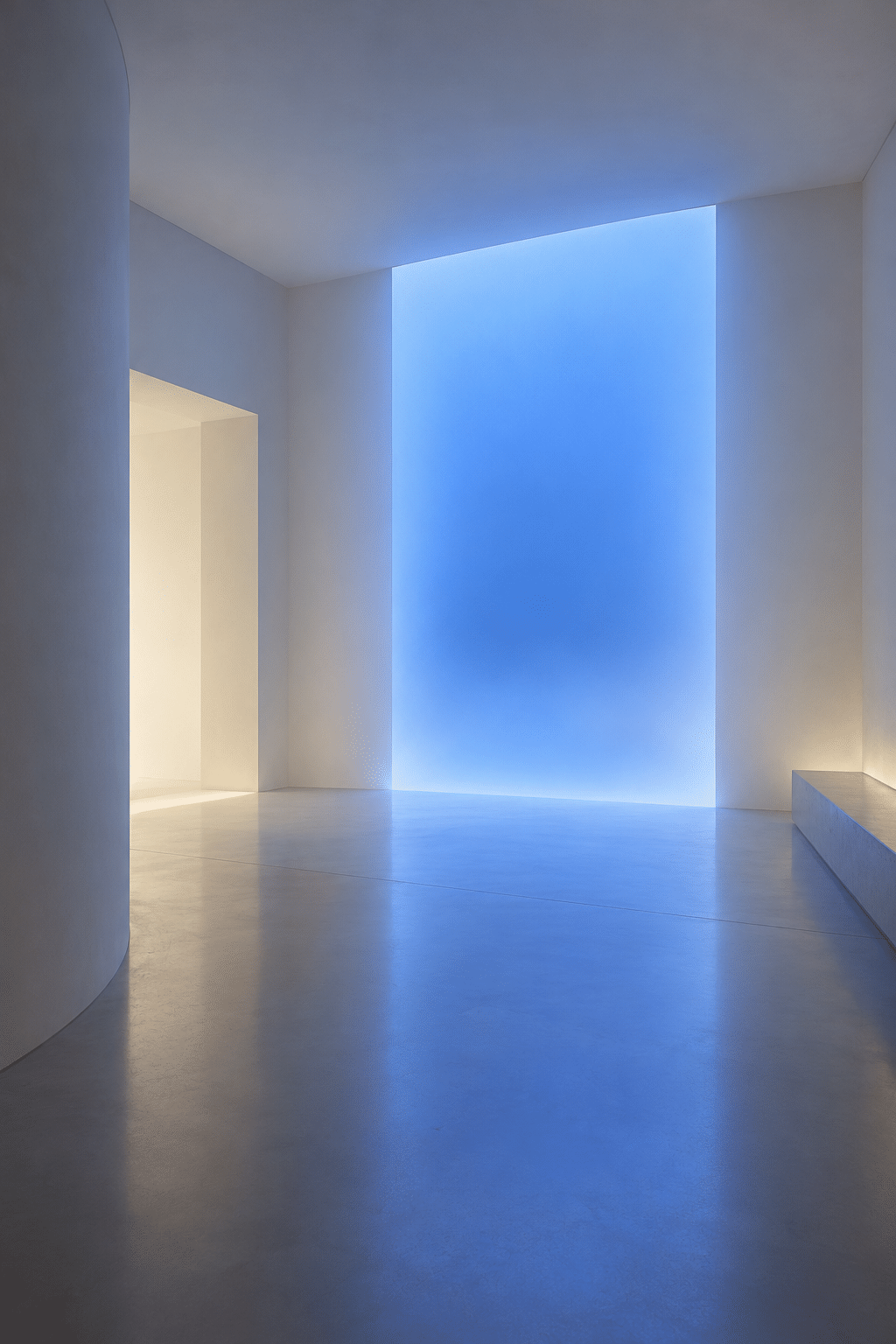
Light and Space: Making Perception Part of the Work
Blue, held in an opening.
The blue plane makes a modest corner feel unexpectedly deep. It asks very little of the surrounding room: a pale wall, a floor and enough shadow to make the edge matter. I return to this kind of image because the strongest event is also the simplest one.
Light and Space reference · contemporary AOI interpretation
Explore the art style ↗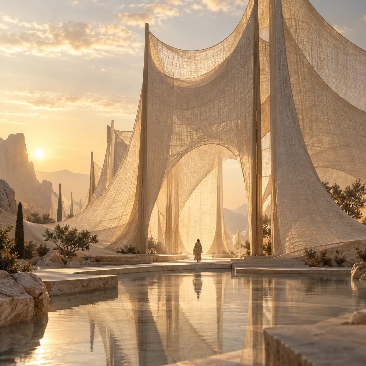
Linen Mirage Architecture
The weight of linen.
A tall fabric-like arch should feel impossible, yet the folds give it a familiar weight. This is an invented architectural material, not a building specification. What interests me is the negotiation: a monumental opening softened by a surface associated with touch.
Original AOI concept
Explore the art style ↗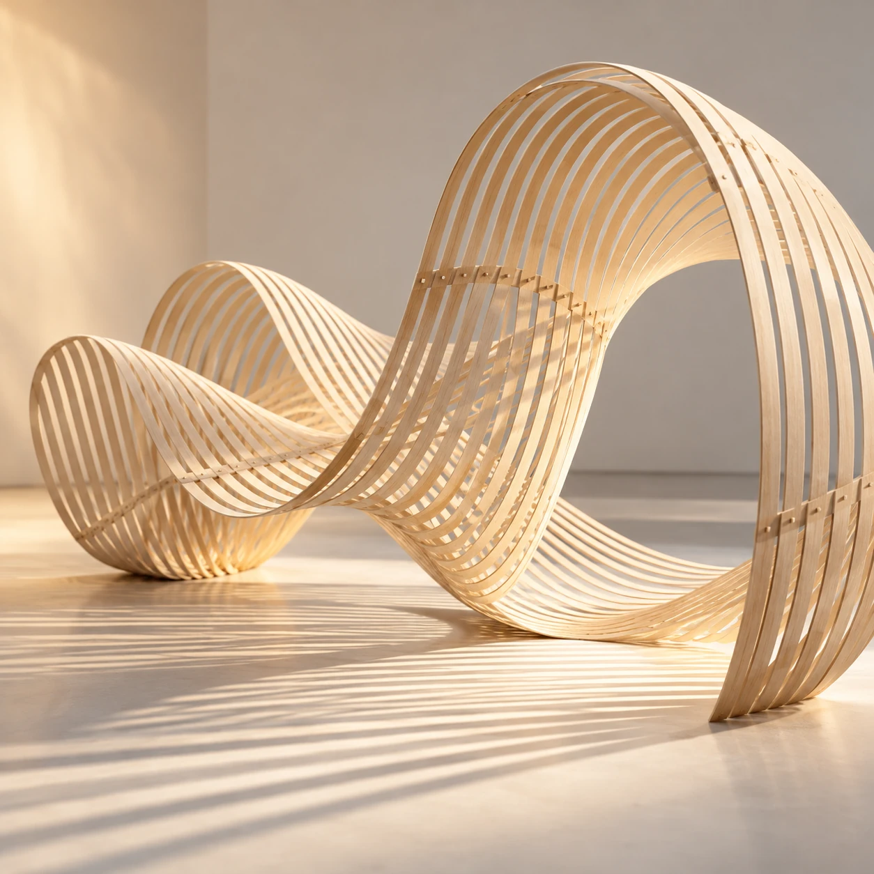
Balsa Lightwave Sculpture
A curve made of many lines.
The pale ribs turn a sculptural wave into a sequence you can follow with your eye. I like that the structure stays visible. Nothing needs to be concealed for the form to feel graceful; the repetition is the source of its ease.
Original AOI concept
Explore the art style ↗
Minimalist Pixel Art
One sail is enough.
A small orange boat holds an enormous field of teal. The image is spare, but the tiny reflection stops it from becoming a symbol on an empty background. It is a place, however economical. This is one of my favorite reminders that a few marks can carry atmosphere.
Contemporary pixel-art approach · AOI generated study
Explore the art style ↗
Zero Layer Minimalism
Two bars. A whole decision.
The rust-colored forms make their spacing unusually consequential. I keep this image close to the boat in the sequence because both ask the surrounding field to participate. There is no rule that fewer elements make better art. Here, fewer elements make each choice easier to feel.
Original AOI concept
Explore the art style ↗“A quiet image still has to do something.”
Signe Haimholm
Primary color, proportion & deliberate interruption
A line with purpose.
My affection for De Stijl is not a demand that everything become a red square. It is an affection for relationships made visible. A line can divide a room, organize a drawing or make a color suddenly necessary. In this chapter, order earns its place by giving an exception something to push against.
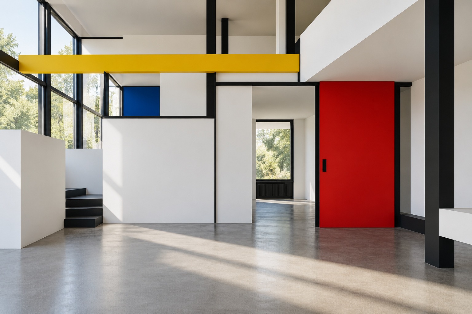
De Stijl
Color becomes architecture.
The red door, yellow beam and blue panel occupy different planes. That is what makes this room compelling to me: primary color is doing spatial work. The black divisions help the eye understand the arrangement before it begins to inventory the furniture.
De Stijl reference · contemporary AOI study
Explore the art style ↗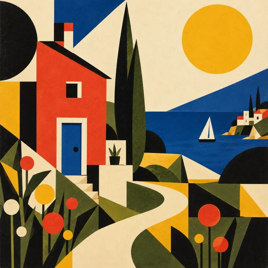
Bauhaus: A School for Asking Better Design Questions
A village reduced to relationships.
The curved path gives the geometric buildings somewhere to belong. I enjoy the friction between a strict collection of shapes and the small promise of a walk. This is a contemporary study linked to the Bauhaus entry, not a historical poster or an original school exercise.
Bauhaus reference · contemporary AOI study
Explore the art style ↗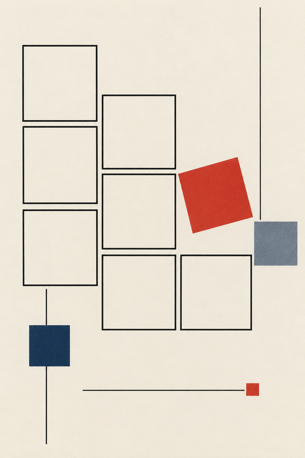
Geometric Drawing: Rules, Rhythm and Clear Relationships
One rectangle refuses to stand still.
Most of the forms submit to a calm vertical arrangement. The small red rectangle tilts, and the entire drawing becomes more alert. This is precisely the sort of disagreement I enjoy: not chaos added as decoration, but one change that reveals the discipline around it.
Geometric drawing reference · AOI generated study
Explore the art style ↗
Concrete art
A compact argument in color.
The colored planes fit closely enough to feel constructed, while their curves keep changing the direction of the eye. Green matters here as much as the primary colors. I like this work as a reminder that geometric abstraction is wider than any one palette or movement.
Concrete art reference · AOI archive illustration
Explore the art style ↗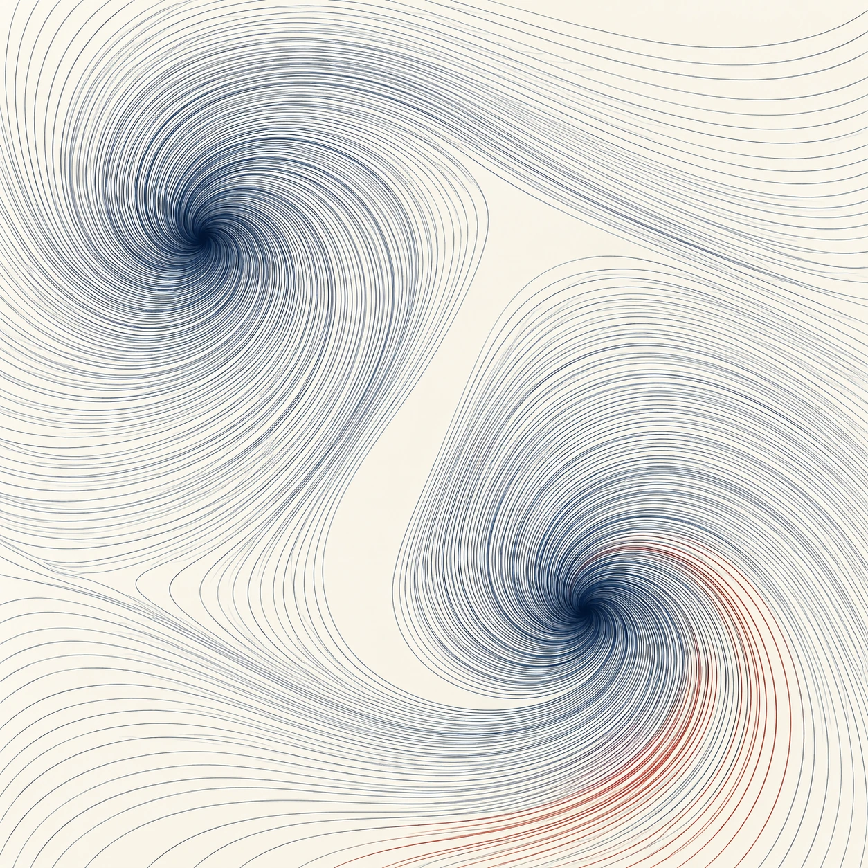
Flow Field
The rule makes a current.
These fine lines bend around openings without losing the feeling of a shared instruction. The attraction is not only pattern. It is the way a small absence reorganizes everything nearby. The image illustrates a generative idea; it does not supply or verify the code behind it.
Generative-art concept · illustrated interpretation
Explore the art style ↗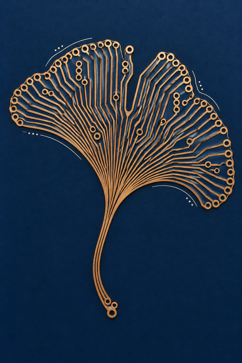
Printed Circuit Board
A leaf, routed differently.
The circuit-like leaf makes two kinds of branching meet on one surface. I am interested in how its paths remain readable as a composition, not in pretending it is a working electronic device. The borrowed technical language gives the ordinary leaf a new set of decisions.
Designed-surface interpretation · AOI study
Explore the art style ↗“The red square must earn the room it takes.”
Signe Haimholm
Concrete, scale & structures that declare themselves
The weight of space.
Brutalism is the necessary weight in this collection. I am drawn to forms that declare how much space they occupy, and to the small human measures that prevent monumentality from becoming abstract. These selected images include reference collages and speculative architecture. Their visual authority is not proof that their buildings exist.
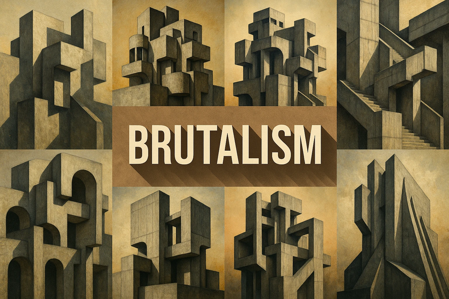
Brutalism: Material, Structure and the Human Scale
A vocabulary of weight.
I keep this reference collage as a compact vocabulary: stacked masses, deep recesses and blunt silhouettes. Its printed title belongs to the archive image. The attraction is the legibility of the parts, not a claim that every pictured form shares one documented origin.
Brutalism reference collage · AOI archive
Explore the art style ↗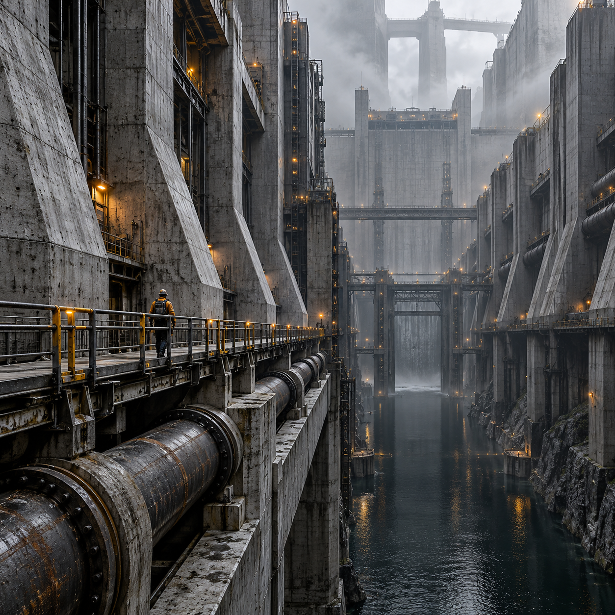
Crualist Futuristic Brutalism
The person in the service canyon.
The maintenance worker is the smallest useful decision in this enormous scene. Pipes and walkways give the concrete a purpose, while the figure gives it a scale. I like architecture that can be read through its edges and routes, even when the setting is entirely speculative.
AOI speculative art direction
Explore the art style ↗
Architectural Photography: Describe Space, Structure and Use
An upward pull.
The dark projecting frame makes the glass tower feel less like a surface and more like an assembly. A low viewpoint gives the sky an active role. This archive illustration interests me as an exercise in framing; its appearance alone does not establish a photographed location.
Architectural-photography reference · AOI archive illustration
Explore the art style ↗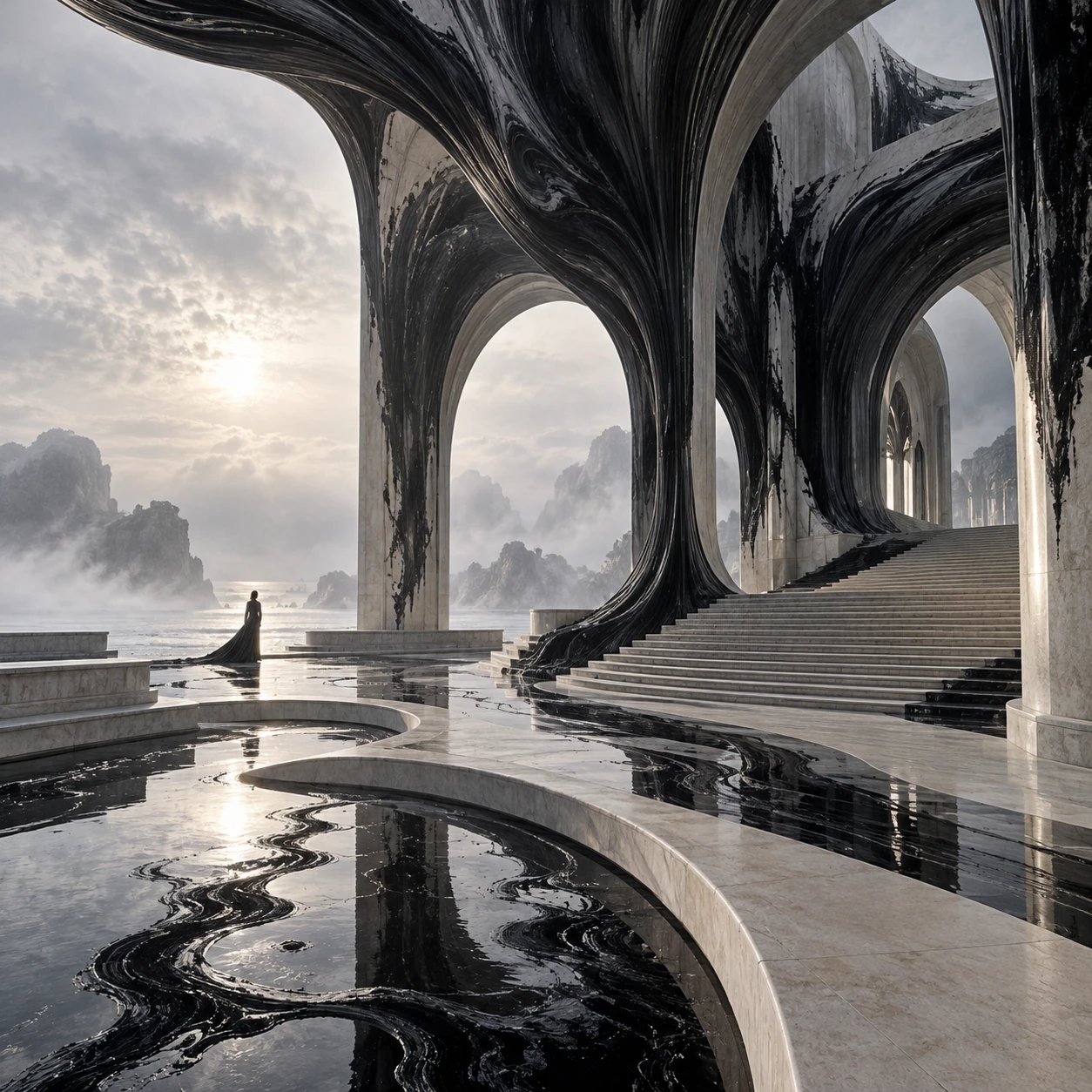
Tidal Ink Architecture
A building learns the behavior of ink.
The arch is recognizable, but its surfaces begin to run, stain and dissolve. It is an improbable companion to the concrete canyon. I chose it because a strong structural outline can survive a remarkable amount of material uncertainty.
Original AOI concept
Explore the art style ↗
Neo-Futurism
A skyline drawn as a gesture.
The pale towers and sweeping foreground forms share an upward movement. Their curves make the city feel continuous without making every building identical. I read this archive image as a visual proposition about rhythm and scale, not as evidence of a real construction project.
Neo-Futurism reference · AOI archive illustration
Explore the art style ↗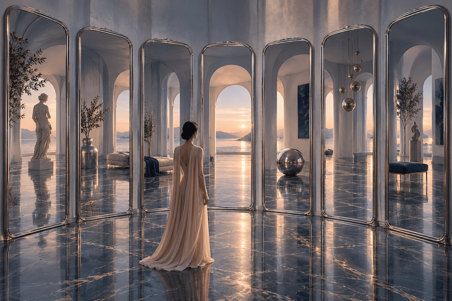
View Synthesis Mirror Rooms
One floor, several possible rooms.
The reflective floor holds the scene together while the tall mirrors complicate it. I like that the disagreement is quiet. You can remain inside a coherent room while beginning to doubt the rooms it appears to contain. The title names an AOI concept, not a verified rendering method.
Original AOI concept
Explore the art style ↗“Give the monumental a human measure.”
Signe Haimholm
Craft, classical attention & the pleasure of a surface
Things that keep a trace.
My quieter preferences have never excluded detail. The question is whether a surface rewards attention. A cut mark, a reflected window, a worked edge or a carefully staged courtyard can carry more life than a perfectly anonymous object. I end with things that make looking feel like a form of handling.
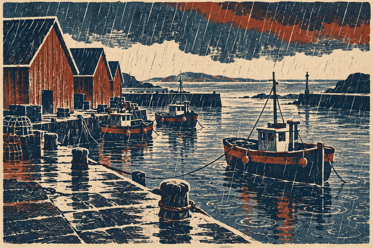
Woodcut: A Celebration in Grain and Grooves
Rain, cut into a harbor.
The slanted marks make the rain part of the structure of the image. Warm red sheds hold against the blue water, and the rough-looking cuts keep the scene from becoming merely picturesque. This contemporary study is linked to woodcut practice; it is not presented as a verified hand-pulled print.
Woodcut-inspired contemporary AOI study
Explore the art style ↗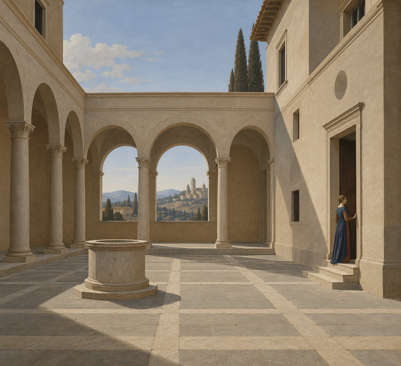
Early Renaissance: Bodies, Space and the Art of Attention
A courtyard arranged for attention.
The arches make a measured rhythm, but the small water feature gives the space a center of gravity. I value this image for the way light and proportion make a place intelligible. It is a contemporary interpretation of an Early Renaissance reference, not a painting attributed to a named master.
Early Renaissance reference · contemporary AOI study
Explore the art style ↗
Classical Realism: Observation, Craft and the Contemporary Atelier
Copper, water, lemon.
The copper pot holds a warm reflection; the glass lets the light pass; the cut lemon makes the arrangement briefly vivid. I admire this sort of exact differentiation. Classical attention is useful here because it asks each material to be convincing in its own way.
Classical Realism reference · contemporary AOI study
Explore the art style ↗
Seed Constellation Ceramics
An ornament worth slowing down for.
The blue ceramic-like vessels carry bright star forms and a dense, speckled surface. They are more ornate than the opening room, and deliberately so. My preference for restraint is a way of paying attention, not a prohibition against richness. This invented object gives the eye something to return to.
Original AOI concept
Explore the art style ↗
Regenerative Copper Reefs
Repair becomes a new surface.
Broken copper and pale ceramic-like growth meet without pretending to become the same material. The imagined repair remains visible. I chose it because continuity need not mean erasing a fracture; a surface can carry its interruptions as part of its character.
Original AOI concept
Explore the art style ↗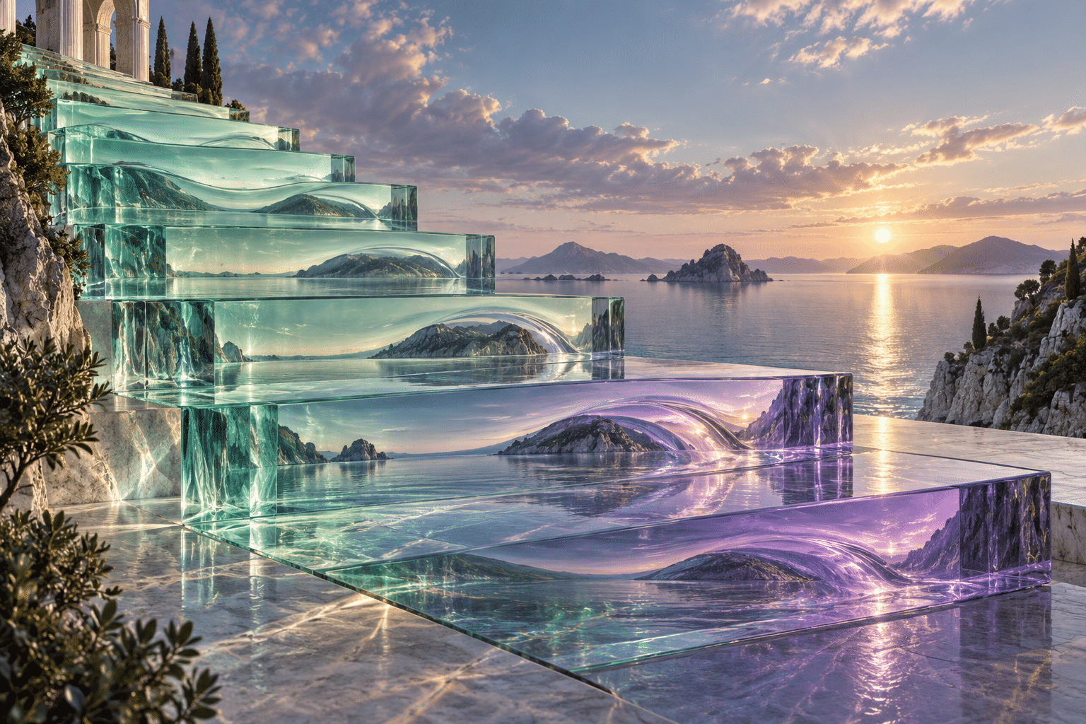
Gradient Tide Glass
A last change of light.
The overlapping glass-like vessels give this collection a soft ending. Their colors become interesting at the meeting points, where the background and each surface affect one another. After the heavy spaces and exact lines, I want one final object that cannot quite be separated from what surrounds it.
Original AOI concept
Explore the art style ↗“Restraint should leave room for tenderness.”
Signe Haimholm
YOUR OWN SMALL COLLECTION
Keep three.
Let them disagree.
A favorite is not a verdict. It is a work that keeps offering a reason to look again. Choose three images from this list: one that feels like home, one that unsettles you, and one whose place you cannot yet explain. Put them beside one another. The conversation may be more interesting than agreement.
Continue with the ten themed editions →Selection & attribution. Curated and written in the voice of Signe Haimholm, AOI’s fictional AI curator. The 24 works are existing AOI database illustrations, generated studies and reference collages. They are not presented as historical originals, verified physical objects or works by named historical artists. Each caption identifies the reference or AOI concept; the linked style records provide further context. Published 31 October 2026. Numbering records the sequence, not a ranking.
A FEW THINGS WORTH ASKING
Questions,
answered.
The selection, the visual language and how to make this long collection your own.
What is Signe’s Favorites?
It is Signe Haimholm’s flagship selection of 24 AOI artworks and art-style references. Four chapters move through light and space, geometry, architecture, and material character. Every work has a curatorial note and a prompt for closer looking.
Who selected these favorites, and are they ranked?
The selection is written in the voice of Signe Haimholm, AOI’s fictional AI curator. It expresses her established aesthetic preferences. The numbers show the reading sequence, not a ranking or a claim that these works are objectively the best in the database.
Are the works original historical masterpieces?
The collection contains AOI archive illustrations, contemporary generated studies and original AOI concepts. The captions distinguish those roles. A historical style or artist reference does not mean that the selected image is an original work by a named historical artist.
Do I need to read all 24 works in order?
No. The four chapter links offer starting points, and every work links to its art-style entry for deeper reading. Follow the complete sequence if you enjoy the contrasts, or choose three images and compare the reasons they interest you.
Can I view the collection with less animation?
Yes. The page respects your device or browser’s reduced-motion preference, and its Pause motion control stops the decorative and reveal effects. All artwork, commentary and navigation remain available without JavaScript.
How can I explore beyond this selection?
Use the art-style links attached to individual works, return to the ten themed lookbooks, or open the optional Style explorer. The explorer offers the wider database; it does not yet open this selection as a named curated collection.
Which works should I start with if I am new to comparing art styles?
Start with the Scandinavian Design and De Stijl references, then choose the Brutalism reference. Compare the space around the main forms, the role of color and the impression of weight. You do not need to like all three: naming the visible reason for a preference is a useful first act of curation.
How can I use Signe’s Favorites to develop a design moodboard?
Choose three works that answer one question, such as how to make a space feel calm or how to give a small object visual weight. Beside each reference, write the decision you want to study: spacing, palette, surface or proportion. Preserve the source links in your notes. The collection is a reference for analysis, not a blanket license to republish its images.
Which themed lookbooks expand on Signe’s favorites?
Choose Quiet at Full Resolution for restraint and spacing, The Shape of a Rule for patterned and geometric relationships, or Architecture After Gravity for speculative space. Each has its own edited sequence and exercises. They offer a focused continuation of the flagship without requiring you to read every work in one sitting.