
Relief printmaking · carved blocks, ink and paper
Discover how woodcut turns carving into printed form, from black-and-white shapes to layered color and subtle grain, with historical examples and practical exercises.
A visual introduction
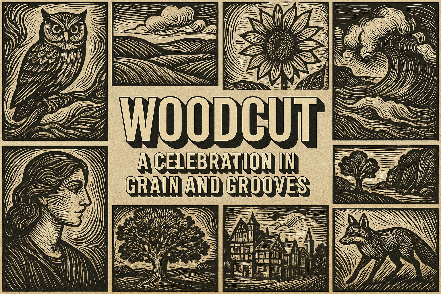
Compare the distinct AOI studies and the titled reference collage. Captions distinguish generated interpretations from documentary evidence.
Select an image for a closer look. Use the thumbnails, arrow keys or a swipe to compare examples. Zoom in to inspect details, or share the image that inspires you.
Creative toolbox · take this style further
Choose an input and a destination. Search sends your words to the chosen site; Copy & open puts them on your clipboard to paste there.
Create with AI
Turn your chosen input into an image prompt or a new creative direction.
ChatGPT
Copy your input and paste it into a ChatGPT conversation or image request.
Copy & open ChatGPT (new tab)Claude · Anthropic
Develop an image prompt or explore the style in a new Claude conversation.
Copy & open Claude · Anthropic (new tab)Midjourney
Paste your input into the Imagine bar on the Create page.
Copy & open Midjourney (new tab)Adobe Firefly
Copy your input, open Firefly, and paste it into the prompt field.
Copy & open Adobe Firefly (new tab)Leonardo.Ai
Copy your input, open Leonardo, and paste it into the generation field.
Copy & open Leonardo.Ai (new tab)Image search
Find visual references. Short, concrete keywords usually work best.
Lexica
Search AI images and prompts using your selected input.
Search with this input Lexica (new tab)Pexels
Search the photo and video library. Short keywords often work best.
Search with this input Pexels (new tab)Pixabay
Search photos, illustrations and other images.
Search with this input Pixabay (new tab)Unsplash
Search photographs using the style name or your own keywords.
Search with this input Unsplash (new tab)Wikimedia Commons
Search photographs, artworks and historical images. Check each file for its source and reuse terms.
Search with this input Wikimedia Commons (new tab)Art & research
Explore artists, collections and the ideas behind a style.
Wikipedia
Search for background reading. A style may not have its own article.
Search with this input Wikipedia (new tab)WikiArt
Copy your input into WikiArt’s search to explore artists and artworks.
Copy & open WikiArt (new tab)Europeana
Paste your keywords into the search to explore European museum, library and archive collections.
Copy & open Europeana (new tab)Inspiration
Discover portfolios and visual ideas from creative communities.
Instagram hashtags
Search a hashtag made from your input: spaces and punctuation are removed. Instagram may require sign-in.
Search with this input Instagram hashtags (new tab)ArtStation
Paste your input into artwork search for concept art, environments, characters and visual development.
Copy & open ArtStation (new tab)Behance
Paste your input into project search for illustration, design and visual storytelling.
Copy & open Behance (new tab)A closer look
Raised surfaces print; carved spaces become light. Shape, gouge direction, wood grain, ink and pressure create a vocabulary ranging from stark silhouettes to layered color.
What a woodcut actually is
A woodcut is a relief print made from a carved wooden block. Ink reaches the raised surface; removed areas usually leave the paper unprinted. MoMA’s technique guide describes carving with knives, gouges and chisels, followed by printing with a press or hand pressure. The essential distinction is the inked raised surface, not simply a rough black-and-white appearance. [1]
A digital picture can imitate the look of a woodcut, but it has not thereby been carved or printed. This gallery contains clearly labelled AI-generated studies of relief-print visual logic. Use them to explore compositions; consult actual prints and workshops to understand the physical medium. A woodgrain filter alone does not reproduce the choices made while cutting a block.
A history with several routes
MoMA’s German Expressionism overview places woodcut in a long history across China and Europe, including its importance to Albrecht Dürer and its revival among modern artists. It emphasizes the Expressionists’ use of simplified shapes, visible cutting and strong contrast. That is one influential use of the process, not its only possible character. [2]
Helen Frankenthaler’s Essence Mulberry, 1977, offers a contrasting example. MoMA records four blocks of different woods and discusses the print’s painterly, delicate effects. The museum also credits its publisher and workshop printers. This is a reminder that a print can be both an artist’s work and the result of skilled collaboration. [3]
Vija Celmins’s Ocean Surface Woodcut 1992 provides another useful point of comparison: a labor-intensive image whose intricacy challenges the assumption that woodcut must be coarse or quickly made. Study the named work through the museum record rather than treating any picture of waves as equivalent. [4]
Think in raised shapes and removed spaces
Begin with the relationship between the inked area and the paper. A silhouette with a few carefully placed cuts can carry more information than an evenly scratched surface. Decide which shapes need to remain continuous and where the eye should enter. Negative space is an active part of the composition, not leftover background.
A light line in a dark field suggests a cut through an inked surface. A dark line in a light field suggests that material has been left standing around it. Mixing these approaches can create rich images, but the distinction helps a design feel intentional. Look at the joints between shapes: a leaf stem, window frame or narrow bridge of black can become the structural hinge of the picture.
Direct marks with the form. Long curved cuts may describe water or a leaf; short angular cuts can articulate bark or a roof. Random scratches can make every surface look alike. Leave some solid areas untouched so the active marks have contrast and the image can breathe.
Grain, color and registration
Wood grain can contribute to the image, but it should have a believable direction and scale. Use it to reinforce broad masses rather than placing identical texture across paper, printed ink and carved white spaces. A few visible grain traces may say more about the material than an all-over distressed surface.
Color adds another compositional problem: the separate areas must relate when printed together. For an introductory design, think in two flat inks plus the paper. Let overlaps create a darker zone where that suits the design. Registration means aligning successive impressions; deliberate offsets should read as a choice rather than an uncontrolled halo.
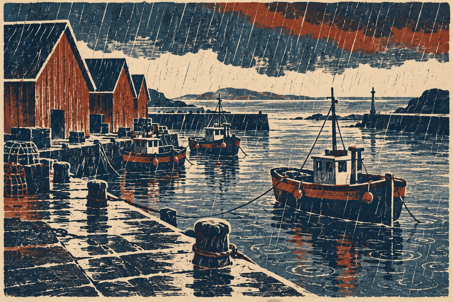
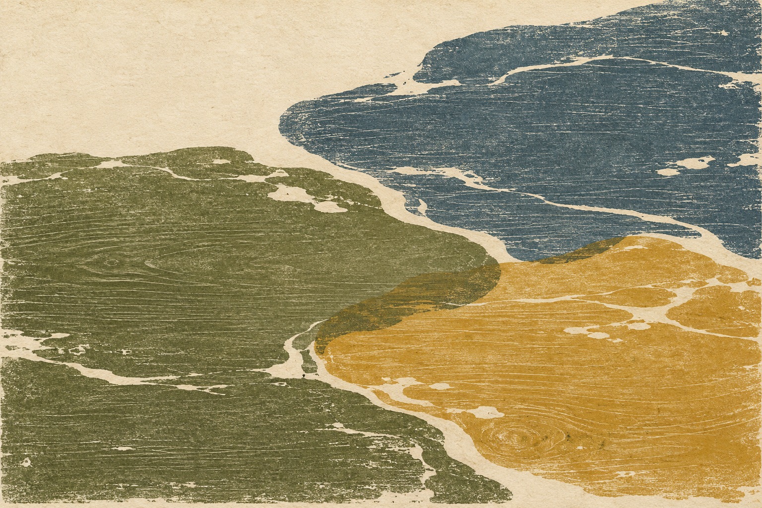
Do not confuse a limited palette with a limited expressive range. Indigo and rust can make a harbor feel wet and weighty; olive and smoky blue can create a quieter field. The paper color participates as another value. Test the design without texture to see whether the shapes and color relationships are already doing useful work.
What the four new studies demonstrate
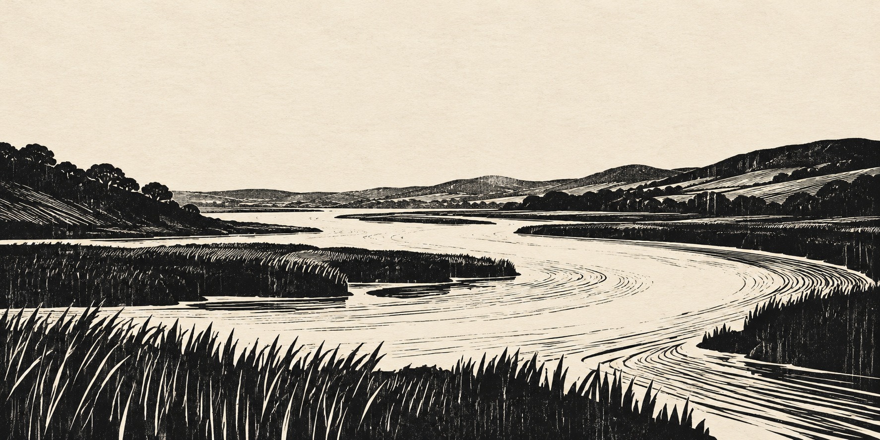
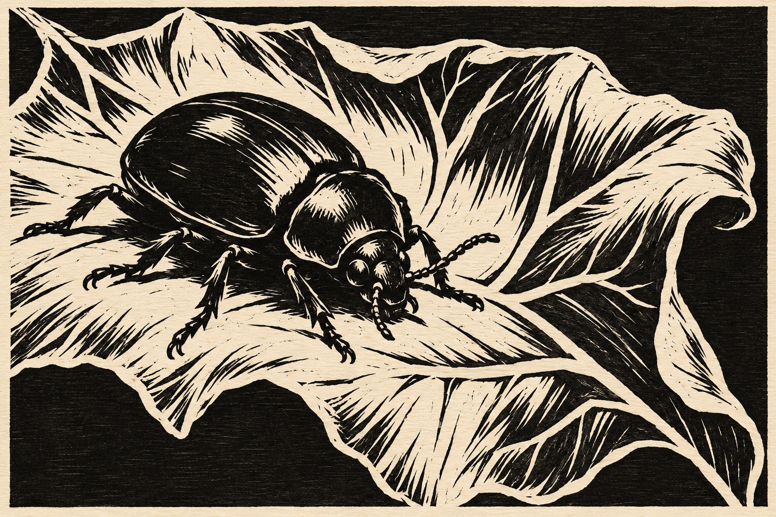
The banner organizes a river through broad light channels and dark banks. Its wide empty sky prevents the dense foreground marks from overwhelming the scene. The beetle-and-leaf study tests a compact silhouette, white cuts and directional veins. It is an invented graphic study, not a scientific plate or a photographed print.
The harbor example adds two principal ink colors, architecture and reflections. The abstract example shifts away from outlined objects toward irregular fields, grain and variable-looking pressure. None of these images proves a particular carving or printing method was used. The retained titled collage remains a useful collection of familiar graphic motifs.
A practical composition exercise
Choose a simple subject with a clear outer shape, such as a leaf, a boat or a doorway. Make one version in black and white with no gray shading. Reverse it and compare the result. This forces you to decide whether the subject is carried by a dark mass or by light cut into a dark mass.
Make a second version using only three families of marks: a broad cleared shape, a long narrow channel and a short tapering cut. Use each for a distinct purpose. If all three appear everywhere, simplify. Then reduce the design to thumbnail size; a print should retain its larger visual organization even when small marks merge.
For a physical experiment, remember that an impression reverses the block image. Plan text and directional details accordingly. Keep a record of each proof and the changes you make. For a digital or generated study, the equivalent is to save successive compositions and compare them without the distraction of a different texture on every version.
Where the approach works—and where it fails
Woodcut-inspired thinking suits book illustration, posters, compact narrative images and designs where a strong silhouette matters. It can also support quiet abstraction. The medium’s logic encourages economy: each mark needs a reason to be there.
Common failures include a photograph merely covered in scratch texture, uniformly thin hatching that ignores the block, and so much distress that the image loses its focal point. When assessing an imitation, ask what would be raised and what would be removed. When assessing an actual print, also consider ink, paper, pressure and the physical evidence of making.
Prompt vocabulary
Useful terms include raised-ink silhouette, carved white channel, tapering gouge mark, directional grain, limited flat inks, warm paper and clear negative space. Specify the subject and the shape relationships before adding texture. If you need an actual process diagram, use verified technical references; a generated artwork is not a reliable map of tool use.
About this guide and its illustrations
This is an AI-authored AOI guide under Penny Wraiter, AOI’s editorial persona. The linked sources support the historical and technical context; the practical exercises, poem and new illustrations are AOI interpretations. Generated pictures are labelled as such and do not establish historical authorship, material authenticity or physical performance.
A small poetic detour
Original words from the AOI studio.
Poetry
The river is the part left white.
The bank is what the hand allows
to meet the ink.
A small cut opens weather.
Another gives the leaf
a place to turn.
Under pressure, the block releases
a mirror of its choices.
The grain keeps a few words
for itself.
The prompt workshop
Original creative exercises. These prompts create new illustrations, not documentary evidence.
Let the white cuts describe the form
Create an original woodcut-inspired image of a curled leaf and a beetle. Use black raised-ink shapes, warm paper and a small vocabulary of tapering white cuts. Let the veins and shell highlights follow the form. No gray gradients, text or signature. Label it a digital interpretation.
Build a two-color scene
Create an original harbor composition in a two-color relief-print vocabulary: indigo and rust ink on ivory paper, angular roofs, three small boats and clear carved water channels. Keep large shapes readable and grain restrained. Show intentional overlap without excessive registration halos.
Use grain as a quiet structure
Create an original abstract woodcut-inspired study with olive, smoky blue and ochre fields. Use irregular carved edges, broad paper channels and a consistent restrained grain direction. Favor quiet space and color relationships over literal scenery. No copied print or artist signature.
A smile from the studio
Jokes
I asked the block for more detail. It suggested I first decide what to remove.