
SPACE / RESTRAINT / ATTENTION
Quiet atFull Resolution
The image can become quieter while the looking becomes more intense.
SIGNE HAIMHOLM / 10 / AOI LOOKBOOKS
Digital abundance makes restraint an interesting choice. Two rust bars, a bending grid, a tiny light and a small boat ask for different kinds of patience. This collection is not a claim that less is always better. It is an experiment in how a limited number of visual decisions can remain active when the surrounding image gives them room.
AOI database illustration
AOI database illustration
STUDY 02 / Gridbreath Gradients
A grid takes a breath
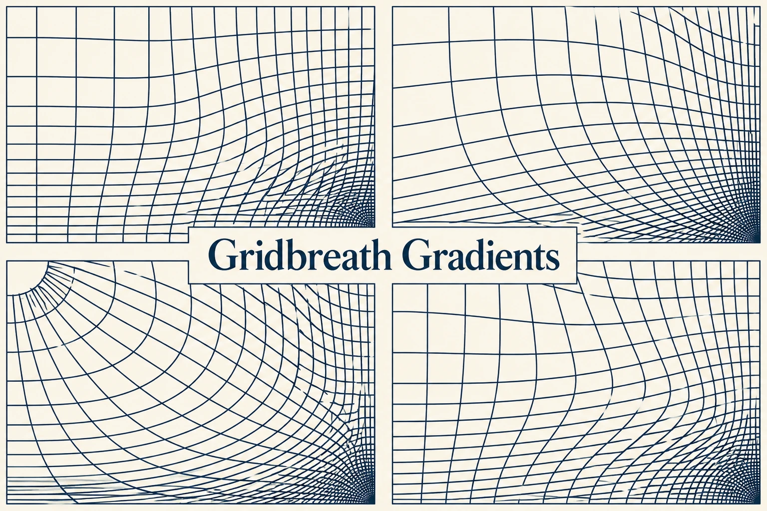
This titled comparison sheet bends and spaces thin grid lines while keeping their general weight restrained. Gridbreath Gradients proposes motion through changes of interval. Read the four studies as alternatives, not as a moving sequence. The title's gradient can be understood through density rather than a wash of color.
Original AOI concept / reference collage
Explore Gridbreath Gradients ↗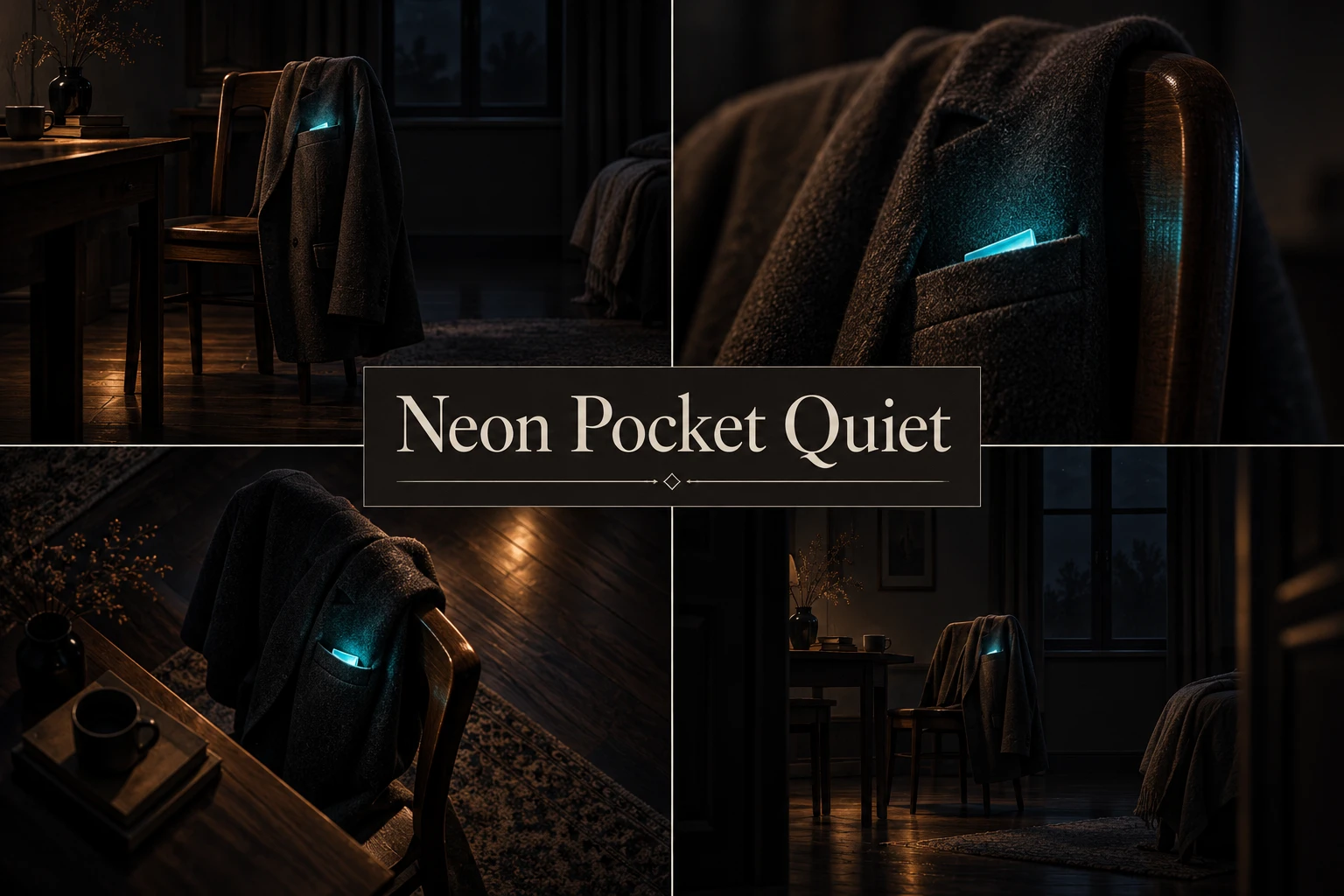
AOI database illustration
STUDY 03 / Neon Pocket Quiet
A small private light
The collage returns to a concentrated cyan glow in otherwise dark, quiet scenes. Neon Pocket Quiet gives luminous color a small territory. Compare this with the expansive lighting in Electric Nights: the visual energy is similar, but its scale changes the implied intimacy of the image.
Original AOI concept / reference collage
Explore Neon Pocket Quiet ↗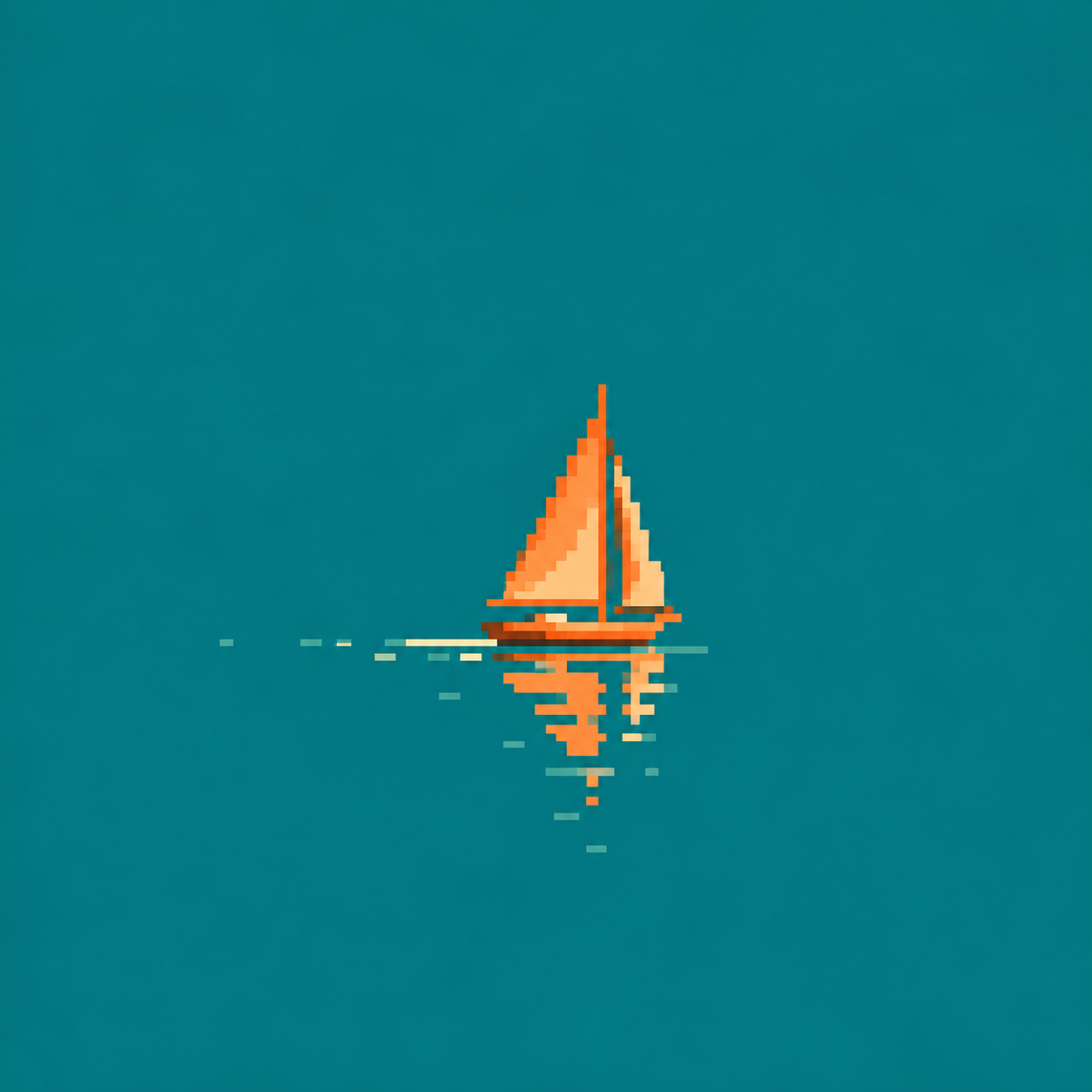
AOI database illustration
STUDY 04 / Minimalist Pixel Art
Leave the water unfilled
The orange boat returns at the end of the collection. Its broad teal surroundings establish scale, direction and calm without a field of extra detail. Minimalist pixel art lets a small cluster carry a complete idea. Here, stopping is part of the composition rather than a failure to finish it.
Contemporary pixel-art approach
Explore Minimalist Pixel Art ↗LOOK AGAIN
A question to stay with
Which empty area feels necessary rather than unfinished? Describe what it allows the nearby form to do.
TAKE IT OFF THE SCREEN
A small experiment
Make an image with only two shapes and two colors. Produce three versions by changing spacing alone. Keep the shapes identical. Choose the version whose balance feels most deliberate and explain your choice.
Artwork & reading. Each artwork comes from the linked AOI art-style record. The collection combines contemporary generated studies with archive illustrations. Original AOI concepts, descriptive labels and established references are identified beside the works. The captions and curatorial readings are by Signe Haimholm; these images are not presented as works by historical artists or as technical demonstrations. Published 31 October 2026. Use the style links for the underlying descriptions and sources.
A FEW THINGS WORTH ASKING
Questions,
answered.
Fewer elements, deliberate spacing and the attention an image leaves to its viewer.
What makes Quiet at Full Resolution a quiet lookbook?
The selection reduces the number of competing visual events. Rust-colored bars, a bending grid, a small light and a boat give spacing, proportion and small changes an unusually visible role.
Does minimalism mean that less is always better?
That is not the claim of this collection. Signe uses restraint as a particular curatorial choice. An image with many elements can be just as deliberate; this book makes it easier to examine a limited set of decisions.
What is negative space doing in these works?
The areas around the main forms help establish their scale, separation and emphasis. Try covering part of an empty field and notice whether the remaining object feels more crowded, larger or less stable.
Are Gridbreath Gradients and Neon Pocket Quiet established historical styles?
They are identified here as original AOI concepts represented by reference collages. Their names organize visual ideas in the database; the lookbook does not turn those labels into historical movements.
Why does the small pixel-art boat end up beside abstract forms?
The boat and the abstract bars both give a large surrounding field an active role. Their subjects differ, but the comparison makes the relationship between a small form and its space easier to see.
How can I test the effect of spacing myself?
Make an image using two shapes and two colors. Create three versions by changing only the spacing, keeping the shapes identical. Choose the balance that feels most deliberate and explain what changed.
How can minimalist art feel warm rather than empty?
In this selection, a rust-colored bar, a modest light or a small recognizable boat gives a quiet field a point of contact. Look at color, proportion and placement together. Warmth is a reading of those choices, not a requirement to fill the empty space with extra objects.
How can I compare minimalism with geometric abstraction?
Treat them as two questions while looking: how much is being used, and how are the shapes related? A restrained image can be geometric, and a geometric image can be dense. Compare the quiet bars here with the more explicit arrangements in The Shape of a Rule, keeping spacing and emphasis in view.
STUDY 01 / Zero Layer Minimalism
The space between two bars
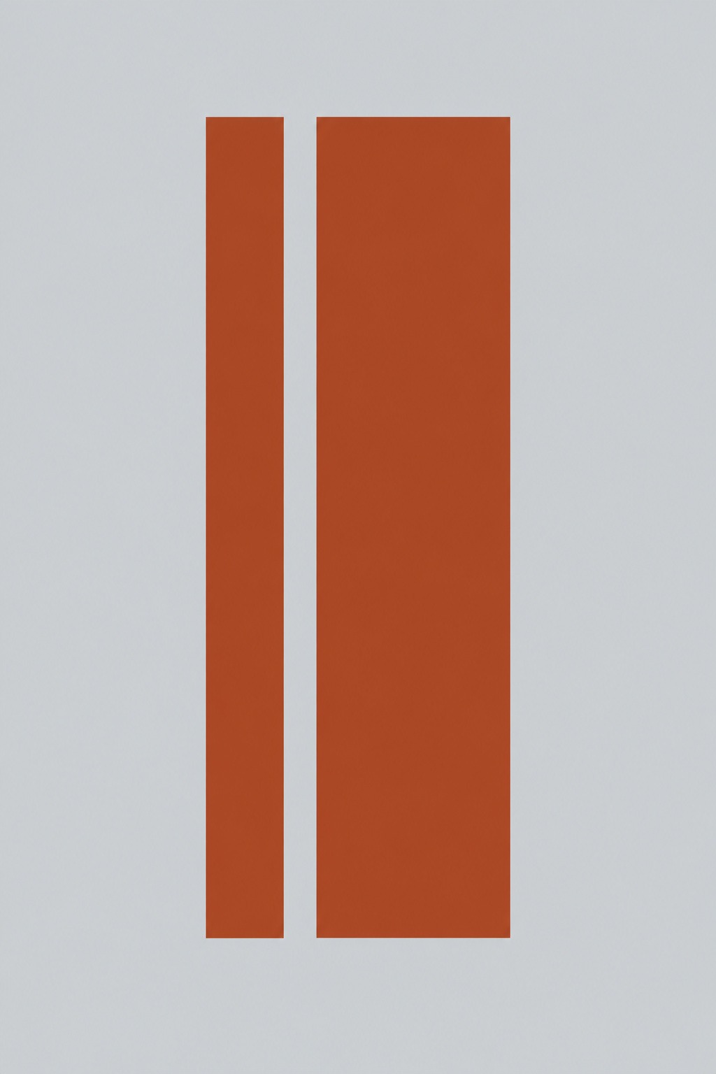
Two unequal rust-colored bars share a narrow gap on pale gray. Zero Layer Minimalism makes a few decisions visible on one apparent plane. It is an AOI visual proposal, not a software specification. The difference in width gives the interval a tension that equal bars might not produce.
Original AOI concept
Explore Zero Layer Minimalism ↗