Non-representational art and constructed relationships
Concrete art concerns forms and colors treated as realities in themselves. The name does not mean that an artwork must be made from cement.
A visual introduction
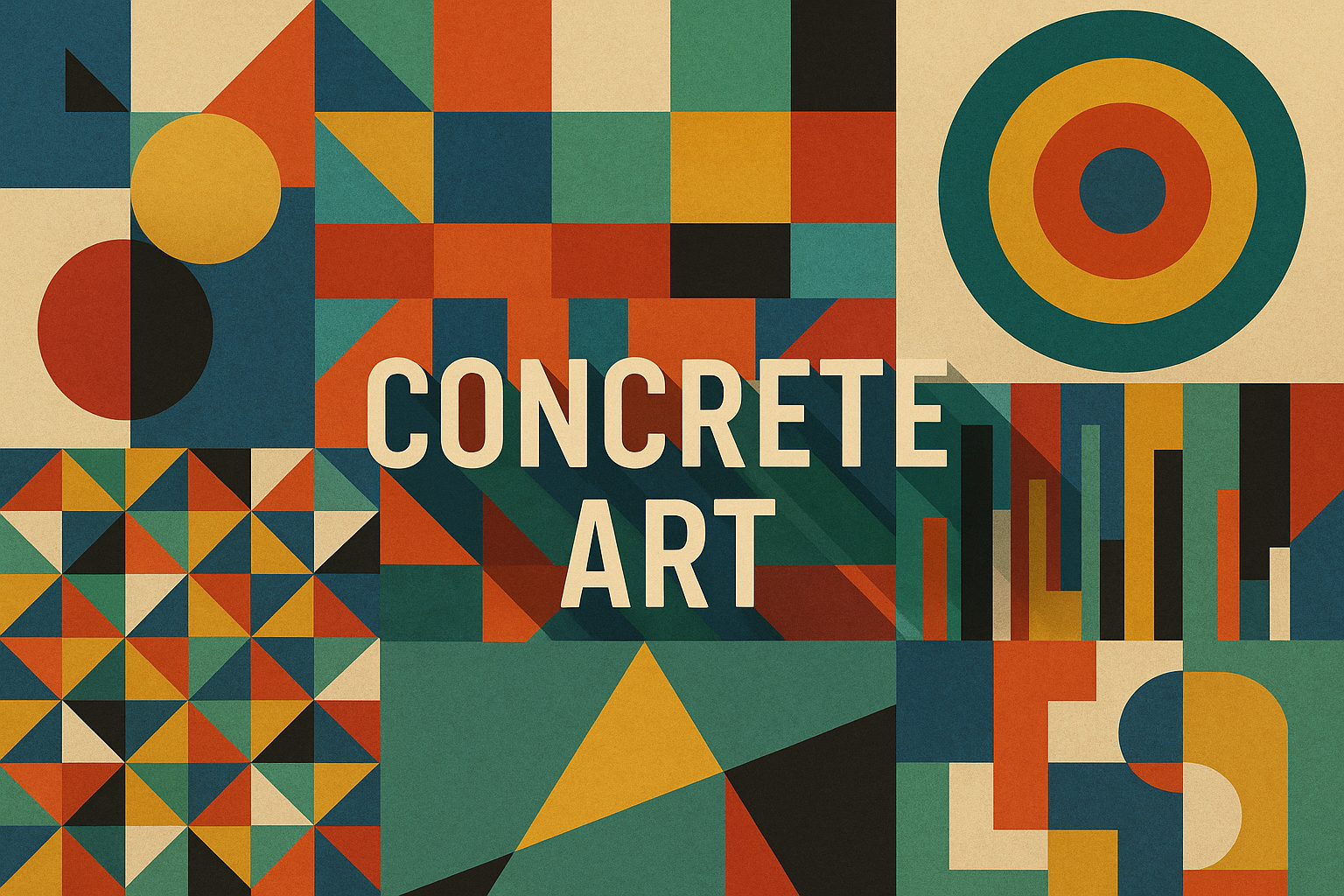
Compare the retained archive studies. The titled collage is modern editorial illustration; its panels are not reproductions of documented works.
Select an image for a closer look. Use the thumbnails, arrow keys or a swipe to compare examples. Zoom in to inspect details, or share the image that inspires you.
Creative toolbox · take this style further
Choose an input and a destination. Search sends your words to the chosen site; Copy & open puts them on your clipboard to paste there.
Create with AI
Turn your chosen input into an image prompt or a new creative direction.
ChatGPT
Copy your input and paste it into a ChatGPT conversation or image request.
Copy & open ChatGPT (new tab)Claude · Anthropic
Develop an image prompt or explore the style in a new Claude conversation.
Copy & open Claude · Anthropic (new tab)Midjourney
Paste your input into the Imagine bar on the Create page.
Copy & open Midjourney (new tab)Adobe Firefly
Copy your input, open Firefly, and paste it into the prompt field.
Copy & open Adobe Firefly (new tab)Leonardo.Ai
Copy your input, open Leonardo, and paste it into the generation field.
Copy & open Leonardo.Ai (new tab)Image search
Find visual references. Short, concrete keywords usually work best.
Lexica
Search AI images and prompts using your selected input.
Search with this input Lexica (new tab)Pexels
Search the photo and video library. Short keywords often work best.
Search with this input Pexels (new tab)Pixabay
Search photos, illustrations and other images.
Search with this input Pixabay (new tab)Unsplash
Search photographs using the style name or your own keywords.
Search with this input Unsplash (new tab)Wikimedia Commons
Search photographs, artworks and historical images. Check each file for its source and reuse terms.
Search with this input Wikimedia Commons (new tab)Art & research
Explore artists, collections and the ideas behind a style.
Wikipedia
Search for background reading. A style may not have its own article.
Search with this input Wikipedia (new tab)WikiArt
Copy your input into WikiArt’s search to explore artists and artworks.
Copy & open WikiArt (new tab)Europeana
Paste your keywords into the search to explore European museum, library and archive collections.
Copy & open Europeana (new tab)Inspiration
Discover portfolios and visual ideas from creative communities.
Instagram hashtags
Search a hashtag made from your input: spaces and punctuation are removed. Instagram may require sign-in.
Search with this input Instagram hashtags (new tab)ArtStation
Paste your input into artwork search for concept art, environments, characters and visual development.
Copy & open ArtStation (new tab)Behance
Paste your input into project search for illustration, design and visual storytelling.
Copy & open Behance (new tab)A closer look
Clearly defined planes, measured intervals, repeated units and color relationships that need no depicted landscape or object.
Concrete does not mean cement
Kode’s introduction to Concrete art documents Theo van Doesburg’s 1930 Art Concret publication and explains the idea of an artwork built from its own lines, planes and colors rather than imitating nature. The Centre Pompidou’s account of Jean Hélion’s Composition orthogonale, also dated 1930, offers a specific work for studying that approach.
A sculpture cast in concrete is therefore not automatically Concrete art, and a painting on paper can belong to its discussion. Geometric appearance alone is also insufficient for an attribution. The point is the relation between the work’s elements and its conception, not a checklist of circles and primary colors.
Set a rule and observe its consequences
For a contemporary exercise, establish a unit: perhaps a square divided into halves and quarters. Choose a small palette and one rule for repetition or rotation. Arrange the forms so that spacing and proportion become active parts of the image. A narrow interval can create tension; a repeated edge can connect distant areas.
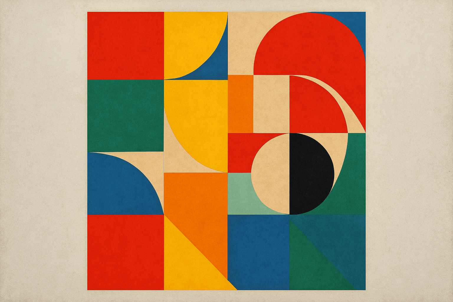
Then test the system. Does one accent dominate accidentally? Does a change in scale clarify the rhythm or merely break it? Keep the surface treatment consistent enough that the viewer can read the relationships. The retained archive studies use grids, arcs and contrasting color planes; they are modern interpretations, not reproductions of van Doesburg’s work. Use them to compare balance and rhythm while keeping the historical claim separate from the practical exercise.
The prompt workshop
Original creative exercises. These prompts create new illustrations, not documentary evidence.
A rule of quarters
Create an original non-representational composition on a square grid using rectangles and quarter circles. Use cream, deep blue, red and ochre, with flat color and precise edges. Establish a visible rotation rule; no objects, texture or lettering.
Intervals become rhythm
Create an original geometric composition of seven vertical colored planes separated by unequal white intervals. Use a restrained palette and make the spacing carry the rhythm. Flat surface, no perspective or text.
One controlled exception
Create an original abstract arrangement of repeated equal squares in three colors, with one carefully placed circular interruption. Balance the exception against the whole field. Crisp edges, no depicted objects or lettering.