Visual perception · appearance and measurement
Optical illusions reveal differences between an image’s measurable structure and its appearance. Explore visual context, three testable diagrams and practical image-making methods.
A visual introduction
Compare the distinct AOI studies and the titled reference collage. Captions distinguish generated interpretations from documentary evidence.
Select an image for a closer look. Use the thumbnails, arrow keys or a swipe to compare examples. Zoom in to inspect details, or share the image that inspires you.


Creative toolbox · take this style further
Choose an input and a destination. Search sends your words to the chosen site; Copy & open puts them on your clipboard to paste there.
Create with AI
Turn your chosen input into an image prompt or a new creative direction.
ChatGPT
Copy your input and paste it into a ChatGPT conversation or image request.
Copy & open ChatGPT (new tab)Claude · Anthropic
Develop an image prompt or explore the style in a new Claude conversation.
Copy & open Claude · Anthropic (new tab)Midjourney
Paste your input into the Imagine bar on the Create page.
Copy & open Midjourney (new tab)Adobe Firefly
Copy your input, open Firefly, and paste it into the prompt field.
Copy & open Adobe Firefly (new tab)Leonardo.Ai
Copy your input, open Leonardo, and paste it into the generation field.
Copy & open Leonardo.Ai (new tab)Image search
Find visual references. Short, concrete keywords usually work best.
Lexica
Search AI images and prompts using your selected input.
Search with this input Lexica (new tab)Pexels
Search the photo and video library. Short keywords often work best.
Search with this input Pexels (new tab)Pixabay
Search photos, illustrations and other images.
Search with this input Pixabay (new tab)Unsplash
Search photographs using the style name or your own keywords.
Search with this input Unsplash (new tab)Wikimedia Commons
Search photographs, artworks and historical images. Check each file for its source and reuse terms.
Search with this input Wikimedia Commons (new tab)Art & research
Explore artists, collections and the ideas behind a style.
Wikipedia
Search for background reading. A style may not have its own article.
Search with this input Wikipedia (new tab)WikiArt
Copy your input into WikiArt’s search to explore artists and artworks.
Copy & open WikiArt (new tab)Europeana
Paste your keywords into the search to explore European museum, library and archive collections.
Copy & open Europeana (new tab)Inspiration
Discover portfolios and visual ideas from creative communities.
Instagram hashtags
Search a hashtag made from your input: spaces and punctuation are removed. Instagram may require sign-in.
Search with this input Instagram hashtags (new tab)ArtStation
Paste your input into artwork search for concept art, environments, characters and visual development.
Copy & open ArtStation (new tab)Behance
Paste your input into project search for illustration, design and visual storytelling.
Copy & open Behance (new tab)A closer look
Repeated edges, contrasting surrounds, ambiguous depth and competing figure–ground readings can alter apparent size, brightness, orientation or space. Each effect needs its own construction.
What is an optical illusion?
An optical illusion is a visual effect in which what we perceive differs from a measurable feature of the stimulus, or in which one image supports incompatible interpretations. Two identical patches can appear unequal; straight lines can seem tilted; a flat drawing can suggest an impossible object. The useful question is specific: what appears different, what is actually present, and how can we compare the two?
Optical illusion is a broad subject, not a single historical art movement or a universal drawing style. Some examples depend on contrast and neighboring edges; others involve perspective, adaptation, motion or an ambiguous interpretation. A convincing-looking swirl does not automatically demonstrate a scientifically defined effect. This guide separates expressive optical artwork from diagrams whose relevant geometry or pixel values can be checked.
A long artistic history, without a single origin
Artists have explored deceptive appearance across different periods and media. In Hans Holbein the Younger’s The Ambassadors (1533), the elongated form near the foreground resolves into a skull from an oblique viewing position. The National Gallery’s account is a useful starting point for anamorphosis: the viewing position is part of the image’s construction, not merely an accidental distortion.
Twentieth-century Op Art made systematic visual relationships especially prominent. MoMA’s 1965 exhibition The Responsive Eye provides historical context for that interest. Op Art and optical illusion overlap, but neither term is a complete substitute for the other. An installation, scientific demonstration, perspective trick and patterned painting can all engage vision while asking quite different questions.
Three families worth distinguishing
Geometric effects concern apparent lengths, angles, sizes or alignment. Luminance and color effects concern how a patch looks in its surroundings. Ambiguous images allow more than one organization of the same marks, such as competing figure and ground. Keep these categories practical rather than absolute: one artwork can combine them, and a shared appearance does not prove a shared mechanism.
For your own work, identify one target relationship before choosing decoration. If the claim concerns equal circles, lock their dimensions. If it concerns brightness, define the exact target values. If it concerns a change in viewpoint, specify that viewpoint. This discipline makes the result understandable and helps distinguish a perceptual effect from an image that simply contains unequal objects.
Study 1: the Café Wall pattern
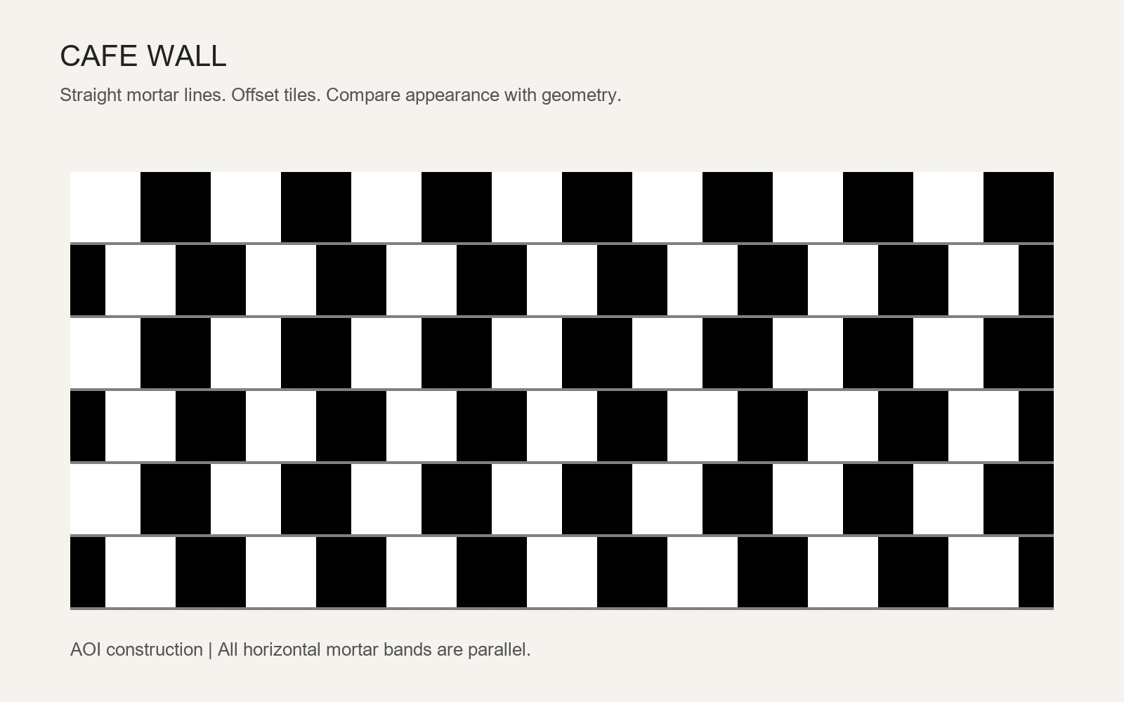
Our reconstructed Café Wall diagram alternates black and white tiles in offset rows, separated by straight gray mortar bands. The bands can appear to slant even though their horizontal geometry is parallel. Follow one band with a straightedge or compare its height at opposite ends. Michael Bach’s interactive demonstration provides a useful companion for exploring this effect.
The AOI construction uses 100-pixel tiles, alternating 50-pixel offsets and four-pixel mortar bands. Those specifications belong to the full source image; a browser may scale the picture. Thin bands, display size and viewing distance affect what you notice. If the effect seems weak, open the image at a comfortable larger size rather than assuming every viewer must report the same experience.
Study 2: the Ebbinghaus comparison
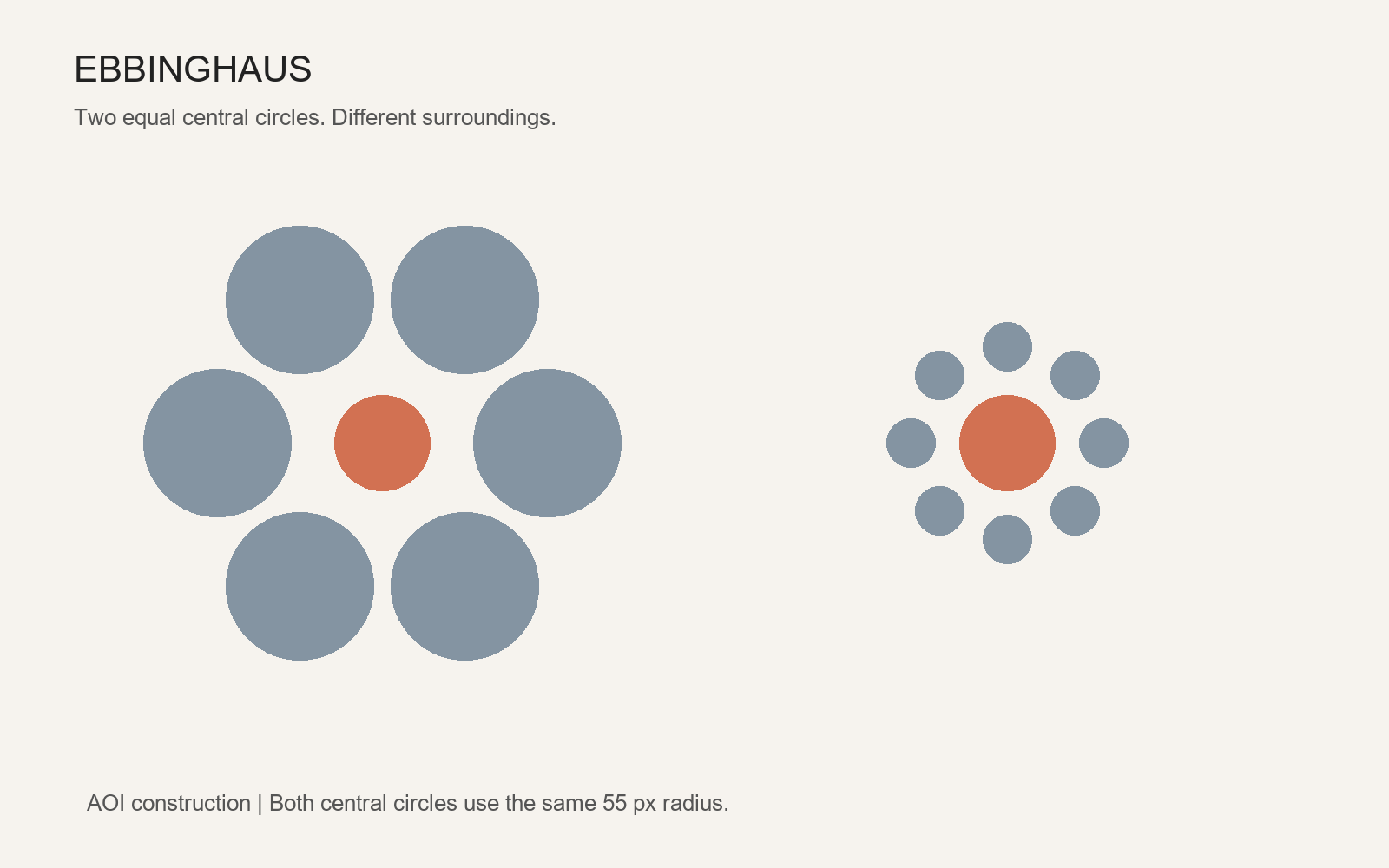
The two central coral circles in our Ebbinghaus reconstruction have identical geometry: both were drawn with a 55-pixel radius. One is surrounded by larger circles and the other by smaller circles. Their apparent sizes can differ. Compare the centers after concealing the surrounding disks, or measure the two central diameters in the same displayed image.
The surrounding arrangement is the variable, not a secret change to the target. Bach’s demonstration also lets readers change or hide the context. The effect is useful to artists because it shows why a form cannot always be judged in isolation from its neighbors. It does not establish a personality type or a special quality of the viewer.
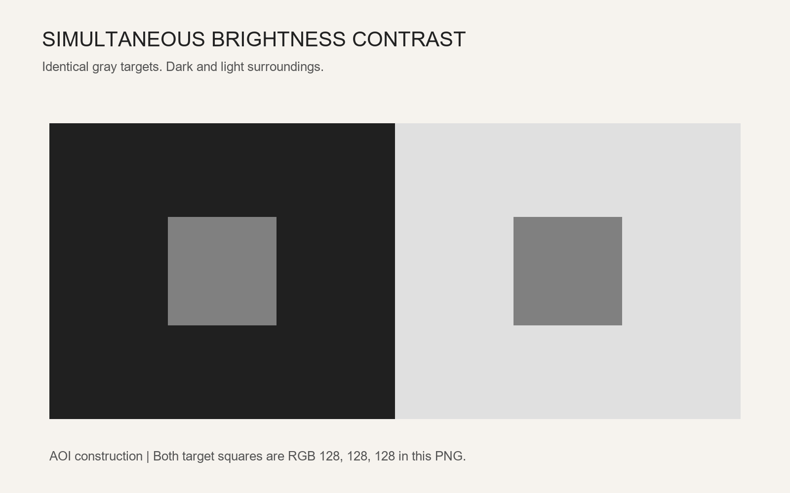
Study 3: simultaneous brightness contrast
Two central squares use the same gray value, RGB 128,128,128, against dark and light surrounds. They may appear different in brightness. In the source PNG, every interior target pixel is identical; there are no gradients or shadows inside the squares. A color sampler can verify this digital fact, while covering the surrounding fields offers a simple visual comparison.
Apparent brightness is not the same thing as a numerical image value. Bach’s discussion of brightness induction helps separate appearance from the physical stimulus. Our diagram illustrates the comparison; it does not calibrate your screen or establish a single explanation for every contrast illusion. Display processing, ambient light and image resizing can influence the experience.
Composition, palette and a dependable workflow
Begin with a quiet frame, a clearly identified target and only the context needed for the effect. Black, white and neutral gray make many comparisons easier to inspect; restrained color can identify a target without adding unnecessary variables. Repetition controls rhythm, but crowding every region with high contrast can make the key comparison difficult to find.
Build the required geometry in a vector or drawing tool, duplicate the target rather than redrawing it, and keep a version with the context hidden. Export a lossless image when exact pixel comparisons matter. Check the final displayed file as well as the source. Write a caption that tells readers what to compare and what was measured. A claim such as “these are equal” needs that evidence.
Using AI without confusing illustration and demonstration
AI image generation is useful for exploring an optical atmosphere: folded stripes, unstable depth, graphic rhythm or architectural puzzles. It can also introduce tiny differences that invalidate a measured comparison. Use a generated picture as an artistic study unless its relevant geometry has been checked independently. Precise construction is more dependable for equal-size and equal-value demonstrations.
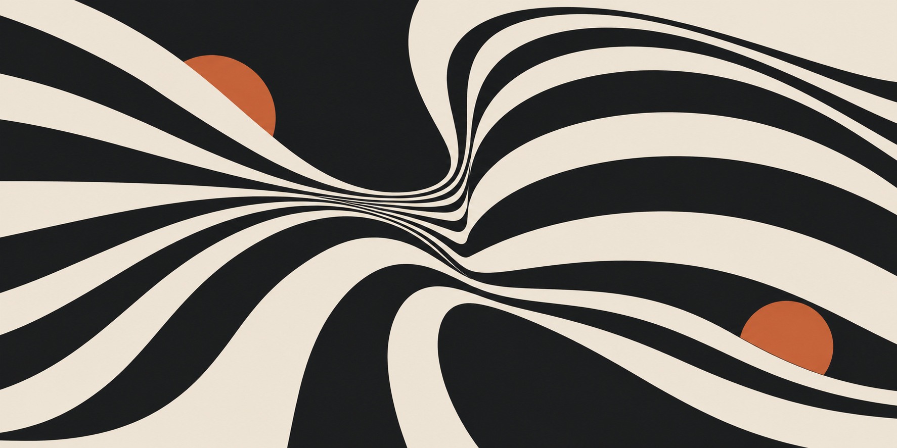
The banner and earlier collage are expressive illustrations; the three labeled diagrams were constructed with Python/Pillow and checked for their stated properties. They are original AOI reconstructions, not photographs or reproductions of a museum work. Compare them with the related Optical Art and Kinetic Art entries to explore how perceptual effects can become part of a larger artistic practice.
About this guide and its illustrations
This is an AI-authored AOI guide under Penny Wraiter, AOI’s editorial persona. The linked sources support the historical and technical context; the practical exercises, poem and new illustrations are AOI interpretations. Generated pictures are labelled as such and do not establish historical authorship, material authenticity or physical performance.
Keep a control image beside the illusion
For a demonstrable illusion, preserve a second version that reveals the relevant measurement: isolated targets, a straight reference line or a neutral surround. The control makes the difference between physical equality and perceived inequality inspectable. A decorative image that merely looks unusual cannot substitute for that comparison.
Change one parameter at a time and record the result. Adjusting spacing, contrast and scale simultaneously makes it difficult to tell which change strengthened or weakened the effect. View the test at the intended display size; a convincing thumbnail may behave differently when enlarged.
If generating an illustration, verify the geometry afterwards with ordinary drawing or measurement tools. Keep the verified diagram separate from any atmospheric artwork so readers know which image supports a perceptual claim and which explores its visual possibilities.
A small poetic detour
Original words from the AOI studio.
Poetry
Two circles borrow different rooms.
One grows in the company of small things;
one waits among giants.
A ruler crosses the silence,
carrying no opinion.
Still the eye returns to its neighborhood,
where every edge has a neighbor
and every certainty a frame.
The prompt workshop
Original creative exercises. These prompts create new illustrations, not documentary evidence.
Start with a measurable comparison
Create a lossless diagram with two identical RGB 128 gray squares, one on an RGB 32 field and one on an RGB 224 field. Duplicate the square geometry and fill exactly. Use no shadows or gradients. Put the explanation outside the test area. Verify both target regions with a pixel sampler before calling them identical.
Build an expressive optical composition
An original optical-art composition of broad black and ivory ribbons that gradually compress around an off-center opening, two small terracotta accents, deliberate negative space, crisp continuous contours, no lettering. Treat this as an artistic exploration of apparent depth, not a calibrated perception test.
Explore viewpoint and ambiguity
Design a simple anamorphic floor drawing that becomes a circle from one specified camera position. First define the plane, camera and projection in a 3D or vector workflow; render a frontal view and the intended oblique view. Keep both views as evidence. Avoid claiming that an unmeasured generated picture demonstrates exact anamorphosis.
A smile from the studio
Jokes
The two circles agreed they were equal. Their neighbors kept making it awkward.
Sources and further exploration
Michael Bach: interactive visual phenomena and explanations
Café Wall: vary the pattern and compare the mortar lines
Ebbinghaus: compare equal targets and hide their surrounds
Brightness induction: distinguish appearance from luminance
National Gallery: Holbein’s The Ambassadors and anamorphosis