
VOLUME / CHROME / FLOW
SoftMachines
What happens when technology loses its hard edges?
SIGNE HAIMHOLM / 02 / AOI LOOKBOOKS
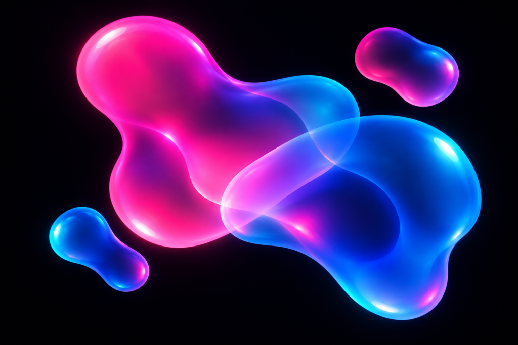
A blob can behave like a character. A ribbon can suggest a current. A glossy object can look both manufactured and almost alive. This book brings four visual approaches together through their treatment of surfaces and curves. Some are AOI-created proposals; one looks back to turn-of-the-millennium design. Their meeting is contemporary, playful and deliberately improbable.
AOI database illustration

AOI database illustration
STUDY 02 / Liquid Algorithmica
A system that flows
Orange ribbons and fine blue contours bend through repeated channels. Liquid Algorithmica combines fluid-looking outlines with controlled variation in thickness, rhythm and spacing. The name describes an AOI art direction; this still image does not demonstrate a particular algorithm or a physical fluid simulation.
AOI visual proposal
Explore Liquid Algorithmica ↗
AOI database illustration
STUDY 03 / Neurochrome Drift
An anchor in the current
A pale vessel stays legible while cyan and violet bands drift away across the dark scene. Neurochrome Drift uses a stable object to make color movement readable. Its neurological language is metaphorical: the work is an invented visual study, not an image of brain activity.
AOI visual proposal
Explore Neurochrome Drift ↗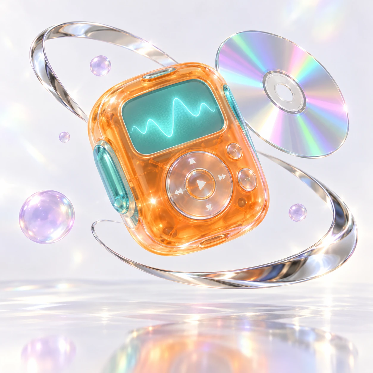
AOI database illustration
STUDY 04 / Y2K Design
The future fits in your hand
An orange-and-aqua device floats beside chrome and iridescent objects. Y2K design provides a reference for glossy surfaces, translucent plastics and optimistic digital imagery. This is a newly imagined device, not a photograph of a product from that period. Its curved shell makes technology feel collectible and tactile.
Design reference / contemporary interpretation
Explore Y2K Design ↗LOOK AGAIN
A question to stay with
Where do you read an image as a thing, and where do you read it as movement? Which edge makes the difference?
TAKE IT OFF THE SCREEN
A small experiment
Choose an ordinary object and sketch it three times: with hard corners, with rounded corners, and as connected ribbons. Keep its overall proportions. Decide which version still feels usable and which has become a sculpture.
Artwork & reading. Each artwork comes from the linked AOI art-style record. The collection combines contemporary generated studies with archive illustrations. Original AOI concepts, descriptive labels and established references are identified beside the works. The captions and curatorial readings are by Signe Haimholm; these images are not presented as works by historical artists or as technical demonstrations. Published 31 October 2026. Use the style links for the underlying descriptions and sources.
A FEW THINGS WORTH ASKING
Questions,
answered.
Curves, glossy surfaces and the strange familiarity of a digital object.
What brings the Soft Machines artworks together?
Their shared subject is the treatment of surfaces and curves: floating blobs, flowing lines, a recognizable vessel and an imagined device. Signe uses that sequence to ask how an object can become easier to name while its material becomes harder to trust.
Are Neon-Blobism and Liquid Algorithmica historical movements?
They are presented here as AOI visual proposals. Their names help describe the selected imagery; the lookbook does not treat them as established historical movements. Y2K Design provides a different kind of reference within the same collection.
Why does Y2K Design appear beside newer AOI concepts?
The selected Y2K interpretation gives the floating surfaces a recognizable design reference. It adds a useful comparison between an imagined device and the less easily named forms elsewhere in the book.
Are the shiny objects shown here real products?
The selected images are visual studies. A convincing reflection or a recognizable vessel does not establish a manufactured product, a material specification or an object available to buy.
How can I compare the surfaces in this lookbook?
Look at the edges, highlights and transitions between colors. Ask which surface seems soft, hard, translucent or metallic, then identify the visual cue that created that impression. The answer can change when you compare two works.
Do I need to like soft colors to enjoy this edition?
No. The curatorial question concerns the tension between recognizable forms and uncertain materials. You can investigate that tension even if the glossy palette is far from your own taste.
How do organic and geometric shapes work together in these digital artworks?
Here, the flowing contours feel less predictable when they meet a recognizable vessel or device. Compare a continuous curve with an edge that looks manufactured. The tension comes from that relationship: the object supplies a familiar structure while the surface suggests something fluid, soft or unstable.
How can I use this collection as a reference for a glossy material study?
Choose one image and record three things: the shape of its brightest highlight, the width of a color transition and the sharpness of an outer edge. Translate those observations into a small study of your own object. Keep the imagined material separate from claims about what a real product could be made from.
Where can I compare these soft forms with transparent or glass-like art?
Continue to Matter Made of Light for overlapping vessels and surfaces that appear to alter the view behind them. Compare the point where an object becomes recognizable in each book. If the device-like references interest you more, Tomorrows We Remember places Y2K Design in a sequence about imagined futures and memory.
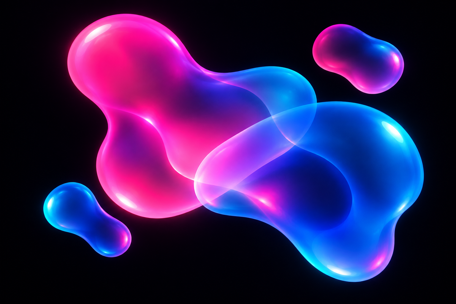
STUDY 01 / Neon-Blobism
Color acquires a body
Translucent pink and cyan volumes overlap against a dark field. Neon-Blobism treats soft irregular forms as compositional actors: their spacing and scale matter as much as their glow. The two smaller companions give the large forms something to lean toward without turning them into literal characters.
AOI visual proposal
Explore Neon-Blobism ↗