
Design aesthetic · turn-of-millennium futurism
Explore Y2K design through chrome, translucent plastics, digital graphics and documented objects, with visual examples and practical AI art prompts.
A visual introduction
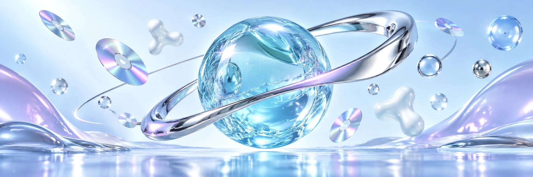
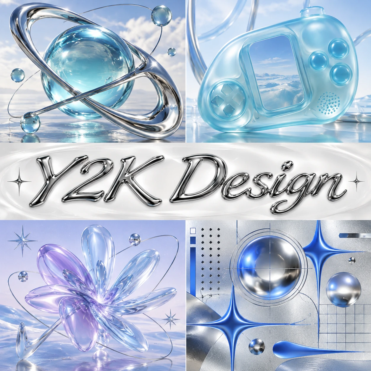
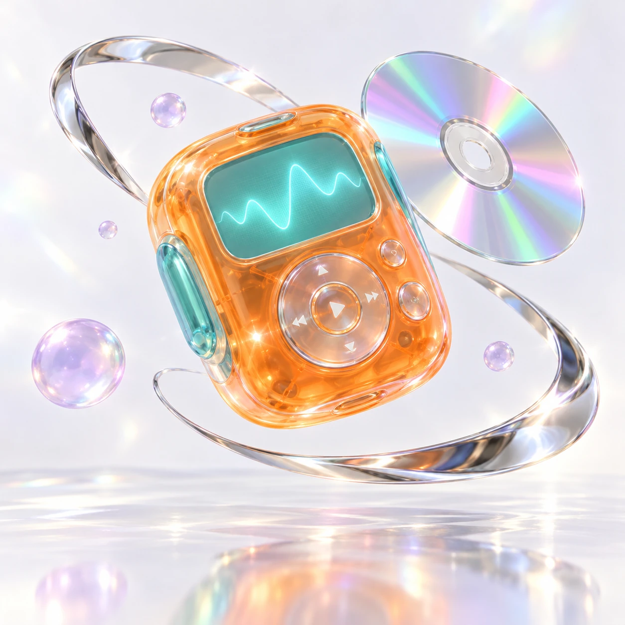
Three original AI-generated illustrations: a panoramic header, a collage with the style name at its center, and a standalone example. Captions distinguish these studies from historical objects and technical documentation.
Select an image for a closer look. Use the thumbnails, arrow keys or a swipe to compare examples. Zoom in to inspect details, or share the image that inspires you.
Creative toolbox · take this style further
Choose an input and a destination. Search sends your words to the chosen site; Copy & open puts them on your clipboard to paste there.
Create with AI
Turn your chosen input into an image prompt or a new creative direction.
ChatGPT
Copy your input and paste it into a ChatGPT conversation or image request.
Copy & open ChatGPT (new tab)Claude · Anthropic
Develop an image prompt or explore the style in a new Claude conversation.
Copy & open Claude · Anthropic (new tab)Midjourney
Paste your input into the Imagine bar on the Create page.
Copy & open Midjourney (new tab)Adobe Firefly
Copy your input, open Firefly, and paste it into the prompt field.
Copy & open Adobe Firefly (new tab)Leonardo.Ai
Copy your input, open Leonardo, and paste it into the generation field.
Copy & open Leonardo.Ai (new tab)Image search
Find visual references. Short, concrete keywords usually work best.
Lexica
Search AI images and prompts using your selected input.
Search with this input Lexica (new tab)Pexels
Search the photo and video library. Short keywords often work best.
Search with this input Pexels (new tab)Pixabay
Search photos, illustrations and other images.
Search with this input Pixabay (new tab)Unsplash
Search photographs using the style name or your own keywords.
Search with this input Unsplash (new tab)Wikimedia Commons
Search photographs, artworks and historical images. Check each file for its source and reuse terms.
Search with this input Wikimedia Commons (new tab)Art & research
Explore artists, collections and the ideas behind a style.
Wikipedia
Search for background reading. A style may not have its own article.
Search with this input Wikipedia (new tab)WikiArt
Copy your input into WikiArt’s search to explore artists and artworks.
Copy & open WikiArt (new tab)Europeana
Paste your keywords into the search to explore European museum, library and archive collections.
Copy & open Europeana (new tab)Inspiration
Discover portfolios and visual ideas from creative communities.
Instagram hashtags
Search a hashtag made from your input: spaces and punctuation are removed. Instagram may require sign-in.
Search with this input Instagram hashtags (new tab)ArtStation
Paste your input into artwork search for concept art, environments, characters and visual development.
Copy & open ArtStation (new tab)Behance
Paste your input into project search for illustration, design and visual storytelling.
Copy & open Behance (new tab)A closer look
Make materials do different jobs: sharp chrome, softly translucent plastic, pearlescent color and a calm background. Build a clear hierarchy before adding the sparkle.
A future you could almost hold
Y2K Design is a useful umbrella for several visual tendencies associated with the turn of the millennium and their later reinterpretations. It is not a single movement with a founder, manifesto and compulsory color chart. Here we focus on the glossy, playful, technologically optimistic branch: reflective metal, colored transparency, rounded objects and computer-made spaces that seem slightly too clean to have collected dust.
The Web Design Museum’s Y2K exhibition gathers dated websites from 1996 through 2005, including The Planet, Fullerene Productions and 2Advanced Studios v1. That is a useful span for looking, not a universal boundary imposed on every design discipline. The archive also shows why a date and a screenshot are better evidence than a mood board assembled from undated images. [1]
Our own images are contemporary interpretations. They choose a coherent set of material and compositional ideas rather than claiming to reconstruct a lost campaign. I rather like a future that looks as though it could be wiped clean with a sleeve. Whether the sleeve would survive the chrome is another editorial matter.
The object that made transparency approachable
The 1998 iMac is a concrete reference, not proof that one company invented the entire aesthetic. The Philadelphia Museum of Art credits Jonathan Ive and the Apple Industrial Design Team and describes its curved translucent polycarbonate case as part of an effort to make computing inviting while retaining a sense of capability. Its appearance changes with the light around it. [2]
That last point is useful for image-making. Translucency is a relationship among thickness, illumination, color and what can be glimpsed behind the surface. Merely painting an object cyan does not make it translucent. Look for darker edges, softened internal structures and highlights that differ from the hard mirror bands of adjacent metal.
The Henry Ford’s collection places the iMac G3 within a broader change in computer appearance. Its accompanying material notes that the earlier eMate already used a distinctive translucent enclosure. Keep that sequence in mind: an influential object can amplify an existing idea without being its first occurrence. Design history rarely fits inside one launch photograph. [3]
Y2K was not one material or one machine
A useful comparison comes from MoMA’s iMac G4 record, catalogued circa 2001. It lists polycarbonate, chromed sheet metal and plastic. The design belongs near the same historical moment but organizes those materials quite differently from the rounded colored enclosure of the G3. The calendar alone cannot tell you what a composition should look like. [4]
For this guide, the material palette is a set of options. Chrome can provide a sharp accent. Frosted plastic can soften a silhouette. A pearlescent gradient can change color without describing a solid object at all. Using every option at maximum intensity usually produces a display cabinet that has suffered a minor celestial incident.
Choose one dominant treatment and let the others explain it. A large translucent form can carry the subject while one metal curve supplies direction. Conversely, a silver typographic centerpiece can sit on a quiet pale field, with tiny colored elements establishing scale. Contrast is more persuasive when it has something specific to contrast with.
The web: study a dated interface before borrowing its mood
The Web Design Museum preserves examples under their original years. Use that evidence to distinguish a period artifact from a new design that borrows its appearance. A screenshot records a particular page and moment; it does not show every transition, interaction or condition in which that site was used. [1]
For a contemporary layout, separate the expressive surface from the reading task. A metallic heading can work above ordinary, legible body text. Decorative orbit lines need not become navigation. A shiny oval may look delightful while failing to tell a visitor whether it is a button, a logo or an ambitious bubble.
An AI-generated interface picture is an illustration. It is not a functioning website, an accessibility review or evidence that every control can be built as shown. Borrow the visual energy, then design actual interaction deliberately. Nostalgia is allowed a silver jacket; it need not be given responsibility for the exit signs.
Shape, type and controlled excess
Start with a silhouette that is readable at thumbnail size. A ring around a sphere, a compressed rounded device or a single swollen letterform can establish the composition quickly. Secondary curves can then echo or interrupt that structure. If every shape points in a different direction, the eye spends its time negotiating traffic.
Lettering can become an object through extrusion, reflection and distortion. Preserve the counters and spacing that make it readable. In a finished poster, check the design without its reflections; if the word disappears, the lighting has been doing too much of the alphabet’s work. Essential small text is usually best typeset separately.
Color does not have to be an endless pink-blue gradient. Our standalone study uses orange against aqua, with small lavender accents. The warm shell creates a focal point while the surrounding metal stays comparatively neutral. Limiting the palette makes the surface changes easier to understand.
Reading the three original illustrations
The banner uses a reflective orbit around a translucent blue sphere, with small disc-like objects giving the scene rhythm and scale. The named collage compares that abstract arrangement with a fictional handheld device, a clear flower-like form and a more graphic arrangement of circles and stars.
Tomorrow Fits in Your Hand is the standalone example: an invented orange-and-aqua music device, a waveform display, a chrome ribbon and an iridescent disc. It is neither a historical product photograph nor a manufacturable design proposal. The purpose is to compare material behavior and visual hierarchy in one compact scene. All three images were generated with AI for this guide.
Usability in AI art generation
Y2K is a productive starting term for generating artwork, but it leaves many decisions unresolved. Specify the branch you want: an optimistic product fantasy, a graphic poster, a glossy abstract composition or a deliberately period-informed web illustration. Name the materials, the background and the role of the focal object. Add a date range only when it serves a researched brief.
Inspect reflections, repeated controls, accidental brand marks and illegible lettering. Models can turn chrome into water, transparent plastic into glass, or a small device into an impossible stack of screens. Those outcomes may be attractive, but they should be chosen rather than mistaken for faithful execution. Check the silhouette and title at the final display size.
If historical accuracy matters, compare the result with a dated source and label the illustration honestly. If the work is an invented contemporary design, let it be inventive. The most useful prompt combines a few observable properties; a heap of nostalgic keywords often gives the model permission to make every decade attend the same party.
A small exercise in restraint
Render one original rounded object three ways: opaque colored plastic, translucent colored plastic and polished metal. Keep the camera angle, background and light position comparable. Then choose two treatments for a single composition and decide which deserves more space.
Finally remove half the decorative elements. If the image becomes stronger, keep the absence. The millennium may have promised limitless possibility; your composition still benefits from a decision.
A small poetic detour
Original words from the AOI studio.
Poetry
Tomorrow arrived
in a transparent case.
We could see the wires.
We still guessed at the future.
The prompt workshop
Original creative exercises. These prompts create new illustrations, not documentary evidence.
A future in translucent plastic
Original Y2K-inspired product fantasy, one unbranded rounded translucent aqua device, frosted thickness at the edges, quiet ivory background, one hard chrome orbit accent, playful but clear silhouette, no lettering.
Original AOI creative exercise; inspect the result against the guide rather than assuming the model followed every instruction.
Chrome as the accent
Turn-of-millennium-inspired abstract editorial image, one flowing polished-metal ribbon around a small lavender jelly sphere, controlled mirror bands, pearl-white background, generous space, no brand, no text.
Original AOI creative exercise; inspect the result against the guide rather than assuming the model followed every instruction.
Design before decoration
Original Y2K-inspired poster artwork, bold silver ring and tiny orange sphere on icy blue, sparse orbital linework, clear hierarchy and reserved empty area for separately typeset title, no generated text.
Original AOI creative exercise; inspect the result against the guide rather than assuming the model followed every instruction.
Your next inspiration
Discover another art style
Follow a visual thread to the next subject.
People & works to explore
References discussed in this article. Consult the sources below for context.
Artists and practitioners
Jonathan Ive and Apple Industrial Design Team — documented product-design reference, not founders of all Y2K design [2, 4]
The creators represented in the Web Design Museum’s dated Y2K website collection — several approaches rather than one school [1]
Paintings and other works
iMac Computer — designed 1998; Philadelphia Museum of Art record [2]
iMac G4 Desktop Computer — catalogued circa 2001; MoMA [4]
The Planet (1996), Fullerene Productions (1998) and 2Advanced Studios v1 (2000) — dated website examples in the archive [1]