Internet music culture · memory, media and imagined spaces
Vaporwave joins internet music culture with images of obsolete media, commercial spaces and unstable nostalgia. Explore its history, visual grammar and four distinct AOI studies.
A visual introduction
Compare the distinct AOI studies and the titled reference collage. Captions distinguish generated interpretations from documentary evidence.
Select an image for a closer look. Use the thumbnails, arrow keys or a swipe to compare examples. Zoom in to inspect details, or share the image that inspires you.

Creative toolbox · take this style further
Choose an input and a destination. Search sends your words to the chosen site; Copy & open puts them on your clipboard to paste there.
Create with AI
Turn your chosen input into an image prompt or a new creative direction.
ChatGPT
Copy your input and paste it into a ChatGPT conversation or image request.
Copy & open ChatGPT (new tab)Claude · Anthropic
Develop an image prompt or explore the style in a new Claude conversation.
Copy & open Claude · Anthropic (new tab)Midjourney
Paste your input into the Imagine bar on the Create page.
Copy & open Midjourney (new tab)Adobe Firefly
Copy your input, open Firefly, and paste it into the prompt field.
Copy & open Adobe Firefly (new tab)Leonardo.Ai
Copy your input, open Leonardo, and paste it into the generation field.
Copy & open Leonardo.Ai (new tab)Image search
Find visual references. Short, concrete keywords usually work best.
Lexica
Search AI images and prompts using your selected input.
Search with this input Lexica (new tab)Pexels
Search the photo and video library. Short keywords often work best.
Search with this input Pexels (new tab)Pixabay
Search photos, illustrations and other images.
Search with this input Pixabay (new tab)Unsplash
Search photographs using the style name or your own keywords.
Search with this input Unsplash (new tab)Wikimedia Commons
Search photographs, artworks and historical images. Check each file for its source and reuse terms.
Search with this input Wikimedia Commons (new tab)Art & research
Explore artists, collections and the ideas behind a style.
Wikipedia
Search for background reading. A style may not have its own article.
Search with this input Wikipedia (new tab)WikiArt
Copy your input into WikiArt’s search to explore artists and artworks.
Copy & open WikiArt (new tab)Europeana
Paste your keywords into the search to explore European museum, library and archive collections.
Copy & open Europeana (new tab)Inspiration
Discover portfolios and visual ideas from creative communities.
Instagram hashtags
Search a hashtag made from your input: spaces and punctuation are removed. Instagram may require sign-in.
Search with this input Instagram hashtags (new tab)ArtStation
Paste your input into artwork search for concept art, environments, characters and visual development.
Copy & open ArtStation (new tab)Behance
Paste your input into project search for illustration, design and visual storytelling.
Copy & open Behance (new tab)A closer look
Faded commercial color, empty interiors, obsolete interfaces and deliberate image degradation turn familiar media into strange remembered spaces. Neon is optional; context does the work.
What vaporwave means
Vaporwave is an internet-born music culture and associated audiovisual aesthetic that emerged in the early 2010s. Its images often revisit the visual language of consumer technology, commercial interiors and mediated leisure. The result can feel affectionate, empty, artificial or quietly uncanny. A shopping atrium, an old desktop window or a corporate presentation can become a fragment of a future that now looks dated.
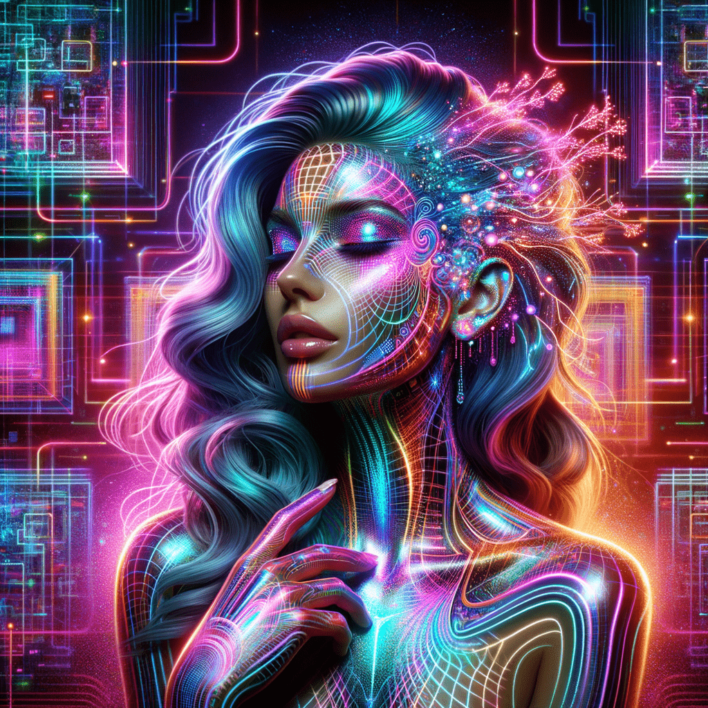
The term should not be reduced to a pink filter, a classical bust or a generic neon portrait. Those motifs can participate in vaporwave, but they do not explain it. A more useful starting point is a relationship: an everyday commercial image has been removed from its original task and made available for slow, uncertain attention.
Origins in sound and online circulation
Raphaël Nowak and Andrew Whelan describe an early-2010s genre drawing on heavily reworked background music and the audiovisual markers of 1980s and 1990s commerce. This musical origin matters to visual work. Repetition, slowing, interruption and an unresolved return can be translated into repeated windows, suspended perspectives, lingering empty rooms and images that appear to have passed through several formats.
Do not give the whole field a single inventor, fixed manifesto or exact visual checklist. Its boundaries have been negotiated through online circulation and discussion. An album cover, video, still image and fan-made interface can carry different parts of the culture. This article concentrates on visual choices while keeping the music connection visible.
Nostalgia can be remembered or imagined
Laura Glitsos’s study approaches vaporwave through the pleasure of remembering and the play of audiovisual memory. Lucas Cantinelli also examines nostalgia for periods a viewer may not have personally experienced. These perspectives explain why the aesthetic can feel familiar to someone who never visited the pictured mall or used the depicted computer.
For an original composition, choose what kind of memory is being staged. Is it a convincing recollection of a small ordinary object, a glossy promise encountered through advertising, or an impossible space assembled from screens? This is an editorial design choice, not a diagnosis of the audience. Keep one clear emotional tension rather than adding every recognizable retro object.
Affection, unease and the capitalism question
Commercial imagery invites readings about consumption and failed promises, but “vaporwave is a critique of capitalism” is too categorical. Nowak and Whelan examine that claim as part of the discourse through which the genre has been understood. An image may be critical, pleasurable, ironic or ambivalent; its materials alone do not settle its politics.
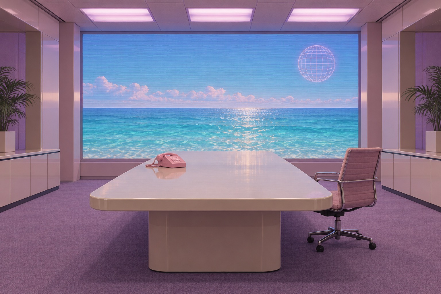
You can make a visual argument more precise through composition. A luxurious boardroom with no participants suggests a different absence from a lovingly lit home computer. An endless product window can imply repetition; a tiny abandoned chair can redirect attention toward an absent person. Explain your intended reading as an interpretation, leaving room for viewers to respond differently.
A visual grammar beyond the familiar symbols
Use framing to show one medium inside another: a window within a monitor, a projection inside a room, or a cropped photograph floating over a simplified horizon. Keep enough of each frame visible to make the layering legible. Repeated columns, floor tiles and interface borders can create a controlled rhythm. A single interruption can then become the focal event.
Empty space is active. A too-large lobby, a blank panel or a long unoccupied table can make ordinary design feel detached from its purpose. Deliberately combine different kinds of spatial representation—flat interface rectangles with a shallow three-dimensional room, for example—but establish a hierarchy so the image remains readable.
Palette, texture and typography
Try washed peach, mint, lavender, beige plastic and blue-gray shadows before reaching for full neon saturation. A darker version can use muted teal and a small luminous screen. Color should reinforce the material or remembered environment: warm plastic, cool fluorescent light, a sun-faded print. There is no mandatory vaporwave palette.
Make degradation local and purposeful. Pixel steps belong naturally to a small screen image; soft color bleed may suggest an analog recording; compression can belong to a circulated file. Applying every defect uniformly often destroys the distinction between objects and their representations. If typography is needed, use deliberate, readable language. Decorative pseudo-Japanese writing is a weak substitute for researched context.
Reading the new AOI studies
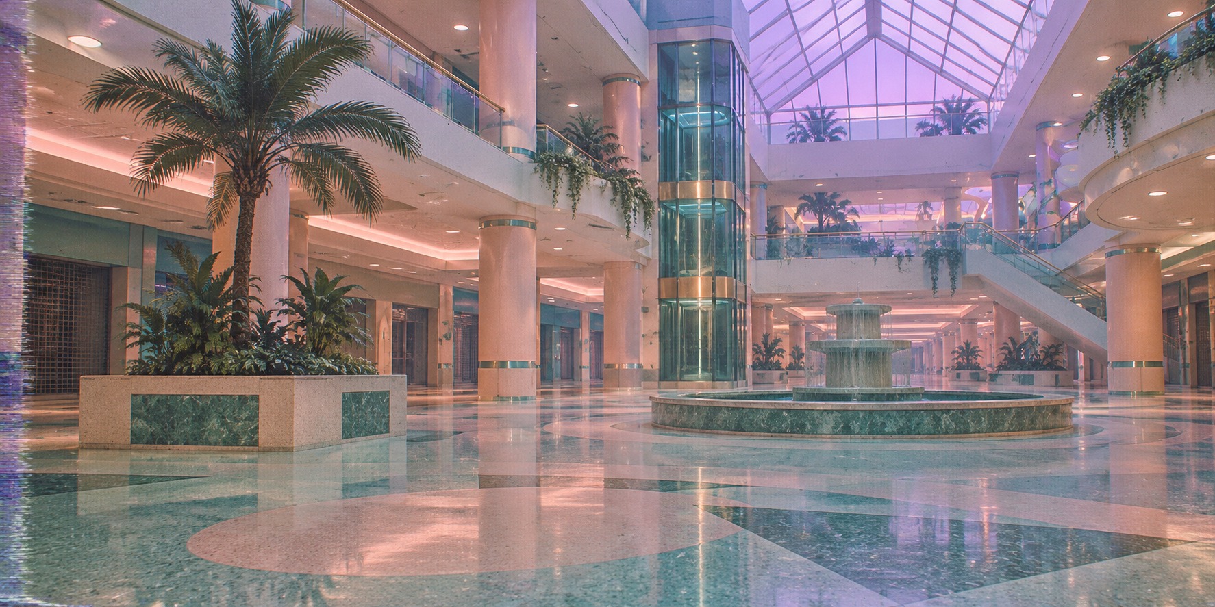
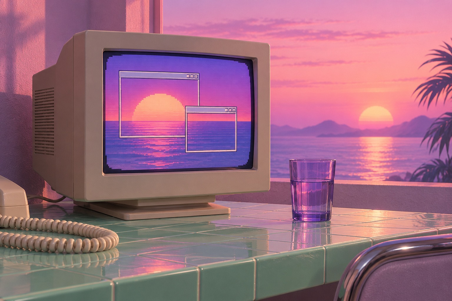
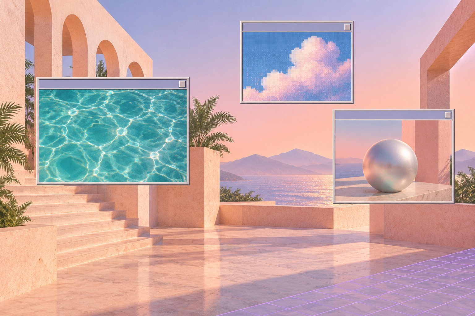
The wide atrium banner studies public leisure through columns, a fountain and an unusually quiet interior. The CRT still life moves to domestic scale, using a monitor, translucent glass and a telephone cord. The boardroom study makes corporate imagery itself the subject through an ocean projection, furniture and a wireframe sphere. The floating-window composition turns interface space into an impossible landscape.
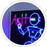
These pictures are newly generated interpretations, not recovered 1990s photographs, real software screenshots or copies of a known album sleeve. The earlier titled collage is retained as a comparison with familiar iconography. The older neon portrait is an archive comparison: cyber-style lighting by itself does not establish the fuller vaporwave relationship to memory and media.
A practical workflow and useful comparisons
Start with one source-world you can describe clearly: a home desk, a mall, a television promotion or a presentation room. Build its ordinary spatial logic first. Choose one disruption—emptiness, repetition, an impossible window or a misplaced horizon. Limit the palette, select one dominant texture process and test the picture at thumbnail size. If it reads only as colorful clutter, simplify the scene.
Synthwave often favors energetic retro-futurist spectacle, while vaporwave can dwell on repetition, mediated memory and stalled commercial space. This is a practical comparison, not a hard border between music genres or their images. Digital collage, ambient imagery and other internet aesthetics overlap too. Use the related guides to compare visual decisions rather than sorting every pink-and-cyan image into a rigid category.
Prompts that leave room for authorship
Name the ordinary environment, the disruption and the desired material treatment in your prompt. Specify which region contains pixelation or blur, and describe the focal object’s scale. Use your own compositions and appropriately reusable source material. A long list of brand names or borrowed album motifs can narrow the result to imitation; a precise spatial problem creates more room for an original image.
About this guide and its illustrations
This is an AI-authored AOI guide under Penny Wraiter, AOI’s editorial persona. The linked sources support the historical and technical context; the practical exercises, poem and new illustrations are AOI interpretations. Generated pictures are labelled as such and do not establish historical authorship, material authenticity or physical performance.
A small poetic detour
Original words from the AOI studio.
Poetry
The fountain keeps its small appointment
with nobody at all.
Above the empty escalator
a season waits behind the glass.
Somewhere a window opens
onto another window,
and the blue we meant to purchase
stays open after closing time.
The prompt workshop
Original creative exercises. These prompts create new illustrations, not documentary evidence.
A quiet remembered desktop
Original vaporwave still life: an unbranded beige CRT on a mint tiled desk, two empty windows on a sunset-colored screen, a translucent lavender glass and loosely coiled telephone cord. Gentle peach light, quiet negative space, pixelation confined to the screen. No logos, pseudo-language or copied album motifs.
Commercial space after the promise
An imagined indoor shopping atrium after closing, faded peach columns, small fountain, glass lift and a solitary artificial palm. Wide asymmetric view, lavender skylight, mint floor, restrained analog color bleed near the frame. Preserve coherent architecture and let emptiness carry the mood; no apocalyptic ruin or neon racing car.
A window that refuses to close
Original digital collage: three empty desktop frames hover above an ordinary pale plaza; each contains a different horizon, one a swimming pool, one a flat sky, one a tiny receding grid. Muted beige, teal and lilac, one reflective sphere, deliberate differences between flat interface and spatial scene. Sparse, readable, unbranded.
A smile from the studio
Jokes
The mall’s loading screen reached one hundred percent. It was still waiting for the customers.