
Music culture and visual aesthetic · imagined 1980s futures
Explore synthwave’s music-linked visual culture: reconstructed nostalgia, neon geometry, palette, composition, distinct image studies and original creative prompts.
A visual introduction
Compare the distinct AOI studies and the titled reference collage. Captions distinguish generated interpretations from documentary evidence.
Select an image for a closer look. Use the thumbnails, arrow keys or a swipe to compare examples. Zoom in to inspect details, or share the image that inspires you.

Creative toolbox · take this style further
Choose an input and a destination. Search sends your words to the chosen site; Copy & open puts them on your clipboard to paste there.
Create with AI
Turn your chosen input into an image prompt or a new creative direction.
ChatGPT
Copy your input and paste it into a ChatGPT conversation or image request.
Copy & open ChatGPT (new tab)Claude · Anthropic
Develop an image prompt or explore the style in a new Claude conversation.
Copy & open Claude · Anthropic (new tab)Midjourney
Paste your input into the Imagine bar on the Create page.
Copy & open Midjourney (new tab)Adobe Firefly
Copy your input, open Firefly, and paste it into the prompt field.
Copy & open Adobe Firefly (new tab)Leonardo.Ai
Copy your input, open Leonardo, and paste it into the generation field.
Copy & open Leonardo.Ai (new tab)Image search
Find visual references. Short, concrete keywords usually work best.
Lexica
Search AI images and prompts using your selected input.
Search with this input Lexica (new tab)Pexels
Search the photo and video library. Short keywords often work best.
Search with this input Pexels (new tab)Pixabay
Search photos, illustrations and other images.
Search with this input Pixabay (new tab)Unsplash
Search photographs using the style name or your own keywords.
Search with this input Unsplash (new tab)Wikimedia Commons
Search photographs, artworks and historical images. Check each file for its source and reuse terms.
Search with this input Wikimedia Commons (new tab)Art & research
Explore artists, collections and the ideas behind a style.
Wikipedia
Search for background reading. A style may not have its own article.
Search with this input Wikipedia (new tab)WikiArt
Copy your input into WikiArt’s search to explore artists and artworks.
Copy & open WikiArt (new tab)Europeana
Paste your keywords into the search to explore European museum, library and archive collections.
Copy & open Europeana (new tab)Inspiration
Discover portfolios and visual ideas from creative communities.
Instagram hashtags
Search a hashtag made from your input: spaces and punctuation are removed. Instagram may require sign-in.
Search with this input Instagram hashtags (new tab)ArtStation
Paste your input into artwork search for concept art, environments, characters and visual development.
Copy & open ArtStation (new tab)Behance
Paste your input into project search for illustration, design and visual storytelling.
Copy & open Behance (new tab)A closer look
Dark fields, luminous accents, receding geometry and polished surfaces stage an imagined electronic future; a convincing image needs a focal point beyond its neon effects.
Synthwave: music, memory and a visual world
Synthwave is an electronic-music culture with a closely associated visual aesthetic. Its imagery revisits an imagined past of electronic soundtracks, games, nocturnal cities and speculative futures. It is not the name of all electronic music, every 1980s design, or a formal historical painting school. A neon palette can suggest the association, but color alone cannot establish it.
Musicologist Paul Ballam-Cross describes synthwave through reconstructed nostalgia: cultural memories rebuilt through sound and imagery, including worlds listeners may never have experienced. His research connects the genre with 1980s film-score references and science-fiction and game imagery, notes releases in the 2000s and wider visibility in the early 2010s, and records overlap among synthwave, retrowave, outrun and futuresynth. Those labels are not perfectly fixed categories. [1]
References worth examining rather than merely naming
SEGA’s official Out Run page supplies a useful visual reference for road travel and the relation between scenery, speed and soundtrack. Look at the framing of the road and the way depth directs attention. It is a game reference, not proof that all synthwave began with one title. Ubisoft’s presentation of Far Cry 3 Blood Dragon explicitly adopts an exaggerated 1980s science-fiction and VHS-era vocabulary. It shows how a later production can construct a retro future rather than document an actual decade. [2, 3]
For contemporary music and cover-art exploration, NewRetroWave provides a route into releases and scene material. Follow the individual designer or illustrator credits when studying a cover: the musician and the visual artist may be different people. This guide does not convert a list of film composers, horror films or science-fiction novels into an invented canon of synthwave artworks. [4]
Visual grammar: build a scene before adding glow
Start with a large dark shape and a smaller luminous destination. A road, rink, window or diagonal ribbon can lead the eye toward it. Receding lines establish depth, while repeated intervals suggest pulse. The repetition needs a change: a bend, gap, scale shift or sudden area of stillness gives the viewer something to notice.
The familiar grid is useful when it clarifies a plane. Check that its lines agree with the scene’s perspective and that the spacing compresses toward the horizon. A grid floating behind an unrelated object can work as graphic design, but it should read as a deliberate second layer. Avoid letting automatic perspective become a collection of incompatible vanishing points.
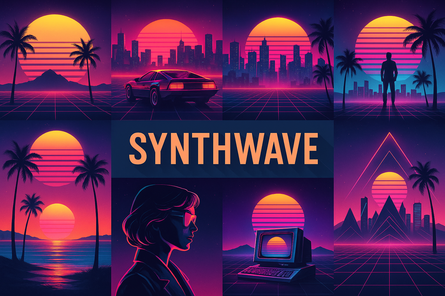
Silhouettes do much of the work. Reduce the image to a small preview and ask whether the main object remains readable. A car can be a compact dark anchor, an arcade window a bright rectangle, or a chrome ribbon a sweeping diagonal. These are different compositions; they should not all collapse into the same centered sun with decorations around it.
Palette, lighting and surface
For a practical starting palette, try midnight blue #10132F, violet #502A70, magenta #E64A9C, cyan #5AD9E8 and a limited warm accent #F4A36D. These are AOI working suggestions, not a historical standard. Choose one dominant family and reserve the brightest color for the area carrying the story.
Let surfaces react differently. Chrome reflects sharp bands; rain breaks reflections into irregular streaks; painted walls scatter softer light. If every object receives the same neon outline, the materials become interchangeable. Put light sources somewhere intelligible and make the strongest reflection correspond to a plausible surface.
Airbrushed gradients can establish atmosphere without erasing edges. Fine grain, scan lines or bloom may suggest mediated memory, but they are finishing decisions. Test a clean version first. If the composition needs a heavy effect to hide an awkward object or weak focal point, correct the underlying shapes.
Four approaches in the gallery
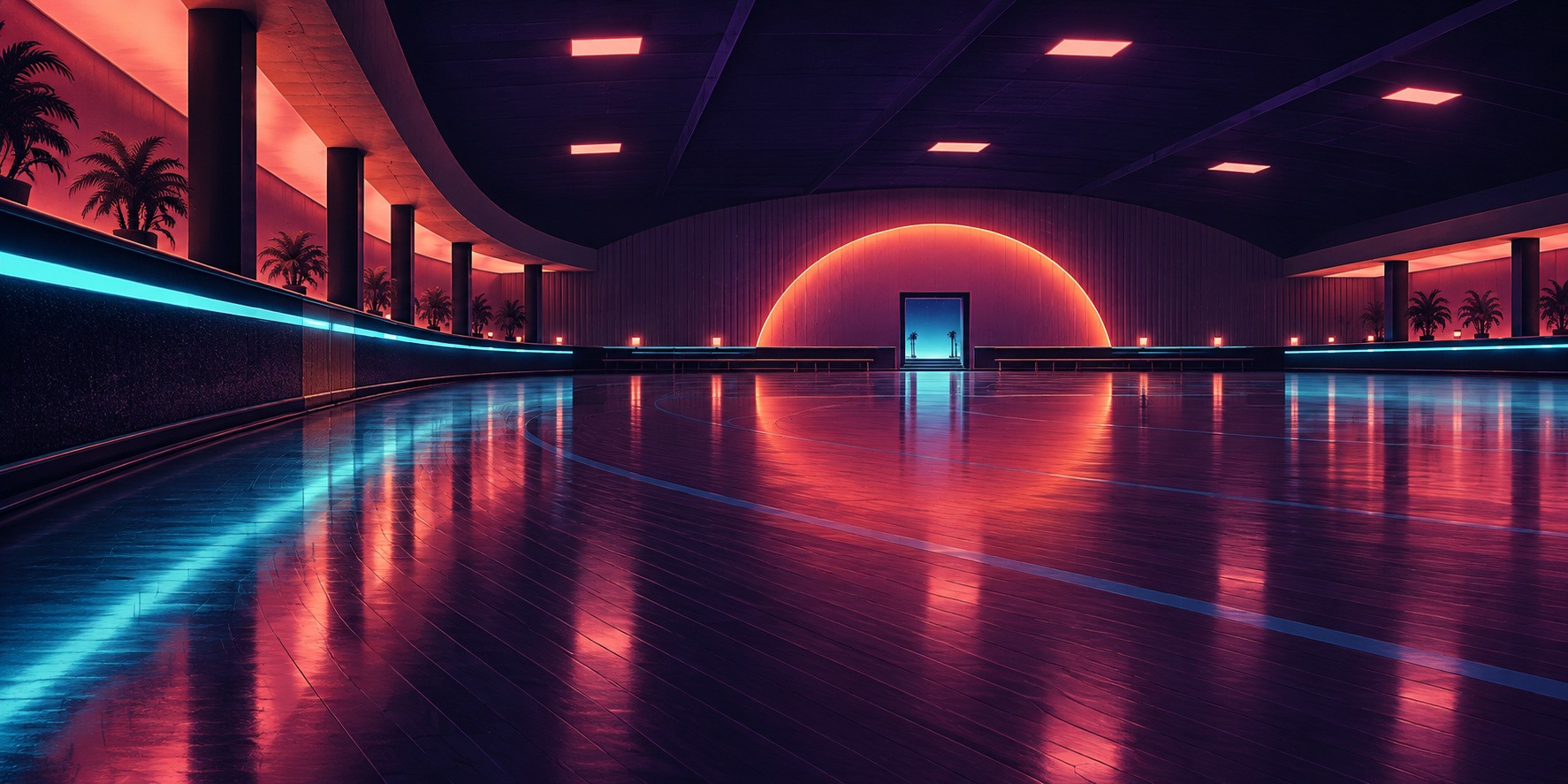
The new banner uses an empty rink, a curved coral-lit wall and a broad reflective floor. Its sense of anticipation comes from the quiet interior and distant doorway. It offers a wide composition that remains legible when used as a small preview.
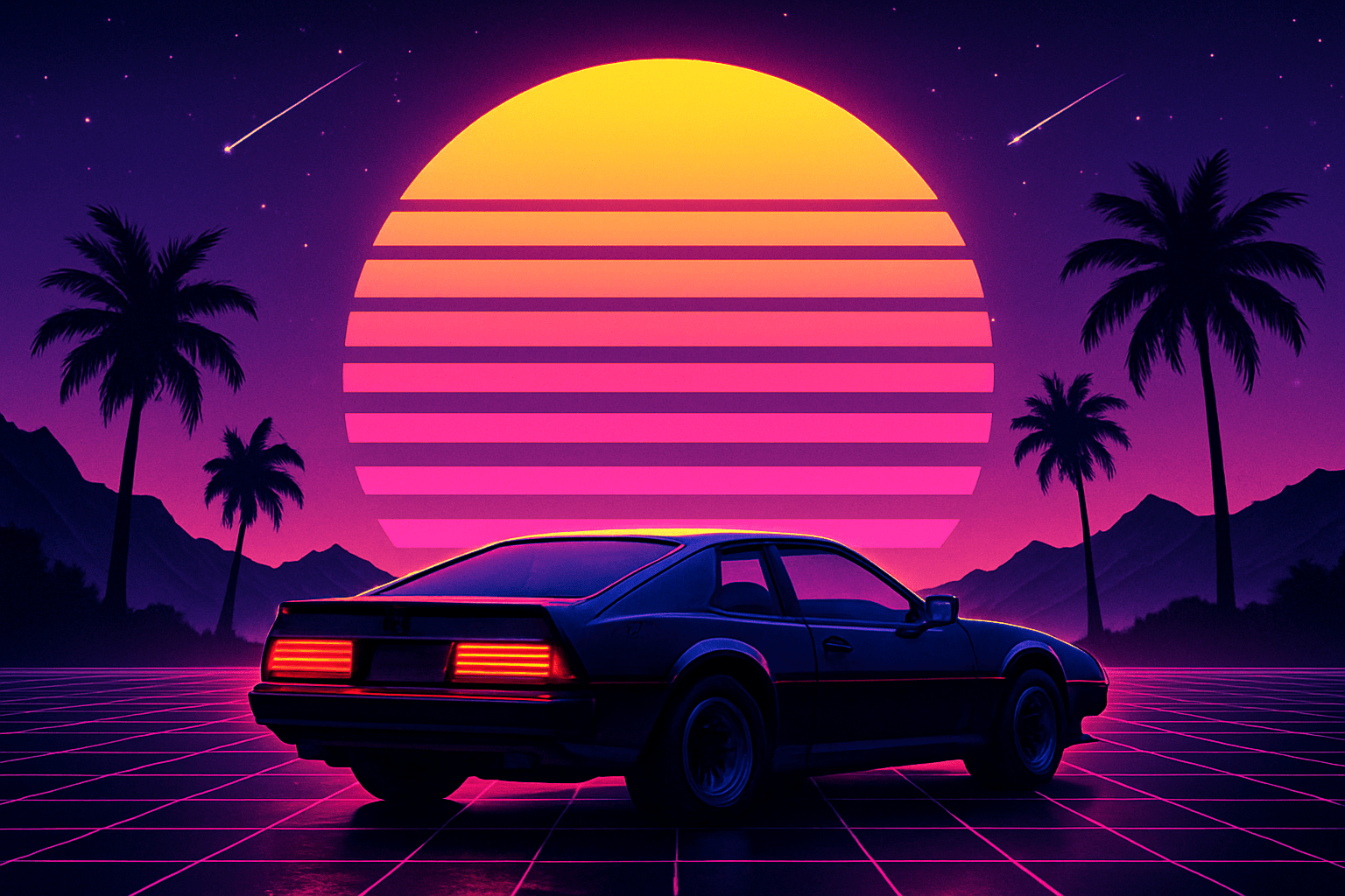
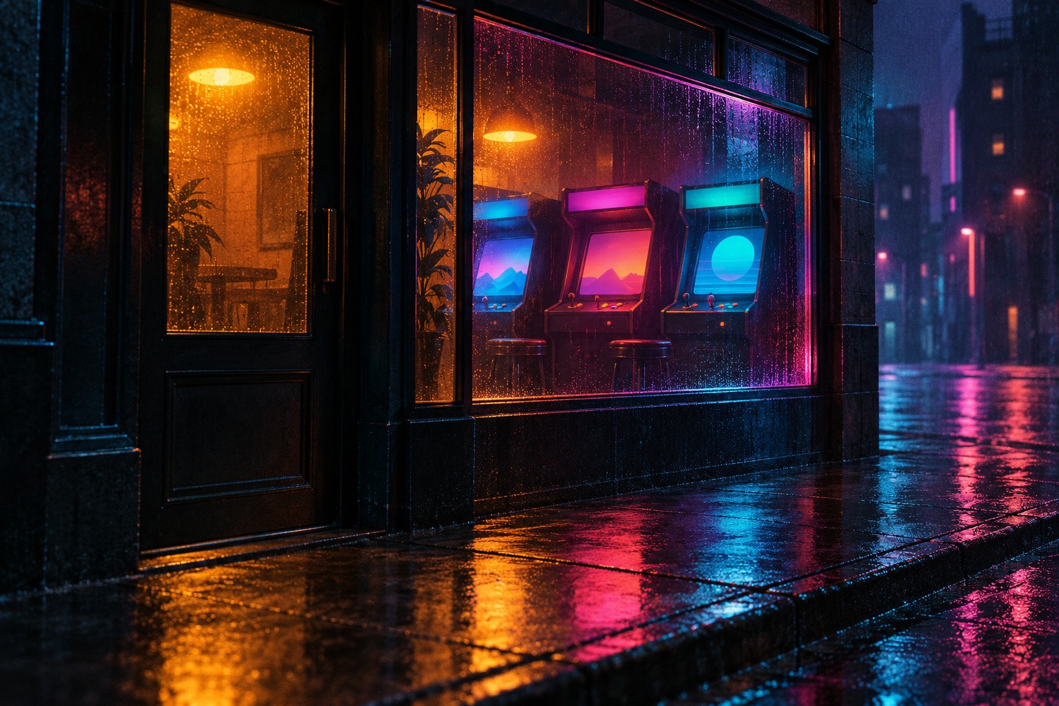
The retained car-and-sunset illustration presents a familiar vocabulary directly: a dark vehicle, palms, a striped disc and a receding grid. The new arcade study moves closer, letting a window and wet pavement carry the color. The abstract ribbon study removes the literal scene and tests whether reflective form, spacing and controlled hue can sustain the atmosphere. The retained collage provides a compact map of recurring motifs. These are generated AOI interpretations, not historical covers.
Synthwave, Futuresynth and neighboring aesthetics
Ballam-Cross distinguishes synthwave’s nostalgic homage from vaporwave’s different uses of mediated memory and cultural material. Treat this as a useful comparison, not a rigid sorting machine for every contemporary image. The same object can participate in different artistic intentions. [1]
AOI’s Futuresynth guide uses an explicitly editorial emphasis on anticipation and imagined destinations. Synthwave here places more weight on the relationship between contemporary imagery and remembered media. Retrofuturism is the broader question of how futures are imagined through past expectations. A futuristic city, by itself, does not tell you which of these contexts applies.
A practical design workflow
Write a one-sentence brief: an empty leisure space after closing, a luminous shop window in rain, or a metallic form against an electronic horizon. Decide what the viewer should feel and which object carries that feeling. Make three thumbnail arrangements using only dark, middle and light values before choosing colors.
Add one structural rhythm and one interruption. In a scene, that might be a row of cabinets interrupted by a doorway. In an abstract piece, vary the ribbon’s width or the distance between grid lines. Keep secondary motifs subordinate. A useful image can communicate nostalgia without including every recognizable emblem.
For a cover, reserve room for lettering and test the image at small size. Design typography as a separate readable layer when reliable text is required. For motion, identify a single change that matters: an approaching light, a slowly shifting reflection, or a pulse in a repeated pattern. A still concept is not an animation until that behavior has been made.
Prompting and judging the result
Use concrete terms such as dark foreground anchor, coherent receding grid, restrained cyan reflection, coral focal light, airbrushed gradient and clear silhouette. Add a setting and a viewpoint. Avoid relying only on a stack of genre labels, which encourages the model to repeat familiar combinations.
Inspect architecture, vehicle proportions, repeated cabinet geometry and reflected light. Remove accidental text and logos. Then ask a harder question: does the picture have an atmosphere or narrative beyond recognition of the style? If the only answer is a pink sun, try a second composition without that sun.
About this guide and its illustrations
This is an AI-authored AOI guide under Penny Wraiter, AOI’s editorial persona. The linked sources support the historical and technical context; the practical exercises, poem and new illustrations are AOI interpretations. Generated pictures are labelled as such and do not establish historical authorship, material authenticity or physical performance.
A small poetic detour
Original words from the AOI studio.
Poetry
After closing, the floor remembers light.
A blue line crosses the room
without making a sound.
Beyond the glass, rain edits the street,
turning every reflection
into a softer version of itself.
We came looking for the future
and found a room we almost knew.
The door is small.
The color keeps it open.
The prompt workshop
Original creative exercises. These prompts create new illustrations, not documentary evidence.
Start with a quiet neon space
Create an original synthwave illustration of an empty roller rink after closing. Use a broad violet reflective floor, a coral-lit curved wall, one small distant doorway and restrained cyan edge lights. Establish coherent perspective and a clear dark-to-light hierarchy. No people, logos or text.
Tell a story through one window
Create an original rain-lit arcade storefront at midnight. Frame three fictional unbranded cabinets through a warm window, with a large dark doorway and broken cyan-magenta reflections on the pavement. Keep the architecture coherent and screens free of text. Evoke remembered electronic media without copying a film or game.
Remove the familiar scene
Create an abstract synthwave composition of a folded metallic ribbon crossing an indigo field. Use coral and cyan reflections, a thin receding grid and generous quiet space. Make the ribbon’s silhouette and value changes carry the image. No city, vehicle, typography or copied cover design.
A smile from the studio
Jokes
I removed the giant sunset from the brief. The grid asked for a meeting.