
AOI creative concept
An AOI-created visual proposal pairing one contour-rich motif with a directed patterned transition and a broad field of shadow. Explore its rules, limits and distinct applications.
An A⊕I –[-.+] creαt¡ve c⊕ncept, n⊕t αn estαbl¡she∂ h¡st⊕r¡cαl m⊕vement.
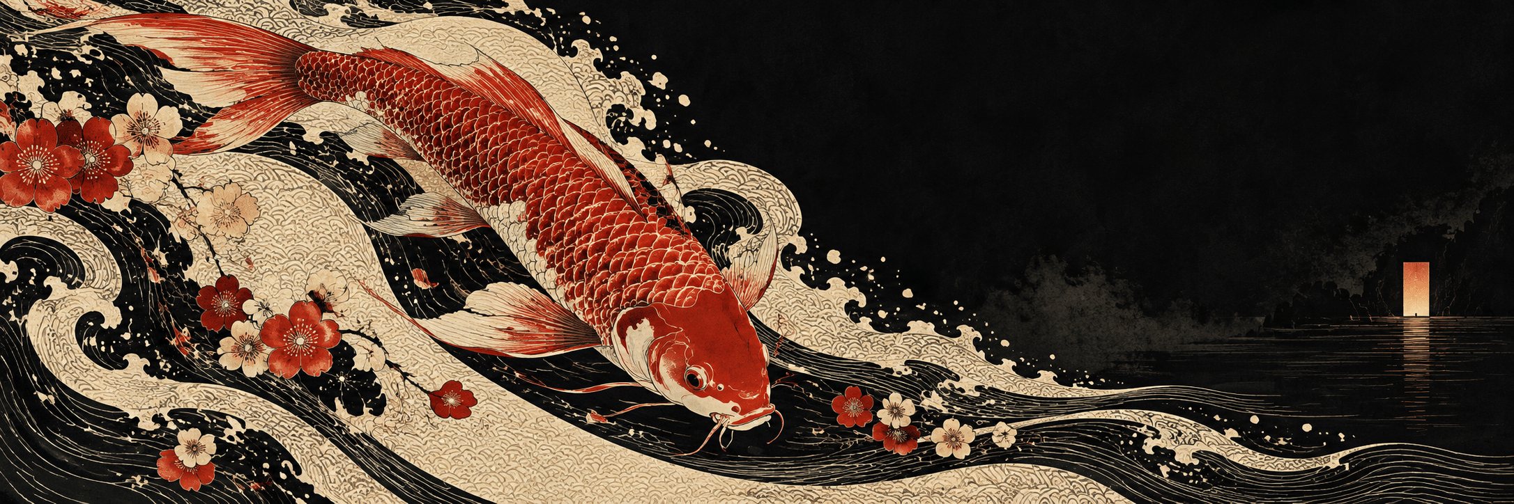
A visual introduction
Select an image for a closer look. Use the thumbnails, arrow keys or a swipe to compare examples. Zoom in to inspect details, or share the image that inspires you.


Creative toolbox · take this style further
Choose an input and a destination. Search sends your words to the chosen site; Copy & open puts them on your clipboard to paste there.
Create with AI
Turn your chosen input into an image prompt or a new creative direction.
ChatGPT
Copy your input and paste it into a ChatGPT conversation or image request.
Copy & open ChatGPT (new tab)Claude · Anthropic
Develop an image prompt or explore the style in a new Claude conversation.
Copy & open Claude · Anthropic (new tab)Midjourney
Paste your input into the Imagine bar on the Create page.
Copy & open Midjourney (new tab)Adobe Firefly
Copy your input, open Firefly, and paste it into the prompt field.
Copy & open Adobe Firefly (new tab)Leonardo.Ai
Copy your input, open Leonardo, and paste it into the generation field.
Copy & open Leonardo.Ai (new tab)Image search
Find visual references. Short, concrete keywords usually work best.
Lexica
Search AI images and prompts using your selected input.
Search with this input Lexica (new tab)Pexels
Search the photo and video library. Short keywords often work best.
Search with this input Pexels (new tab)Pixabay
Search photos, illustrations and other images.
Search with this input Pixabay (new tab)Unsplash
Search photographs using the style name or your own keywords.
Search with this input Unsplash (new tab)Wikimedia Commons
Search photographs, artworks and historical images. Check each file for its source and reuse terms.
Search with this input Wikimedia Commons (new tab)Art & research
Explore artists, collections and the ideas behind a style.
Wikipedia
Search for background reading. A style may not have its own article.
Search with this input Wikipedia (new tab)WikiArt
Copy your input into WikiArt’s search to explore artists and artworks.
Copy & open WikiArt (new tab)Europeana
Paste your keywords into the search to explore European museum, library and archive collections.
Copy & open Europeana (new tab)Inspiration
Discover portfolios and visual ideas from creative communities.
Instagram hashtags
Search a hashtag made from your input: spaces and punctuation are removed. Instagram may require sign-in.
Search with this input Instagram hashtags (new tab)ArtStation
Paste your input into artwork search for concept art, environments, characters and visual development.
Copy & open ArtStation (new tab)Behance
Paste your input into project search for illustration, design and visual storytelling.
Copy & open Behance (new tab)A closer look
One precise motif; a single flowing transition; large purposeful negative space; asymmetry; ink black and ivory with a restrained saturated accent; no dependence on criminal imagery.
An AOI proposal with a defined visual problem
Yakuzaism is used here as an AOI-created visual proposal: a dense, contour-led motif meets a large, quiet field of cinematic shadow. Its purpose is to make ornament and suspense work together. The name is a catalog label, not evidence of a historical art movement, an organisation’s official aesthetic or a recognised Japanese cultural category. No historical founder, legal registration or exclusive ownership of the term is asserted.
The proposal retains an interest in dramatic printed imagery while rejecting the idea that criminal affiliation explains Japanese art or tattooing. A picture of a flower, fish, clothed person or city can explore the same visual tension. The defining issue is how a tightly organised motif changes the surrounding space, not how many supposedly dangerous symbols can be added.
The documented reference and its limits
The Museum of Fine Arts, Boston connects early nineteenth-century Edo tattoo imagery with colour woodblock prints. Its exhibition account discusses Utagawa Kuniyoshi’s Water Margin heroes of about 1827–30 and the role of such images in pictorial tattoo culture. It also describes changing meanings that include devotion, punishment and crime. That history is more varied than the assumption that a tattoo identifies a criminal.
This source supports a relationship between printed motifs and tattoo imagery; it does not establish Yakuzaism as an old movement or make historical printmakers its members. The museum’s contextual account should be read alongside individual works. The compositional rules below are a new AOI interpretation, not instructions attributed to Kuniyoshi or a living tattoo practitioner.
Three rules that make the proposal repeatable
First, give one motif a complete structural contour. A fish needs a readable body, head and fin arrangement; a peony needs a convincing centre and overlapping petals. Second, allow a single band of patterned movement to leave that motif and steer the eye through the image. It might resemble water, wind or a folded ribbon, but it must connect to the composition rather than float as unrelated decoration.
Third, reserve a broad quiet field whose shape answers the busy motif. A small silhouette, doorway or reflected light may interrupt it once. This pairing is the proposal’s distinctive working constraint: dense contour, one directed transition, and purposeful emptiness. Remove any element that creates a second competing centre without adding meaning. An evenly filled surface loses the tension the style is meant to explore.
Palette, space and material
Begin with ink black, warm ivory and one saturated accent such as vermilion or indigo. A second accent should have a specific job, perhaps distinguishing the motif from its reflection. Avoid making every edge glow. The design relies on differences in density and scale rather than a continuous neon outline. At thumbnail size, the large dark and light shapes should still explain the composition.
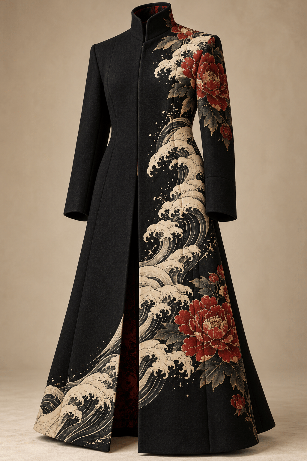
A print-like treatment can use crisp contours, bounded colour areas and selective grain. A painted version can soften the quiet field while retaining a precise motif. A textile concept can let seams or folds interrupt the pattern, but a generated garment is not proof of manufacturability. Keep the chosen material consistent: ink-like edges, cloth folds and reflected street light should not become interchangeable effects.
Five applications beyond a single stereotype
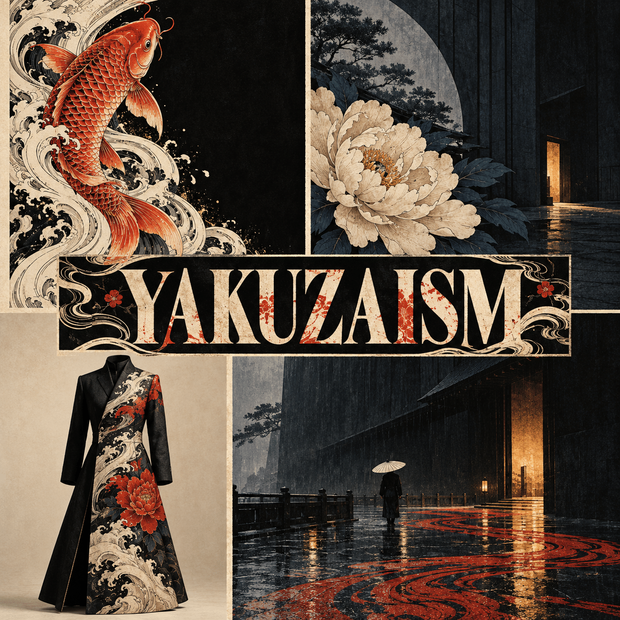
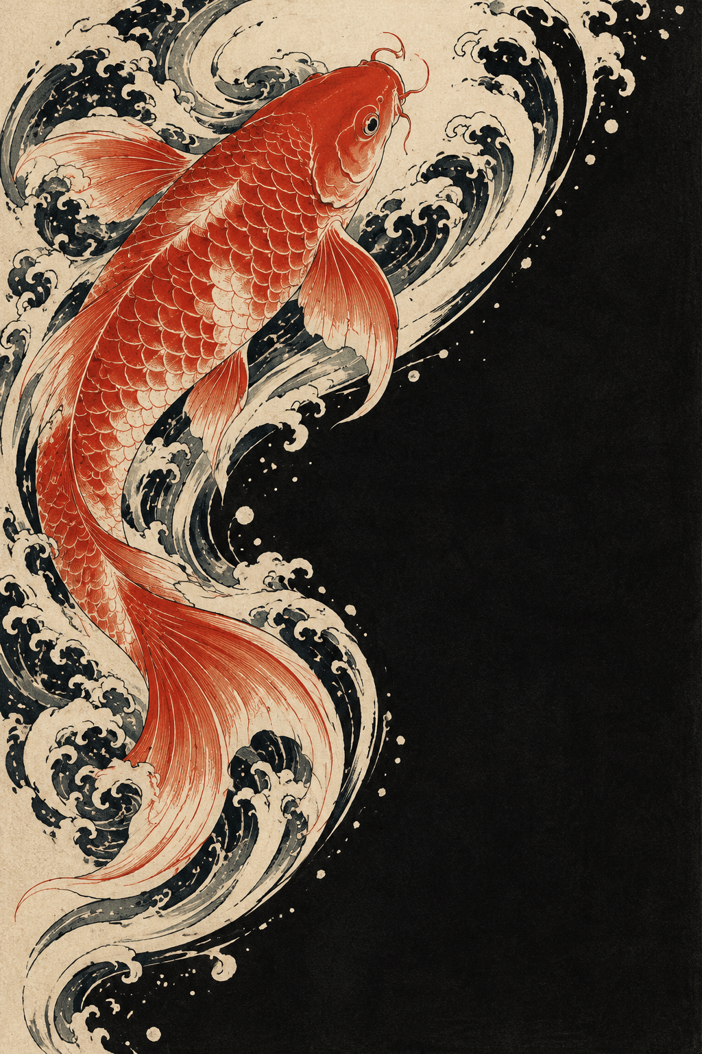
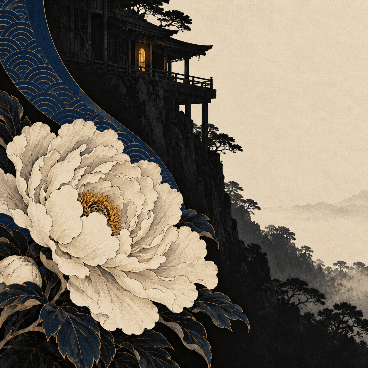
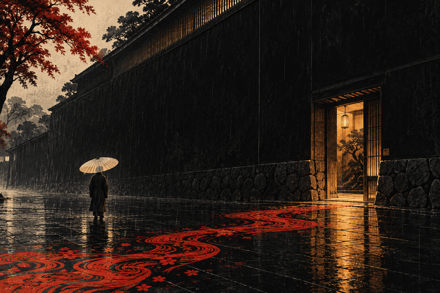
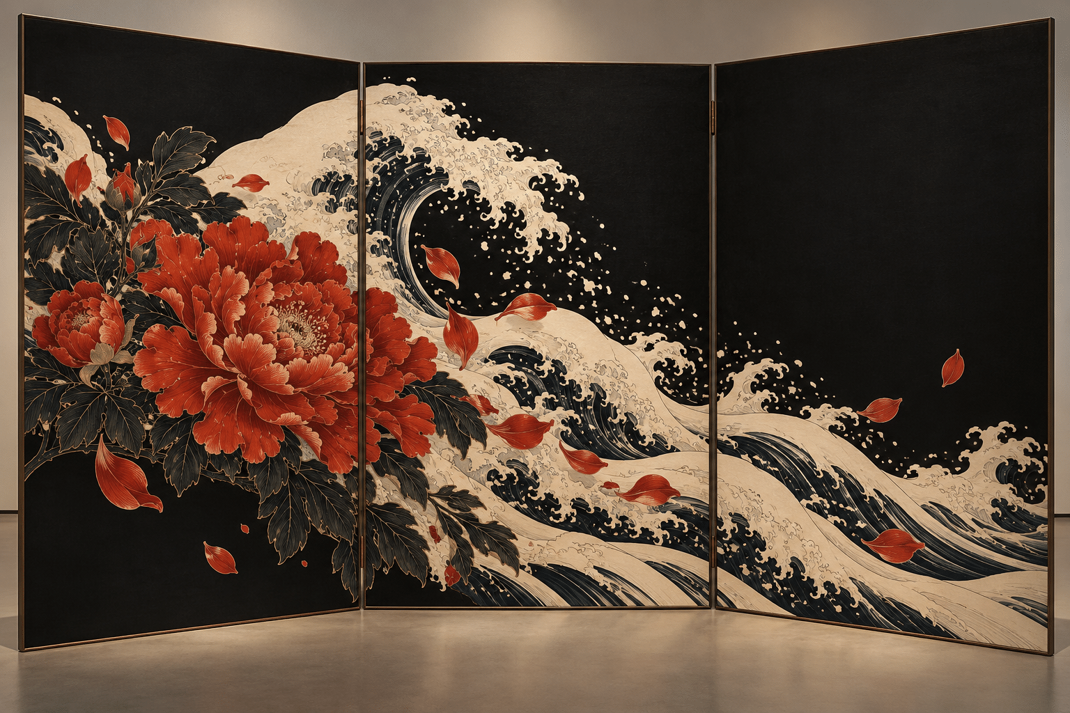
The gallery tests a koi-and-current composition, a peony against architectural shadow, an invented coat design, a rainy street with a small umbrella figure, and a folded-screen concept. Each is an AI-generated interpretation of the proposed rules. None is an authentic tattoo design from a named master, an official group emblem, a documentary street photograph or a historical Japanese artwork.
Vary the relationship between motif and void. The fish can dominate while the street figure remains tiny; the flower can press against an empty plane; the screen can distribute one connected flow across separate panels. These changes demonstrate scale, interruption and continuity. They are more informative than five portraits with different ornamental backgrounds.
A practical critique before finishing
Reduce the image to three values and inspect its silhouette. Then inspect the motif at full size for coherent anatomy or botanical structure. Check whether the patterned transition has a clear direction and whether the quiet field remains quiet. Avoid invented Japanese writing, meaningless seals and claims of cultural authenticity. If a specific source is being studied, name it accurately; if the image is invented, let the caption say so.
Positive perspective — AI-authored editorial assessment
This proposal is strongest when ornament creates narrative pressure. A finely described motif gains force beside a large unoccupied shape, and a small interruption can suggest a story without spelling it out. The restricted palette and deliberate asymmetry suit posters, book-cover studies and atmospheric decorative concepts.
Critical perspective — AI-authored editorial assessment
The name can encourage sensational imagery or cultural shorthand, so the framing matters. Dragons, tattoos and neon alone do not create a distinct visual method. If the composition depends on romanticised criminality or fabricated tradition, it has failed editorially. If every area is equally intricate, it has failed formally. Return to one motif, one transition and a meaningful void.
Neutral perspective — AI-authored editorial assessment
Yakuzaism is an experimental AOI catalog concept informed by selected visual references. It can be evaluated through the clarity and variety of its compositions, not through invented historical prestige. Readers interested in Japanese printmaking or tattoo history should follow those subjects in their own documented contexts rather than treating this proposal as a substitute.
A small poetic detour
Original words from the AOI studio.
Poetry
One line gathers every scale,
One current finds the shore.
A flower leans against the dark,
A lamp becomes a door.
The quiet field keeps half the tale,
The patterned edge keeps time;
What leaves the page unoccupied
Can still complete the rhyme.
The prompt workshop
Original creative exercises. These prompts create new illustrations, not documentary evidence.
A motif and a void
Original AOI Yakuzaism study: one vermilion koi with coherent fins and scales curves through an ivory ribbon of current; half the picture remains a quiet ink-black field. Crisp contour, selective print-like grain, one small distant reflection, no writing, emblem or historical attribution.
Let architecture interrupt a flower
Original poster-like composition: a sharply drawn ivory peony occupies the lower left, one indigo curved band crosses behind it, a broad charcoal architectural shadow fills the right. A single warm doorway light interrupts the void. Asymmetrical hierarchy, no text or signature.
Carry one flow across separate panels
Invented three-panel folding-screen concept with a connected contour-led wave passing between panels, one peony anchor and large empty black fields. Ivory and muted red accents, coherent hinges and perspective, material-aware design. AI concept, not a historical object or manufacturing plan.
A smile from the studio
Jokes
The ornament wanted the whole poster. The empty space declined to move.