Fictional
Ultramarine Confetti Pointillism is an invented AOI style: deep cobalt-blue shadows hold simplified silhouettes while dense circular dots of yellow, amber and orange gather into luminous passages. Its dreamlike contrast depends on the balance between a quiet blue shape and a restless field of colored points.
An A⊕I –[-.+] creαt¡ve c⊕ncept, n⊕t αn estαbl¡she∂ h¡st⊕r¡cαl m⊕vement.

A visual introduction
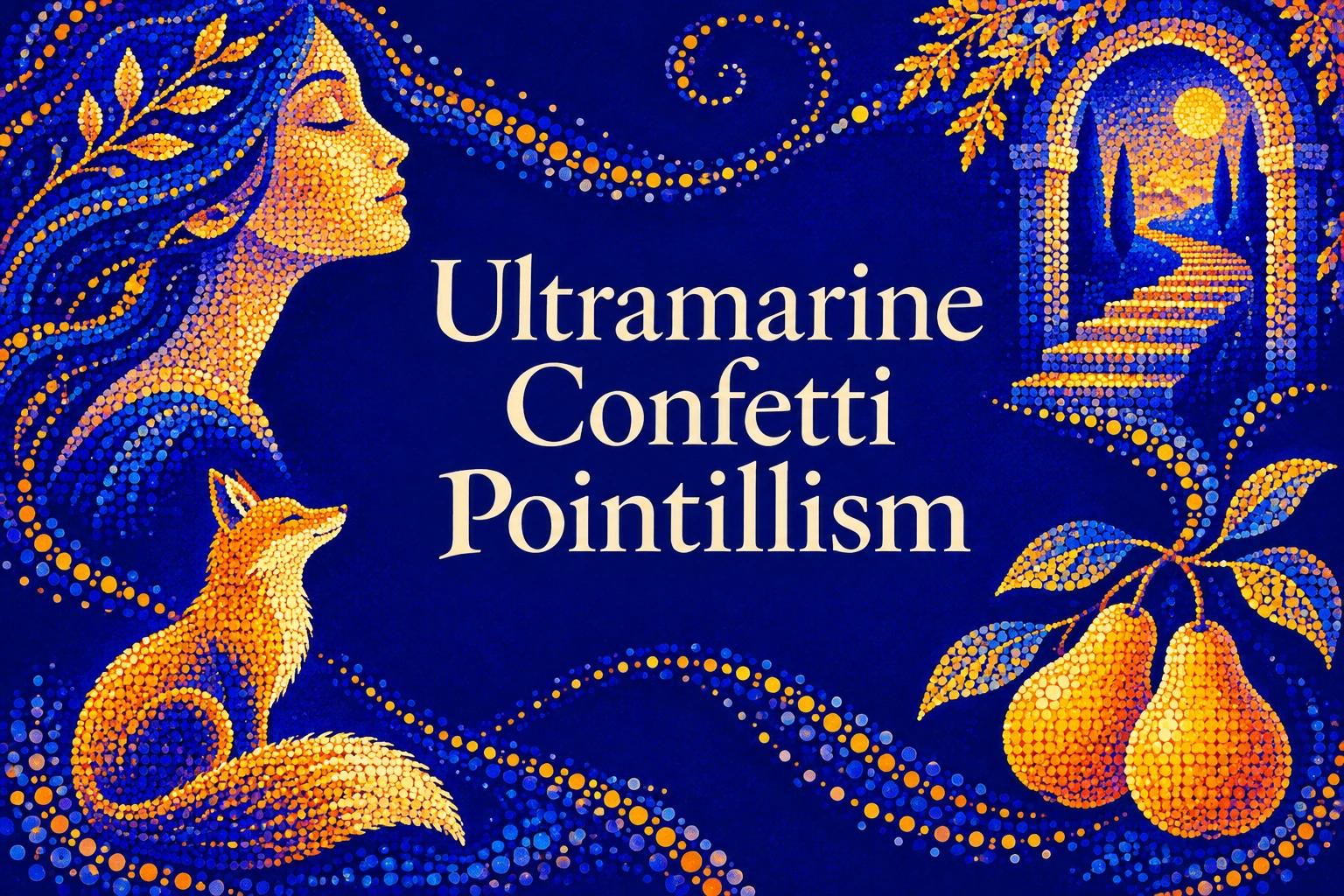
Seven original AI-generated studies explore this subject through a banner, a titled collage and five standalone examples.
Select an image for a closer look. Use the thumbnails, arrow keys or a swipe to compare examples. Zoom in to inspect details, or share the image that inspires you.
Creative toolbox · take this style further
Choose an input and a destination. Search sends your words to the chosen site; Copy & open puts them on your clipboard to paste there.
Create with AI
Turn your chosen input into an image prompt or a new creative direction.
ChatGPT
Copy your input and paste it into a ChatGPT conversation or image request.
Copy & open ChatGPT (new tab)Claude · Anthropic
Develop an image prompt or explore the style in a new Claude conversation.
Copy & open Claude · Anthropic (new tab)Midjourney
Paste your input into the Imagine bar on the Create page.
Copy & open Midjourney (new tab)Adobe Firefly
Copy your input, open Firefly, and paste it into the prompt field.
Copy & open Adobe Firefly (new tab)Leonardo.Ai
Copy your input, open Leonardo, and paste it into the generation field.
Copy & open Leonardo.Ai (new tab)Image search
Find visual references. Short, concrete keywords usually work best.
Lexica
Search AI images and prompts using your selected input.
Search with this input Lexica (new tab)Pexels
Search the photo and video library. Short keywords often work best.
Search with this input Pexels (new tab)Pixabay
Search photos, illustrations and other images.
Search with this input Pixabay (new tab)Unsplash
Search photographs using the style name or your own keywords.
Search with this input Unsplash (new tab)Wikimedia Commons
Search photographs, artworks and historical images. Check each file for its source and reuse terms.
Search with this input Wikimedia Commons (new tab)Art & research
Explore artists, collections and the ideas behind a style.
Wikipedia
Search for background reading. A style may not have its own article.
Search with this input Wikipedia (new tab)WikiArt
Copy your input into WikiArt’s search to explore artists and artworks.
Copy & open WikiArt (new tab)Europeana
Paste your keywords into the search to explore European museum, library and archive collections.
Copy & open Europeana (new tab)Inspiration
Discover portfolios and visual ideas from creative communities.
Instagram hashtags
Search a hashtag made from your input: spaces and punctuation are removed. Instagram may require sign-in.
Search with this input Instagram hashtags (new tab)ArtStation
Paste your input into artwork search for concept art, environments, characters and visual development.
Copy & open ArtStation (new tab)Behance
Paste your input into project search for illustration, design and visual storytelling.
Copy & open Behance (new tab)A closer look
Flat, legible silhouettes anchor broad ultramarine and cobalt fields. Small circular color marks cluster into warm focal areas, thin out toward shadow, and occasionally cross an edge. Gold means a yellow-orange color impression here, not necessarily metallic leaf. Light is suggested through color and spacing rather than photographic bloom.
A proposed style, with a precise visual promise
This is a contemporary AOI invention developed from the supplied name and visual brief. It is presented as a working artistic language, not a newly discovered historical movement. Its minimal specifier is: “Ultramarine-gold confetti pointillism, luminous stippling, flat silhouettes”. The essential signature combines deep cobalt-blue shadows, glowing yellow-orange highlights, dense circular dots, simplified shapes and dreamlike contrast.
The useful tension is between stillness and activity. A silhouette holds its identity in a few firm contours; its surrounding points seem to flicker, gather or drift. A successful image remains clear when small and becomes more intricate when approached. The dots should change how the picture is read, rather than simply decorate a finished scene.
What it borrows from pointillism—and what it changes
The Metropolitan Museum distinguishes Divisionism, the separation of color into individual pigment strokes, from Pointillism, the use of precise dots. Its account places these methods within Neo-Impressionist experiments with optical color. The National Gallery likewise explains the intention that small adjacent marks combine perceptually at a viewing distance. These are historical reference points for the name, not evidence that Ultramarine Confetti Pointillism existed in that period.
This AOI interpretation allows dots to remain conspicuous. They can be larger, unevenly distributed and deliberately ornamental, with quiet flat areas left between them. It does not require a painting made entirely from uniform points or claim to reproduce nineteenth-century optical theory. Its “confetti” describes the lively distribution of round color marks, not literal scraps of paper photographed in the air.
Blue carries the structure; gold makes the event
Begin with a dark blue field and a few readable shapes. Choose which area receives the brightest yellow-orange cluster, then let that choice organize the rest. A face can turn toward a warm patch, an arch can frame it, or a dark river can divide it into broken reflections. Secondary warm passages should support the first, rather than demand equal attention.
Ultramarine and cobalt are used here as practical color descriptions, not a prescription for particular paint chemistry. Nor does “gold” guarantee a metallic material. Different screens, papers and pigments will change the result. Treat blue and yellow-orange as the proposed cool/warm relationship; avoid promising an exact complementary pair for every shade or an objectively measured increase in luminosity.
A dot has three jobs
A dot can describe light, organize rhythm or interrupt a boundary. Decide which job it is doing. Dense warm clusters suggest an illuminated plane; small scattered blue points can keep a warm patch from becoming a single block; a few dots outside a contour can suggest drifting movement. Uniform coverage tends to erase all three distinctions.
Vary density before adding more colors. Try a compact bright cluster, a middle zone of separate marks and a wide dark reserve. Dot size can also change, but keep a visible family resemblance: mostly rounded marks, not an accidental mixture of stars, squares, sparks and lens circles. Selective irregularity gives the confetti character. Repetition without variation produces wallpaper.
Flat silhouettes, dreamlike space
Simplify the subject until its outline reads without surface detail. A fox needs its ears, muzzle, back and tail; a portrait needs a coherent profile; architecture needs an opening and a stable supporting mass. Preserve enough unbroken contour to identify the subject even where dots spill across an edge.
Flatness does not forbid depth. Overlapping shapes, a change in scale and a few horizontal bands can suggest distance without photographic modeling. The Courtauld’s Seurat teaching resource offers a useful historical study of water and reflected light. Here a river or pool becomes an original compositional exercise: warm points interrupted by dark blue bands, rather than a recreation of one of his paintings.
Five applications, five different problems
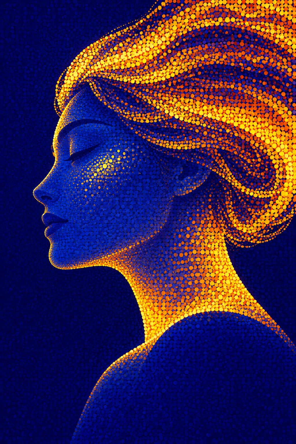
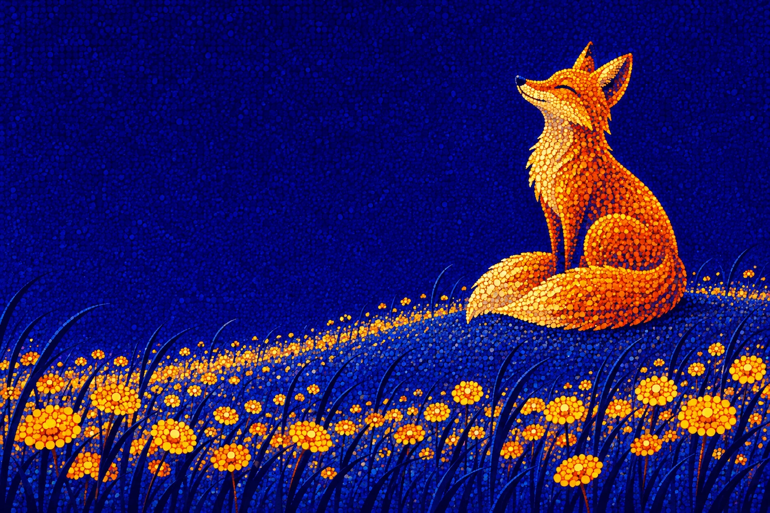
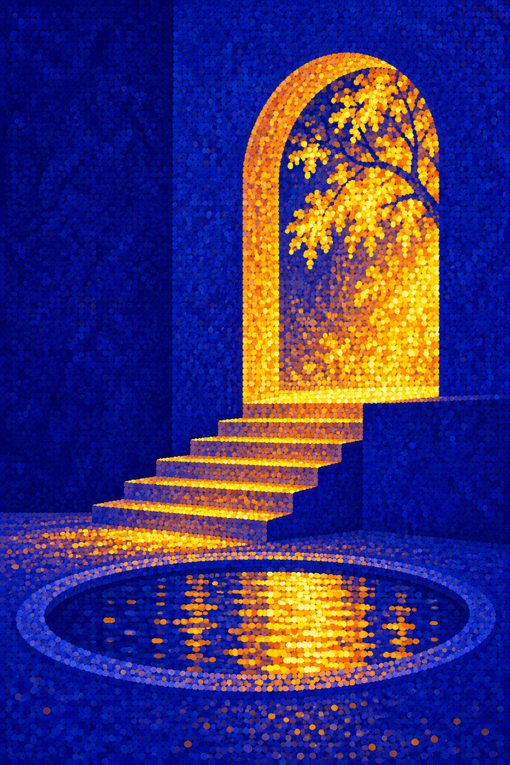
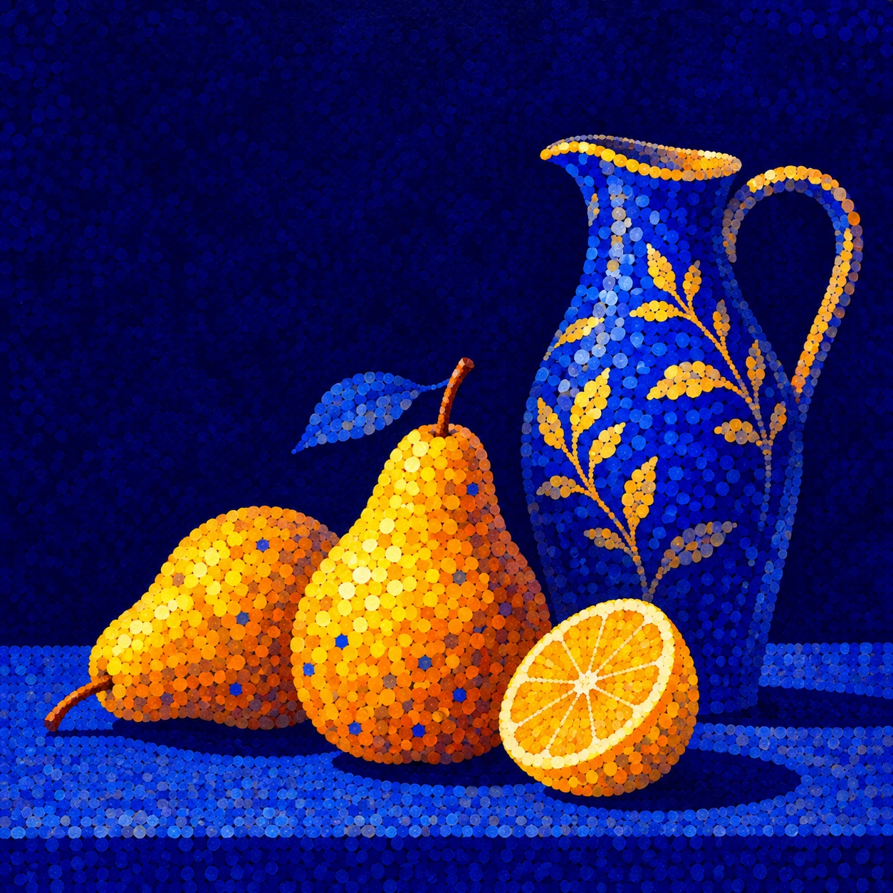
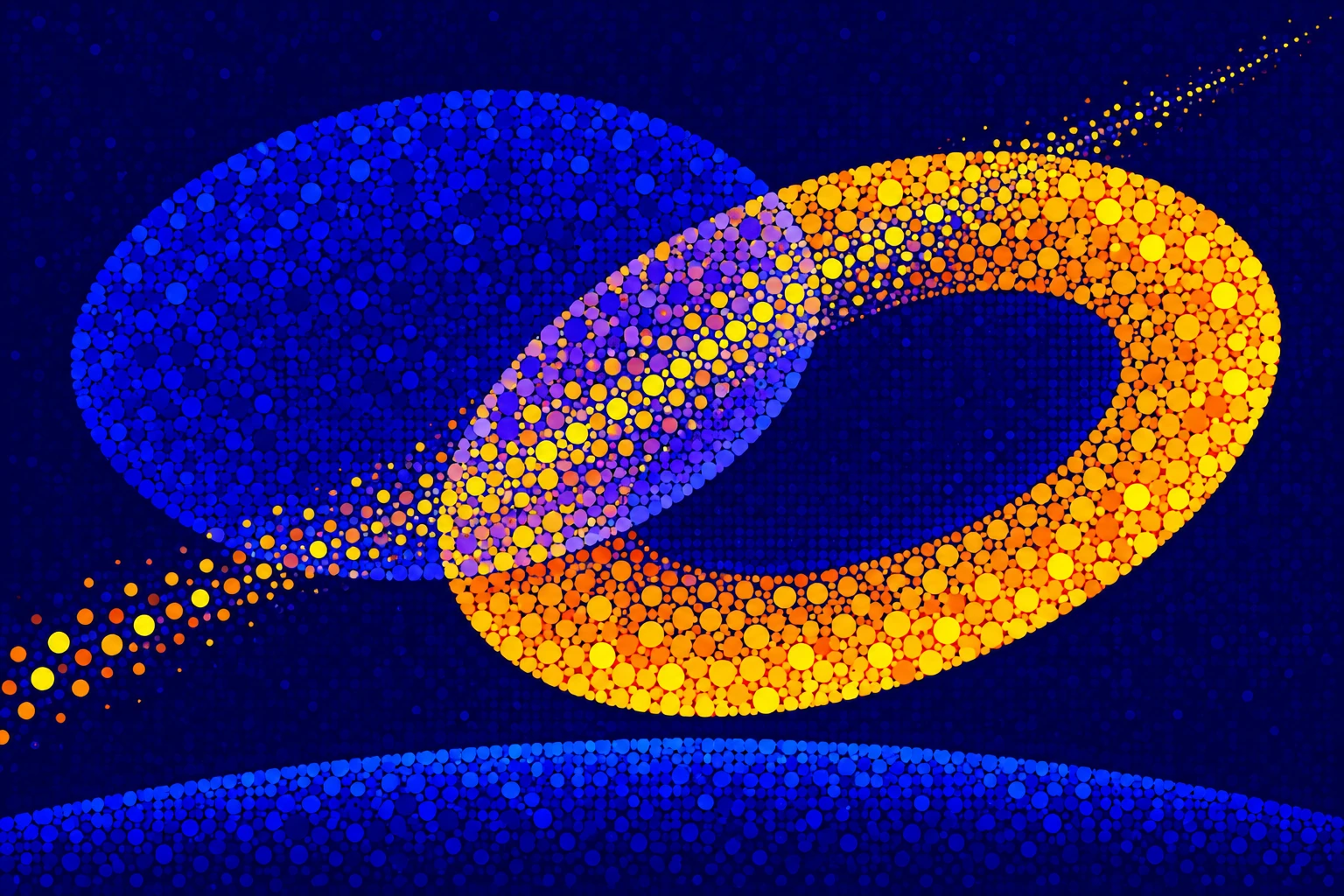
A profile portrait tests whether a small facial contour can remain calm beside a dense halo of color. An animal scene tests silhouette recognition. A stairway and arch test how luminous marks can guide a route through simplified architecture. A still life tests rounded fruit against an almost empty field. An abstract arrangement tests whether dot rhythm alone can hold two intersecting forms together.
The seven AI-generated illustrations include a dedicated landscape banner and a centrally titled collage in addition to those five studies. They are original visual interpretations, not photographs of physical paintings. The collage is an introduction to the vocabulary; each standalone image must also work as a complete composition.
A practical workflow, and the point at which to stop
First draw the large dark and light shapes. Then reserve one principal warm area, add dots that reinforce its direction, and inspect the image at thumbnail size. Return to full size to remove accidental contours, overly regular rows or dense patches that compete with the subject. A crisp edge next to a lively dotted edge can be more expressive than dissolving every boundary.
For prints, textiles or wall art, test the intended viewing distance and reproduction scale. Tiny points may disappear or crowd together; the design should still communicate through its larger shapes. For a screen image, restrain soft glow so that circles remain circles. This is a useful proposed language for atmosphere, decorative storytelling and quiet spectacle. It is less suited to precise diagrams or subjects whose meaning depends on small factual detail.
Limits that make the invention stronger
The blue-and-gold palette can become a shortcut to borrowed grandeur. Repeating the same moon, halo and glittering surface across every subject would narrow the proposal to a preset. Change the balance of space, the size of the motif and the function of the dots while preserving the signature.
Do not confuse visible dot texture with historical authenticity, emotional depth or scientific proof. A convincing work needs a reason for its marks. Ask what becomes clearer, stranger or more moving because the color is separated into points. If the answer is only “more sparkle,” remove a few hundred dots and give the silhouette another chance.
Positive editorial review (AI-authored)
The strongest achievement is the contrast between a restrained silhouette and active color. Warm points can lead the eye through a scene without requiring detailed modeling, while the blue reserve gives each cluster room to register. Across the studies, a face, animal, architecture, fruit and abstract forms test the same visual grammar rather than merely changing a caption.
Negative editorial review (AI-authored)
The palette is immediately attractive, which makes it easy to mistake saturation for composition. Too many equally bright dots flatten the hierarchy and turn the scene into decorative noise. Excessive bloom also weakens the stated circular-mark language. Reduce the warm area, protect a few clear contours and let some parts remain undecorated.
Neutral editorial review (AI-authored)
Ultramarine Confetti Pointillism is an AOI-created visual proposal with historical pointillist references. Its defining choices are a blue-dominant structure, yellow-orange focal clusters, rounded marks and simplified silhouettes. It can serve illustration, print and decorative design; its usefulness depends on subject, viewing distance and control of density. The generated examples demonstrate possibilities rather than establishing a historical movement.
A small poetic detour
Original words from the AOI studio.
Poetry
Blue holds the shape of evening still;
A hundred suns refuse to set.
They gather on a window sill
And warm the dark that keeps them wet.
One quiet curve, one scattered shore,
A gold that never needed weight;
The night leaves room for something more—
Small lights arriving, separate.
The prompt workshop
Original creative exercises. These prompts create new illustrations, not documentary evidence.
A quiet shape, a bright gathering
Ultramarine-gold confetti pointillism, luminous stippling, flat silhouettes. A single fox rests beneath a broad dark-blue tree, amber and yellow circular dots gather along its back and the nearby ground, simplified coherent silhouette, large calm cobalt reserve, selective hard edges, no text.
A portrait that keeps its outline
Ultramarine-gold confetti pointillism, luminous stippling, flat silhouettes. An adult woman in serene side profile, one clear dark-blue facial contour against a crescent-shaped cluster of yellow-orange dots, simplified flat color planes, smaller marks fading into the surrounding ultramarine, elegant negative space, no photographic blur, no text.
Light takes the stairs
Ultramarine-gold confetti pointillism, luminous stippling, flat silhouettes. Invent an impossible but legible courtyard with three broad blue architectural masses, a golden arch and a short staircase. Circular warm dots guide the eye from the steps into the opening; leave the outer walls quiet and flat. Dreamlike scale, coherent geometry, no signage or text.
Your next inspiration
Discover another art style
Follow a visual thread to the next subject.



A smile from the studio
Jokes
The ultramarine shadow asked the gold dots why they had all arrived at once. “We were told this was a highlight.” The shadow pointed to the empty half of the canvas. “And that?” “Negative space.” “Good,” said the shadow. “That is where you can queue. This is a composition, not a glitter emergency.”