
Painting technique and historical tendency
Pointillism builds an image through small, separate, dot-like touches of colour. Its visual effect depends on the relationship between those touches, the larger forms they establish and the distance from which the work is viewed.
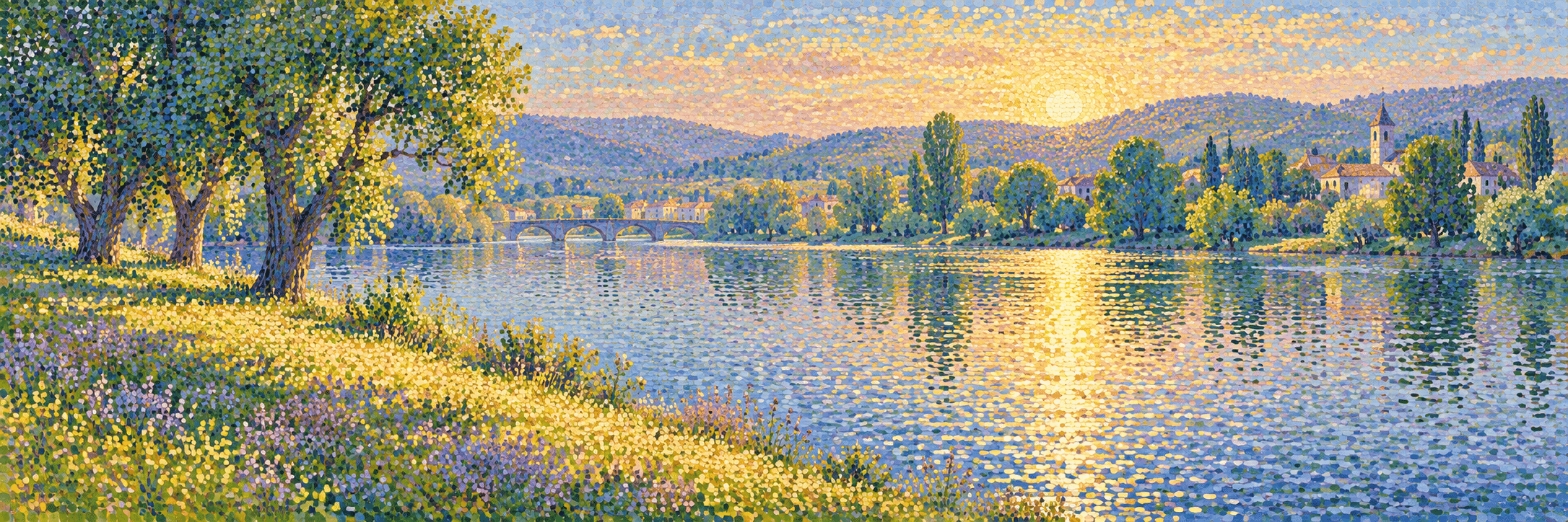
A visual introduction
Select an image for a closer look. Use the thumbnails, arrow keys or a swipe to compare examples. Zoom in to inspect details, or share the image that inspires you.
Creative toolbox · take this style further
Choose an input and a destination. Search sends your words to the chosen site; Copy & open puts them on your clipboard to paste there.
Create with AI
Turn your chosen input into an image prompt or a new creative direction.
ChatGPT
Copy your input and paste it into a ChatGPT conversation or image request.
Copy & open ChatGPT (new tab)Claude · Anthropic
Develop an image prompt or explore the style in a new Claude conversation.
Copy & open Claude · Anthropic (new tab)Midjourney
Paste your input into the Imagine bar on the Create page.
Copy & open Midjourney (new tab)Adobe Firefly
Copy your input, open Firefly, and paste it into the prompt field.
Copy & open Adobe Firefly (new tab)Leonardo.Ai
Copy your input, open Leonardo, and paste it into the generation field.
Copy & open Leonardo.Ai (new tab)Image search
Find visual references. Short, concrete keywords usually work best.
Lexica
Search AI images and prompts using your selected input.
Search with this input Lexica (new tab)Pexels
Search the photo and video library. Short keywords often work best.
Search with this input Pexels (new tab)Pixabay
Search photos, illustrations and other images.
Search with this input Pixabay (new tab)Unsplash
Search photographs using the style name or your own keywords.
Search with this input Unsplash (new tab)Wikimedia Commons
Search photographs, artworks and historical images. Check each file for its source and reuse terms.
Search with this input Wikimedia Commons (new tab)Art & research
Explore artists, collections and the ideas behind a style.
Wikipedia
Search for background reading. A style may not have its own article.
Search with this input Wikipedia (new tab)WikiArt
Copy your input into WikiArt’s search to explore artists and artworks.
Copy & open WikiArt (new tab)Europeana
Paste your keywords into the search to explore European museum, library and archive collections.
Copy & open Europeana (new tab)Inspiration
Discover portfolios and visual ideas from creative communities.
Instagram hashtags
Search a hashtag made from your input: spaces and punctuation are removed. Instagram may require sign-in.
Search with this input Instagram hashtags (new tab)ArtStation
Paste your input into artwork search for concept art, environments, characters and visual development.
Copy & open ArtStation (new tab)Behance
Paste your input into project search for illustration, design and visual storytelling.
Copy & open Behance (new tab)A closer look
Distinct coloured marks remain visible at close range while contributing to broader areas of light, shadow and atmosphere.
Dots are part of a larger idea
The Metropolitan Museum of Art’s record for Seurat’s 1884 study for A Sunday on La Grande Jatte distinguishes its looser small strokes from the tighter dot-like marks in the later monumental painting. The record also explains that Seurat preferred Divisionism, a term concerned with separating colour into adjacent touches.
This distinction prevents a useful technique from becoming a simplistic label. Pointillism refers especially to the character of the mark, while Divisionism describes a broader colour-separation principle. Not every dotted image belongs to the historical Neo-Impressionist project, and not every divided-colour painting uses identical round dots.
Plan the image before the marks
Establish the main shapes and value groups first. A tree, shore or figure must still have a readable relationship to its surroundings. If the underlying arrangement is weak, a large number of carefully placed dots will not give it a convincing structure.
Try a small sketch with only three tonal groups before deciding on colour. Then choose where the strongest contrast should sit. The dot-like touches can enrich that arrangement, but they should not distribute equal emphasis over every part of the surface.
Colour works through neighbours
Place small contrasting colours beside one another and inspect the result from several distances. The perceived effect depends on their size, spacing, value and surrounding field. A patch can feel lively without becoming literally brighter than the pigments or display allow. Avoid treating optical mixture as a magical guarantee of luminosity.
A shadow need not be a uniform dark version of the local colour. Cooler and warmer touches can create a more complex field while retaining the correct overall value. Keep enough consistency for the larger form to remain legible. Random multicoloured dots are not the same as an organized colour relationship.
Scale changes the reading
Marks that work on a small study may become too fine or too coarse when the image is enlarged. Consider the intended viewing distance. At close range the viewer encounters individual touches; farther away, the larger composition should remain strong. A digital thumbnail and a large print may reveal different balances.
Varying density can soften an edge or deepen a passage, but avoid using density as the only control. Hue, value and the size of the marks also matter. A few quiet areas can make the most active colour interactions easier to perceive.
Read the gallery as a set of experiments
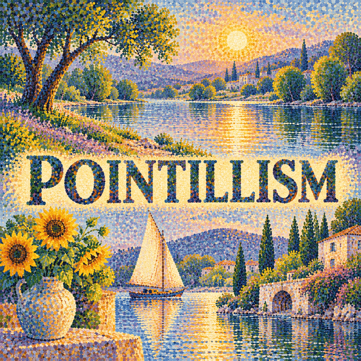
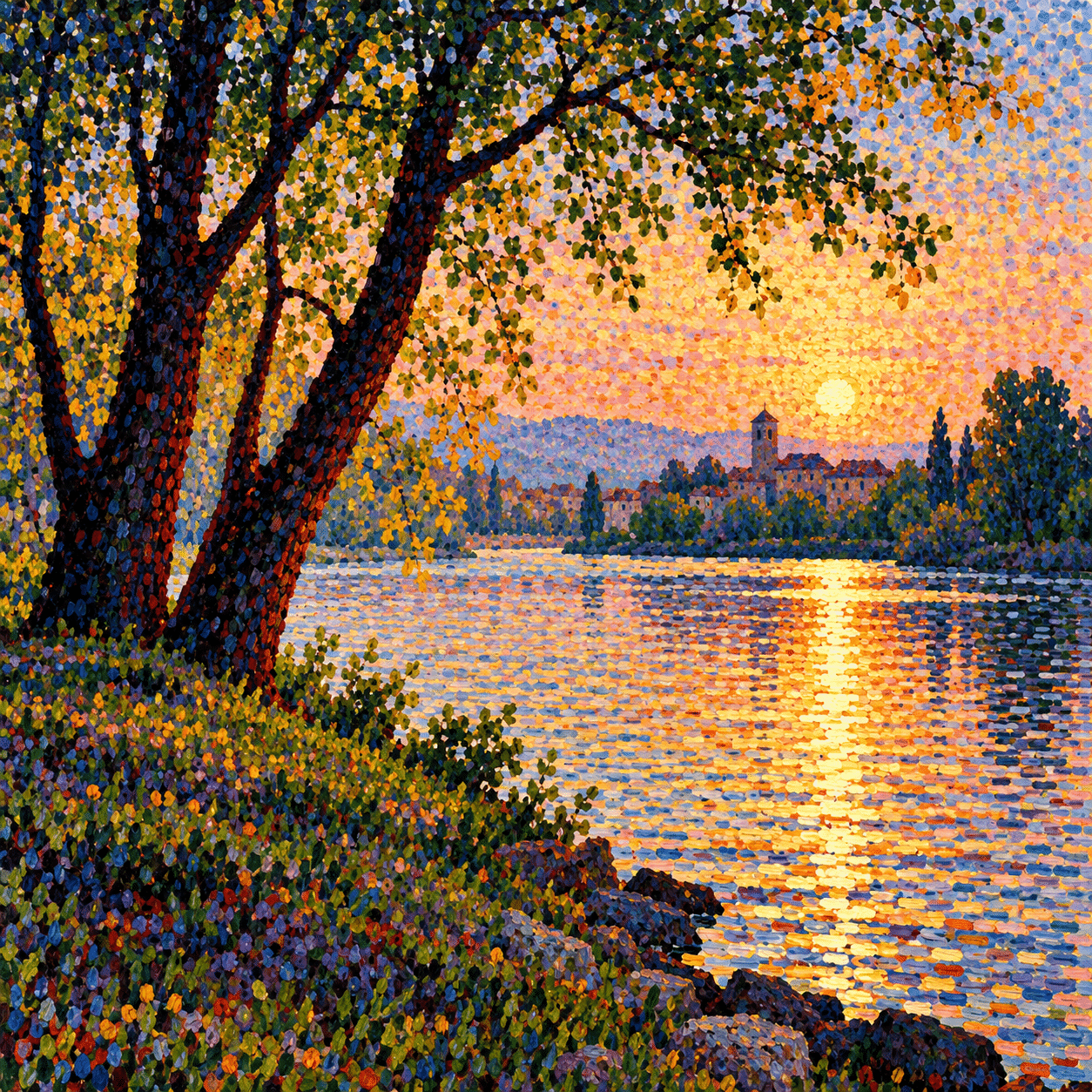
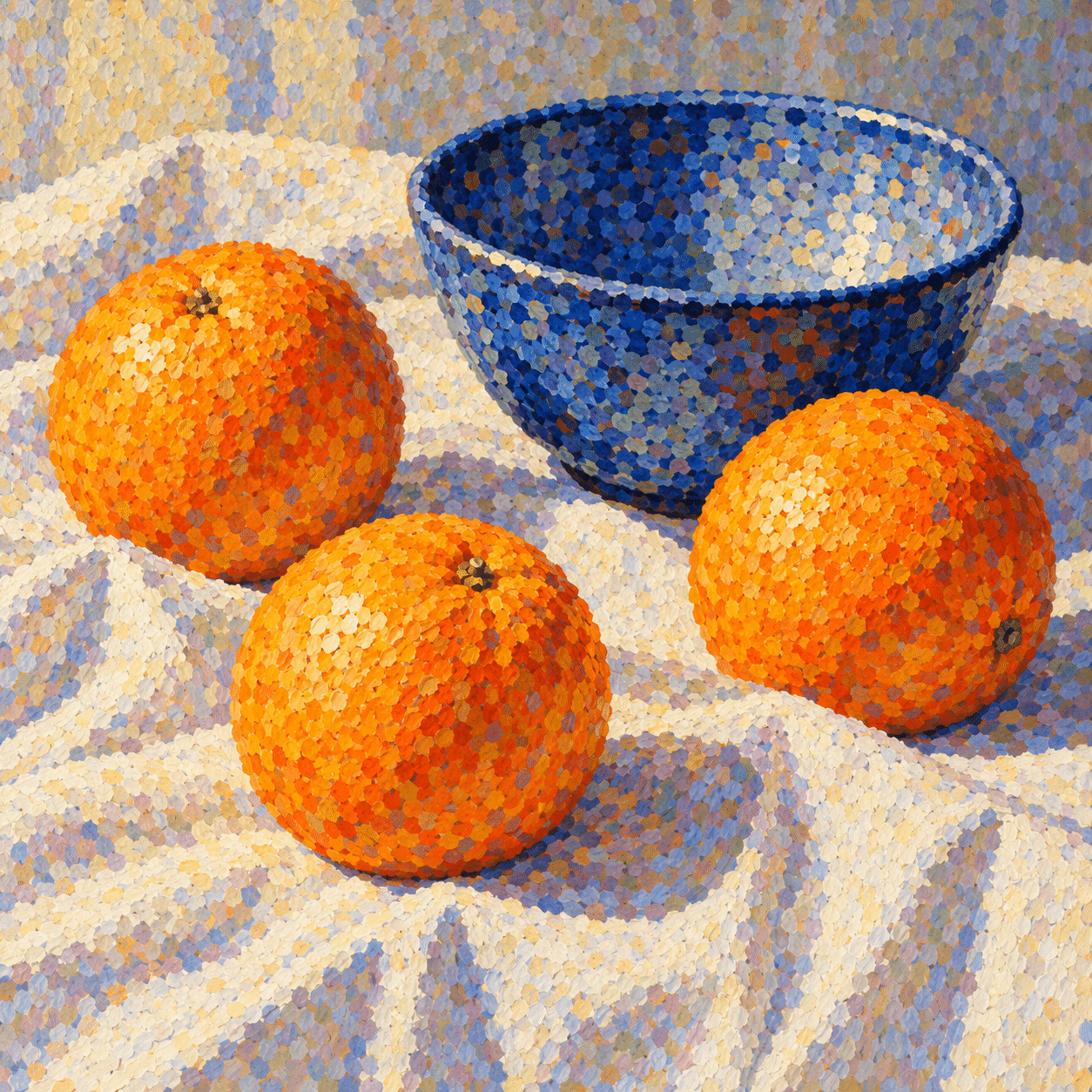
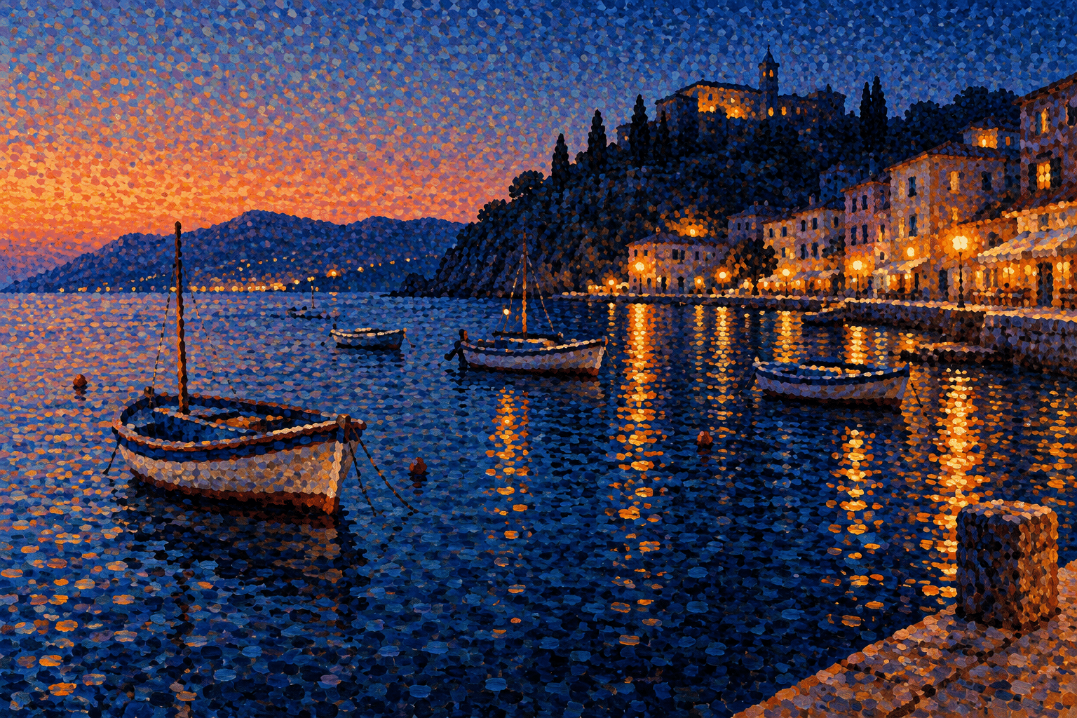
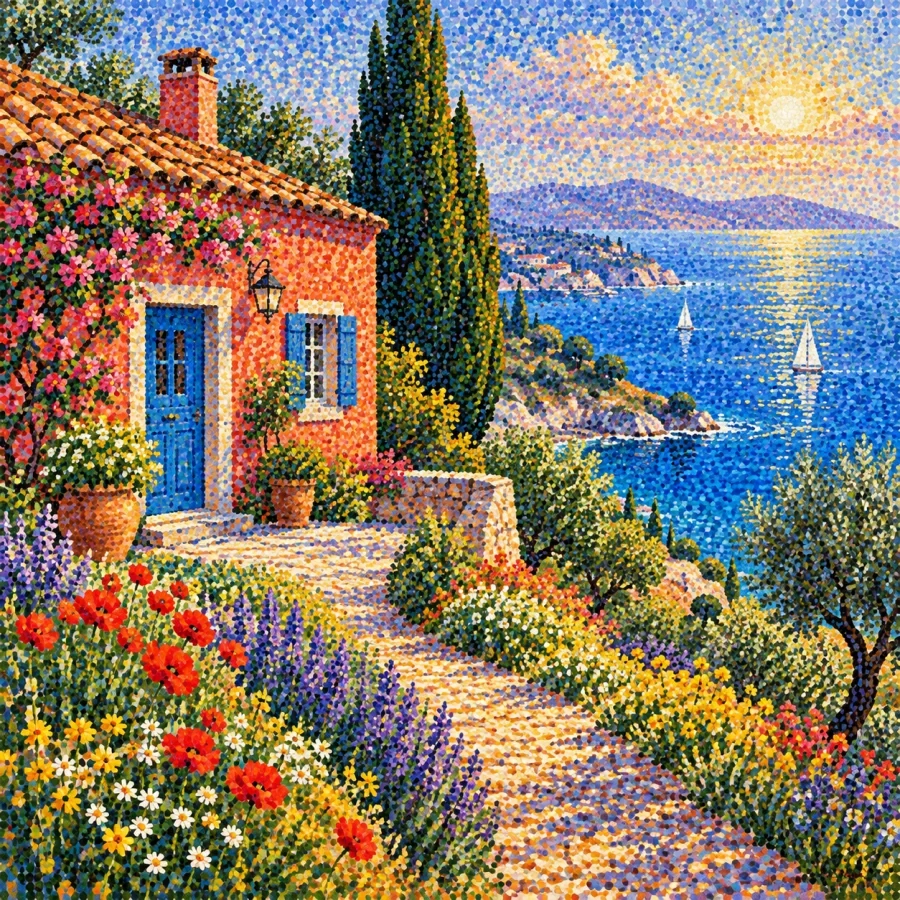
The riverbank, fruit still life and evening harbour studies explore different scales and lighting conditions. They are AI-generated interpretations of pointillist appearances, not Seurat paintings or demonstrations of a physical pigment experiment. Their coloured marks are part of a generated image.
For practice, make two small versions of the same subject with a limited palette. Change the size and spacing of the touches while keeping the large shapes similar. Compare them near and far. The most useful result is not necessarily the one with the most dots, but the one whose small marks sustain the larger image.
A small poetic detour
Original words from the AOI studio.
Poetry
At a Distance
A dot of blue, a touch of gold,
no single mark can make the day.
I step away: the river forms,
the scattered colours find their way.
Come close again—the water breaks
into the little lights it takes.
The prompt workshop
Original creative exercises. These prompts create new illustrations, not documentary evidence.
A riverbank in touches
Create an original Pointillism-inspired riverbank with trees and reflected light, separate small colour touches, clear large value groups and a calm composition. No copied historical painting.
Fruit and colour neighbours
Create a pointillist-inspired still life of oranges and a blue bowl. Use distinct adjacent warm and cool marks to describe form while preserving coherent shadows.
Evening harbour
Create an experimental Pointillism-inspired harbour at dusk, small boats, dark blue water and warm lights built from separate colour touches. Keep the larger silhouettes readable.
A smile from the studio
Jokes
The painting asked for one more dot. The artist requested a more precise estimate.
Sources and further exploration
Metropolitan Museum of Art — Seurat’s study, dot-like marks and Divisionism