
Established
Stylized Weathering turns signs of exposure and use into deliberate visual storytelling. Chips, fading, stains, abrasion and repairs are selected and exaggerated to explain an object's material, history and role in a scene. The aim is readable character, with enough untouched surface for the design to breathe.
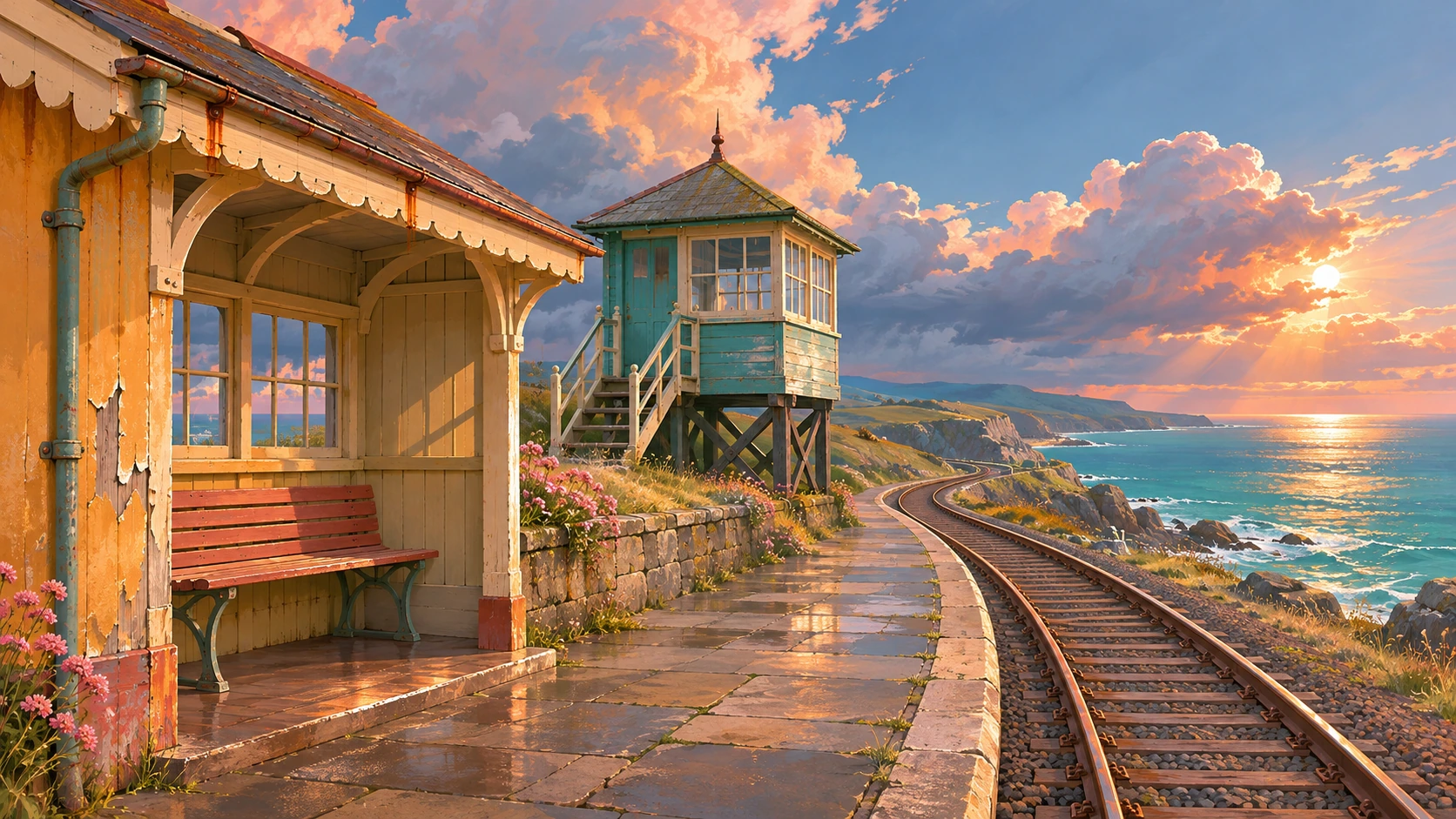
A visual introduction
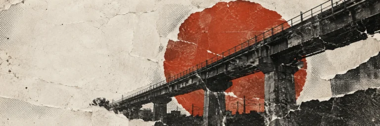
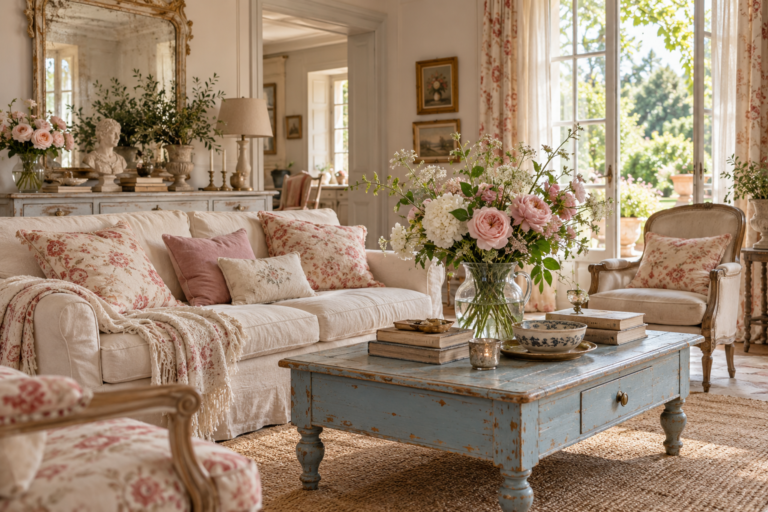
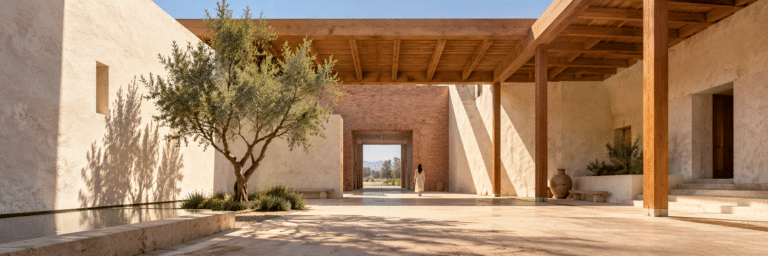
Seven original AI-generated artworks: a dedicated banner, a centrally titled collage and five distinct studies of architecture, robotics, desert transport, clothing and domestic objects. Each uses selective wear to suggest a different history.
Select an image for a closer look. Use the thumbnails, arrow keys or a swipe to compare examples. Zoom in to inspect details, or share the image that inspires you.



Creative toolbox · take this style further
Choose an input and a destination. Search sends your words to the chosen site; Copy & open puts them on your clipboard to paste there.
Create with AI
Turn your chosen input into an image prompt or a new creative direction.
ChatGPT
Copy your input and paste it into a ChatGPT conversation or image request.
Copy & open ChatGPT (new tab)Claude · Anthropic
Develop an image prompt or explore the style in a new Claude conversation.
Copy & open Claude · Anthropic (new tab)Midjourney
Paste your input into the Imagine bar on the Create page.
Copy & open Midjourney (new tab)Adobe Firefly
Copy your input, open Firefly, and paste it into the prompt field.
Copy & open Adobe Firefly (new tab)Leonardo.Ai
Copy your input, open Leonardo, and paste it into the generation field.
Copy & open Leonardo.Ai (new tab)Image search
Find visual references. Short, concrete keywords usually work best.
Lexica
Search AI images and prompts using your selected input.
Search with this input Lexica (new tab)Pexels
Search the photo and video library. Short keywords often work best.
Search with this input Pexels (new tab)Pixabay
Search photos, illustrations and other images.
Search with this input Pixabay (new tab)Unsplash
Search photographs using the style name or your own keywords.
Search with this input Unsplash (new tab)Wikimedia Commons
Search photographs, artworks and historical images. Check each file for its source and reuse terms.
Search with this input Wikimedia Commons (new tab)Art & research
Explore artists, collections and the ideas behind a style.
Wikipedia
Search for background reading. A style may not have its own article.
Search with this input Wikipedia (new tab)WikiArt
Copy your input into WikiArt’s search to explore artists and artworks.
Copy & open WikiArt (new tab)Europeana
Paste your keywords into the search to explore European museum, library and archive collections.
Copy & open Europeana (new tab)Inspiration
Discover portfolios and visual ideas from creative communities.
Instagram hashtags
Search a hashtag made from your input: spaces and punctuation are removed. Instagram may require sign-in.
Search with this input Instagram hashtags (new tab)ArtStation
Paste your input into artwork search for concept art, environments, characters and visual development.
Copy & open ArtStation (new tab)Behance
Paste your input into project search for illustration, design and visual storytelling.
Copy & open Behance (new tab)A closer look
Look for wear that follows a cause: handled edges, exposed surfaces, joints, runoff paths or repeated contact. Shapes are simplified, colors coordinated and detail grouped into a few expressive zones. Different materials keep different kinds of aging.
Age is a design decision
Stylized Weathering is a descriptive approach used in illustration and material design, rather than a single named historical movement. In this entry, the term includes both environmental weathering and the wear of use, although abrasion, dirt deposition and chemical change are different processes. A scratch records contact; a faded patch suggests exposure; a repair implies someone cared enough to intervene.
The stylization lies in selection. An artist can enlarge a few chips, organize stains into broad rhythms or simplify a complicated surface into three tones. A convincing image does not need every possible defect. It needs a clear relationship between the object, its surroundings and what appears to have happened to it.
Begin with a cause, then draw the mark
Give the subject a short material biography: what is it made of, where has it been, and which parts are touched or exposed? On a painted machine, contact might reveal the layer beneath at a handle or corner. On a plaster wall, a narrow stain can begin below a metal fixing and descend with runoff. On a coat, the cuff and shoulder can carry different histories.
Observation prevents the same decorative noise from spreading everywhere. National Park Service guidance on stone surfaces distinguishes soiling, staining, biological growth, salt damage and freeze–thaw effects. These are not interchangeable kinds of 'oldness.' For an illustration, choose a small number of relevant clues and translate them into readable marks. That is visual interpretation, not a diagnosis of an actual building or object.
Build a hierarchy of clean and worn areas
Keep the main silhouette readable before adding texture. Establish broad color masses, place one or two important wear zones, then add a smaller supporting rhythm. A useful exercise is to make three passes: a large fading or staining region, medium chips or cracks, and a few fine scratches. The last pass should never erase the first two.
Reserve calm surfaces. A nearly intact panel makes a damaged corner meaningful; a quiet sleeve lets a patched elbow speak. Match mark size to the final viewing distance. On a small game prop, three designed chips can communicate more than hundreds of faint scratches. In a wall print, larger worn shapes can carry the composition while close detail rewards a second look.
Keep material, color and light distinct
Paint loss, metal discoloration, broken glaze and frayed cloth should not look like copies of one texture. Suggest layers where an actual coating is involved; suggest fibers where fabric wears; let a stone edge lose definition without turning every crack into a black outline. The marks should belong to the underlying form and bend with it.
Weathering does not require a brown palette. A sun-faded violet facade, a chipped yellow enamel vessel or pale scuffs across indigo cloth can be vivid. Separate surface color from illumination: a painted light patch is not automatically a highlight, and a dark stain is not automatically a shadow. Controlled roughness and selective sheen can support that distinction in a rendered image.
A practical digital workflow
Adobe's documented Substance Painter example uses baked curvature and occlusion information to help place exposed wear and dirt in crevices. It also separates material properties such as color, roughness and metallic response. This supplies a useful technical starting point; an automatic mask still needs artistic judgment about the object's actual use.
Whether painting in two dimensions or texturing a model, begin with a clean version. Add exposure, contact wear and deposited material as separate decisions. Interrupt mechanically uniform patterns, preserve some protected areas and inspect the result at its intended display size. These are workflow principles rather than promises about a particular software version or a generated image's underlying texture maps.
Five themes, five different histories
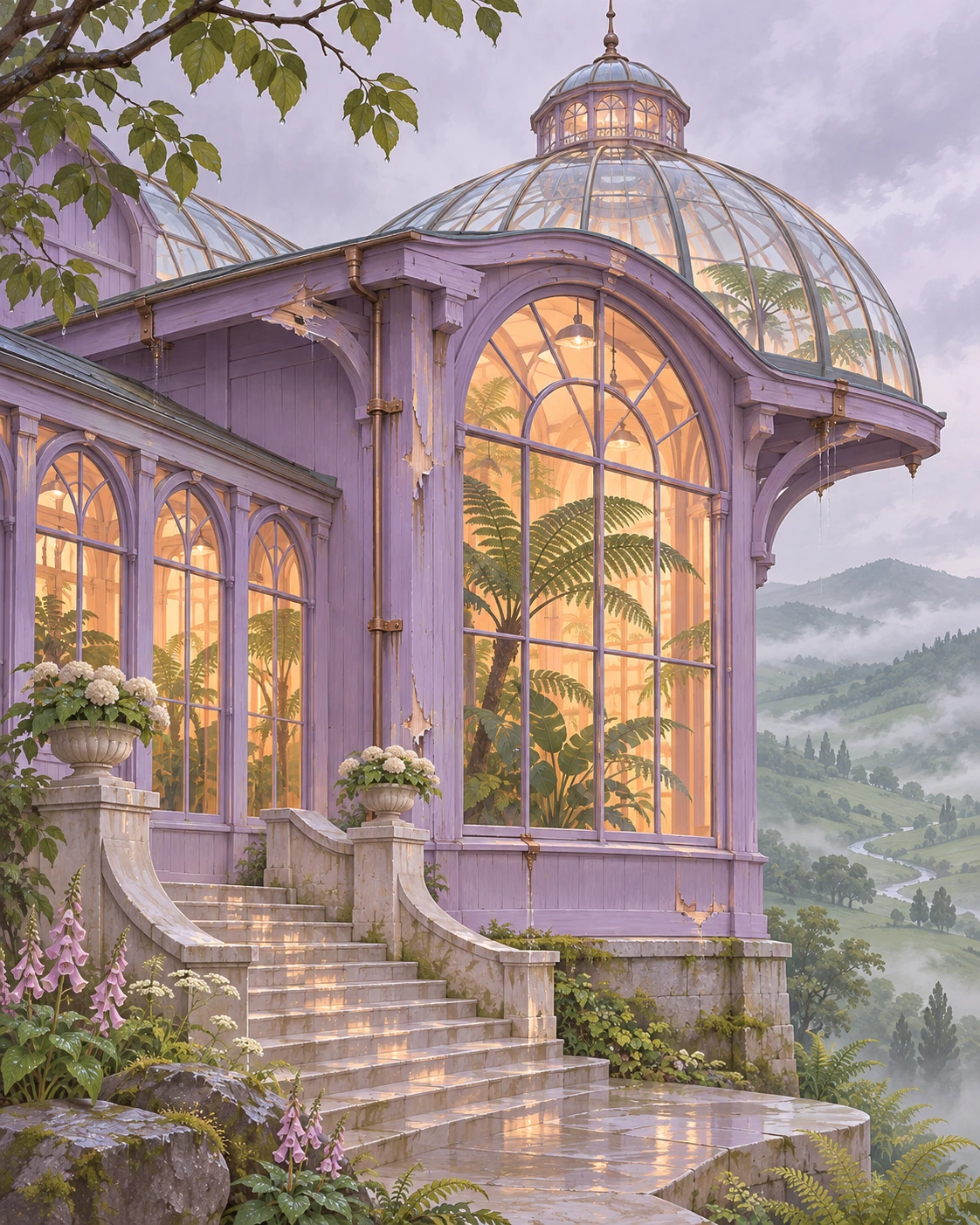
Architecture benefits from coherent runoff and exposure: a greenhouse can keep clear glass while its painted frame and sheltered base carry contrasting conditions. A robot can reveal maintenance through replaced parts and worn joints. A desert vehicle can show dust and directional abrasion while retaining readable tires, controls and body panels.
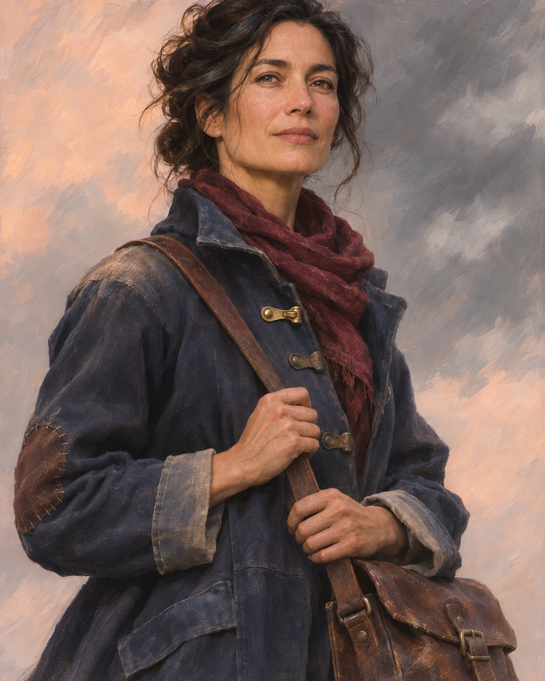
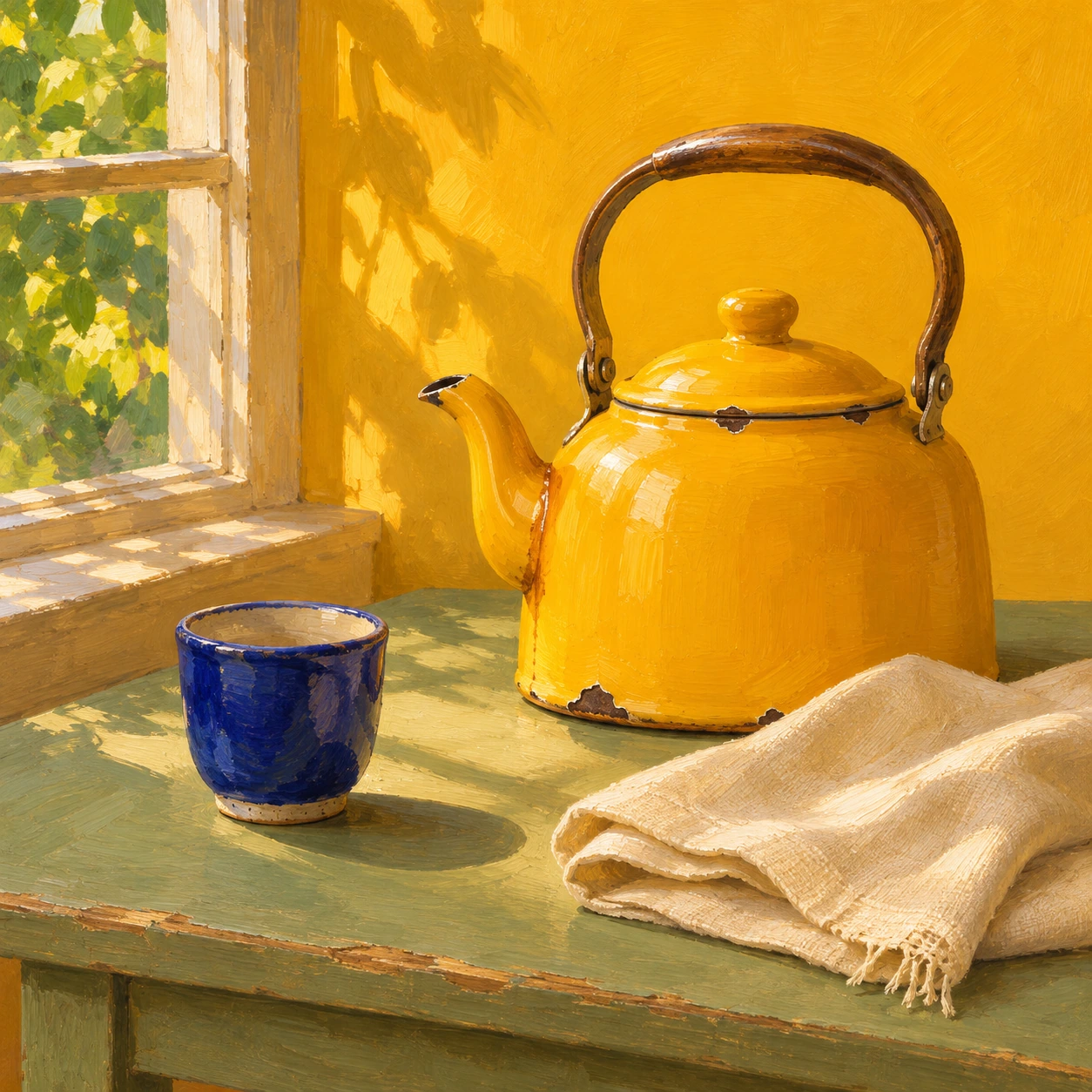
Clothing needs a gentler vocabulary of fading, softened edges and visible mending; the person is not a corroded object. A domestic still life can use small chips and polished contact points to suggest long service without becoming a ruin. The gallery's separate studies explore these themes as original AI-generated interpretations, not documentary photographs or fabricated physical objects.
Where restraint matters
Distressing often emphasizes a worn decorative finish; grunge may treat roughness as an overall graphic field. Stylized Weathering becomes more specific when placement suggests a cause and a sequence of events. It can overlap both approaches without requiring every image to look dirty, abandoned or post-apocalyptic.
A visual finish cannot establish structural safety, historical authenticity or a suitable conservation treatment. Nor should a scarred wall automatically stand in for the lives of people who inhabit it. For imaginative work, the useful question is precise and modest: which signs of time make this particular subject more legible, expressive or memorable?
Positive editorial perspective
AI-authored positive assessment: Stylized Weathering can make an object feel specific before its story is told. The strongest passages connect shape and history: a polished handle sits beside undisturbed paint, a pale rain trail begins beneath a fixing, or a repaired cuff interrupts a faded sleeve. Selective exaggeration lets these clues survive at illustration scale. Across architecture, machines and clothing, the result can feel inhabited without becoming visually heavy.
Critical editorial perspective
AI-authored critical assessment: The approach easily becomes a recipe of orange rust, bright chipped edges and dirt in every recess. Repeating that recipe on unrelated materials destroys their differences. Excessive wear also competes with the subject, while immaculate repairs on otherwise ruined objects can look accidental unless the contrast is deliberate. Reduce the number of effects, vary their scale and remove marks that cannot answer the question: what caused this here?
Neutral editorial perspective
AI-authored neutral assessment: Stylized Weathering is a transferable surface treatment rather than a fixed palette, medium or historical movement. It suits narrative illustration, game environments, prop design and imagined interiors when condition helps communicate use. It is less suitable when pristine manufacture, accurate conservation records or an unambiguous new-product finish is the central requirement. The gallery demonstrates visual choices, not tested aging processes or material condition assessments.
A small poetic detour
Original words from the AOI studio.
Poetry
The rain has learned the window's edge,
the hand has polished one small place.
A chip of blue, a silver ledge,
a seam repaired with patient grace.
The wall keeps sunlight in its grain;
the coat remembers wind and road.
Not every mark must speak of pain:
some tell how carefully we strode.
The prompt workshop
Original creative exercises. These prompts create new illustrations, not documentary evidence.
One object, three clues
Illustrate a yellow enamel kettle using Stylized Weathering: one small chipped rim exposing dark metal, a softly polished handle and a narrow stain beneath the spout. Preserve broad intact yellow areas. Simplified painterly shapes, coherent side light, no lettering or blanket grunge.
An environment with a past
Create a stylized botanical observatory after rain. Faded violet painted frames, restrained peeling at exposed edges, runoff below a few fixings, moss restricted to shaded damp stone near the base, clear glass and warm interior light. Organize wear into a few zones; preserve the architecture's silhouette.
Care becomes the contrast
Paint an adult traveler's portrait in a faded indigo canvas coat with repaired elbow patches, softened cuffs and one newly replaced brass fastener. Skin remains natural and intact. Use selective cloth wear to tell a story of maintenance, quiet background, expressive color blocks and readable anatomy.
Your next inspiration
Discover another art style
Follow a visual thread to the next subject.
A smile from the studio
Jokes
The prop artist gave a brand-new kettle thirty years of history in an afternoon. The kettle was impressed, but asked whether the pension came with it. 'No,' said the artist. 'Just three chips, a tasteful stain and a backstory you must never explain in dialogue.'