Graphic aesthetic
Grunge gives an image the friction of something printed, handled, pasted up and worn away. Torn edges, broken ink and unstable alignment become expressive tools when a clear composition holds them together.
A visual introduction
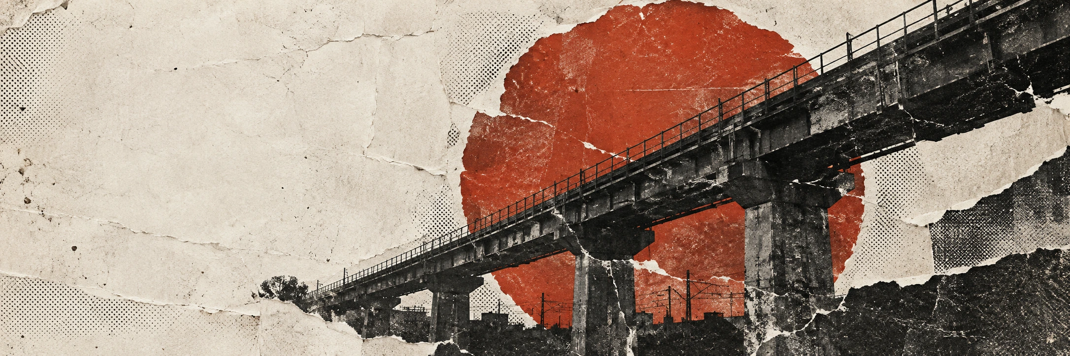
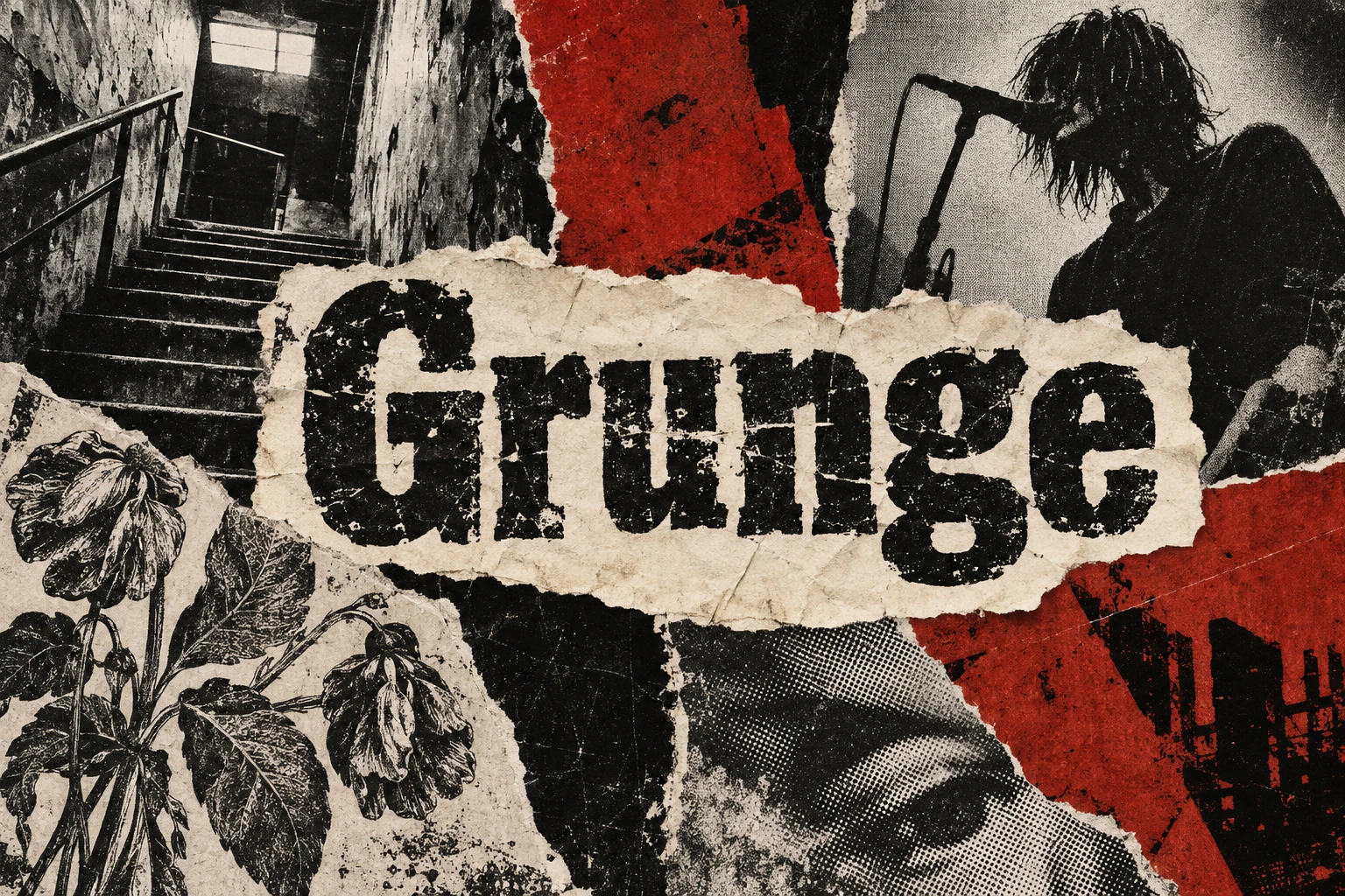
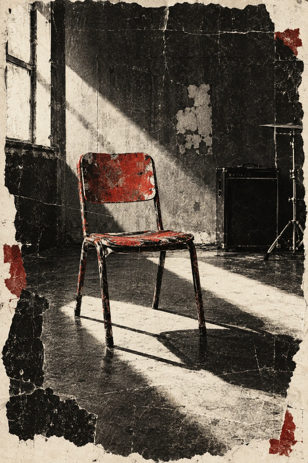
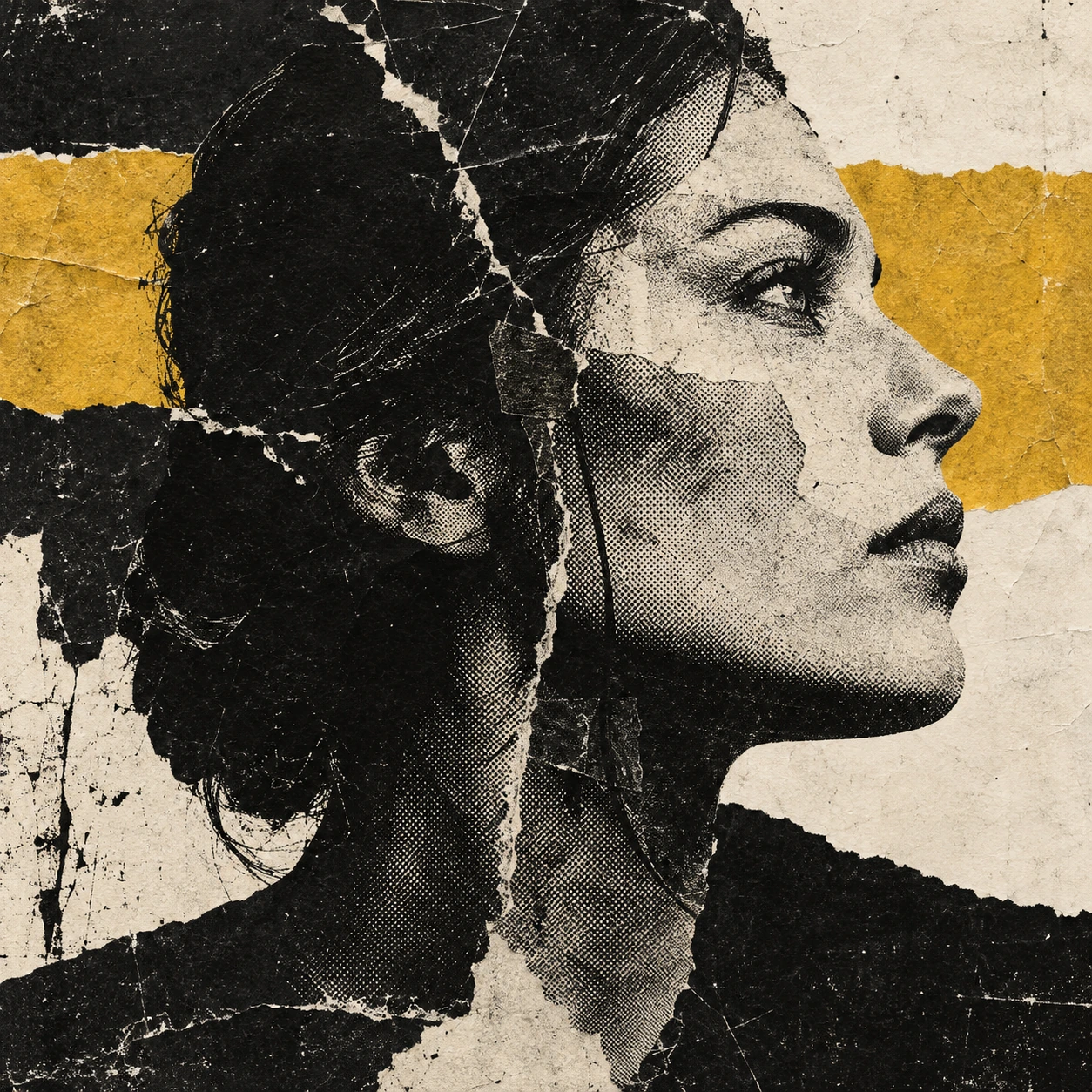
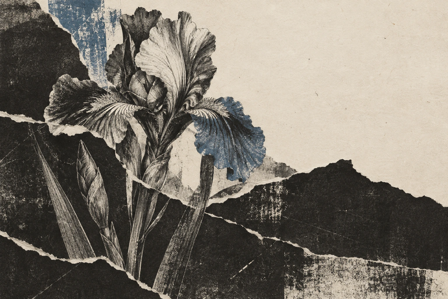
Five original AI-generated AOI interpretations: a dedicated banner, a centrally titled collage and three standalone studies. These images are not historical works or technical fabrication documents.
Select an image for a closer look. Use the thumbnails, arrow keys or a swipe to compare examples. Zoom in to inspect details, or share the image that inspires you.
Creative toolbox · take this style further
Choose an input and a destination. Search sends your words to the chosen site; Copy & open puts them on your clipboard to paste there.
Create with AI
Turn your chosen input into an image prompt or a new creative direction.
ChatGPT
Copy your input and paste it into a ChatGPT conversation or image request.
Copy & open ChatGPT (new tab)Claude · Anthropic
Develop an image prompt or explore the style in a new Claude conversation.
Copy & open Claude · Anthropic (new tab)Midjourney
Paste your input into the Imagine bar on the Create page.
Copy & open Midjourney (new tab)Adobe Firefly
Copy your input, open Firefly, and paste it into the prompt field.
Copy & open Adobe Firefly (new tab)Leonardo.Ai
Copy your input, open Leonardo, and paste it into the generation field.
Copy & open Leonardo.Ai (new tab)Image search
Find visual references. Short, concrete keywords usually work best.
Lexica
Search AI images and prompts using your selected input.
Search with this input Lexica (new tab)Pexels
Search the photo and video library. Short keywords often work best.
Search with this input Pexels (new tab)Pixabay
Search photos, illustrations and other images.
Search with this input Pixabay (new tab)Unsplash
Search photographs using the style name or your own keywords.
Search with this input Unsplash (new tab)Wikimedia Commons
Search photographs, artworks and historical images. Check each file for its source and reuse terms.
Search with this input Wikimedia Commons (new tab)Art & research
Explore artists, collections and the ideas behind a style.
Wikipedia
Search for background reading. A style may not have its own article.
Search with this input Wikipedia (new tab)WikiArt
Copy your input into WikiArt’s search to explore artists and artworks.
Copy & open WikiArt (new tab)Europeana
Paste your keywords into the search to explore European museum, library and archive collections.
Copy & open Europeana (new tab)Inspiration
Discover portfolios and visual ideas from creative communities.
Instagram hashtags
Search a hashtag made from your input: spaces and punctuation are removed. Instagram may require sign-in.
Search with this input Instagram hashtags (new tab)ArtStation
Paste your input into artwork search for concept art, environments, characters and visual development.
Copy & open ArtStation (new tab)Behance
Paste your input into project search for illustration, design and visual storytelling.
Copy & open Behance (new tab)A closer look
Abraded black ink, torn paper boundaries, coarse halftones, compressed tonal values, disrupted alignment and a limited accent colour; a readable focal shape survives the damage.
A visual attitude, not one fixed medium
Grunge is used here as a broad graphic aesthetic: deliberate roughness applied to photography, typography, illustration and collage. It is not a single painting technique or a neatly bounded historical school. Its familiar vocabulary includes distressed print, photocopy grain, ragged paper, aggressive cropping and uneasy relationships between image and type. Those effects can suggest urgency, repetition, age or resistance to polish. They work best when they have a reason to be there. A scratch is a mark; a scratch that interrupts a carefully placed face becomes a decision.
The term also belongs to music and fashion, but an image does not become a historical document of either simply because it looks battered. AOI uses the label to describe visible design choices. Grunge Poster Art is a narrower application in which this language serves a public message. A portrait, a botanical collage or a wordless cover can use the same rough grammar without becoming a poster.
Context: collage, print and editorial disruption
David Carson is a useful documented reference for experimental editorial design and grunge typography. AIGA’s Eye on Design describes his collage work through splicing, layering and deliberate messiness. That is a specific association, not a claim that one designer invented every distressed surface. The relevant lesson is how fragments can produce an expressive reading experience: a cut, overlap or disruption can change the emphasis of a page as much as a conventional heading.
Museum poster collections offer a broader comparison: examine how different designers balance a dominant image with words, flat colour and the practical need to be noticed. Do not collapse every example of punk, collage, distressed printing or experimental typography into grunge. These are overlapping references with different contexts. For a new artwork, borrow a compositional problem—how to make a fragile image feel forceful—rather than copying an identifiable historical layout.
The visual grammar: damage with hierarchy
Begin with three scales of information. The largest shape establishes the subject: a chair, a head, a flower or a strong diagonal. Mid-sized paper fragments and tonal blocks direct the eye. Fine grain, scratches and broken halftones supply the last layer. If all three compete at the same intensity, the image loses its route through the noise. Test it as a thumbnail; the focal shape should still be recognisable before the surface details can be read.
Let distress respond to construction. Paper tears should expose an underlying layer. Ink dropout belongs inside a printed mark. A photocopied shadow can become a coarse field of dots, while a pale margin remains relatively quiet. Uniform noise over the entire image tends to flatten these material differences. Preserve at least one calm area so the rough passages have something to push against. An asymmetrical composition benefits from a deliberate counterweight, such as a small saturated patch opposite a large dark mass.
Palette, type and making process
A restricted palette makes texture easier to read. Start with near-black and warm paper, then introduce one accent such as oxide red, mustard or a desaturated blue. These are useful working choices, not compulsory historical colours. Contrast in value matters more than the number of hues. A pale torn edge against a black field can do more compositional work than a dozen decorative splashes.
For a physical study, make your own photographs, drawings and paper textures, then photocopy, cut and arrange them. For a digital study, separate the source image, paper boundaries, ink breakup and accent layer. Work non-destructively so the amount of damage remains adjustable. If the image carries essential text, keep its principal message readable; distress secondary lettering more freely. In generated images, inspect exact spelling and letter shapes separately from the overall mood. Texture cannot excuse a wrong title.
Where it works—and where it becomes a costume
This language suits expressive covers, independent editorial illustration, music-related graphics and images about use, memory or urban surfaces. It can also make a delicate subject unexpectedly forceful: a flower interrupted by coarse black paper has a different emotional register from a softly lit botanical photograph. Decide what the rough treatment adds to the subject before choosing an effect.
The common failure is generic dirt. Repeated scratches, uniformly brown paper and randomly tilted fragments can become a preset rather than a composition. Another failure is illegibility masquerading as intensity. Reduce texture around essential information, vary the size of fragments and make every strong diagonal lead somewhere. These practical rules are AOI’s editorial interpretation, not a historical manifesto. The accompanying illustrations are newly generated studies, not archival prints or works by the designers discussed above.
Pocket-sized facts
Grunge is treated here as a graphic aesthetic spanning several media, rather than a single formal art movement.
AIGA documents David Carson’s relationship to grunge typography and layered collage.
A physical-looking texture in an AI image does not establish a physical printing process or historical provenance.
Examples worth exploring
Study the collage examples in AIGA’s David Carson feature for the relationship between fragments and visual emphasis.
A small poetic detour
Original words from the AOI studio.
Poetry
Ode to the Second Copy
The first sheet kept its manners,
the second lost a line.
By the fifth, the dark had gathered
where the clean machine declined.
A paper edge became a street,
a crease became the rain;
the chair stayed red beneath it all,
a small refusal to explain.
Leave one pale corner breathing.
Let one torn border show.
A page can carry all this weather
and still know where to go.
The prompt workshop
Original creative exercises. These prompts create new illustrations, not documentary evidence.
Start simple: one object, three tones
Create a wordless grunge illustration of one battered red chair in an empty rehearsal room. Use black photocopy shadows, warm ivory paper and one oxide-red accent. Keep the chair silhouette clear, place torn edges at layer boundaries, and leave a quiet margin. No uniform noise overlay, no logos.
Compare the image at full size and as a thumbnail. Reduce surface noise until the chair reads immediately.
Build a richer portrait collage
Compose a close profile portrait of an anonymous adult from torn monochrome photographic layers. Use coarse halftones only in the shadows, a mustard paper strip behind the head, irregular pasted edges and a clearly readable eye and nose. Balance the dark portrait with pale negative space. No words or brands.
Use material differences to separate layers; avoid repeating the same scratch pattern everywhere.
Experiment: a fragile subject under pressure
Make a grunge botanical artwork of a wild iris rising through torn charcoal paper planes. Combine fine ink drawing, exposed cream fibres, coarse photocopy grain and one misregistered muted-blue layer. Keep the flower identifiable and one corner almost empty. No lettering.
The experiment is the contrast between delicate structure and abrasive surface, not maximum damage.
People & works to explore
References discussed in this article. Consult the sources below for context.
Artists and practitioners
David Carson — documented reference for experimental typography and collage, not the author of the AOI images.
A smile from the studio
Jokes
The printer called it a toner problem. The art director called it atmosphere. Both sent an invoice.