
Animation reference
The Simpsons is an animated television series whose visual identity combines distinctive character silhouettes, broad colour areas and familiar suburban settings. Its usefulness as a drawing reference lies in the relationship between expressive simplification and comic observation—not merely in colouring a face yellow.
A visual introduction
Select an image for a closer look. Use the thumbnails, arrow keys or a swipe to compare examples. Zoom in to inspect details, or share the image that inspires you.

Creative toolbox · take this style further
Choose an input and a destination. Search sends your words to the chosen site; Copy & open puts them on your clipboard to paste there.
Create with AI
Turn your chosen input into an image prompt or a new creative direction.
ChatGPT
Copy your input and paste it into a ChatGPT conversation or image request.
Copy & open ChatGPT (new tab)Claude · Anthropic
Develop an image prompt or explore the style in a new Claude conversation.
Copy & open Claude · Anthropic (new tab)Midjourney
Paste your input into the Imagine bar on the Create page.
Copy & open Midjourney (new tab)Adobe Firefly
Copy your input, open Firefly, and paste it into the prompt field.
Copy & open Adobe Firefly (new tab)Leonardo.Ai
Copy your input, open Leonardo, and paste it into the generation field.
Copy & open Leonardo.Ai (new tab)Image search
Find visual references. Short, concrete keywords usually work best.
Lexica
Search AI images and prompts using your selected input.
Search with this input Lexica (new tab)Pexels
Search the photo and video library. Short keywords often work best.
Search with this input Pexels (new tab)Pixabay
Search photos, illustrations and other images.
Search with this input Pixabay (new tab)Unsplash
Search photographs using the style name or your own keywords.
Search with this input Unsplash (new tab)Wikimedia Commons
Search photographs, artworks and historical images. Check each file for its source and reuse terms.
Search with this input Wikimedia Commons (new tab)Art & research
Explore artists, collections and the ideas behind a style.
Wikipedia
Search for background reading. A style may not have its own article.
Search with this input Wikipedia (new tab)WikiArt
Copy your input into WikiArt’s search to explore artists and artworks.
Copy & open WikiArt (new tab)Europeana
Paste your keywords into the search to explore European museum, library and archive collections.
Copy & open Europeana (new tab)Inspiration
Discover portfolios and visual ideas from creative communities.
Instagram hashtags
Search a hashtag made from your input: spaces and punctuation are removed. Instagram may require sign-in.
Search with this input Instagram hashtags (new tab)ArtStation
Paste your input into artwork search for concept art, environments, characters and visual development.
Copy & open ArtStation (new tab)Behance
Paste your input into project search for illustration, design and visual storytelling.
Copy & open Behance (new tab)A closer look
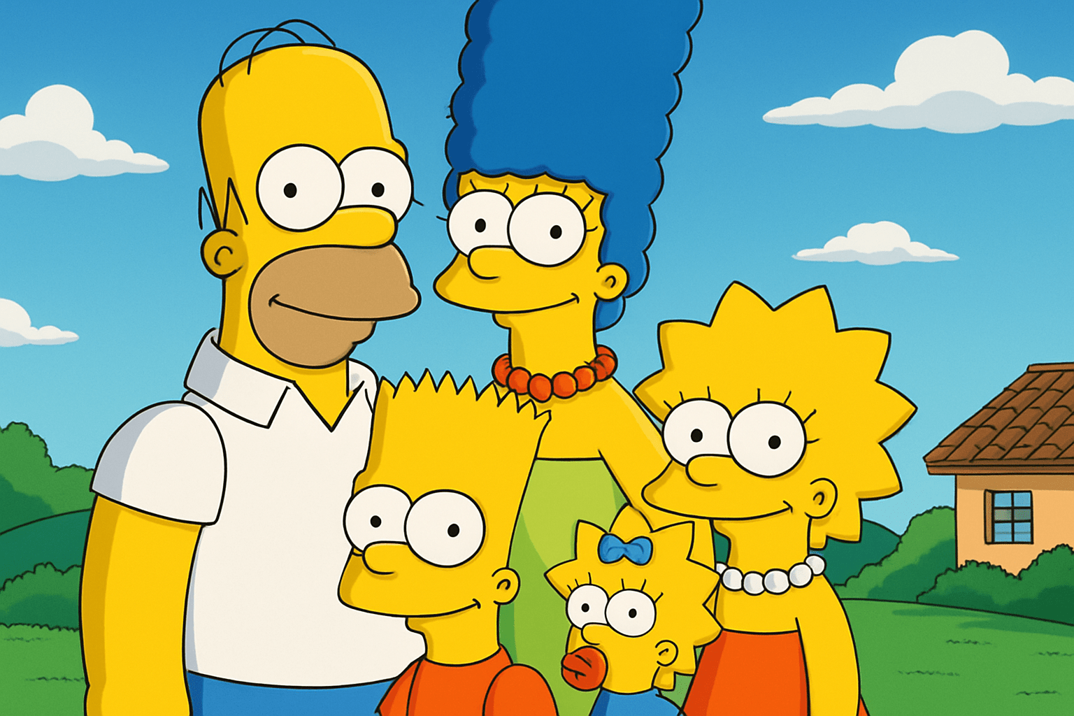
Look for readable outer contours, economical facial features and poses that reveal a relationship. A family group can remain legible through differences in hair, height, posture and clothing even before its background supplies the setting.
A television language, not an art movement
Matt Groening created The Simpsons as short segments for The Tracey Ullman Show before the half-hour series began in 1989. Disney’s account of James L. Brooks describes his role in bringing that transition about. The resulting screen language belongs to a collaborative production, rather than to one artist working alone; the Television Academy’s credits include directors, performers, designers and other animation practitioners.
This article studies visual principles visible in the series. It does not present an official model sheet, a production workflow or a historical fine-art movement. The gallery retains existing site illustrations, whose original production details are unavailable. They are not presented as authenticated episode frames or evidence of a particular animator’s work.
The silhouette does much of the work
Marge’s tall hair, Bart’s pointed head contour and Lisa’s star-like hair establish different rhythms. Homer’s rounded head and body produce a different balance again. These familiar outlines show how a character can become recognizable before small facial details are resolved. The important lesson is a family of contrasting shapes, not a requirement that every cartoon use the same anatomy.
Try drawing an invented group as black shapes. Give each figure a distinctive proportion and stance. Then place them together: does one outline hide another, and can the viewer still tell who is reacting to whom? Clarify the pose before adding clothing seams, eyelashes or background objects.
Expression is a relationship between features
A small change in eye direction can redirect the story. Mouth shape, eyelids, head tilt and shoulders work together; a large smile alone does not explain whether a character is proud, embarrassed or pretending to be cheerful. In a still illustration, choose one emotional beat and let the whole body support it.
Keep hands simple but coherent. A gesture should connect to the arm and to a clear intention: pointing, holding, offering or refusing. Extra lines do not necessarily make the gesture more informative. For a comic exchange, the listener’s reaction may be more important than the speaker’s expression.
Springfield as a stage for ordinary problems
Domestic interiors, schools, shops and streets give fantastic exaggerations a familiar frame. A couch, kitchen table or classroom can organize a group and provide a scale against which behaviour becomes funny. The setting is useful because the viewer understands what ordinarily happens there.
Build the composition around one relationship. A character guarding an impractically tall snack, a child negotiating an obstacle, or a musician absorbed in practice supplies a specific action. If every object demands attention, the image loses the pause in which the viewer understands the situation.
Colour and depth without visual clutter
Flat-looking colour areas and clean contours give the characters graphic clarity. Backgrounds can still contain perspective, overlapping buildings and changes of scale. Separate these jobs: the setting establishes space, while the foreground cast carries the immediate action.
Use one or two larger background colours to support the focal figures. A high-contrast window, sign or patterned wall placed directly behind a face can weaken recognition. At thumbnail size, the viewer should still find the important heads and gestures; detailed scenery should reward a closer look rather than obstruct the first one.
Satire requires a point of view
An exaggerated drawing is not automatically satire. A visual joke becomes more specific when it exposes a mismatch: grand confidence beside a small failure, an elaborate rule beside an ordinary need, or a ceremonial pose in a thoroughly unceremonious room. The subject of the joke should be understandable without a caption explaining every detail.
Avoid treating an accent, nationality or physical difference as the whole joke. Character, situation and competing intentions offer richer material. When developing an independent cartoon, invent people with distinct motives rather than reducing a community to a repeated visual shorthand.
Studies, fan illustration and independent invention
A direct character study asks how an established design reads in a new pose. An independent exercise asks whether principles such as silhouette contrast and reaction staging work with a new cast. Keep these purposes explicit. The prompt workshop proposes independent exercises; the existing gallery is retained for this text update.
A generated image may simplify, reinterpret or deviate from screen designs. It cannot certify animation accuracy. For a practical study, compare the focal silhouette, gesture and scene hierarchy; for production history, consult documented credits and creator interviews. A static picture also cannot demonstrate the timing, performance and editing of an animated joke.
Positive editorial assessment — AI-authored
The visual language offers a strong lesson in economical recognition. Contrasting silhouettes and clearly staged reactions can make an everyday scene legible in a fraction of a second. The best studies use that economy to reveal personality and relationships.
Critical editorial assessment — AI-authored
Yellow skin and familiar hair shapes can become a superficial shortcut. A weak imitation may look recognizable while lacking a readable action or thoughtful observation. Improve it by choosing one emotional beat, resolving the body language and simplifying competing background detail.
Neutral editorial assessment — AI-authored
This is a guide to a television-animation reference, combining sourced context with visual analysis and practical drawing exercises. It is useful for examining character distinction and comic staging, but it does not replace official production material or define all cartoon drawing.
A small poetic detour
Original words from the AOI studio.
Poetry
A room can hold a thousand things,
but one raised eyebrow owns the light.
A shoulder turns; a neighbour waits;
a small mistake grows twice its height.
The street recedes in quiet lines,
the figures claim the forward plane.
We recognize the shape of pride,
and meet ourselves in it again.
The prompt workshop
Original creative exercises. These prompts create new illustrations, not documentary evidence.
Start with contrasting silhouettes
Draw three original cartoon neighbours meeting beside a garden gate. Give them distinctly different heights, hair shapes and postures; use clear black contours, broad colour areas and one readable exchange. Keep the setting simple, with no franchise characters or writing.
Stage an everyday absurdity
Create an independent animated-comedy kitchen scene: an overly confident cook presents a tiny pancake on a huge platter while two family members exchange a doubtful glance. Build the joke through poses and scale, with coherent hands and restrained background contrast.
Experiment with the reaction
Invent a single-panel cartoon in which the main event is outside the frame and three clearly different characters react to it. Use gaze direction, shoulders and mouth shapes to distinguish curiosity, worry and delight. No speech bubbles; the reactions must carry the scene.
A smile from the studio
Jokes
The cartoonist removed every unnecessary line. The character complained that this included the excuse for being late.