Established
Adrian Frutiger (1928–2015) was a Swiss type designer whose work includes Univers, Frutiger, Avenir and OCR-B. This entry explores typography as a relationship between letterform, space and reading conditions, with particular attention to signage and visual clarity. It is separate from the later aesthetic called Frutiger Aero.
A visual introduction
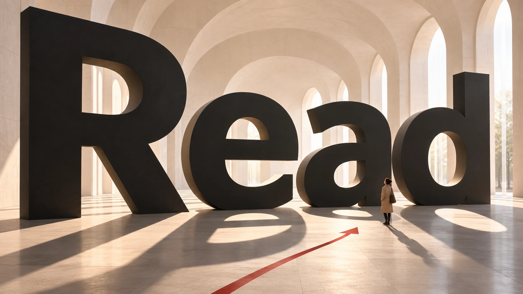
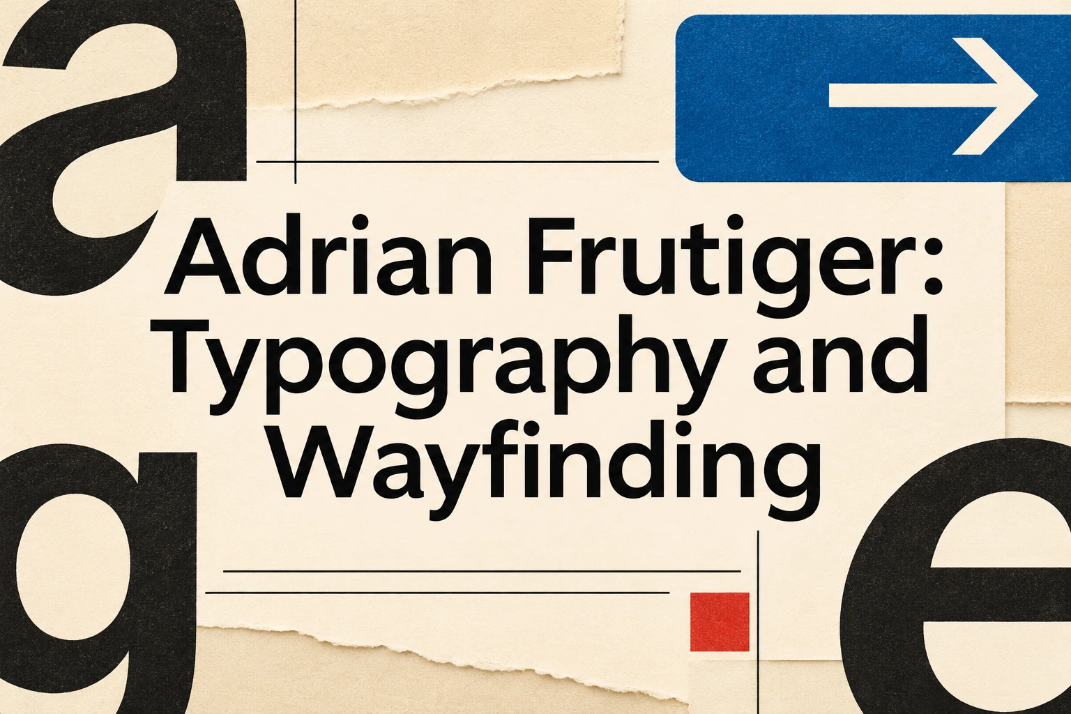
Seven original AI-generated studies explore this subject through a banner, a titled collage and five standalone examples.
Select an image for a closer look. Use the thumbnails, arrow keys or a swipe to compare examples. Zoom in to inspect details, or share the image that inspires you.
Creative toolbox · take this style further
Choose an input and a destination. Search sends your words to the chosen site; Copy & open puts them on your clipboard to paste there.
Create with AI
Turn your chosen input into an image prompt or a new creative direction.
ChatGPT
Copy your input and paste it into a ChatGPT conversation or image request.
Copy & open ChatGPT (new tab)Claude · Anthropic
Develop an image prompt or explore the style in a new Claude conversation.
Copy & open Claude · Anthropic (new tab)Midjourney
Paste your input into the Imagine bar on the Create page.
Copy & open Midjourney (new tab)Adobe Firefly
Copy your input, open Firefly, and paste it into the prompt field.
Copy & open Adobe Firefly (new tab)Leonardo.Ai
Copy your input, open Leonardo, and paste it into the generation field.
Copy & open Leonardo.Ai (new tab)Image search
Find visual references. Short, concrete keywords usually work best.
Lexica
Search AI images and prompts using your selected input.
Search with this input Lexica (new tab)Pexels
Search the photo and video library. Short keywords often work best.
Search with this input Pexels (new tab)Pixabay
Search photos, illustrations and other images.
Search with this input Pixabay (new tab)Unsplash
Search photographs using the style name or your own keywords.
Search with this input Unsplash (new tab)Wikimedia Commons
Search photographs, artworks and historical images. Check each file for its source and reuse terms.
Search with this input Wikimedia Commons (new tab)Art & research
Explore artists, collections and the ideas behind a style.
Wikipedia
Search for background reading. A style may not have its own article.
Search with this input Wikipedia (new tab)WikiArt
Copy your input into WikiArt’s search to explore artists and artworks.
Copy & open WikiArt (new tab)Europeana
Paste your keywords into the search to explore European museum, library and archive collections.
Copy & open Europeana (new tab)Inspiration
Discover portfolios and visual ideas from creative communities.
Instagram hashtags
Search a hashtag made from your input: spaces and punctuation are removed. Instagram may require sign-in.
Search with this input Instagram hashtags (new tab)ArtStation
Paste your input into artwork search for concept art, environments, characters and visual development.
Copy & open ArtStation (new tab)Behance
Paste your input into project search for illustration, design and visual storytelling.
Copy & open Behance (new tab)A closer look
Restrained letterforms, carefully balanced spaces, clear hierarchy and coherent families of weights support reading. In signage, words, arrows and placement work together. The point is not simply to make everything geometric or minimal: forms must remain distinguishable and useful at the intended distance and in the intended environment.
A designer, not a decorative filter
Eye magazine's 1999 interview presents Frutiger's career across type design, signs and symbols, including the development of Univers in the 1950s. His discussion of sans-serif forms emphasizes subtle differences in stroke and curve rather than the idea that every letter can be reduced to rigid geometry.
That distinction makes an artist-related entry more useful than a request for a generic clean font. A typographic composition concerns the relationship between its marks and a reader. An attractive letter considered alone may behave differently in a word, a paragraph or a distant sign.
Roissy and the problem of a quick glance
The Museum für Gestaltung Zürich's record for Douane, dated 1970–72, discusses Frutiger's signage work for Paris-Roissy. It describes legibility studies involving letter width, weight and shape, and highlights open curve endings. The signage alphabet was subsequently adapted for text use as Frutiger.
The museum and Linotype's preserved account give different years for the commercial library introduction, so this guide describes that adaptation broadly as the mid-1970s. The important design distinction is clear: lettering developed for a spatial reading task required adjustment when used in another context. A historical airport sign and a later font family are related, but not interchangeable objects.
Read the spaces as carefully as the strokes
For an original study, look at the open areas within and around the letters. A narrow opening can close visually when a word becomes small or its light spreads. An apparently equal gap can feel unequal beside different shapes. The white space is part of the drawing, not an unused remainder.
Compare a short word at several sizes. Ask whether the letters remain distinct and whether the rhythm stays even. These are practical exercises inspired by typographic concerns, not claims that the generated illustrations reproduce Frutiger's exact outlines or establish measured legibility.
A system needs more than a large arrow
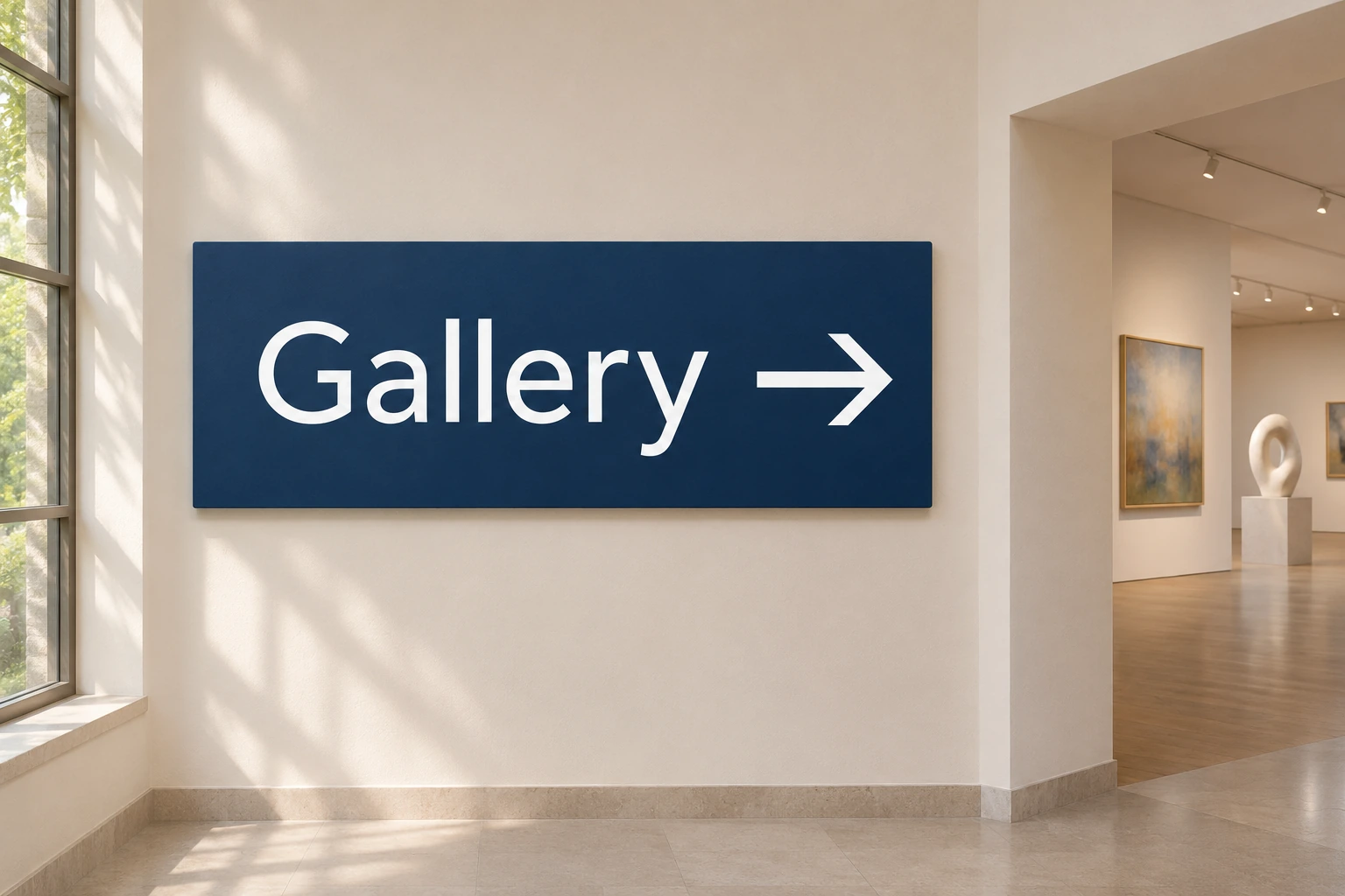
A sign must relate its destination to a direction and a place. Keep the arrow close enough to its label that the association is unambiguous. Separate unrelated routes, repeat a consistent hierarchy and leave room around the message. A dramatic sign mounted where nobody can see it has failed a different part of the problem.
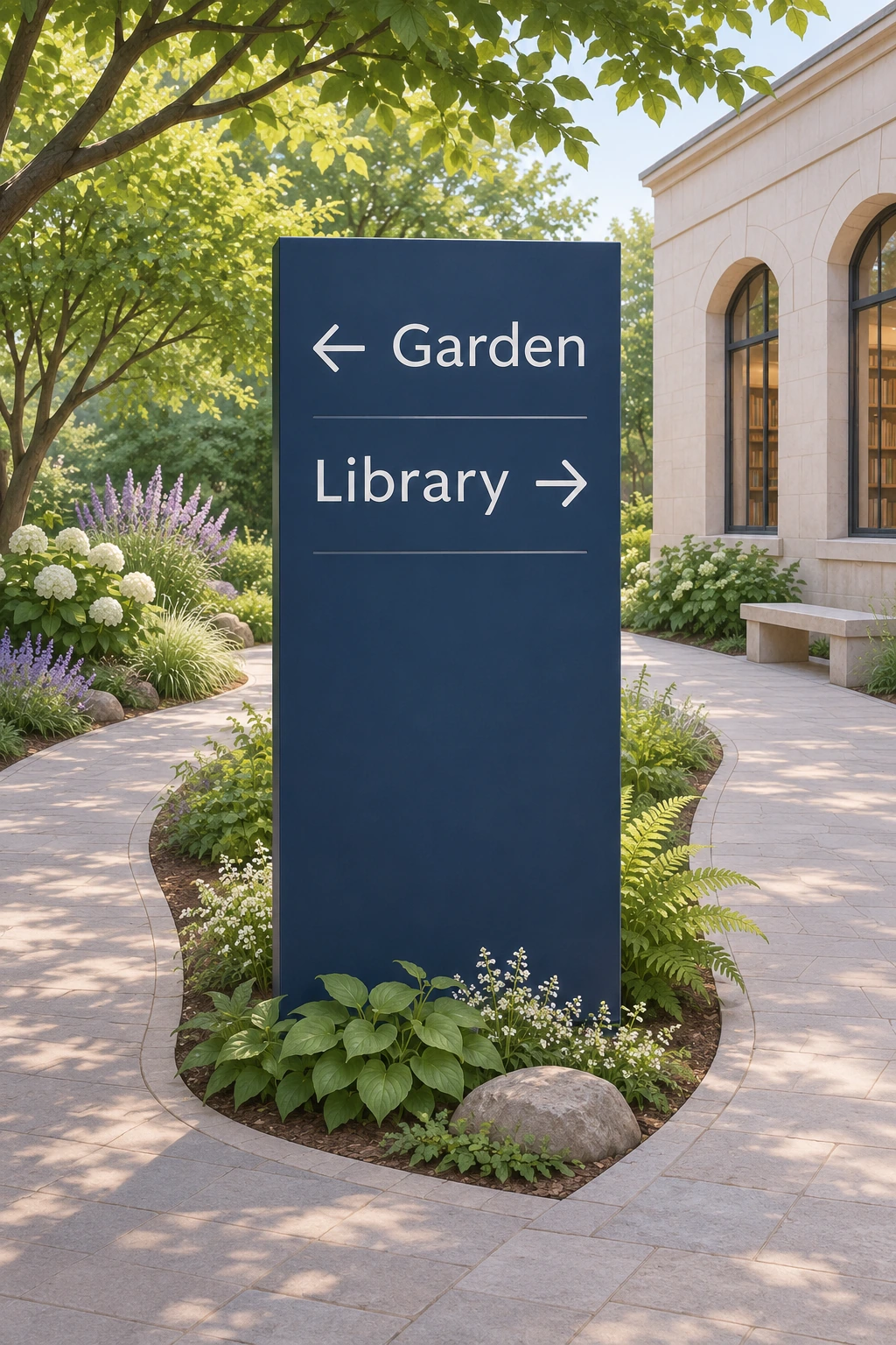
The gallery's signs are fictional design studies with short, proofread words. They do not document a real airport, museum or transport system. A working wayfinding scheme would require site-specific testing, language choices and accessibility decisions beyond what a single illustration can demonstrate.
Family resemblance with meaningful difference
Frutiger's output includes several distinct typefaces; Univers, Frutiger and Avenir should not be treated as alternate names for one design. A related family of weights can organize a page, but hierarchy still depends on size, spacing, position and the amount of text.
Linotype's preserved account describes Neue Frutiger as a 2009 revision developed by Akira Kobayashi in close collaboration with Adrian Frutiger. For exact glyph shapes or differences between versions, consult the foundry's specimens. Generated lettering in this gallery is an illustrative approximation and is not a font file, licensed specimen or substitute for those references.
Use restraint to direct attention
Begin a new poster with one essential message. Give its position and scale a reason, then add only the supporting material needed to make the relationship clear. A small number of colors can distinguish functions, while a generous margin can prevent the composition from becoming a block of competing instructions.
Restraint is not the same as blankness. An oversized letter crop can make a strong visual event, while a quiet sign can be effective precisely because it does not demand admiration. The appropriate balance depends on whether the object is meant to be contemplated, read continuously or understood while moving.
Where the AI illustrations stop
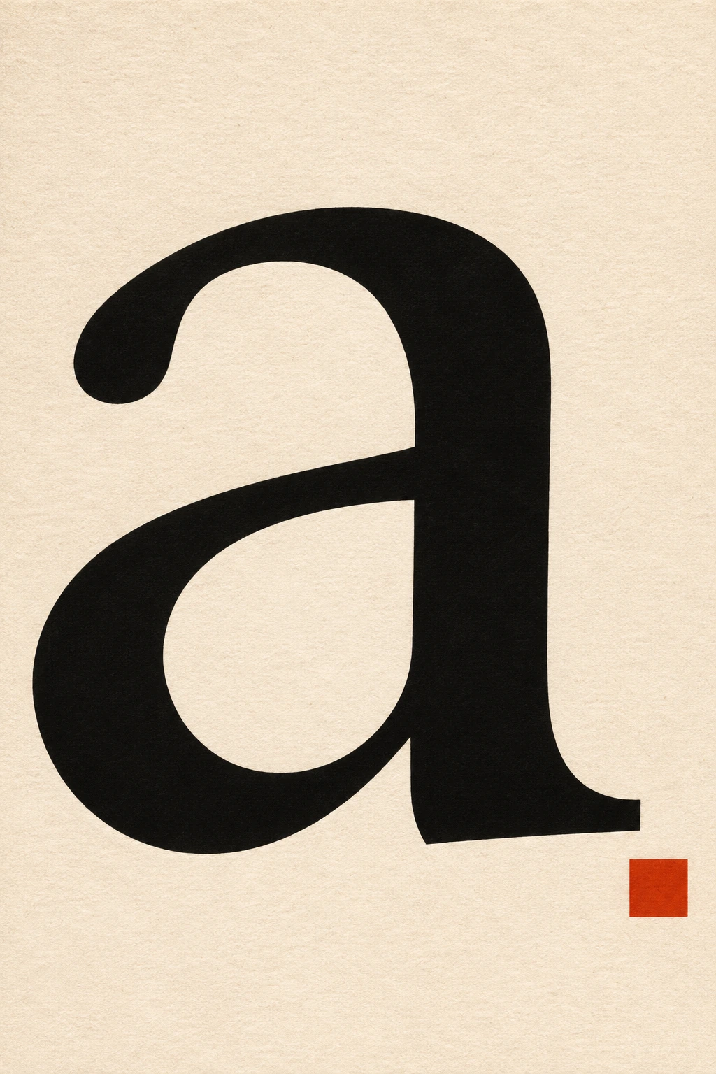
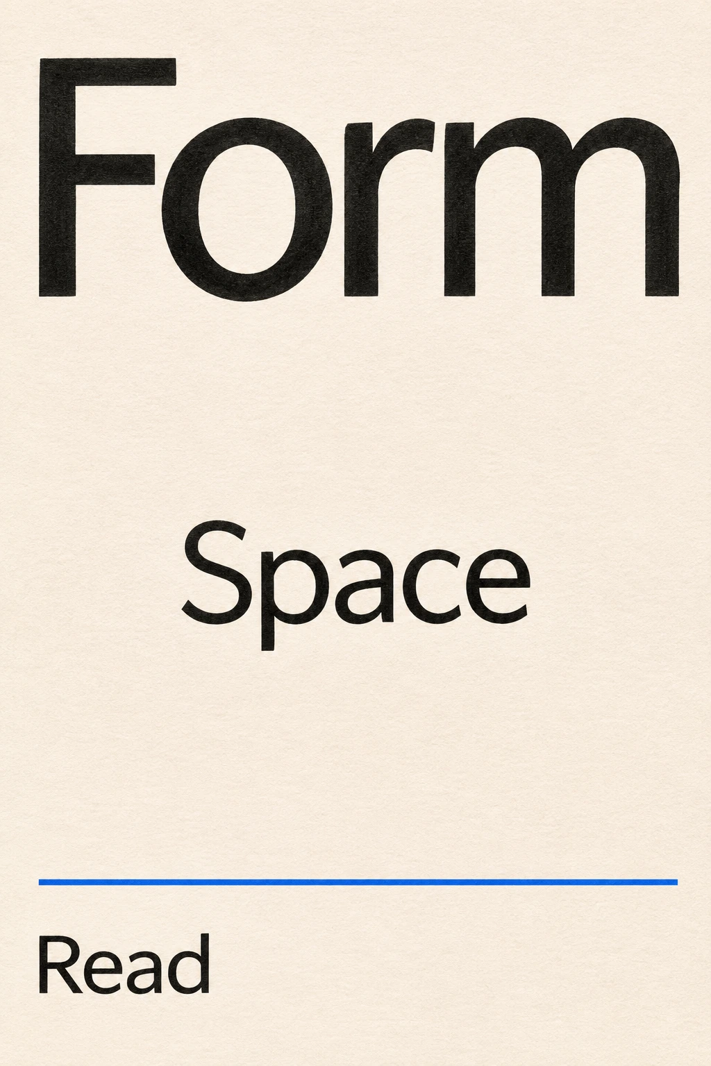
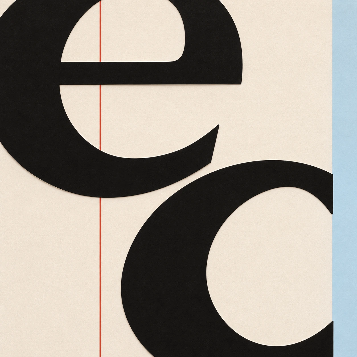
The seven gallery images explore signs, letter counters, page hierarchy and typographic space through new compositions. They are not works by Frutiger, historical facsimiles or authenticated examples of a named typeface. Exact wording is reviewed, but the output remains raster artwork rather than production typography.
For a final publication or real signage project, set the actual text with the chosen font and inspect its full character set and spacing. Use these images to develop a direction, then carry the design into tools that preserve editable text and exact glyphs. Keep this entry distinct from Frutiger Aero, whose glossy nature-and-technology imagery is a different subject.
Positive editorial review (AI-authored)
Frutiger's work offers a demanding model of visual clarity: a letter is part of a reading system, and a sign is part of an environment. The most useful lesson for new work is the attention to relationships among forms, spaces, scales and human perception rather than the imitation of a fashionable surface.
Negative editorial review (AI-authored)
A superficial interpretation can mistake typographic discipline for bland uniformity, or assume that a prestigious typeface solves every communication problem. Poor wording, confusing arrows and unsuitable placement survive even in beautifully drawn letters. A stronger project tests the actual message and setting instead of relying on the designer's name.
Neutral editorial review (AI-authored)
This designer-related entry introduces selected principles through historical sources and original AI-generated visual studies. It is useful for exploring hierarchy, signs and typographic space. It does not provide a Frutiger font, verify exact typeface fidelity or replace practical testing of a real communication system.
A small poetic detour
Original words from the AOI studio.
Poetry
A letter leaves a little room
For light to travel through its wall.
A sign speaks plainly through the gloom,
An arrow answers down the hall.
The quiet spaces hold the line;
The reader gives the marks their time.
The prompt workshop
Original creative exercises. These prompts create new illustrations, not documentary evidence.
One destination, one arrow
Create an original fictional museum wayfinding study with the exact word 'Gallery' and one clear right-pointing arrow on a matte dark-blue panel. Open humanist sans-serif-style letterforms, generous margins, coherent placement in a quiet white corridor. Not a real Frutiger font specimen or a historical sign, no other text.
The space inside a letter
Create a restrained typographic art poster with one enormous lowercase 'a' in black on warm white, its internal counter and surrounding negative space clearly visible. Add one small red square as a compositional counterweight, no other words. Original letterform exploration, not an authenticated typeface specimen.
A page that knows what matters
Create an original editorial typography concept with the exact words 'Form', 'Space' and 'Read' arranged in a clear hierarchy on warm white paper. Black humanist sans-serif-style lettering, one restrained blue rule, deliberate spacing and generous margins. No additional text, no claim of exact Frutiger glyphs.
Your next inspiration
Discover another art style
Follow a visual thread to the next subject.
A smile from the studio
Jokes
The airport hired a type designer to make its signs clearer. The letters were beautifully spaced, the arrows unmistakable and the hierarchy impeccable. Unfortunately, the meeting about which terminal they pointed to had been postponed. Everyone admired the sign on the way to the wrong building.