
Typographic design treatment · premium identity, hierarchy and material
Luxury Typography creates a sense of care through letterforms, spacing, proportion and presentation. A premium impression can come from a delicate serif, a confident sans serif or tactile printing, provided the decisions work together.
A visual introduction
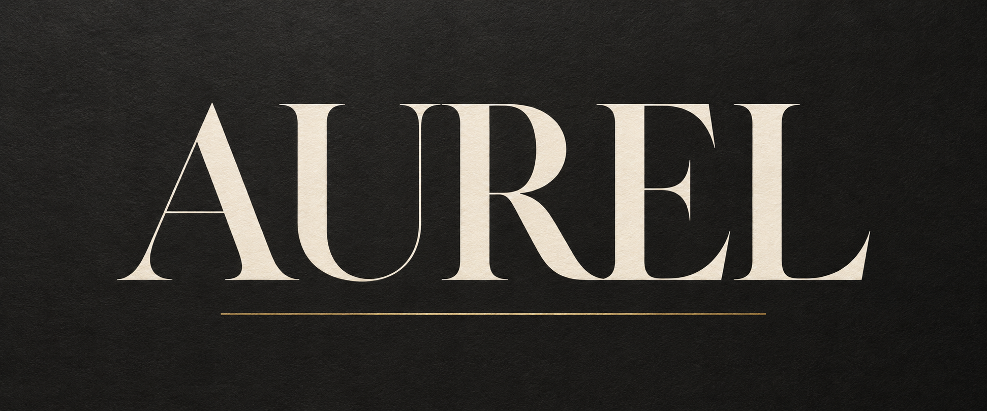
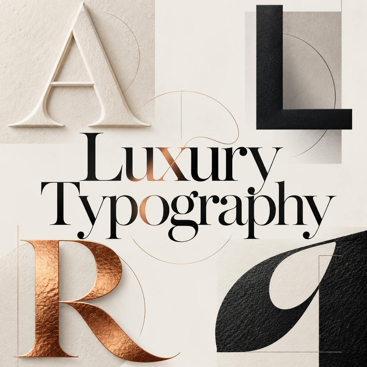
Five original AI-generated AOI interpretations: a dedicated banner, centrally titled collage and three standalone studies. These are illustrative concepts, not historical objects or commercial products.
Select an image for a closer look. Use the thumbnails, arrow keys or a swipe to compare examples. Zoom in to inspect details, or share the image that inspires you.
Creative toolbox · take this style further
Choose an input and a destination. Search sends your words to the chosen site; Copy & open puts them on your clipboard to paste there.
Create with AI
Turn your chosen input into an image prompt or a new creative direction.
ChatGPT
Copy your input and paste it into a ChatGPT conversation or image request.
Copy & open ChatGPT (new tab)Claude · Anthropic
Develop an image prompt or explore the style in a new Claude conversation.
Copy & open Claude · Anthropic (new tab)Midjourney
Paste your input into the Imagine bar on the Create page.
Copy & open Midjourney (new tab)Adobe Firefly
Copy your input, open Firefly, and paste it into the prompt field.
Copy & open Adobe Firefly (new tab)Leonardo.Ai
Copy your input, open Leonardo, and paste it into the generation field.
Copy & open Leonardo.Ai (new tab)Image search
Find visual references. Short, concrete keywords usually work best.
Lexica
Search AI images and prompts using your selected input.
Search with this input Lexica (new tab)Pexels
Search the photo and video library. Short keywords often work best.
Search with this input Pexels (new tab)Pixabay
Search photos, illustrations and other images.
Search with this input Pixabay (new tab)Unsplash
Search photographs using the style name or your own keywords.
Search with this input Unsplash (new tab)Wikimedia Commons
Search photographs, artworks and historical images. Check each file for its source and reuse terms.
Search with this input Wikimedia Commons (new tab)Art & research
Explore artists, collections and the ideas behind a style.
Wikipedia
Search for background reading. A style may not have its own article.
Search with this input Wikipedia (new tab)WikiArt
Copy your input into WikiArt’s search to explore artists and artworks.
Copy & open WikiArt (new tab)Europeana
Paste your keywords into the search to explore European museum, library and archive collections.
Copy & open Europeana (new tab)Inspiration
Discover portfolios and visual ideas from creative communities.
Instagram hashtags
Search a hashtag made from your input: spaces and punctuation are removed. Instagram may require sign-in.
Search with this input Instagram hashtags (new tab)ArtStation
Paste your input into artwork search for concept art, environments, characters and visual development.
Copy & open ArtStation (new tab)Behance
Paste your input into project search for illustration, design and visual storytelling.
Copy & open Behance (new tab)A closer look
Carefully judged letter spacing, strong hierarchy and generous margins make type the focal form. Restrained color, contrasting stroke weights and selective embossing or foil can reinforce the composition without replacing readability.
A design treatment, not a type category
Luxury Typography describes an intended impression rather than a historical movement or one family of fonts. The task is to make an identity feel considered, distinctive and appropriate to its audience. Expensive-looking materials cannot compensate for a poorly spaced name, and a serif alone cannot guarantee refinement.
Monotype's discussion of luxury beauty branding explicitly challenges the assumption that the sector always relies on delicate serif faces. It identifies varied typographic strategies, including bold and geometric approaches. Treat such case studies as evidence of diversity rather than a permanent rule about what every luxury brand uses.
Choose a voice before choosing a finish
Ask what the identity should communicate: quiet precision, expressive craft, contemporary confidence or formal ceremony. A high-contrast serif can create a particular tension between broad stems and fine strokes. A sturdy sans serif can feel direct and composed. A custom letterform can provide distinction when its construction has a clear purpose.
Pentagram's Liberty identity offers a concrete reference for a system with its own character: the project combines a bespoke primary identity with complementary typefaces. The lesson is to build relationships across uses, not to copy a famous wordmark and substitute another name.
The AOI studies use invented words and an imaginary studio label. They demonstrate visual decisions, not finished commercial identities or claims of trademark availability.
Spacing is a visual relationship
Tracking adjusts spacing across a run of letters; kerning adjusts particular pairs. Both should be judged optically. A diagonal next to a round form leaves a different apparent gap from two straight stems, even when the numerical spacing is equal. Monotype's foundry guidance makes this distinction between mechanical symmetry and visual balance.
Start at the intended display size, then reduce the design. Excessive spacing can scatter a short name, while tight spacing can merge thin strokes or close internal shapes. Compare the space within letters with the space between them. The aim is an even visual rhythm, not an arbitrary large tracking value.
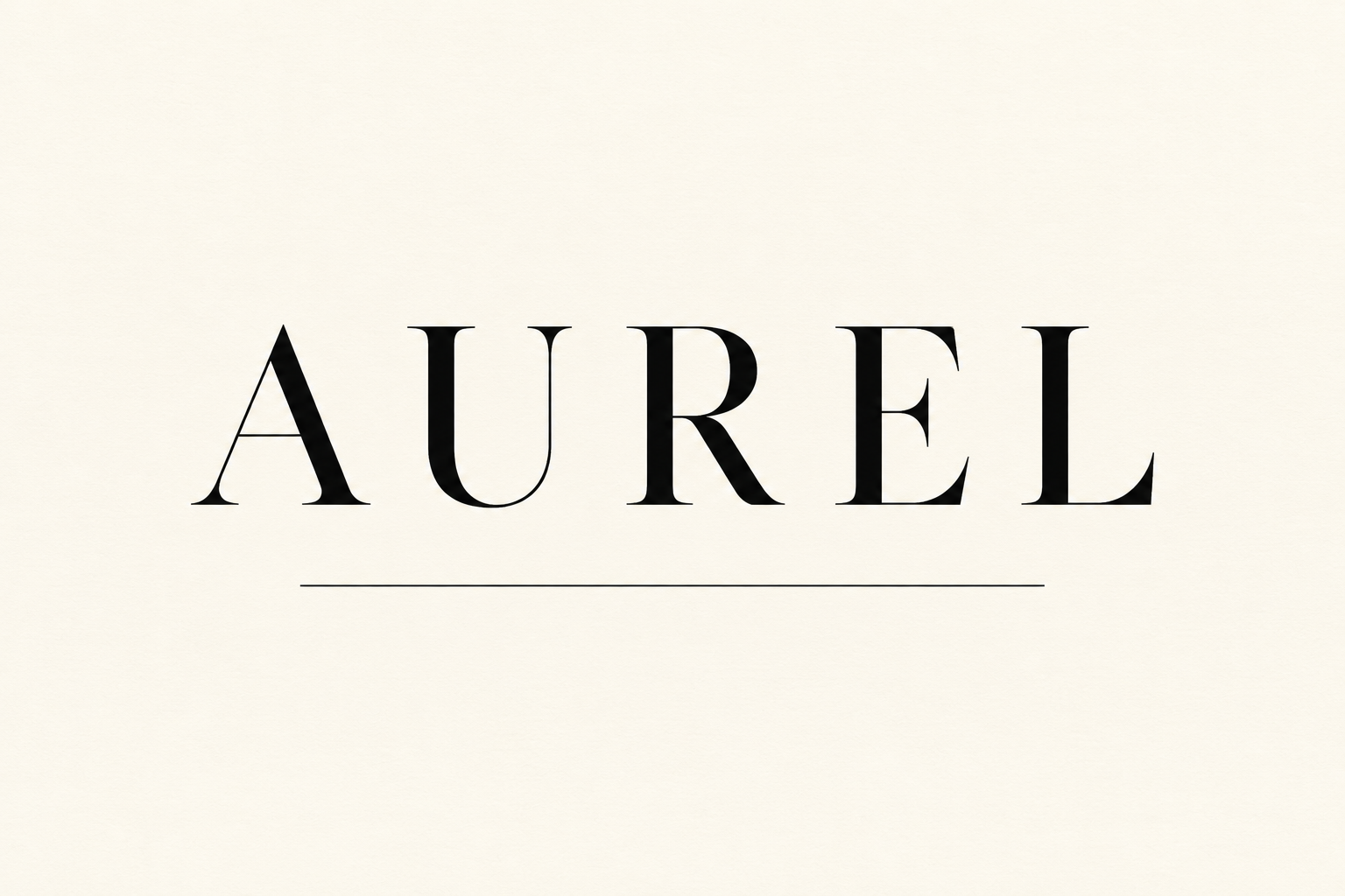
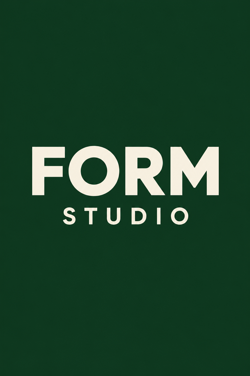
The serif AUREL study leaves broad margins so the word's proportions become visible. Its fine rule is subordinate. The FORM STUDIO study uses a heavier sans serif and a dark green field to create a different kind of assurance.
Hierarchy makes restraint useful
Decide which information deserves the first glance, the second and the third. A name may dominate while a category or date remains quiet. Keep supporting text readable at its actual size. Tiny pale text is not automatically sophisticated; it may simply fail its purpose.
Negative space works when it establishes a relationship between the lettering and the page. Check the top, bottom and side margins as a whole. Centering every element is one option, not the definition of elegance. An asymmetrical layout can feel equally deliberate when alignment and balance are controlled.
Material changes the appearance of letters
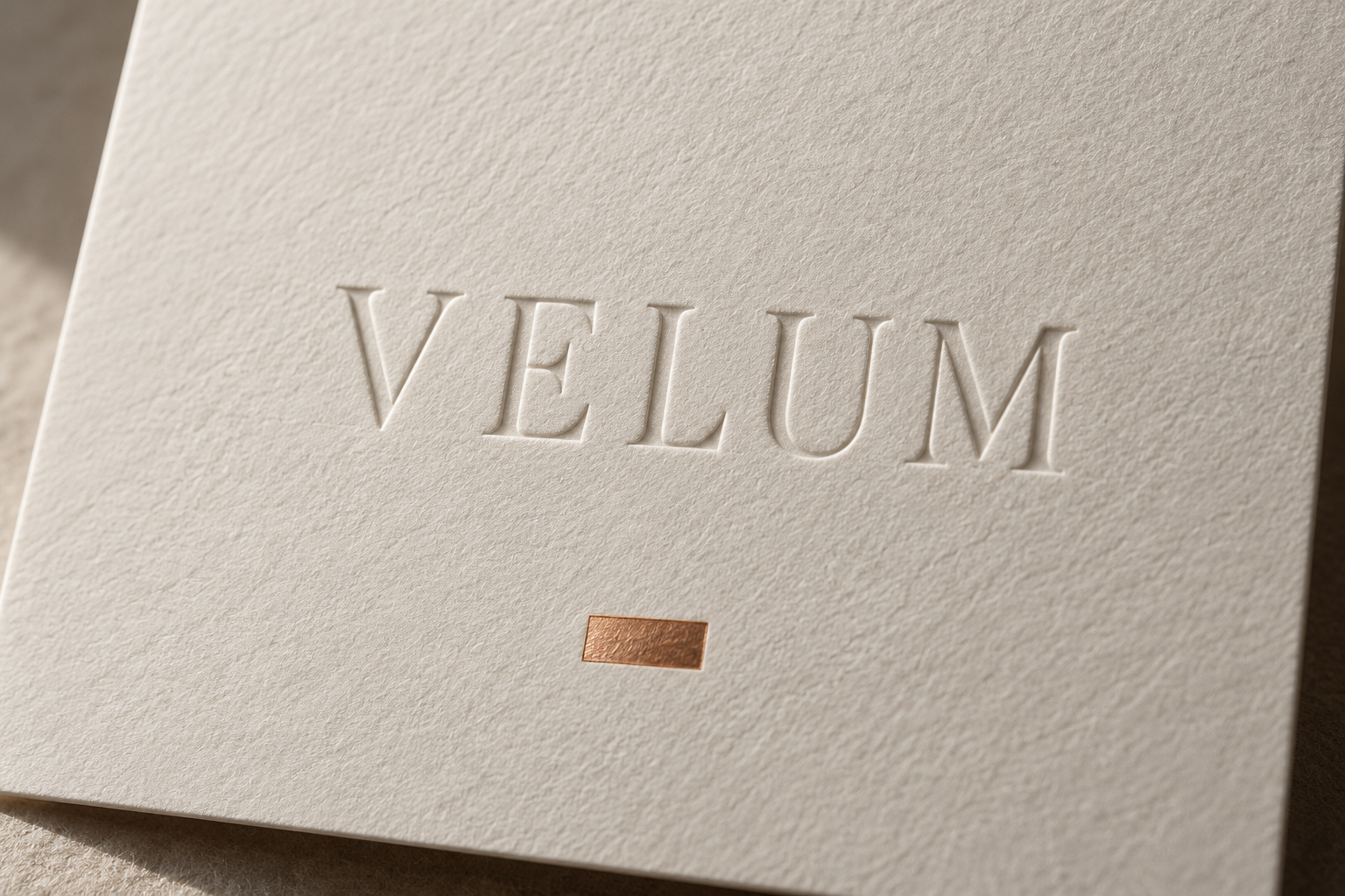
Embossing, debossing, foil and ink create different interactions with light. A blind-embossed word becomes visible through relief and shadow rather than color contrast. Foil can create a strong accent, but a large reflective area may compete with the name. The VELUM study uses side light to reveal recessed, debossed lettering and the texture of the paper.
For physical production, discuss fine strokes, substrate and finishing tolerances with the printer. For screens, check contrast, scaling and rendering. A generated image of embossing is a visual concept, not a production-ready die or evidence of a tested print process.
A useful comparison removes all metallic effects. If the underlying wordmark remains compelling, the finish is reinforcing an existing design. If the composition collapses, more attention to proportion and spacing is needed.
Review letters as carefully as pictures
Check every character, baseline, counter and repeated shape. AI-generated typography can look persuasive at a glance while containing malformed or substituted letters. Keep exact wording short, inspect the result and rebuild final production typography with appropriate type tools when necessary.
For a practical exercise, set the same short word in a serif and a sans serif. Use the same page size and one color. Refine spacing and margins before adding a material treatment. This isolates the choices that create a premium impression without confusing them with decoration.
A small poetic detour
Original words from the AOI studio.
Poetry
Between the letters
The paper leaves a field of snow;
a slender stem divides the white.
Two letters lean, then let it go:
the space between them sets them right.
No golden border needs to plead.
A quiet line can carry weight.
The eye receives enough to read;
the rest is room in which to wait.
I move one letter by a hair.
The word becomes the care put there.
The prompt workshop
Original creative exercises. These prompts create new illustrations, not documentary evidence.
Refine one short serif word
Create a frontal typographic poster with the exact word AUREL in elegant high-contrast black serif capitals on warm ivory. Use optically balanced spacing, generous margins and one subordinate fine rule. No other text.
Inspect every letter and judge the rhythm of the gaps.
Make sans serif feel considered
Create a minimal poster reading FORM with STUDIO beneath, in confident ivory sans-serif lettering on deep green. Use clear hierarchy and careful alignment without metallic effects.
Test whether proportion alone establishes the intended character.
Let paper reveal the word
Create a close-up concept image of an ivory cotton-paper card bearing only VELUM in blind-debossed serif letters. Use shallow side light and a small copper accent below the word.
Treat the image as a material study, not a production file.
Your next inspiration
Discover another art style
Follow a visual thread to the next subject.
A smile from the studio
Jokes
The client asked why the logo cost so much when it contained only five letters. The typographer showed the first version, then the version with carefully adjusted spacing. “I can see the difference,” said the client, “but I can't explain it.” “Exactly,” said the typographer. “The invoice covers the letters. The expertise is mostly in the gaps.”