
Design movement · Milan and the international Memphis group
Memphis Design makes furniture, objects and graphics speak through eccentric geometry, emphatic color and clashing surfaces. Its playful appearance rests on deliberate choices about structure, material and visual hierarchy.
A visual introduction
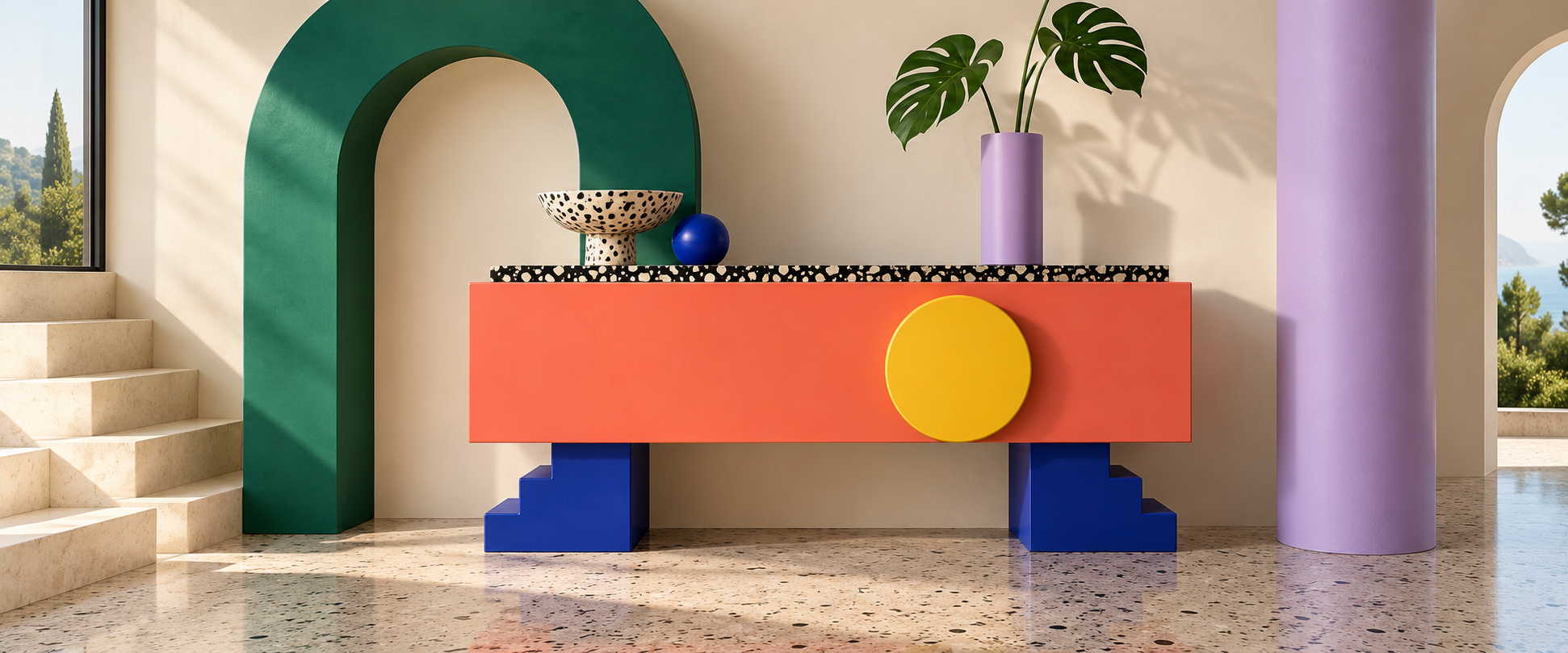
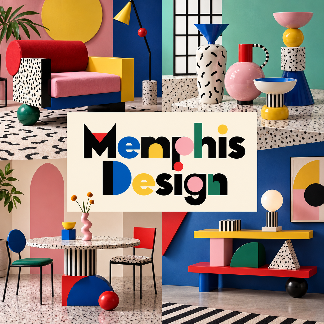
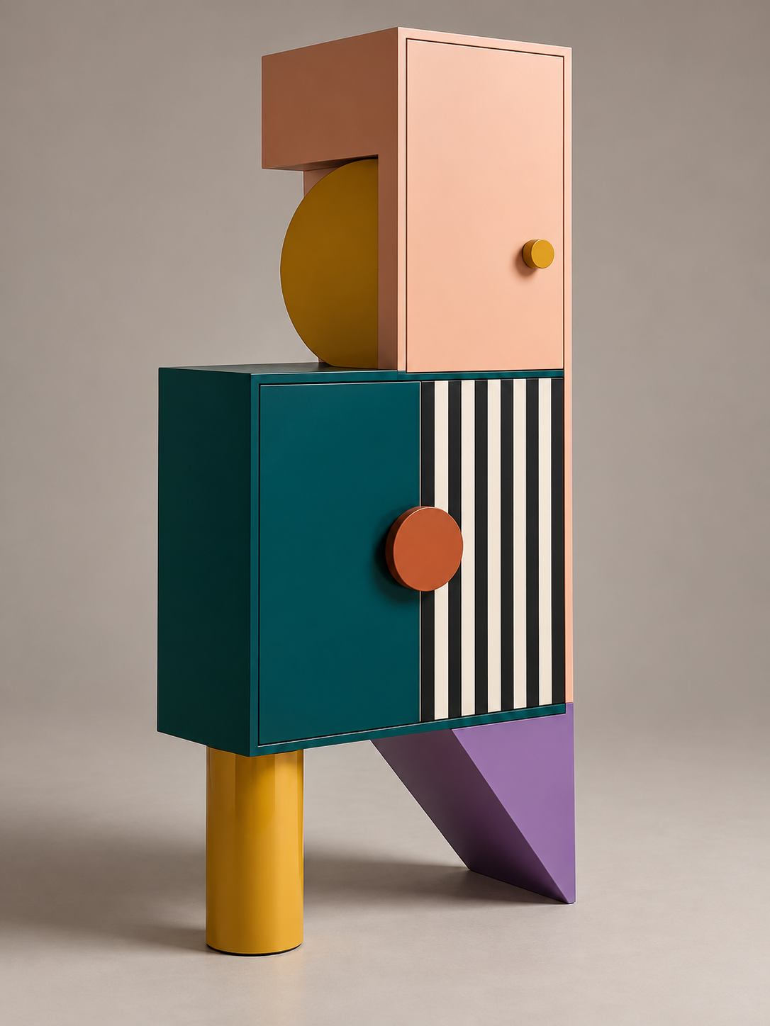
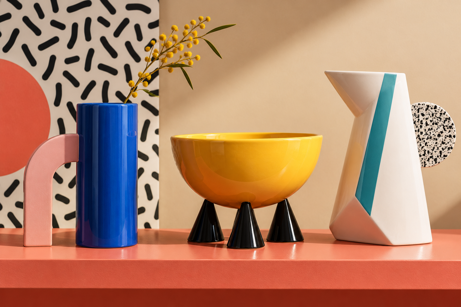
Five original AI-generated AOI studies: a dedicated banner, a centrally titled collage and three standalone examples. These are contemporary interpretations of the visual principles discussed here.
Select an image for a closer look. Use the thumbnails, arrow keys or a swipe to compare examples. Zoom in to inspect details, or share the image that inspires you.

Creative toolbox · take this style further
Choose an input and a destination. Search sends your words to the chosen site; Copy & open puts them on your clipboard to paste there.
Create with AI
Turn your chosen input into an image prompt or a new creative direction.
ChatGPT
Copy your input and paste it into a ChatGPT conversation or image request.
Copy & open ChatGPT (new tab)Claude · Anthropic
Develop an image prompt or explore the style in a new Claude conversation.
Copy & open Claude · Anthropic (new tab)Midjourney
Paste your input into the Imagine bar on the Create page.
Copy & open Midjourney (new tab)Adobe Firefly
Copy your input, open Firefly, and paste it into the prompt field.
Copy & open Adobe Firefly (new tab)Leonardo.Ai
Copy your input, open Leonardo, and paste it into the generation field.
Copy & open Leonardo.Ai (new tab)Image search
Find visual references. Short, concrete keywords usually work best.
Lexica
Search AI images and prompts using your selected input.
Search with this input Lexica (new tab)Pexels
Search the photo and video library. Short keywords often work best.
Search with this input Pexels (new tab)Pixabay
Search photos, illustrations and other images.
Search with this input Pixabay (new tab)Unsplash
Search photographs using the style name or your own keywords.
Search with this input Unsplash (new tab)Wikimedia Commons
Search photographs, artworks and historical images. Check each file for its source and reuse terms.
Search with this input Wikimedia Commons (new tab)Art & research
Explore artists, collections and the ideas behind a style.
Wikipedia
Search for background reading. A style may not have its own article.
Search with this input Wikipedia (new tab)WikiArt
Copy your input into WikiArt’s search to explore artists and artworks.
Copy & open WikiArt (new tab)Europeana
Paste your keywords into the search to explore European museum, library and archive collections.
Copy & open Europeana (new tab)Inspiration
Discover portfolios and visual ideas from creative communities.
Instagram hashtags
Search a hashtag made from your input: spaces and punctuation are removed. Instagram may require sign-in.
Search with this input Instagram hashtags (new tab)ArtStation
Paste your input into artwork search for concept art, environments, characters and visual development.
Copy & open ArtStation (new tab)Behance
Paste your input into project search for illustration, design and visual storytelling.
Copy & open Behance (new tab)A closer look
Totemic silhouettes, tilted supports, stacked cylinders and triangles meet patterned laminates, bright accents and unexpected material contrasts. Plain areas give the busy surfaces room to make their point.
A design movement with something to say
Memphis emerged in Milan around Ettore Sottsass and an international group of designers. Discussions began in 1980; their first collection appeared in Milan in September 1981. The group challenged the idea that an object should communicate mainly through sober utility. A cabinet could behave like a character, a lamp like a small stage set, and a surface pattern like an opinion delivered at full volume.
This is a historical design movement, not simply a label for colorful squiggles. Memphis included furniture, lighting, textiles, ceramics and glass. Its later influence on graphics is easier to understand when the three-dimensional objects come first: shapes carry weight, surfaces meet at edges, and the user encounters the object from more than one direction.
A collective, rather than one signature
Memphis Milano's history names Martine Bedin, Aldo Cibic, Michele De Lucchi, Nathalie Du Pasquier, Matteo Thun and George Sowden among the early participants. Triennale Milano's archive places their posters and invitations alongside the objects, showing how a public graphic identity helped the group circulate its ideas. Different members developed different forms; a useful study leaves room for that variety.
The Metropolitan Museum situates Memphis within the broader experimentation of Italian Radical Design. It also points to a productive contradiction: surfaces associated with inexpensive everyday goods could appear on carefully crafted, costly objects. The result unsettles a simple equation between expensive materials, good taste and cultural importance.
Start with a silhouette that can survive the pattern
Draw the object as a solid black shape before decorating it. A broad upright block on a stepped base feels different from a slender pole balanced by an off-center disc. Cylinders, wedges, arches and diagonals are useful because their relationships can be read quickly. The aim is an identifiable construction, not a pile of unrelated geometry.
Sottsass's Carlton room divider of 1981 is an instructive historical reference. The Met records wood and plastic laminate and describes a structural order based on real and implied equilateral triangles beneath its apparently unruly form. That is a better lesson than copying its outline: apparent misbehavior can have a precise supporting logic.
In a new design, give the largest mass a clear role. Then introduce one asymmetry that changes its attitude. A displaced handle, tilted support or unexpectedly heavy cap can make a quiet cabinet feel animated without making every part compete.
Make color and surface disagree on purpose
Memphis can combine strong colors, pastels, black-and-white marks and imitations of other materials. There is no compulsory pink-and-turquoise formula. Try one large calm color, a smaller contrasting area and a sharply patterned accent. Repeat a color in an unexpected position so the eye has a reason to travel across the object.
Treat pattern scale as a structural choice. Fine speckles can make a broad plane feel active from nearby; a large stripe remains legible at a distance. Place a busy pattern next to a plain surface to reveal the boundary. If every plane has equally loud detail, the design loses the hierarchy that makes the collision enjoyable.
The Met's Ivory table of 1985 provides a useful material comparison: its record lists Formica, wood and glass. Memphis is therefore not reducible to one manufacturing process or one inexpensive substance. What matters visually is the conversation between the materials and the associations they bring.
Move between objects, rooms and flat compositions
For an interior, choose a focal object and let the room give it space. A strongly patterned cabinet may need a comparatively quiet wall and floor. A smaller ceramic ensemble can use the same contrast at the scale of a tabletop: repeat one curve, change its height, and allow one vessel to depart from the rhythm.
For graphics, borrow relationships rather than arranging a sack of decorative confetti. A headline zone can act like the main mass of a cabinet; a tilted bar can interrupt it like an eccentric support. Negative space is a compositional ingredient. Even a deliberately noisy poster needs a place where information can be read.
The AOI studies explore an invented interior, a sculptural storage object, a geometric graphic composition and a ceramic arrangement. They illustrate ways to use the vocabulary without presenting generated objects as historical Memphis products.
Playfulness still needs judgment
A frequent failure is to equate more pattern with more Memphis. Remove one decorative layer and test whether the silhouette becomes stronger. Another is to make a chair look surprising while forgetting where a person would sit. Visual provocation and practical use can negotiate; neither becomes more interesting through accidental failure.
Corporate Memphis, the later label commonly applied to certain flat corporate illustrations, is a separate subject in the AOI database. Shared bright colors do not make those illustrations products of the Milan collective. Keep the historical reference specific, then explain what a contemporary adaptation actually borrows.
Begin a small exercise with a box, a cylinder and a diagonal. Make three versions using the same parts but different emphasis. Only then add surface treatments. The best result should remain memorable when the pattern is temporarily hidden.
A small poetic detour
Original words from the AOI studio.
Poetry
The cabinet has an opinion
A blue disc leans above a yellow door;
a stripe refuses to remain a stripe.
The little legs have heard this speech before
and brace themselves beneath the pink and white.
A handle makes a modest claim to sense.
The surface answers, speckled, with a grin.
Between the useful shelf and its defense,
a bright, unnecessary life gets in.
I put one book inside and leave it there.
The room rearranges how it wears the air.
The prompt workshop
Original creative exercises. These prompts create new illustrations, not documentary evidence.
Give a small cabinet a large personality
Design an original Memphis-inspired cabinet with a clear rectangular storage body, one eccentric cylindrical support and a displaced circular handle. Use cobalt, butter yellow, warm pink and a small black-and-white patterned panel. Keep the silhouette legible and the construction plausible. No logos or copied historical designs.
Begin with structure; use pattern to sharpen one relationship.
Compose a room around one noisy object
Create a refined interior centered on an original Memphis-inspired sculptural console. Contrast its bold geometric masses and patterned laminate with a calm ivory wall, a simple floor and restrained lighting. Add one small ceramic object that repeats a color without repeating the entire design.
The surrounding room gives the focal object room to speak.
Translate the object into a flat field
Create a wordless geometric graphic composition inspired by Memphis design: one broad quiet field, a tilted bar, two unequal circles, a stepped shape and a small speckled area. Balance saturated and pastel color, crisp edges and generous empty space.
Test whether the composition still works when the pattern is removed.
Your next inspiration
Discover another art style
Follow a visual thread to the next subject.

People & works to explore
References discussed in this article. Consult the sources below for context.
Artists and practitioners
Ettore Sottsass
Nathalie Du Pasquier
Martine Bedin
George Sowden
Michele De Lucchi
Paintings and other works
Ettore Sottsass — Carlton room divider (1981)
Ettore Sottsass — Ivory table (1985)
A smile from the studio
Jokes
The client asked for a cabinet that would quietly blend into the room. The designer returned with a pink tower, a yellow disc and a black-and-white zigzag base. “It has a very strong personality,” said the client. “Can we make it less opinionated?” The designer removed one blue handle. They stood in silence. “Better?” “No,” said the client. “Now it looks as though it has resigned on principle.”
Sources and further exploration
Memphis Milano — the group’s history, participants and material experiments
Triennale Milano — archival posters and invitations from the Memphis collective
The Met — Carlton room divider (1981), materials and underlying triangular structure
The Met — Ivory table (1985), a contrasting example in Formica, wood and glass
The Met — Sottsass exhibition galleries, Radical Design and the Memphis context