Established
A calligram makes language visible as an image: the placement, direction and spacing of words help form what the text evokes. It can be read as a poem and seen as a drawing, with each mode changing the other. The challenge is to make the shape carry meaning without losing the language inside it.
A visual introduction
Five original AI-generated studies explore this subject through a banner, a titled collage and three standalone examples.
Select an image for a closer look. Use the thumbnails, arrow keys or a swipe to compare examples. Zoom in to inspect details, or share the image that inspires you.
Creative toolbox · take this style further
Choose an input and a destination. Search sends your words to the chosen site; Copy & open puts them on your clipboard to paste there.
Create with AI
Turn your chosen input into an image prompt or a new creative direction.
ChatGPT
Copy your input and paste it into a ChatGPT conversation or image request.
Copy & open ChatGPT (new tab)Claude · Anthropic
Develop an image prompt or explore the style in a new Claude conversation.
Copy & open Claude · Anthropic (new tab)Midjourney
Paste your input into the Imagine bar on the Create page.
Copy & open Midjourney (new tab)Adobe Firefly
Copy your input, open Firefly, and paste it into the prompt field.
Copy & open Adobe Firefly (new tab)Leonardo.Ai
Copy your input, open Leonardo, and paste it into the generation field.
Copy & open Leonardo.Ai (new tab)Image search
Find visual references. Short, concrete keywords usually work best.
Lexica
Search AI images and prompts using your selected input.
Search with this input Lexica (new tab)Pexels
Search the photo and video library. Short keywords often work best.
Search with this input Pexels (new tab)Pixabay
Search photos, illustrations and other images.
Search with this input Pixabay (new tab)Unsplash
Search photographs using the style name or your own keywords.
Search with this input Unsplash (new tab)Wikimedia Commons
Search photographs, artworks and historical images. Check each file for its source and reuse terms.
Search with this input Wikimedia Commons (new tab)Art & research
Explore artists, collections and the ideas behind a style.
Wikipedia
Search for background reading. A style may not have its own article.
Search with this input Wikipedia (new tab)WikiArt
Copy your input into WikiArt’s search to explore artists and artworks.
Copy & open WikiArt (new tab)Europeana
Paste your keywords into the search to explore European museum, library and archive collections.
Copy & open Europeana (new tab)Inspiration
Discover portfolios and visual ideas from creative communities.
Instagram hashtags
Search a hashtag made from your input: spaces and punctuation are removed. Instagram may require sign-in.
Search with this input Instagram hashtags (new tab)ArtStation
Paste your input into artwork search for concept art, environments, characters and visual development.
Copy & open ArtStation (new tab)Behance
Paste your input into project search for illustration, design and visual storytelling.
Copy & open Behance (new tab)A closer look
Words become contours, masses, paths or intervals. Line lengths may shape an object, letters may follow its motion, or several text groups may create a scene. White space works as actively as ink; legibility, reading order and silhouette must be designed together.
A modern name with older precedents
Guillaume Apollinaire is central to the modern term. The Centre Pompidou dates his publication of Lettre-océan to 1914, when he used the description lyrical ideogram, and places the appearance of the word calligramme in 1917. The Bibliothèque nationale de France records the first Paris edition of his collection Calligrammes in 1918.
The shaped-poem tradition is much older than that name. An Académie des Inscriptions et Belles-Lettres discussion traces figurative poetry to Hellenistic Greek examples, including a pipe-shaped poem associated with Theocritus. The distinction matters: Apollinaire's naming and modern experiments should not be confused with inventing every earlier relationship between text and image.
The shape participates in the reading
In its discussion of La Mandoline, l’Œillet et le Bambou, the Centre Pompidou shows how graphic forms and meaning reinforce one another, while a suggested sequence does not eliminate the reader's freedom. A calligram can therefore organize more than an outline: it can invite a path, a pause or a return.
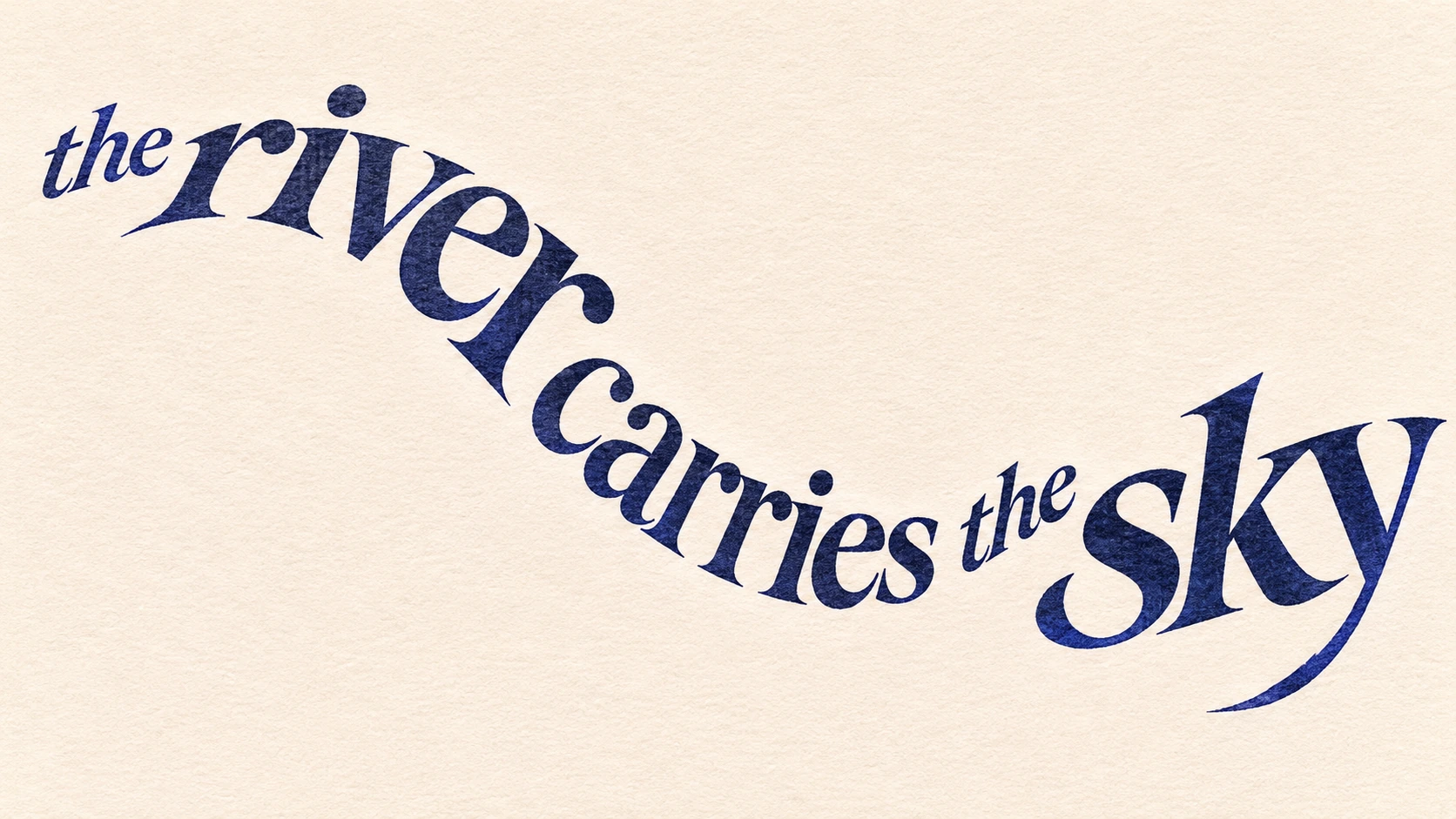
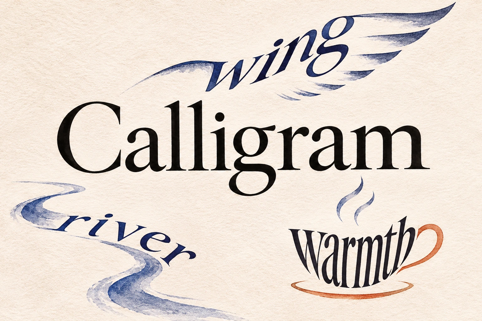
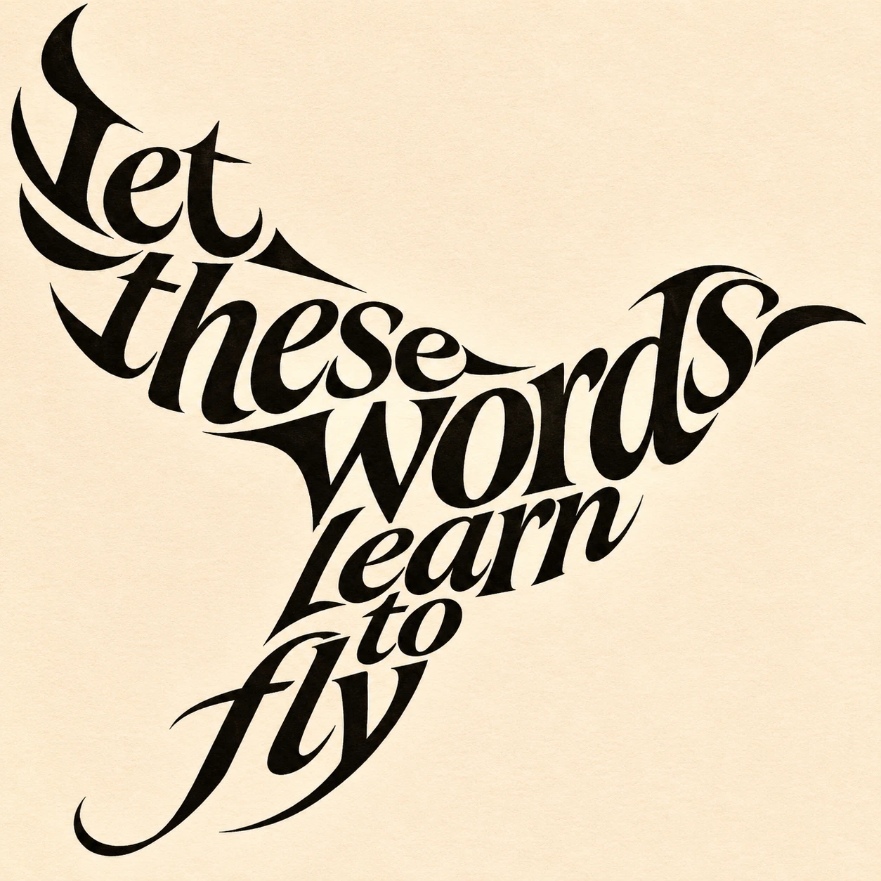
A river of words may bend before the sentence reaches its destination. A wing-shaped arrangement can make a short phrase appear to lift. The visual decision should change the experience of the words. If the same text could be poured into any silhouette without consequence, the result may be decorative word art with little poetic connection.
Write before you squeeze
Start with a short original text whose language has a reason to inhabit the chosen form. Read it aloud, remove unnecessary words, then test several arrangements. Do not preserve an elegant silhouette by adding meaningless filler or breaking a word where its identity becomes obscure.
A useful first exercise is one sentence, one shape and one reading path. More complex works can combine objects or competing directions, but that complexity should reward attention. Keep a plain-text version beside the image so readers can recover the language even when the arrangement is difficult or inaccessible.
Three ways to organize the page
A contour calligram sends text along an edge or motion: a wing, a winding stream, a spiral. A mass calligram varies line lengths and spacing so the text occupies an object's body. A spatial calligram places separate word groups in a relationship, allowing the empty areas to suggest distance or movement.
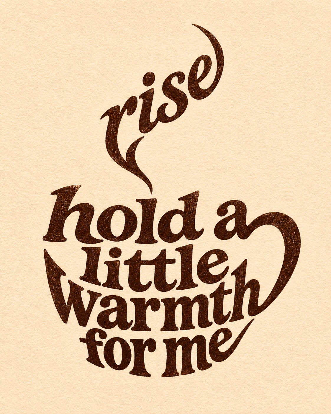
These are practical workshop categories rather than a fixed historical taxonomy. They can overlap. A cup might use a compact text body, a curved word as its handle and a rising word as steam. Ask whether each addition strengthens the poem or simply makes the object easier to identify.
Typography is part of the voice
Letter size changes emphasis; weight changes the apparent density of an object; spacing can suggest breath, speed or hesitation. Use these differences deliberately. A thin line may feel fragile, but if its letters disappear at the intended viewing size, the reader loses the verbal layer.
Black ink on a pale ground is often enough. Color can distinguish reading paths or establish a second meaning, yet it should not be required to decode every word. Test the image at a small size and enlarged. Check individual letters, punctuation, word order and unintended repetitions, especially in generated imagery.
Related forms and useful distinctions
Calligraphy concerns the expressive formation of writing; a calligram concerns the image made by its arrangement. Either can employ the other. Visual poetry is a broader useful context, and not every visual poem needs to depict a recognizable object. A word cloud may share a silhouette while serving a different purpose, such as emphasizing word frequency.
This entry uses original English phrases for its generated demonstrations rather than reproducing Apollinaire's pages. The images are contemporary interpretations, not historical facsimiles. Their short texts are provided below as reading aids; the visual arrangement is the additional layer.
Workshop texts and applications
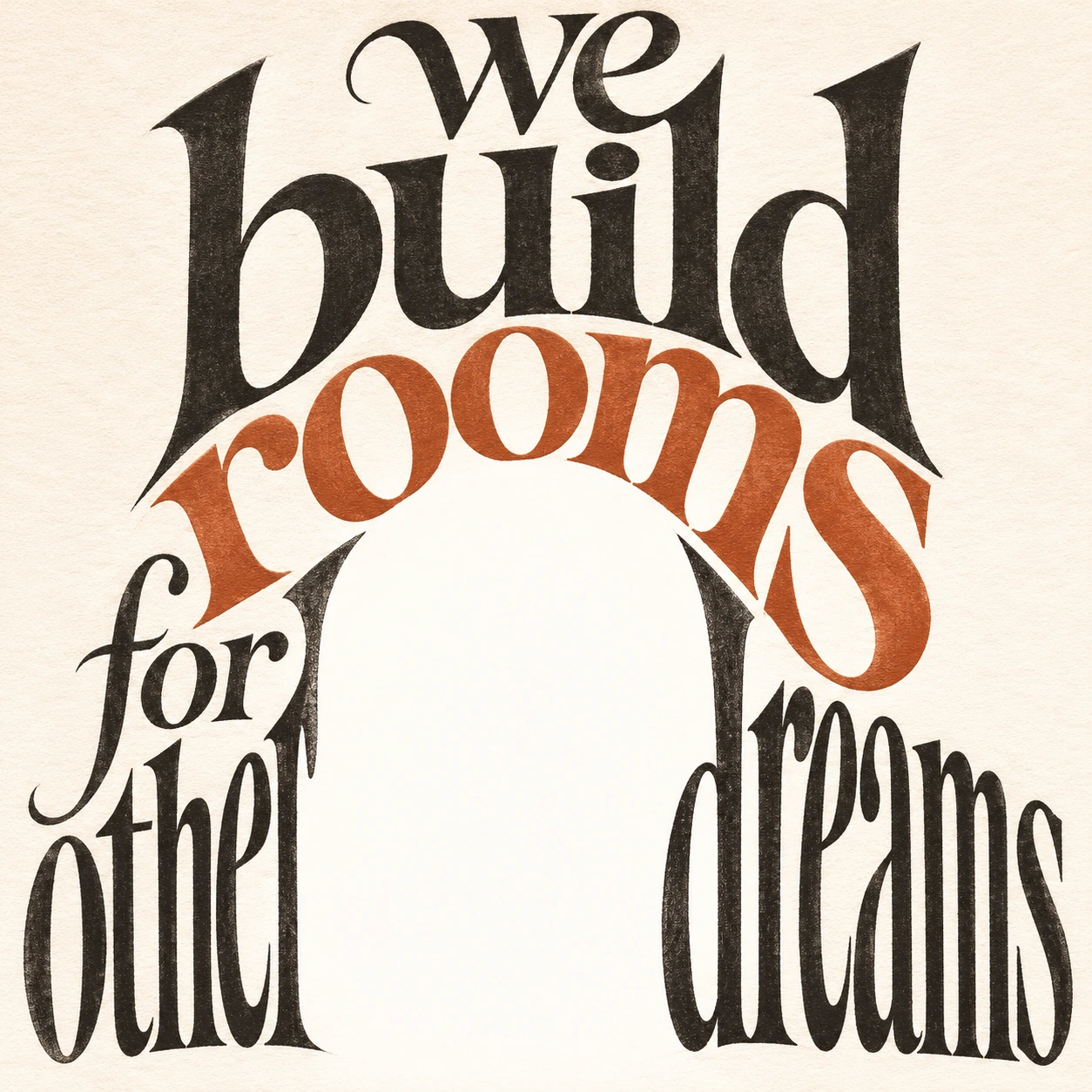
The river study uses: “the river carries the sky.” The wing study uses: “let these words learn to fly.” The cup study uses: “hold a little warmth for me,” with “rise” as steam. The doorway study uses: “we build rooms for other dreams.” These are original AOI phrases; line position and scale turn them into visual exercises.
Calligrams can enrich book pages, poetry posters, editorial illustrations and carefully designed identity work. Keep a transcript and descriptive alternative text available. For print or a small screen, simplify the shape before sacrificing the words. The strongest calligram makes the reader feel why that sentence needed that space.
A small poetic detour
Original words from the AOI studio.
Poetry
A sentence leaves its level track,
And bends to give the river back.
A word grows wings; a pause makes room;
The page becomes a place to bloom.
Read slowly where the letters turn—
The shape has something else to learn.
The prompt workshop
Original creative exercises. These prompts create new illustrations, not documentary evidence.
A sentence becomes a river
Create a calligram using only the exact original words “the river carries the sky”. Arrange the readable words as one flowing river-like curve across pale paper. Let spacing and letter scale suggest movement, with a deep blue ink color and generous white space. No separate river illustration or extra text.
Words attempt flight
Arrange the exact original phrase “let these words learn to fly” into a bird-like calligram with sweeping typographic wings. Keep every word readable, black ink on warm white paper, expressive variation of scale and direction, no drawn bird outline and no extra text.
A cup made of language
Create a calligram cup from the exact words “hold a little warmth for me”, with the word “rise” curling above as steam. Letter arrangement forms the body and handle, refined dark ink on cream paper, clear readable wording, no separate cup drawing.
Your next inspiration
Discover another art style
Follow a visual thread to the next subject.
A smile from the studio
Jokes
The poem applied for a position as a bird. Its spelling was excellent, but the interviewer wanted more lift in the second line. After one careful adjustment to the spacing, it flew out of the page and left the proofreader holding a very elegant blank sheet.