
Painting medium and technique · acrylic colour
A pale wash can hold the distance while one loaded brushstroke brings an orange into the light. Acryl, used here for acrylic painting, names a medium with many possible styles: crisp or atmospheric, smooth or ridged, restrained or exuberant. Its most useful lesson is how to make different kinds of paint handling work together.
A visual introduction
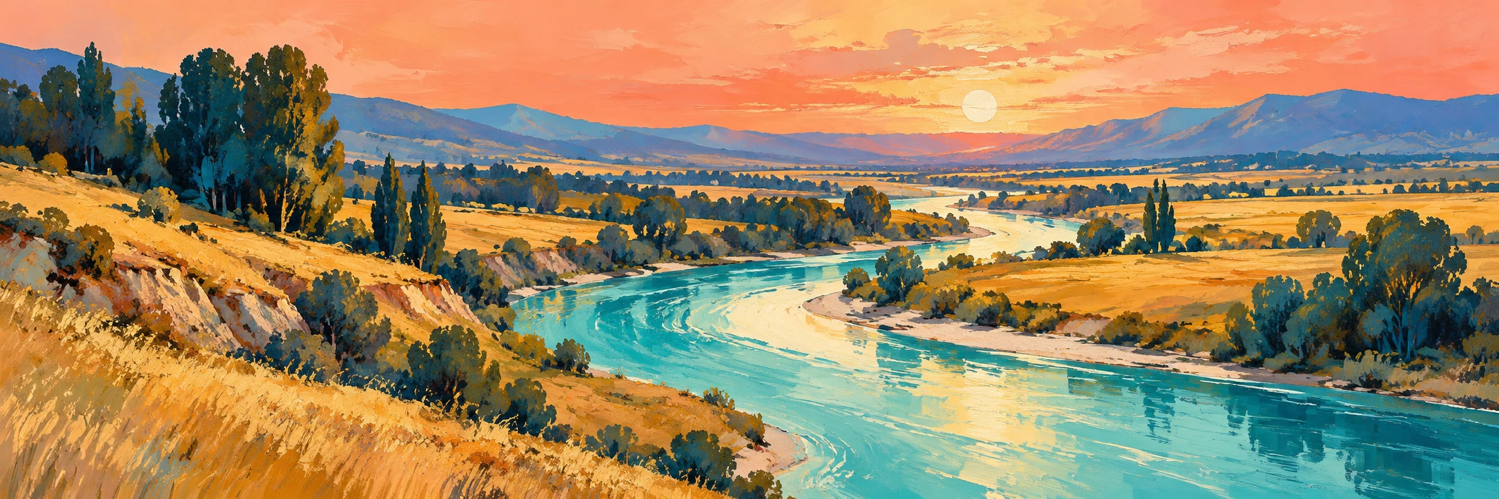
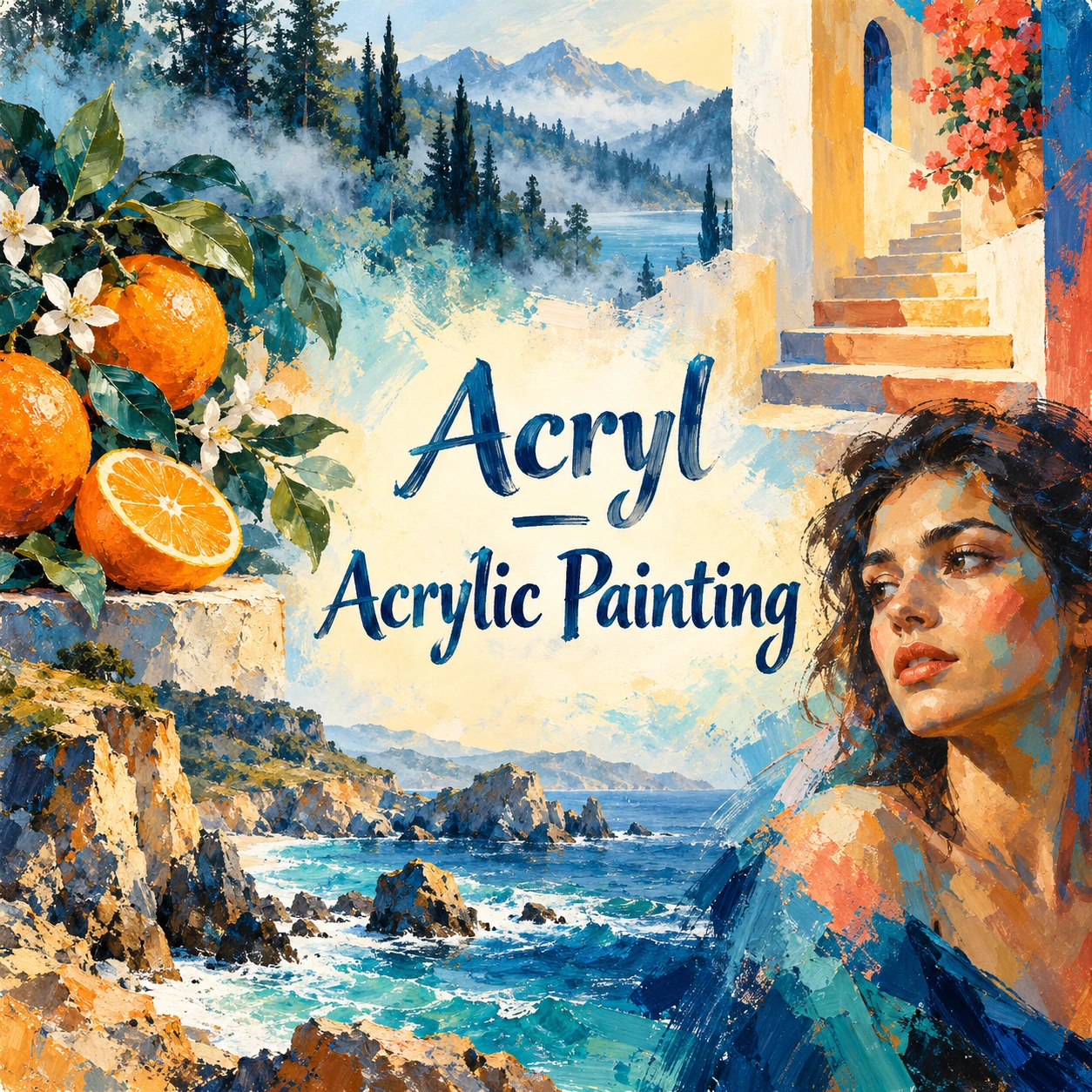
Seven original AI-generated interpretations of acrylic painting: a wide landscape banner, a centrally titled collage and five studies of distinct subjects and paint handling. They illustrate visual possibilities rather than document physical paintings.
Select an image for a closer look. Use the thumbnails, arrow keys or a swipe to compare examples. Zoom in to inspect details, or share the image that inspires you.

Creative toolbox · take this style further
Choose an input and a destination. Search sends your words to the chosen site; Copy & open puts them on your clipboard to paste there.
Create with AI
Turn your chosen input into an image prompt or a new creative direction.
ChatGPT
Copy your input and paste it into a ChatGPT conversation or image request.
Copy & open ChatGPT (new tab)Claude · Anthropic
Develop an image prompt or explore the style in a new Claude conversation.
Copy & open Claude · Anthropic (new tab)Midjourney
Paste your input into the Imagine bar on the Create page.
Copy & open Midjourney (new tab)Adobe Firefly
Copy your input, open Firefly, and paste it into the prompt field.
Copy & open Adobe Firefly (new tab)Leonardo.Ai
Copy your input, open Leonardo, and paste it into the generation field.
Copy & open Leonardo.Ai (new tab)Image search
Find visual references. Short, concrete keywords usually work best.
Lexica
Search AI images and prompts using your selected input.
Search with this input Lexica (new tab)Pexels
Search the photo and video library. Short keywords often work best.
Search with this input Pexels (new tab)Pixabay
Search photos, illustrations and other images.
Search with this input Pixabay (new tab)Unsplash
Search photographs using the style name or your own keywords.
Search with this input Unsplash (new tab)Wikimedia Commons
Search photographs, artworks and historical images. Check each file for its source and reuse terms.
Search with this input Wikimedia Commons (new tab)Art & research
Explore artists, collections and the ideas behind a style.
Wikipedia
Search for background reading. A style may not have its own article.
Search with this input Wikipedia (new tab)WikiArt
Copy your input into WikiArt’s search to explore artists and artworks.
Copy & open WikiArt (new tab)Europeana
Paste your keywords into the search to explore European museum, library and archive collections.
Copy & open Europeana (new tab)Inspiration
Discover portfolios and visual ideas from creative communities.
Instagram hashtags
Search a hashtag made from your input: spaces and punctuation are removed. Instagram may require sign-in.
Search with this input Instagram hashtags (new tab)ArtStation
Paste your input into artwork search for concept art, environments, characters and visual development.
Copy & open ArtStation (new tab)Behance
Paste your input into project search for illustration, design and visual storytelling.
Copy & open Behance (new tab)A closer look
Opaque colour planes beside translucent passages; deliberate brush edges, dry-brush breaks and selective impasto. Surface sheen, opacity and texture vary with pigment, formulation, medium and application rather than defining one compulsory acrylic look.
A medium, not a single art movement
Acryl is the short German label used here for Acrylmalerei, or acrylic painting. In this article the term refers primarily to artists’ water-based acrylic paints, not acrylic sheet, textile fibre or every industrial coating with an acrylic binder. A material name does not prescribe a subject: an acrylic painting can be figurative, abstract, graphic, gestural or minutely observed.
Liquitex describes this paint as pigment held in an acrylic polymer emulsion, with water carrying the mixture while it is wet. As the water leaves, a binding film forms. Its company timeline distinguishes a water-based acrylic gesso in 1955 from its Medium Viscosity Artist Color in 1956. These are documented commercial milestones, not the invention of every synthetic paint or the founding dates of an artistic movement. The useful distinction is between the material’s history and the many styles artists build with it.
Choose the handling before the effect
Consistency is a starting decision. GOLDEN distinguishes thick heavy-body colour that retains brush or knife marks from flowing formulations suited to details, stains and other thin applications. Its range also includes matte paints and slower-drying acrylics. These examples show why “acrylic” alone cannot tell you whether a painting should be glossy, thick, flat or quick to set.
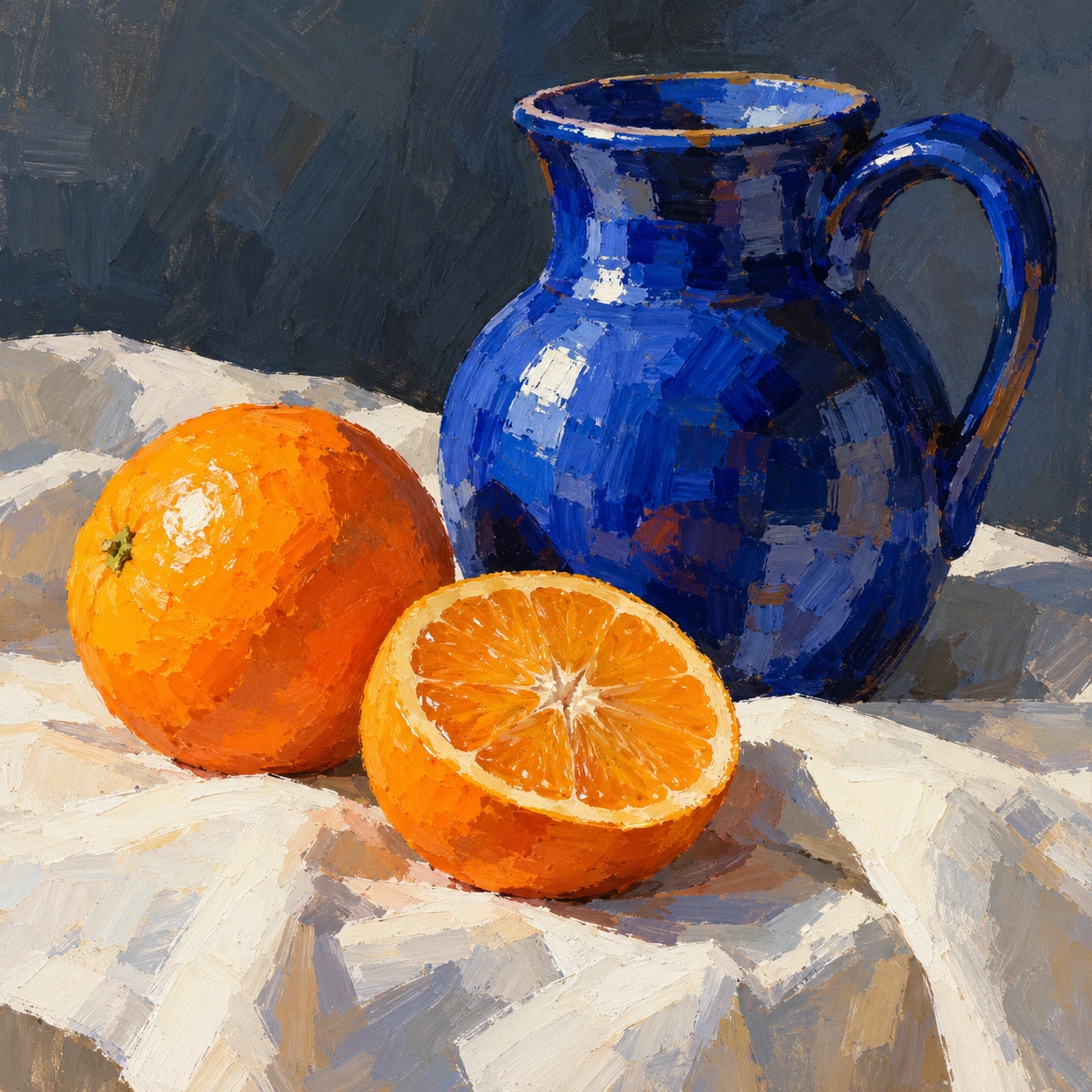
For a study, give each handling method a task. A broad opaque stroke can establish the weight of a jug. A thinner passage can keep the background open. A small raised highlight can describe citrus peel. If every square centimetre has the same ridge, the texture becomes wallpaper. Variation matters more than the maximum amount of paint the image can appear to carry.
Build a picture in layers
Begin with a small value sketch: where are the largest light and dark shapes? Establish those relationships in a lean first pass, then choose the focal area. Work from broad masses toward smaller decisions. A blue jug against a subdued ground needs a coherent silhouette before it needs reflections. A convincing handle comes from its opening and connection to the vessel, not from a stripe of white labelled “shine”.
Once a layer is ready for the next operation, opaque paint can revise an edge or cover a passage. A transparent glaze changes the colour of what remains visible beneath it. GOLDEN’s technical guide explains how gels and mediums can alter consistency, transparency and sheen. Choose a compatible product for the intended operation and follow its instructions; adding medium is a material decision, not a guarantee that any mixture or surface will behave well.
Let drying time shape the sequence
Acrylic often encourages a useful rhythm: establish a passage, allow it to settle, then make the next decision. GOLDEN distinguishes a surface becoming touch-dry from the whole paint film drying through. Thickness, support and surrounding conditions affect that process. A dry-looking surface is therefore a poor clock for a deep ridge or gel layer. Avoid promising one universal number of minutes.
For a soft transition, prepare adjacent colours before working the area and keep the passage manageable. If the surface begins to drag, repeated scrubbing may make a worse edge rather than a smoother blend. Let it dry and revise in another layer, or select a slower-working formulation for a later study. The point is not to race the paint; it is to choose an order of work that suits the result.
Four techniques worth telling apart
Opaque layering builds a shape by placing covering colour over another passage. Glazing uses a transparent layer so the earlier information remains visible. Dry-brushing drags a relatively spare load across surface texture, leaving broken marks. Impasto gives paint actual relief through thicker application. These can coexist, but they should remain distinguishable enough for the viewer to understand what each contributes.
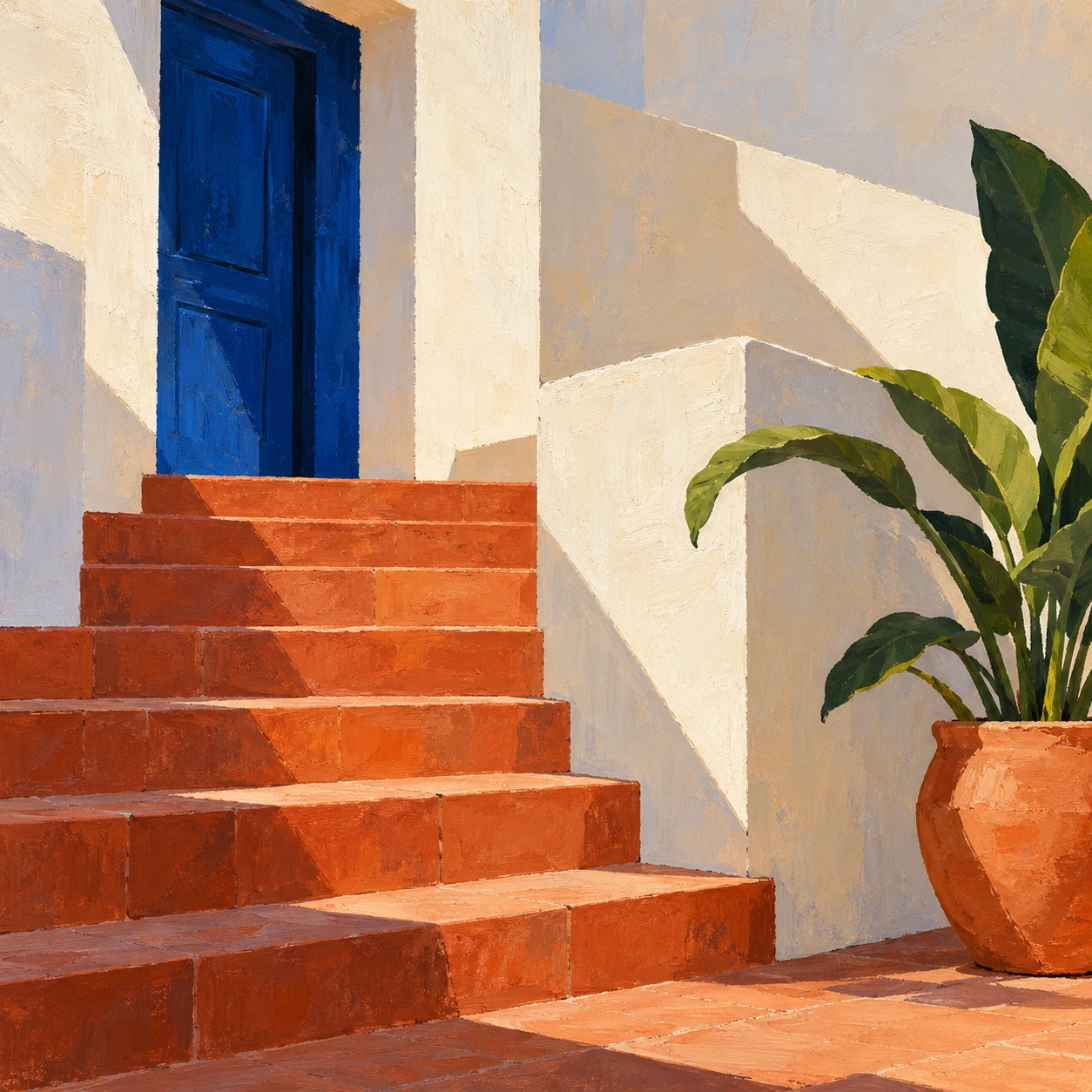
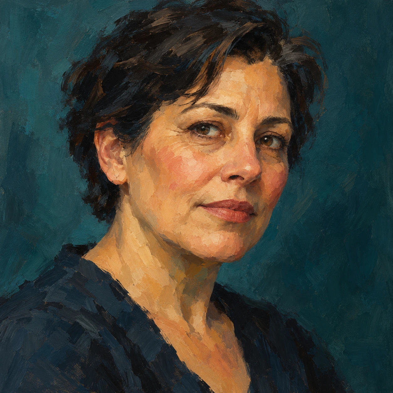
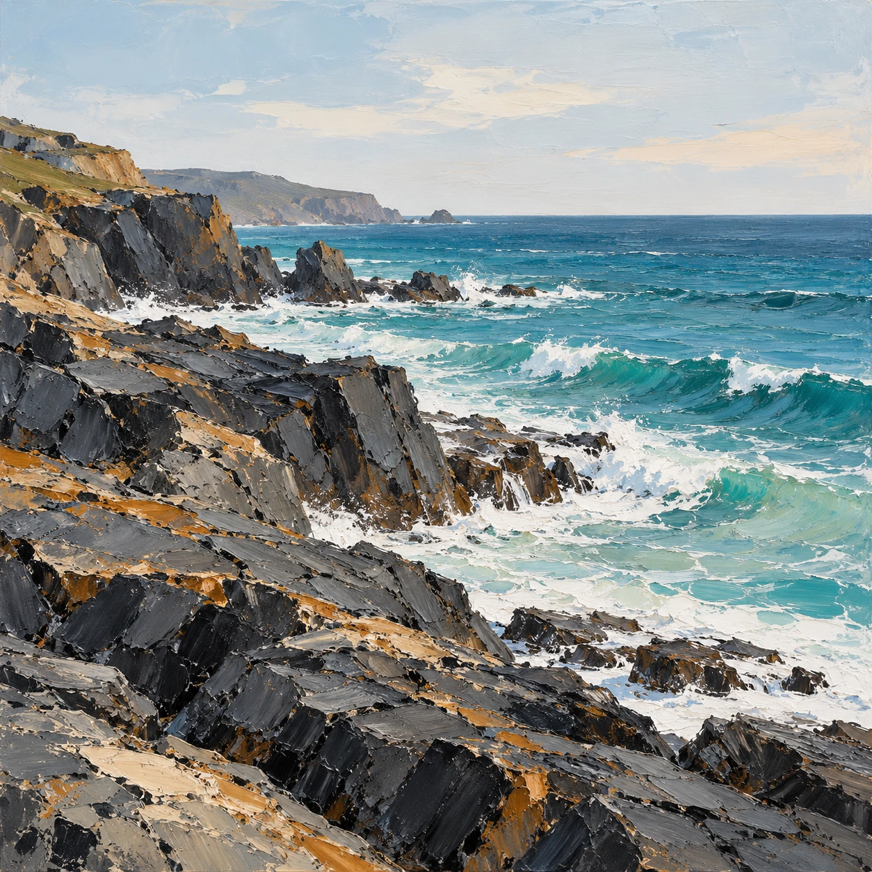
The gallery gives them different jobs. Citrus and jug use broad opaque modelling; the birch scene explores luminous depth and selective trunk marks; the courtyard tests flatter colour and controlled edges; the portrait organizes features into warm and cool planes; the coast contrasts rough rock marks with quieter water and sky. The images illustrate the appearance of these decisions. They do not document a physical layering sequence, and pixels cannot establish which real paint or tool made a mark.
Colour, edge and surface
Plan a hierarchy of edges. A sharply defined doorway can hold an otherwise quiet courtyard together. A distant tree line can lose an edge into mist, while a nearby white trunk remains clear. In the portrait, the turn of the cheek should explain the face before a lively stroke calls attention to itself. Paint handling earns its place by describing form, light or movement.
Check colour relationships after a test passage has dried. Liquitex notes that the binder’s wet appearance can affect colour and that the change is more noticeable in some paints than others. Do not compensate with a blanket rule such as “always mix lighter”. Compare an actual dried swatch. Likewise, restrained ochre or grey can be as useful as saturated blue: brightness becomes expressive when the composition gives it a reason to stand out.
The support and the finished object
Prepared canvas, suitable painting paper and a properly prepared panel offer different textures and absorbencies. Choose the support with the kind of mark in mind, then test the paint system on it. A rough tooth may help a broken brushstroke while frustrating a finely controlled edge. For physical work, consult the manufacturer’s preparation guidance rather than assuming that adhesion to one surface proves adhesion to all surfaces.
Describe dry acrylic as water-resistant rather than treating “waterproof” as a universal promise. A painting’s behaviour involves the paint, support, preparation and exposure. Water-based also does not mean every colour or additive is automatically harmless. Use the product’s current label and safety information; collect paint residue and follow local disposal guidance. These practical choices belong to making an object, while an AI interpretation remains an image of possible paint handling.
A useful exercise and a better prompt
Paint or generate the same simple jug twice. In the first version, use five large opaque shapes and almost no surface relief. In the second, retain the same drawing but introduce a thin background, a broken edge and only two or three thicker accents. Compare where your eye enters each image. The second version succeeds only if the additional handling clarifies something the first version could not.
For image generation, name the operation and its location: “opaque cobalt planes on the jug, a thin muted background, thick cream highlights only on the orange”. Add a subject, viewpoint and edge hierarchy before asking for texture. Avoid treating “acrylic masterpiece” as a complete specification. For real painting, the corresponding task is to select a paint and support, make a small proof, and revise from the material’s actual response.
Positive editorial assessment · AI-authored
Acrylic’s strongest opportunity is the coexistence of different kinds of handling within one coherent picture. The jug study makes broad colour describe volume, while the courtyard finds interest in flatter shapes and the coast reserves relief-like marks for rock and foam. This variety can make a limited subject feel spacious. The achievement lies in choosing where each mark belongs, rather than treating speed or saturation as virtues by themselves.
Negative editorial assessment · AI-authored
An acrylic interpretation becomes generic when every edge is equally sharp, every colour equally loud and every surface covered in the same digital impasto. That combination can flatten depth while advertising texture. Simplify the value design, reserve thick accents for a few places and give quiet passages enough space. In physical work, an attractive surface is also no substitute for suitable preparation or adequate drying.
Neutral editorial assessment · AI-authored
Acrylic painting is a broad material practice whose appearance depends on formulation, support and application. It suits controlled layering as well as direct, visible brushwork, with different working times available in different systems. This article offers compositional exercises and generated visual studies. It does not identify physical paint from an image or certify a painting’s materials, durability or provenance.
Pocket-sized facts
Acrylic painting is a medium-based practice, not one historical movement.
Acrylic paints can be thick or fluid, transparent or opaque, matte or glossier depending on formulation and use.
Touch-dry and thoroughly dry describe different stages.
The seven AOI illustrations are generated interpretations of paint handling, not photographs of physical paintings.
A small poetic detour
Original words from the AOI studio.
Poetry
The Layer That Lets Light Stay
The blue jug keeps a room inside its blue.
An orange lends the cloth a little heat.
I leave a pale edge where the light comes through
and let the darker brushstroke find its seat.
Beyond the birches, water thins to air;
a quieter colour gives the distance room.
One broken mark can say a reed is there;
another, spared, can keep the bank from gloom.
The stair is firm. The cheek turns toward the day.
The rock keeps ridges where the white waves run.
Each surface asks how much a mark should say,
each stroke a task before the task is done.
I stop before the light is painted out.
The layer underneath still has its say.
The hand can leave a little room for doubt
and let the finished colour hold the day.
The prompt workshop
Original creative exercises. These prompts create new illustrations, not documentary evidence.
Start simple: jug, orange and five shapes
Create an original acrylic-painting interpretation of a cobalt ceramic jug beside one whole orange and a cut half on pale cloth. Establish five large light and dark shapes, then add selective opaque brush marks. Keep the handle and rim coherent, the background quiet and the thickest highlights on the fruit. No lettering or signature.
Start with drawing and value; texture should explain the objects.
Build depth: birches beside water
Compose an original acrylic-style landscape of birch trees beside still water in morning light. Use thin translucent-looking teal and violet passages for distance, selective opaque white trunk marks and broken dry-brush reeds in the foreground. Keep reflections coherent and leave a calm opening toward the light. No text.
Ask for a hierarchy of thin and opaque passages, not equal texture everywhere.
Experiment: one courtyard, two kinds of edge
Design an imagined acrylic-painted courtyard with a terracotta stair, cobalt doorway, cream walls and one green plant. Use flatter opaque colour with crisp architectural edges, then soften one shadow transition and add a few broken leaf marks. Preserve plausible stair geometry. No signage or signature.
Compare the result with a version using only flat shapes; keep changes that improve the composition.
Your next inspiration
Discover another art style
Follow a visual thread to the next subject.
A smile from the studio
Jokes
The meeting about the sky
The painter mixed the exact blue for the sky, then received a call from Editorial.
“Could we discuss whether the blue communicates openness?”
“Briefly,” said the painter.
Editorial proposed a meeting, a smaller meeting to prepare for it, and a shared document called Blue: A Living Conversation.
When the painter returned to the palette, the blue was no longer interested in conversation. It had formed a small, decisive skin.
“Can you reopen it?” asked Editorial.
“I can mix a new passage.”
“Will that preserve the original strategic direction?”
The painter looked at the canvas. The blue jug was finished, the oranges were behaving, and the sky was still blank.
“Yes. The direction is up.”
They agreed that the next meeting would take place after the painting was dry. The painter carefully asked which meaning of dry they had in mind.
An original fictional studio joke about working time and unnecessary meetings.
Sources and further exploration
Liquitex — what acrylic paint contains; binder, water and wet-to-dry colour change
Liquitex — company timeline distinguishes the 1955 gesso and 1956 artists’ colour
GOLDEN — compare thick, fluid, matte and slower-working acrylic formulations
GOLDEN — technical notes on surface drying, through-drying and influential conditions
GOLDEN — how gels and mediums change consistency, transparency and sheen
GOLDEN — preparing painting supports and understanding absorbency
Liquitex — product labelling, studio practice and disposal guidance