
Stencil duplicating process · contemporary print culture
Risograph colour is built in layers. A blue shape and a pink shape can meet as a third colour, while the paper and tonal screen remain part of the image. The most persuasive work treats those relationships as design decisions, not as an excuse to add fluorescent noise everywhere.
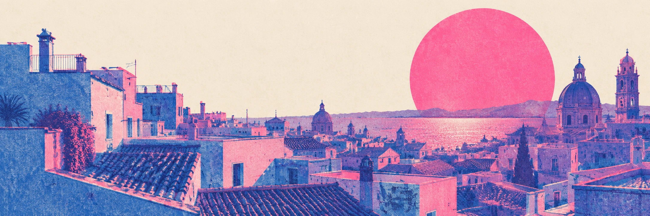
A visual introduction
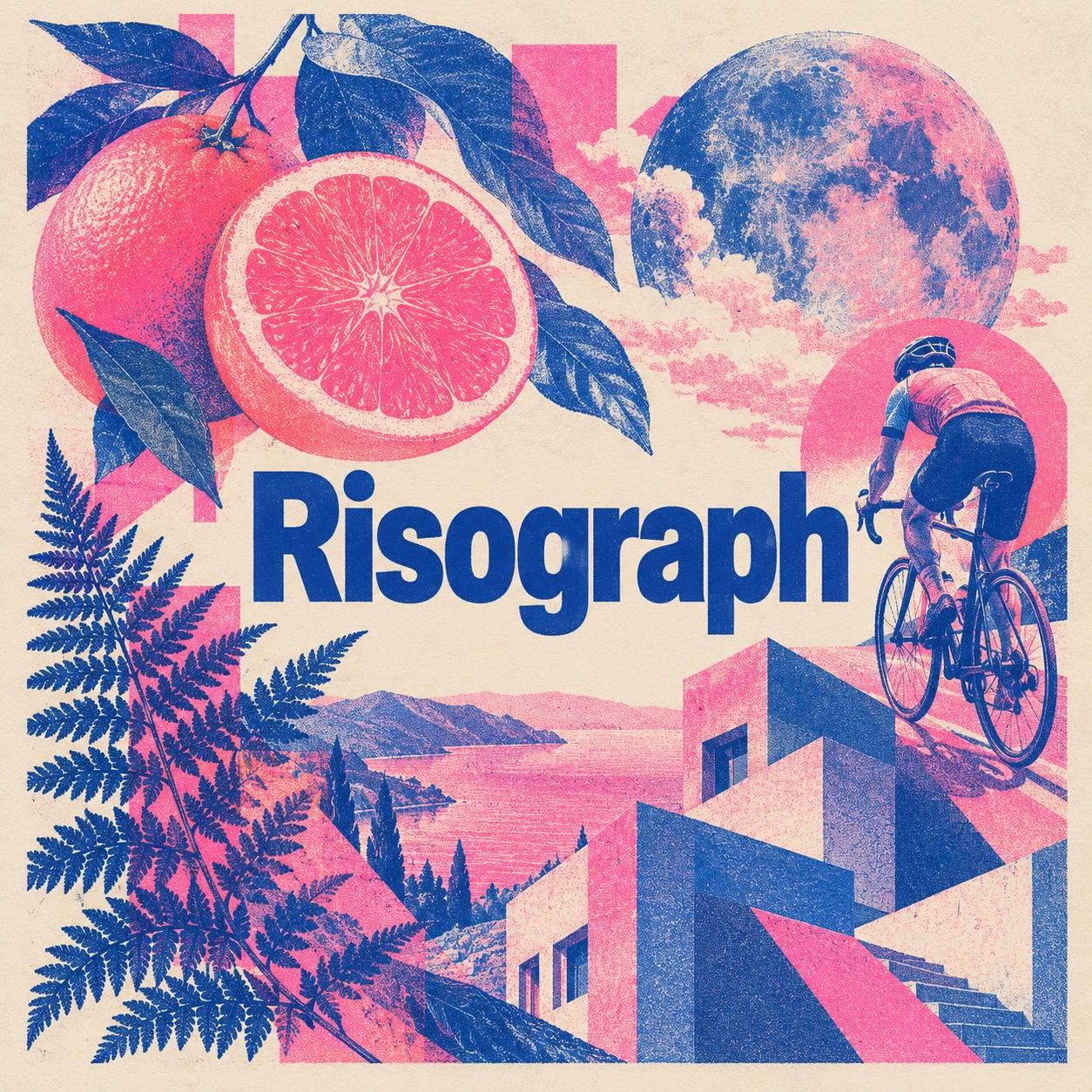
Seven original AI-generated interpretations: a dedicated banner, a centrally titled collage and five standalone studies. These are contemporary illustrations, not historical objects or proof of a physical printing process.
Select an image for a closer look. Use the thumbnails, arrow keys or a swipe to compare examples. Zoom in to inspect details, or share the image that inspires you.
Creative toolbox · take this style further
Choose an input and a destination. Search sends your words to the chosen site; Copy & open puts them on your clipboard to paste there.
Create with AI
Turn your chosen input into an image prompt or a new creative direction.
ChatGPT
Copy your input and paste it into a ChatGPT conversation or image request.
Copy & open ChatGPT (new tab)Claude · Anthropic
Develop an image prompt or explore the style in a new Claude conversation.
Copy & open Claude · Anthropic (new tab)Midjourney
Paste your input into the Imagine bar on the Create page.
Copy & open Midjourney (new tab)Adobe Firefly
Copy your input, open Firefly, and paste it into the prompt field.
Copy & open Adobe Firefly (new tab)Leonardo.Ai
Copy your input, open Leonardo, and paste it into the generation field.
Copy & open Leonardo.Ai (new tab)Image search
Find visual references. Short, concrete keywords usually work best.
Lexica
Search AI images and prompts using your selected input.
Search with this input Lexica (new tab)Pexels
Search the photo and video library. Short keywords often work best.
Search with this input Pexels (new tab)Pixabay
Search photos, illustrations and other images.
Search with this input Pixabay (new tab)Unsplash
Search photographs using the style name or your own keywords.
Search with this input Unsplash (new tab)Wikimedia Commons
Search photographs, artworks and historical images. Check each file for its source and reuse terms.
Search with this input Wikimedia Commons (new tab)Art & research
Explore artists, collections and the ideas behind a style.
Wikipedia
Search for background reading. A style may not have its own article.
Search with this input Wikipedia (new tab)WikiArt
Copy your input into WikiArt’s search to explore artists and artworks.
Copy & open WikiArt (new tab)Europeana
Paste your keywords into the search to explore European museum, library and archive collections.
Copy & open Europeana (new tab)Inspiration
Discover portfolios and visual ideas from creative communities.
Instagram hashtags
Search a hashtag made from your input: spaces and punctuation are removed. Instagram may require sign-in.
Search with this input Instagram hashtags (new tab)ArtStation
Paste your input into artwork search for concept art, environments, characters and visual development.
Copy & open ArtStation (new tab)Behance
Paste your input into project search for illustration, design and visual storytelling.
Copy & open Behance (new tab)A closer look
Distinct spot-colour layers, grain or halftone tones, visible paper, deliberate translucent overlaps and occasional restrained registration variation; bold shapes with an intelligible colour plan.
Name the process accurately
Risograph is RISO’s duplicating system, and “Riso printing” is common shorthand for the associated process and creative practice. RISO dates the system’s debut to 1980. The supplied spelling “Risesograph Printing” is treated here as a spelling variant, not a separate technique. The article uses the conventional name Risograph so readers can find the relevant process and sources.
RISO explains that an image is made into a master stencil wrapped around an ink drum. Ink passes through that stencil onto the paper as the drum turns. Additional colours require their own separations and masters; the precise pass sequence depends on the machine configuration. This is a printing process with material consequences, not simply a digital colour filter.
Think in separations
Begin by deciding what each ink layer contributes. One might carry the structural drawing while another supplies atmosphere or a large accent. Imagine the layers separately before considering their overlap. If either layer is an accidental collection of fragments, the combined image may be difficult to control. A two-colour composition can contain considerable variety without imitating full-colour photography.
The gallery uses blue and fluorescent pink as an illustrative pairing. The violet overlap is a design choice that demonstrates the idea of combined layers; it is not a calibrated prediction of a particular ink and paper combination. Real output requires proofs. Treat on-screen colour as a planning aid, especially when saturated or fluorescent inks are part of the intended physical result.
Paper and tone are active parts
A tonal screen can turn a solid shape into a field of dots or grain. Use that field to describe light, depth or surface, rather than assigning the same texture to every object. A bottle may benefit from a broad blue mass, while a citrus slice can use a finer internal rhythm. Leave enough paper visible for the colours to remain distinct.
RISO’s creative printing guidance discusses uncoated stocks and layered colour. For a production project, check the capabilities and requirements of the actual printer and chosen stock. For a generated illustration, make the implied paper and ink behaviour coherent. A glossy plastic surface covered in random fluorescent speckles does not become a convincing print merely because it is labelled Risograph.
Registration is a tool, not an obligation
A slight offset between layers can introduce a lively edge or reveal how the image was assembled. It should be placed with judgment. Keep faces, narrow rails and important contours readable. A global displacement that breaks every intersection is usually less interesting than one small area where the overlap becomes visible.
Do not make errors the definition of the process. A well-planned print can use careful registration, clean lettering and controlled tones. Conversely, a digital imitation can be perfectly aligned while still exploring spot-colour relationships. The relevant question is whether the layers cooperate, not whether the image has enough accidents to look fashionable.
Five studies of layered colour
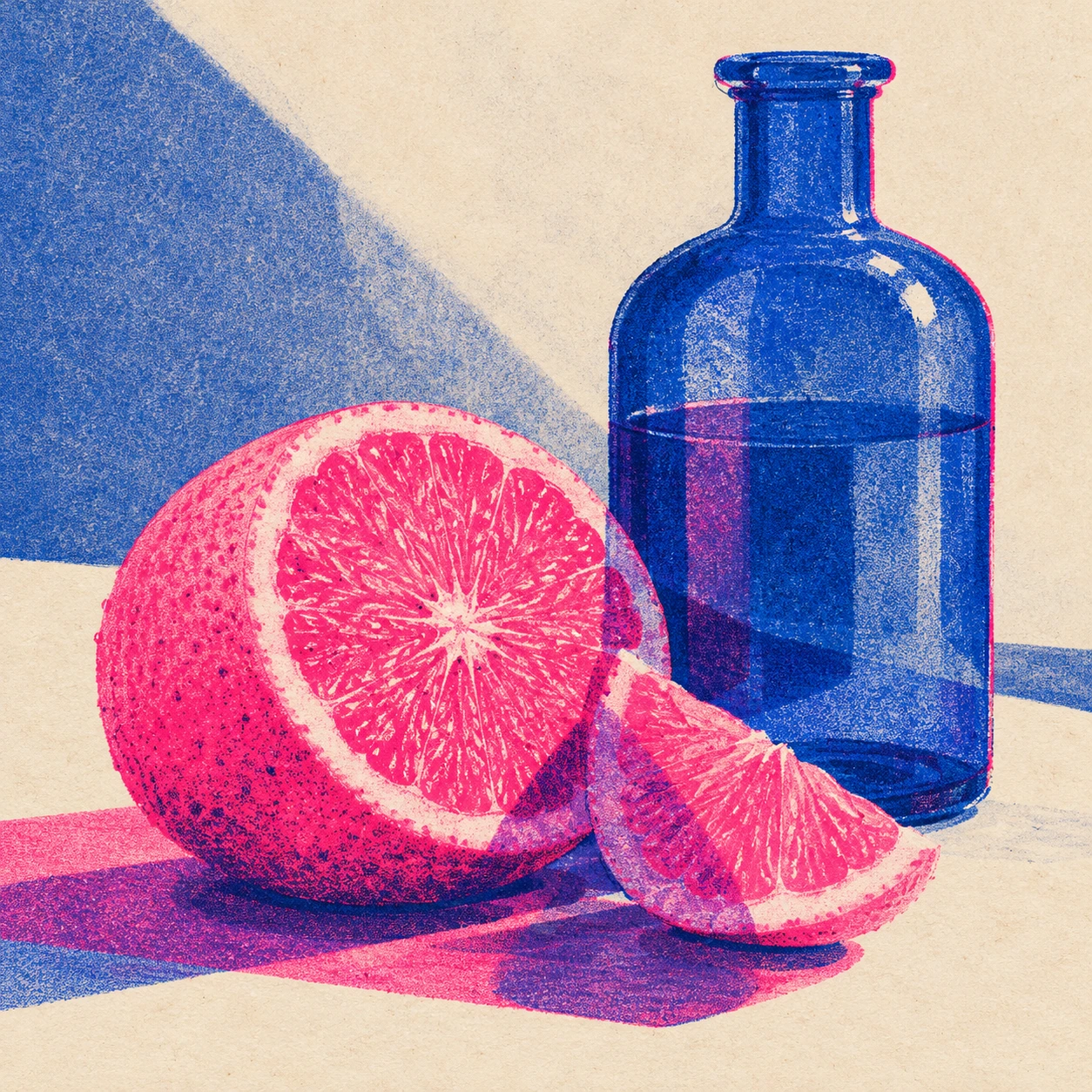
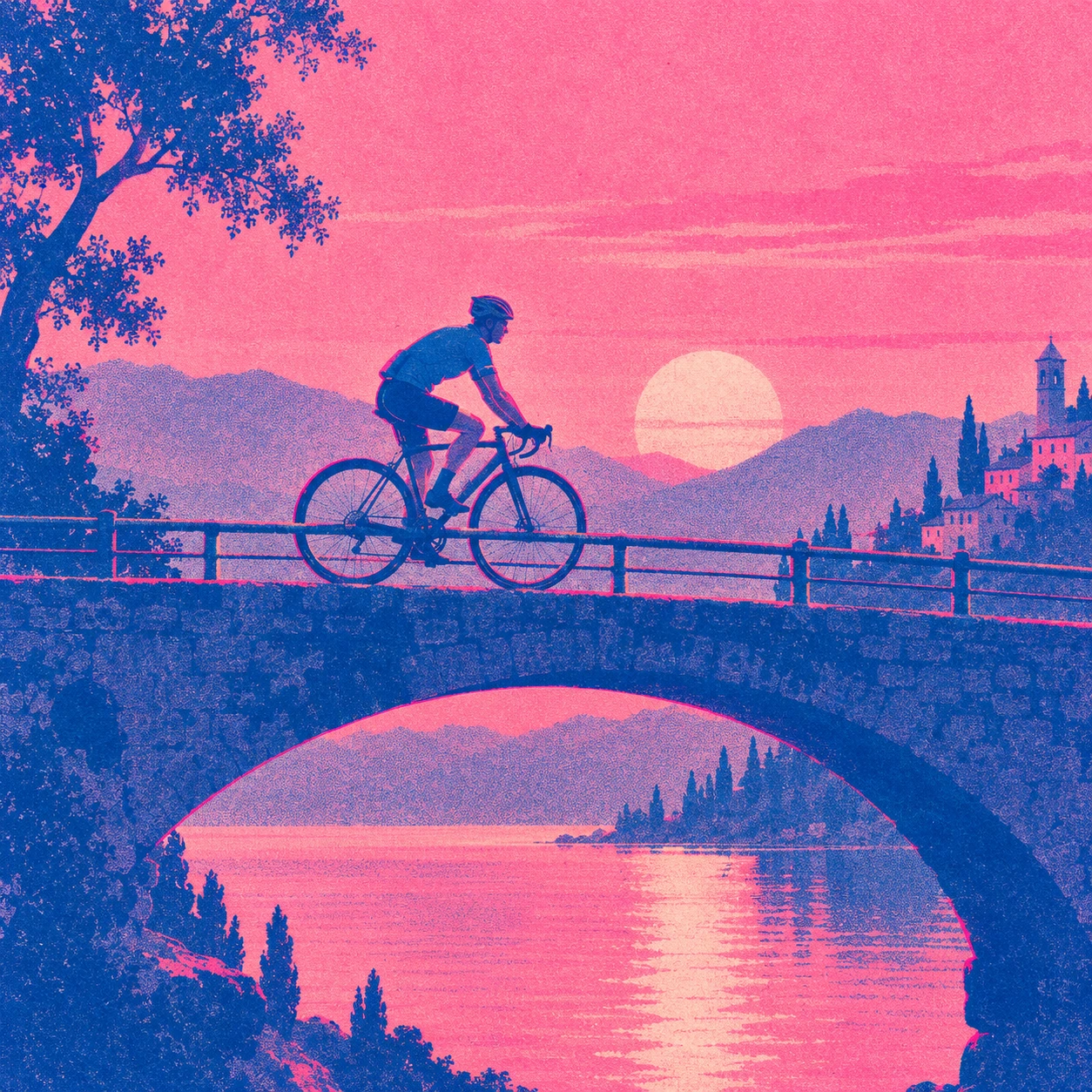
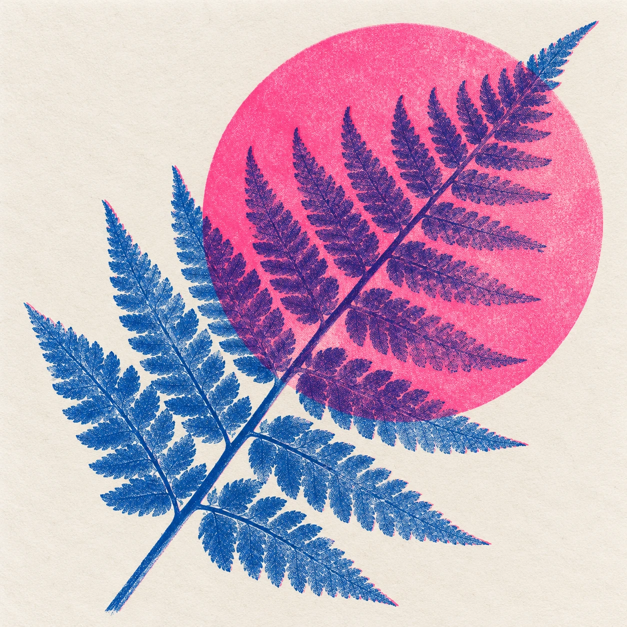
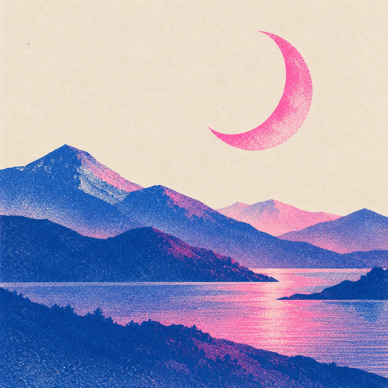
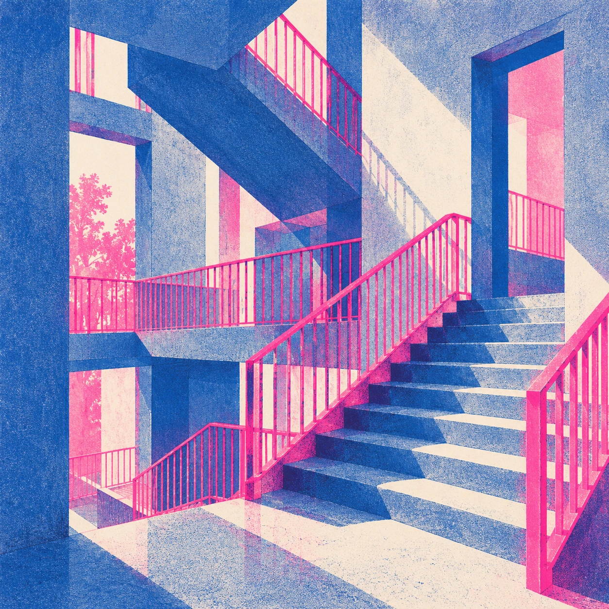
The citrus and bottle study tests contrasting round and vertical forms. The cyclist tests a moving figure and readable mechanical structure. The fern tests fine branching against a broad colour field. The moon landscape tests quiet space and large tonal masses. The stairwell tests coherent architecture, rails and overlapping planes. Each gives the two inks a different task.
Inspect small structural details after checking the overall colour plan. A cyclist still needs a plausible relation between body, pedals and wheels. A stairwell needs a believable path and connections. Grain should not be allowed to conceal those problems. If the drawing fails, simplify it before adding another colour or a stronger paper texture.
From visual reference to practical use
Risograph-inspired composition can support posters, zines, editorial images and small publications. It is particularly useful when a limited palette is part of the idea rather than a compromise applied at the end. The original AOI images demonstrate visual approaches; they are not separated production files or evidence of a physical print run.
For physical work, discuss separations, stock, coverage and proofs with the printer handling the job. For digital work, retain honest captions and evaluate the design at its intended display size. The strongest revision often removes an unnecessary effect: less offset, a quieter grain field, or one larger area of untouched paper. Colour becomes more vivid when it has something clear to do.
Positive editorial assessment · AI-authored
The strongest Risograph-inspired images let a small number of layers generate a rich visual conversation. The bottle and citrus approach gives overlap a clear purpose, while the fern study contrasts fine branching with a broad colour field. Grain and paper become useful tonal resources. A limited palette can produce variety without sacrificing a recognizable hierarchy.
Negative editorial assessment · AI-authored
Fluorescent colour, grain and misregistration can become a formula that obscures weak drawing. An offset on every edge is not a substitute for a thoughtful separation plan. Improve the image by assigning each layer a job, keeping important contours coherent and preserving quiet paper. Do not present generated texture as proof of a physical printing process.
Neutral editorial assessment · AI-authored
Risograph refers to a specific duplicating technology and the creative work made with it. This article introduces its layer-based logic through original digital interpretations. The gallery is useful for compositional comparison but is not colour-calibrated, separated for production or physically proofed. Actual print preparation depends on the selected equipment, inks and stock.
Pocket-sized facts
“Risesograph Printing” is retained as a supplied spelling variant of Risograph printing.
Separate colour layers and masters are central to the process.
The gallery contains AI-generated interpretations, not physical prints.
A small poetic detour
Original words from the AOI studio.
Poetry
Where the Two Colours Meet
The blue arrives with somewhere else to go.
The pink lays down a weather of its own.
Between their edges, deeper colours grow;
the paper keeps the light they leave alone.
A wheel is dark against a passing field.
A leaf divides the grain into a vein.
The second layer lets the first be revealed,
then gives the same small shape another name.
One slight displacement shows the work was built.
One quiet margin lets the brightness breathe.
The picture needs no catalogue of guilt
for every lovely overlap beneath.
The prompt workshop
Original creative exercises. These prompts create new illustrations, not documentary evidence.
Start simple: two inks and a still life
Create an original Risograph-inspired print of a pink citrus slice beside a blue bottle on cream paper. Use distinct spot-colour layers, a controlled violet overlap and different tonal screens for the two objects. No lettering or signature.
Judge the separations as well as the combined image.
Build a moving composition
Make an original two-colour print-inspired illustration of one cyclist crossing a simple bridge. Preserve plausible body and bicycle geometry. Use blue for structure, pink for a broad atmospheric shape and restrained grain in secondary areas.
Registration variation should not break important contours.
Experiment: a leaf and a colour field
Create a blue fern frond crossed by a translucent pink circle on uncoated-paper-like cream. Let the overlap become violet and vary the leaf’s tonal density. Leave generous open paper.
A visual study, not a calibrated prediction of ink behaviour.
Your next inspiration
Discover another art style
Follow a visual thread to the next subject.
A smile from the studio
Jokes
The accidental third colour
The designer approved a two-colour poster, then discovered a third colour where the blue and pink overlapped.
“Who authorized the purple?”
The printer explained that the two inks had met on the paper.
The designer asked whether they had held a planning meeting first. The printer said the registration marks were the closest thing available.
After a long look, the designer decided the purple was essential and requested it everywhere.
“Then we will need to discuss what happens to the blue and pink,” said the printer.
They settled on one generous overlap and a large cream margin. The margin declined to attend the colour meeting, which greatly improved the composition.
An original fictional printing-studio joke.
Sources and further exploration
RISO UK — creative Risograph printing, masters, drums and colour layers