
Hand-stencilled colour · printmaking technique
Pochoir gives colour a carefully cut boundary and a human touch. Brilliant pigment, clean shapes and subtle variations within them create an unusually vivid meeting of precision and handling. The technique rewards looking at edges as closely as at the decorative whole.
A visual introduction
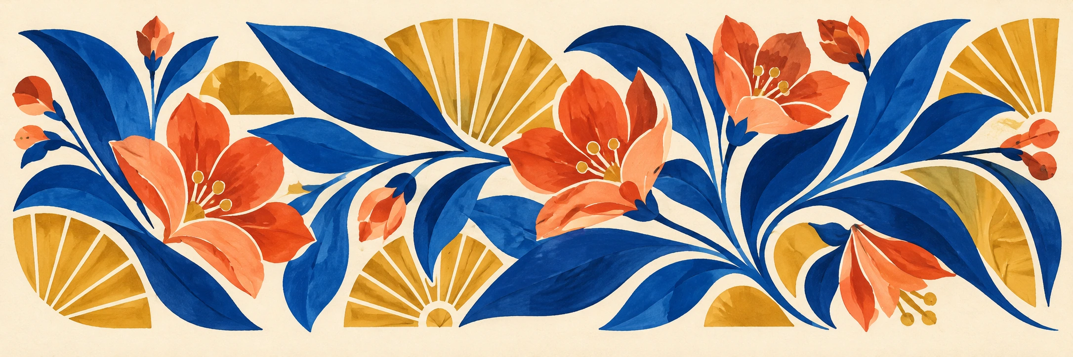
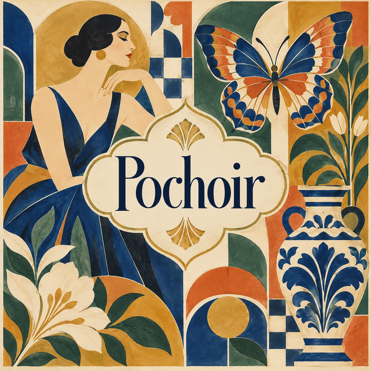
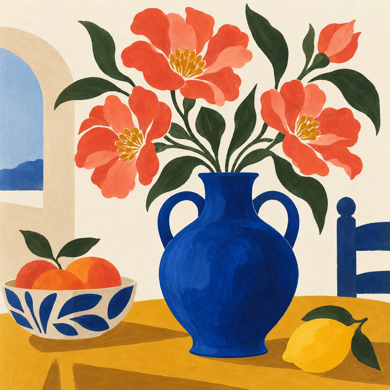
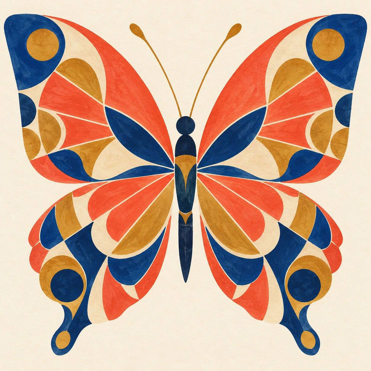
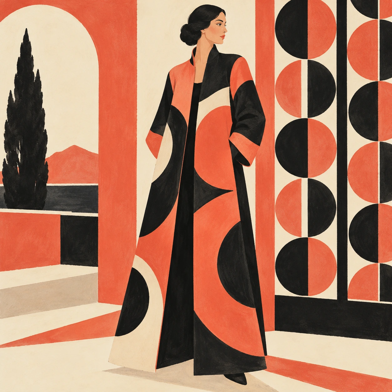
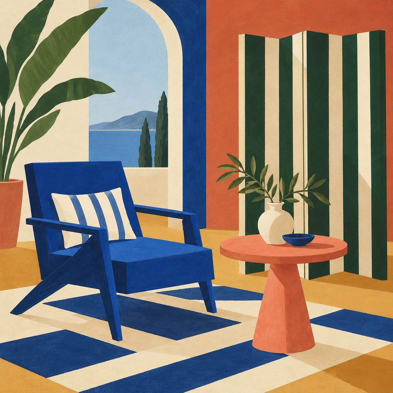
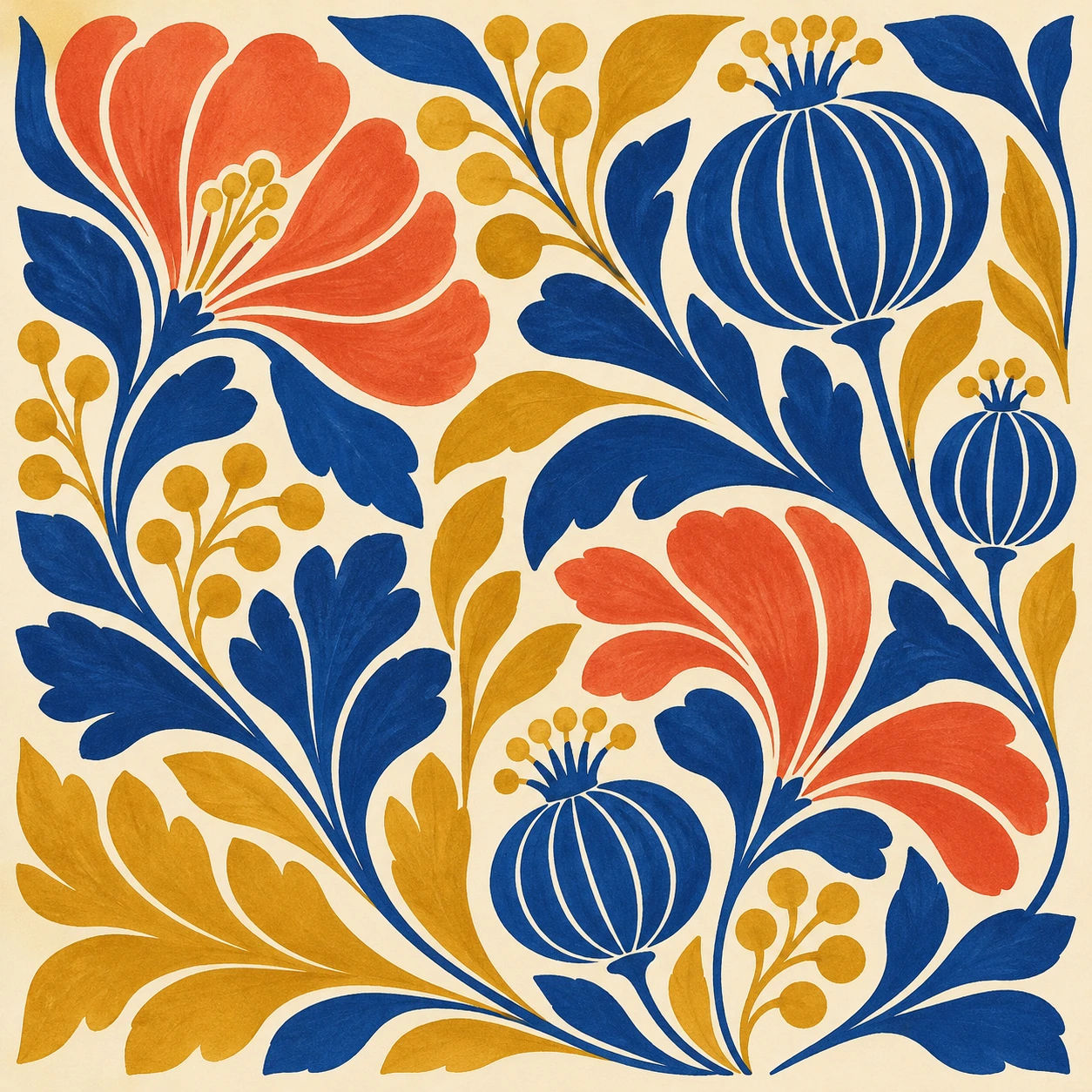
Seven original AI-generated interpretations: a dedicated banner, a centrally titled collage and five standalone studies. These are contemporary illustrations, not historical objects or proof of a physical printing process.
Select an image for a closer look. Use the thumbnails, arrow keys or a swipe to compare examples. Zoom in to inspect details, or share the image that inspires you.
Creative toolbox · take this style further
Choose an input and a destination. Search sends your words to the chosen site; Copy & open puts them on your clipboard to paste there.
Create with AI
Turn your chosen input into an image prompt or a new creative direction.
ChatGPT
Copy your input and paste it into a ChatGPT conversation or image request.
Copy & open ChatGPT (new tab)Claude · Anthropic
Develop an image prompt or explore the style in a new Claude conversation.
Copy & open Claude · Anthropic (new tab)Midjourney
Paste your input into the Imagine bar on the Create page.
Copy & open Midjourney (new tab)Adobe Firefly
Copy your input, open Firefly, and paste it into the prompt field.
Copy & open Adobe Firefly (new tab)Leonardo.Ai
Copy your input, open Leonardo, and paste it into the generation field.
Copy & open Leonardo.Ai (new tab)Image search
Find visual references. Short, concrete keywords usually work best.
Lexica
Search AI images and prompts using your selected input.
Search with this input Lexica (new tab)Pexels
Search the photo and video library. Short keywords often work best.
Search with this input Pexels (new tab)Pixabay
Search photos, illustrations and other images.
Search with this input Pixabay (new tab)Unsplash
Search photographs using the style name or your own keywords.
Search with this input Unsplash (new tab)Wikimedia Commons
Search photographs, artworks and historical images. Check each file for its source and reuse terms.
Search with this input Wikimedia Commons (new tab)Art & research
Explore artists, collections and the ideas behind a style.
Wikipedia
Search for background reading. A style may not have its own article.
Search with this input Wikipedia (new tab)WikiArt
Copy your input into WikiArt’s search to explore artists and artworks.
Copy & open WikiArt (new tab)Europeana
Paste your keywords into the search to explore European museum, library and archive collections.
Copy & open Europeana (new tab)Inspiration
Discover portfolios and visual ideas from creative communities.
Instagram hashtags
Search a hashtag made from your input: spaces and punctuation are removed. Instagram may require sign-in.
Search with this input Instagram hashtags (new tab)ArtStation
Paste your input into artwork search for concept art, environments, characters and visual development.
Copy & open ArtStation (new tab)Behance
Paste your input into project search for illustration, design and visual storytelling.
Copy & open Behance (new tab)A closer look
Crisp stencil boundaries, brilliant flat or gently graduated pigment, controlled brush variation, carefully separated colours and tactile paper; elegant shape relationships without compulsory distress.
The stencil is the method
Pochoir is a stencil-based method for producing coloured images or adding colour to an existing print. The Getty’s terminology distinguishes it as a process, not an art movement. A fashion plate, pattern or interior design may use pochoir, but none of those subjects alone identifies the technique. Likewise, an Art Deco-looking image is not automatically a pochoir print.
The Smithsonian’s collection account places particular emphasis on French illustrated publications and design portfolios from the late nineteenth century into the 1930s. It describes the cooperation of cut stencils and hand-applied colour. That history gives a useful context for the medium’s precision, but our gallery contains newly generated interpretations rather than scans or reproductions of collection objects.
What an edge can reveal
A clean boundary does not require a perfectly mechanical interior. The Smithsonian describes how gouache can build slightly against a stencil edge and how brush application can introduce traces or tonal variation. These small differences make the relationship between mask and pigment worth studying. They should remain subordinate to the image rather than becoming exaggerated ridges around every shape.
For a contemporary illustration, begin with one clear mask shape and decide whether its interior is flat, softly graduated or lightly brushed. Keep that behaviour consistent enough to read. A cobalt vase can have a firm outline and a restrained tonal passage; it does not need a wash escaping into the background to prove that a hand was involved.
Compose with colour areas
Think in areas that can be considered separately. A coral flower, blue vase and ochre tabletop should remain distinct before any texture is added. Let the paper establish an additional light value. Place a small intense colour against a larger quieter one so that the viewer has a clear place to begin. Saturation is powerful when it is organized.
The gallery’s cobalt, coral and mustard palette is one chosen experiment. Pochoir does not require those colours, symmetry or a decorative border. A restrained two-colour study can be just as revealing. Try moving the main shape slightly off centre or varying the size of repeated leaves; the image should feel designed rather than filled.
Five subjects, different demands
The floral vessel tests a few large colour areas. The butterfly tests paired shapes and small internal divisions. The fashion plate tests silhouette, proportion and the relation between figure and screen. The interior tests furniture geometry and flat depth. The botanical panel tests repetition without monotony. A successful set retains the stencil logic while allowing each subject a different rhythm.
Figures and furniture need structural scrutiny even when they are elegant abstractions. A coat should have a plausible relation to the body; a chair should make sense where seat and legs meet. If the rendering becomes smooth painterly modelling everywhere, simplify it back toward deliberate shapes. If every surface becomes grainy, restore the clean colour that makes this reference distinctive.
Distinguish neighbouring techniques
Pochoir should not be used as a synonym for all stencil printing. Screen-based methods support their stencil through a mesh, while hand-stencil colouring can place pigment directly through cut openings. Woodcut organizes raised printing surfaces and removed areas. Risograph uses a different duplicating system. These distinctions matter when explaining a physical process, even when digital interpretations share a love of flat colour.
The practical comparison is visual as well as technical. A carved white gouge belongs to a relief-print vocabulary; a slight controlled colour edge belongs comfortably in this study. Do not add every available print effect to the same picture. Choose the process reference first, then decide which features actually help the composition communicate it.
Use and revision
Pochoir-inspired work can serve a decorative illustration, an original fashion concept, a pattern study or a colour-composition exercise. If the work is generated, say so. If it is physically made, record the actual materials and stages rather than borrowing a digital caption. Do not invent an artist signature, publication date or edition number to make an image seem archival.
A useful revision pass removes all texture temporarily in your mental reading. Are the shapes and colour relationships still compelling? Then inspect the edges: are they crisp where intended, and do any variations have a plausible purpose? The best interpretation joins vivid design with attentive handling. It should look deliberate before it looks antique.
Positive editorial assessment · AI-authored
Pochoir’s visual strength is the partnership between exact boundaries and responsive colour handling. The vase and botanical studies show how a few saturated areas can feel rich without becoming crowded. Small internal variations reward close attention while the whole remains readable from a distance. Precision becomes a way of giving colour room, not a way of making it inert.
Negative editorial assessment · AI-authored
An imitation can become a generic decorative poster if it borrows the palette but ignores the mask-and-pigment relationship. Artificial aging and heavy grain often weaken the reference rather than strengthen it. Improve the shape design, keep edges purposeful and introduce only enough brush variation to describe handling. Do not mistake an Art Deco subject for evidence of pochoir technique.
Neutral editorial assessment · AI-authored
Pochoir is a historical and continuing stencil-based process with varied uses. This article offers a visual introduction and original AI studies, not a complete workshop manual or a set of authenticated prints. The sources provide historical and terminological context; the gallery explores contemporary composition, colour areas and edge behaviour.
Pocket-sized facts
Pochoir is a technique rather than a single style or movement.
The AOI gallery consists of original digital interpretations.
A small poetic detour
Original words from the AOI studio.
Poetry
The Colour Finds Its Edge
The blue arrives and knows where it may stay.
The coral waits behind a paper gate.
A brush persuades the morning into shape;
the edge is firm, the touch is not quite straight.
A leaf repeats, then changes where it turns.
A small cream interval becomes the light.
The vivid field is measured as it burns;
the quiet border makes the brightness right.
Lift the mask slowly. Let the shape appear.
The hand has left a variation there.
Precision need not banish what is near:
one clean line, and colour taking air.
The prompt workshop
Original creative exercises. These prompts create new illustrations, not documentary evidence.
Start simple: three colour areas
Create an original pochoir-inspired illustration of a cobalt vase, coral flowers and a mustard tabletop on cream paper. Use crisp stencil boundaries with restrained brush variation inside selected shapes. No lettering or signature.
Make the composition work before adding material texture.
Build a decorative interior
Design an original hand-stencil-inspired interior with a blue angular chair, coral round table and striped screen. Use flat gouache-like colour areas and coherent furniture geometry. Keep pale paper visible.
This is an interpretation of visual qualities, not proof of a physical process.
Experiment: paired wings
Create a geometric butterfly study using cobalt, coral and ochre stencil-like shapes. Preserve coherent bilateral anatomy while varying small interior colour areas. Keep edges clean and the background quiet.
Use controlled differences rather than global distress.
Your next inspiration
Discover another art style
Follow a visual thread to the next subject.
A smile from the studio
Jokes
An urgent request for spontaneity
The art director admired the pochoir proof but asked whether it could look more spontaneous.
“Of course,” said the colourist. “Which carefully cut area should become spontaneous?”
“All of them, but please keep the edges exactly where they are.”
The colourist made a beautifully subtle change inside one blue shape. The art director called it much freer, then requested that precisely the same freedom appear on every copy.
They eventually agreed that spontaneity would be scheduled for the afternoon, after the stencils had been checked.
The brush, which had done most of the negotiating, received no meeting invitation.
An original imagined studio exchange.