
Contemporary study informed by Inuit stencil printmaking
A stencil can give a shape a decisive edge while allowing its colour to breathe. This article looks at that productive contrast through documented Inuit printmaking in Kinngait, then develops clearly identified contemporary studies of masks, brushed ink and open paper. The artists and printers behind the tradition remain part of the story.
A visual introduction
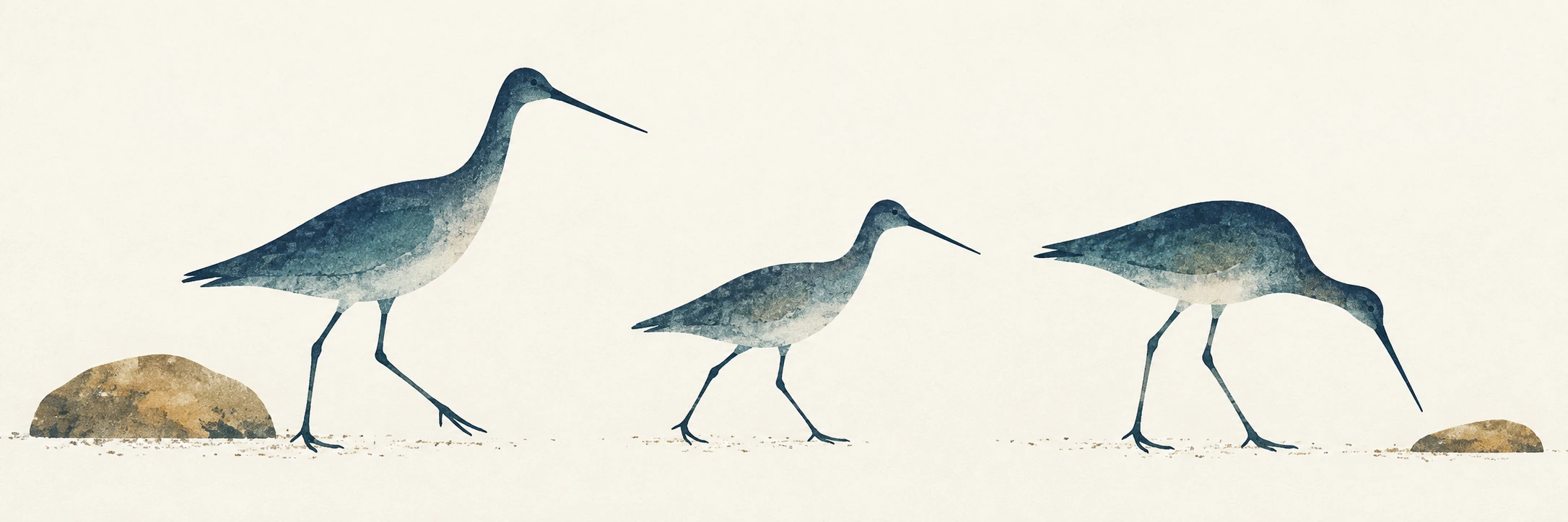
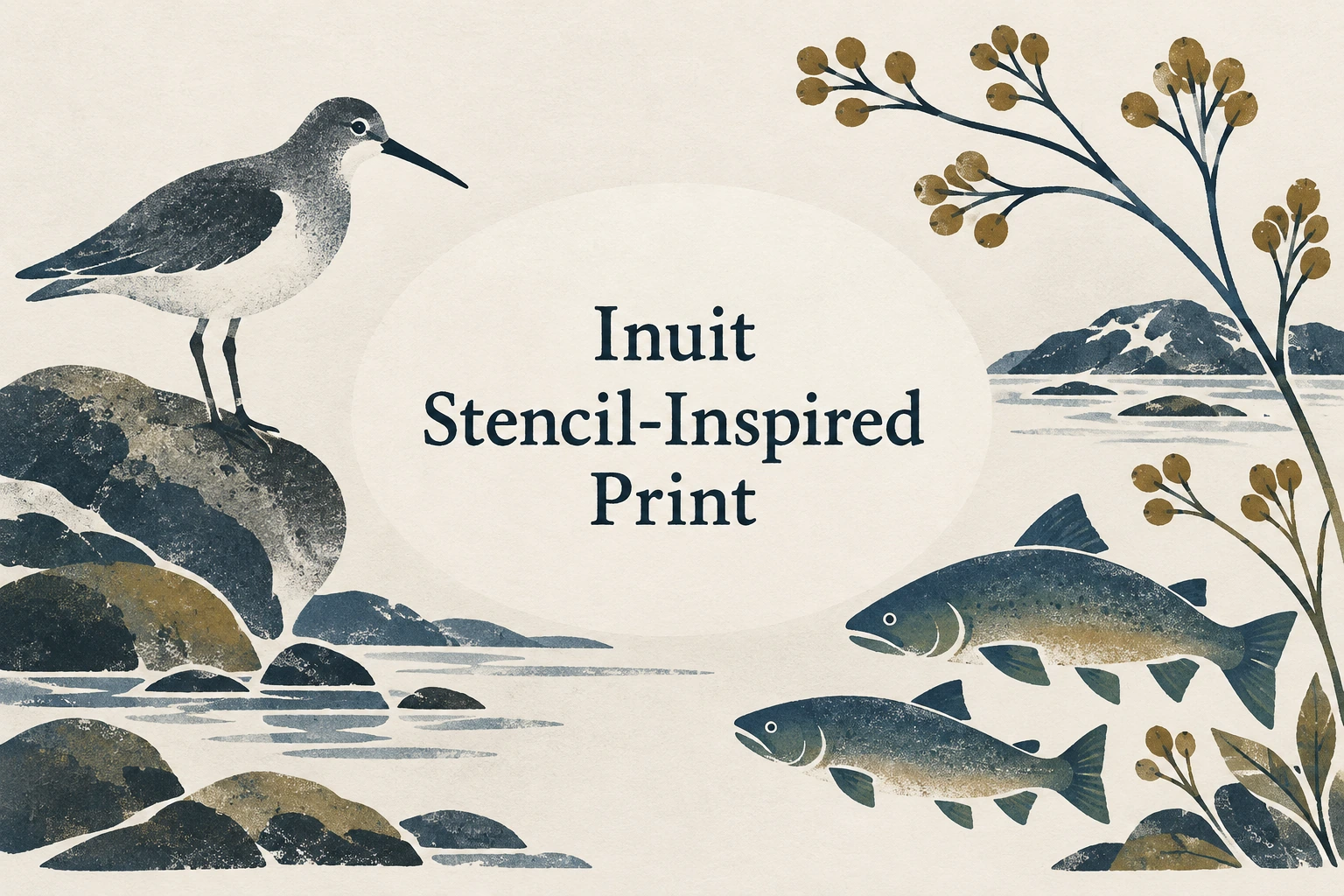
Seven original AI-generated interpretations: a dedicated banner, a centrally titled collage and five standalone studies. Captions identify the subject and distinguish these illustrations from historical or practitioner-made works.
Select an image for a closer look. Use the thumbnails, arrow keys or a swipe to compare examples. Zoom in to inspect details, or share the image that inspires you.
Creative toolbox · take this style further
Choose an input and a destination. Search sends your words to the chosen site; Copy & open puts them on your clipboard to paste there.
Create with AI
Turn your chosen input into an image prompt or a new creative direction.
ChatGPT
Copy your input and paste it into a ChatGPT conversation or image request.
Copy & open ChatGPT (new tab)Claude · Anthropic
Develop an image prompt or explore the style in a new Claude conversation.
Copy & open Claude · Anthropic (new tab)Midjourney
Paste your input into the Imagine bar on the Create page.
Copy & open Midjourney (new tab)Adobe Firefly
Copy your input, open Firefly, and paste it into the prompt field.
Copy & open Adobe Firefly (new tab)Leonardo.Ai
Copy your input, open Leonardo, and paste it into the generation field.
Copy & open Leonardo.Ai (new tab)Image search
Find visual references. Short, concrete keywords usually work best.
Lexica
Search AI images and prompts using your selected input.
Search with this input Lexica (new tab)Pexels
Search the photo and video library. Short keywords often work best.
Search with this input Pexels (new tab)Pixabay
Search photos, illustrations and other images.
Search with this input Pixabay (new tab)Unsplash
Search photographs using the style name or your own keywords.
Search with this input Unsplash (new tab)Wikimedia Commons
Search photographs, artworks and historical images. Check each file for its source and reuse terms.
Search with this input Wikimedia Commons (new tab)Art & research
Explore artists, collections and the ideas behind a style.
Wikipedia
Search for background reading. A style may not have its own article.
Search with this input Wikipedia (new tab)WikiArt
Copy your input into WikiArt’s search to explore artists and artworks.
Copy & open WikiArt (new tab)Europeana
Paste your keywords into the search to explore European museum, library and archive collections.
Copy & open Europeana (new tab)Inspiration
Discover portfolios and visual ideas from creative communities.
Instagram hashtags
Search a hashtag made from your input: spaces and punctuation are removed. Instagram may require sign-in.
Search with this input Instagram hashtags (new tab)ArtStation
Paste your input into artwork search for concept art, environments, characters and visual development.
Copy & open ArtStation (new tab)Behance
Paste your input into project search for illustration, design and visual storytelling.
Copy & open Behance (new tab)A closer look
Clearly bounded shapes, softly brushed or stippled colour within them, expressive silhouettes, deliberate spacing and a paper surface that contributes to the composition.
An inspiration label with a specific reference
“Inuit Stencil-Inspired Print” names the scope of this AOI study; it is not the title of a single historical movement or a definition of Inuit art as a whole. Inuit artists work across many media and individual approaches. Here the reference is specifically the stencil process documented by Dorset Fine Arts in relation to Kinngait printmaking. That gives us a concrete technique to discuss, rather than a vague request for something to look “Arctic.”
The accompanying images are original AI-generated process-inspired illustrations. They are not Inuit-made prints, reproductions of collection works or statements on behalf of a community. Their bird, fish, plant, shoreline and moth motifs provide accessible ways to examine shape and colour. Those motifs do not acquire cultural provenance merely by appearing on pale paper. The distinction lets us appreciate a visual exercise while directing attention to the actual practitioners and their work.
Kinngait: artists, printers and a continuing practice
Dorset Fine Arts documents annual catalogued print collections from Kinngait Studios beginning in 1959. Its archive offers a way to encounter named artists and particular works rather than treating the output as anonymous folk decoration. The studio context also makes the printmaker’s role visible: an image and its printed realization involve decisions that deserve attribution. Read the credits supplied with each actual print instead of assuming that every stage was carried out by one person.
A particularly useful documented example is The Archer (1960), attributed by Dorset Fine Arts to Niviaksiak, with the sealskin stencil credited to printer Iyola Kingwatsiak. It appears in their explanation of the process. This article points readers to that record; it does not reuse the image as a decorative asset. The example matters because it joins a named image-maker, a named printer and a particular material, giving a technique its human context.
How a crisp boundary can contain soft colour
In the process described by Dorset Fine Arts, the printmaker cuts openings in a stencil, lays it against the printing paper and taps ink through those openings with a thick brush. Separate stencils can add further colours after earlier ink has dried. Stencil can also accompany stonecut printing, bringing tonal variation to the result. The source describes changes in stencil materials over time; a contemporary water-resistant stencil is not evidence that every historical print used the same material.
For a visual study, separate two decisions: the outer shape and the distribution of colour within it. A bird can have a clean, readable back while its breast fades into a light stipple. The boundary explains the silhouette; the interior explains weight, light or emphasis. If both are equally blurry, the image loses its structural premise. If every interior is perfectly uniform, the opportunity for brushed variation has disappeared. Neither result should be mistaken for the full range of actual Inuit printmaking.
Let the paper do some of the drawing
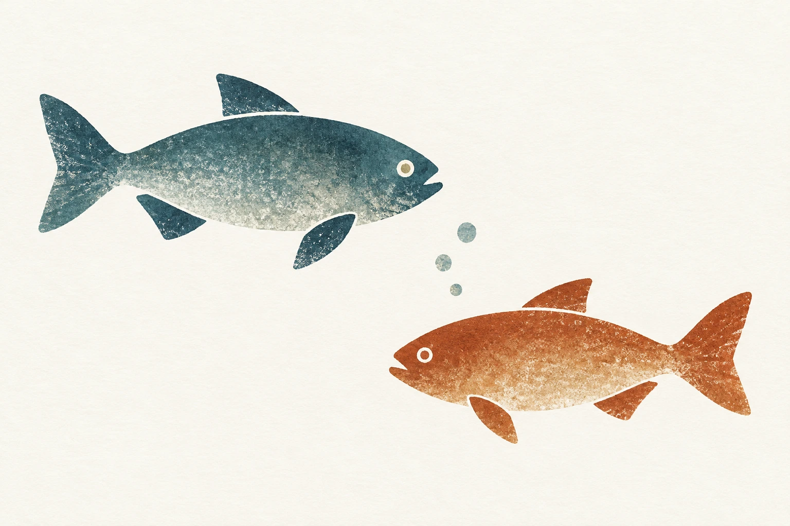
Open paper is an active part of these compositions. The gap beneath a bird’s body helps articulate its legs; the space between two fish establishes their separate movement; the unprinted area around a seed stem gives its small turns importance. Try looking at the pale shapes between the coloured ones. If those spaces are awkward slivers or accidental tangencies, revise the arrangement before adding texture.
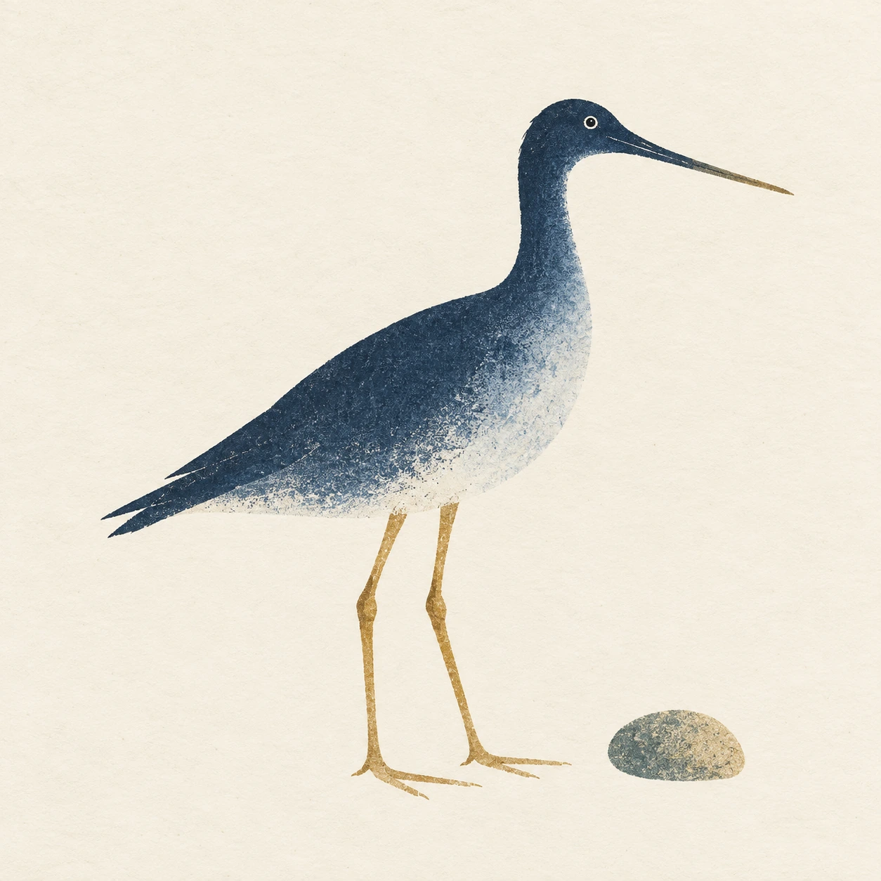
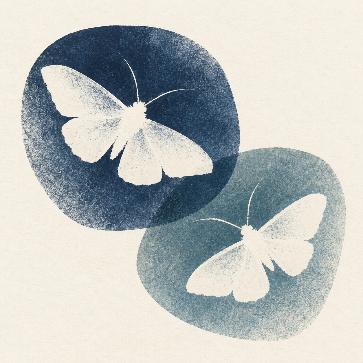
A useful exercise is to make one silhouette, one secondary mark and one broad area of untouched paper. Move the secondary mark until the composition feels balanced without becoming mechanically symmetrical. In the shorebird study, a small stone gives the lower edge a modest counterweight. The moth study reverses the relationship: pale silhouettes emerge within darker printed fields. These are editorial composition exercises, not claims that one formula characterizes the work of Inuit artists.
A limited palette can still describe a living surface
Choose colours for their relationship, not because they supposedly belong to a culture. Indigo and muted ochre work here because they provide a clear value contrast while leaving the paper visible. Within one masked shape, a shift from dark to light can direct the eye or distinguish an overlapping form. Keep the shift purposeful. Applying identical distressed speckles everywhere makes the brushwork look like a wallpaper effect.
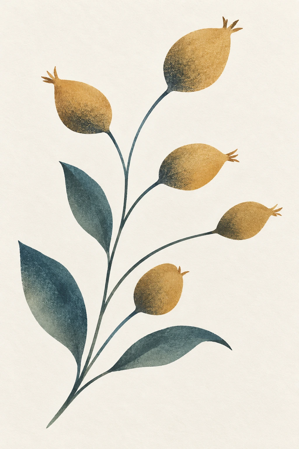
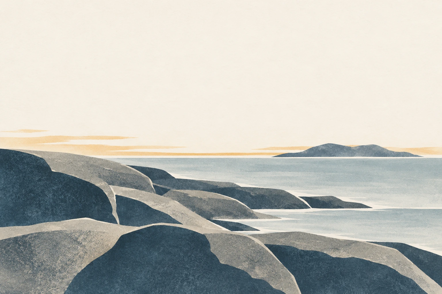
The five studies vary the visual problem. The solitary bird emphasizes silhouette and balance. The paired fish explore opposing directions. The seed plant uses branching rhythm. The shoreline builds depth from broad overlapping masks. The pale moths test reversed shapes against coloured fields. None requires invented symbolism. Judge the set by how clearly those different decisions are visible, and then compare its limited exercise with the far broader range represented in the print catalogues.
Prompts, uses and the responsibilities of a caption
For a new illustration, begin with a subject you have a reason to depict. Describe a crisp mask edge, softly brushed ink, a flat paper surface and a deliberate amount of empty space. Avoid asking the model to copy a named artist’s characteristic composition. A prompt should help you articulate a visual problem, not conceal whose work supplied the idea. If a commission requires Inuit authorship or a community-specific story, work with an appropriate artist and agree the context directly.
This process-focused approach can be useful for educational comparisons, botanical studies and experiments in silhouette. It becomes weaker when it substitutes a generic cultural label for research. Captions should say what the image is, how it was made and what it does not document. Do not add a fictitious artist signature, edition number or traditional title. Good attribution is part of the finished composition’s meaning, not paperwork to attach after the attractive part is done.
Positive editorial assessment · AI-authored
The most rewarding feature of a stencil-process study is the meeting of a clear silhouette with a gently changing interior. The solitary bird makes that relationship easy to see: its outline stays decisive while the breast becomes lighter and more open. The moth composition adds a useful reversal, letting pale shapes emerge from surrounding ink. These examples show how restraint can produce variety. The accompanying references improve the exercise by naming practitioners and keeping the real printmaking context visible.
Negative editorial assessment · AI-authored
A generic bird, distressed texture and cream background do not establish an Inuit artwork. That shortcut flattens individual authorship into a decorative label. Visually, the same shortcut produces monotonous speckles and interchangeable motifs. Improve the illustration by making a specific decision about silhouette, mask overlap or tonal placement. Improve the explanation by discussing actual credited works and stating the generated image’s medium. The criticism here concerns weak imitation and labelling, not a judgement on Inuit printmaking as a whole.
Neutral editorial assessment · AI-authored
This article connects a documented stencil process with a limited set of contemporary visual exercises. It does not survey all Inuit printmaking or reproduce the working knowledge of a studio. The studies can help readers discuss edges, brush texture and paper space; catalogues and practitioner sources are needed for the artists’ own work and its context. For projects where cultural authorship matters, an AI interpretation cannot supply it.
Pocket-sized facts
The reference here is a specific printmaking process, not a definition of all Inuit art.
Dorset Fine Arts documents both stencil techniques and named artists and printers.
The AOI gallery contains contemporary AI illustrations, not Inuit-made editions.
Examples worth exploring
Niviaksiak, The Archer (1960), with stencil credited to printer Iyola Kingwatsiak in Dorset Fine Arts’ process explanation.
A small poetic detour
Original words from the AOI studio.
Poetry
Where the Brush Is Allowed
The cut edge waits without a colour.
The brush arrives in little taps.
A blue grows dark along a shoulder,
then thins towards the paper’s gaps.
A bird takes shape beside the quiet;
its narrow legs divide the ground.
The blank is not a missing landscape—
it is the room the bird has found.
Lift the mask. The edge stays certain.
Inside, the weather of the hand
has left its lighter, darker passages,
a grain no outline could have planned.
I leave the margin to its silence,
let one small mark remain alone.
The page can carry all this colour
and still make space around a stone.
The prompt workshop
Original creative exercises. These prompts create new illustrations, not documentary evidence.
Start simple: silhouette and one stone
Create an original contemporary stencil-process illustration of one long-necked shorebird and a small offset stone on warm white paper. Use a crisp indigo silhouette with softly stippled blue shading inside it, ochre legs and generous open paper. No signature, edition number or cultural emblem.
Describe the result as an AI process study, not an Inuit-made print.
Compose opposing forms
Create two original simplified fish at different heights, facing opposite directions. Use restrained blue-green and rust ink, crisp mask boundaries and gentle brushed tonal changes inside the shapes. Keep most of the paper open. Avoid decorative borders and copied artist motifs.
Test the shape of the gap between the fish as carefully as their silhouettes.
Experiment: let untouched paper become the subject
Create two pale moth silhouettes within overlapping indigo and soft blue stencil fields. Keep the wings readable through unprinted space, with sparse antennae and controlled stippled shading in the surrounding ink. Flat matte paper; no text or invented symbolism.
An original negative-space exercise informed by stencil mechanics.
Your next inspiration
Discover another art style
Follow a visual thread to the next subject.
People & works to explore
Speculative or unverified references from the database. Check the names, dates and associations before treating them as facts.
Artists and practitioners
Niviaksiak — documented artist of The Archer
Iyola Kingwatsiak — documented stencil printer for The Archer
Paintings and other works
The Archer (1960) — consult the Dorset Fine Arts stencil reference for the credited example.
A smile from the studio
Jokes
A studio disagreement about empty space
The designer looked at the stencil study and asked whether the large unprinted area was finished.
“Yes,” said the printmaker.
“Could we add a second bird?”
“We could.”
“And a border?”
“We could.”
“And a caption explaining the peaceful atmosphere?”
The printmaker put down the brush. “We could also leave enough room for the first bird to have one.”
The designer considered this, then suggested a small badge reading GENEROUS NEGATIVE SPACE. The bird quietly applied for a larger sheet.
An original AOI studio joke about over-designing a page; no claim of traditional origin.