
Decorative-paper technique
Paper marbling transfers a floating pattern onto a sheet. Rings, combed ribbons, stone-like pools and drawn floral shapes preserve the meeting of deliberate gestures with a responsive liquid surface. The finished paper carries movement without needing to look wet.
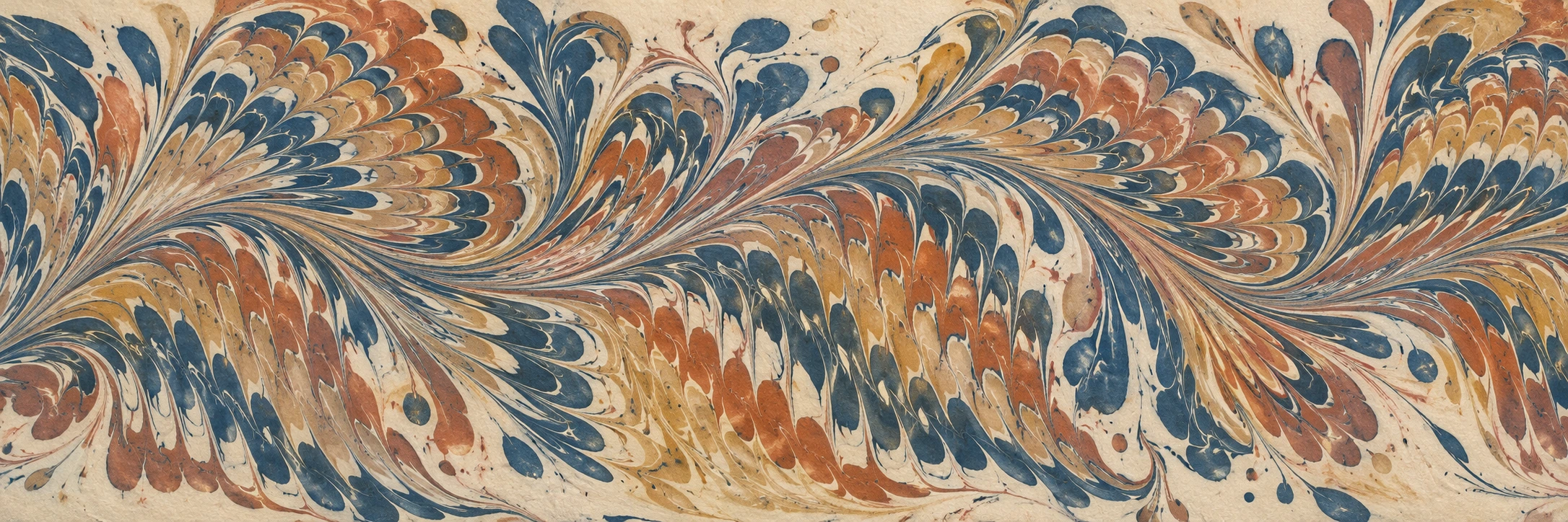
A visual introduction
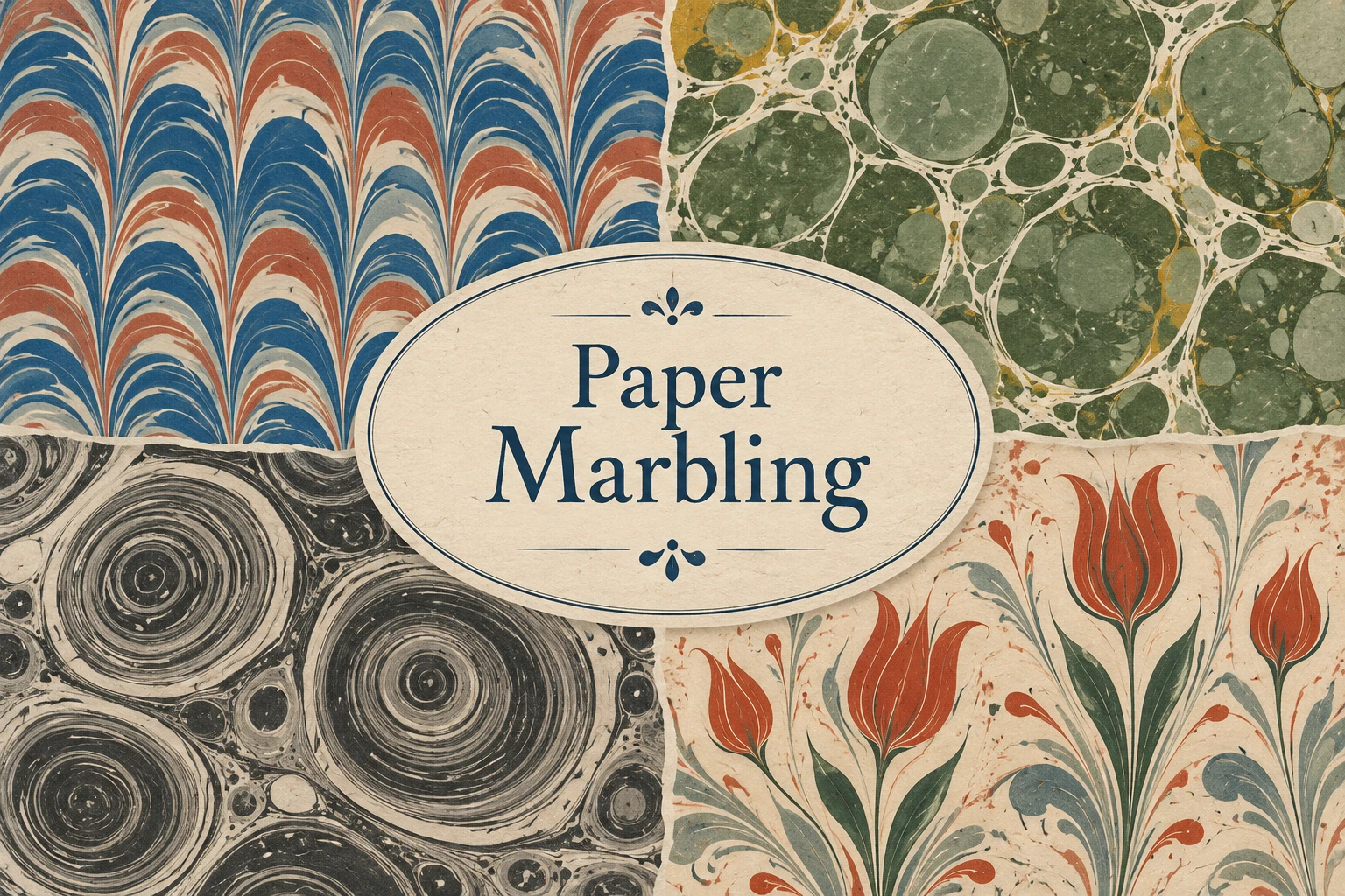
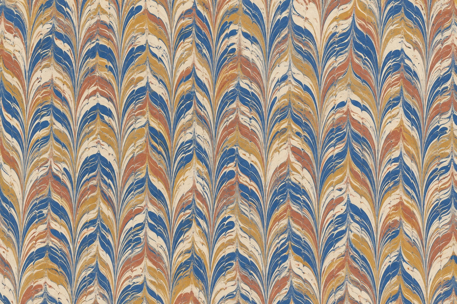
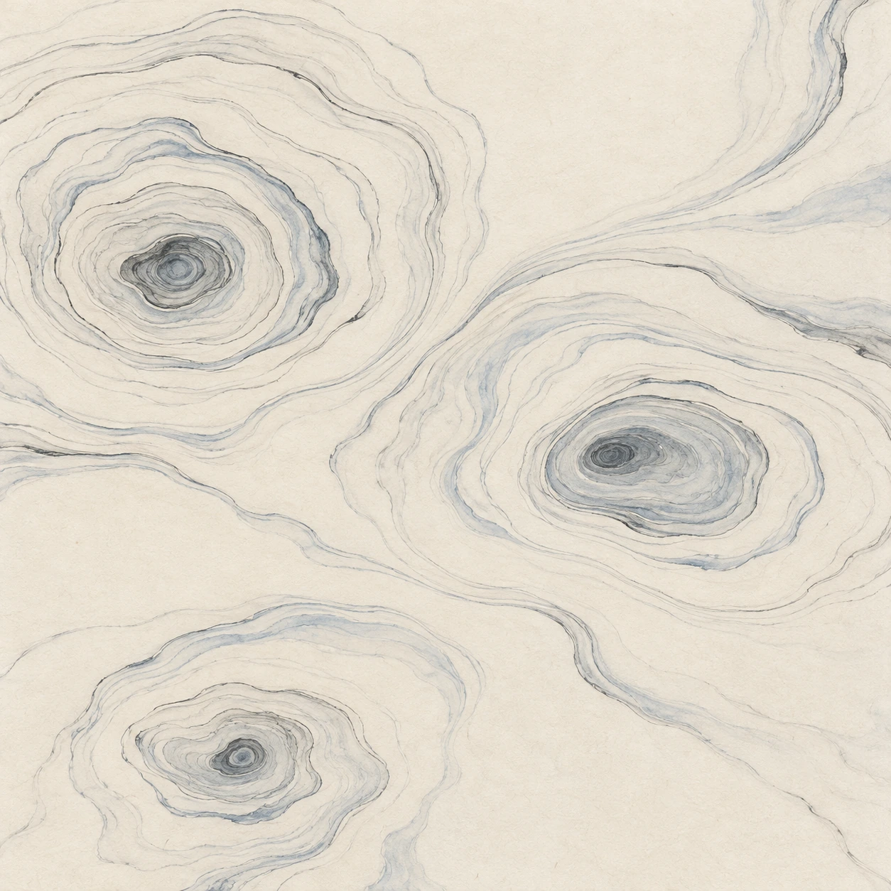
Five original AI-generated interpretations: a dedicated banner, a centrally titled collage and three standalone studies. See captions for the subject and medium distinction.
Select an image for a closer look. Use the thumbnails, arrow keys or a swipe to compare examples. Zoom in to inspect details, or share the image that inspires you.
Creative toolbox · take this style further
Choose an input and a destination. Search sends your words to the chosen site; Copy & open puts them on your clipboard to paste there.
Create with AI
Turn your chosen input into an image prompt or a new creative direction.
ChatGPT
Copy your input and paste it into a ChatGPT conversation or image request.
Copy & open ChatGPT (new tab)Claude · Anthropic
Develop an image prompt or explore the style in a new Claude conversation.
Copy & open Claude · Anthropic (new tab)Midjourney
Paste your input into the Imagine bar on the Create page.
Copy & open Midjourney (new tab)Adobe Firefly
Copy your input, open Firefly, and paste it into the prompt field.
Copy & open Adobe Firefly (new tab)Leonardo.Ai
Copy your input, open Leonardo, and paste it into the generation field.
Copy & open Leonardo.Ai (new tab)Image search
Find visual references. Short, concrete keywords usually work best.
Lexica
Search AI images and prompts using your selected input.
Search with this input Lexica (new tab)Pexels
Search the photo and video library. Short keywords often work best.
Search with this input Pexels (new tab)Pixabay
Search photos, illustrations and other images.
Search with this input Pixabay (new tab)Unsplash
Search photographs using the style name or your own keywords.
Search with this input Unsplash (new tab)Wikimedia Commons
Search photographs, artworks and historical images. Check each file for its source and reuse terms.
Search with this input Wikimedia Commons (new tab)Art & research
Explore artists, collections and the ideas behind a style.
Wikipedia
Search for background reading. A style may not have its own article.
Search with this input Wikipedia (new tab)WikiArt
Copy your input into WikiArt’s search to explore artists and artworks.
Copy & open WikiArt (new tab)Europeana
Paste your keywords into the search to explore European museum, library and archive collections.
Copy & open Europeana (new tab)Inspiration
Discover portfolios and visual ideas from creative communities.
Instagram hashtags
Search a hashtag made from your input: spaces and punctuation are removed. Instagram may require sign-in.
Search with this input Instagram hashtags (new tab)ArtStation
Paste your input into artwork search for concept art, environments, characters and visual development.
Copy & open ArtStation (new tab)Behance
Paste your input into project search for illustration, design and visual storytelling.
Copy & open Behance (new tab)A closer look
Fine fluid boundaries, nested pools or rings, combed feather rhythms and subtle irregularities absorbed into a flat paper surface; the pattern feels transferred rather than carved, piled up or polished like stone.
A surface transfer, not a slab of marble
Paper marbling is a family of techniques in which colour is arranged on a liquid surface and transferred onto paper. The familiar name describes a resemblance to veined stone, but the finished object is decorated paper. This difference is worth keeping visible in an image: a matte sheet with fine pigment boundaries communicates a different process from a glossy block of mineral, a resin pour or a raised oil-paint swirl.
The broad label covers distinct traditions and working methods. A picture of feathery colour does not establish where or how a sheet was made. This article therefore separates a general visual vocabulary from specific cultural references. The AOI illustrations are new AI-generated interpretations; they are not handmade sheets, historical examples or evidence of a practitioner’s mastery. Their value is to help readers notice pattern, scale and composition before exploring the physical craft through appropriate instruction.
Related traditions, with their differences intact
Ebru is a living Turkish marbling tradition inscribed by UNESCO on its Representative List of the Intangible Cultural Heritage of Humanity in 2014. UNESCO describes the making and transfer of coloured patterns, including floral and ornamental forms, and emphasizes the knowledge passed between practitioners and apprentices. The designation concerns a cultural practice, not a label that can be attached to any digitally swirled texture.
Suminagashi, often translated as floating ink, is a Japanese decorative-paper technique. The Metropolitan Museum of Art’s account of a demonstration by conservator Yukari Hayashida describes ink and a dispersing solution applied to water with brushes. Alternating applications form rings that can be disturbed into flowing patterns. It is useful to compare these fine, open contours with denser combed marbling without treating one as an incomplete version of the other.
The Met’s conservation writing also documents marbled papers in book arts, including borders and bindings. Those uses offer an important compositional lesson: a lively pattern can frame a quiet area rather than occupy every part of a design. The subject has a long and geographically varied history; a single confident invention story would obscure more than it explains. Consult the linked institutional accounts for the particular objects and traditions they discuss.
How the pattern carries a gesture
Read a marbled pattern by looking for the action implied by its boundaries. Rounded pools suggest successive spreading drops. Repeated narrow bends suggest a comb moving through the colour. A long pull can organize several colours into a shared direction; a small disturbance can interrupt that order. The fascination lies in the tension between a visible decision and the irregular way the surface responds. Perfectly repeated decorative units lose some of that tension.
In the denser bath-based process described by The Met, colour is placed on a thickened liquid, shaped and then transferred by carefully lowering paper onto the surface. The exact preparation varies with the method and materials. Avoid mixing instructions from unrelated systems as though every ink, paint, paper and bath were interchangeable. For this visual guide, the useful observation is the thin transferred layer and the continuity of the colour boundaries, rather than a universal recipe.
Composition and palette: choose the dominant rhythm
Start by deciding whether the sheet should feel all-over, directional or spacious. An all-over pattern can be rich without a single focal object; its interest comes from controlled variation across the surface. A directional pattern needs a clear sweep that remains visible through smaller ripples. A spacious ring study relies on the unprinted ground as much as on the ink. These are different design briefs, and forcing all three into one image often produces confusion.
Limit the palette for the first study. Indigo, warm ivory and a muted earth colour can reveal fine boundaries without relying on brilliance. In a floral interpretation, reserve a stronger colour for the flowers and let the surrounding pattern remain pale. Check both the smallest veins and the largest colour masses. A close-up may be exquisite while the full sheet lacks balance; an attractive thumbnail may hide harsh, mechanically repeated edges. Both scales deserve attention.
Three studies, three different visual problems
The combed study emphasizes repeated feather-like turns: the task is to keep a coherent rhythm while avoiding the sterile regularity of a tiled vector pattern. The floating-ink interpretation emphasizes open contours and breathing space. Its challenge is restraint—extra colour and extra rings can quickly erase the quietness that made the composition interesting.
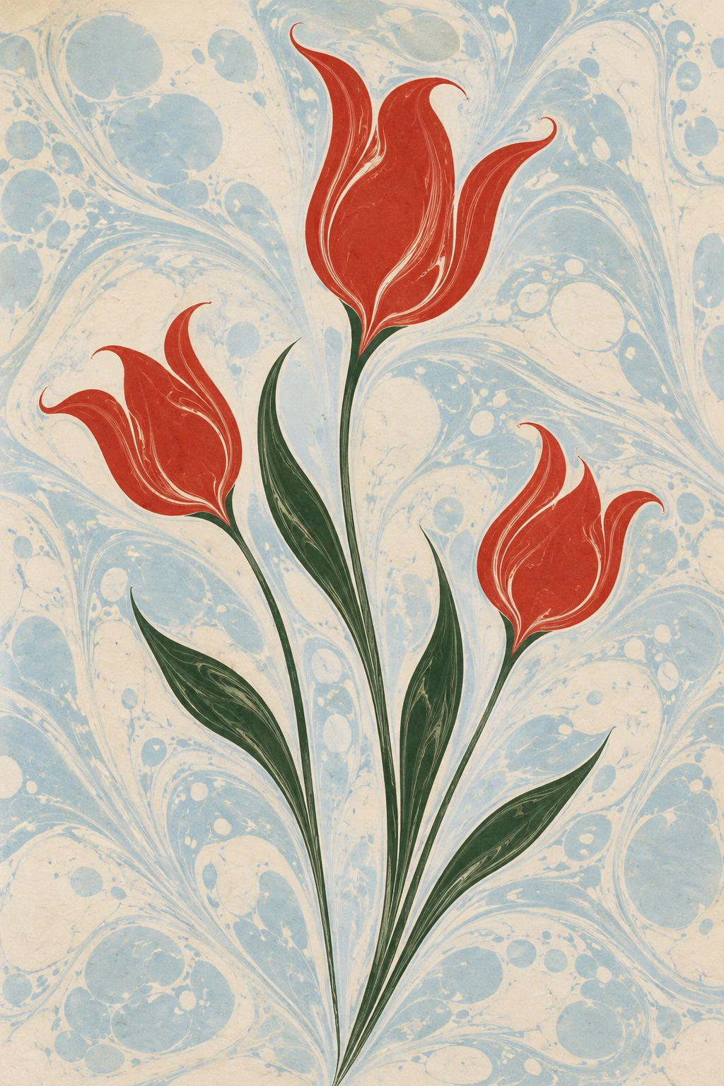
The floral interpretation asks how a recognisable subject can emerge from fluid colour. Simple tulip-like forms work as a visual exercise because their silhouettes can remain clear against a lightly patterned ground. This is an inspired interpretation rather than a technical demonstration of Ebru. When discussing the image, describe the actual flowers, stems, edges and paper appearance rather than assigning an invented maker, date or traditional provenance.
Use it well, and recognise the imitation
Marbled imagery can be useful for book-related design, expressive packaging, editorial backgrounds and abstract prints. Consider the intended crop before choosing the sheet: a small label may need a broad quiet pool, while an endpaper can support a more continuous pattern. Keep essential text on a calm region or a separate panel. If the pattern competes with every letter, reducing its contrast is usually more useful than adding another outline to the type.
Common failures in generated examples include glossy three-dimensional ridges, metallic veins, identical repeated feathers and colour boundaries that dissolve into generic smoke. Ask for a flat matte paper surface, fine liquid-shaped edges and a specific pattern family. A convincing image still cannot substitute for the material experience of the craft. When a project requires handmade marbling, credit and work with practitioners; when it requires an illustration, identify the medium honestly.
Pocket-sized facts
Paper marbling transfers a liquid-surface pattern onto paper.
Ebru was inscribed on UNESCO’s Representative List in 2014.
Suminagashi and Ebru are distinct traditions within the wider discussion of marbled and decorated papers.
Examples worth exploring
The Met’s marbled-paper article shows the use of marbling in manuscript borders and explains the transfer process.
The Met’s Yukari Hayashida demonstration provides a separate reference for suminagashi.
A small poetic detour
Original words from the AOI studio.
Poetry
Ode to the Lifted Sheet
A colour finds its shoreline
before a shore is there.
A comb persuades the water
to remember passing air.
The paper comes down softly;
the wandering edges stay.
A small and restless weather
is carried from the tray.
No stone was split to make it,
no river learned to wait.
The sheet dries into silence,
with movement for a weight.
The prompt workshop
Original creative exercises. These prompts create new illustrations, not documentary evidence.
Start simple: combed colour on paper
Create a flat overhead illustration of matte marbled paper with repeated narrow indigo, terracotta, ochre and ivory feather waves. Keep the combed rhythm clear but introduce small fluid irregularities. Show subtle paper fibres and thin pigment boundaries. No glossy resin, stone slab, metallic veins, lettering or frame.
Judge the broad pattern and the fine edges separately.
Explore quiet floating-ink contours
Create a contemporary interpretation inspired by floating-ink marbling: fine charcoal and blue-grey irregular rings from three offset centres on warm ivory paper. Stretch some rings into gentle open contours and preserve large unprinted areas. Flat matte ink, no thick paint, combed feathers, seals or signatures.
Describe this as an AI interpretation, not an authentic historical suminagashi print.
Experiment: floral shapes from fluid colour
Create a contemporary floral-marbling-inspired illustration of three vermilion tulip-like blooms with dark green stems on a pale blue and cream marbled ground. Use rounded fluid pigment shapes, delicate edges and a flat paper texture. One taller bloom balances two shorter flowers. No impasto, calligraphy or invented signature.
Keep the flowers readable; this is a visual exercise rather than a demonstration of traditional technique.
A smile from the studio
Jokes
The marbler requested a repeatable result. The water agreed to repeat the experiment.