
Digital illustration technique and visual language
One dark sweep can turn a cheek. A thin cream curve can make a teapot shine. Vexel art builds an image from carefully organized colour shapes, translating continuous light into edges that the eye can follow.
A visual introduction
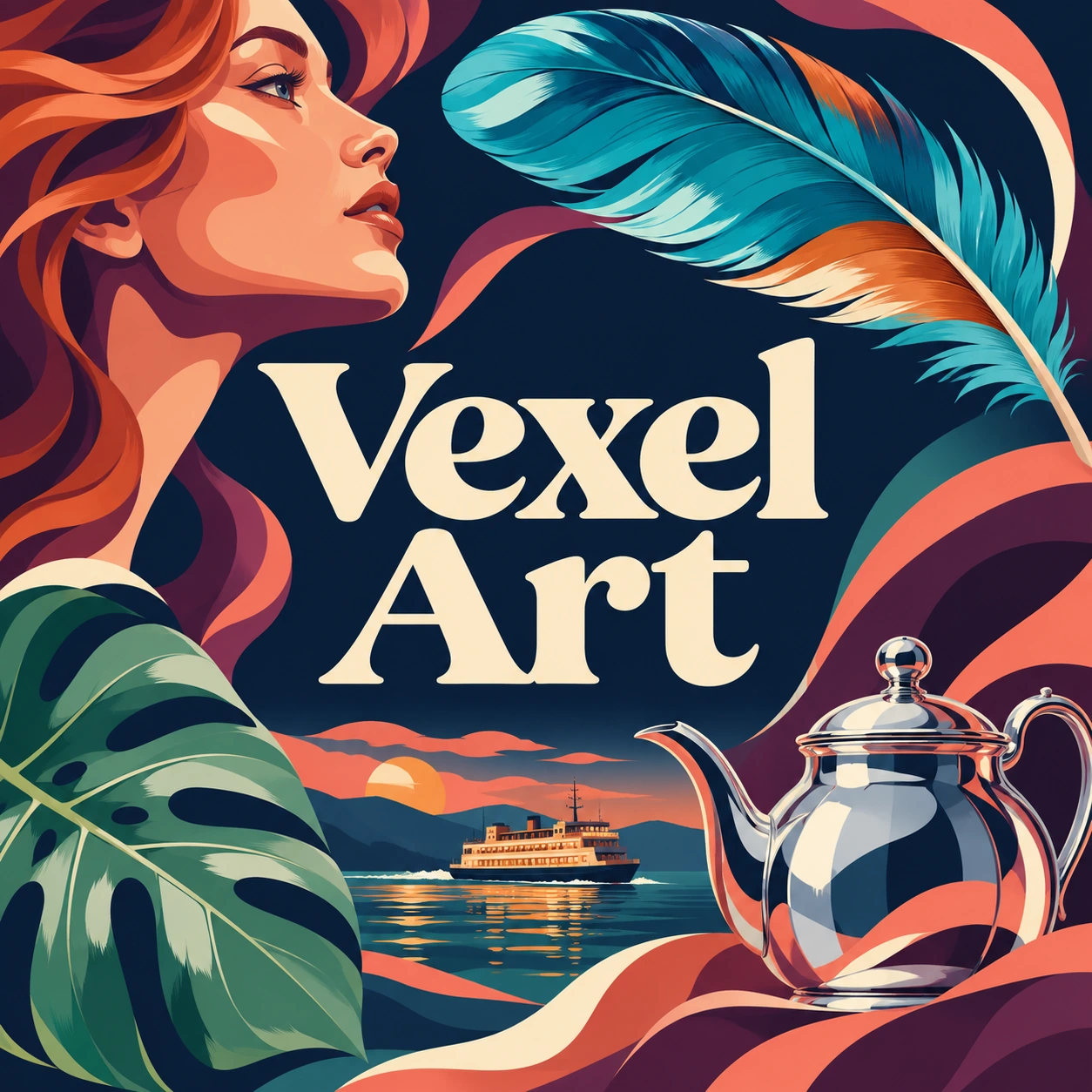
Eight original AI-generated studies explore the appearance of vexel illustration. They include a banner, centrally titled collage, five standalone works and an additional tall composition.
Select an image for a closer look. Use the thumbnails, arrow keys or a swipe to compare examples. Zoom in to inspect details, or share the image that inspires you.


Creative toolbox · take this style further
Choose an input and a destination. Search sends your words to the chosen site; Copy & open puts them on your clipboard to paste there.
Create with AI
Turn your chosen input into an image prompt or a new creative direction.
ChatGPT
Copy your input and paste it into a ChatGPT conversation or image request.
Copy & open ChatGPT (new tab)Claude · Anthropic
Develop an image prompt or explore the style in a new Claude conversation.
Copy & open Claude · Anthropic (new tab)Midjourney
Paste your input into the Imagine bar on the Create page.
Copy & open Midjourney (new tab)Adobe Firefly
Copy your input, open Firefly, and paste it into the prompt field.
Copy & open Adobe Firefly (new tab)Leonardo.Ai
Copy your input, open Leonardo, and paste it into the generation field.
Copy & open Leonardo.Ai (new tab)Image search
Find visual references. Short, concrete keywords usually work best.
Lexica
Search AI images and prompts using your selected input.
Search with this input Lexica (new tab)Pexels
Search the photo and video library. Short keywords often work best.
Search with this input Pexels (new tab)Pixabay
Search photos, illustrations and other images.
Search with this input Pixabay (new tab)Unsplash
Search photographs using the style name or your own keywords.
Search with this input Unsplash (new tab)Wikimedia Commons
Search photographs, artworks and historical images. Check each file for its source and reuse terms.
Search with this input Wikimedia Commons (new tab)Art & research
Explore artists, collections and the ideas behind a style.
Wikipedia
Search for background reading. A style may not have its own article.
Search with this input Wikipedia (new tab)WikiArt
Copy your input into WikiArt’s search to explore artists and artworks.
Copy & open WikiArt (new tab)Europeana
Paste your keywords into the search to explore European museum, library and archive collections.
Copy & open Europeana (new tab)Inspiration
Discover portfolios and visual ideas from creative communities.
Instagram hashtags
Search a hashtag made from your input: spaces and punctuation are removed. Instagram may require sign-in.
Search with this input Instagram hashtags (new tab)ArtStation
Paste your input into artwork search for concept art, environments, characters and visual development.
Copy & open ArtStation (new tab)Behance
Paste your input into project search for illustration, design and visual storytelling.
Copy & open Behance (new tab)A closer look
Look for a hierarchy of large silhouettes, curved shadow planes and selective highlights. The direction of each boundary should explain a surface. A face, a metal pot and a leaf need different kinds of edge.
Where the name belongs
Vexel is used for raster artwork that evokes the shaped colour areas associated with vector illustration. Sarah Teer’s published Vexel Art tutorial documents a portrait workflow using the Pen tool, paths, pixel fills and organized layers. It describes the name as a combination of vector and pixel. That practitioner account provides a useful record of the term and method. Its discussion gives no independently verifiable founding date or named inventor.
Tracing a photographic reference is one route into the technique. The decisions begin with which tonal changes deserve a boundary, how the subject separates from the background and where complexity should gather. A carefully observed drawing can supply the same decisions. In this guide, the examples are AI-generated raster interpretations of that visual grammar. Their editable source structure consists of the generated image files.
What the file actually contains
Adobe’s raster-and-vector guide distinguishes a pixel grid from geometry described by lines and shapes. A crisp-looking edge on screen can come from either representation. Inspecting the working document and export settings establishes which one you have. Our PNG originals and WebP publication images contain pixels.
Photoshop itself supports several kinds of construction. Adobe’s drawing-mode documentation explains that Shape mode keeps editable vector masks, Path mode creates paths that can later be used for selections or fills, and Fill Pixels draws raster content. A Photoshop origin therefore leaves the underlying method open. The companion Vector Art guide follows scalable shape construction in more detail.
Draw the large decisions first
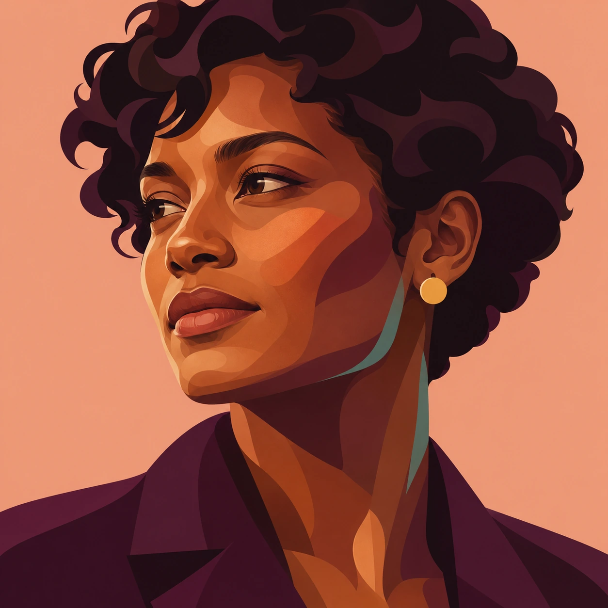
Begin with a silhouette that survives at thumbnail size. Divide its interior into a light family and a shadow family. Add a middle tone where a surface changes direction. Only then decide which small highlights earn a place. In the portrait here, the copper cheek, plum jaw and nearly black hair establish the head before the eye accents arrive.
Edges have jobs. A cheek boundary can travel in one long curve, then tighten beside the nose. A hair mass can carry two broad curls while a few fine strands supply scale. If every visible fluctuation in a reference becomes a separate island, the picture acquires an exhausting amount of information. Join neighbouring shapes that describe the same turn of form.
Use colour relationships deliberately. Warm skin can sit beside a cool reflected edge. Similar values can unite a shadow across several hues. Keep the strongest light-dark jump near the focal point, and allow quieter sections to merge. This gives a complicated subject a readable route through it.
Let the material change the shape
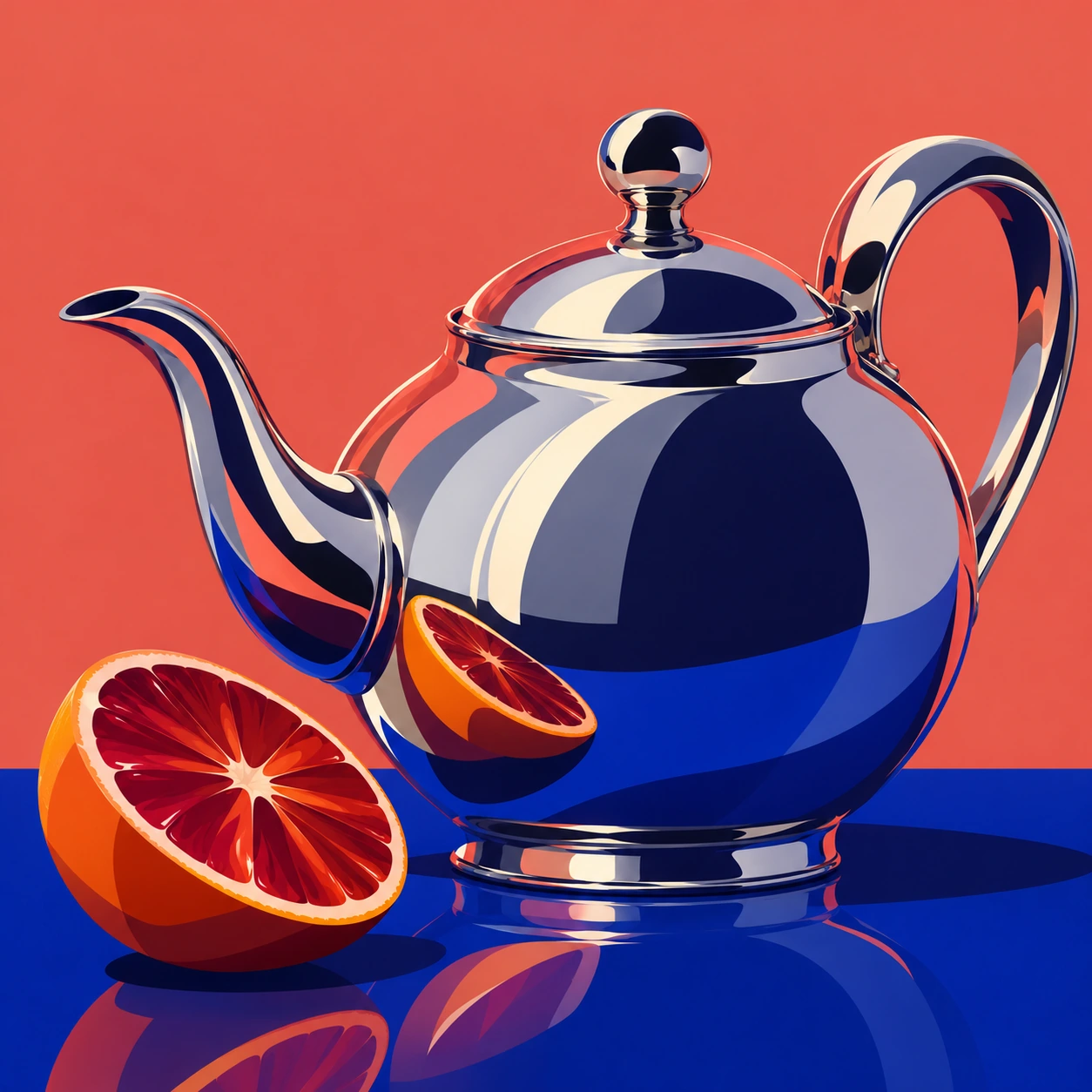
The chrome teapot carries huge blue areas and slender cream ribbons. Those reflected shapes bend around the vessel and its spout. Their abrupt changes make the surface feel polished. The orange offers a softer, segmented rhythm beside it, so the viewer can compare two materials under the same graphic treatment.
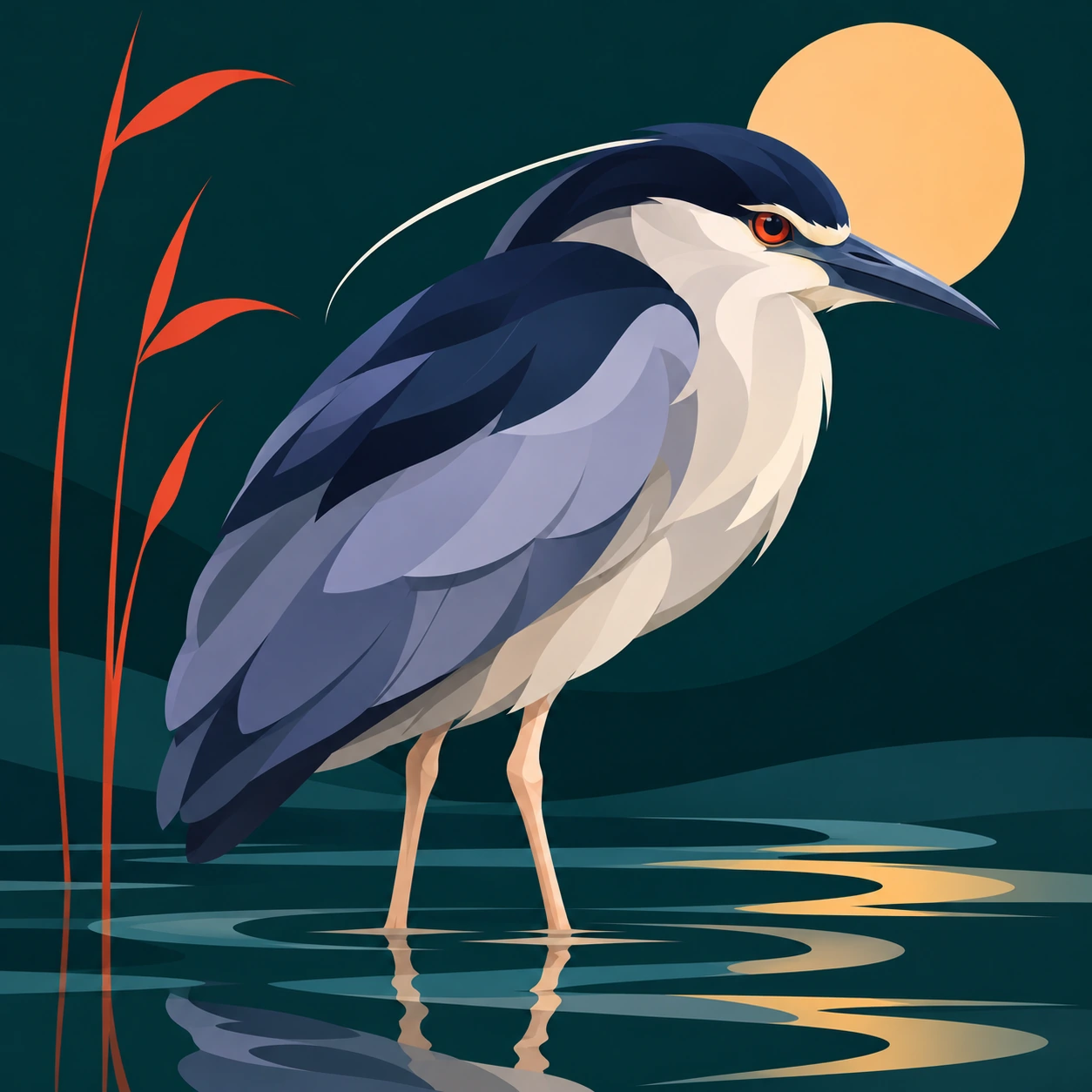
The greenhouse study uses branching veins, broad greens and five small droplets. Each droplet is economical, with a dark curve and a pale highlight. In the heron, long overlapping feather masses replace a catalogue of individual barbs. The harbour reserves angular geometry for the crane and warehouses while giving the water longer horizontal bands.
These are practical variations within a shared approach. Try changing the contour language while holding the palette steady. Then hold the contours steady and change the light. The first exercise tests construction. The second tests whether the image still communicates its material.
Compose for the intended viewing size
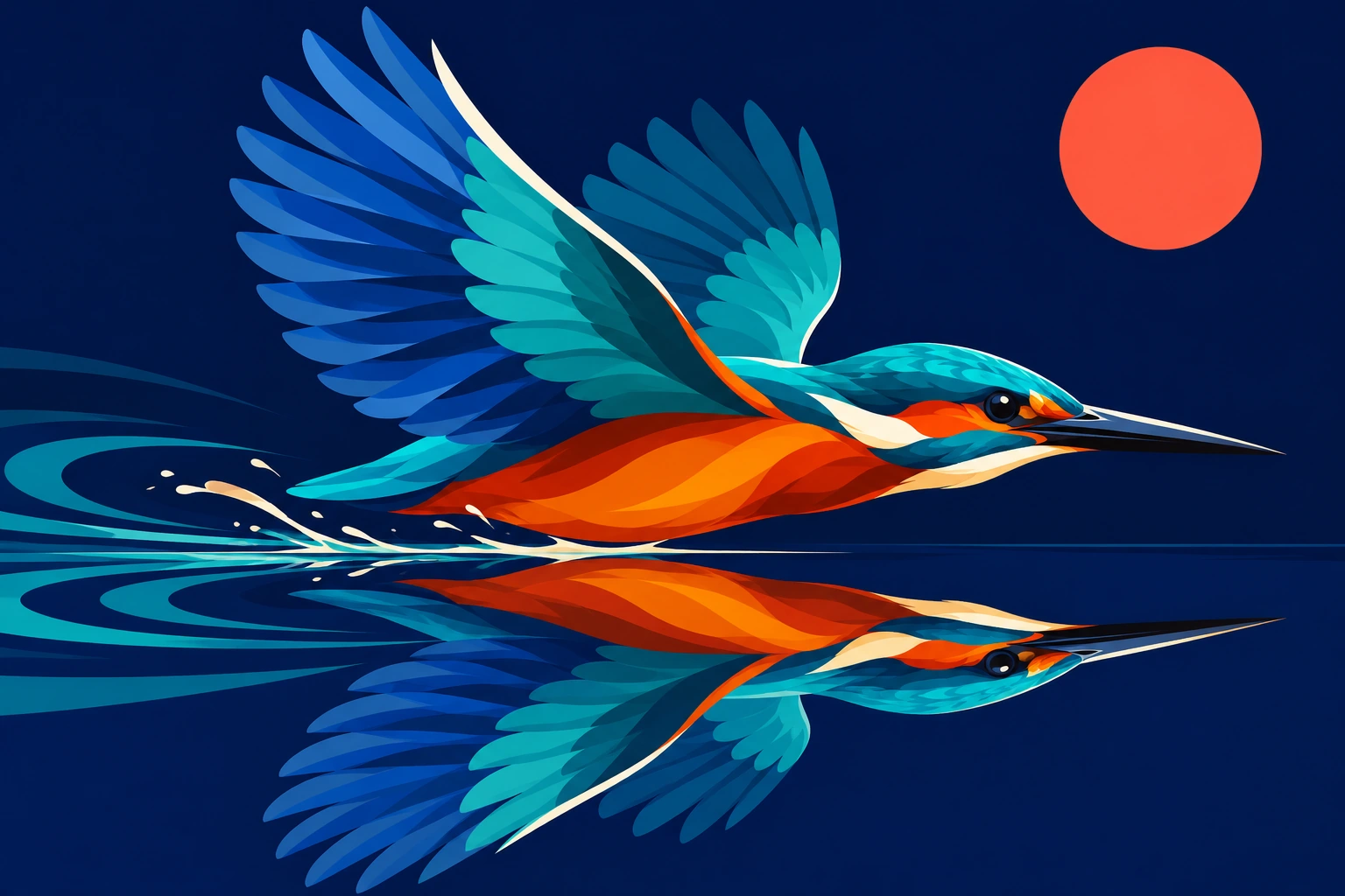
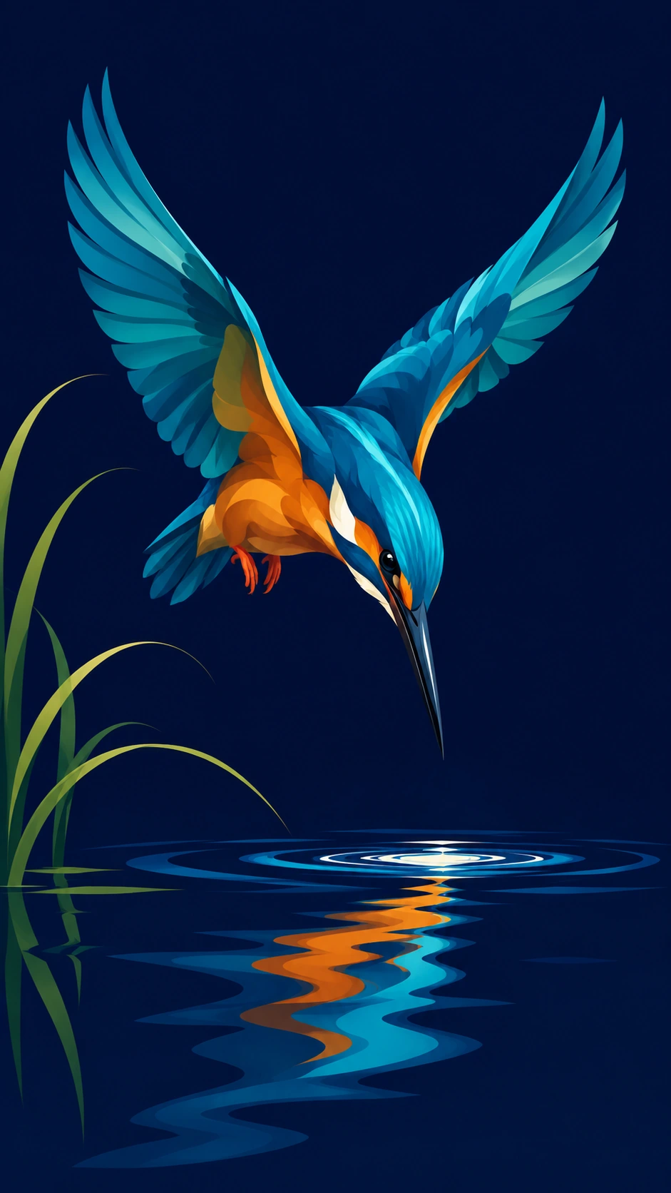
The banner lets the kingfisher skim horizontally along the waterline. The additional tall study turns the flight into a descent, with raised wings above a small ripple and a long reflection below. Its empty navy areas give that movement room. This is a new arrangement of the motif.
A phone-sized presentation rewards a clear outer silhouette and a short chain of focal points. Check the full image on a narrow screen, then inspect the eye, beak and wing tips enlarged. For a print or large display, inspect the export at its intended physical size. The sharp appearance remains subject to the available pixel dimensions.
Using the look in a generator
Describe the construction you want. Ask for interlocking curved tonal planes, broad quiet shadows, a few thin highlight ribbons and a controlled palette. Name the subject’s surface too. Polished metal needs a different arrangement from a folded feather or a translucent leaf. The style name alone leaves many of these decisions unspecified.
Check for contour logic after generation. A bright stripe should travel around a coherent form. Small patches should support a larger mass. Faces need convincing eye alignment and a readable jaw. Save the actual prompt with the result and distinguish a successful generated appearance from a manually layered workflow. These studies explore the appearance.
Where it earns its space
Portrait features, music imagery, packaging concepts and editorial spots can benefit from this concentrated shape language. It makes the designer decide where an image’s identity lives. Its weak point is over-description. A thousand carefully bounded fragments can still leave a viewer searching for the subject.
Try removing one small region at a time in a manual redraw. If the image becomes easier to read, the shape was spending attention without returning much. The best bright accent often works because its neighbours have the restraint to stay dark.
Positive editorial review
AI-authored editorial assessment. Vexel’s strongest achievement is the way a contour can do several jobs at once. In the teapot study, a pale ribbon describes curvature, light and polish. The portrait’s broad cheek plane gives the smaller eye details somewhere to settle. That economy makes the images readable at small sizes while leaving enough shape variation for close looking.
Negative editorial review
AI-authored editorial assessment. The method can become a competition to draw more patches. Faces then resemble contour maps, and a polished object loses its large reflective masses beneath decorative shards. Generated versions can also introduce soft shading that weakens the deliberate edges. A useful revision would merge minor regions, simplify the background and concentrate the sharpest changes around one focal point.
Neutral editorial review
AI-authored editorial assessment. Vexel describes a family of raster illustration practices and a recognizable shape-based appearance. Its applications range from portraits to still life and landscape. Production choices depend on the needed pixel dimensions, editing workflow and final display. A generated raster can demonstrate the appearance, while a layered working document provides additional evidence about how an image was constructed.
A small poetic detour
Original words from the AOI studio.
Poetry
The cheek turns at a copper edge.
A blue wing folds the evening down.
One white line finds the kettle’s curve,
and all the room is gathered there.
I leave the darkest shape alone.
It knows how much the light can spare.
The prompt workshop
Original creative exercises. These prompts create new illustrations, not documentary evidence.
Start with three tonal families
Create an original vexel-style raster portrait from an invented adult sitter. Use one large dark hair mass, copper midtones, plum shadows and restrained cream highlights. Shape the jaw and cheek with long deliberate curves. Keep eyes coherent and the background quiet.
Make metal explain its surroundings
Compose a chrome teapot and halved blood orange on a cobalt table. Translate reflections into curved, hard-edged colour ribbons. Give the pot one coherent spout, handle and lid. Use broad navy areas and a few pale accents, with all surfaces sharing the same lighting.
Recompose a motif vertically
Create a tall phone-oriented vexel image of a turquoise kingfisher descending toward a small ripple. Raise the complete wings in a narrow V and extend its reflection below. Use deep navy negative space, economical feather planes and a short chain of focal points.
Your next inspiration
Discover another art style
Follow a visual thread to the next subject.

Vector Art: Shape, Curves and Images Built to Adapt
Compare the underlying file structure and scalable shape construction.

A smile from the studio
Jokes
The teapot asked for a flattering portrait. I gave it one highlight and it immediately began reflecting on its achievements.
Sources and further exploration
Adobe, Raster and vector — Explains pixel grids and the geometric construction of vector graphics.