Digital image construction method
Vector art builds images from defined shapes, paths and their visual properties. Its creative strength is the control of relationships: a curve, a gap or a colour boundary can do as much expressive work as a thousand small marks. The method supports many appearances, from spare symbols to elaborate illustration.
A visual introduction
Select an image for a closer look. Use the thumbnails, arrow keys or a swipe to compare examples. Zoom in to inspect details, or share the image that inspires you.




Creative toolbox · take this style further
Choose an input and a destination. Search sends your words to the chosen site; Copy & open puts them on your clipboard to paste there.
Create with AI
Turn your chosen input into an image prompt or a new creative direction.
ChatGPT
Copy your input and paste it into a ChatGPT conversation or image request.
Copy & open ChatGPT (new tab)Claude · Anthropic
Develop an image prompt or explore the style in a new Claude conversation.
Copy & open Claude · Anthropic (new tab)Midjourney
Paste your input into the Imagine bar on the Create page.
Copy & open Midjourney (new tab)Adobe Firefly
Copy your input, open Firefly, and paste it into the prompt field.
Copy & open Adobe Firefly (new tab)Leonardo.Ai
Copy your input, open Leonardo, and paste it into the generation field.
Copy & open Leonardo.Ai (new tab)Image search
Find visual references. Short, concrete keywords usually work best.
Lexica
Search AI images and prompts using your selected input.
Search with this input Lexica (new tab)Pexels
Search the photo and video library. Short keywords often work best.
Search with this input Pexels (new tab)Pixabay
Search photos, illustrations and other images.
Search with this input Pixabay (new tab)Unsplash
Search photographs using the style name or your own keywords.
Search with this input Unsplash (new tab)Wikimedia Commons
Search photographs, artworks and historical images. Check each file for its source and reuse terms.
Search with this input Wikimedia Commons (new tab)Art & research
Explore artists, collections and the ideas behind a style.
Wikipedia
Search for background reading. A style may not have its own article.
Search with this input Wikipedia (new tab)WikiArt
Copy your input into WikiArt’s search to explore artists and artworks.
Copy & open WikiArt (new tab)Europeana
Paste your keywords into the search to explore European museum, library and archive collections.
Copy & open Europeana (new tab)Inspiration
Discover portfolios and visual ideas from creative communities.
Instagram hashtags
Search a hashtag made from your input: spaces and punctuation are removed. Instagram may require sign-in.
Search with this input Instagram hashtags (new tab)ArtStation
Paste your input into artwork search for concept art, environments, characters and visual development.
Copy & open ArtStation (new tab)Behance
Paste your input into project search for illustration, design and visual storytelling.
Copy & open Behance (new tab)A closer look
Purposeful contours; coordinated curves; deliberate positive and negative shapes; clear colour boundaries; consistent or intentionally varied stroke weight; and a hierarchy that remains readable at the intended display size.
A construction method, not one fashionable look
A vector image describes geometry and appearance rather than storing only a fixed grid of coloured pixels. Adobe’s comparison of raster and vector graphics explains why this distinction matters when resizing and editing. A vector shape can be recalculated at a new scale; a raster export has a particular pixel size. Neither description guarantees that the design itself is good.
The familiar flat-colour poster is one possibility, not the definition. Vector artwork can include gradients, intricate curves and layered forms. Equally, a crisp-looking PNG can imitate a vector aesthetic while remaining a raster image. Judge both the visual language and the underlying deliverable. Renaming a file or placing a bitmap inside an SVG does not redraw its contents as editable paths.
Paths are decisions about an edge
The W3C description of SVG paths includes straight lines, Bézier curves, arcs and closed shapes. A path can define a filled form, a stroke or a clipping boundary. These are construction tools, but each produces a visible consequence: where an edge turns, how a shape closes and what can be seen through or around it.
In an illustration, place a curve’s turning points deliberately. Too many control points can make a simple contour difficult to refine; too few can flatten a distinctive gesture. Work from large relationships towards local corrections. A leaf, cheek or roofline needs the right silhouette before it needs a decorative internal pattern.
Fill, stroke and the space between
Fill describes the interior appearance of a shape; stroke describes a line along its outline. MDN’s SVG guide shows that these properties can be controlled separately, along with details such as line caps and joins. A rounded cap feels different from a blunt one, and a sharp corner may become visually aggressive when the stroke grows.
Choose a coherent system, then make exceptions for a reason. A continuous heavy outline around every object can flatten depth; removing selected outlines lets adjacent colour shapes carry the edge. Negative space is equally active. The gap beneath an arm or between two leaves should read as a designed shape rather than a leftover sliver.
Colour works through adjacency
Begin with a small palette and decide which colour owns the focal point. The same orange can feel luminous beside deep blue and quieter beside warm cream. Large areas establish the image’s rhythm; tiny accents should support that rhythm rather than compete with it. A palette does not need to be loud to feel distinctly graphic.
Gradients can describe volume or atmosphere, but they should not repair unclear silhouettes. Test the composition as a few flat masses first. If the subject disappears when shading is removed, its structure may need work. Where subtle gradients are essential, keep the main contour simple enough to give them a clear stage.
Scalable geometry still needs optical judgment
An image can retain mathematically smooth outlines and still fail at small sizes. Thin gaps close, delicate details disappear and several neighbouring shapes may merge perceptually. Inspect the work at its actual intended size as well as enlarged. A small icon and a poster may need different versions of the same design.
Editability also depends on how the file is organized. Meaningful groups and a manageable number of shapes make revision easier than thousands of unstructured tracing fragments. Keep the original editable document, then export the format and dimensions needed for its destination. Embedded bitmap textures and raster effects should be identified rather than hidden behind a general claim of infinite scalability.
Translate a subject instead of tracing every detail
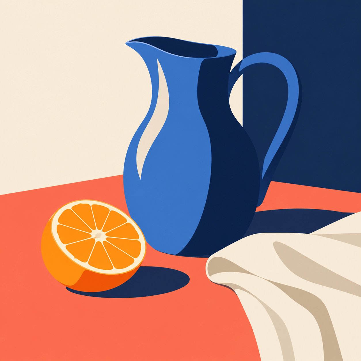
For an expressive portrait, decide which three or four shape relationships carry the likeness or mood. For a landscape, establish the rhythm of near, middle and distant planes. For a still life, exploit the difference between a circular opening, a long diagonal and a quiet block of space. Simplification works when it selects the important information.
Tracing can be a starting point, but faithfully following every small fluctuation may preserve noise rather than character. Redraw awkward tangencies, remove redundant points and compare adjacent contours. The objective is a convincing image with intentional relationships, not a record of how many paths the software can hold.
What the generated gallery demonstrates
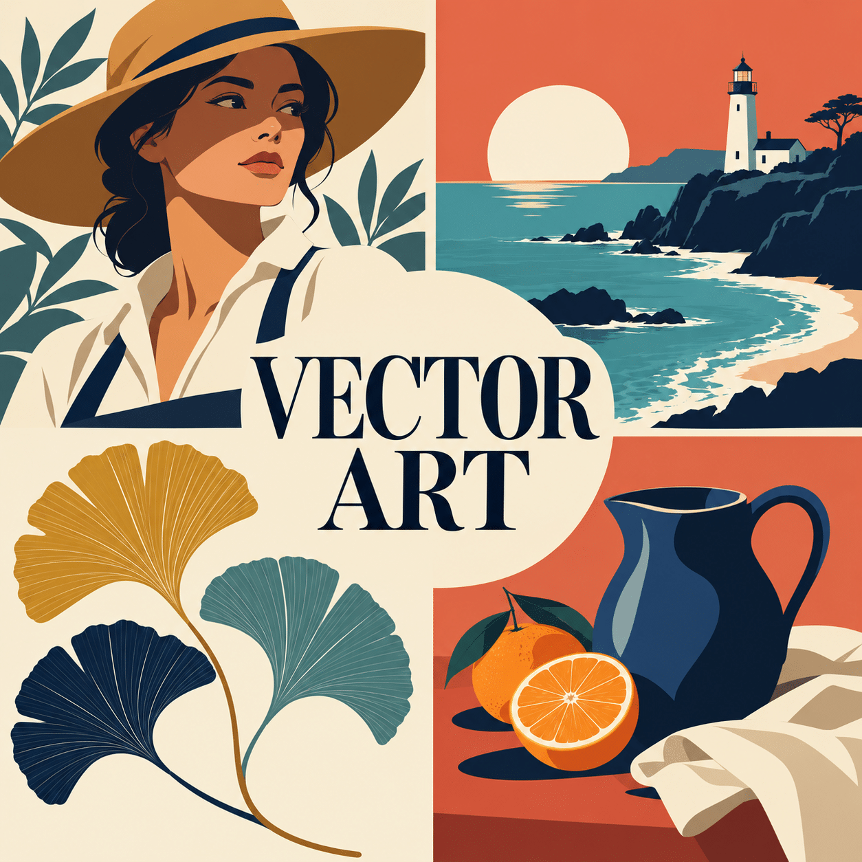
The new gallery consists of AI-generated raster illustrations of vector-like visual language. They demonstrate contour, flat shapes, limited palettes and graphic composition; they are not editable SVG or Illustrator files. Anyone needing production vector artwork must construct or carefully redraw the chosen concept in a vector-capable tool and inspect the resulting paths.
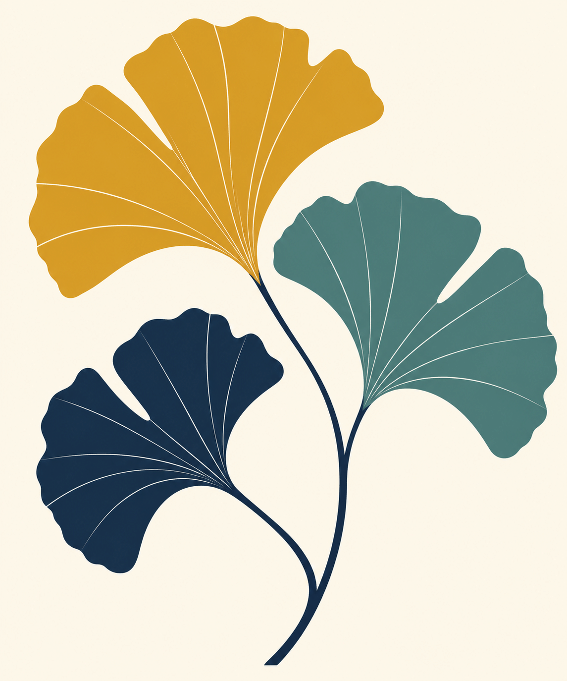
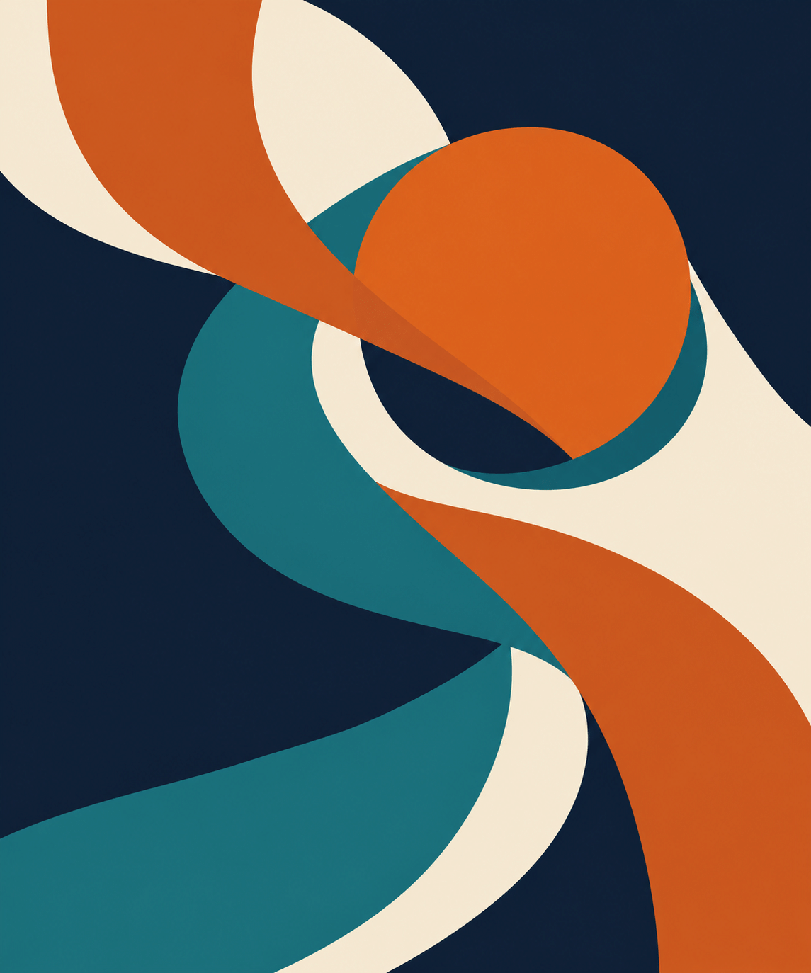
The examples move between portrait, landscape, botanical study, still life and an abstract composition. This variety matters: vector construction is not restricted to logos, and geometric abstraction is not automatically vector art. Use a prompt to explore a visual idea, then judge whether its shapes are clear enough to translate into a useful editable design.
Positive editorial assessment — AI-authored
Vector art rewards economical decisions. A carefully shaped interval or a single well-placed curve can make an image memorable without surface excess. Its adaptability is especially valuable when a design must retain a recognizable identity across several uses and sizes.
Critical editorial assessment — AI-authored
Clean edges can disguise weak observation. Generic faces, arbitrary geometric fragments and fashionable palettes may look polished while saying little. Improve the underlying silhouette and visual idea before adding more shapes. Excessive automatic tracing can also produce a cumbersome file with none of the clarity expected from the method.
Neutral editorial assessment — AI-authored
Vector art is a method of constructing and editing images, compatible with many styles and levels of complexity. It is well suited to work that benefits from controlled geometry and adaptable output. Its usefulness depends on the design, file structure and intended destination, not on a universal superiority over raster painting.
Pocket-sized facts
Vector geometry and raster appearance are different properties.
Scalable outlines do not guarantee that small details remain readable.
The new gallery demonstrates vector-like aesthetics using raster illustrations.
A small poetic detour
Original words from the AOI studio.
Poetry
A curve can hold a little weight;
a gap can let the daylight through.
The line decides where forms relate,
the empty shape decides it too.
I take one point away and find
the gesture I had nearly lost:
a simpler edge, a clearer mind,
a space no extra mark can cost.
The prompt workshop
Original creative exercises. These prompts create new illustrations, not documentary evidence.
A few shapes, a clear subject
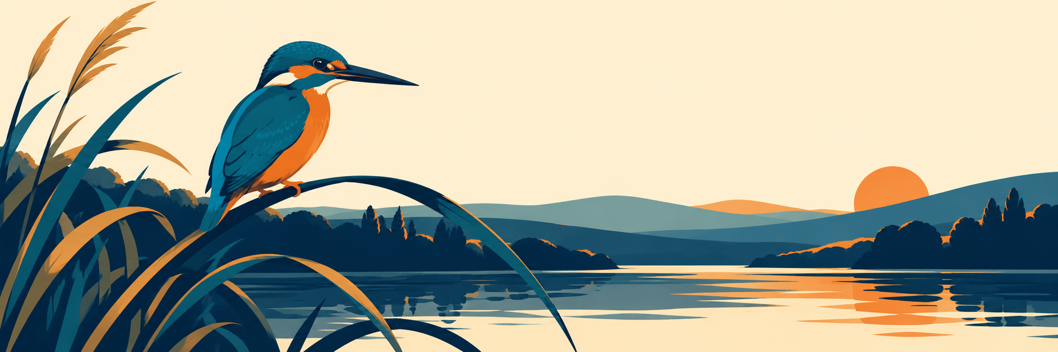
Develop a vector-style illustration concept of a kingfisher on a curved reed, built from deliberate overlapping colour shapes. Deep navy, teal, orange and warm cream, clear beak and wing silhouette, generous negative space, no texture or lettering. If generated as a bitmap, treat it as a concept to redraw as editable paths.
Graphic portrait
Develop an original vector-style portrait concept of a fictional adult gardener in a wide hat, using five flat colours and a few purposeful curves. Let the hat’s shadow form one strong shape across the face, maintain readable features, offset the figure against a large quiet background, no logo or imitation of a named illustrator.
An abstract conversation
Create an original vector-style composition of two curved ribbon forms and one circle, balanced through interlocking negative spaces. Use midnight blue, burnt orange and cream with one restrained teal accent. Clear overlaps, consistent edge logic, no gradients, noise, lettering or decorative fragments. This is a raster concept unless supplied as actual vector paths.
Your next inspiration
Discover another art style
Follow a visual thread to the next subject.
A smile from the studio
Jokes
The curve had too many control points. It was receiving excellent management and making very little progress.
Sources and further exploration
Adobe: raster and vector comparison — image construction, resizing and output distinctions
W3C SVG paths — the authoritative geometry model for lines, curves and compound shapes
MDN SVG fills and strokes — practical explanations of interior colour and outline properties