Graphic identity design
A logo is a visual identifier: a wordmark, symbol, monogram or combination used to recognize an organization, product, service or project. Logo design develops that identifier for repeated use across different sizes and settings. It is a design discipline, not one art style, and a successful mark depends on its context as much as its shape.
A visual introduction
Select an image for a closer look. Use the thumbnails, arrow keys or a swipe to compare examples. Zoom in to inspect details, or share the image that inspires you.




Creative toolbox · take this style further
Choose an input and a destination. Search sends your words to the chosen site; Copy & open puts them on your clipboard to paste there.
Create with AI
Turn your chosen input into an image prompt or a new creative direction.
ChatGPT
Copy your input and paste it into a ChatGPT conversation or image request.
Copy & open ChatGPT (new tab)Claude · Anthropic
Develop an image prompt or explore the style in a new Claude conversation.
Copy & open Claude · Anthropic (new tab)Midjourney
Paste your input into the Imagine bar on the Create page.
Copy & open Midjourney (new tab)Adobe Firefly
Copy your input, open Firefly, and paste it into the prompt field.
Copy & open Adobe Firefly (new tab)Leonardo.Ai
Copy your input, open Leonardo, and paste it into the generation field.
Copy & open Leonardo.Ai (new tab)Image search
Find visual references. Short, concrete keywords usually work best.
Lexica
Search AI images and prompts using your selected input.
Search with this input Lexica (new tab)Pexels
Search the photo and video library. Short keywords often work best.
Search with this input Pexels (new tab)Pixabay
Search photos, illustrations and other images.
Search with this input Pixabay (new tab)Unsplash
Search photographs using the style name or your own keywords.
Search with this input Unsplash (new tab)Wikimedia Commons
Search photographs, artworks and historical images. Check each file for its source and reuse terms.
Search with this input Wikimedia Commons (new tab)Art & research
Explore artists, collections and the ideas behind a style.
Wikipedia
Search for background reading. A style may not have its own article.
Search with this input Wikipedia (new tab)WikiArt
Copy your input into WikiArt’s search to explore artists and artworks.
Copy & open WikiArt (new tab)Europeana
Paste your keywords into the search to explore European museum, library and archive collections.
Copy & open Europeana (new tab)Inspiration
Discover portfolios and visual ideas from creative communities.
Instagram hashtags
Search a hashtag made from your input: spaces and punctuation are removed. Instagram may require sign-in.
Search with this input Instagram hashtags (new tab)ArtStation
Paste your input into artwork search for concept art, environments, characters and visual development.
Copy & open ArtStation (new tab)Behance
Paste your input into project search for illustration, design and visual storytelling.
Copy & open Behance (new tab)A closer look
A distinctive silhouette or letterform rhythm, deliberate negative space, balanced proportions and a controlled relationship between symbol and name. A logo may be geometric, expressive, typographic or illustrative; it should remain identifiable in the situations for which it is designed.
An identifier within a larger identity
A logo helps people recognize a source. It cannot communicate every value, service and story by itself. Typography, colour, photography, language, behaviour and the experience of an organization all contribute to its identity. Asking one small mark to contain the entire brand often produces an overloaded drawing.
Separate the logo from an illustration and from a complete identity system. An illustration can reward extended viewing and change from one use to another. A logo usually needs repeated recognition. An identity system defines how the mark works with other elements across applications. These functions can overlap, but they create different design problems.
Begin with a brief, not a favourite shape
Define what is being identified, who needs to recognize it and where it will appear. A public library, a performance group and a precision workshop may need different tones and applications. List the important settings: a small navigation header, a sign seen from a distance, a printed label or a stitched patch.
Research the visual conventions around the subject. Identify which conventions help recognition and which make competitors indistinguishable. Choose a few relevant attributes and translate them into decisions about weight, spacing, rhythm and form. Words such as trustworthy or innovative are not drawings; the useful work is explaining why a particular visual direction fits the brief.
Choose the appropriate form
A wordmark makes the name itself the identifier. Its character comes from letterforms, proportion and spacing. A monogram condenses initials, which can be helpful when they are already meaningful to the audience. A symbol may be pictorial or abstract; without familiarity, it often benefits from being paired with the name.
A combination mark fixes a relationship between symbol and wording. An emblem encloses elements within a shared shape and can suit a badge or seal, although fine internal details may become fragile at small sizes. These are working categories rather than a rigid hierarchy. Select the form that solves the recognition problem, not the one that looks most fashionable on a presentation board.
Shape, countershape and optical balance
Draw the negative space as deliberately as the filled shape. Narrow gaps, small counters and crowded intersections can disappear when the mark is reduced or reproduced on a rough surface. Compare the overall silhouette before refining tiny details. If the mark becomes memorable only after a long explanation, test whether its visible form is doing enough work.
A construction grid can help establish consistency, but mathematical equality is not the same as visual equality. IBM’s official guidance provides a useful concrete example: its positive and reversed 8-bar marks use optical adjustments to stripe thickness. That is a lesson in judging the visible result, not a recipe for copying the IBM design.
Typography and the relationship between parts
Test the actual name, not a convenient substitute. Repeated round letters, a long final word or an awkward pair can alter the balance. Adjust spacing by looking at the perceived gaps between shapes. Decorative changes to a letter should preserve the intended reading unless ambiguity is a conscious and appropriate part of the brief.
When pairing a symbol and wordmark, compare their apparent weight and the distance between them. MIT Media Lab’s official portal describes a monogram glyph combined with a wordmark, explaining the name for external audiences. Pentagram’s project account shows how a shared underlying grid can support a family of related identifiers. The lesson is to define relationships that remain coherent across a system.
Colour should support recognition
Develop a version that can work in one colour when the intended applications require it. This reveals whether the structure depends on a subtle gradient or separation that will vanish in a stamp, engraving or low-cost print. Then decide what colour adds: contrast, hierarchy, association or differentiation.
Check the mark on the backgrounds where it will actually appear. A pale accent that is attractive on a dark presentation slide may disappear on white packaging. Prepare appropriate positive and reversed artwork rather than assuming that an automatic inversion will always look balanced. Avoid treating a colour’s emotional meaning as universal across every audience and context.
Test use, not just the large presentation
Inspect the design at its smallest intended size and at a realistic viewing distance. Print it if print is part of the brief. Check whether lettering remains readable, gaps remain open and the symbol stays distinct. A large mockup with dramatic lighting can flatter a weak mark; a plain black version often makes its problems easier to see.
Define clear space around the mark and specify the approved arrangements. A compact symbol may serve a tiny avatar while a fuller arrangement includes the name in a header. Responsive variants need deliberate relationships, not arbitrary stretching or the removal of whatever fails to fit. Record which version belongs in which setting.
From concept to usable artwork
A raster concept is useful for exploring shape and mood, but it is not an editable vector master. Final production often requires clean paths, controlled curves, reliable colour definitions and checked typography. Export the formats needed by the actual workflow, keeping the editable master and a clear record of versions.
Before adopting a design, examine whether it is confusingly close to existing identities and verify the permissions for any fonts or other incorporated material. These generated exercises are not cleared commercial identities. They demonstrate visual directions and should not be presented as proof of uniqueness, registration or suitability for a specific organization.
What the new gallery demonstrates
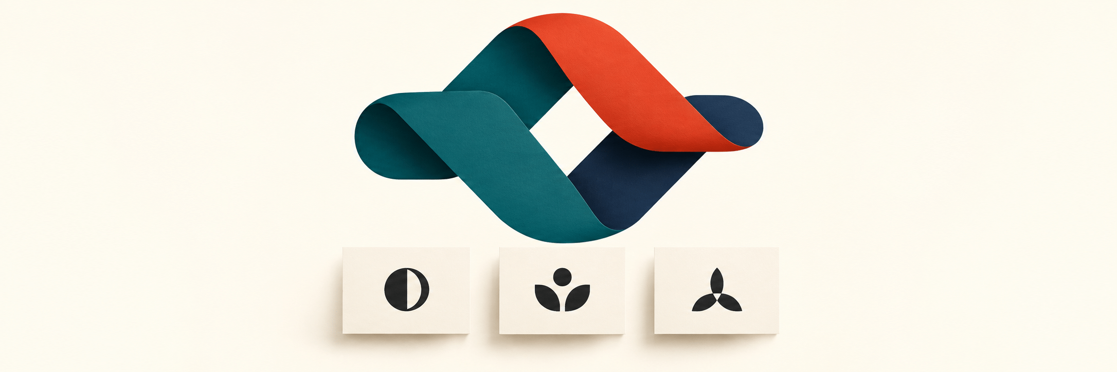
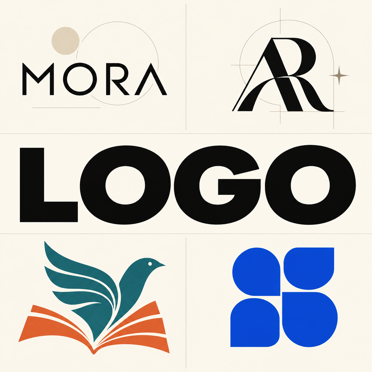
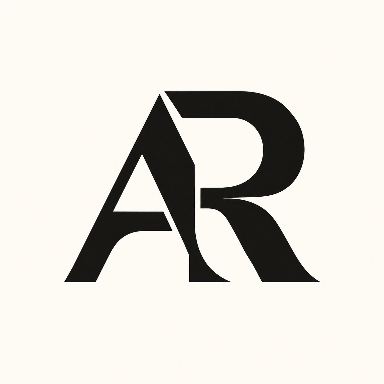
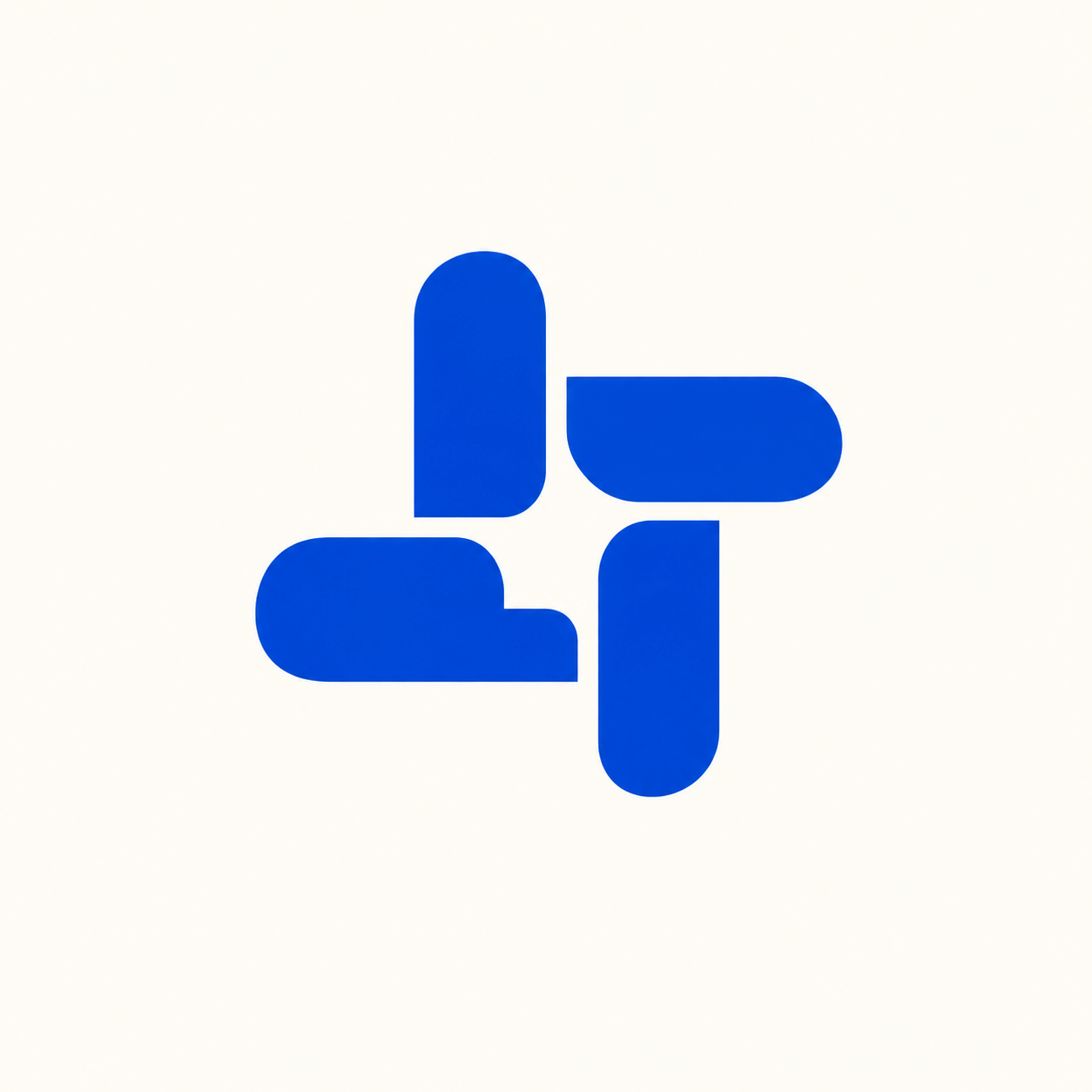
The new AI-generated studies deliberately vary the problem: a wordmark, an interlocking monogram, a pictorial symbol, a modular abstract mark and a botanical emblem. The banner and centrally titled collage introduce this range. None is an official identity for a real client or a reproduction of the historical examples discussed in the text.
Use the prompts to explore alternatives, then compare the results against a written brief. Check spelling, letter structure and small internal spaces in the actual image. For a finished identity, redraw and test the chosen direction. Do not let a polished paper texture or a dramatic mockup substitute for a readable mark.
Positive editorial assessment — AI-authored
Logo design can compress a complex recognition problem into a clear and durable visual form. Its strongest achievement is not mere simplicity but a precise relationship among shape, name and context. A well-developed system makes that relationship survive everyday use.
Critical editorial assessment — AI-authored
Generic geometric symbols, overexplained hidden meanings and spectacular mockups can make weak concepts look more resolved than they are. A mark also fails when its smallest intended use was considered too late. Improve it through plain-scale tests, clearer spacing and comparison with the actual environment in which it must work.
Neutral editorial assessment — AI-authored
A logo is one component of visual identity. Its success depends on recognition, differentiation, appropriateness and reproducibility within a defined context. Geometric restraint and expressive illustration can both work; neither guarantees quality independently of the brief and implementation.
Pocket-sized facts
Logo design is a discipline within graphic identity, not a single visual style.
A wordmark, symbol and monogram solve different recognition problems.
Generated raster concepts are not editable vector masters or cleared commercial identities.
A small poetic detour
Original words from the AOI studio.
Poetry
A name returns in shape and space,
a small familiar turn of line;
not every story in one place,
but one clear sign that says: this sign.
The gap is drawn, the curve is weighed,
the smallest version has its say;
and what the patient hand has made
must meet the ordinary day.
The prompt workshop
Original creative exercises. These prompts create new illustrations, not documentary evidence.
A typographic direction
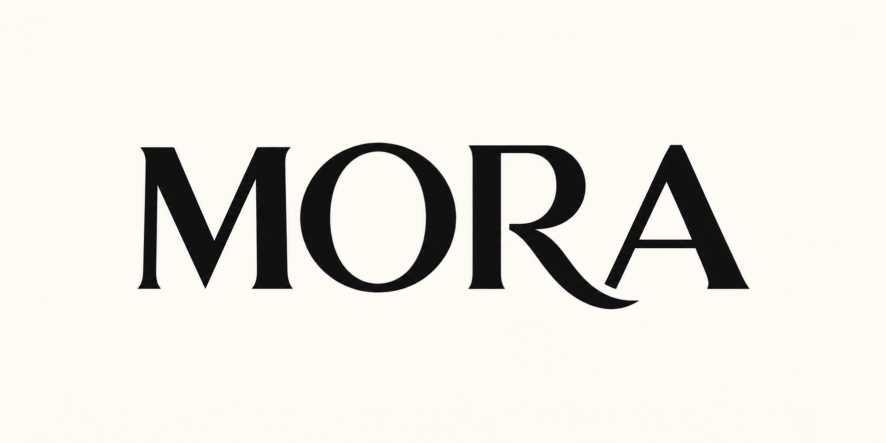
Create an original AI-generated logo-design study using the exact word "MORA" in carefully drawn black uppercase lettering. Contemporary humanist proportions, distinctive but readable curved R leg, balanced optical spacing, flat ivory background, generous clear space. No existing brand reference, mockup, tagline, shadows or extra text. This is a lettering exercise, not a cleared commercial identity.
A pictorial symbol
Create an original AI-generated flat two-colour logo concept for a fictional reading project: a small bird and an open book combined into one clear silhouette through negative space, deep teal and warm orange, balanced simple shapes, plain light background. No letters, real brand reference, gradients, shadows or intricate feathers.
A compact monogram
Create an original AI-generated monogram exploration using the letters A and R, two interlocking broad forms with open counters, strong one-colour black silhouette on ivory, optical balance and generous clear space. Show one finished concept only, no construction labels, extra letters, existing brand reference or 3D mockup.
Your next inspiration
Discover another art style
Follow a visual thread to the next subject.

Vector Art: Shape, Curves and Images Built to Adapt
Explore paths, curves and the difference between vector masters and raster previews.
Heraldry: Shields, Symbols and the Discipline of Clear Design
Compare identification through symbols in a distinct historical discipline.
A smile from the studio
Jokes
The logo worked beautifully at six feet wide. The business card requested a second opinion.