Letterform illustration · typography and custom lettering
Explore how letterforms become images through shape, spacing, repetition and meaning, with documented design references and three distinct original visual exercises.
A visual introduction
Select an image for a closer look. Use the thumbnails, arrow keys or a swipe to compare examples. Zoom in to inspect details, or share the image that inspires you.
Creative toolbox · take this style further
Choose an input and a destination. Search sends your words to the chosen site; Copy & open puts them on your clipboard to paste there.
Create with AI
Turn your chosen input into an image prompt or a new creative direction.
ChatGPT
Copy your input and paste it into a ChatGPT conversation or image request.
Copy & open ChatGPT (new tab)Claude · Anthropic
Develop an image prompt or explore the style in a new Claude conversation.
Copy & open Claude · Anthropic (new tab)Midjourney
Paste your input into the Imagine bar on the Create page.
Copy & open Midjourney (new tab)Adobe Firefly
Copy your input, open Firefly, and paste it into the prompt field.
Copy & open Adobe Firefly (new tab)Leonardo.Ai
Copy your input, open Leonardo, and paste it into the generation field.
Copy & open Leonardo.Ai (new tab)Image search
Find visual references. Short, concrete keywords usually work best.
Lexica
Search AI images and prompts using your selected input.
Search with this input Lexica (new tab)Pexels
Search the photo and video library. Short keywords often work best.
Search with this input Pexels (new tab)Pixabay
Search photos, illustrations and other images.
Search with this input Pixabay (new tab)Unsplash
Search photographs using the style name or your own keywords.
Search with this input Unsplash (new tab)Wikimedia Commons
Search photographs, artworks and historical images. Check each file for its source and reuse terms.
Search with this input Wikimedia Commons (new tab)Art & research
Explore artists, collections and the ideas behind a style.
Wikipedia
Search for background reading. A style may not have its own article.
Search with this input Wikipedia (new tab)WikiArt
Copy your input into WikiArt’s search to explore artists and artworks.
Copy & open WikiArt (new tab)Europeana
Paste your keywords into the search to explore European museum, library and archive collections.
Copy & open Europeana (new tab)Inspiration
Discover portfolios and visual ideas from creative communities.
Instagram hashtags
Search a hashtag made from your input: spaces and punctuation are removed. Instagram may require sign-in.
Search with this input Instagram hashtags (new tab)ArtStation
Paste your input into artwork search for concept art, environments, characters and visual development.
Copy & open ArtStation (new tab)Behance
Paste your input into project search for illustration, design and visual storytelling.
Copy & open Behance (new tab)A closer look
Counters become openings, strokes become contours, and repeated words create rhythm. A strong composition lets the viewer move deliberately between reading a letter and seeing an image.
When letters become the image
Typography Drawing is used here as a practical umbrella for images made with letterforms. It is not presented as a single historical movement. A composition may arrange existing type, draw custom letters, or use repeated characters to build a pictorial shape. Its distinguishing question is whether the letters actively create the image, rather than merely label an illustration.
Typography concerns the arrangement of type; hand lettering develops letterforms by drawing them. Calligraphic work places particular emphasis on the written stroke and its execution. These practices can overlap in a finished design. Adobe’s typography and lettering guides offer useful starting points, but the name of a tool does not determine what a composition achieves. [1][2]
Begin with a word, a shape or a rule
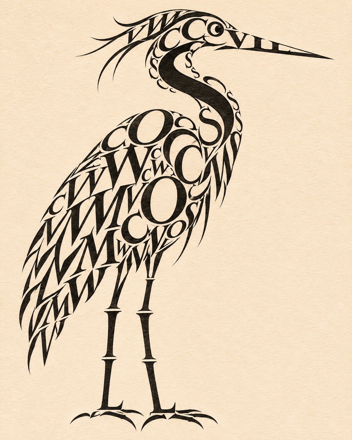
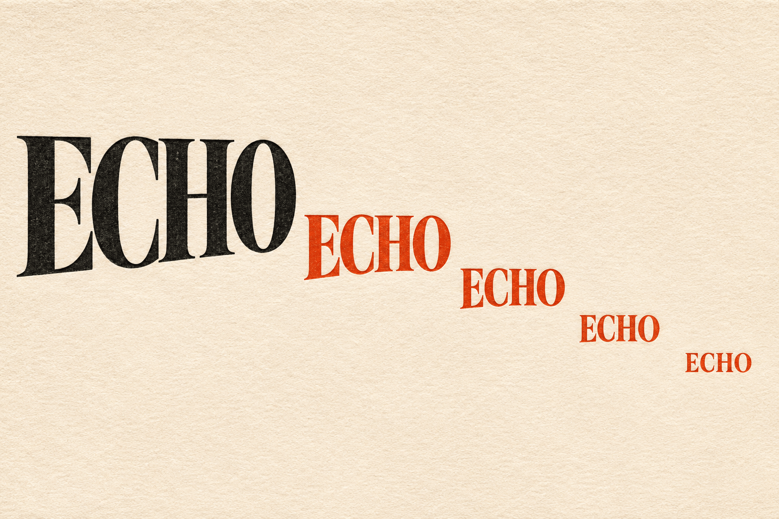
Choose the problem before choosing a decorative alphabet. A word-led design can make its meaning visible through weight, direction or spacing. A shape-led design can build a bird from recognisable glyphs. A rule-led experiment can repeat one word while changing scale or position. Each approach gives the viewer a different route between reading and looking.
Ask which element must be recognised first. If a viewer should read the word immediately, protect its sequence and distinctive letter features. If the image should emerge first, work on silhouette and density while leaving enough identifiable characters to reward a closer look. Trying to give every letter equal emphasis often produces noise rather than richness.
Space is part of the drawing
The empty interior of an O can become as important as its stroke. The interval between two letters can open a path or interrupt a rhythm. Adobe’s glossary distinguishes kerning, which adjusts particular letter pairs, from tracking or letterspacing across a longer passage. Those distinctions are useful when diagnosing why a word feels uneven. [3]
Judge optical relationships, not only ruler measurements. A broad diagonal and a narrow vertical create different surrounding spaces. Step back, reduce the design and examine it in monochrome. If the intended shape disappears, revise the underlying proportions before adding texture or another colour. A small amount of deliberate irregularity can feel lively; accidental collisions usually weaken the reading.
Historical reference: letters as structure and meaning
Hansjörg Mayer offers a documented example of typography becoming an experimental medium. Museo Experimental el Eco’s account of his work describes compositions using overlay, distribution and print processes to produce visual rhythms and landscapes. This provides a richer reference than an unsupported list of supposedly famous typography drawings. [4]
Concrete poetry is a related field, with its own histories and arguments. In her 1972 essay abstract, Mary Ellen Solt discusses the relationship between typographic choices and a visual poem’s meaning, questioning restrictive approaches to its visual possibilities. A typographic illustration is not automatically a concrete poem: consider whether language, arrangement and the reading experience are doing poetic work together. [5]
A verified design example
IBM credits Paul Rand with its eight-bar logo of 1972 and its 1981 eye–bee–M rebus poster. They demonstrate two different relationships between letters and images: a systematic treatment of letterforms, and a sequence that asks the viewer to read pictures and a letter together. They are corporate identity designs, not evidence of a movement called Typography Drawing. [6]
Study the design decision rather than copying the mark. For an original exercise, invent a short word and test how much of each letter can change while the reading remains intact. Do not describe an AI illustration as work by Rand or another designer, and do not invent an artwork title merely to fill a reference list.
A practical making sequence
Sketch several small arrangements in black and white. Select one clear hierarchy, establish the letters’ proportions, then resolve their spaces. Add colour only when it contributes a specific contrast: one focal letter, one repeated rhythm or one plane of depth. Texture should reveal a material character without closing small counters or eroding essential edges.
For a production design, keep editable lettering or type wherever possible and proof the exact final copy. A raster study can suggest a direction, but it does not supply a reusable font or a complete identity system. Check every character, accent and punctuation mark. When readable language matters, an attractive near-word is a defect, not an artistic substitute.
Three studies to compare
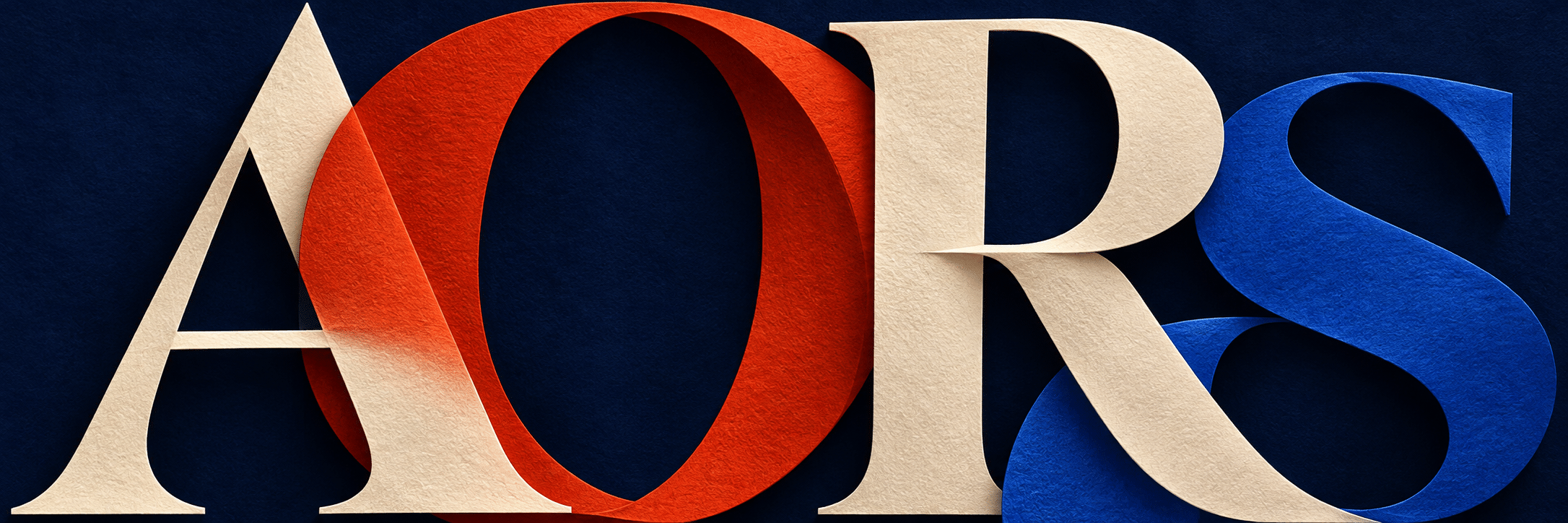
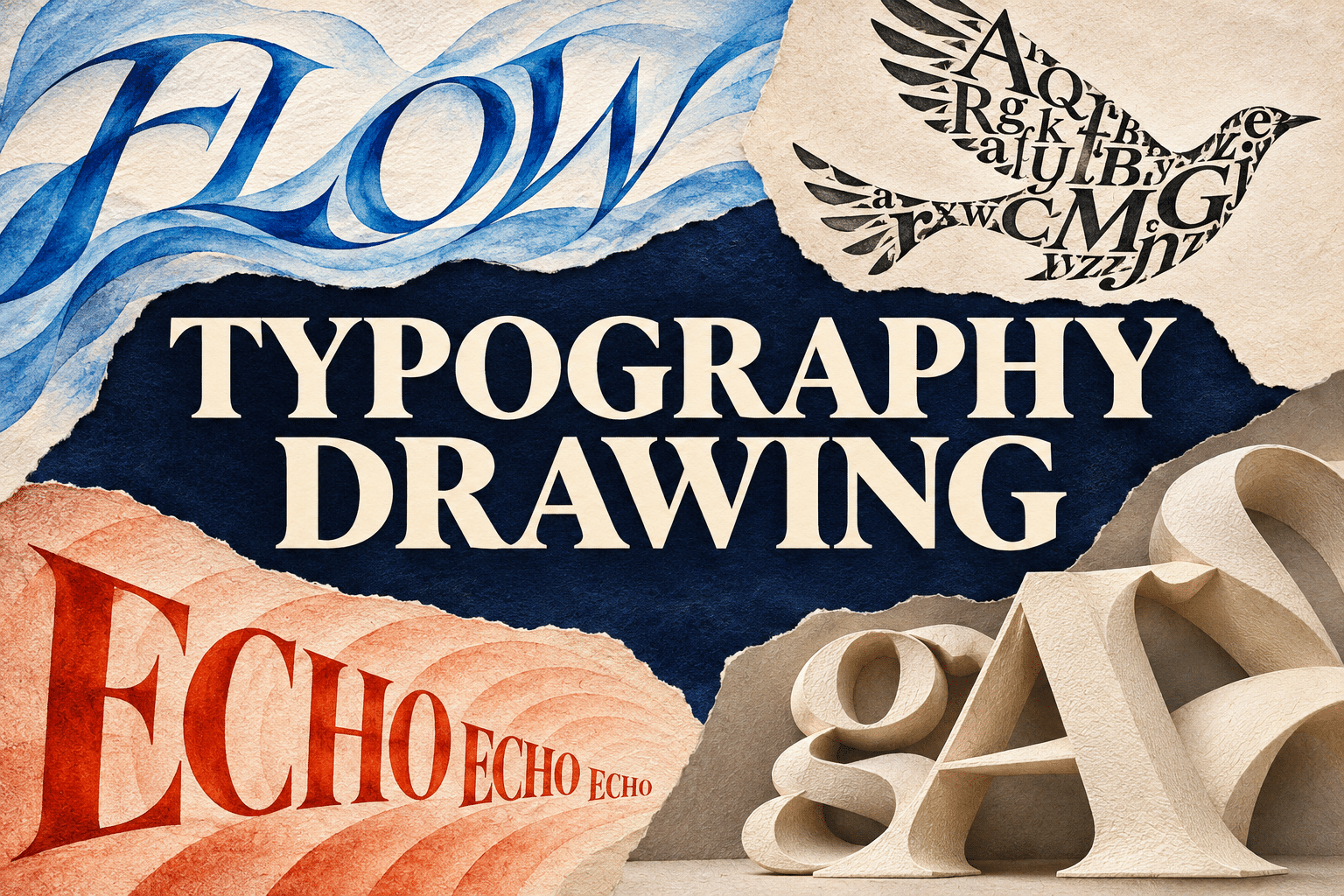
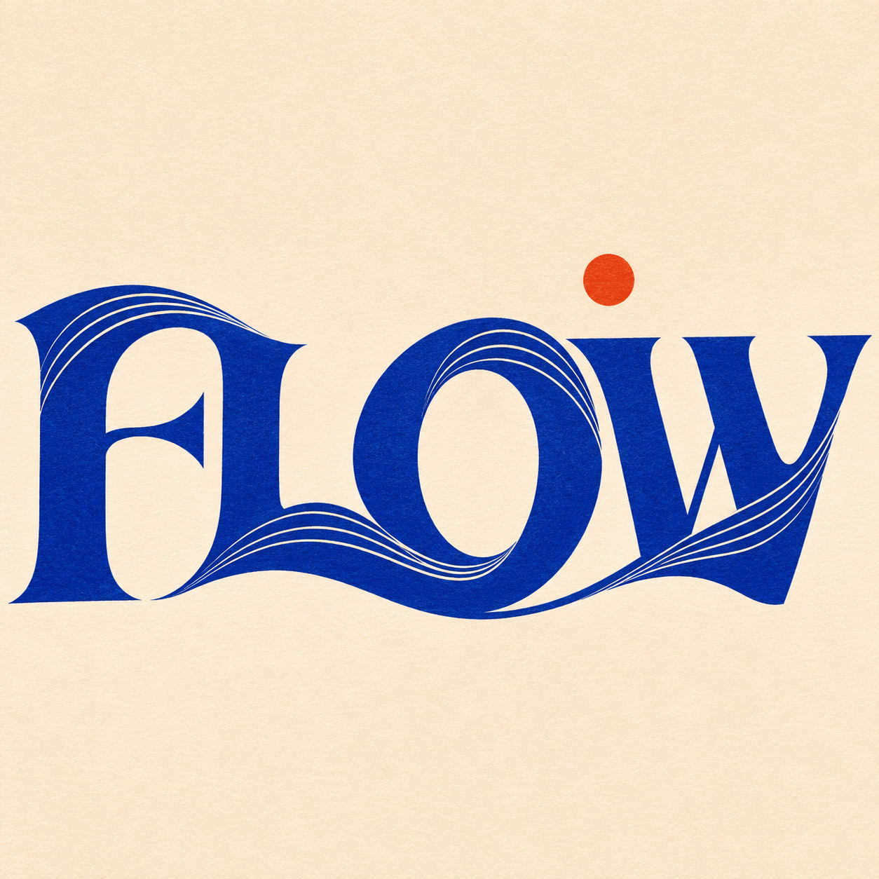
The FLOW study tests a word whose strokes suggest movement. The bird study uses letter shapes as pictorial building blocks. The ECHO study makes repetition and changing scale the main event. Together they separate custom word drawing, glyph illustration and spatial word composition, while the banner treats letters as sculptural forms.
These are original AI-generated studies. Read their words at full size and again as small previews; inspect the bird as both a silhouette and a gathering of characters. The collage introduces the approaches with its full central title. Success depends on a precise visual idea and readable construction, not the maximum number of fonts.
A small poetic detour
Original words from the AOI studio.
Poetry
A letter lifts its rounded room.
A line leans out to meet the light.
Between two strokes, an opening
turns silent paper into flight.
The word moves slowly through its shape;
its echo finds a smaller space.
We read, then look, then read again,
and give the interval its place.
The prompt workshop
Original creative exercises. These prompts create new illustrations, not documentary evidence.
Make a word move
Create an original typographic artwork using only the word FLOW. Keep all four letters readable while making their strokes suggest one continuous wave. Use a restrained blue-and-ivory palette, clear spacing and no extra caption.
Build an image from glyphs
Create a poised bird entirely from recognisable Latin letterforms in black on ivory. Vary scale, orientation and density to make the silhouette. Keep individual glyphs visible at close range; do not add an ordinary drawn bird underneath.
Give a word a spatial rhythm
Compose five correctly spelled instances of ECHO, each smaller than the previous one, along a deliberate descending arc. Make spacing and scale carry the visual idea. Use two ink colours and generous empty space; proof every letter.
People & works to explore
References discussed in this article. Consult the sources below for context.
Artists and practitioners
Hansjörg Mayer — experimental typography; see Museo Experimental el Eco
Paul Rand — graphic design; see IBM’s documented history
Paintings and other works
Paul Rand, IBM eight-bar logo (1972)
Paul Rand, IBM eye–bee–M rebus poster (1981)
A smile from the studio
Jokes
The letters asked for a little space. The typographer adjusted the kerning.
Sources and further exploration
[1] Adobe — Typography: arrangement, hierarchy and readability
[2] Adobe — Digital lettering: drawing and developing custom letters
[3] Adobe — Typographic Terms: kerning, letterspacing and other definitions
[4] Museo Experimental el Eco — Hansjörg Mayer, Typographic Landscapes
[5] Mary Ellen Solt — Typography and the Visual Concrete Poem, Visible Language (1972)