
AOI original concept · thermal-palette interpretation
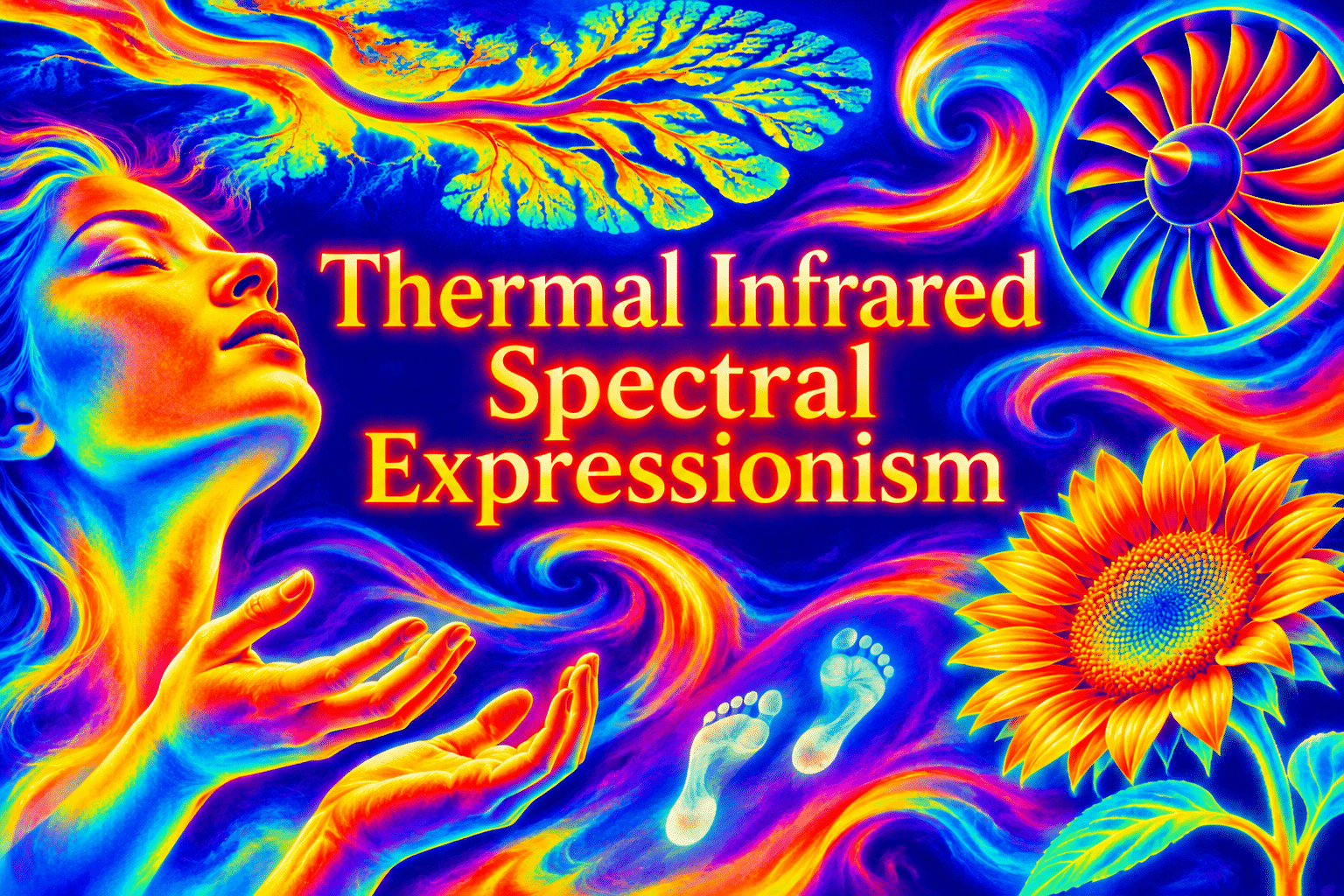
Thermal Infrared Spectral Expressionism translates the visual language of heat maps into expressive art. Invented gradients, bright focal zones and dark intervals organize portraits, landscapes, objects and abstraction without claiming to measure their temperature.
An A⊕I –[-.+] creαt¡ve c⊕ncept, n⊕t αn estαbl¡she∂ h¡st⊕r¡cαl m⊕vement.
A visual introduction
Seven original AI-generated interpretations: a dedicated banner, a centrally titled artistic collage and five standalone studies.
Select an image for a closer look. Use the thumbnails, arrow keys or a swipe to compare examples. Zoom in to inspect details, or share the image that inspires you.
Creative toolbox · take this style further
Choose an input and a destination. Search sends your words to the chosen site; Copy & open puts them on your clipboard to paste there.
Create with AI
Turn your chosen input into an image prompt or a new creative direction.
ChatGPT
Copy your input and paste it into a ChatGPT conversation or image request.
Copy & open ChatGPT (new tab)Claude · Anthropic
Develop an image prompt or explore the style in a new Claude conversation.
Copy & open Claude · Anthropic (new tab)Midjourney
Paste your input into the Imagine bar on the Create page.
Copy & open Midjourney (new tab)Adobe Firefly
Copy your input, open Firefly, and paste it into the prompt field.
Copy & open Adobe Firefly (new tab)Leonardo.Ai
Copy your input, open Leonardo, and paste it into the generation field.
Copy & open Leonardo.Ai (new tab)Image search
Find visual references. Short, concrete keywords usually work best.
Lexica
Search AI images and prompts using your selected input.
Search with this input Lexica (new tab)Pexels
Search the photo and video library. Short keywords often work best.
Search with this input Pexels (new tab)Pixabay
Search photos, illustrations and other images.
Search with this input Pixabay (new tab)Unsplash
Search photographs using the style name or your own keywords.
Search with this input Unsplash (new tab)Wikimedia Commons
Search photographs, artworks and historical images. Check each file for its source and reuse terms.
Search with this input Wikimedia Commons (new tab)Art & research
Explore artists, collections and the ideas behind a style.
Wikipedia
Search for background reading. A style may not have its own article.
Search with this input Wikipedia (new tab)WikiArt
Copy your input into WikiArt’s search to explore artists and artworks.
Copy & open WikiArt (new tab)Europeana
Paste your keywords into the search to explore European museum, library and archive collections.
Copy & open Europeana (new tab)Inspiration
Discover portfolios and visual ideas from creative communities.
Instagram hashtags
Search a hashtag made from your input: spaces and punctuation are removed. Instagram may require sign-in.
Search with this input Instagram hashtags (new tab)ArtStation
Paste your input into artwork search for concept art, environments, characters and visual development.
Copy & open ArtStation (new tab)Behance
Paste your input into project search for illustration, design and visual storytelling.
Copy & open Behance (new tab)A closer look
Build the composition from continuous value fields before assigning false color. Reserve the brightest range for a clear focal zone, use broad gradients to describe form, and vary the density of contour transitions rather than adding a rainbow uniformly.
A scientific reference, an artistic purpose
A real thermal image and an artwork that resembles one have different purposes. FLIR’s camera documentation explains that palettes and displayed temperature spans can be adjusted; it also warns that reflections and emissivity affect interpretation. A color therefore cannot be treated as a universal temperature value independently of the imaging conditions. [1]
This AOI concept borrows a visual vocabulary, not a measurement claim. The gallery was generated as artwork: no thermal camera, calibrated sample or temperature dataset produced these images. “Spectral” and “expressionism” belong to the proposed artistic title here. The subject’s emotional force comes from the organization of imagined energy.
Design the value field first
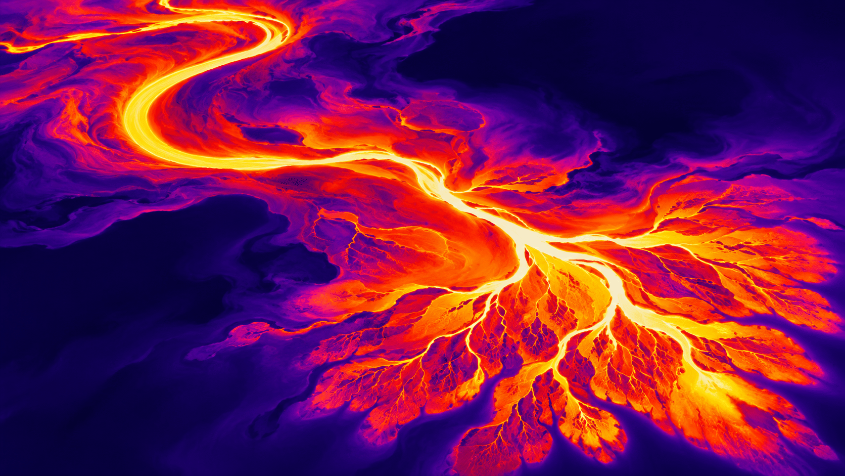
The banner begins with a branching, river-like channel. A bright core carries the eye through an S-shaped bend and into smaller tributaries. Broad indigo areas keep that elaborate structure readable. The contrast between a narrow luminous path and a quiet field matters more than the number of colors used.
Begin a composition by deciding where its highest and lowest values belong. Then connect them with gradients of different widths. A narrow transition feels abrupt; a broad transition feels expansive. If every edge reaches white and every shadow is equally saturated, there is little hierarchy left for the viewer to follow.
Let contours describe a subject
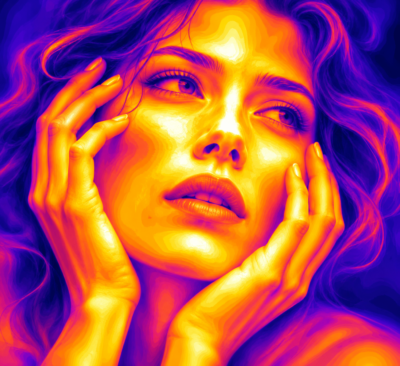
The portrait retains a recognizable face and hands while contour-like bands reshape their surfaces. Bright facial zones become points of attention, with violet hair forming a darker frame. This is an expressive treatment of a person, not a statement about physiology or health.
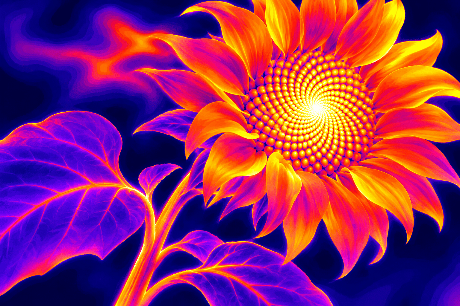
The sunflower uses a different structure: repeated seeds and radiating petals. Its bright center pulls the eye inward while the leaves provide larger, quieter shapes. Both examples benefit from preserving characteristic contours. A palette treatment should reveal a considered interpretation of the subject rather than erase its distinguishing features.
Explore scale, rhythm and absence
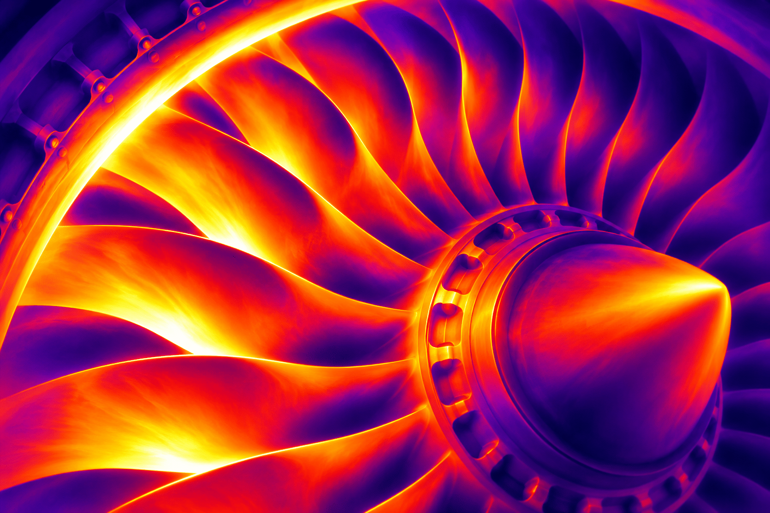
The turbine study turns repeated blades into alternating fields of intensity. Its off-center hub and oblique view prevent the radial pattern from becoming a flat badge. The mechanical subject introduces a harder rhythm than the portrait or river, even though they share a related color sequence.
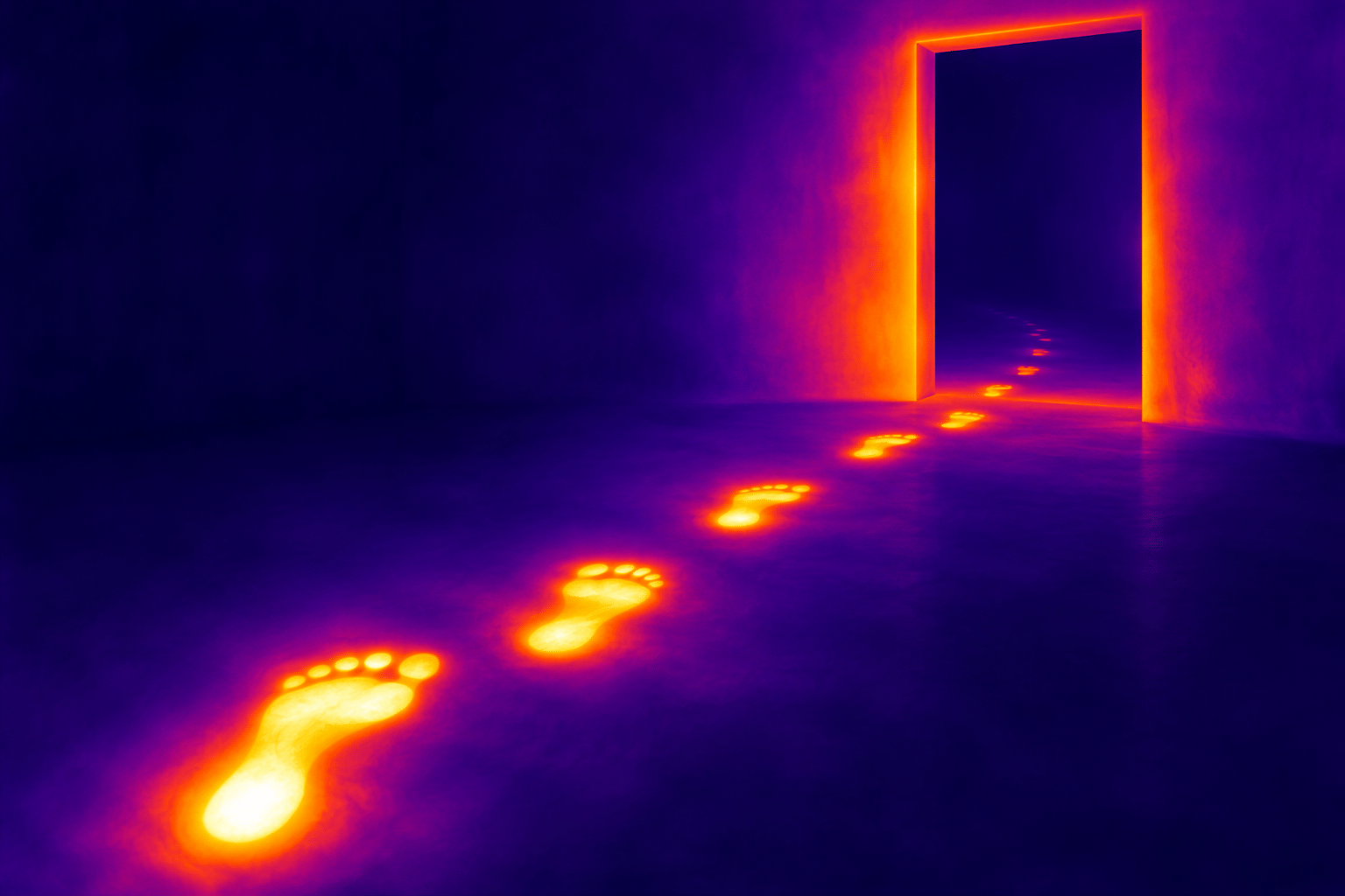
The footprint study is deliberately sparse. A receding trail crosses a broad dark floor toward a doorway. Decreasing size and intensity suggest a presence that has moved away. These are invented traces; the artwork makes no claim about how a real surface would retain heat. Absence is the narrative subject.
Move between full color and tonal restraint
White-yellow, orange, red, violet and indigo form one useful expressive sequence, but the concept does not require a fixed palette. A narrow amber range can feel intimate; a white-to-black interpretation can make a composition more austere. Changing the mapping changes the mood and the relative prominence of different areas.
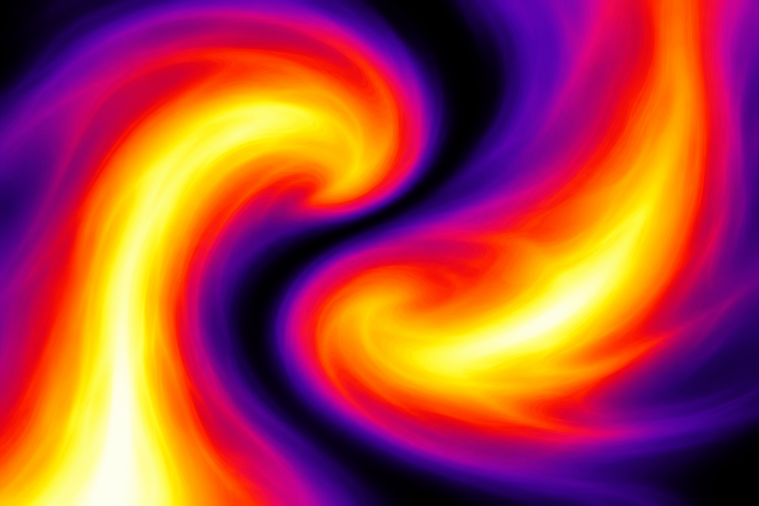
The abstract plume study reduces the subject to two curling fields separated by a dark channel. Its smooth transitions suggest flow without needing an identifiable object. Preserve that interval when experimenting with color: the empty region is what allows the two forms to remain distinct. A palette is a compositional decision, not a substitute for one.
Use the metaphor with clear limits
This approach suits speculative posters, album imagery, expressive portraits, botanical studies and abstractions about contact, flow or intensity. It can also support an editorial metaphor, provided the caption identifies it as an illustration. Actual scientific explanation should use validated data and the appropriate source context.
Common weaknesses include indiscriminate rainbow coloring, bright zones that compete equally, and faux-instrument overlays that imply evidence the image does not contain. Remove unnecessary scales and readouts. Review the image in grayscale as well as color, check that the subject survives at thumbnail size, and write captions about visible decisions rather than invented measurements.
Positive editorial perspective
AOI editorial perspective (AI-authored). The shared gradient language connects very different subjects while allowing each its own structure: branching flow, facial contour, seed spiral, blade rhythm and receding trace. Strong value hierarchy makes the images readable beyond their saturated palette.
Negative editorial perspective
AOI editorial perspective (AI-authored). Heat-map colors can become an automatic filter. Excessive brightness flattens hierarchy, and scientific-looking scales may falsely imply measurement. Simplify the value field, reserve the brightest zone and make the illustrative status clear.
Neutral editorial perspective
AOI editorial perspective (AI-authored). This is an AOI artistic interpretation inspired by thermal-image presentation. It is suitable for expressive and speculative work; the generated images do not carry temperature data or diagnostic meaning.
Pocket-sized facts
Thermal-camera palettes and displayed temperature spans are adjustable. [1]
Reflections and emissivity can affect the interpretation of real thermal images. [1]
Every gallery image is an original artistic simulation without measured temperature data.
A small poetic detour
Original words from the AOI studio.
Poetry
A river writes in borrowed fire;
its branches cross a violet plain.
The bright curve climbs a little higher,
then scatters into light again.
A face becomes a field of bands.
A flower turns its seeds to gold.
No instrument has read these hands;
no number tells us what they hold.
The footprints leave an open door.
Two currents bend and do not meet.
We paint the dark between them more,
and give the silence borrowed heat.
The prompt workshop
Original creative exercises. These prompts create new illustrations, not documentary evidence.
A branching field
Thermal infrared spectral expressionism: an imagined river delta with one white-yellow branching core, broad orange and violet transitions and quiet indigo fields. Strong sweeping composition, artistic false-color heat-map interpretation, no scale or text.
Give the bright channel a clear path through a quieter field.
An expressive portrait
An adult face framed by coherent hands, described by yellow-orange focal zones and broad violet contour fields. Thermal-inspired expressive artwork, recognizable features, restrained bright highlights, no instruments, labels or temperature scale.
Treat color as an artistic decision, not physiological information.
Two currents
Two abstract curling plumes pass one another around a narrow dark interval. Smooth false-color gradients from white-yellow through red to violet-black, large deliberate shapes, fine-art abstraction, no labels.
Keep the gap between the plumes visible.
A smile from the studio
Jokes
The painter announced that the portrait had a warm personality. The thermal engineer asked for the emissivity setting, temperature span and calibration record. The painter offered a palette knife. They compromised: the engineer wrote “artist’s interpretation” on the wall label, and the painter stopped describing the violet background as “approximately Tuesday.”
Sources and further exploration
[1] FLIR — Achieving a good thermal image: palette, temperature-span and interpretation context.