Historical abstraction · colour and rhythm
Simultanism is the colour-based approach developed by Robert and Sonia Delaunay in the early twentieth century. Adjacent and interlocking colour areas generate relationships that help construct form, light and rhythm. It is not simply the depiction of several events at once, nor a general name for any colourful abstract image.
A visual introduction
Select an image for a closer look. Use the thumbnails, arrow keys or a swipe to compare examples. Zoom in to inspect details, or share the image that inspires you.


Creative toolbox · take this style further
Choose an input and a destination. Search sends your words to the chosen site; Copy & open puts them on your clipboard to paste there.
Create with AI
Turn your chosen input into an image prompt or a new creative direction.
ChatGPT
Copy your input and paste it into a ChatGPT conversation or image request.
Copy & open ChatGPT (new tab)Claude · Anthropic
Develop an image prompt or explore the style in a new Claude conversation.
Copy & open Claude · Anthropic (new tab)Midjourney
Paste your input into the Imagine bar on the Create page.
Copy & open Midjourney (new tab)Adobe Firefly
Copy your input, open Firefly, and paste it into the prompt field.
Copy & open Adobe Firefly (new tab)Leonardo.Ai
Copy your input, open Leonardo, and paste it into the generation field.
Copy & open Leonardo.Ai (new tab)Image search
Find visual references. Short, concrete keywords usually work best.
Lexica
Search AI images and prompts using your selected input.
Search with this input Lexica (new tab)Pexels
Search the photo and video library. Short keywords often work best.
Search with this input Pexels (new tab)Pixabay
Search photos, illustrations and other images.
Search with this input Pixabay (new tab)Unsplash
Search photographs using the style name or your own keywords.
Search with this input Unsplash (new tab)Wikimedia Commons
Search photographs, artworks and historical images. Check each file for its source and reuse terms.
Search with this input Wikimedia Commons (new tab)Art & research
Explore artists, collections and the ideas behind a style.
Wikipedia
Search for background reading. A style may not have its own article.
Search with this input Wikipedia (new tab)WikiArt
Copy your input into WikiArt’s search to explore artists and artworks.
Copy & open WikiArt (new tab)Europeana
Paste your keywords into the search to explore European museum, library and archive collections.
Copy & open Europeana (new tab)Inspiration
Discover portfolios and visual ideas from creative communities.
Instagram hashtags
Search a hashtag made from your input: spaces and punctuation are removed. Instagram may require sign-in.
Search with this input Instagram hashtags (new tab)ArtStation
Paste your input into artwork search for concept art, environments, characters and visual development.
Copy & open ArtStation (new tab)Behance
Paste your input into project search for illustration, design and visual storytelling.
Copy & open Behance (new tab)A closer look
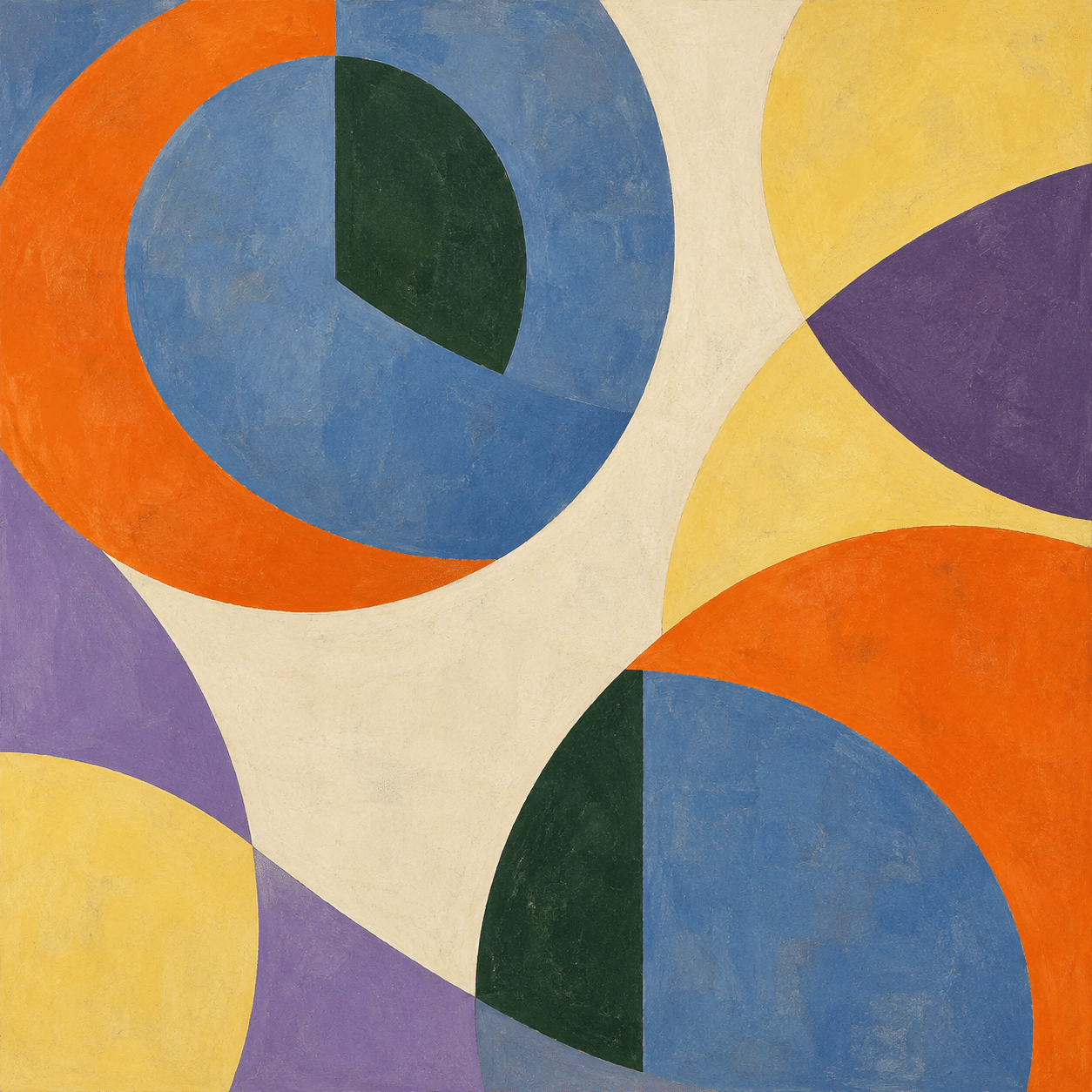
Look at what happens where colours meet: a warm arc against a cool field, a repeated hue surrounded by different neighbours, or a disc interrupted by an offset plane. The effect depends on relationships across the whole surface. Circles are useful, but a pile of rainbow circles alone does not explain the method.
The historical foundation
Getty’s Art & Architecture Thesaurus identifies Simultanism with Robert and Sonia Delaunay and connects it to Michel Eugène Chevreul’s theory of simultaneous colour contrast. Its defining vocabulary includes interlocking or overlapping areas of contrasting colours. [1] Matisse and Kandinsky are important to other histories of modern colour, but neither should be presented as the founder of this approach.
The term concerns how colours act together within an image. It also belongs to a wider modernist interest in light, movement and the experience of contemporary life. Keep the documented historical practice separate from the looser everyday meaning of simultaneity: several things happening at once.
Two works that sharpen the definition
Robert Delaunay’s Simultaneous Contrasts: Sun and Moon is catalogued by MoMA as Paris 1913, although the painting bears the date 1912. [2] That distinction matters: repeat the museum’s qualified dating rather than turning an inscription into an unquestioned creation date.
Sonia Delaunay’s Prismes électriques (couleurs simultanées), dated 1914, provides another anchor. The Centre Pompidou connects its colour vibration to electric lighting and rail travel. [3] The two works offer related investigations, not evidence that one artist’s contribution can be reduced to an extension of the other’s.
When comparing them, ask how colour constructs the image rather than merely decorating a pre-existing drawing. Where does a boundary become emphatic? Where does a form seem to continue through a change of hue? These questions lead beyond the recognition of a familiar circular motif.
What simultaneous contrast means for looking
A colour is encountered in relation to its surroundings. The same-looking patch can read differently beside a dark or light field, or next to a warmer or cooler neighbour. Simultanist composition makes such encounters an active part of the image instead of treating colour as a set of isolated samples.
For a practical comparison, place a muted blue shape in two different surroundings and keep its size and nominal colour constant. Observe the difference before increasing saturation. This is a useful studio exercise, not a calibrated scientific measurement; screens, lighting and viewing conditions affect what you see.
Do not promise that every viewer will perceive identical optical motion. A successful picture can create rhythm through repeated intervals and changing boundaries without behaving like an animated object. Describe the visual decisions and leave room for differences in perception.
A visual grammar of boundaries and intervals
Begin with a small number of large colour areas. Give them unequal roles: a dominant field, a counterweight and a few accents. Then decide where a curve changes direction, where a band is interrupted and where a quiet area lets the eye rest.
Discs, semicircles and wedges can create turning rhythms. Rectangles and diagonals can interrupt them. The aim is not to fill every gap with geometry, but to make each meeting of shapes matter. If all boundaries are equally sharp and all colours equally intense, the surface may become busy without becoming organized.
Repeat a hue in different contexts to connect distant parts of the composition. Vary the scale of a recurring arc or move its centre. These small changes can create a relationship across the surface while avoiding the mechanical regularity of a target pattern.
Beyond the easel: books and design
Sonia Delaunay’s collaboration with Blaise Cendrars, La Prose du Transsibérien et de la Petite Jehanne de France (1913), extends the discussion into the relationship between reading and seeing. MoMA describes an accordion-format book combining colour illustration and letterpress text, which can be unfolded to present the composition together. [4]
MoMA’s artist record also includes costume, clothing and textile-related work. [5] These examples help prevent an account of abstraction that treats applied design as a minor footnote. A pattern changes when it folds, wraps around a body or meets a seam; a book changes when it opens.
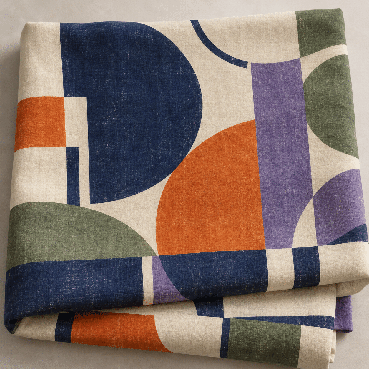
In a contemporary exercise, test the same colour logic on a flat panel and a folded surface. Keep the comparison explicit. A generated textile image can suggest a design problem, but it does not prove that a fabric has been woven, printed or manufactured.
How the new gallery tests the idea
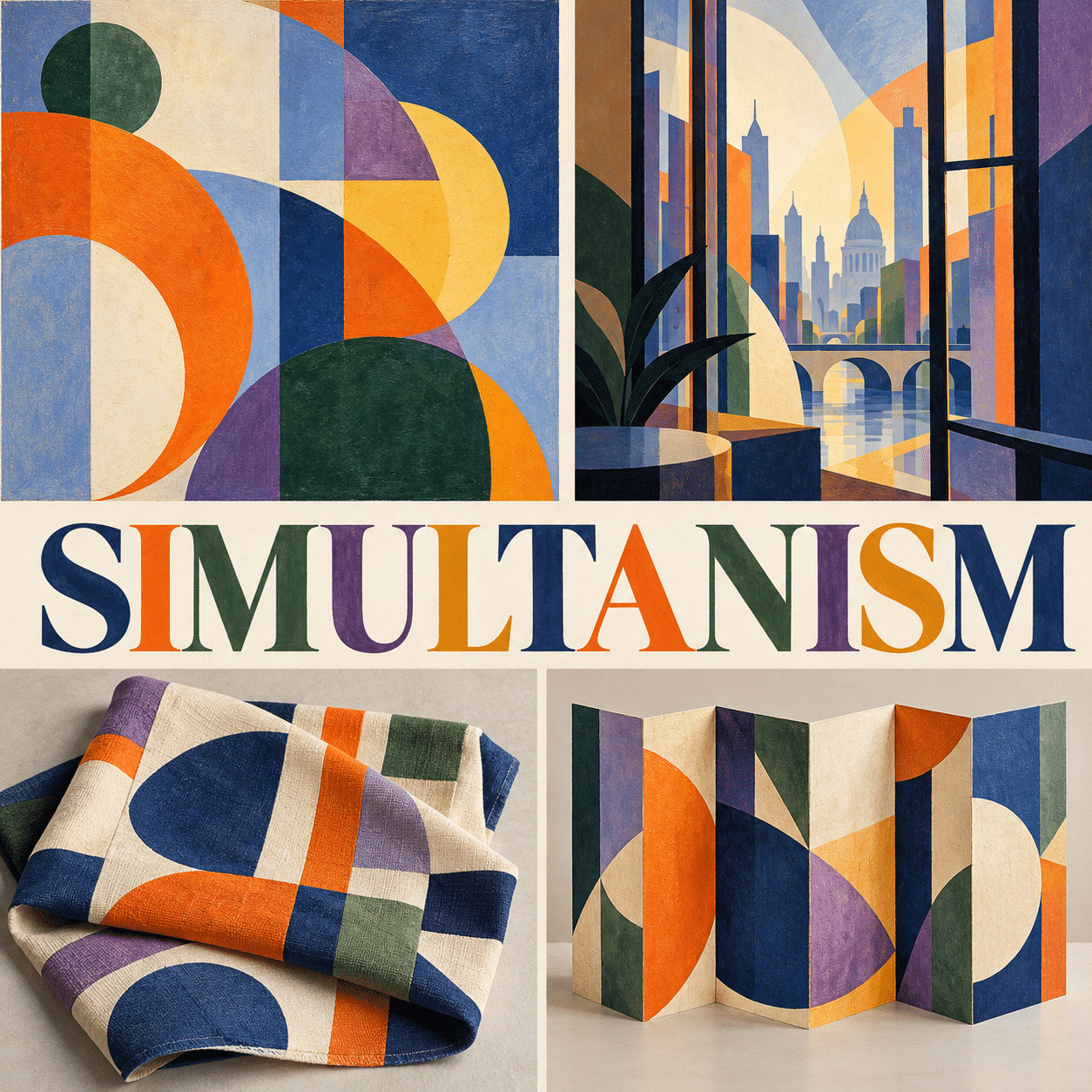
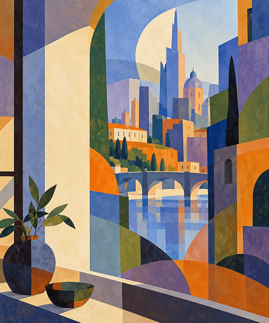
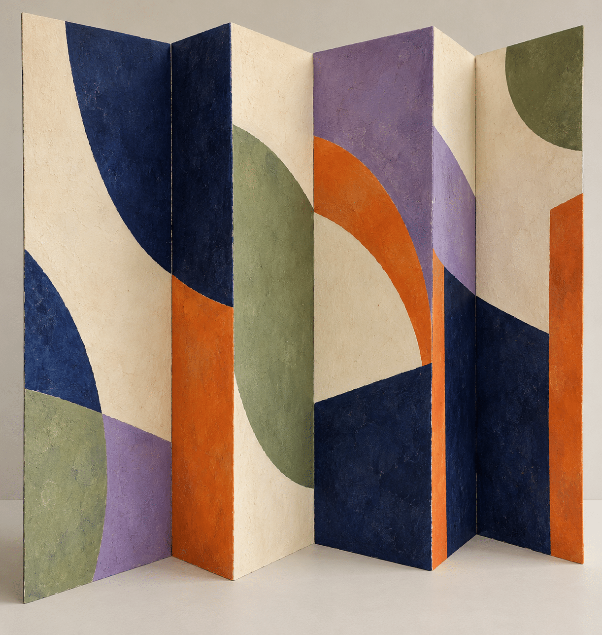
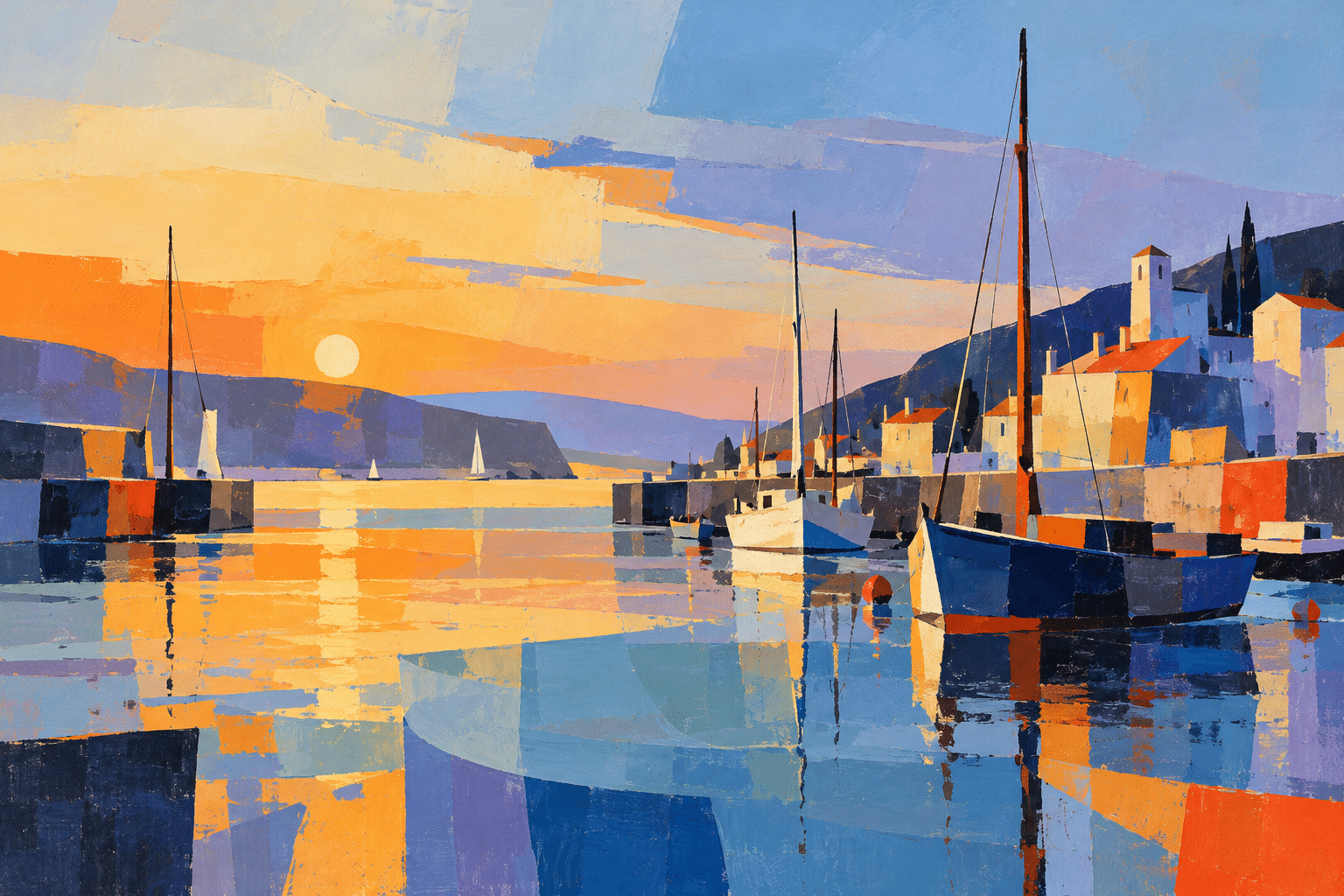
The first study uses offset discs and a quiet field to test colour rhythm without a recognizable subject. The second builds an invented city-window view from interacting planes. A folded textile study explores how geometry changes across a surface. A long accordion-paper study uses colour alone to suggest a reading rhythm. The fifth turns a harbour into a network of curved and angular colour relationships.
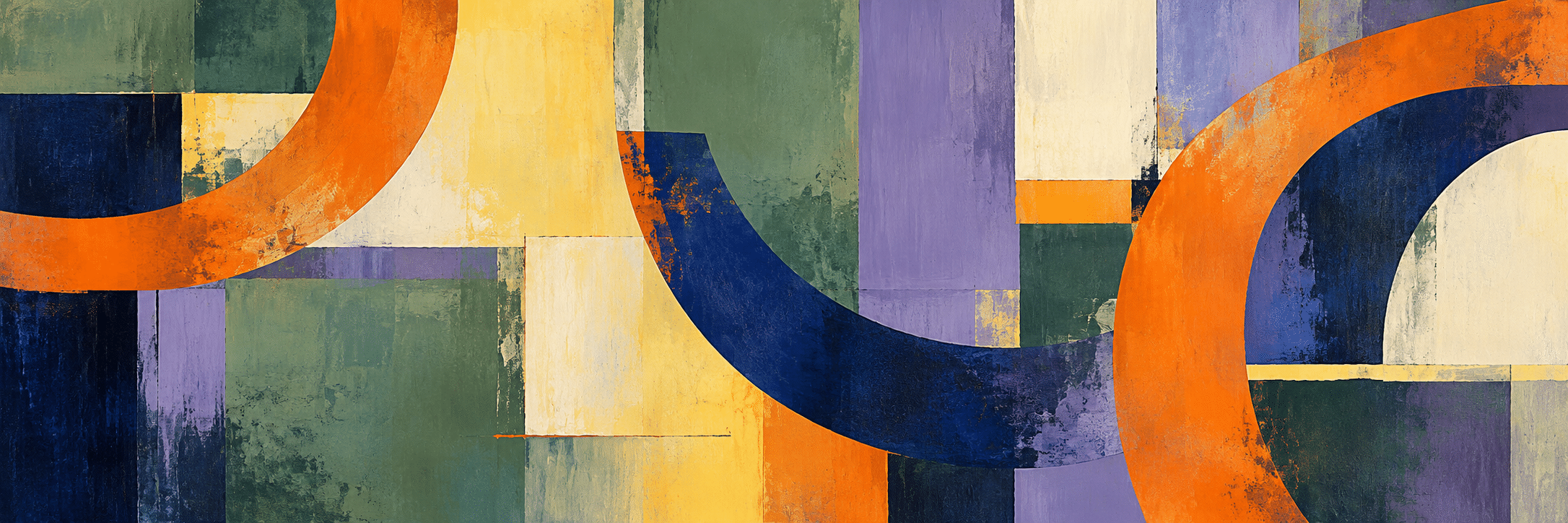
The wide banner introduces a continuous rhythm across several unequal centres, while the centrally titled collage compares different applications. All new images are AI-generated contemporary interpretations. None is a reproduction, an undocumented Delaunay work or evidence of a historical object.
Build a more precise prompt
Specify colour relationships rather than only colour names: an orange arc beside a muted blue field, repeated violet planes against different neighbours, or a pale interval separating two saturated groups. Name the spatial problem and the desired hierarchy.
Choose whether the picture is non-objective or retains a subject. For a harbour, preserve a few recognition cues such as a mast and waterline while letting colour planes carry the structure. For a textile, describe the folds and how the printed pattern continues across them. Avoid mixing every application into one image.
Review at both small and large scale. If the composition loses its balance as a thumbnail, simplify the main masses. If it reads only as a colour wheel, offset the centres and vary the intervals. If it becomes an indistinct glow, recover a few decisive boundaries.
Positive editorial assessment — AI-authored
Simultanism makes colour an organizing force. Its strongest lessons concern relationships: one edge activates another, a repeated hue links distant areas, and a change of scale creates rhythm. The approach can sustain both abstract painting and thoughtful experiments across designed surfaces.
Critical editorial assessment — AI-authored
The familiar disc vocabulary is easily reduced to decorative targets or uniformly saturated rainbow fragments. More colour does not necessarily produce richer relationships. Improve a weak study by reducing the palette, varying intervals and giving quiet areas a deliberate role.
Neutral editorial assessment — AI-authored
Simultanism is a historically situated colour-based practice associated with Robert and Sonia Delaunay. This guide combines institutional references with contemporary exercises in adjacency, rhythm and surface. Its generated examples illustrate visual principles without claiming historical authorship or scientific proof of optical effects.
A small poetic detour
Original words from the AOI studio.
Poetry
An orange edge addresses blue;
a violet answers from the side.
The colour keeps its place, yet seems
to change the room in which it lies.
One arc returns, another breaks,
a quiet field allows them through.
The eye composes as it moves—
each neighbour makes the colour new.
The prompt workshop
Original creative exercises. These prompts create new illustrations, not documentary evidence.
Colour makes the rhythm
Create an original non-objective painting with three unequal offset disc centres, interrupted arcs and a broad quiet ivory field. Place orange beside muted blue, violet beside pale yellow, and repeat one deep green in different surroundings. Clear hierarchy, matte painted texture, no lettering or colour-wheel diagram.
A city built from relationships
Create an invented city-window view where a few vertical buildings and a bridge remain recognizable while overlapping blue, orange, green and violet planes construct the space. Offset arcs suggest changing light; preserve a calm pale interval and avoid uniform saturation. No historical artwork copy or text.
Colour across a fold
Create an original textile design shown as folded cloth, with unequal semicircles, rectangular colour planes and interrupted bands. Use cream, indigo, orange, muted green and violet; maintain pattern continuity across folds and balance saturated edges with quiet areas. No logos or lettering.
People & works to explore
References discussed in this article. Consult the sources below for context.
Artists and practitioners
Robert Delaunay
Sonia Delaunay
Paintings and other works
Robert Delaunay, Simultaneous Contrasts: Sun and Moon — Paris 1913, dated 1912 on the painting
Sonia Delaunay, Prismes électriques (couleurs simultanées) — 1914
Sonia Delaunay and Blaise Cendrars, La Prose du Transsibérien et de la Petite Jehanne de France — 1913
A smile from the studio
Jokes
Blue asked why it looked different today. Orange said it had only moved in next door.
Sources and further exploration
[1] Getty AAT — definition and connection to Chevreul’s colour theory
[2] MoMA — Robert Delaunay, Simultaneous Contrasts: Sun and Moon, qualified dating
[3] Centre Pompidou — Sonia Delaunay, Prismes électriques, 1914
[4] MoMA — Delaunay and Cendrars’s accordion-format book, 1913
[5] MoMA — Sonia Delaunay’s works across illustration, costume and design