
Historical art and design · researched guide
Rococo is an eighteenth-century language of art and design associated with curling ornament, asymmetry and elaborate relationships between objects, pictures and interiors. It deserves more than the instruction “add pink and gold”. This guide follows a candlestick, a painted pastoral and the circulation of designs to show how the style actually works.
A visual introduction
Open any image to look closer, then browse the examples.
A closer look
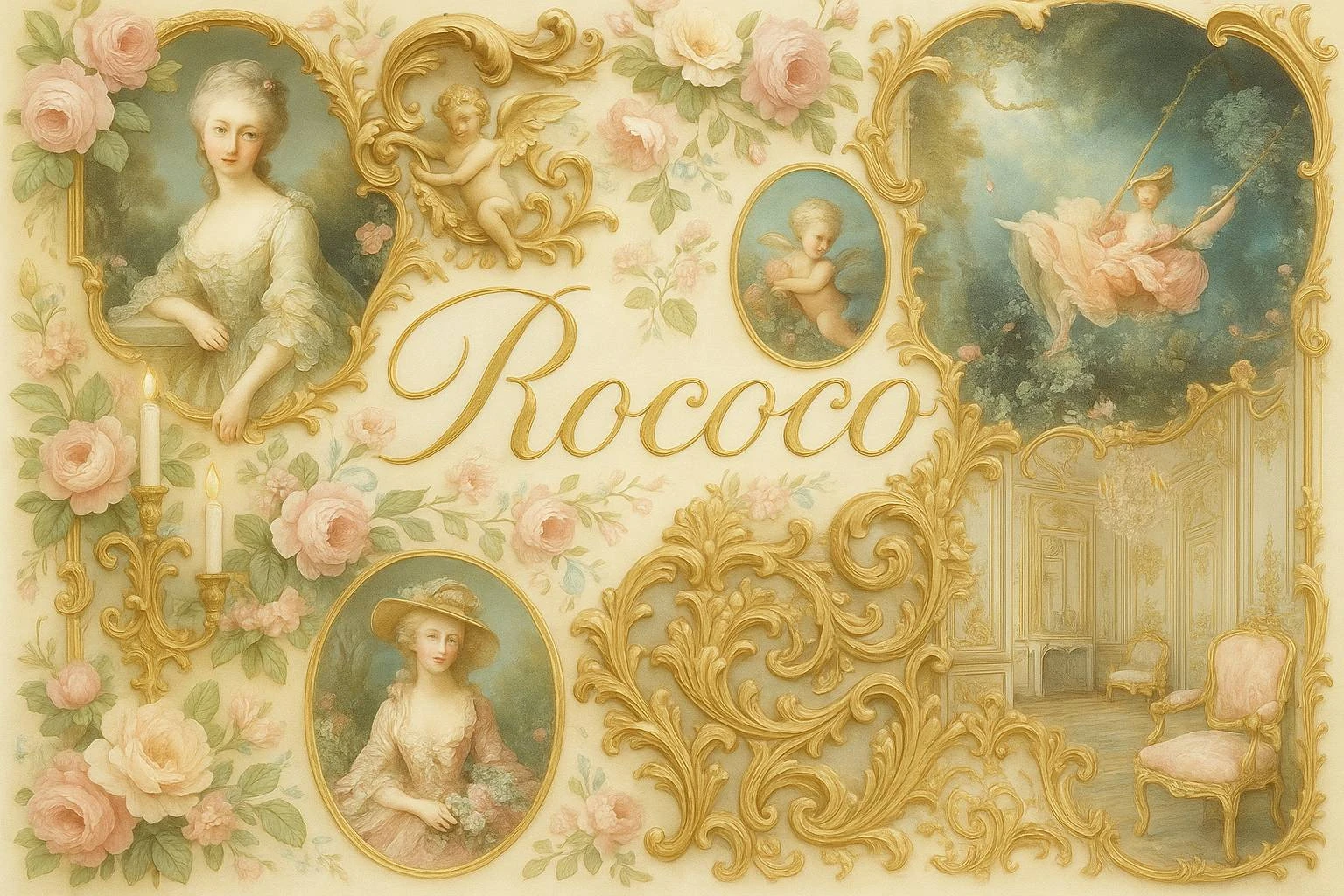
The AOI collage joins pale roses, gilt-looking scrolls, invented portraits, a swing scene and an elegant interior. Its muted pink, cream and green palette creates continuity. These are synthetic interpretations of familiar motifs, not identified historical paintings, portraits or rooms.
Start with a curve that changes the object
Consider the Met’s pair of gilt-bronze candlesticks, dated 1735–50, after designs by Juste Aurèle Meissonnier. Shells, floral details and an irregularly spiralling stem disturb the expectation of a rigid vertical support. Ornament changes how the object appears to balance and move. The museum connects the model with engraved designs published in 1734–35. This is a documented example of Rococo design, with a maker relationship, material and date that can be checked. [1]
Look at the base, then follow the stem upward. Which curve carries your eye onward, and which curls back? Compare the silhouette with the details on its surface. This separates structural rhythm from decorative quantity: a very ornate object can still be stiff, while a small change in outline can make another seem animated.
Rococo travelled through design
The Met’s Chippendale exhibition explains the French Louis XV taste for natural motifs, including rocks, plants and shells, and its circulation through prints and migrating craftspeople. British designers developed their own interpretations. Rococo therefore cannot be defined by one palace, one country’s furniture or one universal checklist. A design may be adapted across materials and places while retaining recognisable relationships between curves and asymmetrical details. [2]
When comparing objects, record where they were made and what they were made to do. A chair has to support a body; a candlestick carries a flame; a frame directs attention toward something else. Asking how ornament negotiates those jobs is more revealing than counting the flowers. Beauty has practical negotiations to conduct, even when it arrives wearing gold.
Painting: pleasure is also a construction
François Boucher’s pastoral scenes provide a different entrance. The Met describes idealised landscapes with elegantly dressed shepherds and shepherdesses, and connects his painting with theatre and decorative design. The Interrupted Sleep (1750), made as an overdoor for Madame de Pompadour, is one example. The rural setting is a cultivated fantasy, not a neutral account of agricultural life. [3]
That distinction matters when looking at a persuasive image. Ask who inhabits the landscape, what labour is visible, and what the image leaves out. A soft palette does not make a picture innocent, and an invented idyll is not automatically a failure: its construction is precisely what makes it interesting to interpret.
Use the collage as a study, then leave it behind
Our archive illustration offers convenient comparisons between framed scenes and scrolling decoration. Follow how the large gold curves interrupt the rectangular picture. Then notice its limitations: the repeated roses and gentle colours make different subjects appear unusually uniform. Do not attribute any panel to Boucher or treat its room as a documented historical interior.
For a practical exercise, design a small frame in pencil using three linked curves. Make one version symmetrical and another deliberately uneven, while keeping the centre equally open. Only then introduce colour. If generating an image, specify the object, material, silhouette and asymmetry, and label the result as a contemporary interpretation. Historical understanding begins where the decorative preset stops.
People & works to explore
References discussed in this article. Consult the sources below for context.
Artists and practitioners
Juste Aurèle Meissonnier — designer discussed through a museum object record
François Boucher — painter discussed through the Met’s research
Paintings and other works
Pair of candlesticks after Meissonnier, 1735–50 — linked museum example
The Interrupted Sleep, François Boucher, 1750 — discussed, not reproduced
Sources and further exploration
[1] The Met — candlesticks after Meissonnier, 1735–50
Creative studies to try
Explore these collected prompts as creative interpretations. They are starting points for image-making, not reproductions of historical artworks or evidence about a tradition.
Visual cues: historical staging, old light, ceremonial weight
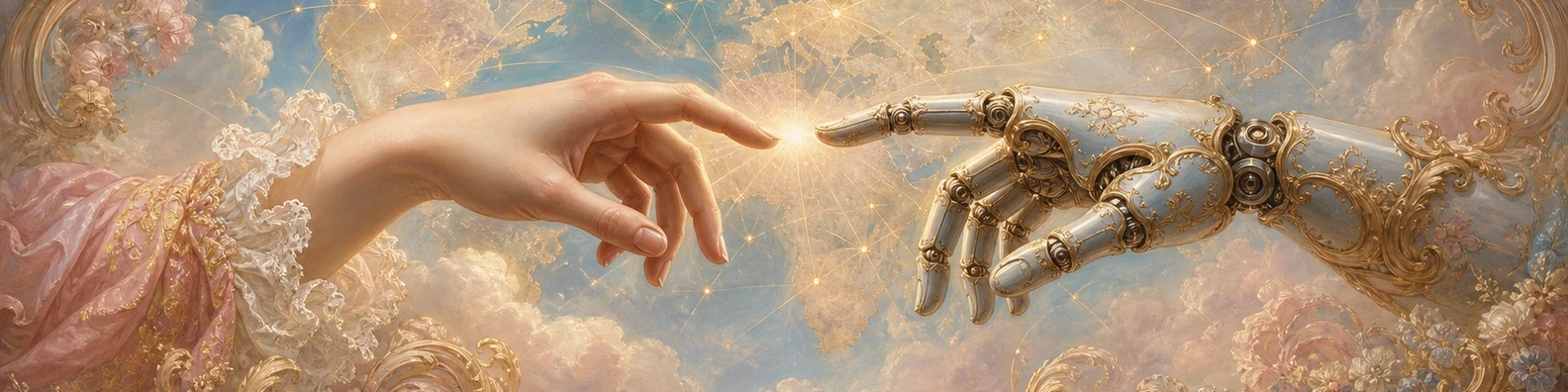
Study 1 — Rococo
Ultra-wide panoramic banner, a human hand and a sleek robotic hand reaching toward each other, fingertips almost touching, a bright luminous spark of intelligence between them, a subtle world map behind them with global data network lines, symbolizing human-AI collaboration and digital transformation, rendered in Rococo style, with dramatic gesture, refined anatomy, theatrical lighting, rich painterly depth, high quality, high detail, balanced composition, no text, no logo, no watermark, exact aspect ratio 1584:396
Prompt source: 1001 Art Styles. Select the text to copy, then adapt the subject and composition.