
Hybrid visual study
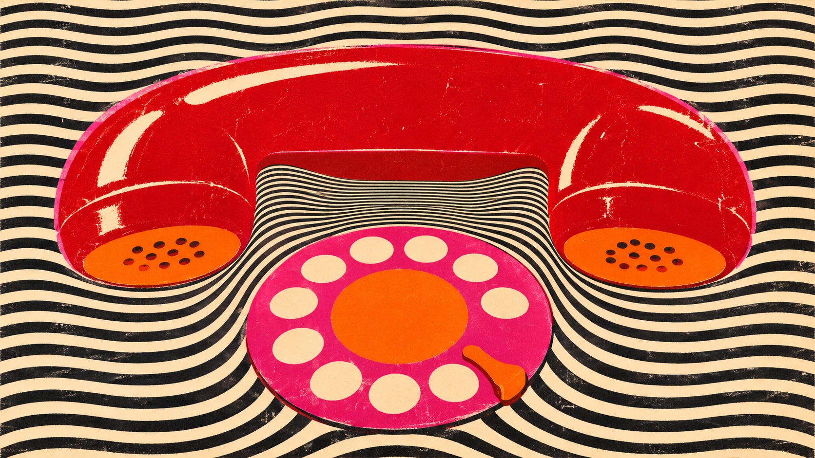
Put a rotary telephone against a field of steady lines. Bend those lines under the receiver and the phone acquires a weight that its flat red ink could never supply alone. This AOI print study brings three different 1960s visual traditions to the same sheet.
A visual introduction
Follow one edge from a recognizable object into the surrounding pattern. Each original AOI interpretation gives the transition a different job.
Select an image for a closer look. Use the thumbnails, arrow keys or a swipe to compare examples. Zoom in to inspect details, or share the image that inspires you.
Creative toolbox · take this style further
Choose an input and a destination. Search sends your words to the chosen site; Copy & open puts them on your clipboard to paste there.
Create with AI
Turn your chosen input into an image prompt or a new creative direction.
ChatGPT
Copy your input and paste it into a ChatGPT conversation or image request.
Copy & open ChatGPT (new tab)Claude · Anthropic
Develop an image prompt or explore the style in a new Claude conversation.
Copy & open Claude · Anthropic (new tab)Midjourney
Paste your input into the Imagine bar on the Create page.
Copy & open Midjourney (new tab)Adobe Firefly
Copy your input, open Firefly, and paste it into the prompt field.
Copy & open Adobe Firefly (new tab)Leonardo.Ai
Copy your input, open Leonardo, and paste it into the generation field.
Copy & open Leonardo.Ai (new tab)Image search
Find visual references. Short, concrete keywords usually work best.
Lexica
Search AI images and prompts using your selected input.
Search with this input Lexica (new tab)Pexels
Search the photo and video library. Short keywords often work best.
Search with this input Pexels (new tab)Pixabay
Search photos, illustrations and other images.
Search with this input Pixabay (new tab)Unsplash
Search photographs using the style name or your own keywords.
Search with this input Unsplash (new tab)Wikimedia Commons
Search photographs, artworks and historical images. Check each file for its source and reuse terms.
Search with this input Wikimedia Commons (new tab)Art & research
Explore artists, collections and the ideas behind a style.
Wikipedia
Search for background reading. A style may not have its own article.
Search with this input Wikipedia (new tab)WikiArt
Copy your input into WikiArt’s search to explore artists and artworks.
Copy & open WikiArt (new tab)Europeana
Paste your keywords into the search to explore European museum, library and archive collections.
Copy & open Europeana (new tab)Inspiration
Discover portfolios and visual ideas from creative communities.
Instagram hashtags
Search a hashtag made from your input: spaces and punctuation are removed. Instagram may require sign-in.
Search with this input Instagram hashtags (new tab)ArtStation
Paste your input into artwork search for concept art, environments, characters and visual development.
Copy & open ArtStation (new tab)Behance
Paste your input into project search for illustration, design and visual storytelling.
Copy & open Behance (new tab)A closer look
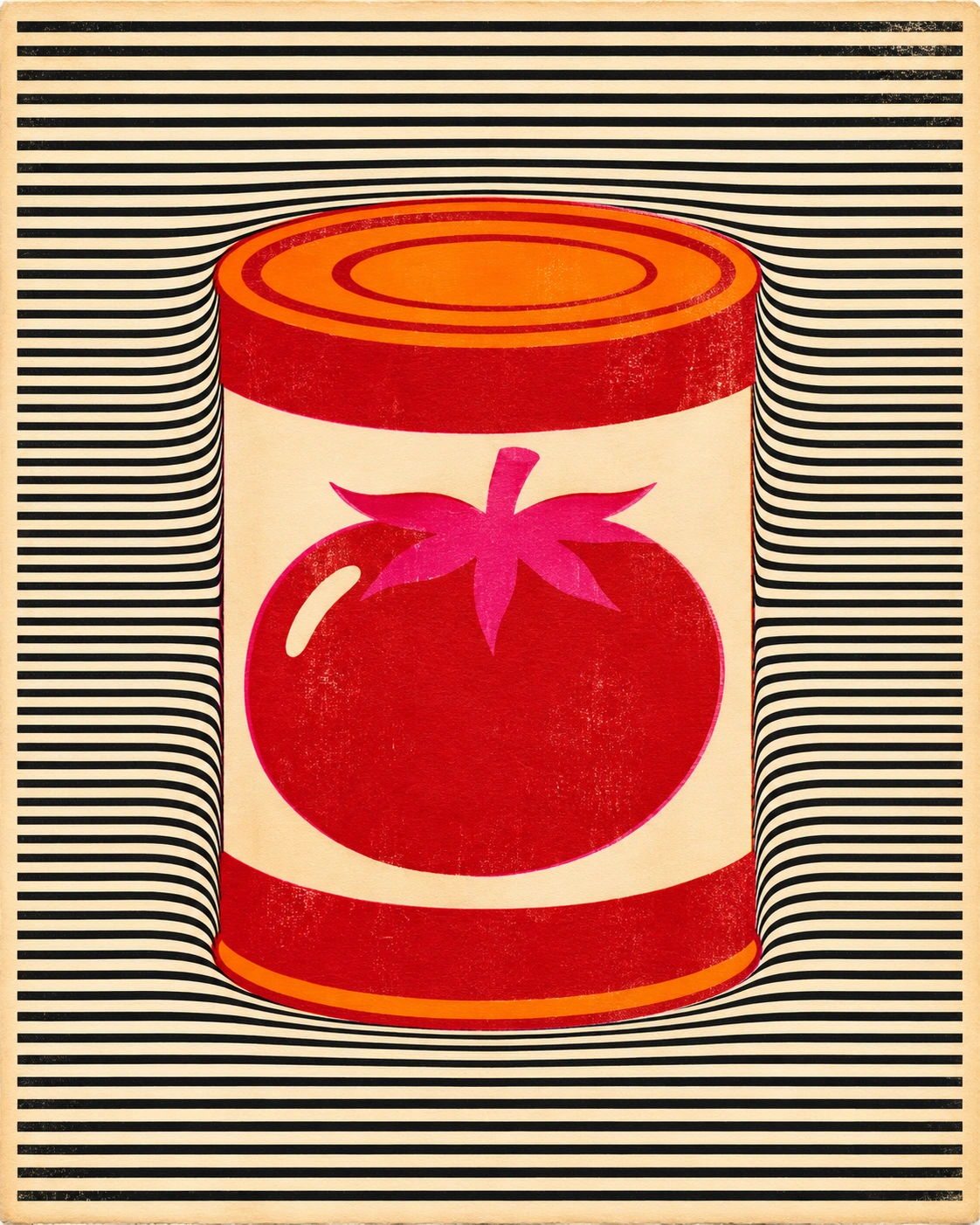
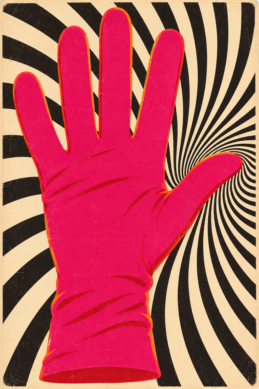
One blunt commercial silhouette interrupts a repeated black-and-cream pattern. A few saturated spot colors give the object its voice. The change in spacing does the optical work, while open paper gives the eye somewhere to rest.
Three histories on one sheet
Pop artists found usable shapes in packaging, comics and advertising. A can or a glove could carry an audience’s recognition before a painter had made a single shadow. In the Bay Area, concert posters turned lettering and saturated color into an event of their own. SFMOMA’s Art of Noise places that printed work alongside the music culture it served.
Op Art supplied another kind of event. In Bridget Riley’s Current (1964), a black-and-white field appears to flex under prolonged looking. MoMA included the painting in The Responsive Eye in 1965. This guide gives those separate histories a shared visual problem. What happens when a known object interrupts an optical field with rules of its own?
Find the one place where the pattern gives
Sketch the object in solid black first. Check the hand opening of a glove or the gap under a receiver. Next build a field whose spacing somebody could predict with a finger. Alter that spacing in one area where the object pushes, cuts or turns. Returning to the original interval on the far side lets the viewer feel the disturbance.
Two colors of similar brightness can make an edge quiver. Reserve that collision for an accent. A rim of plain paper around a small bit of type makes a better reading aid than a third outline. At phone size a fine beat can collapse into grey, so look at the thumbnail and the full print before choosing the line spacing.
Ways of reading the five studies
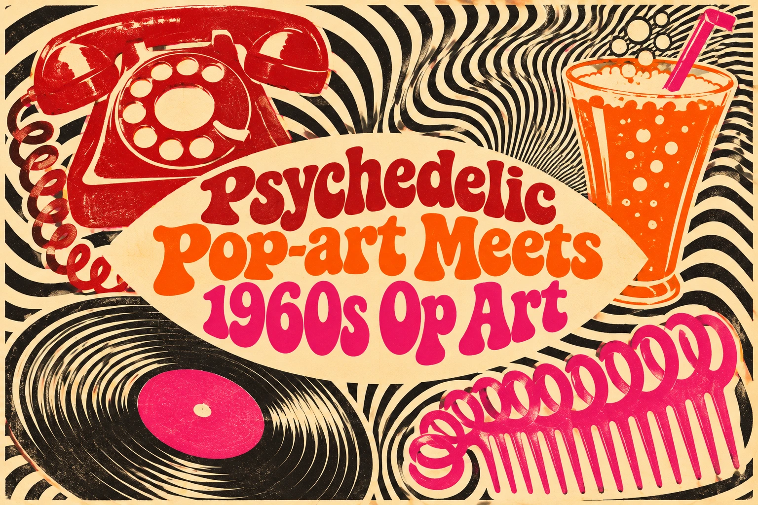
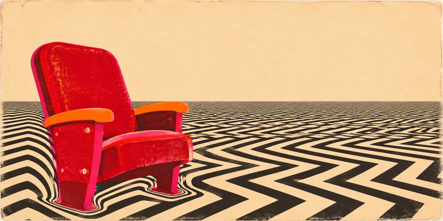
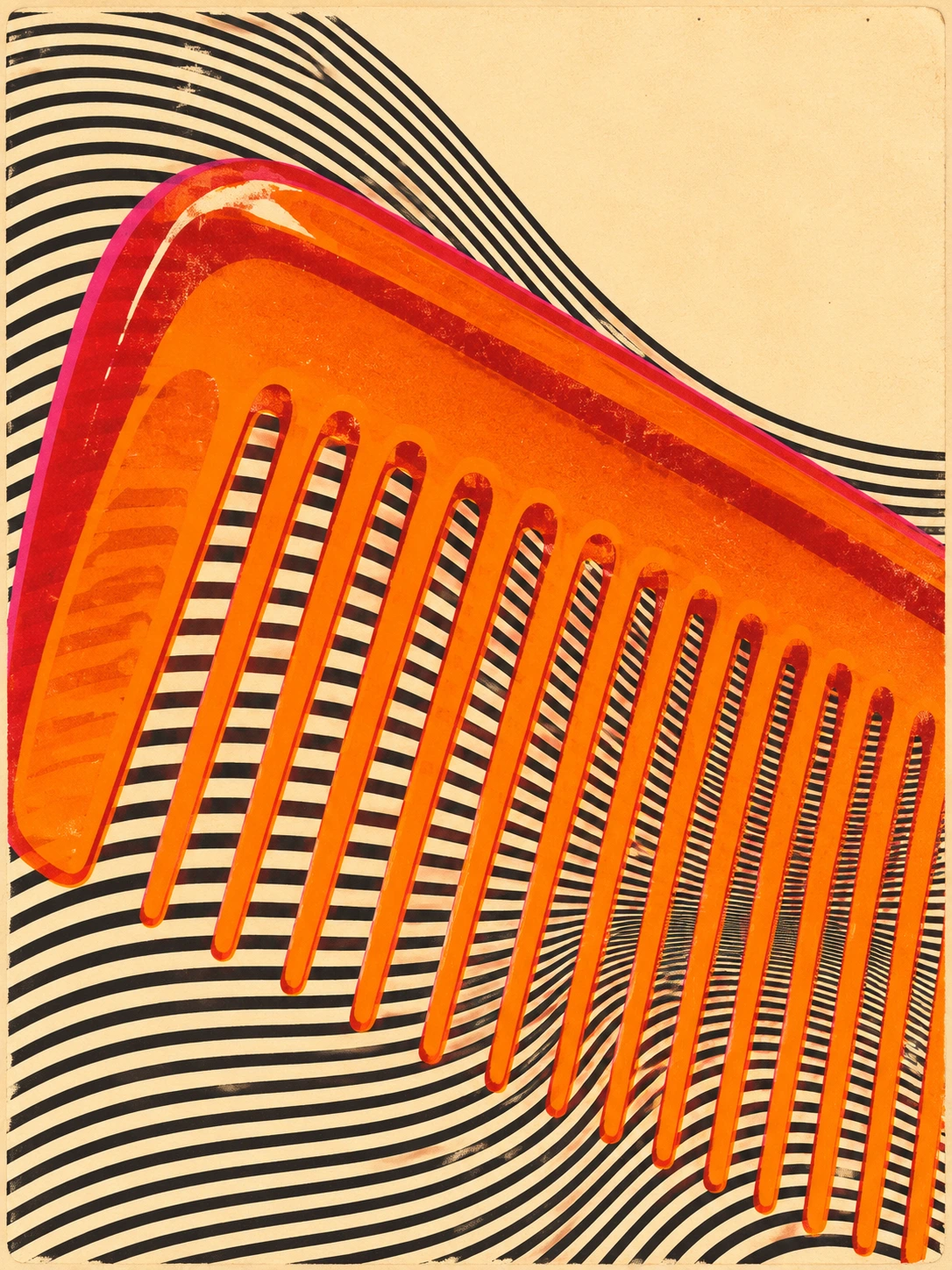
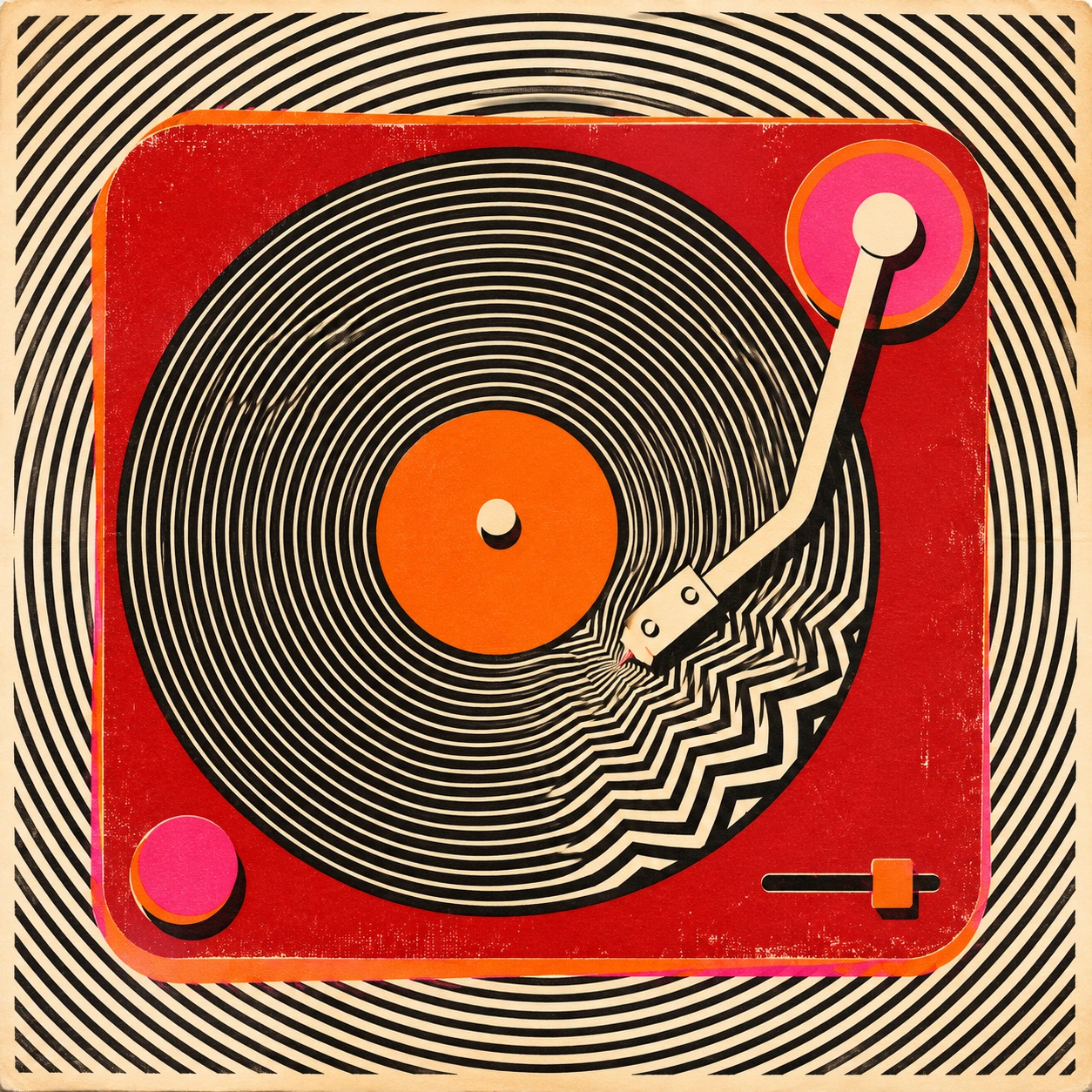
The comb offers a frequency experiment. Its teeth already supply half a pattern. A record supplies a different one through its concentric grooves. In the cinema row, the recognizability of an upholstered seat has to survive at a much greater distance. Compare which object you name first and which field you keep looking at afterwards.
For an editorial cover, give the subject a generous outline and put the densest optical work at one hinge. A record sleeve can reward a closer look around the outer edge. A sustained optical vibration over a paragraph of small type is a considerable favor to neither the type nor the reader.
Three readings from Penny’s desk
Positive review. The receiver gives a moving field a point of contact. Once the bend seems to carry weight, looking at the picture becomes a small physical game.
Negative review. A generator can produce decorative stripes faster than it can keep a comb legible. Cover half the field and inspect the teeth. If the comb improves, some of those stripes have earned early retirement.
Neutral review. The method suits posters, covers and a single editorial idea. The viewing distance matters as much as the ink colors, particularly where fine repeated lines meet small text.
A small poetic detour
Original words from the AOI studio.
Poetry
The dial returns by little teeth.
A red ear rests upon the page.
The rules bow down beneath its weight.
A thumb of paper holds its place.
The phone rings once in black and white.
The prompt workshop
Original creative exercises. These prompts create new illustrations, not documentary evidence.
Start with one handle
A flat red telephone receiver on warm cream paper. Use parallel black lines at even intervals across the sheet. Crowd the lines below the handle and leave its central gap clean. Print with two spot colors and one black.
Set a rhythm against a rhythm
Look down on an orange comb against fine black-and-white rules. Change the angle gradually through one third of the picture, letting a single beat emerge. Keep the spine simple and one corner entirely open.
Make a visual rest
Design a cinema poster around one empty pink seat. Interrupt the zigzag of neighboring seats with a broad blank aisle. Keep the poster readable when reduced to the size of a matchbox.
A smile from the studio
Jokes
The cinema sold every seat. The pattern sat in most of them.