
Book arts and fine printing
Private press is a practice of making carefully designed books, usually in small editions under the direction of an individual or small group. Type, illustration, paper, ink, page proportions and binding are considered together. It is a tradition of bookmaking rather than one fixed illustration style, and its strongest lessons concern how a book reads as well as how it looks.
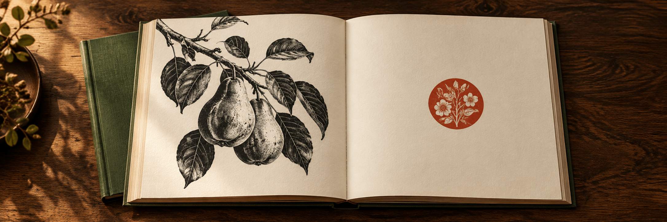
A visual introduction
Select an image for a closer look. Use the thumbnails, arrow keys or a swipe to compare examples. Zoom in to inspect details, or share the image that inspires you.

Creative toolbox · take this style further
Choose an input and a destination. Search sends your words to the chosen site; Copy & open puts them on your clipboard to paste there.
Create with AI
Turn your chosen input into an image prompt or a new creative direction.
ChatGPT
Copy your input and paste it into a ChatGPT conversation or image request.
Copy & open ChatGPT (new tab)Claude · Anthropic
Develop an image prompt or explore the style in a new Claude conversation.
Copy & open Claude · Anthropic (new tab)Midjourney
Paste your input into the Imagine bar on the Create page.
Copy & open Midjourney (new tab)Adobe Firefly
Copy your input, open Firefly, and paste it into the prompt field.
Copy & open Adobe Firefly (new tab)Leonardo.Ai
Copy your input, open Leonardo, and paste it into the generation field.
Copy & open Leonardo.Ai (new tab)Image search
Find visual references. Short, concrete keywords usually work best.
Lexica
Search AI images and prompts using your selected input.
Search with this input Lexica (new tab)Pexels
Search the photo and video library. Short keywords often work best.
Search with this input Pexels (new tab)Pixabay
Search photos, illustrations and other images.
Search with this input Pixabay (new tab)Unsplash
Search photographs using the style name or your own keywords.
Search with this input Unsplash (new tab)Wikimedia Commons
Search photographs, artworks and historical images. Check each file for its source and reuse terms.
Search with this input Wikimedia Commons (new tab)Art & research
Explore artists, collections and the ideas behind a style.
Wikipedia
Search for background reading. A style may not have its own article.
Search with this input Wikipedia (new tab)WikiArt
Copy your input into WikiArt’s search to explore artists and artworks.
Copy & open WikiArt (new tab)Europeana
Paste your keywords into the search to explore European museum, library and archive collections.
Copy & open Europeana (new tab)Inspiration
Discover portfolios and visual ideas from creative communities.
Instagram hashtags
Search a hashtag made from your input: spaces and punctuation are removed. Instagram may require sign-in.
Search with this input Instagram hashtags (new tab)ArtStation
Paste your input into artwork search for concept art, environments, characters and visual development.
Copy & open ArtStation (new tab)Behance
Paste your input into project search for illustration, design and visual storytelling.
Copy & open Behance (new tab)A closer look
A purposeful text block, rhythmic spacing, considered margins and images that belong to the page. Approaches range from densely patterned borders and dark relief prints to spare typography with a single coloured initial.
The book is the composition
Private press describes a publishing and making practice, not a promise that every page will look medieval. The State Library Victoria places small editions and fine printing at the centre of its definition. The familiar late nineteenth-century revival connected these aims with dissatisfaction at aspects of industrial book production. That history should not be simplified into a claim that all machine-made books are bad or all handmade books are good.
A book is experienced over time. Its cover, opening, type size, illustrations and closing pages establish a sequence of expectations. A beautiful individual print can still make an awkward book if it overwhelms the text or interrupts the reading rhythm. Judge an opening, a sequence and the physical object as well as a single photographed page.
Kelmscott and a revival of attention
William Morris established the Kelmscott Press in Hammersmith in 1891. The University of Glasgow describes its attention to paper, letterforms, spacing and the position of printing on the page, with early printed books as important models. The point was an integrated book, not simply the addition of ornamental foliage to an otherwise ordinary layout.
The 1896 Kelmscott Chaucer is a useful historical reference. Washington University places it alongside the Doves Press English Bible of 1903–05 and the Ashendene Dante of 1909 in its Triple Crown collection. These are documented editions to study through library records; the generated images on this page are independent design exercises, not reproductions of them.
Ornament is a choice, not a requirement
The Doves Press offers a revealing comparison. The University of Utah describes its English Bible through clear type, wide unadorned margins and restrained colour, with red initials by Edward Johnston. Its effect depends on relationships between letters, lines and empty paper rather than a mass of decorative illustration.
It would be misleading to make every private-press book look medieval or to equate a small print run with good design. A spare modern page can demand just as much attention to spacing, paper and the relation between text and image as a densely ornamented one. Treat ornament as an answer to a particular text and format, not as a membership badge.
Design the opening, not just the border
Work with a pair of facing pages. Set the text area first, then compare the inner and outer margins and the space above and below it. Add an illustration where it supports the reading sequence. A heavy frame can trap a small text block; a more restrained ornament may give the page greater authority.
Start with the intended reader and the physical page size. Compare line length, type size and leading using actual words, not only grey rectangles. Check how much space disappears into the gutter when the book opens. A symmetrical diagram can become an uncomfortable object if the binding makes its inner text difficult to see.
Type, illustration and colour
Read a page at two distances. From across a table, examine its balance of dark and light. At reading distance, examine letter spacing, line breaks and the hierarchy of headings and body text. A heavy initial may need breathing room; a delicate illustration may disappear beside a dense text block. Make those relationships deliberate.
For a relief-print illustration, decide which shapes must remain legible at the final printed size. Large dark masses, white cuts and controlled hatching can create depth without photographic modelling. A second ink can identify a structural element or establish a repeated accent across the book. Extra colours are useful only when they clarify the design or extend its expressive range.
Paper, impression and binding
Paper affects contrast, feel, opacity and the way an image meets its background. Test the chosen stock with the intended printing process. A digitally simulated paper texture cannot establish how a real sheet will absorb ink or fold. Nor is a dramatically embossed impression a universal measure of good letterpress printing.
Make a folded dummy before final production. Check page order, opening behaviour, the relationship of cover to contents and whether the book can be handled comfortably. A binding is part of the reading experience, not an expensive afterthought. The edition should remain coherent when the reader turns the page, not only when a camera looks down at it.
A practical contemporary exercise
Choose a short text you have written or are permitted to use. Design an eight-page booklet with one type family, one illustration and at most two inks. Begin with a restrained version. Then make an alternative in which a border or initial changes the rhythm. Compare them at actual size and explain what each additional mark contributes.
Keep an honest colophon describing the people, materials and processes involved. A small edition, a distressed surface or an elaborate binding does not establish historical authenticity. For a digital concept, label it as a concept. For a finished printed book, record what was actually used rather than presenting simulated craft as physical workmanship.
Using the gallery and prompts
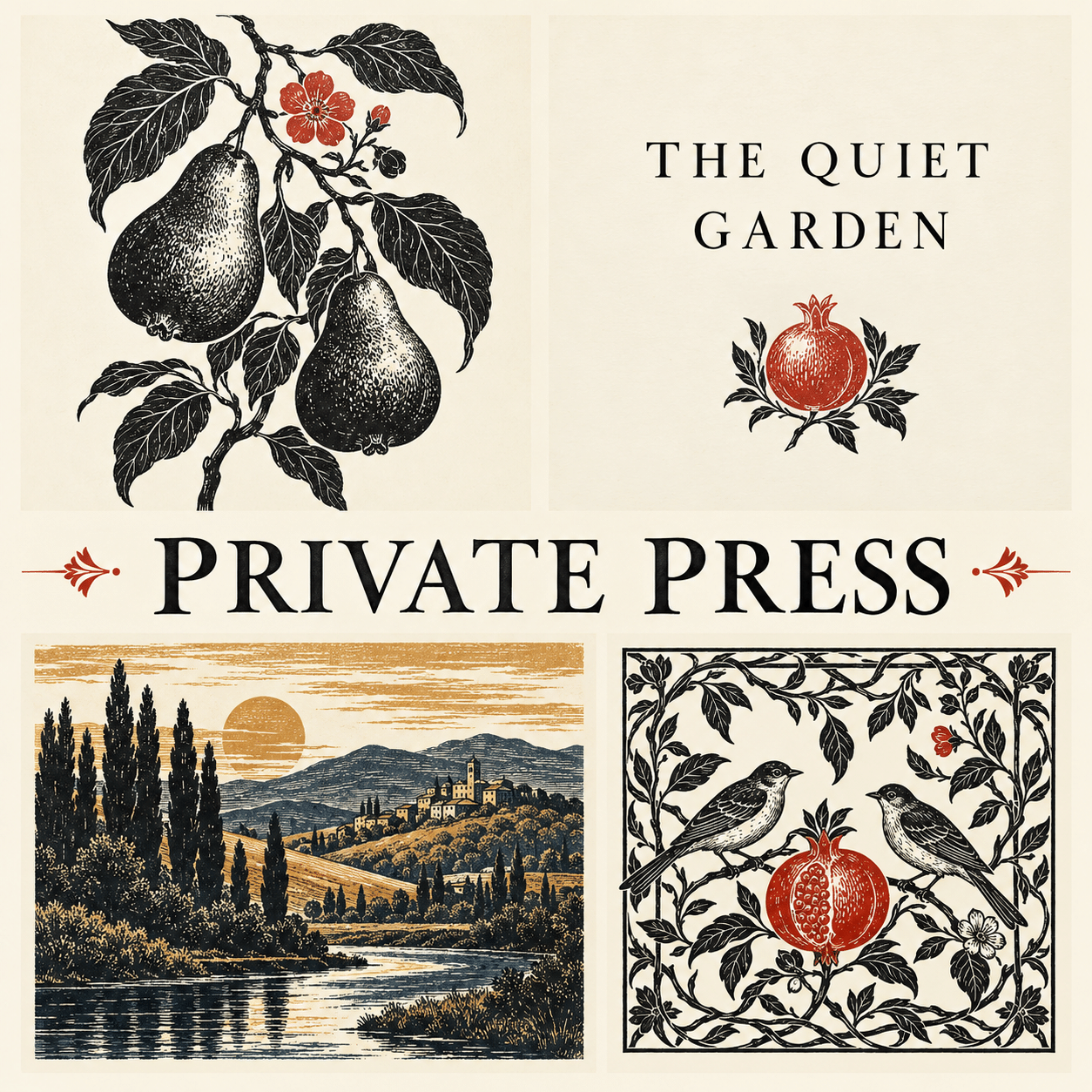
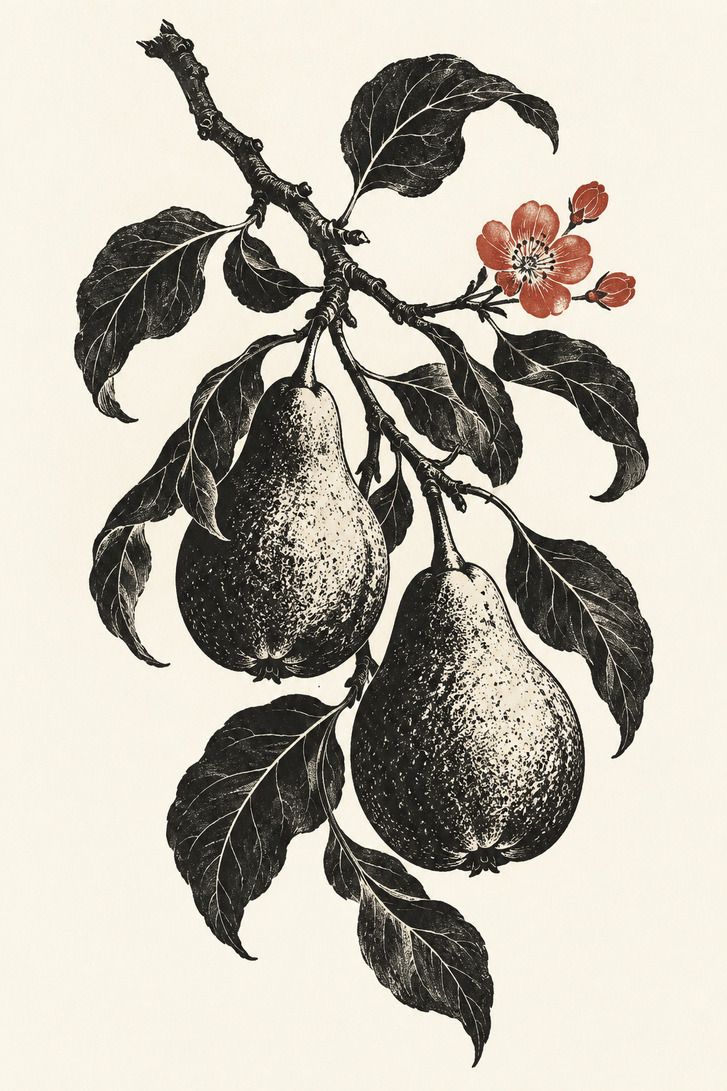
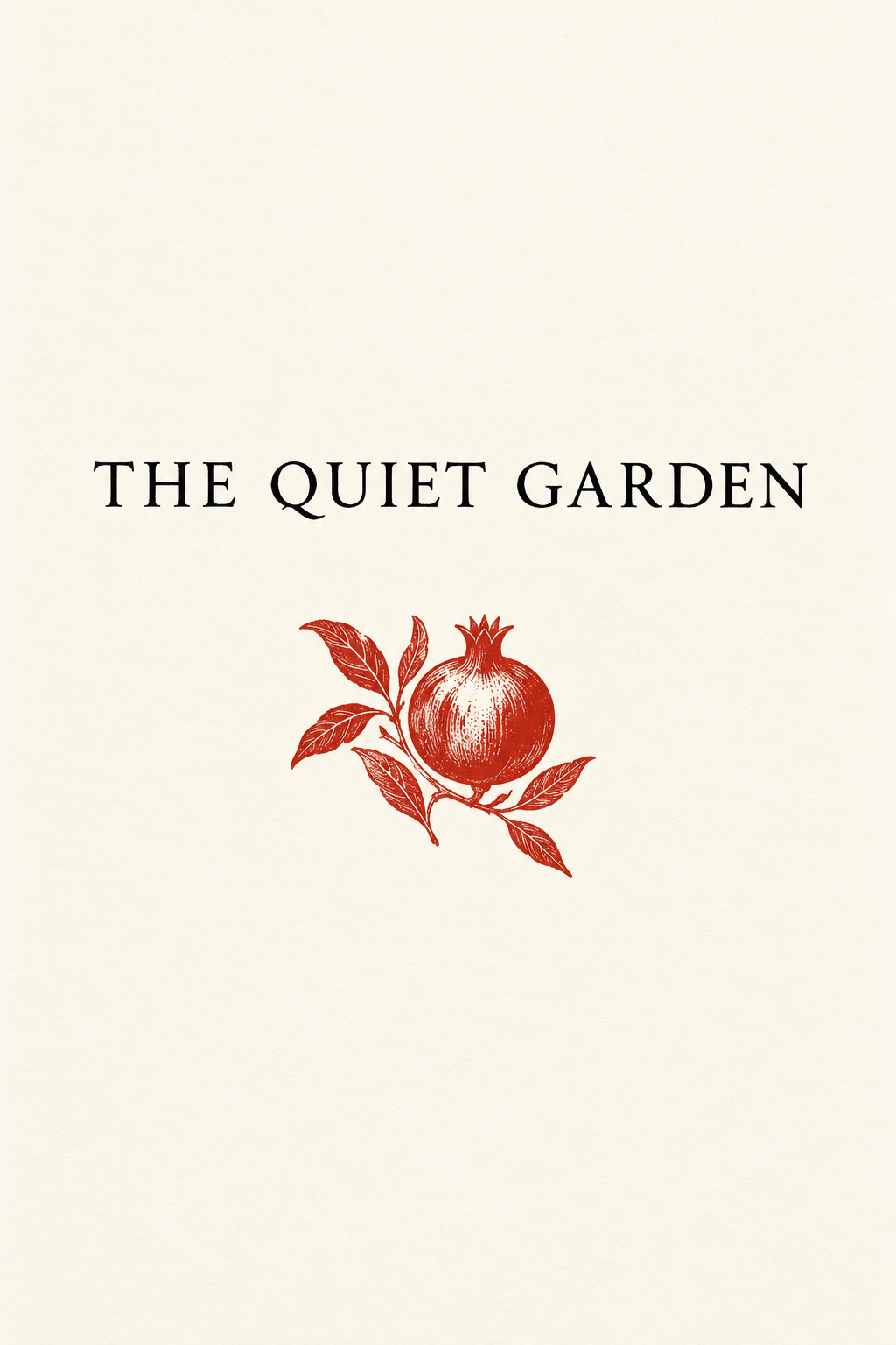
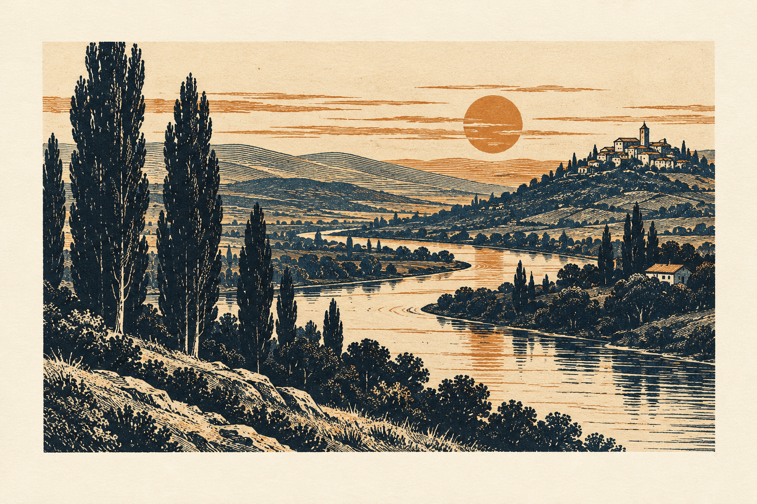
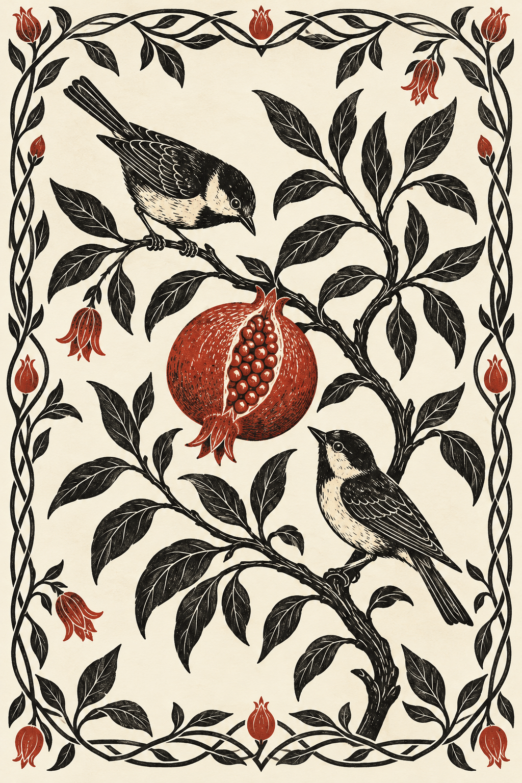
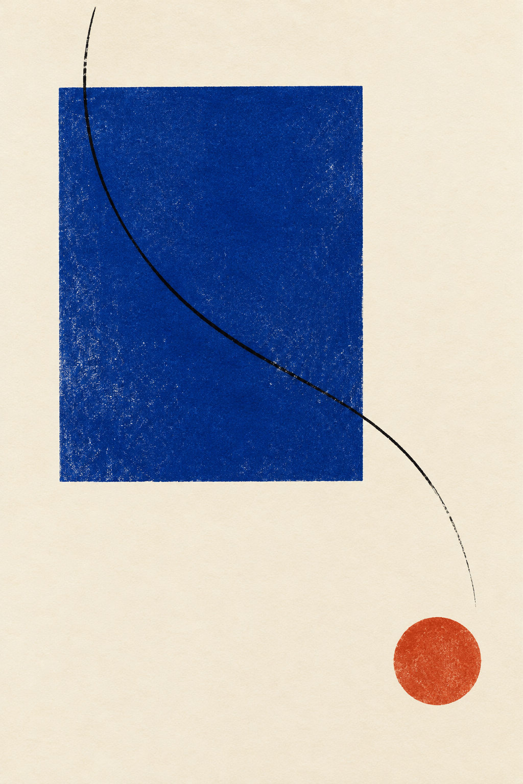
The new images are AI-generated private-press design interpretations: a botanical plate, a restrained title-page concept, a landscape illustration, a bird-and-fruit ornament and an experimental abstract page. They explore different balances of image and paper. They do not document a named historical press or prove that printable type and separations have been prepared.
Generated lettering can suggest a direction, but a real edition needs deliberate typesetting and proofreading. Keep prompt text short when testing an illustrated title and assemble longer passages in a page-layout tool. Avoid artificial wear as a substitute for craftsmanship: an apparently old page can still have poor hierarchy, illegible text or meaningless decoration.
Positive editorial assessment — AI-authored
Private-press thinking makes small decisions visible. A generous margin, a precisely placed image and a well-chosen sheet can give a short text unusual presence. Its greatest strength is the relationship among parts: a book can become richer without becoming louder.
Critical editorial assessment — AI-authored
The tradition can slide into expensive nostalgia. Heavy borders, imitation ageing and luxurious materials may conceal weak typography or a text chosen merely to justify a handsome object. Improve the work by reading it at its intended size and removing decoration that contributes no rhythm, meaning or clarity.
Neutral editorial assessment — AI-authored
Private press is a useful framework for book arts, typography and small-edition publishing. It includes varied visual approaches and overlaps with fine printing and artists’ books without making those terms identical. Evaluate the edition through design, reading experience and documented production, rather than rarity alone.
Pocket-sized facts
Private press is a bookmaking practice, not a single illustration style.
William Morris established the Kelmscott Press in 1891.
The new gallery consists of AI-generated design studies, not historical book scans.
A small poetic detour
Original words from the AOI studio.
Poetry
The page is not an empty field,
but room the letters learn to share;
a branch beside a sentence yields
a little dark, a little air.
The folded leaf returns the light,
the margin keeps its measured place;
and ink, by being set just right,
allows the thought a slower pace.
The prompt workshop
Original creative exercises. These prompts create new illustrations, not documentary evidence.
One image, enough paper
Create an original private-press-inspired botanical plate: one finely cut black relief-print pear branch with two fruits and curling leaves, a small muted red accent, warm ivory paper and generous clean margins. Deliberate black and white shapes, no border, lettering, stains or historical attribution.
A restrained title page
Create an original fine-press title-page concept on clean ivory paper. Exact text: "THE QUIET GARDEN" in elegant black roman capitals, centred with generous spacing; below it one small red pomegranate relief-print ornament. No author, publisher, date, imitation wear or other text. This is a modern AI-generated concept, not an antique book scan.
Modern private-press experiment
Create an original modern fine-press page artwork: a disciplined cobalt rectangle, thin black curved line and small vermilion circle on warm ivory paper, asymmetrical yet balanced, extensive empty paper and subtle ink grain. No text or faux ageing. Think about the relationship between image weight and the page edge, not decorative maximalism.
Your next inspiration
Discover another art style
Follow a visual thread to the next subject.

Shin-hanga: Modern Light, Collaborative Woodblock Craft
Compare the relief-print logic of woodblock images, while keeping their distinct Japanese context clear.
Engraving: Form and Tone Built from Incised Lines
Compare engraved illustration and the different marks made by an intaglio process.
A smile from the studio
Jokes
The printer removed one ornament. The page immediately looked more expensive. Nobody told the ornament.