
Historical art-historical category
Post-Impressionism is a retrospective name for diverse responses to Impressionism, especially in late-nineteenth-century French painting. It includes the structural investigations of Paul Cézanne, Vincent van Gogh’s expressive handling, Georges Seurat’s organized colour and Paul Gauguin’s flattened symbolic imagery. These approaches overlap, but they do not form one uniform technique.
A visual introduction
Select an image for a closer look. Use the thumbnails, arrow keys or a swipe to compare examples. Zoom in to inspect details, or share the image that inspires you.


Creative toolbox · take this style further
Choose an input and a destination. Search sends your words to the chosen site; Copy & open puts them on your clipboard to paste there.
Create with AI
Turn your chosen input into an image prompt or a new creative direction.
ChatGPT
Copy your input and paste it into a ChatGPT conversation or image request.
Copy & open ChatGPT (new tab)Claude · Anthropic
Develop an image prompt or explore the style in a new Claude conversation.
Copy & open Claude · Anthropic (new tab)Midjourney
Paste your input into the Imagine bar on the Create page.
Copy & open Midjourney (new tab)Adobe Firefly
Copy your input, open Firefly, and paste it into the prompt field.
Copy & open Adobe Firefly (new tab)Leonardo.Ai
Copy your input, open Leonardo, and paste it into the generation field.
Copy & open Leonardo.Ai (new tab)Image search
Find visual references. Short, concrete keywords usually work best.
Lexica
Search AI images and prompts using your selected input.
Search with this input Lexica (new tab)Pexels
Search the photo and video library. Short keywords often work best.
Search with this input Pexels (new tab)Pixabay
Search photos, illustrations and other images.
Search with this input Pixabay (new tab)Unsplash
Search photographs using the style name or your own keywords.
Search with this input Unsplash (new tab)Wikimedia Commons
Search photographs, artworks and historical images. Check each file for its source and reuse terms.
Search with this input Wikimedia Commons (new tab)Art & research
Explore artists, collections and the ideas behind a style.
Wikipedia
Search for background reading. A style may not have its own article.
Search with this input Wikipedia (new tab)WikiArt
Copy your input into WikiArt’s search to explore artists and artworks.
Copy & open WikiArt (new tab)Europeana
Paste your keywords into the search to explore European museum, library and archive collections.
Copy & open Europeana (new tab)Inspiration
Discover portfolios and visual ideas from creative communities.
Instagram hashtags
Search a hashtag made from your input: spaces and punctuation are removed. Instagram may require sign-in.
Search with this input Instagram hashtags (new tab)ArtStation
Paste your input into artwork search for concept art, environments, characters and visual development.
Copy & open ArtStation (new tab)Behance
Paste your input into project search for illustration, design and visual storytelling.
Copy & open Behance (new tab)A closer look
Look for decisions that organize a picture beyond the passing appearance of light: constructive colour planes, deliberate contours, rhythmic brushwork, separated touches or simplified shapes. No single palette, subject or kind of mark defines the whole category. The new gallery compares distinct visual problems rather than applying one bright filter.
A name applied after the work
Roger Fry introduced the term for his 1910 London exhibition Manet and the Post-Impressionists. It groups artists who knew Impressionism but pursued different expressive and symbolic possibilities. [1] It is therefore useful as an art-historical umbrella, not a manifesto signed by a single organized school.
The Met emphasizes that these artists often worked independently and did not regard themselves as one collective movement. [2] When looking at an individual picture, begin with the painter, date and particular method. The broad label should help locate the work without replacing those specifics.
Several routes through the same question
How can a painted surface do more than register an optical impression? Cézanne offers a route through constructed form; Van Gogh makes the direction and pressure of marks expressive; Seurat develops controlled relationships between separate touches of colour; Gauguin uses bounded colour areas and symbolic imagery. The National Gallery identifies all four as central to the category. [1]
These routes can conflict productively. A tightly controlled divisionist surface is not equivalent to a thick, agitated stroke. A flattened silhouette does not solve the same problem as a still life built from shifting planes. Learn to describe the difference before combining their vocabulary.
Read the surface and the space
Start with an edge. Does it close a shape like a drawn contour, emerge through adjacent colours, or break into small marks? Follow that edge into the surrounding field. Its treatment tells you whether the picture prioritizes silhouette, mass, atmosphere or movement.
Next examine depth. Compare the tabletop, ground plane or path with the objects placed upon it. A tilted plane can make an arrangement feel active, but deliberate instability still needs relationships that hold the eye. Distortion is a decision to evaluate, not automatic proof of expressive depth.
Finally compare the size and direction of marks. A repeated stroke may turn around a tree trunk, cut across a field or gather around a face. Ask what the repetition accomplishes. If every area receives identical handling, the image may become a texture sample rather than a composition.
Colour has different jobs
Colour can describe volume, intensify a feeling, organize a pattern or build an optical relationship. Select the job before selecting the palette. A blue shadow against a warm table might clarify a still life; a green-violet night scene might establish a different emotional register.
Seurat’s practice drew on contemporary colour theory and the juxtaposition of small touches. The Met distinguishes this Neo-Impressionist method within the wider field. [2] Do not treat every dotted picture as a successful optical experiment: viewing distance, value structure and the placement of accents still matter.
Brightness alone is a weak criterion. Reserve saturated colour for a structural or expressive purpose and allow quieter passages to support it. A subdued study can investigate Post-Impressionist questions as clearly as a dazzling landscape.
Five original studies, five problems
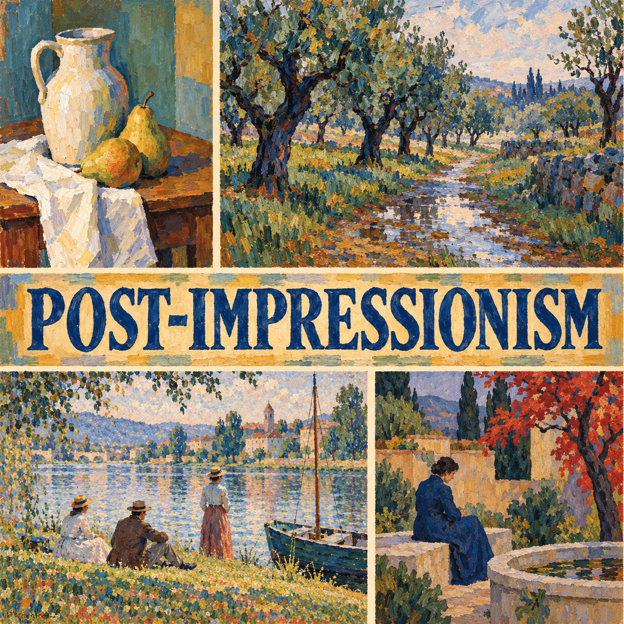
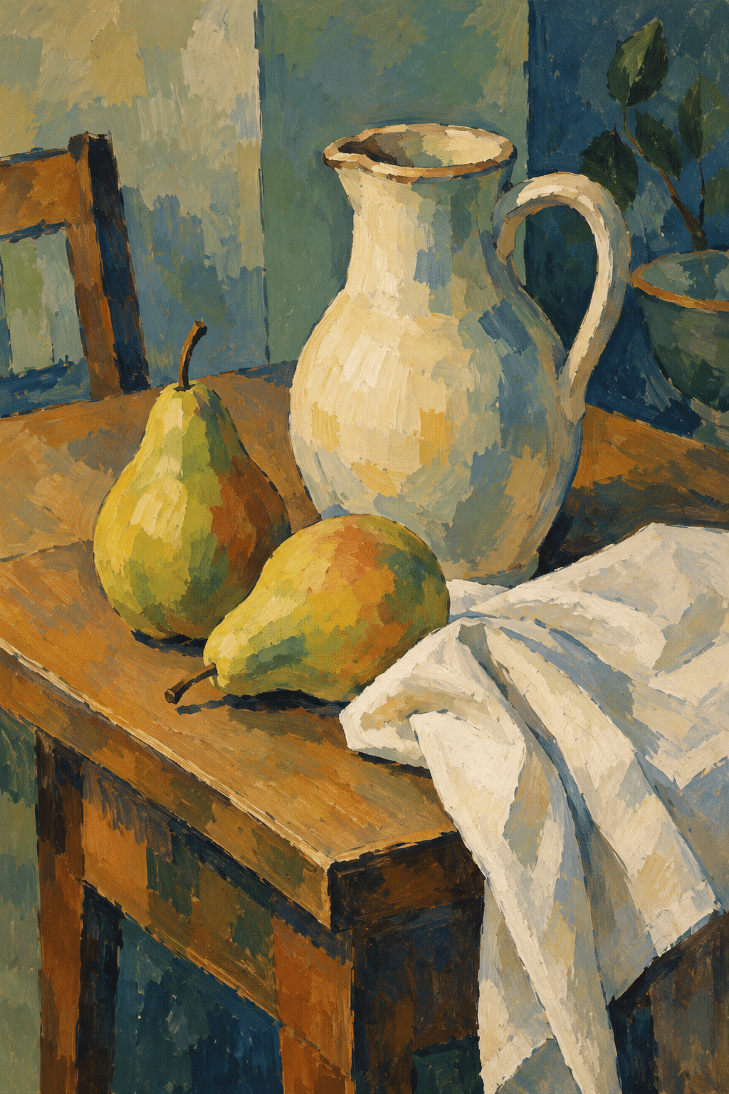
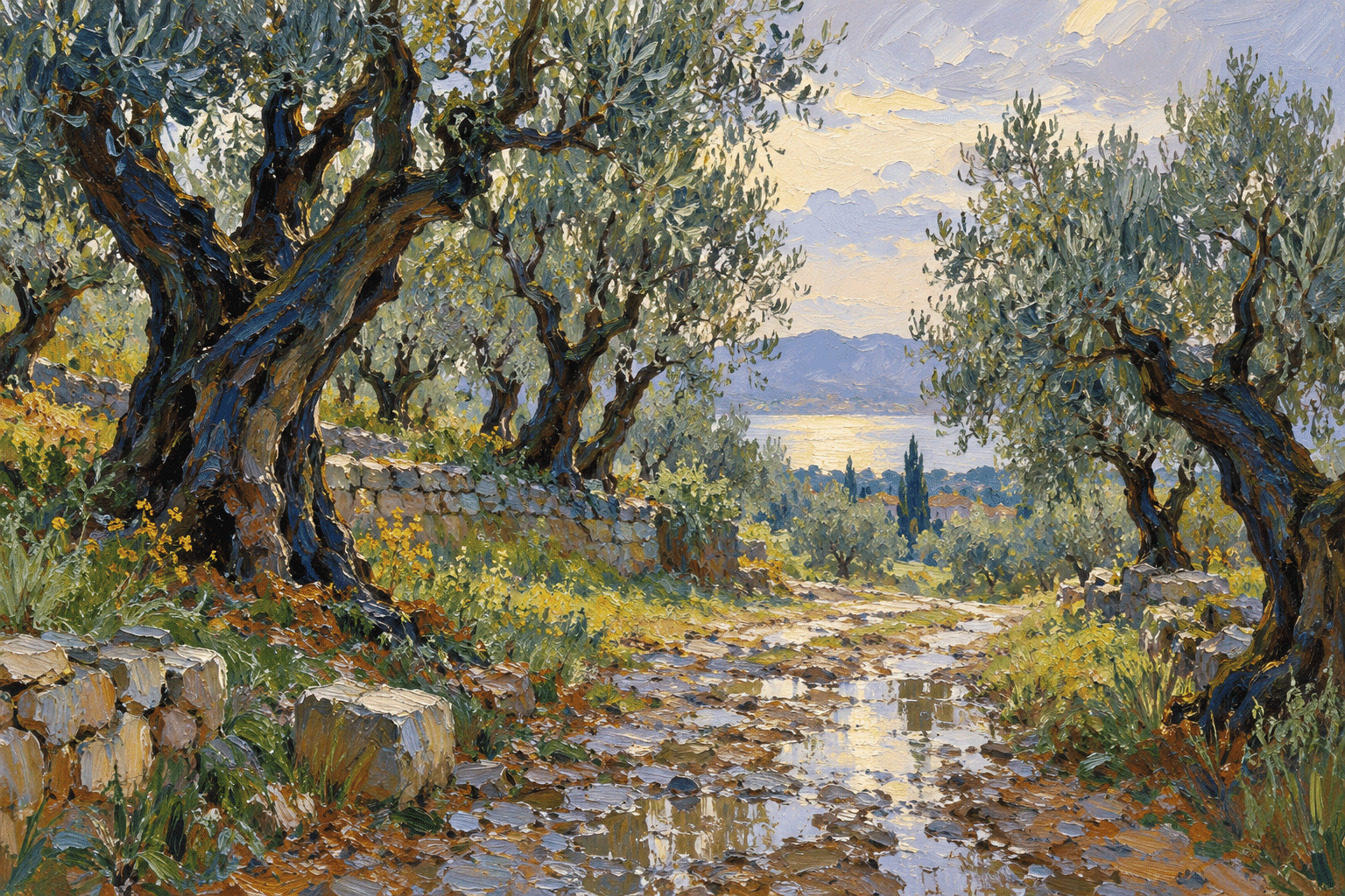
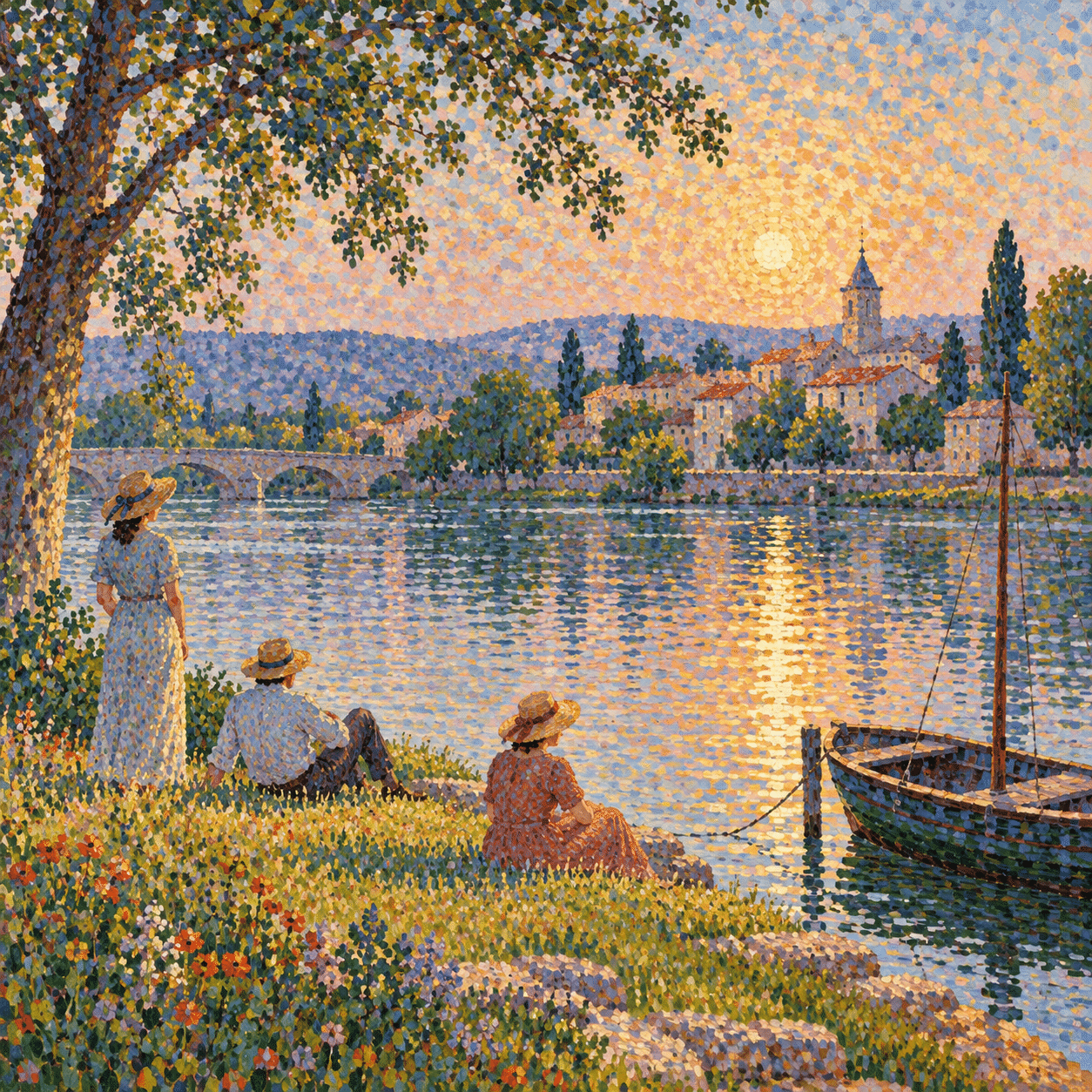
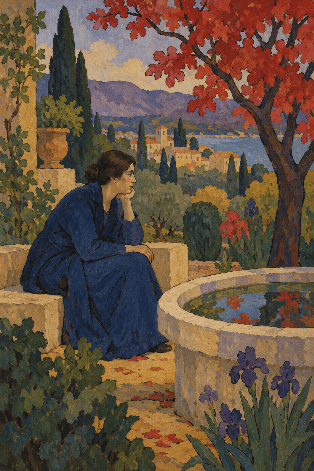
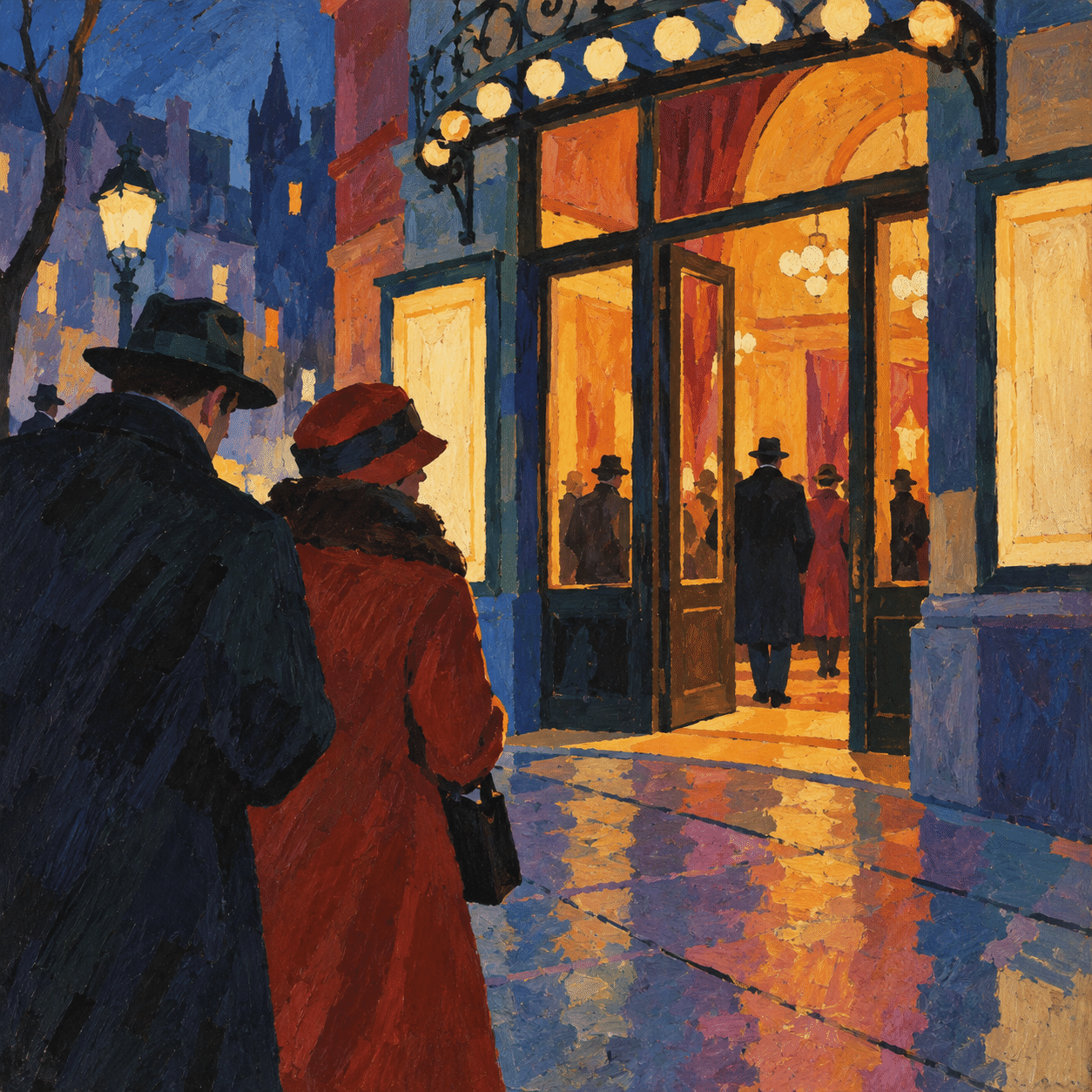
The still life tests how colour planes build weight around a jug and fruit. The orchard makes directional strokes carry the energy of a landscape. A riverside study separates small colour touches while keeping figures and banks legible. A contemplative garden uses flat bounded areas and a restrained symbolic arrangement. A theatre entrance explores cropped silhouettes and the rhythm of an urban scene.
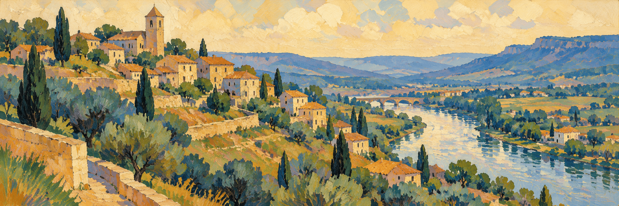
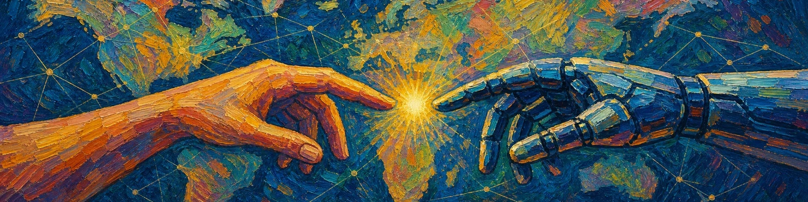
These are newly generated interpretations, not reproductions or newly discovered works by historical artists. Their purpose is comparison. The dedicated banner uses a constructed village landscape; the centrally titled collage puts different surface treatments together without pretending they share one recipe.
A practical way to build an image
Choose one dominant problem: weight, rhythm, optical colour, symbolic flatness or silhouette. Make a small value sketch with only a few large masses. Establish the focal point and a quiet interval before adding surface activity.
For a structural still life, vary the angle and temperature of adjacent planes. For an expressive landscape, direct marks around the forms rather than sprinkling strokes indiscriminately. For separated colour, keep the large value pattern readable from a distance. For flat imagery, make the intervals between shapes as deliberate as the shapes themselves.
Use a prompt that names those operations and a concrete subject. “A jug built from broad ochre and blue planes on a tilted table” supplies more useful information than the category name alone. Avoid asking for every famous painter at once; the result often loses the distinction that makes each approach interesting.
Limits of the umbrella
The label can conceal differences of medium as well as method. The Met includes Toulouse-Lautrec’s colour lithographs alongside paintings and drawings. [2] Print design, portraiture, landscape and still life should not be collapsed into one idea of loosely brushed outdoor painting.
Nor should the story become an inevitable ladder leading to abstraction, with each picture valued only for what came later. An image has its own subject, audience and historical circumstances. When interpreting representations of people or places, examine those circumstances instead of treating them as decorative raw material.
Positive editorial assessment — AI-authored
The category is most useful when it opens several ways of thinking about a painted surface. Structure, rhythm and colour become active decisions. Comparing distinct methods can sharpen observation and encourage a maker to choose an expressive problem rather than repeat an attractive finish.
Critical editorial assessment — AI-authored
The broad label easily becomes a mixture of bright colour, thick paint and famous names. That mixture obscures the differences between controlled dots, flat silhouettes and constructive planes. Improve a study by choosing one primary method, testing its spatial logic and reducing effects that do not serve it.
Neutral editorial assessment — AI-authored
Post-Impressionism is a retrospective classification encompassing independent practices rather than a single organized movement. This overview introduces selected differences and practical ways to observe them. The museum sources provide historical context; the generated gallery offers clearly labelled contemporary studies.
A small poetic detour
Original words from the AOI studio.
Poetry
The table leans; the pitcher stays,
a blue plane holds the weight of clay.
Along the path the brush conveys
the turns a measured foot might stray.
A hundred touches share the light;
one contour keeps a garden still.
No single hand explains the sight,
no single colour speaks its will.
The prompt workshop
Original creative exercises. These prompts create new illustrations, not documentary evidence.
Build weight with colour
Create an original still life of a cream jug, two pears and a folded cloth on a slightly tilted wooden table. Build volume through broad adjacent ochre, muted green and blue planes; keep the rim coherent and the background quiet. Deliberate painted surface, no lettering.
Make marks carry a landscape
Create an original orchard after rain, a narrow path between dark trunks and a pale opening beyond. Direct thick blue, green and ochre strokes around the trees and along the ground; vary their scale and leave a calm sky. Clear focal route, no copied historical composition.
Compare another route
Create an original riverside leisure scene using small separated touches of colour, with a few clothed adult figures and anchored horizontal banks. Preserve a strong large-scale value pattern, quiet spacing and luminous reflected light. No uniform dot overlay, lettering or signature.
A smile from the studio
Jokes
The still life requested a level table. The painter offered a carefully balanced composition instead.