
Historical art movement
Pop Art transforms familiar mass-media images and everyday goods through repetition, enlargement, cropping and material surprise. Explore its history, visual grammar and five contrasting original studies.
A visual introduction
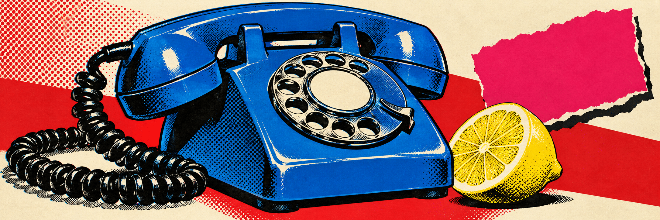
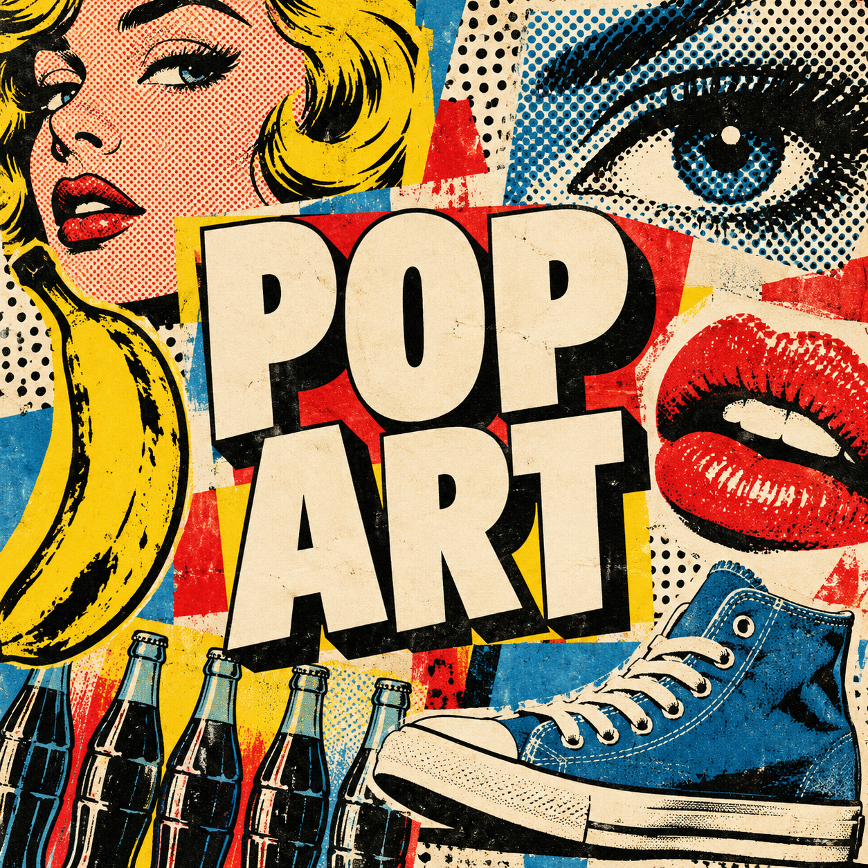
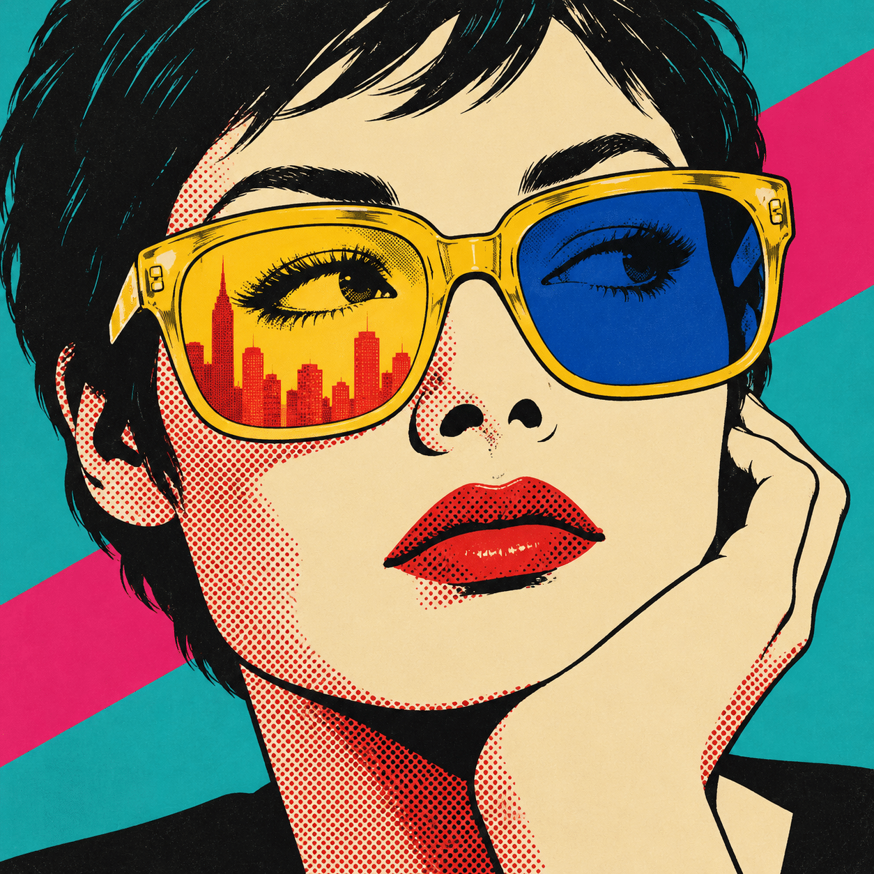
Seven new AI-generated AOI studies: a dedicated banner, a titled overview collage and five standalone works exploring portraiture, serial imagery, sculptural scale, photomontage and an everyday interior. Earlier illustrations remain for comparison. These are contemporary interpretations, not historical works.
Select an image for a closer look. Use the thumbnails, arrow keys or a swipe to compare examples. Zoom in to inspect details, or share the image that inspires you.

Creative toolbox · take this style further
Choose an input and a destination. Search sends your words to the chosen site; Copy & open puts them on your clipboard to paste there.
Create with AI
Turn your chosen input into an image prompt or a new creative direction.
ChatGPT
Copy your input and paste it into a ChatGPT conversation or image request.
Copy & open ChatGPT (new tab)Claude · Anthropic
Develop an image prompt or explore the style in a new Claude conversation.
Copy & open Claude · Anthropic (new tab)Midjourney
Paste your input into the Imagine bar on the Create page.
Copy & open Midjourney (new tab)Adobe Firefly
Copy your input, open Firefly, and paste it into the prompt field.
Copy & open Adobe Firefly (new tab)Leonardo.Ai
Copy your input, open Leonardo, and paste it into the generation field.
Copy & open Leonardo.Ai (new tab)Image search
Find visual references. Short, concrete keywords usually work best.
Lexica
Search AI images and prompts using your selected input.
Search with this input Lexica (new tab)Pexels
Search the photo and video library. Short keywords often work best.
Search with this input Pexels (new tab)Pixabay
Search photos, illustrations and other images.
Search with this input Pixabay (new tab)Unsplash
Search photographs using the style name or your own keywords.
Search with this input Unsplash (new tab)Wikimedia Commons
Search photographs, artworks and historical images. Check each file for its source and reuse terms.
Search with this input Wikimedia Commons (new tab)Art & research
Explore artists, collections and the ideas behind a style.
Wikipedia
Search for background reading. A style may not have its own article.
Search with this input Wikipedia (new tab)WikiArt
Copy your input into WikiArt’s search to explore artists and artworks.
Copy & open WikiArt (new tab)Europeana
Paste your keywords into the search to explore European museum, library and archive collections.
Copy & open Europeana (new tab)Inspiration
Discover portfolios and visual ideas from creative communities.
Instagram hashtags
Search a hashtag made from your input: spaces and punctuation are removed. Instagram may require sign-in.
Search with this input Instagram hashtags (new tab)ArtStation
Paste your input into artwork search for concept art, environments, characters and visual development.
Copy & open ArtStation (new tab)Behance
Paste your input into project search for illustration, design and visual storytelling.
Copy & open Behance (new tab)A closer look
Recognizable everyday forms meet conspicuous presentation: repeated units, abrupt changes of scale, cropped photographic fragments, clean silhouettes and surfaces that reveal a reproduction process. Color can be brilliant or restrained; the relationship to circulating images matters more than any one palette.
Familiar images, changed relationships
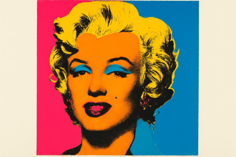
Pop Art is a historical movement that developed first in Britain and then in the United States during the 1950s and 1960s. Artists drew on advertising, comics, television and consumer goods, making widely circulated images available for reconsideration within art. Recognition is often the opening move: the viewer already knows the sort of object or image, then encounters it at an unexpected size, in a series, or in a different material. MoMA’s collection provides a useful point of departure because its examples include paintings, collage and sculpture rather than a single graphic formula.
The movement is not adequately defined by saturated color, a speech bubble or a fashionable portrait filter. Its subjects arrive with associations: convenience, desire, celebrity, domestic routine, authority or disposable pleasure. A successful new exercise decides which association to bring into focus. An image can feel affectionate and troubling at once; a cheerful surface is not sufficient evidence that an artist endorses everything represented.
A wider history than the familiar icons
MoMA’s collection places Richard Hamilton’s Interior, James Rosenquist’s F-111, Marisol’s Love and Rosalyn Drexler’s Hold your Fire (Men and Machines) alongside widely recognized works by Andy Warhol and Roy Lichtenstein. This is a productive viewing route: compare how each work selects and organizes its material before deciding what Pop must look like. The collection also includes Beatriz González, a reminder that a short British-American origin account is not a complete map of the field.
Materials make a difference. MoMA records Drexler’s 1966 Hold your Fire as acrylic and paper on canvas, while Oldenburg’s 1962 Two Cheeseburgers, with Everything uses burlap soaked in plaster and painted with enamel. The latter belongs to the context of The Store, where handmade objects recalled familiar merchandise. A plausible-looking object can be materially unruly. The soft-sculpture exercise in this gallery is a new AI interpretation of that broader problem, not a reproduction or attribution to Oldenburg.
Visual grammar: a clear unit and a consequential operation
Begin with one readable unit: a cup, shoe, telephone, face, appliance or packaging silhouette. Reduce incidental detail until it can be recognized at a glance. Then choose a principal operation. Repetition makes comparison possible; enlargement gives an ordinary thing unusual authority; cropping turns a fragment into a competing visual world; juxtaposition makes two familiar things disagree. Combining all four immediately often weakens the premise.
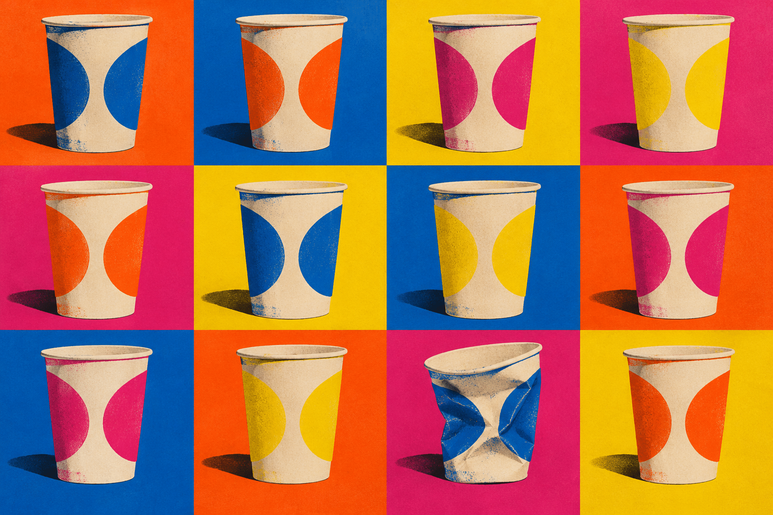
Think about the relationship between the unit and its frame. A tight crop can feel insistent, a regular border can suggest a product display, and an expanse of blank ground can give a disposable object the attention normally reserved for a monument. In a series, keep enough constants for a variation to register. Twelve unrelated objects are a collection; eleven intact cups and one crushed cup create a specific comparison.
Palette, surface and the appearance of reproduction
For an original print-like study, choose two or three dominant colors and a neutral ground before introducing an accent. Complementary opposition can make a shape jump forward, but equal saturation everywhere removes hierarchy. A dark contour can carry the image at thumbnail size while a finer dot pattern becomes a reward at a larger viewing scale. Monochrome photographic fragments can be just as useful as bright color.
Treat halftone dots, hard edges, paper tears and displaced color layers as visible decisions. Dots that are too small may disappear or produce distracting interference when resized. Registration offsets work best when limited to selected edges; random misalignment across every contour can destroy the intended object. In physical screenprinting, separate stencils and ink layers produce a real material process. A generated image can evoke that process, but its convincing appearance does not make it an actual print.
Five new studies, five different visual problems
The portrait pairs yellow glasses with a sharply divided face: recognition depends on a few large shapes, while the lenses hold a second, urban scale. The cup series uses repetition as its structure and one collapsed unit as its exception. These two images contrast concentrated identity with standardized objects; neither needs a commercial logo to make its premise legible.
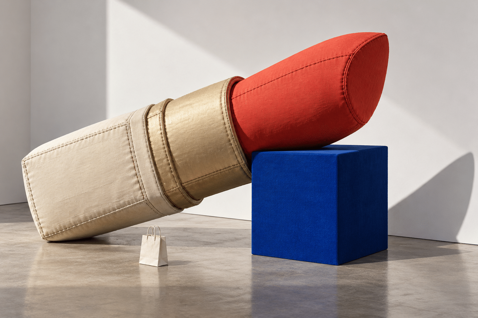
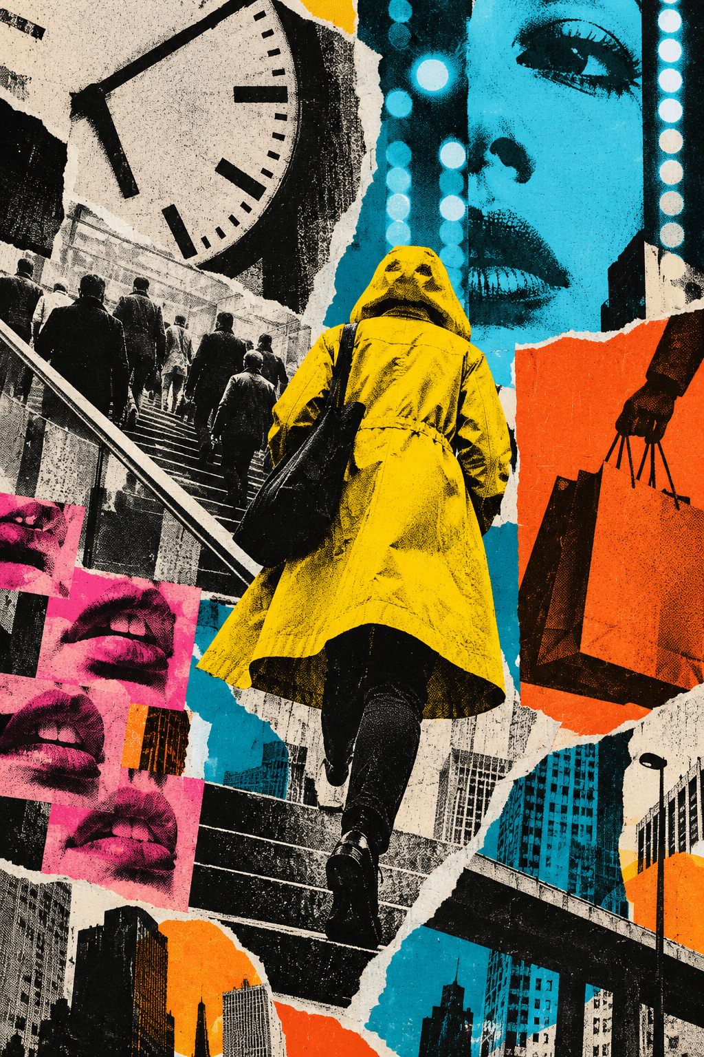
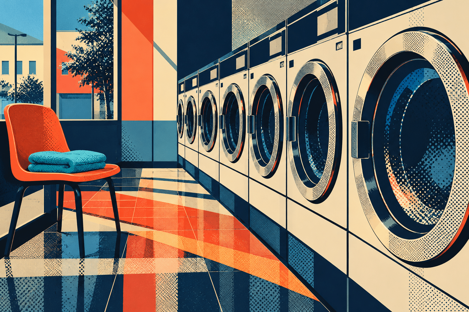
The monumental fabric cosmetic turns a hard everyday object into a stitched, yielding presence. The commuter photomontage uses torn edges, photographic crowds and advertising-like fragments to make the city feel mediated. The laundromat arranges circular machines along a receding diagonal, interrupted by an orange chair and folded turquoise towels. This quieter interior tests whether rhythm and ordinary routines can carry the idea without a celebrity face.
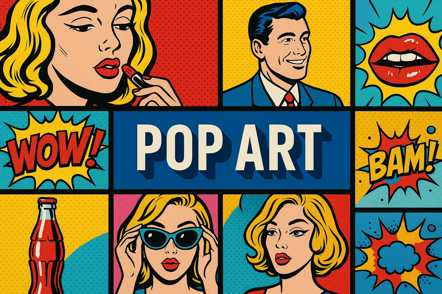
A dedicated telephone banner gives the page a clear consumer-object silhouette. The centrally titled collage brings several motifs together as an overview rather than replacing the standalone examples. Every new gallery image is AI-generated for AOI. The retained older images are comparison material, and the linked museum records are the sources for documented historical works.
Make a series with a reason to exist
Choose an ordinary object that has a specific role in your life. Make three studies with the object unchanged: one isolated, one repeated, one cropped so closely that it becomes almost abstract. Compare the effect on attention and apparent value. Next change just one property, such as material or condition, and decide whether the new version says something the first three could not.
For a finished composition, write a one-sentence intention before generating or drawing. For example: a familiar object becomes strange when it is larger than the room that should contain it. Translate that intention into subject, scale, framing, palette and surface. Useful prompt vocabulary includes serial arrangement, enlarged consumer object, cropped photographic fragment, flat ink fields, selective halftone and interrupted repetition. Avoid stacking these terms without specifying their relationships.
Applications, neighbors and common failures
This approach can support editorial illustration, posters, exhibition graphics and critical images about everyday culture. Decide how much explanation the audience needs. A campaign image must remain legible quickly; an artwork may deliberately prolong uncertainty. A commercial-looking result can unintentionally resemble an advertisement, so test whether the composition changes the familiar image or merely makes it more attractive.
Compare Pop with photomontage for fragment relationships, with graphic design for hierarchy, and with Anti-Art for different challenges to artistic convention. These are neighboring questions, not interchangeable labels. When a study feels generic, remove a decorative effect and strengthen its central operation. When it feels like a recognizable artist’s existing work, change the subject, arrangement and conceptual premise rather than merely switching colors.
Positive editorial assessment — AI-authored
Pop’s strongest resource is its speed of recognition followed by a delay in interpretation. The new cup series makes this particularly clear: the repeated units establish an order, then the crushed cup asks the eye to return. The enlarged fabric object takes the same reconsideration into material and scale. Together, these studies show how accessible imagery can sustain more than immediate visual pleasure.
Critical editorial assessment — AI-authored
Pop-inspired imagery is easily reduced to a package of dots, loud colors and famous faces. That shortcut can drain a subject of specificity and turn criticism into another attractive commodity. The commuter montage risks visual congestion; the portrait risks being read mainly as a stylish illustration. Stronger versions would give each fragment an identifiable role and test whether the intended observation survives without decorative texture.
Neutral editorial assessment — AI-authored
Pop Art offers a broad historical field and a practical set of operations for working with familiar imagery. The exercises here are useful for studying scale, repetition, mediation and material contrast. They do not reconstruct the movement’s full social history, and an AI-generated appearance cannot demonstrate a physical printing or sculptural technique. Read the contemporary studies alongside documented objects and their individual contexts.
A small poetic detour
Original words from the AOI studio.
Poetry
Ode to the Ordinary
The cup returns, then returns again,
a small white room for thirst.
The twelfth lies folded in its square
and makes us see the first.
A telephone grows taller than
the table it once knew;
its ordinary question rings
through fields of red and blue.
We brought our errands to the wall,
our bright and brief desires.
The things we scarcely looked at wait
with all their colors wired.
The prompt workshop
Original creative exercises. These prompts create new illustrations, not documentary evidence.
One object, unusual authority
Create an original Pop-inspired image of a plain blue tin opener enlarged across a cream field, one sharp orange shadow, strong cropped silhouette and selective coarse halftone only in the shadow. Make its ordinary mechanism surprisingly monumental. No logos, lettering or borrowed artwork.
Start with scale and contour. Compare a version with the whole object to a tighter crop.
Repetition with a consequential exception
Compose twelve invented paper cups in a precise four-by-three arrangement, consistent viewpoint, cobalt, coral and butter-yellow ink fields. Keep eleven upright and let one collapse. Use slight print registration variation, clear negative space and no branding. Make the disruption readable before adding texture.
The exception should change how the series is read, rather than become an unrelated decoration.
An everyday object changes material
Imagine a monumental soft canvas alarm clock slumping over a simple gallery plinth, stitched seams, cream fabric, red and blue planes, a small unbranded household object for scale. Strong side light and an uncluttered background. Create an original Pop-related sculpture study without copying any existing artwork.
An AI visualization explores the premise; it is not evidence of a fabricated sculpture.
Your next inspiration
Discover another art style
Follow a visual thread to the next subject.
A smile from the studio
Jokes
The repeated cup asked for a solo exhibition. The curator offered it twelve identical openings.