Drawing and painting medium
Oil pastel combines direct drawing with dense, blendable colour. Learn how pressure, layering, broken marks and scratched passages create expressive surfaces, and how this medium differs from dry pastel and oil paint.
A visual introduction
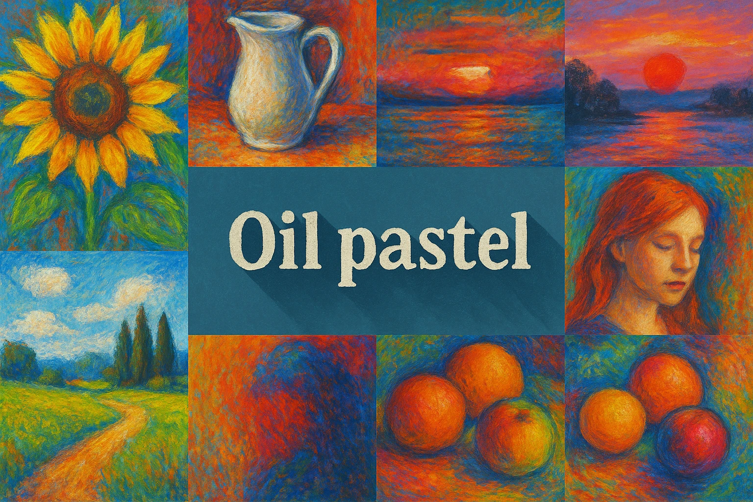
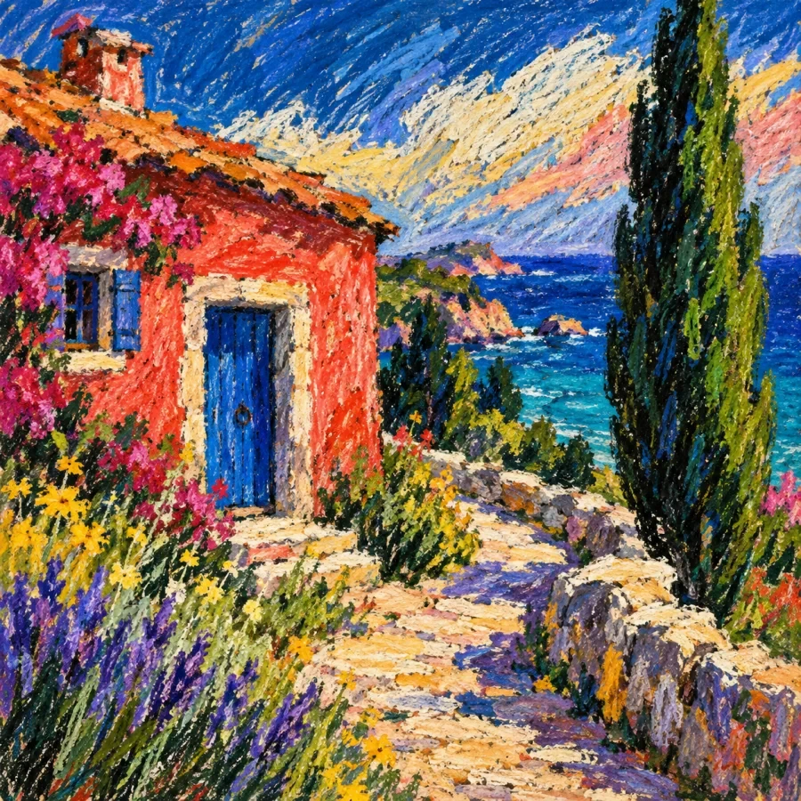
Select an image for a closer look. Use the thumbnails, arrow keys or a swipe to compare examples. Zoom in to inspect details, or share the image that inspires you.
Creative toolbox · take this style further
Choose an input and a destination. Search sends your words to the chosen site; Copy & open puts them on your clipboard to paste there.
Create with AI
Turn your chosen input into an image prompt or a new creative direction.
ChatGPT
Copy your input and paste it into a ChatGPT conversation or image request.
Copy & open ChatGPT (new tab)Claude · Anthropic
Develop an image prompt or explore the style in a new Claude conversation.
Copy & open Claude · Anthropic (new tab)Midjourney
Paste your input into the Imagine bar on the Create page.
Copy & open Midjourney (new tab)Adobe Firefly
Copy your input, open Firefly, and paste it into the prompt field.
Copy & open Adobe Firefly (new tab)Leonardo.Ai
Copy your input, open Leonardo, and paste it into the generation field.
Copy & open Leonardo.Ai (new tab)Image search
Find visual references. Short, concrete keywords usually work best.
Lexica
Search AI images and prompts using your selected input.
Search with this input Lexica (new tab)Pexels
Search the photo and video library. Short keywords often work best.
Search with this input Pexels (new tab)Pixabay
Search photos, illustrations and other images.
Search with this input Pixabay (new tab)Unsplash
Search photographs using the style name or your own keywords.
Search with this input Unsplash (new tab)Wikimedia Commons
Search photographs, artworks and historical images. Check each file for its source and reuse terms.
Search with this input Wikimedia Commons (new tab)Art & research
Explore artists, collections and the ideas behind a style.
Wikipedia
Search for background reading. A style may not have its own article.
Search with this input Wikipedia (new tab)WikiArt
Copy your input into WikiArt’s search to explore artists and artworks.
Copy & open WikiArt (new tab)Europeana
Paste your keywords into the search to explore European museum, library and archive collections.
Copy & open Europeana (new tab)Inspiration
Discover portfolios and visual ideas from creative communities.
Instagram hashtags
Search a hashtag made from your input: spaces and punctuation are removed. Instagram may require sign-in.
Search with this input Instagram hashtags (new tab)ArtStation
Paste your input into artwork search for concept art, environments, characters and visual development.
Copy & open ArtStation (new tab)Behance
Paste your input into project search for illustration, design and visual storytelling.
Copy & open Behance (new tab)A closer look
Dense waxy colour; visible pressure changes; broken strokes over paper tooth; blended passages beside distinct marks; scratched lines revealing lower layers; strong opaque accents. The medium supports both restrained studies and vivid colour.
A medium, not a single style
Oil pastel is a coloured stick medium that can be used for drawing and painting. Its smooth, relatively oily handling differs from the powdery character of dry pastel. Caran d’Ache distinguishes oil pastels from both dry pastels and wax crayons, while noting that different products offer different textures and uses.
An oil-pastel artwork need not be soft in colour or loose in execution. A controlled architectural study, a bright still life and an expressive landscape can all use the medium convincingly. What connects them is the behaviour of the marks and surface, not a fixed subject or palette.
A useful historical distinction
Sennelier dates the development of its own oil pastel to 1949, following an approach by Henri Goetz on behalf of Pablo Picasso. This is a history of that manufacturer’s formulation, not proof that every oil pastel began with Picasso. Keeping the distinction clear avoids turning a familiar artist story into an inaccurate universal origin.
The manufacturer describes a non-drying binder and wax, producing a creamy material. Oil pastel should therefore not be treated as ordinary oil paint in stick form. Product formulations vary, so decisions about supports, protective finishes and display should follow the relevant maker’s guidance and a small test rather than assumptions borrowed from another medium.
Pressure becomes part of the image
Begin with light pressure and a few large relationships. A lightly dragged stick catches the texture of the support, leaving small gaps that keep the surface lively. Firmer pressure builds a denser, more continuous patch. Using both allows a focal object to feel substantial while surrounding passages remain open.
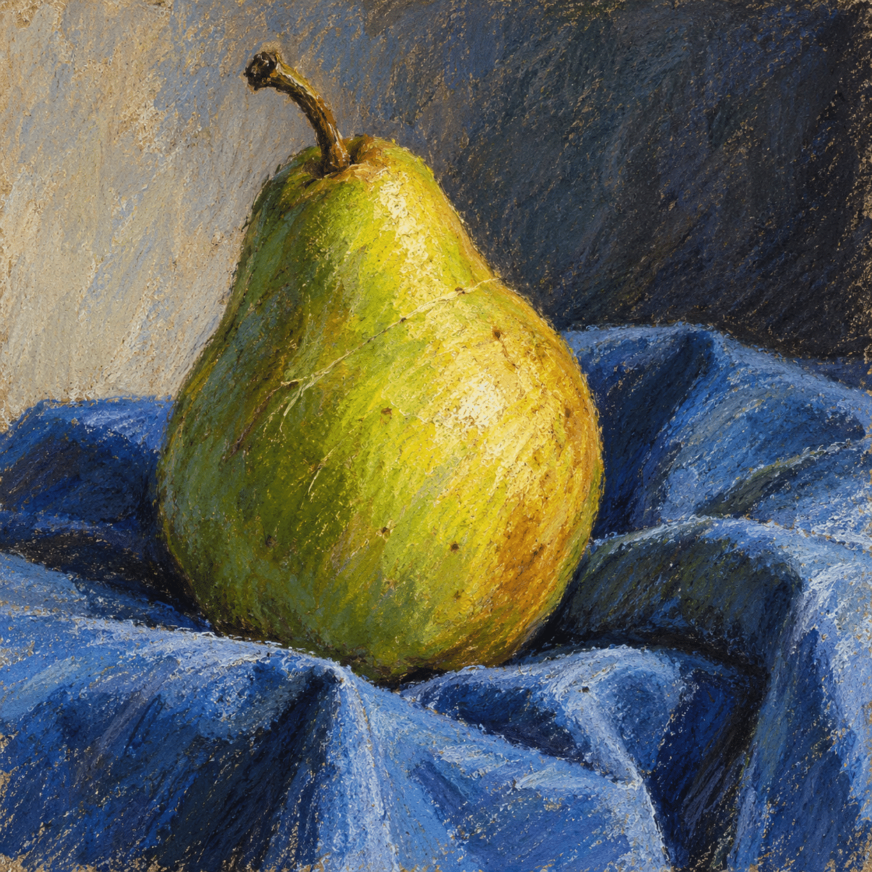
For a simple pear study, reserve the strongest pressure for the lit edge and a few colour accents. Let lighter, broken strokes describe the turning form. The cast shadow can be a broad cool mass rather than a heavily outlined shape. A coherent light direction matters more than filling every grain of paper.
Layer, blend and interrupt
Blending can unite a passage, but excessive rubbing often removes the distinctive energy of the original marks. Leave some strokes separate so adjacent colours remain visible. Test which order of colours works on the chosen support; a light accent over a dense dark layer may behave differently from the reverse.
Scratched passages can reveal earlier colour and create fine linear contrasts. Use them with a purpose: a few grass stems, a patterned cloth or a sharp architectural edge. A whole image covered in scratches quickly loses hierarchy. Contrast broad masses with selective detail, and keep one or two areas quieter than the focal point.
Translate the material into a visual brief
For AI illustration, describe the observable surface: creamy dragged marks, pressure-dependent coverage, visible paper tooth and selective sgraffito-like lines. Merely adding “oil pastel” to a prompt may produce generic painterly texture. Specify where the texture changes and what role those changes play in the composition.
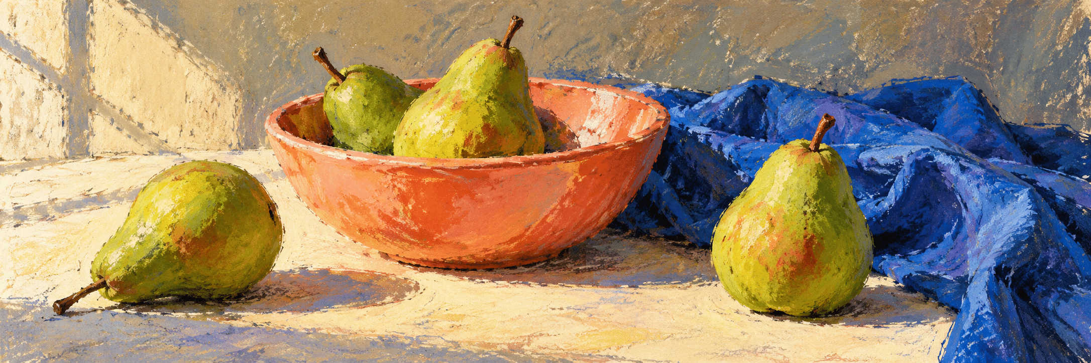
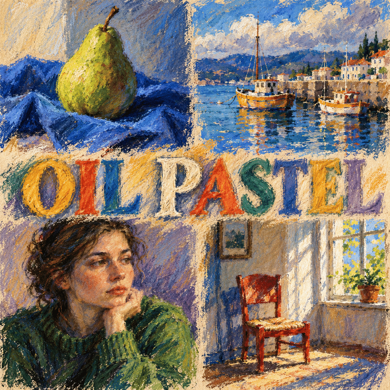
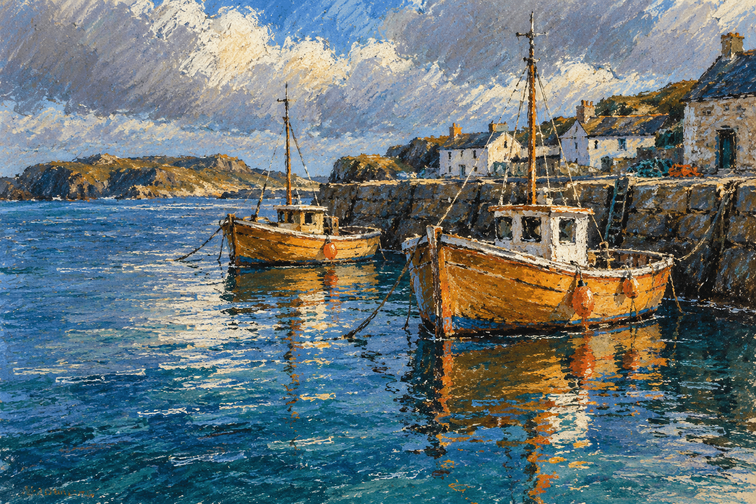
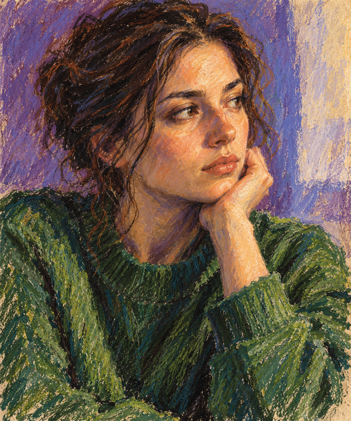
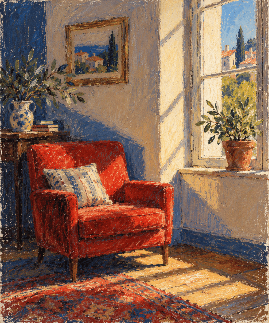
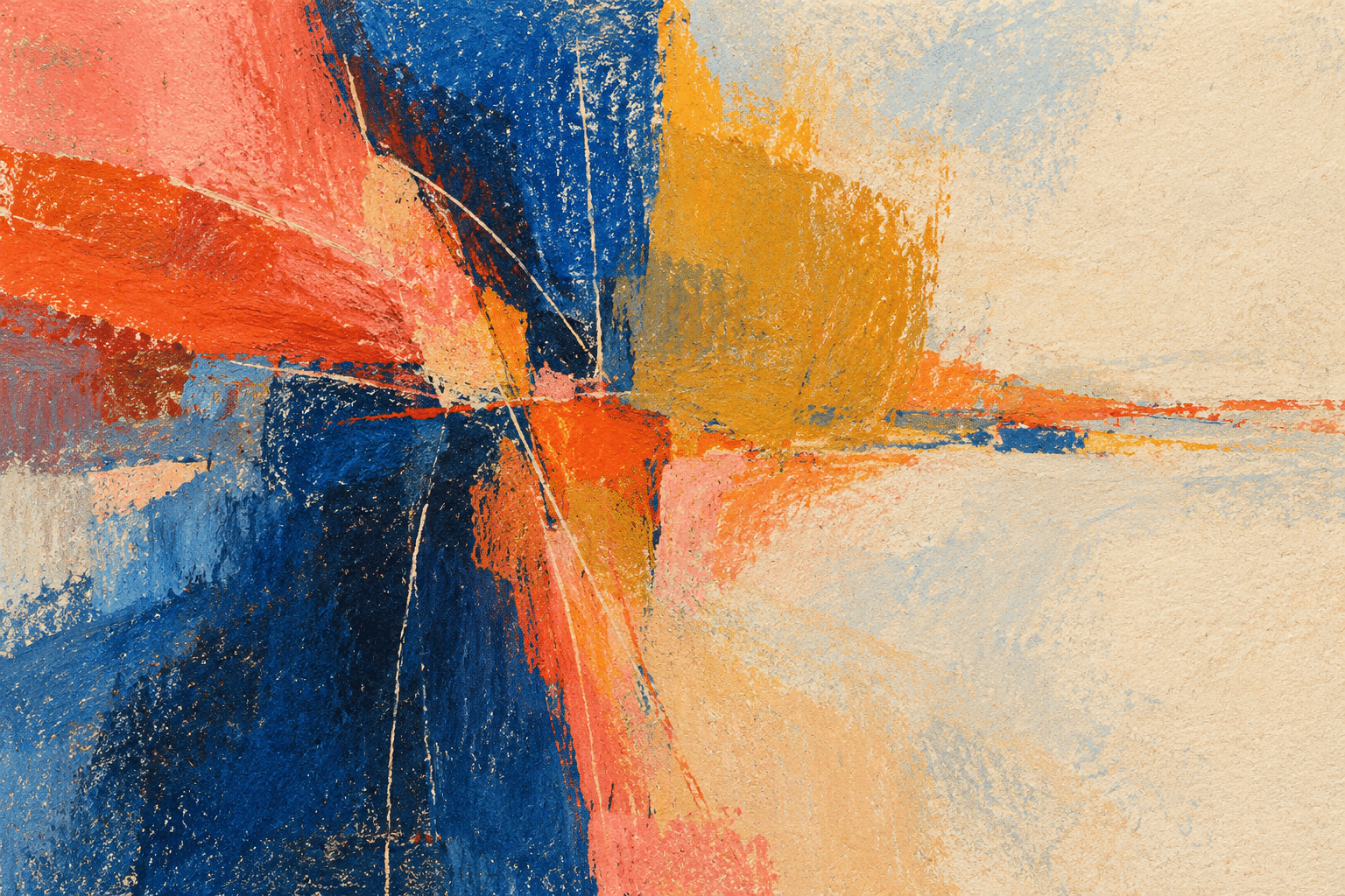
The new gallery contains AI-generated interpretations, not photographs of physical pastel originals. It explores fruit, a harbour, a portrait, an interior and abstract colour relationships. These examples show possible visual effects rather than certifying a particular pigment, support or preservation method. Study real materials alongside them when planning a physical artwork.
Positive editorial assessment — AI-authored
Oil pastel gives colour an immediate physical presence. A single stroke can carry both shape and pressure, while layered passages connect drawing with painting. Its strongest results preserve that directness while using value, edge and colour relationships to hold the composition together.
Critical editorial assessment — AI-authored
Heavy coverage everywhere can flatten an image, and repeated blending can turn vivid colour into indistinct mixtures. Generic digital imitations often confuse oil pastel with dry chalk or thick brush paint. Improve the work by varying pressure, preserving selected marks and making material effects serve the subject.
Neutral editorial assessment — AI-authored
Oil pastel is a versatile medium for observational studies, expressive drawing and layered colour work. Its handling and surface remain important considerations beyond the finished image. A useful evaluation considers composition and material control together, rather than judging quality by brightness or texture alone.
A small poetic detour
Original words from the AOI studio.
Poetry
The colour catches on the grain;
a lighter hand lets paper breathe.
A yellow edge returns again
from darker blue concealed beneath.
The rubbed horizon softens slow;
one stubborn mark remains its own.
A pressure change can make it glow,
a quiet patch can give it room.
The prompt workshop
Original creative exercises. These prompts create new illustrations, not documentary evidence.
Pear and blue cloth
Original oil-pastel interpretation of a green pear on folded blue cloth, light from the left, broken creamy marks and visible paper tooth, firm yellow-green accents beside lightly dragged shadows, simple strong composition, no signature.
Harbour in changing weather
Original oil-pastel interpretation of a small harbour under cloud, broad cool water, warm boats, varied pressure, unblended colour strokes and a few scratched mast lines, coherent reflections and restrained detail.
Colour under pressure
Original abstract oil-pastel interpretation with layered coral, cobalt and ochre masses, visible paper grain, selective scratched lines revealing cream below, a clear focal junction and a generous quiet area.
Your next inspiration
Discover another art style
Follow a visual thread to the next subject.
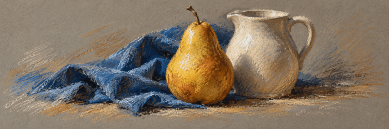
Colored Chalk Drawing: Line, Powder and the Colour of Paper
Compare the behavior of oil-bound pastel and dry chalk.
A smile from the studio
Jokes
The pastel tried to make a subtle entrance. Its colour arrived first.