
Drawing and painting medium
Oil pastel uses pigment in a wax-and-oil binder to create direct, often richly colored marks. It can support drawing, broad painting-like passages, layered textures and scraped accents; its behavior differs from both soft pastel and conventional oil paint.
A visual introduction
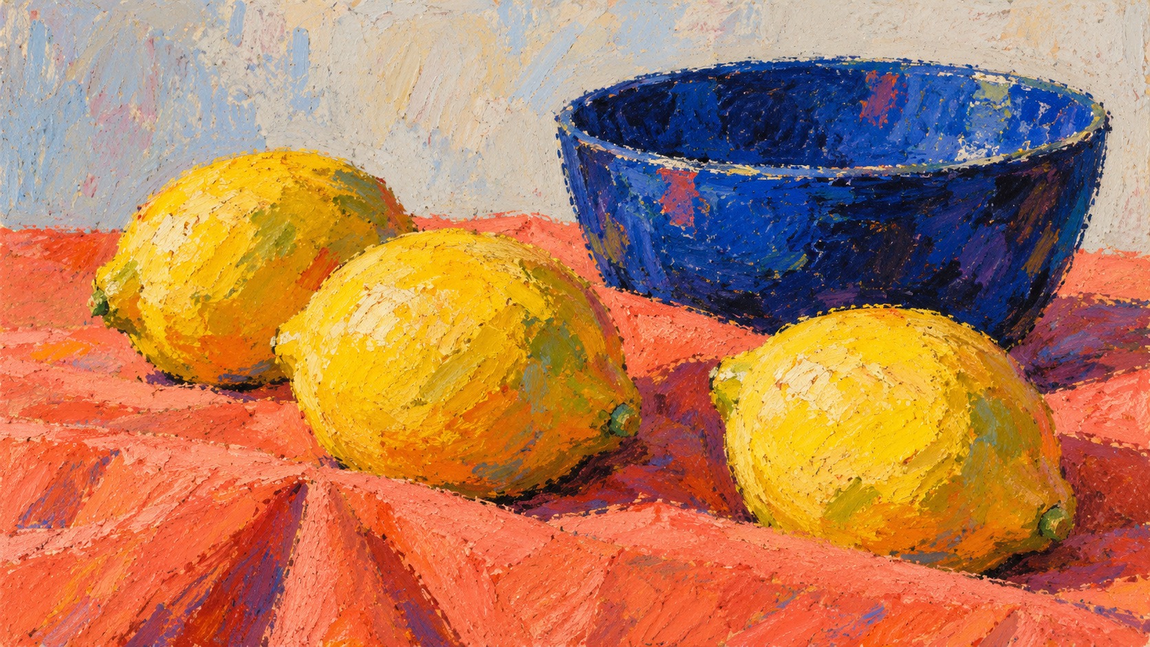
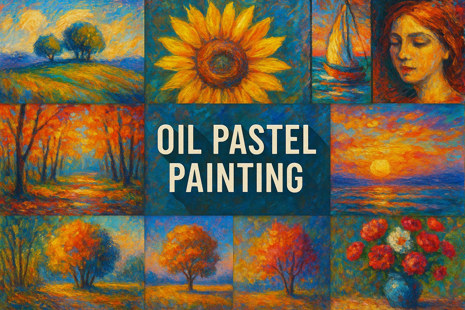
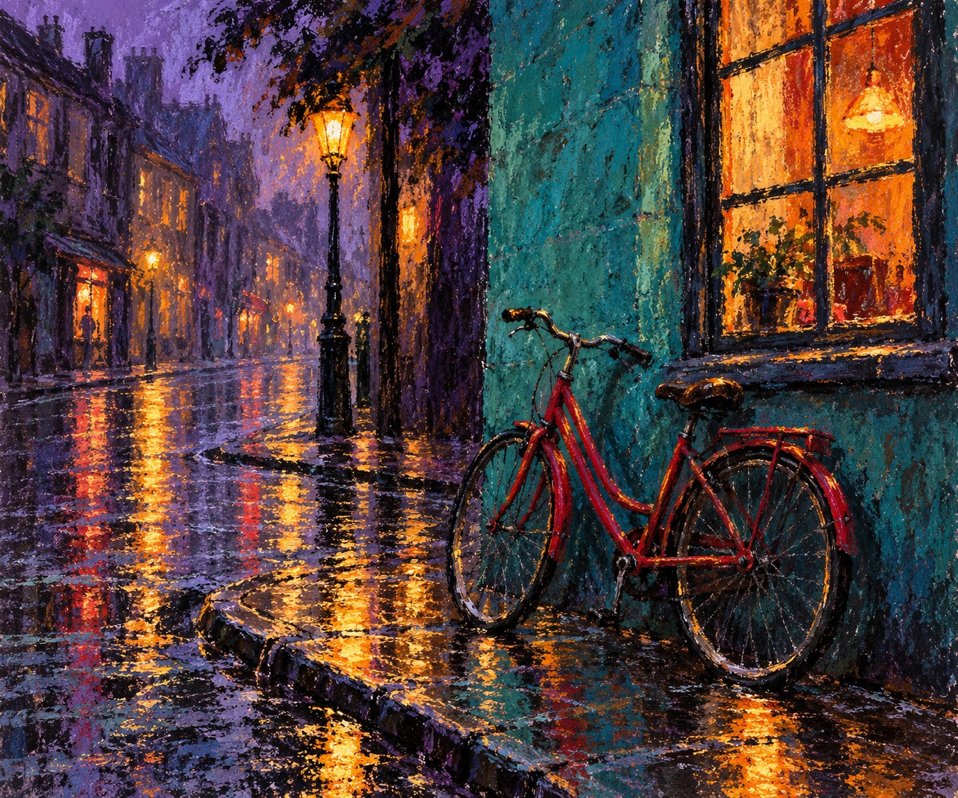
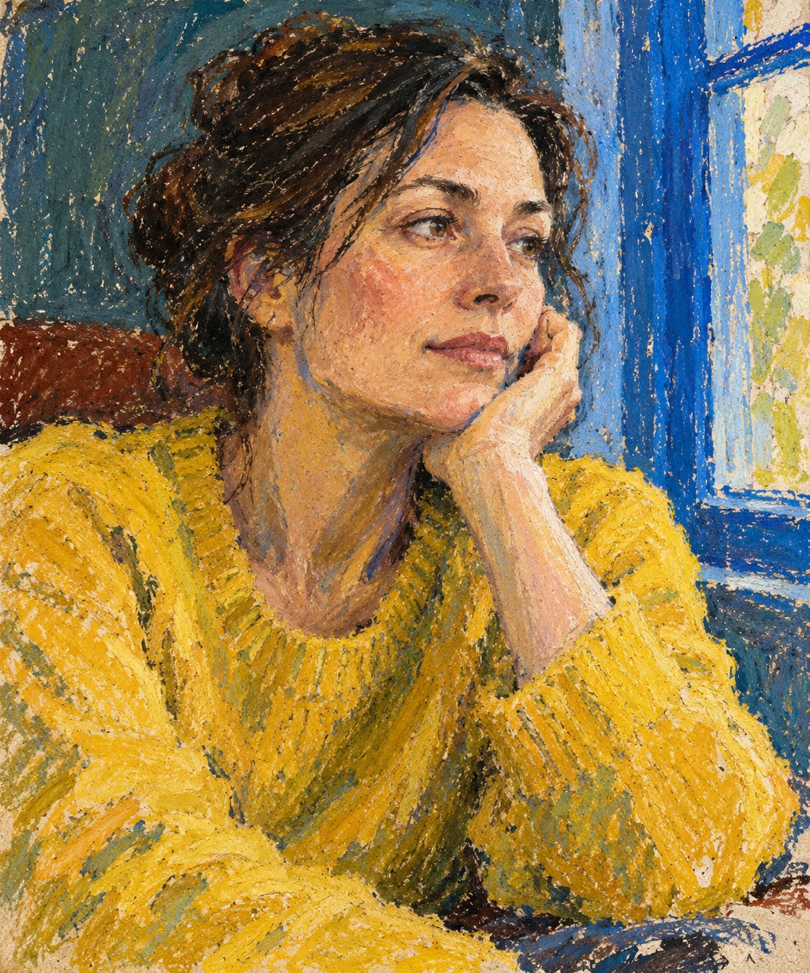
Four new oil-pastel-like studies explore still life, street reflections, portraiture and abstraction alongside a reviewed earlier collage.
Select an image for a closer look. Use the thumbnails, arrow keys or a swipe to compare examples. Zoom in to inspect details, or share the image that inspires you.
Creative toolbox · take this style further
Choose an input and a destination. Search sends your words to the chosen site; Copy & open puts them on your clipboard to paste there.
Create with AI
Turn your chosen input into an image prompt or a new creative direction.
ChatGPT
Copy your input and paste it into a ChatGPT conversation or image request.
Copy & open ChatGPT (new tab)Claude · Anthropic
Develop an image prompt or explore the style in a new Claude conversation.
Copy & open Claude · Anthropic (new tab)Midjourney
Paste your input into the Imagine bar on the Create page.
Copy & open Midjourney (new tab)Adobe Firefly
Copy your input, open Firefly, and paste it into the prompt field.
Copy & open Adobe Firefly (new tab)Leonardo.Ai
Copy your input, open Leonardo, and paste it into the generation field.
Copy & open Leonardo.Ai (new tab)Image search
Find visual references. Short, concrete keywords usually work best.
Lexica
Search AI images and prompts using your selected input.
Search with this input Lexica (new tab)Pexels
Search the photo and video library. Short keywords often work best.
Search with this input Pexels (new tab)Pixabay
Search photos, illustrations and other images.
Search with this input Pixabay (new tab)Unsplash
Search photographs using the style name or your own keywords.
Search with this input Unsplash (new tab)Wikimedia Commons
Search photographs, artworks and historical images. Check each file for its source and reuse terms.
Search with this input Wikimedia Commons (new tab)Art & research
Explore artists, collections and the ideas behind a style.
Wikipedia
Search for background reading. A style may not have its own article.
Search with this input Wikipedia (new tab)WikiArt
Copy your input into WikiArt’s search to explore artists and artworks.
Copy & open WikiArt (new tab)Europeana
Paste your keywords into the search to explore European museum, library and archive collections.
Copy & open Europeana (new tab)Inspiration
Discover portfolios and visual ideas from creative communities.
Instagram hashtags
Search a hashtag made from your input: spaces and punctuation are removed. Instagram may require sign-in.
Search with this input Instagram hashtags (new tab)ArtStation
Paste your input into artwork search for concept art, environments, characters and visual development.
Copy & open ArtStation (new tab)Behance
Paste your input into project search for illustration, design and visual storytelling.
Copy & open Behance (new tab)A closer look
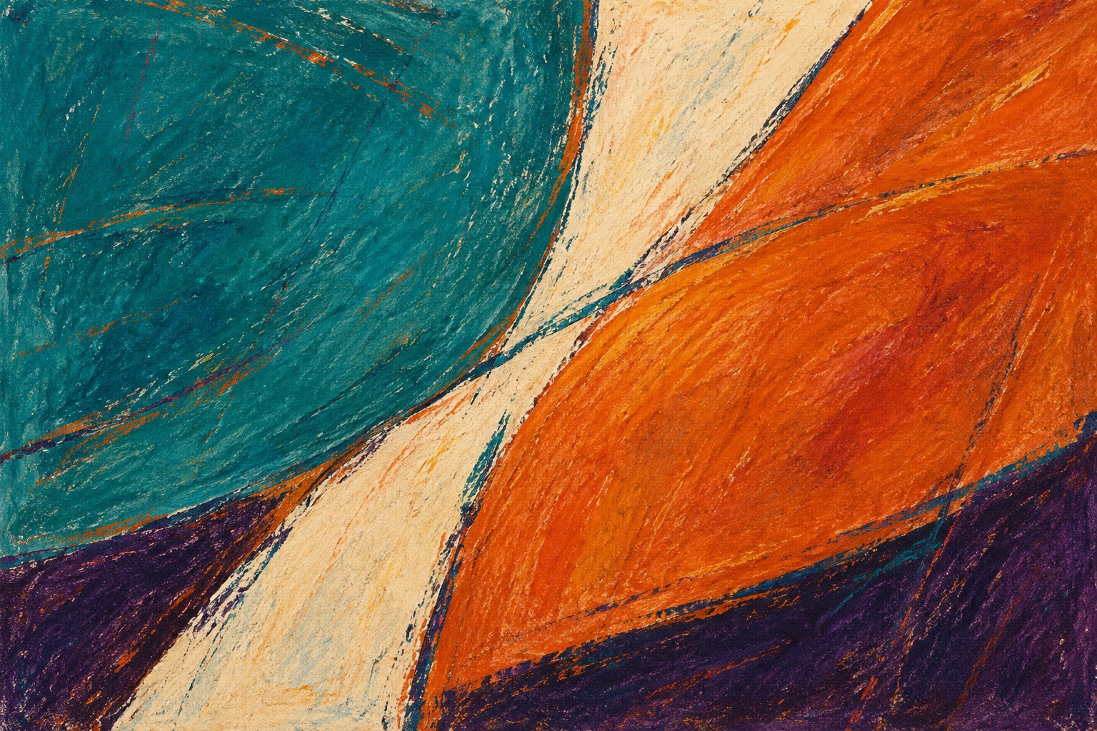
Waxy drag, broken deposits, dense color and marks scraped through an upper layer can give the surface energy. Shape, pressure and the sequence of colors matter as much as the subject.
Understand the material before the effect
Sennelier describes its oil pastels as pigment with a non-drying synthetic binder and mineral wax, and dates the development of its artist range to 1949. That manufacturer’s history is useful for its own product; it should not be mistaken for a complete history of every pastel-like material or a universal recipe. Formulation and hardness differ between products.
Oil pastel is not simply oil paint packaged as a stick. Nor does it behave like dry soft pastel. A useful first step is to make a small test sheet with the materials you actually have: light pressure, firm pressure, overlapping colors and a carefully scraped passage. Note what remains distinct, what blends and what becomes difficult to work further. A digital interpretation can suggest these appearances but cannot predict physical handling.
Build with pressure and sequence
A lightly applied first layer can leave paper visible between marks. A firmer later stroke can establish a dense accent. If every area receives maximum pressure immediately, there may be little room to adjust the surface or introduce contrasting marks. Plan where you want broad coverage and where broken deposits will contribute to the image.
Color order changes the result. A dark layer beneath a light one can remain visible through gaps or scraped lines; a bright underlayer can enliven a quieter upper passage. Try the same pair in both orders before using it in a larger work. This makes layering a deliberate color decision instead of a way to keep adding material until the subject disappears.
Scraping and blending have different jobs
Scraping through an upper layer can reveal a lower color and establish a crisp line. Use it where the line explains a contour, reflection or repeated rhythm. Too many equally sharp scratches can break a calm area into noise. The strongest scraped accents often work because nearby surfaces remain broader.
Blending can connect adjacent passages, but it should not erase every mark. Let some strokes retain their direction and edges. In a face, broad planes may carry the structure while a few transitions soften; in a street scene, rough dragged marks can suggest reflected light without describing each paving stone. Choose the mark according to its role in the composition.
Composition beyond bright color
Start with a few large shapes and a limited palette. A cobalt bowl against coral cloth, for example, can establish a strong relationship before small highlights are added. Check whether the lightest and darkest areas support the intended focus. Saturated color everywhere can flatten the hierarchy just as equal detail can.
The medium is useful for still life, portraits, landscape and abstraction, but each subject needs a different distribution of marks. A portrait benefits from coherent proportions and selective color shifts; an abstract composition needs convincing relationships of scale and interval. A tactile surface is an asset when it helps those decisions, not a substitute for them.
Prompting and evaluating a study
For generated illustrations, specify waxy broken strokes, pressure variation, layered color and selective scrape-through marks. Connect the surface to a clear subject and light arrangement. Ask for a contemporary interpretation rather than claiming that an actual hand-made pastel has been photographed. Avoid adding physical-material provenance that the image cannot establish.
Compare the result at thumbnail and full size. At the smaller scale, the main arrangement should remain clear. At full size, look for purposeful variation instead of uniform simulated texture. In physical work, consult the manufacturer’s advice for the particular support, storage and presentation system; oil-pastel surfaces and compatibility are product-dependent. The workshop here offers visual experiments, not a conservation prescription.
About this guide
This AI-authored AOI guide appears under Penny Wraiter, AOI’s editorial persona. Sources support the historical context; exercises, prompts and poetry are original editorial interpretations. Image captions distinguish generated studies from documented works.
Make a pressure chart that answers a pictorial question
Use one color to produce light, medium and heavy passages, then cross each with a second color. Compare which combinations preserve the first layer and which cover or drag it. Keep this small chart beside a study so the texture you choose follows the intended effect rather than an assumption about how the material should behave.
Plan one scraped passage before applying the upper layer. The exposed lower color should have a compositional purpose, such as a narrow reflection or a rhythm of stems. Scratching evenly across the entire surface can turn a useful contrast into visual noise.
For a generated study, inspect broad areas and edges separately. The image should combine deposited color, broken coverage and occasional blending in plausible relationships, rather than imitate oil pastel solely through a uniform roughness filter.
A small poetic detour
Original words from the AOI studio.
Poetry
A yellow stroke meets cobalt blue.
The paper shows between the grain.
A line scraped back reveals the first
bright thought beneath a second stain.
The surface keeps the hand’s decision,
its pressure, pause and change of mind.
One quiet patch beside the color
lets all the rougher marks unwind.
The prompt workshop
Original creative exercises. These prompts create new illustrations, not documentary evidence.
A bold still life
Create an original oil-pastel-like still life of lemons and a cobalt bowl on coral cloth. Broad waxy marks, broken layers, a few scraped highlights and a calm pale wall. Clear large shapes, no signature or claim of a physical artwork.
Reflections with rough marks
Interpret a rainy street corner with one red bicycle and a lit window in oil-pastel-like color. Use teal, violet and amber, broad dragged strokes and selective scrape-through accents. Keep perspective simple and the main light reflection clear; no lettering.
Layer, reveal, repeat
Compose an abstract study with teal and burnt-orange bands over a cream ground. Reveal an earlier violet layer through a few controlled scraped lines. Vary pressure and mark width while keeping a limited number of large shapes.
A smile from the studio
Jokes
The oil pastel had a strong opinion about the paper. It left most of the discussion on the surface.