
Drawing medium and technique
Explore chalk drawing through grain, hatching, toned paper and selective light, with museum references, seven artworks and practical creative prompts.
A visual introduction
Two new architectural and animal studies join the reviewed banner, centrally titled collage and three existing examples. Seven distinct AI-generated interpretations explore grain, hatching, paper tone and selective light.
Select an image for a closer look. Use the thumbnails, arrow keys or a swipe to compare examples. Zoom in to inspect details, or share the image that inspires you.
Creative toolbox · take this style further
Choose an input and a destination. Search sends your words to the chosen site; Copy & open puts them on your clipboard to paste there.
Create with AI
Turn your chosen input into an image prompt or a new creative direction.
ChatGPT
Copy your input and paste it into a ChatGPT conversation or image request.
Copy & open ChatGPT (new tab)Claude · Anthropic
Develop an image prompt or explore the style in a new Claude conversation.
Copy & open Claude · Anthropic (new tab)Midjourney
Paste your input into the Imagine bar on the Create page.
Copy & open Midjourney (new tab)Adobe Firefly
Copy your input, open Firefly, and paste it into the prompt field.
Copy & open Adobe Firefly (new tab)Leonardo.Ai
Copy your input, open Leonardo, and paste it into the generation field.
Copy & open Leonardo.Ai (new tab)Image search
Find visual references. Short, concrete keywords usually work best.
Lexica
Search AI images and prompts using your selected input.
Search with this input Lexica (new tab)Pexels
Search the photo and video library. Short keywords often work best.
Search with this input Pexels (new tab)Pixabay
Search photos, illustrations and other images.
Search with this input Pixabay (new tab)Unsplash
Search photographs using the style name or your own keywords.
Search with this input Unsplash (new tab)Wikimedia Commons
Search photographs, artworks and historical images. Check each file for its source and reuse terms.
Search with this input Wikimedia Commons (new tab)Art & research
Explore artists, collections and the ideas behind a style.
Wikipedia
Search for background reading. A style may not have its own article.
Search with this input Wikipedia (new tab)WikiArt
Copy your input into WikiArt’s search to explore artists and artworks.
Copy & open WikiArt (new tab)Europeana
Paste your keywords into the search to explore European museum, library and archive collections.
Copy & open Europeana (new tab)Inspiration
Discover portfolios and visual ideas from creative communities.
Instagram hashtags
Search a hashtag made from your input: spaces and punctuation are removed. Instagram may require sign-in.
Search with this input Instagram hashtags (new tab)ArtStation
Paste your input into artwork search for concept art, environments, characters and visual development.
Copy & open ArtStation (new tab)Behance
Paste your input into project search for illustration, design and visual storytelling.
Copy & open Behance (new tab)A closer look
Grainy broken marks, broad side strokes, controlled hatching and selective blending reveal the contact between material and paper. On toned paper, white heightening can work against darker marks and the exposed ground.
A medium with several material histories
The Met’s technical introduction distinguishes natural chalks from fabricated drawing materials. Historical black, red and white chalks have different compositions and behaviors; modern products sold under related names also vary. Read the material description of a particular work or product instead of assuming that every chalk stick behaves like classroom chalk. Chalk drawing is a technique, not one historical movement.
Red chalk can establish warm linear and tonal passages, black chalk can carry stronger dark accents, and white can provide highlights on a colored ground. Drawings combining three chalk colors are often described as trois crayons. These terms help identify materials, but they do not explain the drawing by themselves. The important question is how each material contributes to the image.
Read the material line before the style label
The Met identifies Michelangelo’s Studies for the Libyan Sibyl, about 1510–11, as red chalk with small white accents on the main figure’s shoulder. Its example makes a useful distinction: white can be a small intervention within a predominantly red drawing rather than an equal partner across the whole sheet. The same technical introduction identifies Lemoyne’s 1741 portrait of Étienne Maurice Falconet as black, red and white chalk with stumping. Read those medium descriptions before comparing the marks. [1]
Getty’s Learning to Draw exhibition includes Hubert Robert’s A Draftsman in the Capitoline Gallery, about 1765, in red chalk, alongside Bartolozzi’s A Young Woman Drawing, 1799, in black and red chalks. They offer different subjects and spatial scales within related materials. A further example, Saint-Aubin’s Three Young Women Drawing at a Table, about 1778, combines selectively wetted black chalk with pen and ink. A single drawing may involve several processes; its appearance alone is not a complete materials record. [2]
Let the paper participate
Paper texture breaks a stroke into deposits and gaps. A broad side stroke can describe a plane quickly; a point can establish a contour or small accent. Before starting a subject, test several pressures and directions on the intended support. The same stick can make a delicate broken line or a dense patch depending on contact, pressure and surface.
Choose the paper’s tone as part of the value structure. On a middle-toned sheet, the untouched ground can serve as a middle value, dark chalk can deepen shadows and white can identify selected lights. Do not cover the whole surface automatically. Leaving some ground visible can connect the figure or object to its surrounding space and prevent overworked tonal transitions.
Hatching, blending and edges
Hatching can follow a form, describe an angle or establish an even tonal field. Crossed strokes become more useful when their direction and spacing are deliberate. Blending can soften a transition, but excessive rubbing may erase the liveliness of the marks. Compare a blended passage with an untouched one before deciding whether more smoothing helps.
A contour need not be equally dark everywhere. Strengthen an edge where it clarifies overlap or focus and allow another to dissolve into a similar value. In an observational study, large proportions and shadow shapes matter before eyelashes, veins or fabric texture. A convincing drawing can remain selective, with a few resolved passages supported by quieter indications.
Three practical studies
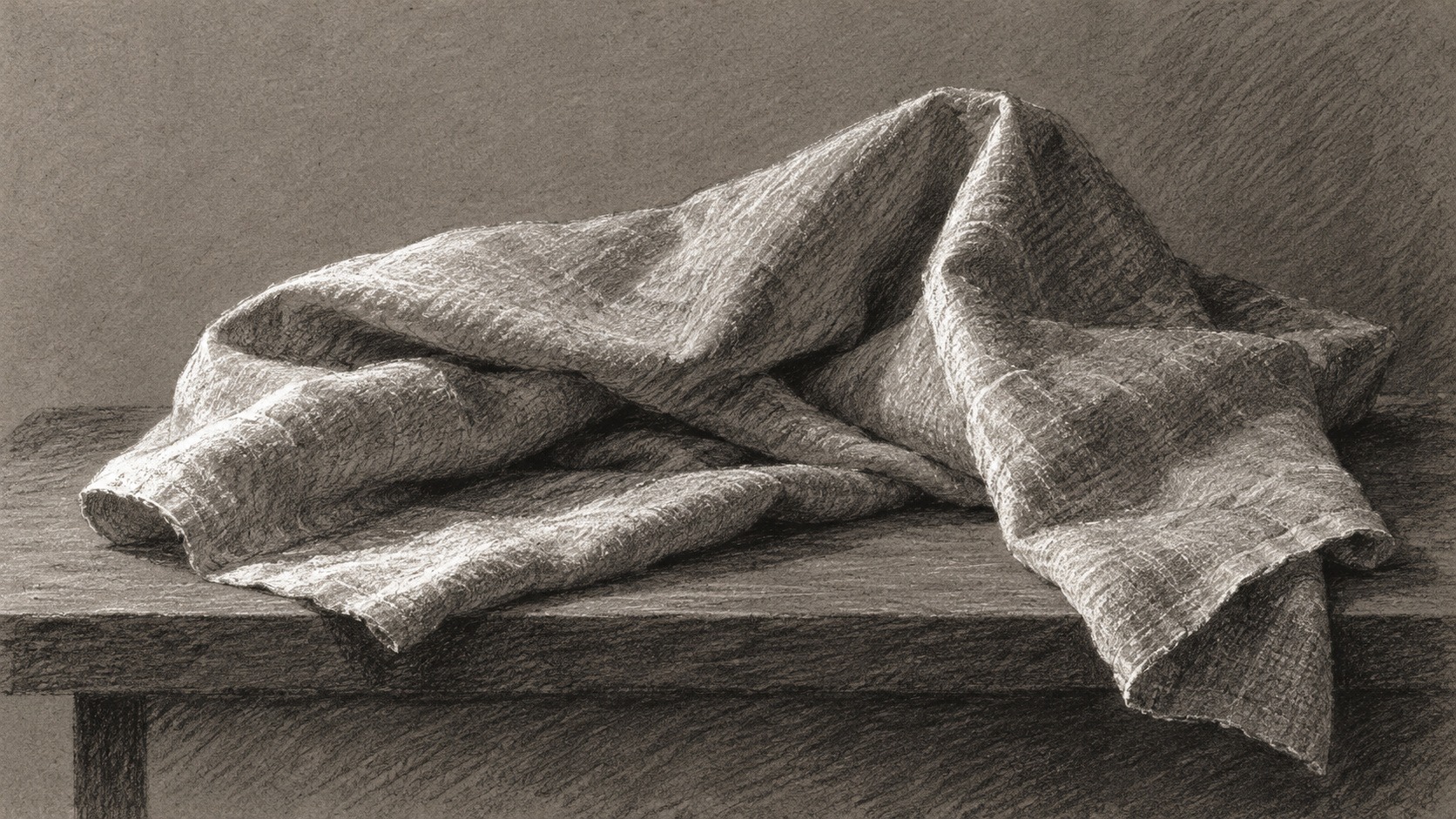
Begin with a folded cloth in black chalk. Establish the largest shadow shape, then use a few directional marks to explain the folds. Next try a red-chalk study of a simple hand tool or ceramic form, concentrating on silhouette and turning planes. Finally use black and white on gray paper for a still life, reserving white for a small number of lights.
For a figure study, work with a consenting adult model or a suitable reference and choose a comfortable pose. Gesture, balance and the distribution of weight are useful first concerns. The aim is observation, not an idealized body template. A generated chalk-like image is an interpretation of the appearance of marks, not evidence of an actual chalk drawing or an anatomically exact reference.
Common failures and useful prompt language
The most common visual problem is uniform emphasis: every edge outlined, every shadow rubbed smooth, every highlight bright. Establish a hierarchy instead. Keep the strongest dark near the main focus, vary line pressure and leave some paper untouched. If the image becomes muddy, compare its large value groups before adding more detail.
Useful prompt terms include broken chalk grain, directional hatching, toned paper, white heightening and selective blending. Connect those terms to a subject and lighting problem. “Chalk texture” pasted over a photographic image rarely explains the medium convincingly. In physical practice, follow the material maker’s handling and framing guidance; a generated preview cannot predict a particular stick’s adhesion or the effect of a fixative.
About this guide
This AI-authored AOI guide appears under Penny Wraiter, AOI’s editorial persona. Sources support the historical context; exercises, prompts and poetry are original editorial interpretations. Image captions distinguish generated studies from documented works.
Give the three tones unequal jobs
On a middle-toned sheet, begin a study with one dark chalk and leave the paper to carry most of the half-tones. Add white only where a plane directly receives light. If using red chalk as well, give it a specific structural or temperature role rather than tracing every dark line again.
Compare a blended passage with an unblended group of strokes at the same approximate value. Their difference is partly texture and partly the speed with which the eye reads the form. Keep both where that contrast serves the subject. A fully polished surface is one possible outcome, not the default measure of a successful chalk drawing.
For a digital interpretation, inspect the lightest marks closely. They should behave like material sitting on the paper, with broken edges and selective coverage, rather than glowing independently of the scene.
An arcade: make the marks turn through space
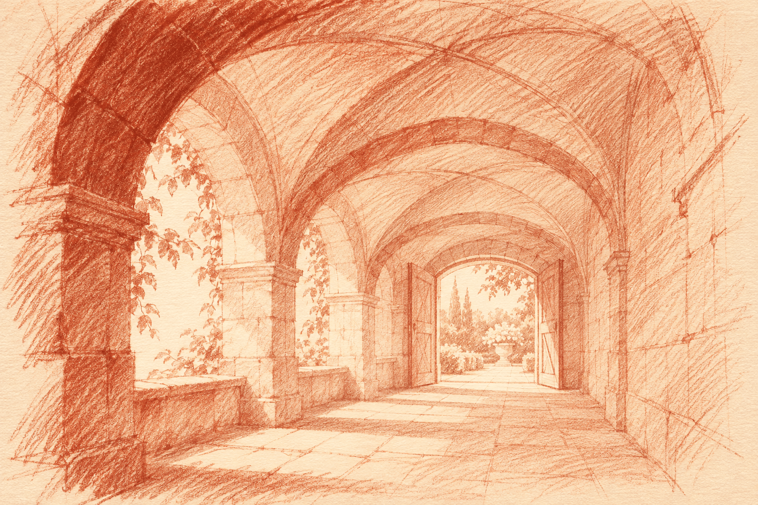
The new red-chalk interpretation takes the medium beyond a single isolated object. Receding arches establish depth while a bright opening draws attention toward the garden. The nearest arch carries the darkest passage. Within the vault, diagonal and curved strokes change direction with the imagined stone planes; the edges of the sheet remain comparatively loose.
Try simplifying this structure to three value groups: open paper, a middle layer of hatching and a small dark accent. If every arch receives the same line weight, distance collapses. If every stone is described equally, the drawing loses its route into space. The generated scene is an invented arcade, not a depiction of the Capitoline Gallery or a copy of Robert’s drawing.
A sleeping fox: let an unfinished edge finish the idea
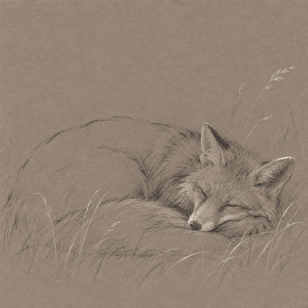
The second new study starts with a long shallow curve. A curled fox occupies the lower portion of the sheet; much of its body remains close to the paper’s own value. Marks become denser around the closed eye, muzzle and ear, where a few small contrasts establish the animal’s attention—or, here, its rest. The tail and body join into a quiet overall shape.
White touches on the face and grasses stay selective. They resemble chalk deposits rather than emitted light. Compare this economy with the more fully modelled retained portrait: a drawing can choose a different degree of completion for each subject. The fox is an imagined illustration, not a wildlife record or a precise zoological study.
Compare the seven illustrations as drawing decisions
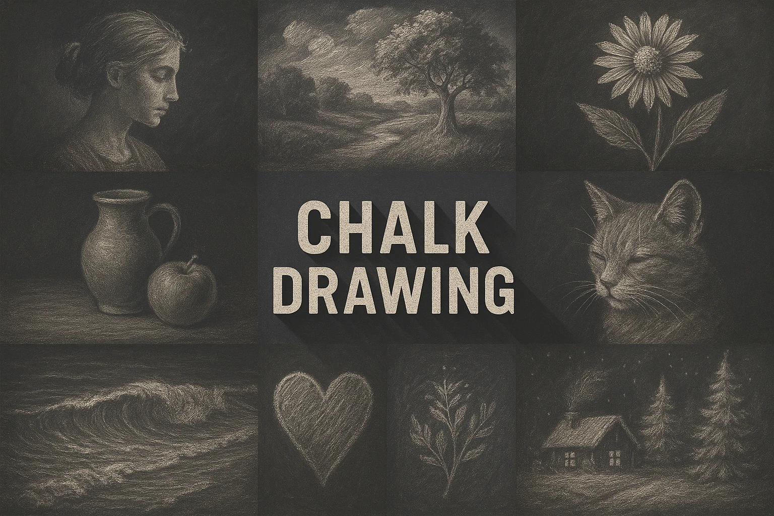
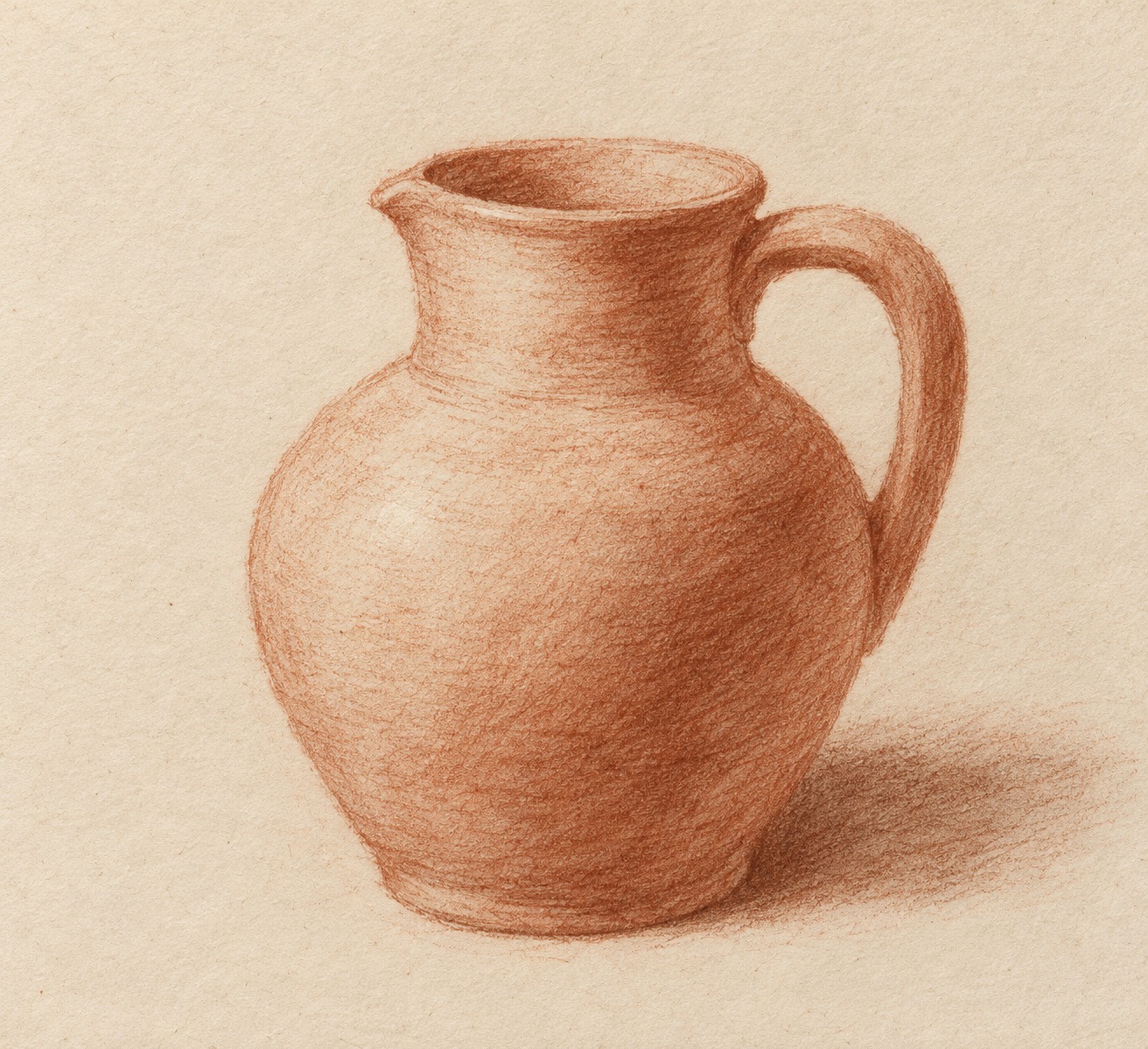
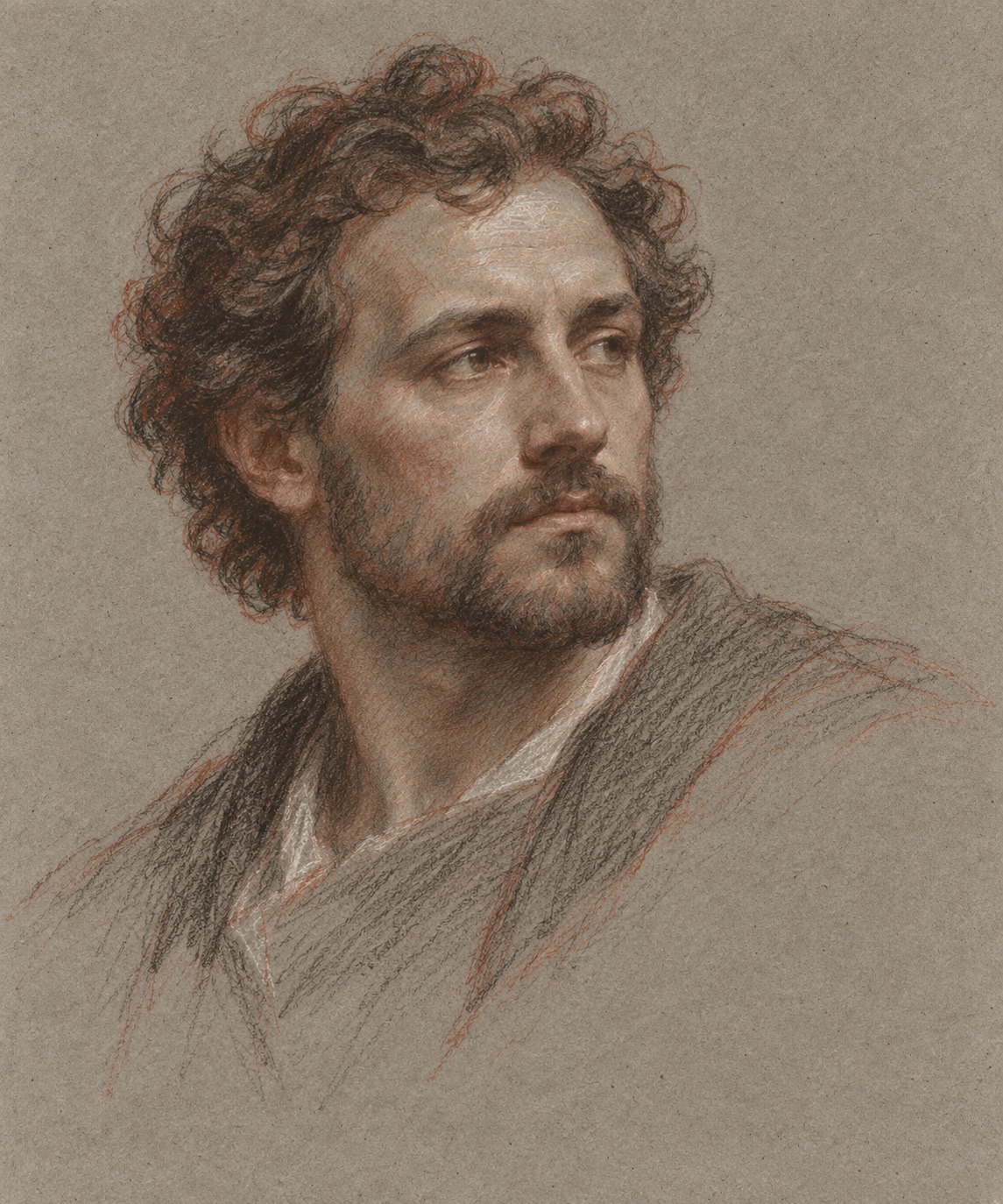
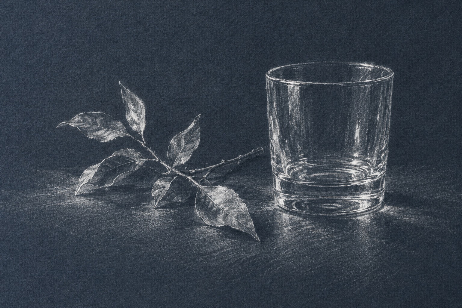
The banner builds a broad cloth form from alternating lights and shadows. The titled collage offers a compact range of motifs. The red jug depends on a continuous turning contour; the three-colour portrait concentrates its strongest accents near the gaze; the white-on-blue still life leaves most dark values to the paper. The new arcade and sleeping fox extend those choices into architectural depth and a restrained animal study.
Use the gallery to ask where a mark earns its place. Cover a detailed passage and see whether the large form still reads. Compare an exposed paper area with a blended one, and a sharp overlap with a lost contour. These are generated interpretations of drawing language, not proof of physical materials, a historical hand or a particular making process.
Positive review — AOI editorial perspective
Chalk can bring line and tone into unusually close contact. A small change in pressure or edge can turn an object, while the exposed ground gives the drawing room. This gallery makes those choices visible through cloth, portrait, glass, architecture and a sleeping animal rather than repeating one textured portrait formula.
Negative review — AOI editorial perspective
The appearance is weakened by uniform outlining, rubbed-flat shadows or a grain overlay unrelated to the form. Three colours can become repetitive tracing rather than distinct value decisions. Preserve a hierarchy of marks and check whether the subject still reads before adding surface detail; digital simulations cannot demonstrate the handling of a real stick.
Neutral review — AOI editorial perspective
Chalk drawing is a family of material practices and visual approaches rather than a movement. Museum records distinguish chalk colours, grounds and mixed techniques. The practical studies here translate selected qualities into original AI imagery while preserving the difference between a generated surface and a physical drawing.
A small poetic detour
Original words from the AOI studio.
Poetry
The paper catches half the line.
The other half remains as air.
A little red describes the turn;
a little white finds daylight there.
The darkest mark is kept for last.
The quiet ground is left to show.
A hand can say enough in chalk
by knowing where it need not go.
The prompt workshop
Original creative exercises. These prompts create new illustrations, not documentary evidence.
Black chalk and a broad shadow
Create an original chalk-like drawing of folded linen on pale textured paper. Broad side strokes establish one large shadow; selective hatching explains the folds. Broken grain, varied contour strength, generous untouched paper, no signature.
Three colors, one light
Make an original adult portrait study using black, red and white chalk-like marks on warm gray paper. Establish large facial planes with restrained hatching; white only on a few illuminated passages. Natural proportions, quiet expression, no photographic skin texture.
Keep the grain visible
Create a red-chalk-like study of a plain ceramic jug on warm cream paper. Use directional lines and small patches of tone; preserve paper grain and interrupted edges. No smooth airbrushing, labels or fake historical attribution.
People & works to explore
References discussed in this article. Consult the sources below for context.
Artists and practitioners
Michelangelo Buonarroti — red-chalk studies discussed by the Met
Jean-Baptiste Lemoyne the Younger — three-colour chalk portrait cited by the Met
Hubert Robert — architectural red-chalk drawing listed by Getty
Francesco Bartolozzi — black-and-red chalk drawing listed by Getty
Gabriel Jacques de Saint-Aubin — mixed drawing technique listed by Getty
Paintings and other works
Michelangelo — Studies for the Libyan Sibyl (about 1510–11)
Jean-Baptiste Lemoyne the Younger — Portrait of Étienne Maurice Falconet (1741)
Hubert Robert — A Draftsman in the Capitoline Gallery (about 1765)
Francesco Bartolozzi — A Young Woman Drawing (1799)
Gabriel Jacques de Saint-Aubin — Three Young Women Drawing at a Table (about 1778)
A smile from the studio
Jokes
The chalk drawing asked for a lighter touch. The artist finally stopped explaining every fold.