Drawing medium · value, edge and the active paper surface
Explore charcoal drawing through materials, history, tonal structure and practical exercises, with distinct visual studies and clear guidance for digital interpretation.
A visual introduction
Compare an interior banner, the titled collage, a portrait, a still life and a landscape. These AOI illustrations explore charcoal-like visual decisions; museum sources below document historical media.
Select an image for a closer look. Use the thumbnails, arrow keys or a swipe to compare examples. Zoom in to inspect details, or share the image that inspires you.


Creative toolbox · take this style further
Choose an input and a destination. Search sends your words to the chosen site; Copy & open puts them on your clipboard to paste there.
Create with AI
Turn your chosen input into an image prompt or a new creative direction.
ChatGPT
Copy your input and paste it into a ChatGPT conversation or image request.
Copy & open ChatGPT (new tab)Claude · Anthropic
Develop an image prompt or explore the style in a new Claude conversation.
Copy & open Claude · Anthropic (new tab)Midjourney
Paste your input into the Imagine bar on the Create page.
Copy & open Midjourney (new tab)Adobe Firefly
Copy your input, open Firefly, and paste it into the prompt field.
Copy & open Adobe Firefly (new tab)Leonardo.Ai
Copy your input, open Leonardo, and paste it into the generation field.
Copy & open Leonardo.Ai (new tab)Image search
Find visual references. Short, concrete keywords usually work best.
Lexica
Search AI images and prompts using your selected input.
Search with this input Lexica (new tab)Pexels
Search the photo and video library. Short keywords often work best.
Search with this input Pexels (new tab)Pixabay
Search photos, illustrations and other images.
Search with this input Pixabay (new tab)Unsplash
Search photographs using the style name or your own keywords.
Search with this input Unsplash (new tab)Wikimedia Commons
Search photographs, artworks and historical images. Check each file for its source and reuse terms.
Search with this input Wikimedia Commons (new tab)Art & research
Explore artists, collections and the ideas behind a style.
Wikipedia
Search for background reading. A style may not have its own article.
Search with this input Wikipedia (new tab)WikiArt
Copy your input into WikiArt’s search to explore artists and artworks.
Copy & open WikiArt (new tab)Europeana
Paste your keywords into the search to explore European museum, library and archive collections.
Copy & open Europeana (new tab)Inspiration
Discover portfolios and visual ideas from creative communities.
Instagram hashtags
Search a hashtag made from your input: spaces and punctuation are removed. Instagram may require sign-in.
Search with this input Instagram hashtags (new tab)ArtStation
Paste your input into artwork search for concept art, environments, characters and visual development.
Copy & open ArtStation (new tab)Behance
Paste your input into project search for illustration, design and visual storytelling.
Copy & open Behance (new tab)A closer look
Matte dark masses, grainy broken marks, selective stumping, lifted light and exposed paper. Value grouping and varied edges build form; neither smudging nor monochrome alone establishes charcoal.
Charcoal drawing: a medium, not a single style
Charcoal drawing makes images through dark particles, the surface that catches them, and the light left between marks. It can be a quick gesture, a carefully observed portrait, a spacious landscape or an invented scene. The subject does not define the medium, and neither does a uniformly smoky finish. A useful charcoal image makes deliberate decisions about value, edge, pressure and exposed paper.
This guide separates physical charcoal practice from digital pictures that evoke it. The new AOI illustrations are generated interpretations of visible mark-making; they are not scans of handmade drawings. Use them to compare compositional choices, then turn to the museum records below for documented materials and historical works.
Natural sticks, compressed charcoal and pencils
Natural vine or willow charcoal is made by heating wood with very little oxygen. Its loose particles can be spread or lifted, and paper texture helps hold them. The Met’s materials guide shows how the point, edge and side of a stick produce different marks, while stumping distributes particles into broader tone. Lifting with a kneaded eraser can create light as well as correct a mark.
Compressed charcoal combines powder with a binder and is formed into sticks; charcoal pencils put a compressed core inside a casing. West Dean’s drawing-materials notes distinguish their denser dark marks and less easy erasure from natural sticks. Grades vary between manufacturers. For a small working test, compare a light line, a broad patch and an erased patch from each tool on the same sheet. Choose by the mark you need, rather than assuming that the darkest stick is always best.
A brief history with identifiable works
Charcoal has a long history and no single founder. The Met describes its Renaissance role in preparatory drawings and its development into highly finished nineteenth-century works. That history should not be reduced to a claim that Leonardo invented the medium, nor should famous paintings be listed as charcoal drawings merely because their makers also drew.
Odilon Redon’s Armor (1891), in The Met, is catalogued as charcoal and Conté crayon. Its dark head covering and pale face offer a specific comparison of concentrated black and restrained light. The combination of materials matters: the object is not evidence that every black passage was made with the same tool. Follow the linked collection record to study the actual work; none of the AOI gallery illustrations reproduces it.
Black media are not interchangeable
Graphite, natural black chalk, fabricated crayons and charcoal can share a monochrome appearance while behaving differently. Getty’s Noir research uses technical examination to distinguish materials that can be difficult to identify by eye. A digital reproduction is an especially weak basis for declaring a medium. Read the object label and retain mixed-media descriptions rather than simplifying them to a convenient style tag.
A useful historical caution is Georges Seurat. In Getty’s interview with curator Lee Hendrix, his later characteristic drawings are discussed in terms of Conté crayon on textured paper, with controlled shading rather than freely erasable charcoal. Look at the particular sheet instead of treating every Seurat drawing as charcoal. Chiaroscuro, meanwhile, describes an organization of light and dark; it is not the name of a drawing substance.
Contemporary use extends beyond a finished sheet
MoMA’s Drawing from Stereoscope (1998–99) by William Kentridge is recorded as charcoal, pastel and colored pencil on paper. It was made alongside the animated film of the same name. The museum discusses how drawings initially serving his films also developed an independent exhibition life. This example expands the subject beyond academic studies and nineteenth-century tonal drawing without pretending that one artist represents every contemporary practice.
For your own experiments, a sequence can be as revealing as a single final image: record an initial arrangement, move one dark shape, and compare what changed. Treat the surviving traces as choices. If an image is digitally generated, describe that process clearly instead of attributing a fictional physical sequence to it.
Visual grammar: values, edges and the paper
Begin by deciding what the viewer should notice first. Then give that area a clear value relationship: a pale bowl against dark cloth, a cheek meeting hair, or a dark tree against open sky. A drawing with strong value grouping can remain readable at thumbnail size. Detail becomes useful when it reinforces that structure; it cannot rescue an arrangement whose major shapes compete equally.
Edges carry a second hierarchy. A sharp boundary can name a focal point, while a broken or lost edge can let form merge into its surroundings. Reserve some untouched paper so the picture has places to breathe. In this AOI exercise, the goal is not maximum texture everywhere: it is a contrast between quiet areas, active marks and a few decisive accents.
An exercise in adding and removing
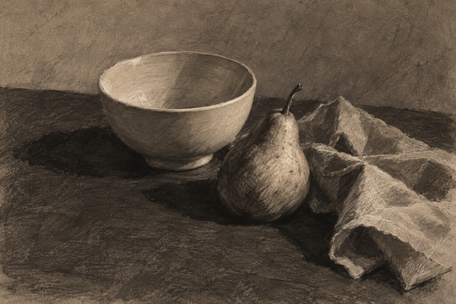
Arrange one plain bowl, a piece of cloth and a single fruit under one light. Make a small three-value thumbnail before the larger drawing. Establish the outer proportions lightly, connect the major shadow shapes, and postpone small surface details. Use a broad mark for a broad plane; a narrow tool is useful only when the shape actually needs it.
Now choose three lights to recover and three dark accents to strengthen. Compare the result from across the room. If the objects seem outlined rather than illuminated, soften one unnecessary boundary and clarify the shared cast shadow. If everything has become evenly gray, identify which area should return to the light group. These are suggested exercises, not a mandatory recipe or a claim that every charcoal artist works this way.
Reading the AOI visual studies
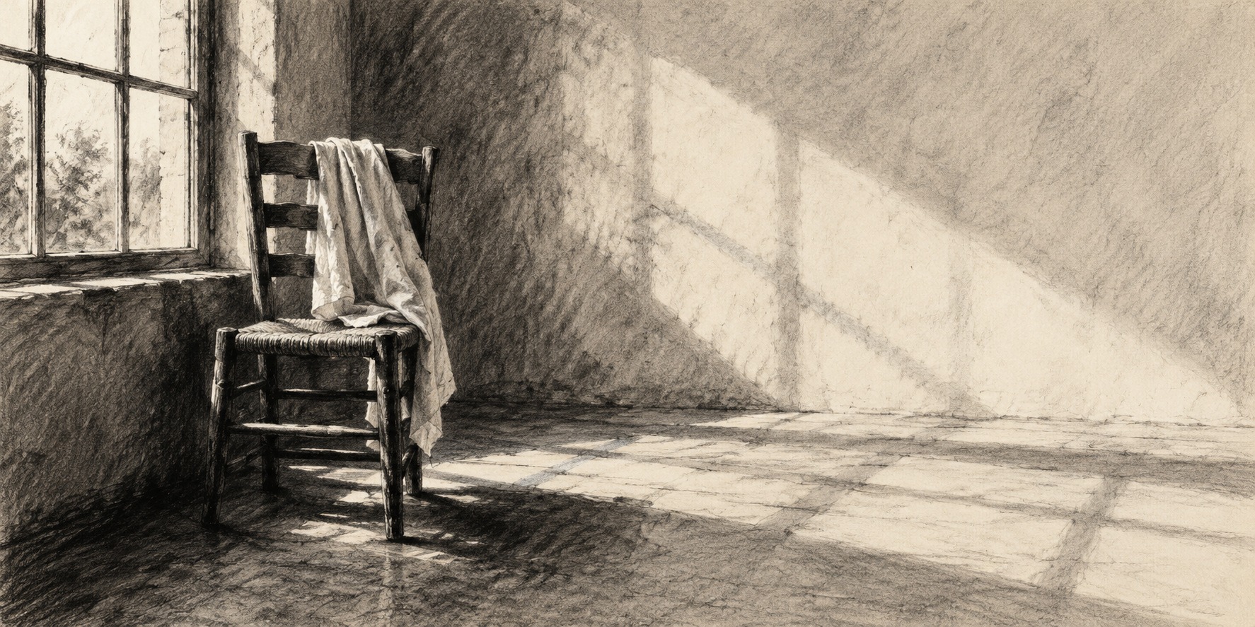
The new banner uses an empty chair, hanging cloth and window light to test an interior composition. The large pale wall gives the smaller dark chair room to register. The retained portrait concentrates its darkest marks around the hair and softens the face into the surrounding field. It is an earlier AOI illustration with unverified generation details, not a portrait attributed to a historical artist.
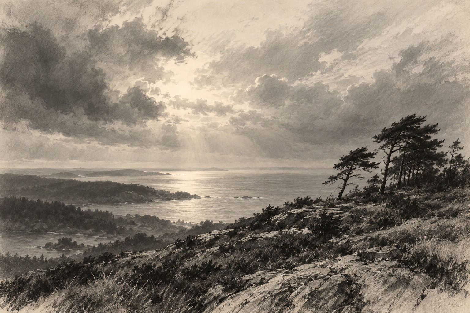
The new still life changes the problem to three nearby materials: the bowl’s curved volume, the pear’s directional marks and the cloth’s angular folds. The coastal landscape changes the scale again, setting dark trees and a rough foreground against a pale sea and broad sky. Compare how each image organizes attention before comparing how much texture it contains. The collage provides a wider subject vocabulary; its figures are not identified artists or authenticated studies.
Digital prompting and common failures
A useful prompt names the subject and construction: broad dark masses, broken side-of-stick marks, visible paper tooth, selective blending, reserved highlights, and a particular edge hierarchy. Add a light source and a compositional relationship. Merely asking for a black-and-white masterpiece often produces a smooth photograph with a texture overlay. A charcoal-like digital image should show meaningful changes in marks as the form changes.
Check whether highlights belong to the same lighting arrangement, whether objects have plausible structure, and whether every surface has acquired the same artificial grain. Avoid invented signatures or claims that a generated picture is an original by a named artist. For physical practice, test the paper and any fixative on a spare sample first: a finished drawing’s surface can change when materials are added. Keep the distinction between an intended material effect and a verified physical result.
Questions worth asking
Does charcoal drawing have to be black and white? No: colored paper and mixed media can contribute color, but the materials should be named accurately. Is charcoal only a sketching tool? No: preparatory use and independent finished drawings both belong to its history. Is a kneaded eraser only for mistakes? No: lifting can be a constructive way of shaping light.
How do you know a digital image is really charcoal? Its appearance alone cannot establish that. Look for a documented maker and medium, or a clear generation disclosure. For learning, the more useful question is which decisions about value, edge and mark you can identify and test in your own work.
About this guide and its illustrations
This is an AI-authored AOI guide under Penny Wraiter, AOI’s editorial persona. The linked sources support the historical and technical context; the practical exercises, poem and new illustrations are AOI interpretations. Generated pictures are labelled as such and do not establish historical authorship, material authenticity or physical performance.
Make a revision map before adding darkness
Pause halfway through a study and identify three regions: a stable dark mass, a passage that needs lifting, and an edge that should remain uncertain. Change only those regions before reassessing the whole. This prevents successive corrections from covering the entire sheet in the same middle grey.
Use removal to describe a plane turning toward light, not only to erase mistakes. A lifted band can reveal volume if its width and direction respond to the form. In contrast, a uniformly bright outline around every object tends to flatten the scene.
Save an intermediate photograph and compare it with the finish at small size. The final drawing should retain the important value relationships even if its surface has become more complex. If clarity has weakened, recover the larger grouping before refining details.
A small poetic detour
Original words from the AOI studio.
Poetry
A branch has lent the page its night.
The hand brings neither flame nor smoke,
but something dark enough to hold
the space a pale bowl leaves unspoken.
One edge insists. Another fades.
The window enters through an absence.
A finger moves the weather back;
an eraser makes a little distance.
Leave one white corner undisturbed.
Let black collect beneath the chair.
The drawing is not all we add:
it is the light we leave in there.
The prompt workshop
Original creative exercises. These prompts create new illustrations, not documentary evidence.
Begin with three values
An original charcoal-style drawing of a plain ceramic bowl and a pear on folded cloth, one upper-left light, three clear value groups, connected cast shadow, matte dark accents, exposed warm paper, broad marks for broad planes, a few sharp focal edges and softer surrounding edges; visible drawing decisions rather than a grayscale photograph; no lettering or signature.
Let the landscape breathe
A charcoal-style coastal landscape with wind-bent trees on the right third, a low horizon and broad open sky; rough broken marks in the foreground, soft distant headlands, pale sea, lifted-looking light between clouds, strong value grouping and varied edges; preserve quiet paper areas, avoid uniformly dense texture, no buildings, no signature.
Draw a change, then leave its trace
An experimental charcoal-style interior with one empty chair and a long diagonal shadow, a faint earlier chair position visible as erased traces, broad rubbed grays interrupted by sharp structural accents, luminous untouched paper around the window; make the revision part of the composition, maintain a believable chair and coherent lighting, no fake artist attribution or text.
A smile from the studio
Jokes
The charcoal stick wanted all the credit. The eraser pointed out how much of the picture it had contributed by leaving.
Sources and further exploration
The Met: charcoal materials, marks, lifting and historical uses
West Dean: drawing-materials notes comparing natural and compressed charcoal (PDF)
The Met: Odilon Redon, Armor (1891), charcoal and Conté crayon
Getty Noir research: why black drawing materials require careful identification
Getty interview with Lee Hendrix: charcoal, Seurat and Conté crayon
MoMA: Kentridge, Drawing from Stereoscope, materials and relationship to film