
Light and tonal technique
Chiaroscuro uses relationships of light and dark to model volume, organize attention and create expressive contrast. The Italian term means light-dark; it describes a technique and effect across subjects, not a single art movement.
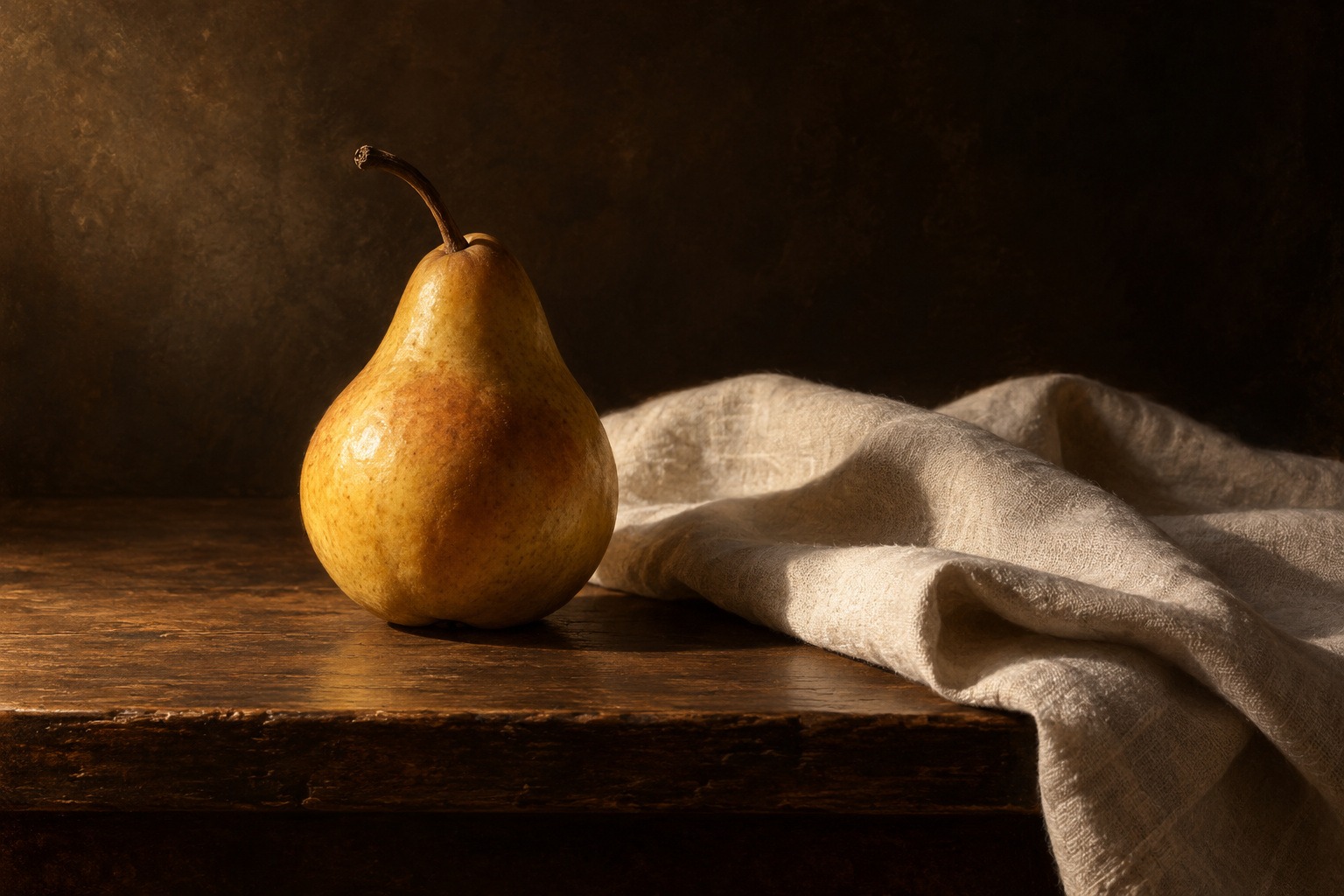
A visual introduction
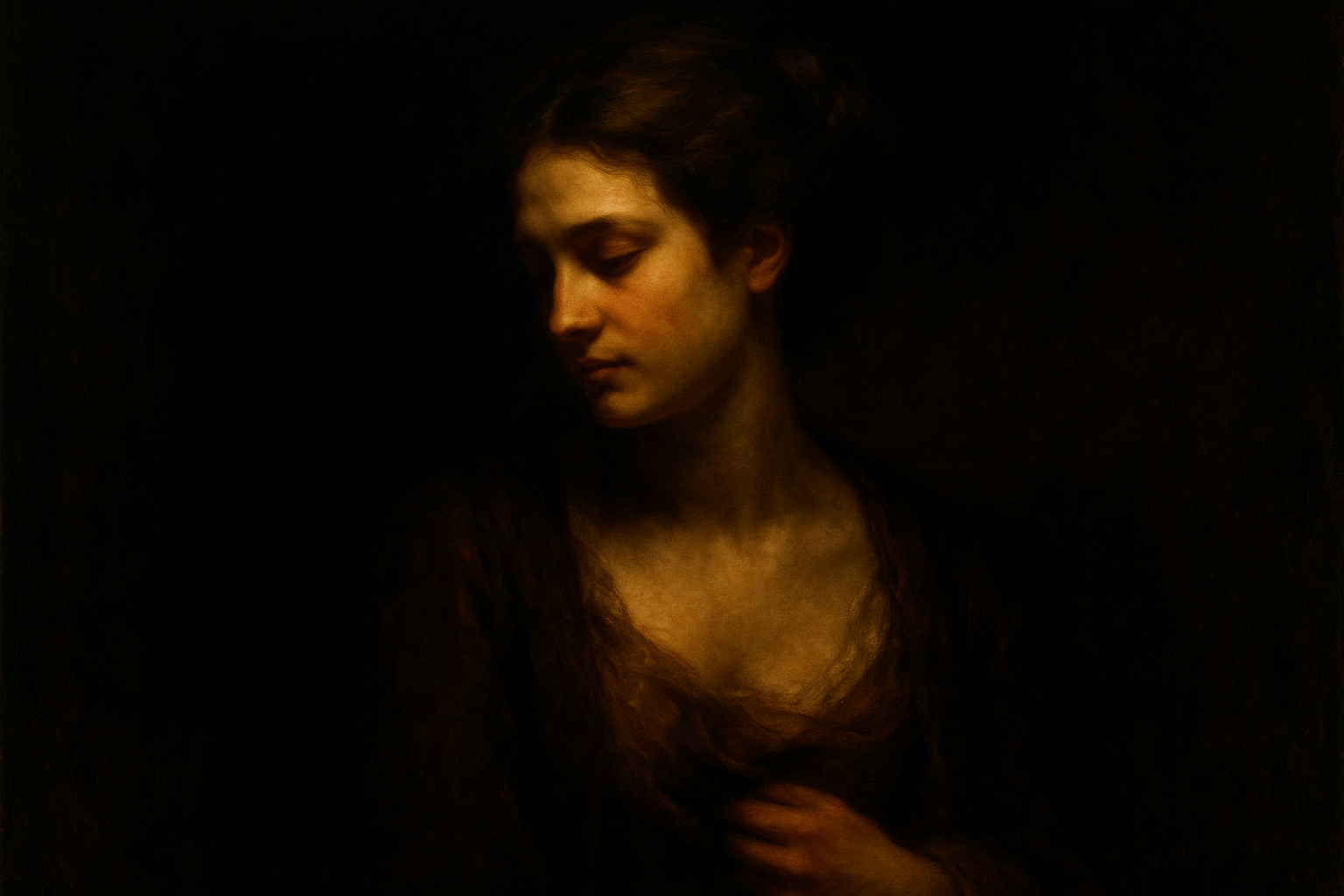
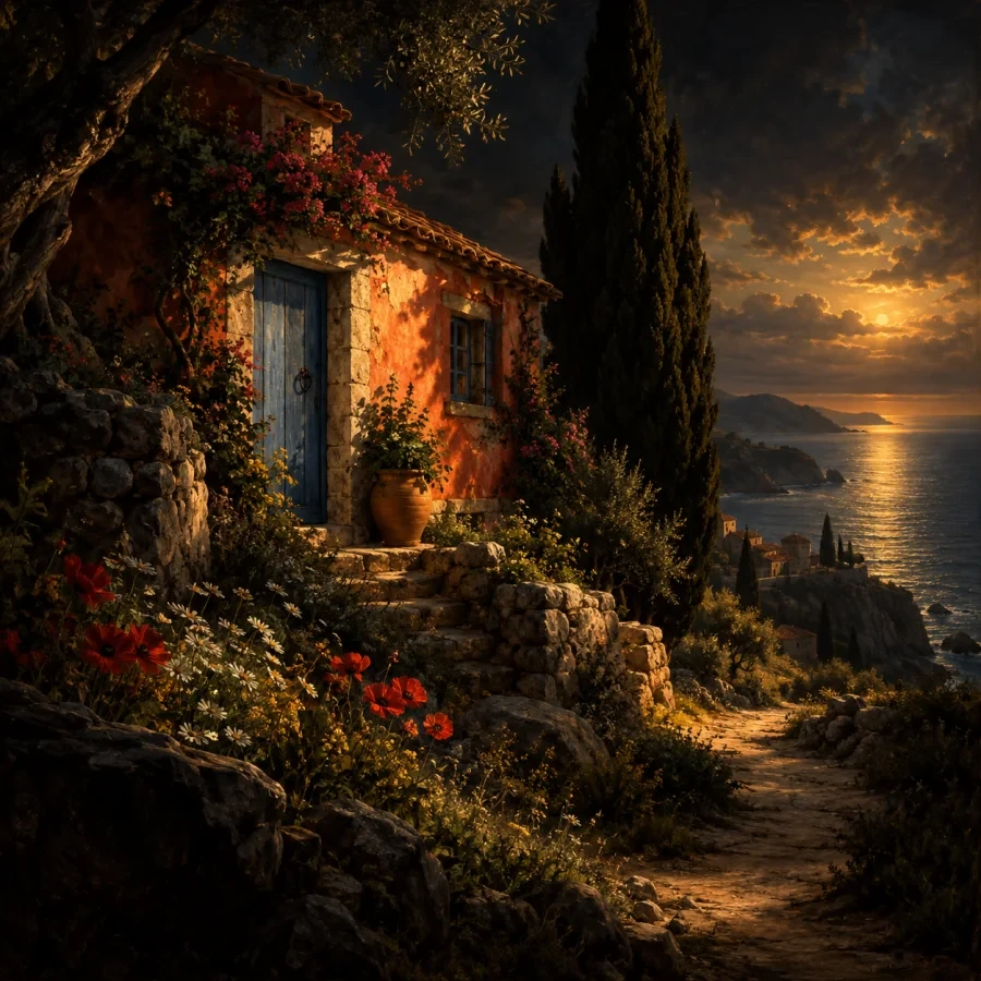
Two new light studies extend the reviewed portrait, landscape and titled collage. The set compares how tonal relationships work across subjects.
Select an image for a closer look. Use the thumbnails, arrow keys or a swipe to compare examples. Zoom in to inspect details, or share the image that inspires you.

Creative toolbox · take this style further
Choose an input and a destination. Search sends your words to the chosen site; Copy & open puts them on your clipboard to paste there.
Create with AI
Turn your chosen input into an image prompt or a new creative direction.
ChatGPT
Copy your input and paste it into a ChatGPT conversation or image request.
Copy & open ChatGPT (new tab)Claude · Anthropic
Develop an image prompt or explore the style in a new Claude conversation.
Copy & open Claude · Anthropic (new tab)Midjourney
Paste your input into the Imagine bar on the Create page.
Copy & open Midjourney (new tab)Adobe Firefly
Copy your input, open Firefly, and paste it into the prompt field.
Copy & open Adobe Firefly (new tab)Leonardo.Ai
Copy your input, open Leonardo, and paste it into the generation field.
Copy & open Leonardo.Ai (new tab)Image search
Find visual references. Short, concrete keywords usually work best.
Lexica
Search AI images and prompts using your selected input.
Search with this input Lexica (new tab)Pexels
Search the photo and video library. Short keywords often work best.
Search with this input Pexels (new tab)Pixabay
Search photos, illustrations and other images.
Search with this input Pixabay (new tab)Unsplash
Search photographs using the style name or your own keywords.
Search with this input Unsplash (new tab)Wikimedia Commons
Search photographs, artworks and historical images. Check each file for its source and reuse terms.
Search with this input Wikimedia Commons (new tab)Art & research
Explore artists, collections and the ideas behind a style.
Wikipedia
Search for background reading. A style may not have its own article.
Search with this input Wikipedia (new tab)WikiArt
Copy your input into WikiArt’s search to explore artists and artworks.
Copy & open WikiArt (new tab)Europeana
Paste your keywords into the search to explore European museum, library and archive collections.
Copy & open Europeana (new tab)Inspiration
Discover portfolios and visual ideas from creative communities.
Instagram hashtags
Search a hashtag made from your input: spaces and punctuation are removed. Instagram may require sign-in.
Search with this input Instagram hashtags (new tab)ArtStation
Paste your input into artwork search for concept art, environments, characters and visual development.
Copy & open ArtStation (new tab)Behance
Paste your input into project search for illustration, design and visual storytelling.
Copy & open Behance (new tab)A closer look
A readable light direction, grouped shadow masses and selective edges give forms weight. Strong contrast can be dramatic, but chiaroscuro also depends on the transitions that make a surface turn in space.
Volume and drama are related but different
The National Gallery distinguishes Leonardo’s use of tonal contrast to suggest three-dimensional form from Caravaggio’s dramatic deployment of light and dark. Both show why the technique is more than making a background black. Light can explain a surface, direct attention to a gesture or change the emotional temperature of a scene.
Tenebrism is a more specific neighboring term. The National Gallery describes significant features illuminated against a predominantly dark setting, often in relation to Caravaggio and his followers. Chiaroscuro is the broader idea; not every modeled face or shaded object is tenebrist. Keeping the terms distinct makes both historical description and practical prompting more precise.
Begin with a light source and large values
Choose where the main light comes from and how broad it appears. A small source can produce sharper shadow boundaries; a broad source can make transitions gentler. For an imagined painting, the arrangement may be expressive, but its main relationships should still be intelligible. Decide which surfaces face the light and which turn away.
Group the image into a few large values before describing small details. The illuminated side of a bowl, its turning half-tone and its shadow should belong to a connected volume. A cast shadow describes an object’s relation to another surface; a form shadow describes the object’s own turning. Confusing these roles can make even a highly polished image feel unstable.
Edges and reflected light
Not every boundary needs equal sharpness. A contour may disappear where object and background share a value, then become distinct where contrast increases. A crisp edge can mark a focal transition while softer ones allow quieter passages to recede. Think about the whole pattern of edges rather than adding blur everywhere outside the subject.
Reflected light can make a shadow readable, but it should not automatically rival the primary light. Compare its strength with the lit planes. The darkest accent may occur at a contact or narrow recess rather than across an entire shadow area. Preserving these relationships helps the subject feel substantial instead of looking like a cutout pasted onto darkness.
Composition through illumination
Place the strongest light-dark encounter where it serves the intended focus. In a portrait, that may be the face or a hand; in a still life, a rim or fold can carry the transition. A landscape can use a lit building or a band of sky against a darker mass. The same technique therefore supports many subjects without requiring the same mood.
Color remains important even when value dominates. Warm light and cooler surroundings can create a relationship, but neither is compulsory. Compare a limited neutral study with a colored version to see whether added hue clarifies or competes with the tonal structure. Maximum saturation and maximum contrast in every area usually weaken the hierarchy.
Prompting and reviewing a study
Describe the subject, direction and breadth of light, background value, principal shadow and desired edge behavior. “Dramatic chiaroscuro” alone leaves most decisions unspecified. A prompt such as a pear and folded linen under one high side light gives a more useful starting arrangement.
Review the result in simplified values and at thumbnail size. Do highlights belong to the stated light? Do cast shadows share a coherent direction? Can the viewer still understand the main form where detail falls away? Avoid treating crushed black areas as proof of sophistication. Darkness is most useful when it participates in the composition and makes the visible portions more meaningful.
About this guide
This AI-authored AOI guide appears under Penny Wraiter, AOI’s editorial persona. Sources support the historical context; exercises, prompts and poetry are original editorial interpretations. Image captions distinguish generated studies from documented works.
Distinguish a dark shape from a shadow
In a simple still life, compare a dark local color in the light with a pale object in shadow. Their values may approach each other, but the causes differ. Preserving that distinction through edges, reflected light and neighboring tones helps the viewer understand the objects rather than seeing only an arrangement of black and white patches.
Squint at the study or reduce it to a small thumbnail. Group nearby values where doing so clarifies the principal mass. Then restore a limited number of accents that explain a turning plane or a change in material.
Avoid outlining every dark object with an invented rim light. A lost edge can make two regions belong to the same illumination, and a later sharp edge can recover the form where the composition needs it.
A small poetic detour
Original words from the AOI studio.
Poetry
The light arrives along a rim.
A pear turns slowly into shade.
The linen keeps one folded gleam;
the table bears the shadow made.
An edge is lost, then found again,
a quiet contour left unsaid.
The dark gives weight to what we see;
the light reveals where thought is led.
The prompt workshop
Original creative exercises. These prompts create new illustrations, not documentary evidence.
One light, two objects
Create an original oil-like still life of a pear and folded pale linen under one high side light from the left. Connected half-tones, a clear cast shadow, deep brown background and selective edges; no signature.
A readable shadow
Paint an imagined adult portrait in three-quarter view with broad window light, coherent facial planes and restrained reflected light in the shadow side. Muted palette, some lost edges and one focal contrast, no imitation of a named painting.
Light as a path
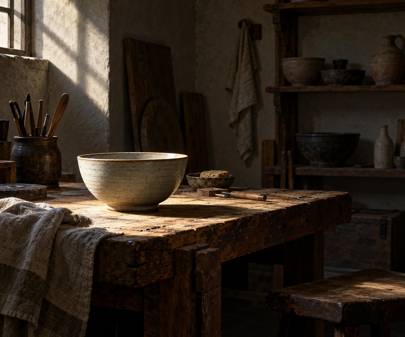
Compose an imagined quiet workshop interior with a shaft of daylight illuminating a ceramic bowl and part of a wooden table. Let the rest remain readable in grouped shadows; strong but controlled contrast, no theatrical fog or text.
A smile from the studio
Jokes
The shadow declined a spotlight. It felt that would compromise its role.
Sources and further exploration
National Gallery: Chiaroscuro — volume, modelling and historical examples
National Gallery: Tenebrism — the more specific dark-setting approach
National Portrait Gallery: Chiaroscuro — examples across portrait media
Creative studies to try
Explore these collected prompts as creative interpretations. They are starting points for image-making, not reproductions of historical artworks or evidence about a tradition.
Visual cues: deep shadow, directional light, dramatic contrast; A spotlight in the darkness
Study 1 — Chiaroscuro
Ultra-wide panoramic banner, a human hand and a sleek robotic hand reaching toward each other, fingertips almost touching, a bright luminous spark of intelligence between them, a subtle world map behind them with global data network lines, symbolizing human-AI collaboration and digital transformation, rendered in Chiaroscuro style, with refined composition, distinctive materials, elegant lighting, high-detail artistic finish, high quality, high detail, balanced composition, no text, no logo, no watermark, exact aspect ratio 1584:396
Prompt source: 1001 Art Styles. Select the text to copy, then adapt the subject and composition.
Study 2 — Chiaroscuro
Apply the following visual style to my subject or project, preserving its core content and purpose. Use dramatic chiaroscuro oil painting, with a single warm light revealing the subject from deep shadow. Model forms with smooth tonal transitions, rich dark grounds, and carefully placed brilliant highlights. Adapt the composition and palette to suit my subject. Do not add text unless my project calls for it.
Prompt source: Emergent Mind Style Atlas. Select the text to copy, then adapt the subject and composition.