
Japanese painting · Materials, observation and modern tradition
Nihonga is a living category of Japanese painting whose identity involves materials, practice and a modern history of exchange. Mineral color, ink, paper or silk can produce surfaces of remarkable delicacy and presence. A blossom, a figure or a contemporary city can become its subject; it is not restricted to panoramic landscapes or one decorative formula.
A visual introduction
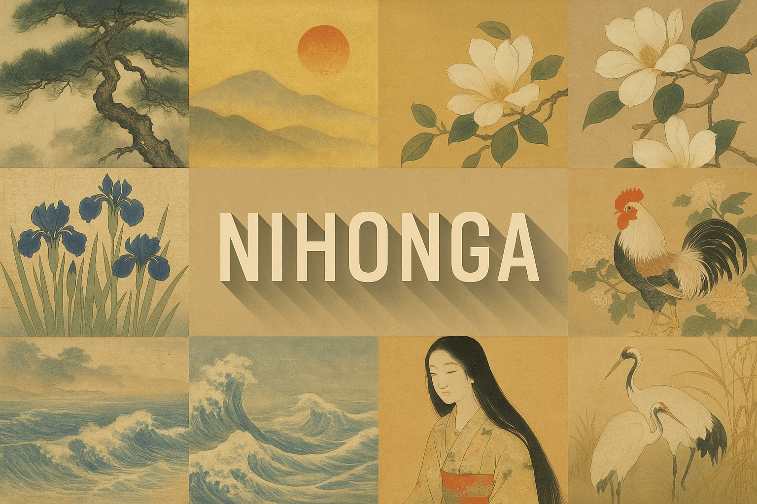
Retained AOI example and centrally titled collage, illustrating several composition possibilities rather than a complete definition of Nihonga.
Select an image for a closer look. Use the thumbnails, arrow keys or a swipe to compare examples. Zoom in to inspect details, or share the image that inspires you.

Creative toolbox · take this style further
Choose an input and a destination. Search sends your words to the chosen site; Copy & open puts them on your clipboard to paste there.
Create with AI
Turn your chosen input into an image prompt or a new creative direction.
ChatGPT
Copy your input and paste it into a ChatGPT conversation or image request.
Copy & open ChatGPT (new tab)Claude · Anthropic
Develop an image prompt or explore the style in a new Claude conversation.
Copy & open Claude · Anthropic (new tab)Midjourney
Paste your input into the Imagine bar on the Create page.
Copy & open Midjourney (new tab)Adobe Firefly
Copy your input, open Firefly, and paste it into the prompt field.
Copy & open Adobe Firefly (new tab)Leonardo.Ai
Copy your input, open Leonardo, and paste it into the generation field.
Copy & open Leonardo.Ai (new tab)Image search
Find visual references. Short, concrete keywords usually work best.
Lexica
Search AI images and prompts using your selected input.
Search with this input Lexica (new tab)Pexels
Search the photo and video library. Short keywords often work best.
Search with this input Pexels (new tab)Pixabay
Search photos, illustrations and other images.
Search with this input Pixabay (new tab)Unsplash
Search photographs using the style name or your own keywords.
Search with this input Unsplash (new tab)Wikimedia Commons
Search photographs, artworks and historical images. Check each file for its source and reuse terms.
Search with this input Wikimedia Commons (new tab)Art & research
Explore artists, collections and the ideas behind a style.
Wikipedia
Search for background reading. A style may not have its own article.
Search with this input Wikipedia (new tab)WikiArt
Copy your input into WikiArt’s search to explore artists and artworks.
Copy & open WikiArt (new tab)Europeana
Paste your keywords into the search to explore European museum, library and archive collections.
Copy & open Europeana (new tab)Inspiration
Discover portfolios and visual ideas from creative communities.
Instagram hashtags
Search a hashtag made from your input: spaces and punctuation are removed. Instagram may require sign-in.
Search with this input Instagram hashtags (new tab)ArtStation
Paste your input into artwork search for concept art, environments, characters and visual development.
Copy & open ArtStation (new tab)Behance
Paste your input into project search for illustration, design and visual storytelling.
Copy & open Behance (new tab)A closer look
Attend to the relationship between drawn contour, granular color, layered surfaces and unpainted intervals. Some works emphasize line and flat areas; others soften boundaries or build atmospheric depth. Gold, a muted palette and seasonal motifs are possibilities, not requirements.
A modern name with older inheritances
The Yamatane Museum explains that the term Nihonga came into use during the Meiji period to distinguish Japanese painting from Western-style oil painting. Earlier schools and Western influences contributed to its development. The category remains open to debate and change; it does not mean every picture made by a Japanese artist.
Treat the name as a starting point for looking at particular works and materials, rather than a promise of one timeless national aesthetic. Ask what the painter does with line, support and color. A contemporary subject need not contradict a material tradition.
What the materials contribute
Yamatane identifies paper and silk among the supports, alongside sumi ink, mineral pigments, shell-derived gofun white and nikawa glue. Mineral particle size affects color appearance; metal leaf may also be used. This combination helps explain why close viewing can reveal qualities lost in a small reproduction.
A digital texture can suggest grain but does not reproduce those materials. When describing an illustration, separate appearance from process: “mineral-pigment-like surface” is more accurate than claiming an AI-generated file was painted with ground stone. Gold-colored pixels are not gold leaf.
Read the retained AOI illustrations
The featured image places a dark branching trunk against a quiet blue-grey distance. Pale blossoms form a broad canopy, while falling petals connect the foreground to the open area at the left. The image works through unequal masses and a gentle warm–cool contrast.
The retained collage compares flowers, birds, landscape, waves and a figure around the centered title. It is an AOI visual sampler, not a set of authenticated historical works or a definition of Nihonga. The original production prompts are unverified. Its paper-like grain and restrained colors offer one interpretation among many.
Build a study from observation
Choose one branch, flower or everyday object and make several contour studies from observation. Select the view with the clearest relationship between solid form and surrounding space. In a digital interpretation, limit the first version to three value groups before adding surface variation.
Place detail where it supports attention. A few precise petals can carry more weight than equal sharpness everywhere. Try a second version with a different crop and less background detail; compare which arrangement gives the subject room to breathe. These are AOI composition exercises, not a substitute for learning physical painting methods.
Keep tradition open to new subjects
Try a railway platform, a greenhouse or a small urban garden using the same attention to contour and intervals. Avoid filling the composition with unrelated cultural emblems just to make it appear Japanese. The quality of the observed forms matters more than an inventory of familiar symbols.
For a museum comparison, the Yamatane collection provides a concrete starting point across different painters and periods. For image generation, specify a new subject, arrangement and surface behavior. Label the output as an interpretation, and do not attach an invented artist attribution or historical date.
A small poetic detour
Original words from the AOI studio.
Poetry
A branch leans into quiet air;
The falling petals pause us there.
Between the hill and blossom white,
The paper keeps a little light.
The prompt workshop
Original creative exercises. These prompts create new illustrations, not documentary evidence.
Start here · One flowering branch
Original digital illustration inspired by Nihonga materials and composition: one flowering plum branch entering from the right across spacious warm ivory paper, precise dark contours, pale pink and shell-white petals with subtly granular color, a few falling petals. Unequal masses and generous quiet space. A digital interpretation, no calligraphy, seal, signature or copied painting.
Landscape · Rain beyond the reeds
Original Nihonga-inspired digital landscape: a low bank of reeds in the foreground, a broad quiet river and distant blue-grey hills partially softened by rain. Restrained mineral-pigment-like grain, selected fine contours, large open intervals, subtle tonal layers. No mandatory gold background, no text or signature.
Contemporary · Greenhouse at dusk
Original digital interpretation informed by Nihonga: a small urban greenhouse at dusk, angular window frames balanced against broad leaves, warm light behind translucent-looking surfaces, fine dark contour and restrained green granular color. Spacious asymmetric composition, contemporary observed subject, no text or artist imitation.
Study · A bird and an interval
Nihonga-inspired digital study of one white egret beside two slender reeds, a large unpainted-looking ivory interval and a low soft blue-grey waterline. Precise beak and feet, subtle feather groups rather than uniform detail, quiet surface texture and balanced negative space. No seal, inscription or signature.
Your next inspiration
Discover another art style
Follow a visual thread to the next subject.
A smile from the studio
Jokes
The empty space asked for credit. It had been supporting the whole composition.
The blossom refused another filter: it already had excellent petal definition.