Medium & practice · Pen, brush and wash
A thin line can describe a roof; a diluted wash can make the air around it visible. Modern European ink painting is best approached as a broad field of practices, not one movement with a founder or manifesto. Explore how pen, brush, water and the unmarked paper create structure, atmosphere and expressive rhythm—and how to translate those choices into original illustrations.
A visual introduction
Select an image for a closer look. Use the arrow keys or gallery controls to compare the illustrations.
Creative toolbox · take this style further
Choose an input and a destination. Search sends your words to the chosen site; Copy & open puts them on your clipboard to paste there.
Create with AI
Turn your chosen input into an image prompt or a new creative direction.
ChatGPT
Copy your input and paste it into a ChatGPT conversation or image request.
Copy & open ChatGPT (new tab)Claude · Anthropic
Develop an image prompt or explore the style in a new Claude conversation.
Copy & open Claude · Anthropic (new tab)Midjourney
Paste your input into the Imagine bar on the Create page.
Copy & open Midjourney (new tab)Adobe Firefly
Copy your input, open Firefly, and paste it into the prompt field.
Copy & open Adobe Firefly (new tab)Leonardo.Ai
Copy your input, open Leonardo, and paste it into the generation field.
Copy & open Leonardo.Ai (new tab)Image search
Find visual references. Short, concrete keywords usually work best.
Lexica
Search AI images and prompts using your selected input.
Search with this input Lexica (new tab)Pexels
Search the photo and video library. Short keywords often work best.
Search with this input Pexels (new tab)Pixabay
Search photos, illustrations and other images.
Search with this input Pixabay (new tab)Unsplash
Search photographs using the style name or your own keywords.
Search with this input Unsplash (new tab)Wikimedia Commons
Search photographs, artworks and historical images. Check each file for its source and reuse terms.
Search with this input Wikimedia Commons (new tab)Art & research
Explore artists, collections and the ideas behind a style.
Wikipedia
Search for background reading. A style may not have its own article.
Search with this input Wikipedia (new tab)WikiArt
Copy your input into WikiArt’s search to explore artists and artworks.
Copy & open WikiArt (new tab)Europeana
Paste your keywords into the search to explore European museum, library and archive collections.
Copy & open Europeana (new tab)Inspiration
Discover portfolios and visual ideas from creative communities.
Instagram hashtags
Search a hashtag made from your input: spaces and punctuation are removed. Instagram may require sign-in.
Search with this input Instagram hashtags (new tab)ArtStation
Paste your input into artwork search for concept art, environments, characters and visual development.
Copy & open ArtStation (new tab)Behance
Paste your input into project search for illustration, design and visual storytelling.
Copy & open Behance (new tab)A closer look
Expressive contours, variable brush marks, transparent-looking washes and deliberate areas of untouched paper. Black, brown or colored ink can organize a landscape, a figure or an abstract field; the balance between precise edges and spreading tone matters more than a fixed palette.
A useful label, not a single movement
Here, “Modern European ink painting” names an area of exploration: ink-based work associated with European artists and settings, especially modern approaches to line, gesture and tone. It is not presented as a recognized school with a common program. “Modern” and “contemporary” are also not interchangeable dates. A work needs its own artist, period and material description rather than a sweeping label attached afterward.
Ink drawing, brush painting and mixed-media work overlap. A picture built primarily from lines may be catalogued as a drawing even when its washes feel painterly. A watercolor with some ink remains mixed media; it does not become a pure ink painting because its outlines are dark. These distinctions make looking more interesting, not less. Ask what the marks do and what materials are actually documented.
Four documented points of reference
A historical starting point is Rembrandt’s The artist drawing from the model, dated about 1639 by the British Museum. Its record lists pen and brown iron-gall ink, brown wash and touches of white on brown-washed paper. This predates the eighteenth century: the earlier article’s claim that ink painting simply arrived in Europe then was misleading. Rembrandt is a historical reference here, not a member of a modern movement.
The Metropolitan Museum’s Delacroix exhibition identifies The Giaour on Horseback, 1824–26, as pen and iron-gall ink with wash over graphite. The combination is useful to study as layered decision-making: a preparatory material, a linear material and tonal wash can coexist in one work. It should not be reduced to a generic black-on-white formula.
Paul Klee’s Twittering Machine, 1922, offers a modern mixed-media example. MoMA records oil-transfer drawing, watercolor and ink on paper, with gouache and ink borders on board. It is an excellent reminder to distinguish the visual effect of a wiry line from the process that produced it; not every dark contour was drawn directly with a pen.
Henri Michaux’s Untitled, about 1958, is catalogued by the Met as pen and ink on paper. This supplies a precise modern reference without inventing a common movement linking all four artists. Follow the collection records below to compare works and materials. None of the museum works is reproduced in the AOI illustration on this page.
Three tools, three kinds of decisions
Pen: think in direction, intervals and pressure. A continuous contour can make a building feel settled; broken strokes can suggest weather, vibration or a surface only partly seen. Hatching can build shadow, but the lines should describe something—its plane, curve or rhythm. Filling every gap with equally dense marks usually flattens the hierarchy.
Brush: think in weight, speed and edge. Try the point, the side and a brush carrying less liquid. One broad mark can establish a dark tree or a coat more decisively than many small corrections. Keep a sheet of trials nearby: nib, brush, ink and paper interact, so a useful mark on one surface may behave differently on another.
Wash: think in connected areas of tone. For an ink suitable for dilution, test three strengths and let each dry before judging the values. Work on a sample before layering: some inks reactivate while others resist water after drying. Check the specific product rather than assuming permanence, waterproofness or lightfastness from the word “ink.”
Compose with the paper, not only the marks
Choose a focal relationship before drawing details. In a street scene, a dark doorway against a pale wall may carry the picture; in a portrait, an eyebrow and a single cheek shadow may do more than a fully outlined face. Reserve the lightest areas deliberately. Untouched paper can act as sky, glare or a pause between shapes.
For a simple exercise, use one ink and three values: paper, a middle wash and a dark accent. Draw the same small courtyard three times. First emphasize contour; next omit most outlines and connect the shadows; finally combine a few lines with one broad wash. Compare which version communicates the space most clearly at thumbnail size.
Vary edges as carefully as values. Let a distant roof dissolve into a light wash while a nearby railing stays crisp. Limit the strongest contrast to a chosen area. A uniformly dramatic picture can become surprisingly monotonous; a quiet margin gives a forceful mark room to matter.
Reading the retained landscape illustration
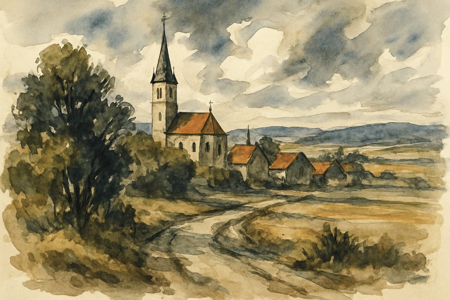
The AOI archive image shows a village church, warm roofs, trees and a winding pale path beneath a soft grey sky. The path leads toward the buildings; dark foliage anchors the foreground; pale hills recede. Its strongest lesson is this arrangement of light and dark, not the number of details in the architecture.
The image looks wash-based and watercolor-like. Its original physical medium and artist are not verified, so it is captioned as an archive illustration rather than an authenticated historical ink painting. Use it as a compositional comparison: imagine reducing the village to a few pen contours and three ink values. The old broken collage has been removed from the active article.
Translate the practice into an original image
For digital work, separate structural lines, broad washes and restrained paper texture. Describe a specific subject, viewpoint, light direction and distribution of empty space. “European” alone is not a visual instruction: an invented canal warehouse, a hillside village and a tram stop demand different shapes. Do not substitute a list of famous names for a composition.
For an abstract study, borrow the logic rather than the appearance of a landscape. Let five vertical strokes establish a rhythm, interrupt it with one sloping wash and leave a large silent interval. Repeat the study with different spacing before adding color. The question is whether the marks form a purposeful relationship, not whether they resemble an established artist.
The prompts alongside this article are original studio proposals. They describe material effects for illustrations, not evidence that an image was physically made with ink. Review generated results for impossible architecture, repetitive marks and fake signatures. Keep the variation that makes its visual decisions clearest.
Pocket-sized facts
This title is a descriptive umbrella, not a claim of one historical movement.
Museum material records distinguish pen and ink, washes and mixed-media processes.
The retained AOI landscape is illustrative; its artist and physical medium are unverified.
Technique notes
Test dilution and rewetting on scrap paper using the actual ink and surface.
Compare contour-only, wash-only and combined versions of one small subject.
Keep a large quiet area; place the darkest accent deliberately.
Label digital or generated illustrations honestly rather than asserting a physical medium.
A small poetic detour
Original words from the AOI studio.
Poetry
A roof is held by half a line,
A cloud by paper left to shine.
The brush lets go; the shadows flow,
And leave a road for light to know.
The prompt workshop
Original creative exercises. These prompts create new illustrations, not documentary evidence.
Start here · Three-value courtyard
Original pen-and-ink wash illustration of a small invented stone courtyard after rain, eye-level view, one dark doorway as the focal point. Warm white paper, dilute grey middle wash and a few nearly black accents; broken precise contours on nearby stones, softer distant edges. Leave half the sky and the central reflection as unmarked paper. Restrained, observational, clear architecture; no signature, lettering or simulated museum labels.
Richer scene · A village along the path
Original ink-and-wash-inspired landscape illustration: a winding pale path leads through dark foreground trees toward a compact hillside village with one slender steeple. Brown-black brush masses, fine selective roof contours and transparent-looking grey washes; a small muted ochre accent on the roofs. Soft distant hills, spacious cloudy sky, purposeful untouched paper. Convincing perspective, no copied artwork, no signature, no decorative frame.
Experimental · A rhythm interrupted
Original abstract ink-inspired composition on warm uncoated paper: five irregular vertical brush gestures create a measured rhythm, interrupted by one pale diagonal wash. Vary stroke width and spacing; one dense black mark low on the left, a large quiet interval on the right. Visible dry-brush edges in selected areas, no uniform noise, no symbols, text or signature. Precise relationships between weight, direction and empty space.
Close observation · Window and glass
An intimate original pen-and-wash still life of a clear drinking glass and a folded cloth beside a tall window. A few fine brown-black contours describe the rim and cloth folds; broad dilute ink shadows connect the objects to the tabletop. Reserve paper for glass highlights, use one dark reflected edge, soft side lighting and generous quiet background. Material study with believable ellipses, no signature, no lettering.
Your next inspiration
Discover another art style
Follow a visual thread to the next subject.
People & works to explore
References discussed in this article. Consult the sources below for context.
Artists and practitioners
Rembrandt — historical comparison
Eugène Delacroix — historical comparison
Paul Klee — modern mixed-media example
Henri Michaux — modern pen-and-ink example
Paintings and other works
Rembrandt, The artist drawing from the model, about 1639
Delacroix, The Giaour on Horseback, 1824–26
Klee, Twittering Machine, 1922
Michaux, Untitled, about 1958
A smile from the studio
Jokes
My ink drawing needed more atmosphere, so I stopped drawing the atmosphere.
The pen wanted the last word. The wash preferred a broader statement.
I reserved some negative space. It has never been so positively useful.