
Mixed-media practice · a descriptive combination of materials
Abstract pencil and watercolour art brings the precision, hesitation and pressure of a drawn line into conversation with fluid colour. The name describes a way of working, not a documented movement with a founder or manifesto. Its appeal lies in the difference between the materials: a line can insist on a direction while a wash spreads, interrupts or quietly refuses to follow.
Creative toolbox · take this style further
Choose an input and a destination. Search sends your words to the chosen site; Copy & open puts them on your clipboard to paste there.
Create with AI
Turn your chosen input into an image prompt or a new creative direction.
ChatGPT
Copy your input and paste it into a ChatGPT conversation or image request.
Copy & open ChatGPT (new tab)Claude · Anthropic
Develop an image prompt or explore the style in a new Claude conversation.
Copy & open Claude · Anthropic (new tab)Midjourney
Paste your input into the Imagine bar on the Create page.
Copy & open Midjourney (new tab)Adobe Firefly
Copy your input, open Firefly, and paste it into the prompt field.
Copy & open Adobe Firefly (new tab)Leonardo.Ai
Copy your input, open Leonardo, and paste it into the generation field.
Copy & open Leonardo.Ai (new tab)Image search
Find visual references. Short, concrete keywords usually work best.
Lexica
Search AI images and prompts using your selected input.
Search with this input Lexica (new tab)Pexels
Search the photo and video library. Short keywords often work best.
Search with this input Pexels (new tab)Pixabay
Search photos, illustrations and other images.
Search with this input Pixabay (new tab)Unsplash
Search photographs using the style name or your own keywords.
Search with this input Unsplash (new tab)Wikimedia Commons
Search photographs, artworks and historical images. Check each file for its source and reuse terms.
Search with this input Wikimedia Commons (new tab)Art & research
Explore artists, collections and the ideas behind a style.
Wikipedia
Search for background reading. A style may not have its own article.
Search with this input Wikipedia (new tab)WikiArt
Copy your input into WikiArt’s search to explore artists and artworks.
Copy & open WikiArt (new tab)Europeana
Paste your keywords into the search to explore European museum, library and archive collections.
Copy & open Europeana (new tab)Inspiration
Discover portfolios and visual ideas from creative communities.
Instagram hashtags
Search a hashtag made from your input: spaces and punctuation are removed. Instagram may require sign-in.
Search with this input Instagram hashtags (new tab)ArtStation
Paste your input into artwork search for concept art, environments, characters and visual development.
Copy & open ArtStation (new tab)Behance
Paste your input into project search for illustration, design and visual storytelling.
Copy & open Behance (new tab)A closer look
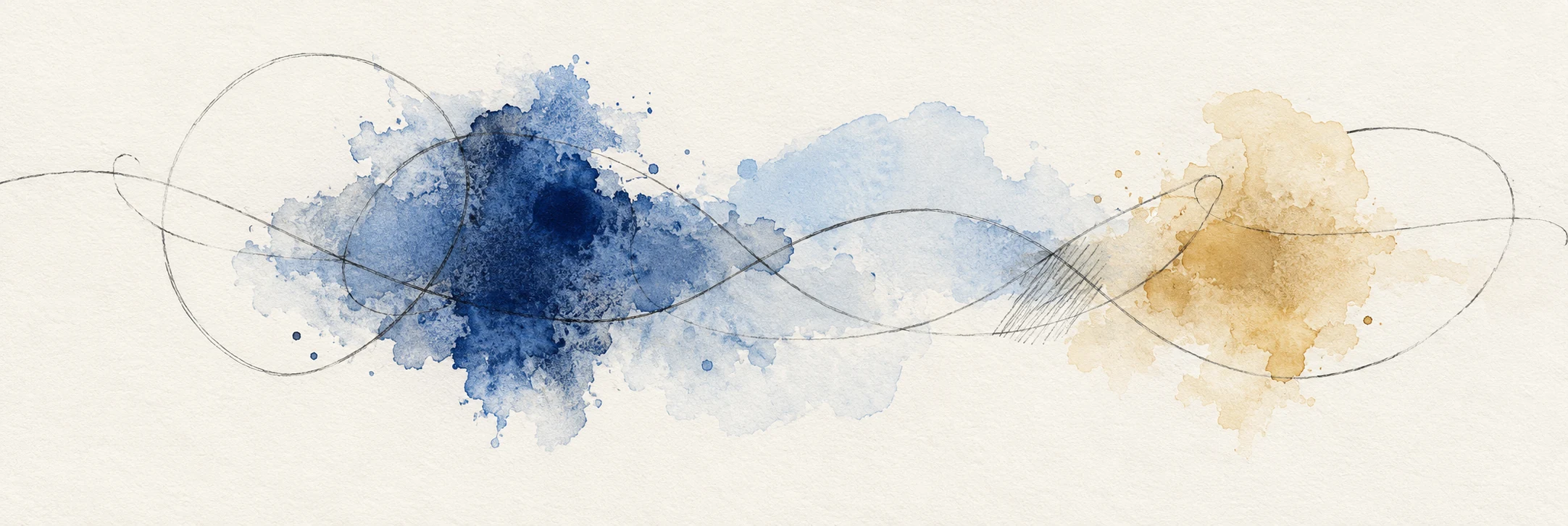
Our original banner presents graphite-like loops, short hatching and transparent blue and ochre washes on a light paper ground. Some lines cross the colour; others seem partly submerged. Open areas are left to connect the marks. This is a digitally generated interpretation of the materials, not a scan of a hand-painted original.
Two materials, several possible relationships
Pencil can establish a structure that colour later complicates. It can also arrive after a wash, picking out a boundary or adding a rhythm that was absent from the first stage. Neither order is a rule. What matters is whether each material contributes something the other cannot do as clearly.
The V&A explains watercolour as pigment combined with a binder, usually gum arabic, and water. Its account also challenges the assumption that watercolour must always be pale and transparent: artists have used a variety of opaque and transparent effects. This guide concentrates on a line-and-wash approach because it makes the interaction with pencil especially easy to examine. [1]
Do not call any image with a grey outline “pencil and watercolour.” A digital illustration may imitate both. A catalogue description should distinguish actual materials from a visual simulation, while an AI prompt can legitimately ask for the appearance of those materials.
A historical reference without an invented movement
The V&A discusses John Constable’s Study of Clouds (1830), noting the faint graphite preparation, watercolour washes and areas of paper left for the lights. This is a useful documented example of pencil and watercolour working together. It is a representational cloud study, not evidence that Constable founded an “Abstract Pencil and Water Color Art” movement. [1]
That distinction keeps material history separate from our present exercise. You can study how a line survives beneath a wash without assigning the earlier artist to a category they did not use. A reference can teach a method without sharing your subject or intention.
For the abstract part of the practice, the question is what the marks do when they no longer need to describe a cloud, branch or vessel. Do they suggest a pulse, a boundary, an interruption or a field of movement? Give the composition a small, specific problem to solve.
Let the paper participate
In the banner, the spaces between the washes are as important as the coloured areas. A broad untouched interval lets a thin line remain audible, so to speak. If every gap is filled, the line must compete with the entire sheet.
Try reserving one large quiet area before making the first wash. Place a smaller dark accent nearby and see how it changes the balance. You are not merely decorating the white. You are deciding how activity and stillness share the page.
Edges offer another source of variety. A wash can end softly, accumulate along a boundary or meet a firm pencil stroke. Observe these differences before adding another colour. Sometimes an image needs a clearer edge relationship rather than a larger palette.
A small studio sequence
Use a scrap of the same paper for tests. Try a light pencil line and a heavier one, apply a small wash, and compare them once dry. Materials differ, so the result in front of you is more useful than a promise that every pencil and paper combination behaves alike.
For the first composition, choose two colours and one pencil. Draw a loose path with a few interruptions. Add three unequal areas of colour, leaving part of the path outside them. Let the sheet dry before deciding where further drawn marks are useful.
Stop and inspect the whole page from a distance. Is one area doing too much? Does a repeated mark establish rhythm or merely occupy space? Make the next change answer one of those questions. A sequence of small decisions usually teaches more than rescuing an overworked sheet with more of everything.
Translate the idea into an AI prompt
Describe the contrast you want: thin irregular graphite-like lines, translucent washes, restrained colour and generous unpainted paper. Ask for a composition rather than a desk photograph unless tools and surroundings are part of the subject.
Inspect the generated texture at full size. Repeated paper grain, implausible pigment edges and ornamental scribbles can make the result feel generic. Keep the caption accurate and use a real material study when you need to learn how paint and pencil actually behave. The simulation can suggest a composition; the sheet teaches the hand.
Plan the order of the marks
Make three small tests before committing to a larger sheet: line beneath a wash, line over a dry wash, and line interrupted by an intentionally unpainted gap. Use the same shape and colours in all three. The comparison shows whether the drawing acts as an armature, a later response or an independent voice.
Decide which passages should remain unresolved. A line that stops before meeting a coloured edge can make the paper feel active; closing every contour can turn an open composition into a colouring exercise. Reserve the darkest graphite-like accents for a few structural points and let lighter marks suggest alternatives.
Judge the relationship at two scales
At a distance, check whether the main colour masses and blank intervals form a coherent rhythm. Close up, look for variation in line pressure and wash boundaries. If every mark has the same intensity, remove or soften a few before adding anything. The aim is a conversation between two material languages, with enough difference for each to remain visible.
A small poetic detour
Original words from the AOI studio.
Poetry
A pencil crosses the blue.
The water has kept
its own account of the journey.
The prompt workshop
Original creative exercises. These prompts create new illustrations, not documentary evidence.
Start with two materials
Create an original abstract line-and-wash composition on warm white paper: thin irregular graphite-like paths, three transparent blue and ochre washes, open space and restrained hatching. No desk, tools or lettering.
Original AOI exercise; a generated image is not historical or documentary evidence.
Build the conversation
Let one pencil-like line pass into and out of translucent colour. Vary soft wash boundaries and crisp drawn accents. Keep a large unpainted area and a single dark focus; avoid decorative all-over scribbling.
Original AOI exercise; a generated image is not historical or documentary evidence.
Change one decision
Make paired versions of the same abstract composition, moving only the darkest drawn accent. Preserve palette and washes. Compare balance, direction and the role of the empty paper.
Original AOI exercise; a generated image is not historical or documentary evidence.
People & works to explore
References discussed in this article. Consult the sources below for context.
Artists and practitioners
John Constable — material reference, not a founder of the descriptive category
Paintings and other works
John Constable, Study of Clouds (1830) — representational pencil-and-watercolour reference discussed by the V&A
Sources and further exploration
[1] V&A — What is watercolour? Materials and documented examples