Fictional
Newsletter becomes an AOI joke style: the humble update swells into a monument to its own importance. Competing boxes, breathless announcements, artificial urgency and ceremonial calls to action turn information overload into a visible comedy. Some images are deliberately ugly; the composition still needs to be good.
An A⊕I –[-.+] creαt¡ve c⊕ncept, n⊕t αn estαbl¡she∂ h¡st⊕r¡cαl m⊕vement.
A visual introduction
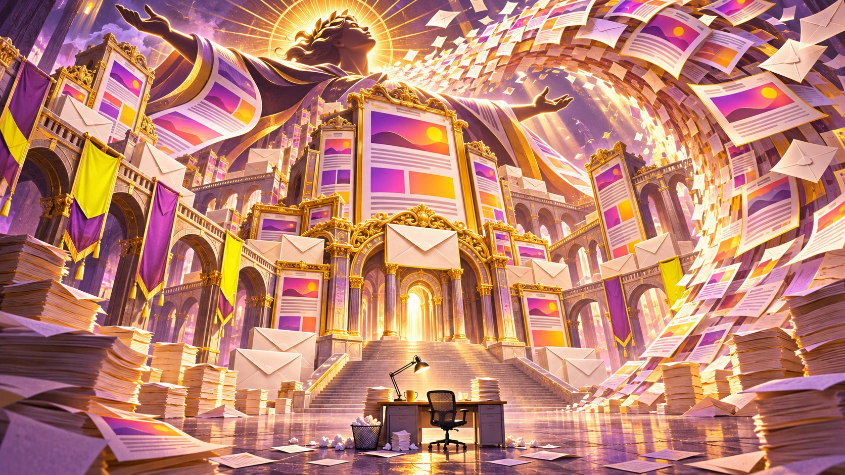
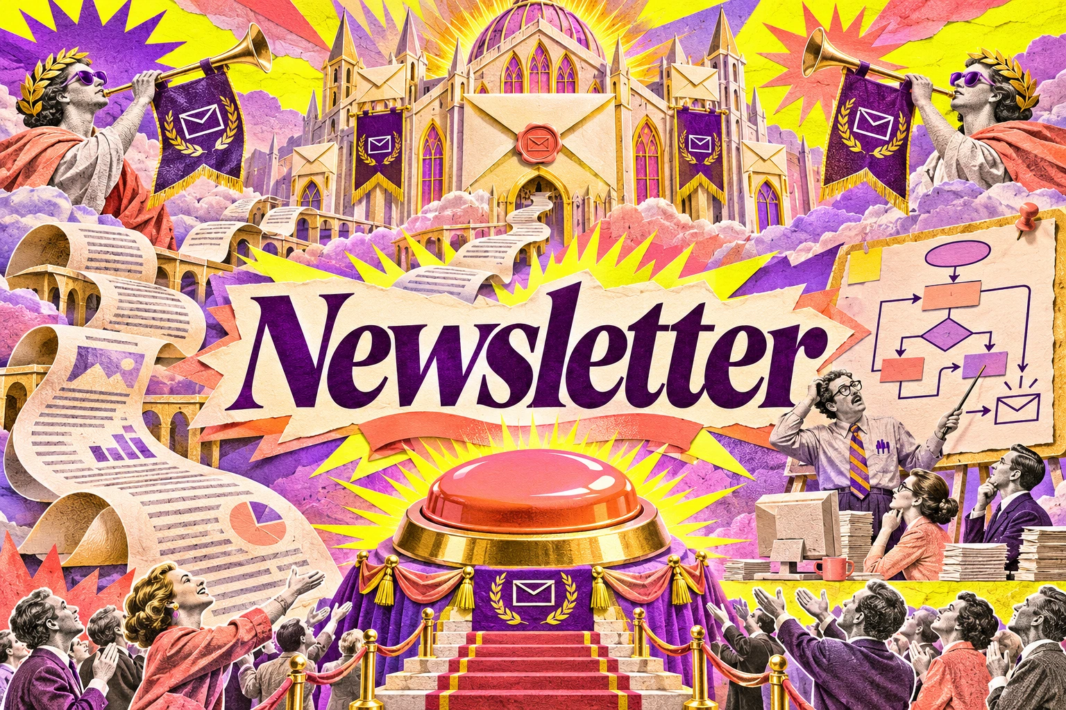
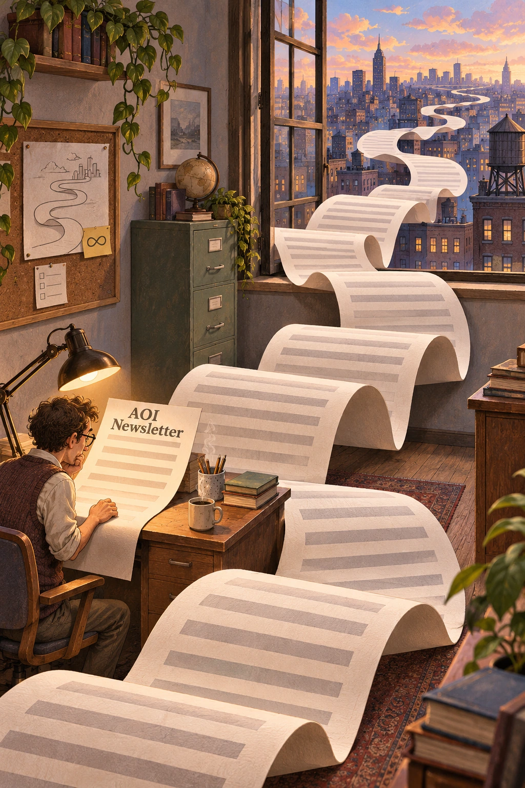
Seven original AI-generated studies explore this subject through a banner, a titled collage and five standalone examples.
Select an image for a closer look. Use the thumbnails, arrow keys or a swipe to compare examples. Zoom in to inspect details, or share the image that inspires you.
Creative toolbox · take this style further
Choose an input and a destination. Search sends your words to the chosen site; Copy & open puts them on your clipboard to paste there.
Create with AI
Turn your chosen input into an image prompt or a new creative direction.
ChatGPT
Copy your input and paste it into a ChatGPT conversation or image request.
Copy & open ChatGPT (new tab)Claude · Anthropic
Develop an image prompt or explore the style in a new Claude conversation.
Copy & open Claude · Anthropic (new tab)Midjourney
Paste your input into the Imagine bar on the Create page.
Copy & open Midjourney (new tab)Adobe Firefly
Copy your input, open Firefly, and paste it into the prompt field.
Copy & open Adobe Firefly (new tab)Leonardo.Ai
Copy your input, open Leonardo, and paste it into the generation field.
Copy & open Leonardo.Ai (new tab)Image search
Find visual references. Short, concrete keywords usually work best.
Lexica
Search AI images and prompts using your selected input.
Search with this input Lexica (new tab)Pexels
Search the photo and video library. Short keywords often work best.
Search with this input Pexels (new tab)Pixabay
Search photos, illustrations and other images.
Search with this input Pixabay (new tab)Unsplash
Search photographs using the style name or your own keywords.
Search with this input Unsplash (new tab)Wikimedia Commons
Search photographs, artworks and historical images. Check each file for its source and reuse terms.
Search with this input Wikimedia Commons (new tab)Art & research
Explore artists, collections and the ideas behind a style.
Wikipedia
Search for background reading. A style may not have its own article.
Search with this input Wikipedia (new tab)WikiArt
Copy your input into WikiArt’s search to explore artists and artworks.
Copy & open WikiArt (new tab)Europeana
Paste your keywords into the search to explore European museum, library and archive collections.
Copy & open Europeana (new tab)Inspiration
Discover portfolios and visual ideas from creative communities.
Instagram hashtags
Search a hashtag made from your input: spaces and punctuation are removed. Instagram may require sign-in.
Search with this input Instagram hashtags (new tab)ArtStation
Paste your input into artwork search for concept art, environments, characters and visual development.
Copy & open ArtStation (new tab)Behance
Paste your input into project search for illustration, design and visual storytelling.
Copy & open Behance (new tab)A closer look
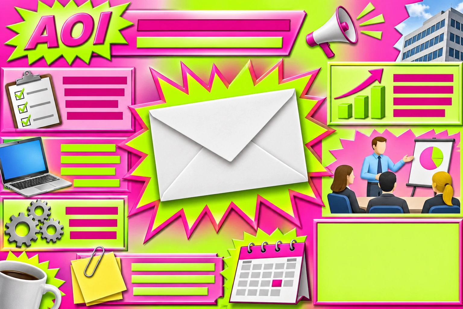
Stacked modules, oversized announcement bursts, inconsistent typographic voices and anxious accent colors compete for attention. The strongest image keeps one readable visual joke at its center, then lets the surrounding clutter demonstrate how a message can lose control of itself.
A format promoted beyond its qualifications
A newsletter is a recurring communication format, not a historical art movement. Here it receives an entirely fictional promotion to aesthetic doctrine. Its appointed mission is to make every minor update look like the event for which civilization invented language.
The target is inflated communication and design by accumulated requests. Useful newsletters exist. This comic interpretation exaggerates the moment when a concise update becomes a maze of modules, banners and urgent invitations, each convinced it should be read first.
The banner has called a meeting
Build the image around one absurd transformation: a small envelope becomes a cathedral, a stack of content boxes becomes a collapsing monument, or a single update unfurls into an endless ceremonial scroll. The viewer should understand the mismatch before reading any caption.
A dramatic banner can be beautifully lit while depicting a very ugly information system. That difference matters. Random clutter is tiring; staged clutter gives the eye a route through the disaster. Choose one dominant mass, a few supporting interruptions and a clear escape of empty space.
Controlled ugliness is a compositional choice
Mix incompatible visual voices deliberately: a solemn serif announcement beside a childish starburst, a corporate gradient behind a photocopied diagram, a bevel so enthusiastic it appears load-bearing. Restrict the main palette enough that these collisions remain visible.
Use simulated text bars and blank modules when the words are not the joke. If a phrase matters, keep it short and proofread it. An image full of accidental pseudo-text does not become witty merely because real newsletters sometimes feel that way.
The practical rules behind the parody
Mailchimp's design guidance emphasizes purpose, hierarchy and a clear next action; its mobile guidance also stresses readable type and usable controls. Those principles supply the comic counterpoint here. Our fictional newsletter gives every element equal importance, then wonders why nothing is important.
This is a visual-art exercise, not a recommended email template. Keep any real page containing the artwork readable and accessible. Put the dysfunction inside the illustration, with descriptive alternative text and a concise explanation outside it.
Five ways to make the joke visible
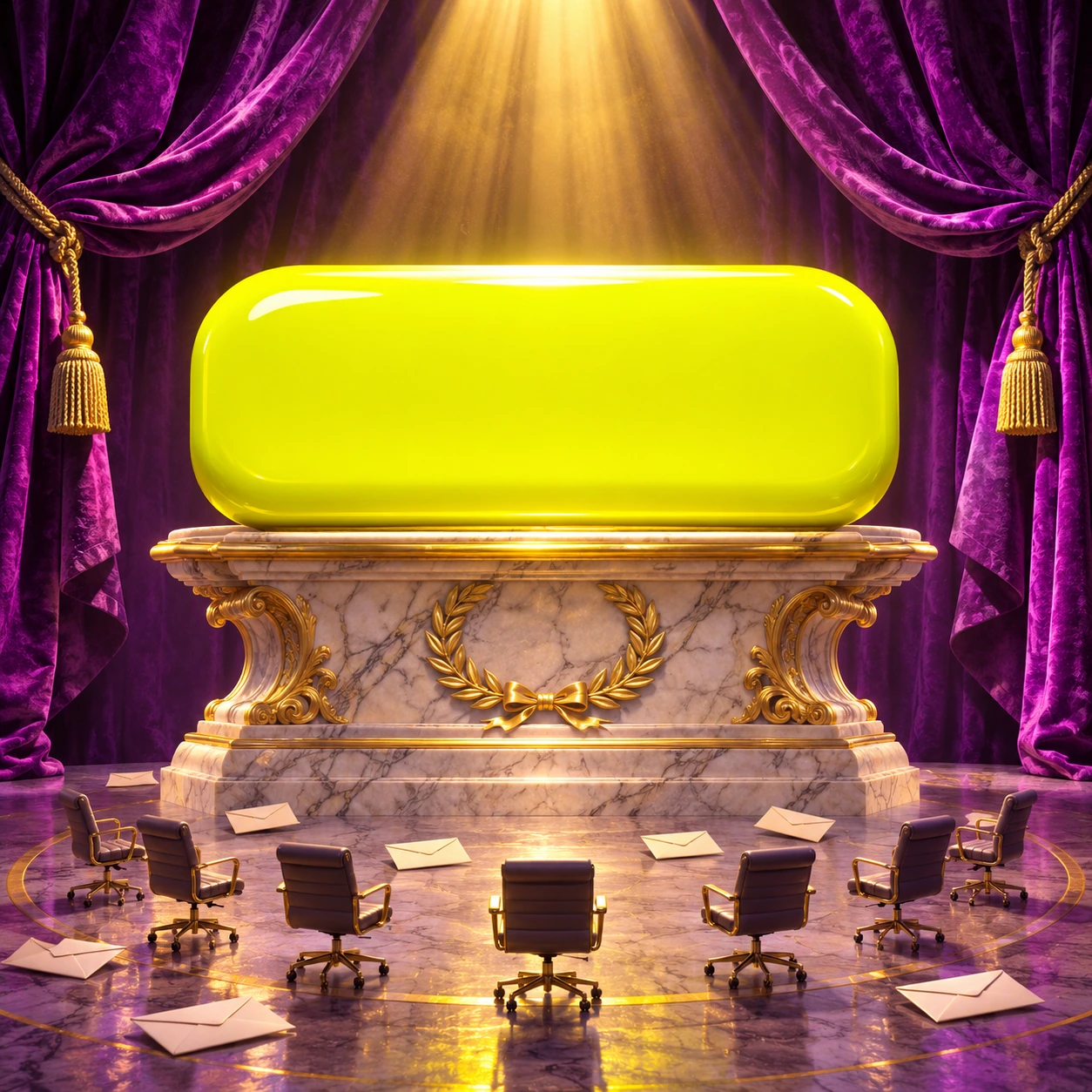
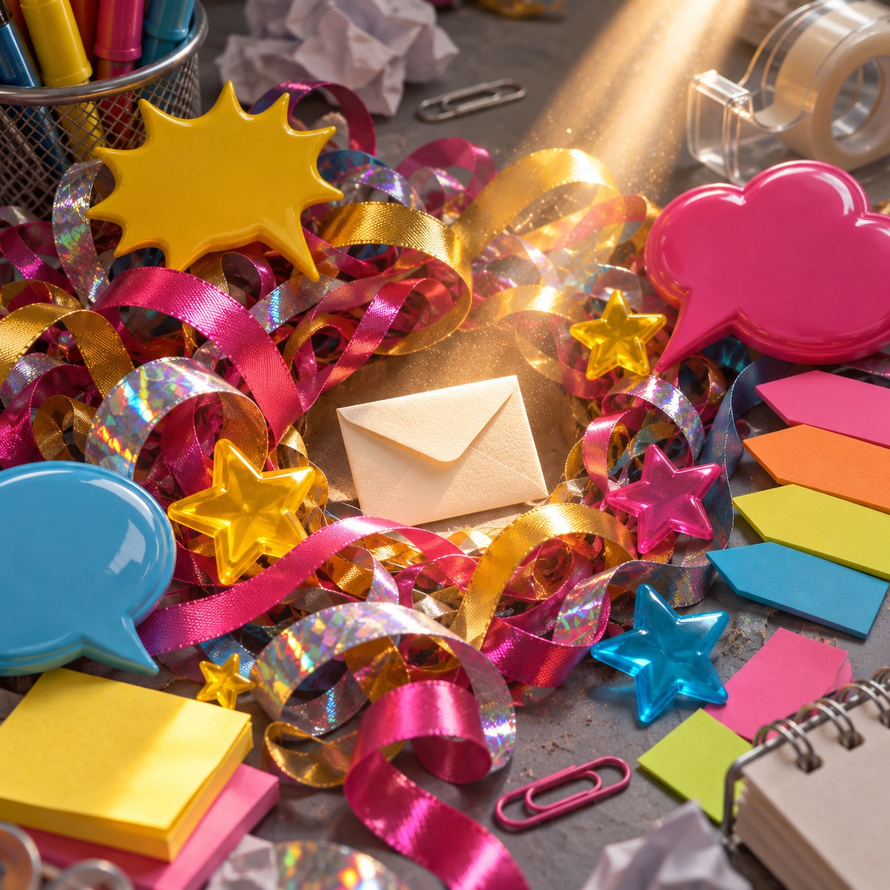
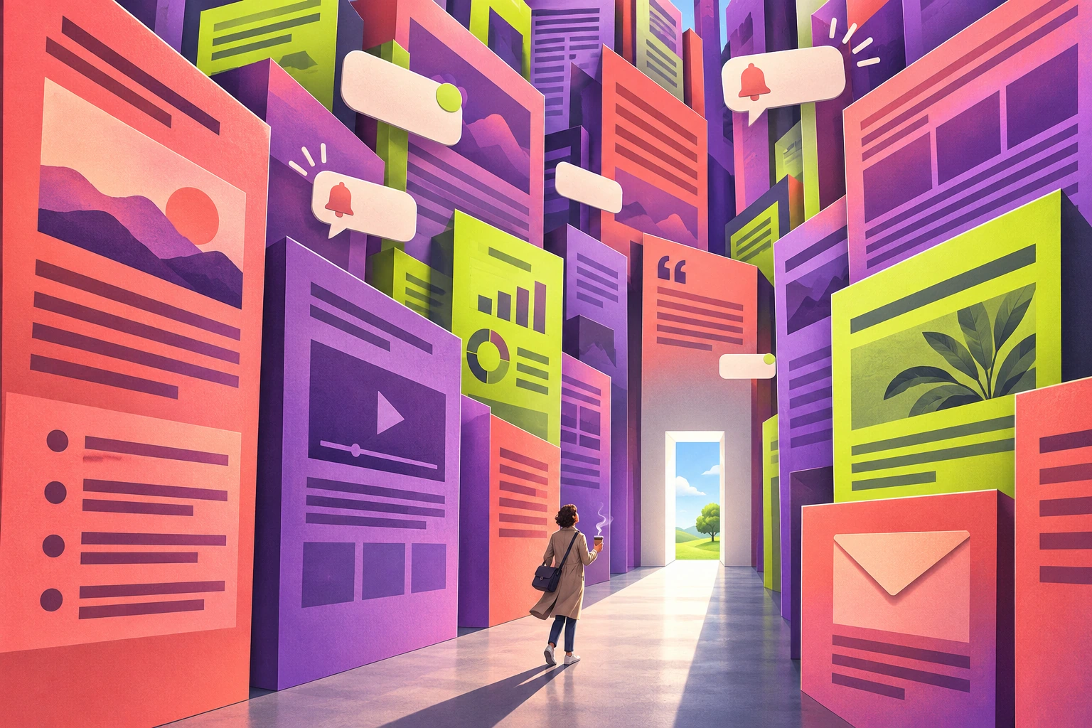
The overloaded dashboard turns modules into architecture. The endless scroll treats a routine update as an epic. The ceremonial button gives a trivial action the scale of a monument. The corporate still life surrounds a blank envelope with promotional debris. A deliberately garish poster makes incompatible design choices collide in one controlled field.
Vary the medium as well as the subject: polished cinematic sculpture, paper collage, awkward office illustration and flat graphic satire reveal different kinds of excess. Repeating the same stack of colorful rectangles five times would be an unusually honest newsletter, but a weak gallery.
A useful limit to the noise
A satire needs something specific to criticize. Is the problem urgency without substance, competing priorities, decorative metrics or the inability to finish a sentence? Pick one and make its visual consequence concrete. A tiny exhausted desk beneath an enormous announcement says more than a hundred unrelated icons.
The approach suits editorial illustrations, posters about attention, comic exhibition pieces and self-aware communication workshops. It weakens when it merely mocks readers or substitutes bad usability for a joke. Give the viewer the pleasure of recognizing the problem and the relief of leaving it.
Positive editorial review (AI-authored)
This AOI satire is strongest when it turns a familiar communication failure into a single physical absurdity. Monumental scale, careful lighting and a tiny ordinary object let the joke register instantly. Deliberate ugliness becomes expressive when the surrounding composition remains controlled.
Negative editorial review (AI-authored)
Noise can easily overwhelm the point. Too many generic icons, fake paragraphs or competing jokes reproduce the exhaustion being criticized without offering insight. Reduce the image to one identifiable failure, and keep important wording short enough to verify.
Neutral editorial review (AI-authored)
Newsletter is treated here as a humorous visual interpretation of a communication format. It can support editorial commentary and design teaching, but it is neither a historical movement nor a practical specification for an email. The seven generated studies demonstrate different kinds of staged excess.
A small poetic detour
Original words from the AOI studio.
Poetry
A modest note began its day
With one small thing it wished to say.
Then banners came, and boxes grew,
And fourteen buttons joined the queue.
The footer whispered from below:
I knew the point an hour ago.
The prompt workshop
Original creative exercises. These prompts create new illustrations, not documentary evidence.
The announcement becomes architecture
Create a satirical Newsletter artwork: an enormous cathedral built from colorful content modules and blank email envelopes towers above one tiny office desk. Lavish cinematic light, deliberately excessive modules, one clear focal point, no readable text or real brand logos.
A two-minute read
Create a comic editorial illustration of an impossibly long newsletter scroll winding through a modest office and out into the horizon, one tiny reader at its beginning, absurd corporate ceremony, carefully controlled paper rhythm, blank text bars rather than invented writing.
The button takes command
Create a magnificent satirical still life: one giant glossy unlabeled call-to-action button sits on a ceremonial plinth, surrounded by tiny envelopes and abandoned office chairs. Restrained violet and acid yellow, tactile materials, dry humor, no logos or text.
Your next inspiration
Discover another art style
Follow a visual thread to the next subject.
A smile from the studio
Jokes
The newsletter promised a two-minute read. By the third executive introduction, the reader had aged into a new demographic segment. Marketing celebrated the improved audience coverage and added a section explaining why the update was now even more relevant.