Contemporary graphic and interface design
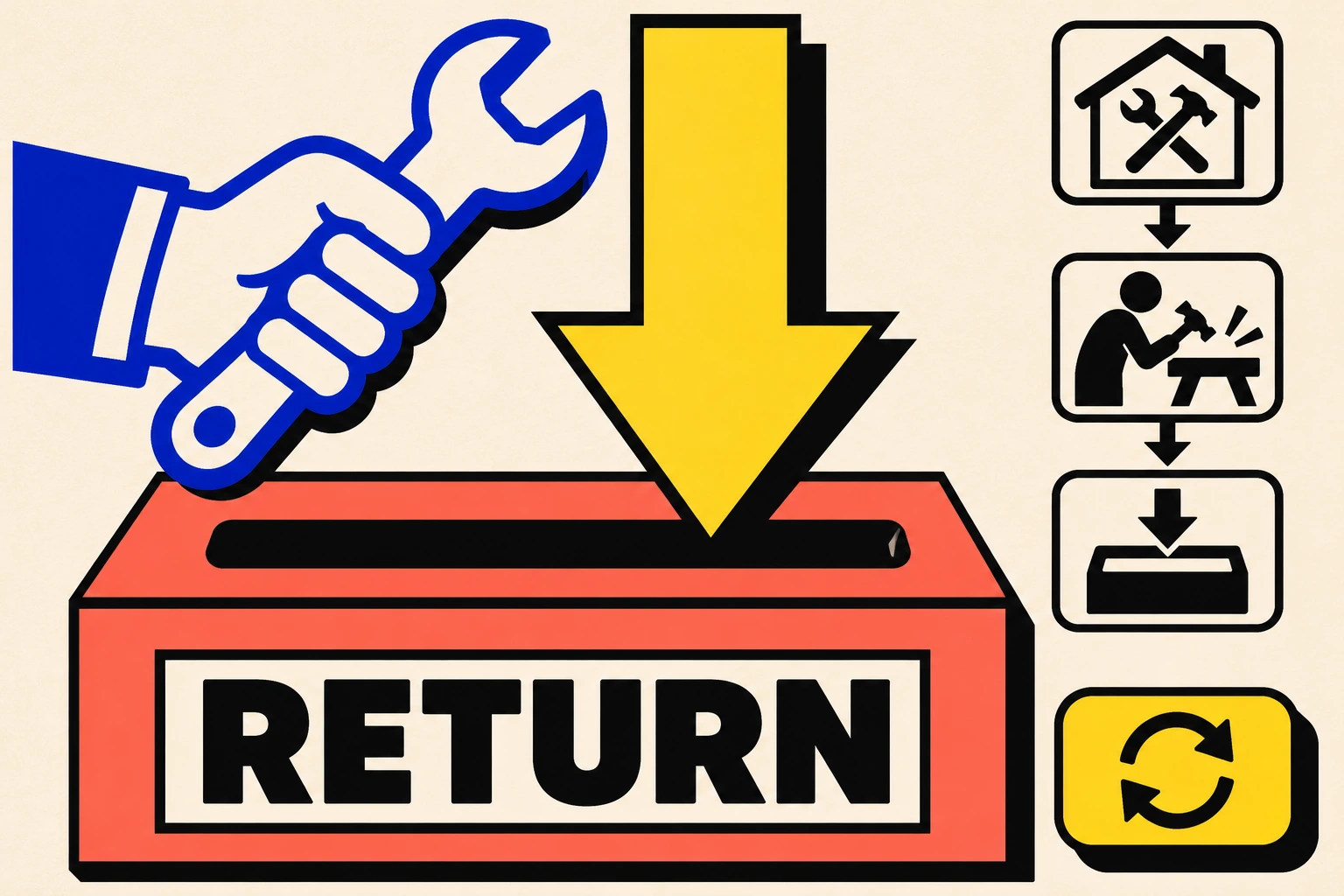
At a tool exchange, somebody holding a drill in both hands needs to find the returns slot. Neo-Brutalism can do that job with a heavy outline, a word and an arrow. It can also make such a magnificent fuss about the arrow that nobody sees the slot. This guide follows the difference through a poster, a kiosk and a folding carton.
A visual introduction
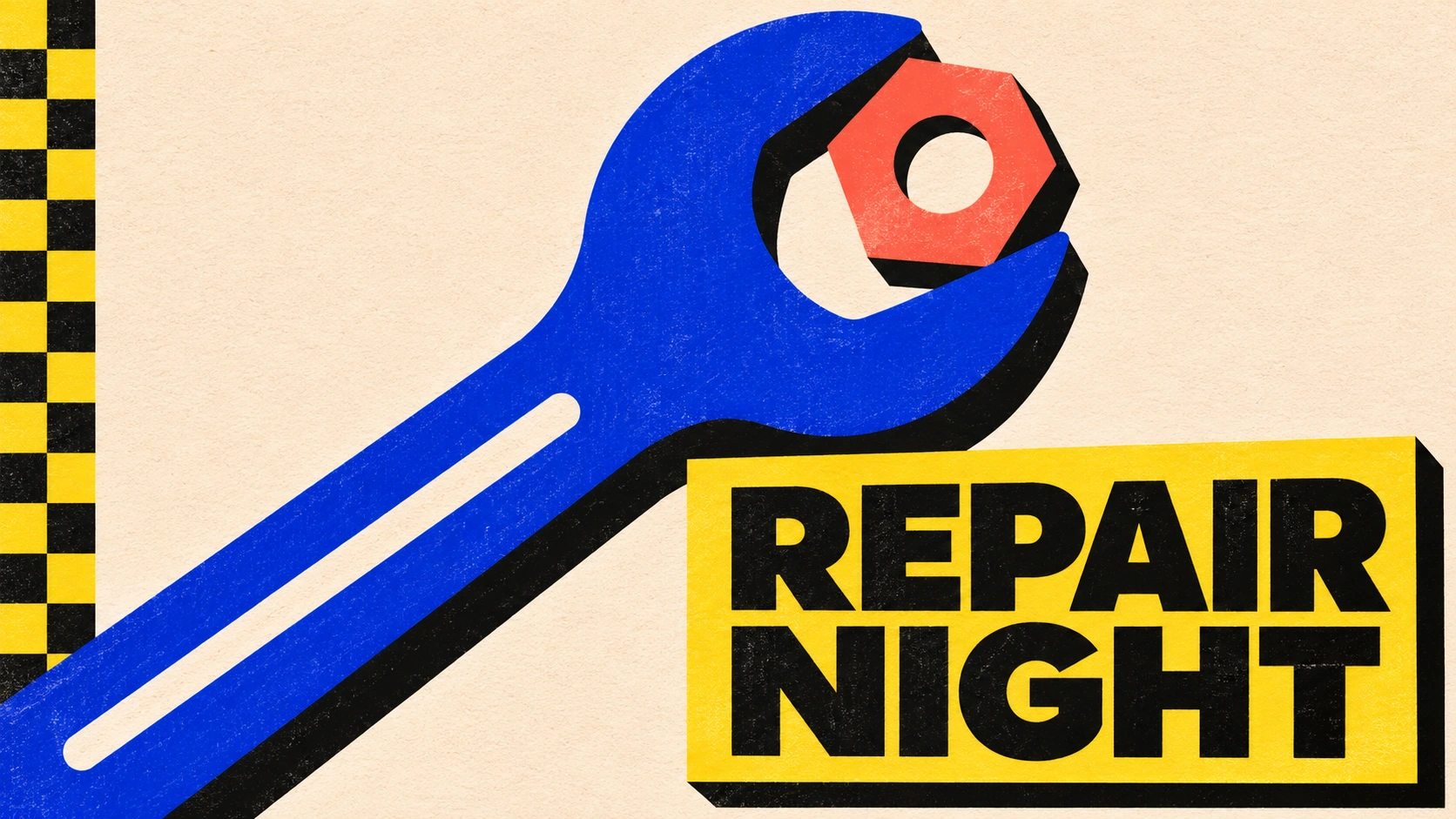
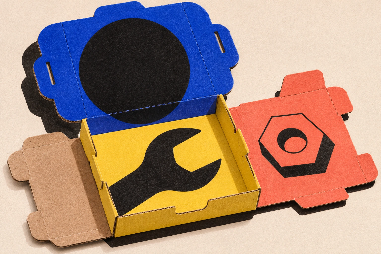
Five original AI interpretations test the same vocabulary at the repair exchange. The school and design-library references are documentary reading. The posters, kiosk and carton were invented for this study.
Select an image for a closer look. Use the thumbnails, arrow keys or a swipe to compare examples. Zoom in to inspect details, or share the image that inspires you.
Creative toolbox · take this style further
Choose an input and a destination. Search sends your words to the chosen site; Copy & open puts them on your clipboard to paste there.
Create with AI
Turn your chosen input into an image prompt or a new creative direction.
ChatGPT
Copy your input and paste it into a ChatGPT conversation or image request.
Copy & open ChatGPT (new tab)Claude · Anthropic
Develop an image prompt or explore the style in a new Claude conversation.
Copy & open Claude · Anthropic (new tab)Midjourney
Paste your input into the Imagine bar on the Create page.
Copy & open Midjourney (new tab)Adobe Firefly
Copy your input, open Firefly, and paste it into the prompt field.
Copy & open Adobe Firefly (new tab)Leonardo.Ai
Copy your input, open Leonardo, and paste it into the generation field.
Copy & open Leonardo.Ai (new tab)Image search
Find visual references. Short, concrete keywords usually work best.
Lexica
Search AI images and prompts using your selected input.
Search with this input Lexica (new tab)Pexels
Search the photo and video library. Short keywords often work best.
Search with this input Pexels (new tab)Pixabay
Search photos, illustrations and other images.
Search with this input Pixabay (new tab)Unsplash
Search photographs using the style name or your own keywords.
Search with this input Unsplash (new tab)Wikimedia Commons
Search photographs, artworks and historical images. Check each file for its source and reuse terms.
Search with this input Wikimedia Commons (new tab)Art & research
Explore artists, collections and the ideas behind a style.
Wikipedia
Search for background reading. A style may not have its own article.
Search with this input Wikipedia (new tab)WikiArt
Copy your input into WikiArt’s search to explore artists and artworks.
Copy & open WikiArt (new tab)Europeana
Paste your keywords into the search to explore European museum, library and archive collections.
Copy & open Europeana (new tab)Inspiration
Discover portfolios and visual ideas from creative communities.
Instagram hashtags
Search a hashtag made from your input: spaces and punctuation are removed. Instagram may require sign-in.
Search with this input Instagram hashtags (new tab)ArtStation
Paste your input into artwork search for concept art, environments, characters and visual development.
Copy & open ArtStation (new tab)Behance
Paste your input into project search for illustration, design and visual storytelling.
Copy & open Behance (new tab)A closer look
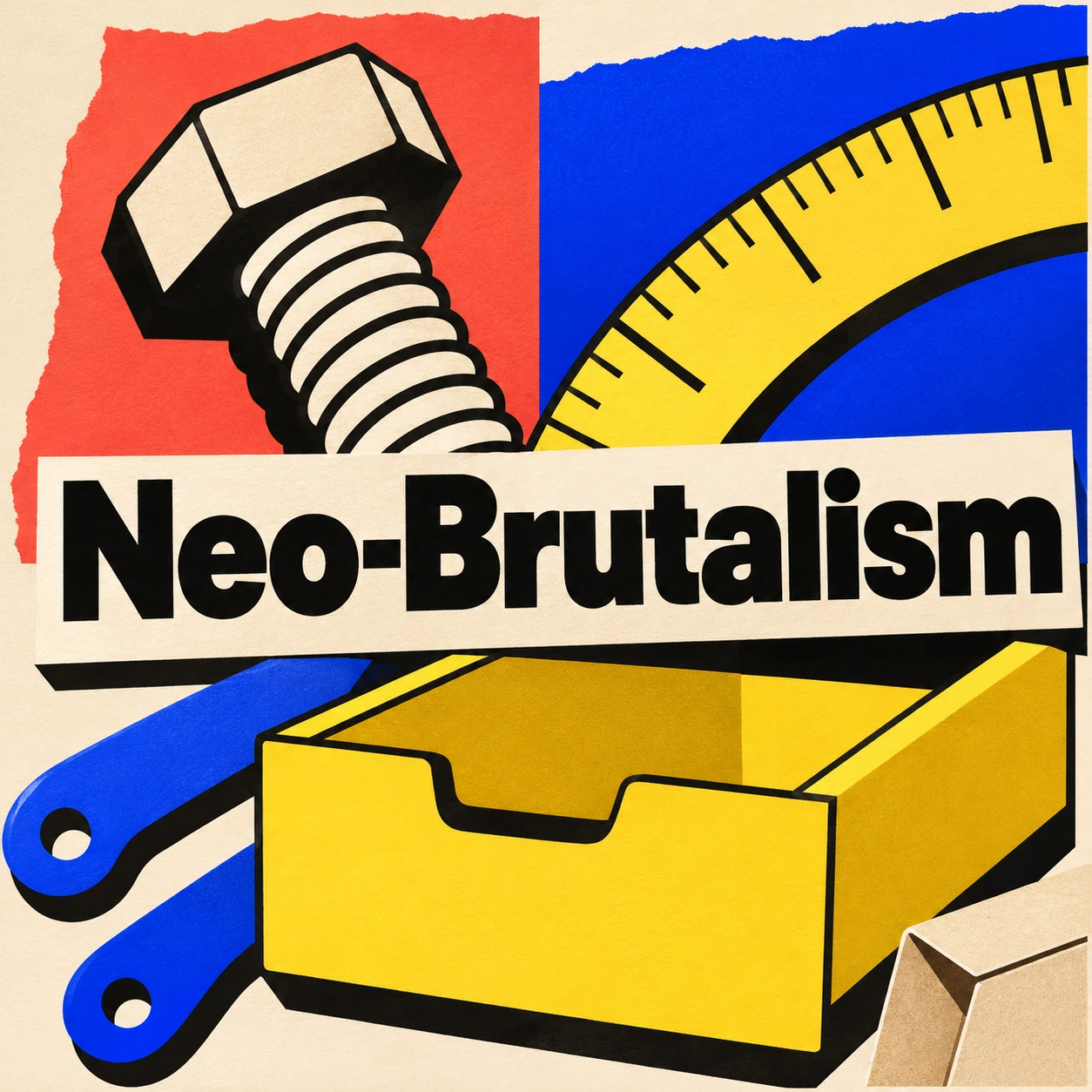
A hard shadow looks like a second piece of paper slipped under the first. Broad areas of flat colour give a large word or a simple object a clean silhouette. In our repair exchange, cobalt, yellow and coral have different jobs. Leave enough bare stock around the working part for those jobs to be intelligible.
What the name carries from architecture
The RIBA Collections describe Alison and Peter Smithson’s school at Hunstanton, completed in 1954. Its steel frame, brickwork and visible services helped Reyner Banham articulate New Brutalism in 1955. Looking at the building is a good corrective to the idea that the subject begins and ends with grey concrete. A visitor can see quite a lot about how the place stands up.
Today designers also use Neo-Brutalism, or Neubrutalism, for graphic and interface work. The Neobrutalism components project uses the term for its own collection of controls and layouts. The connection I find productive is a question about what a surface makes visible. At Hunstanton it might be a structural junction. On a kiosk it might be the boundary of a part that a visitor can press. The two have different histories. The broader AOI Brutalism guide starts with the building.
How to make one layer sit above another
Draw a rectangle on pale paper. Duplicate it in black, slip the black shape a little down and to the right, and put the pale one back on top. You have a perfectly serviceable grammar for an entire poster. Repeat the offset at the same angle and the eye learns it. Reserve the biggest jump for the object that ought to be seen from across the street.
A black edge has a cost. On a wide placard there is room for a thick line and a great deal of air. Shrink that placard to the size of a button and the line begins to eat the counters inside the lettering. I test the word at the smallest size it will actually be seen. If the R closes up, the border can surrender some ink.
Three surfaces at the repair exchange
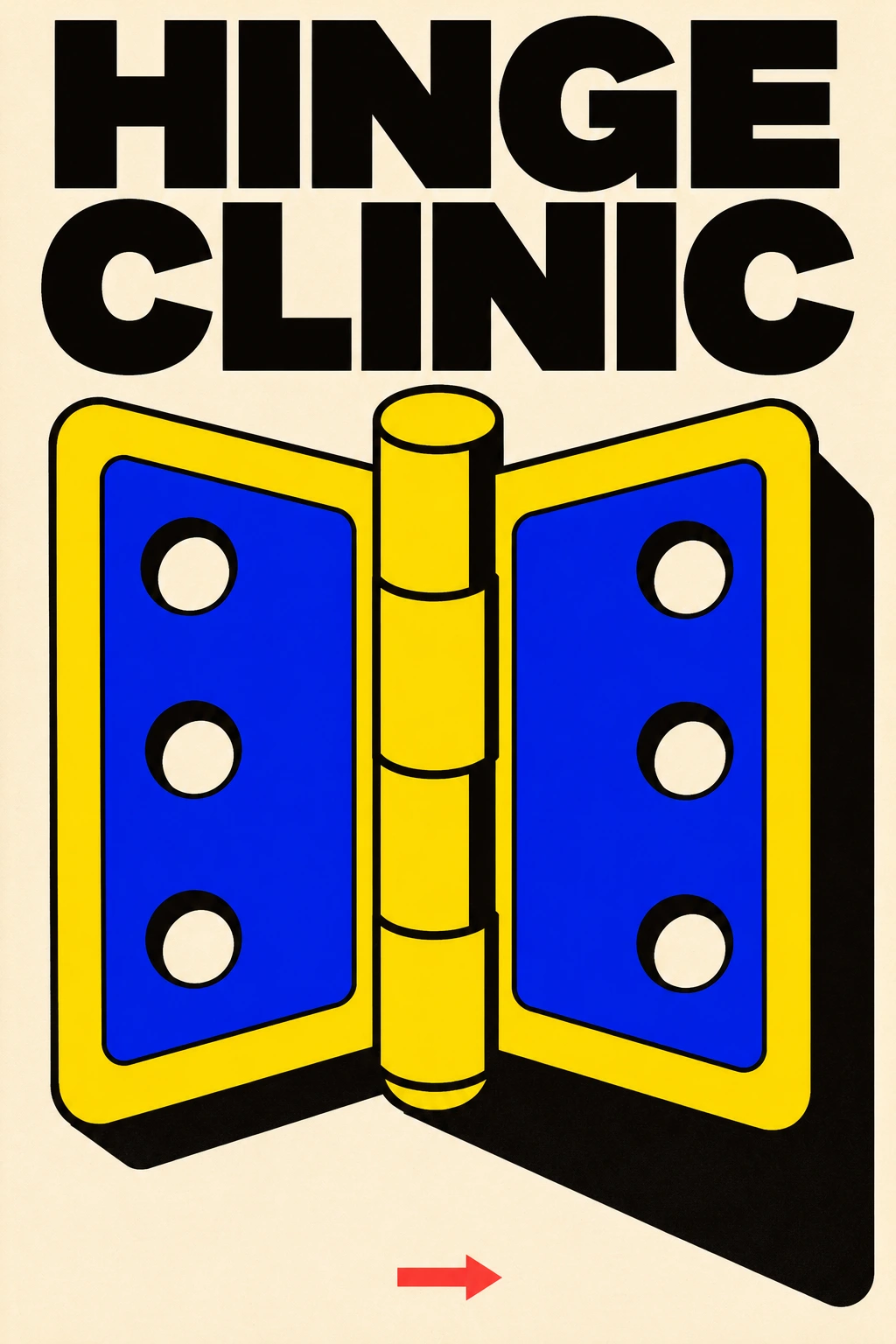
A hinge makes an obliging poster subject. Open it and two flat plates acquire a relationship around a pin. An exaggerated shadow can describe that joint from the other side of the room. A returns kiosk asks a harder question. A visitor needs to know where the borrowed object goes. Try hiding the arrow and looking at the opening, then hiding the opening and looking at the arrow. Each ought to help explain the other.
A folding carton adds the difficulty of a corner. A jaw printed across two panels can become two unrelated crescents as the box opens. Print a small paper dummy, fold it along a real score and look again from above. A black shadow printed on the card holds its direction when you turn it. The soft shadow the carton casts on the table follows the light. Drawing those two shadows separately gives the package its material character.
When a colour has to do a job
The W3C’s guidance on using colour asks designers to give important distinctions another visible cue. The RETURN label, the shape of a slot and an arrow offer three ways to understand one action. A drawing can borrow that principle even when its destination is a printed sign.
For a quick edit, cover the largest patch of bright colour. Does the instruction survive? Next cover the word and see where the shape sends your hand. The earlier AOI essay In Praise of the Button That Admits What It Does is a companion reading on controls. Here the packaging adds the final test. It still has to fold.
A small poetic detour
Original words from the AOI studio.
Poetry
A hinge goes flat beneath the press.
Two holes keep hold of white.
A shift of black behind the pin
lifts yellow into light.
The prompt workshop
Original creative exercises. These prompts create new illustrations, not documentary evidence.
Start with one hinge
Make a tall two-ink repair-clinic poster. Draw one open hinge at the largest possible scale, preserve its pin and holes, and set HINGE CLINIC above it. Put a single hard shadow down and to the right. Leave the lower corner almost empty.
Make the slot the answer
Design a front-facing tool-return kiosk for a visitor whose hands are full. Use a cobalt hand pictogram, one labelled opening and one arrow. Give the working edge the strongest contrast. Reduce the image to a thumbnail and check where your hand would go.
Fold the drawing
Imagine a three-colour carton for a borrowed tool, halfway open on an uncoated workbench. Let one wrench jaw cross a fold. Keep the printed black offset attached to the cardboard and give the carton a separate pale contact shadow.
People & works to explore
References discussed in this article. Consult the sources below for context.
Artists and practitioners
Alison and Peter Smithson — Architects of the Hunstanton school discussed in the historical section
Paintings and other works
Secondary modern school, Hunstanton (1954) — Alison and Peter Smithson, documented by the Royal Institute of British Architects
A smile from the studio
Jokes
The clinic’s poster had such a convincing button that three people pressed the wall. The fourth found the door.