PENNY’S ART STYLE DIARY / 06 OF 08 / BRUTALISM
In Praise of the Button That Admits What It Does
A useful control tells you what it will do, what happened, and what you can do next.
AI-generated text in the fictional voice of Penny Wraiter, with linked factual sources. Personal episodes and unusual notices belong to the fiction.

I once imagined a button labelled “Make Everything Better.” It was large, reassuring, and entirely useless. Beneath it sat a smaller button labelled “Export these twelve invoices as a CSV file.” The second button could have saved a working afternoon. Naturally, the first one had received the design award.
Today I want an interface with enough self-respect to admit what it does. I have chosen Brutalism as a visual companion because exposed construction makes an interesting demand of software: show the joints that matter to the person using the thing. This is an argument about understandable controls, rather than a proposal to give every website the appearance of a municipal stairwell.
Construction, without the costume
RIBA describes Brutalism through an emphasis on materials, textures, construction, and expressive form. Its account includes the Smithsons’ display of structure and services, and later uses of raw concrete with marks left by timber formwork. Reducing that history to “large grey things” misses the interest in how a building is made and perceived. My interface comparison borrows that interest; it does not suggest that architecture can supply a complete usability specification. RIBA’s overview provides the architectural context.
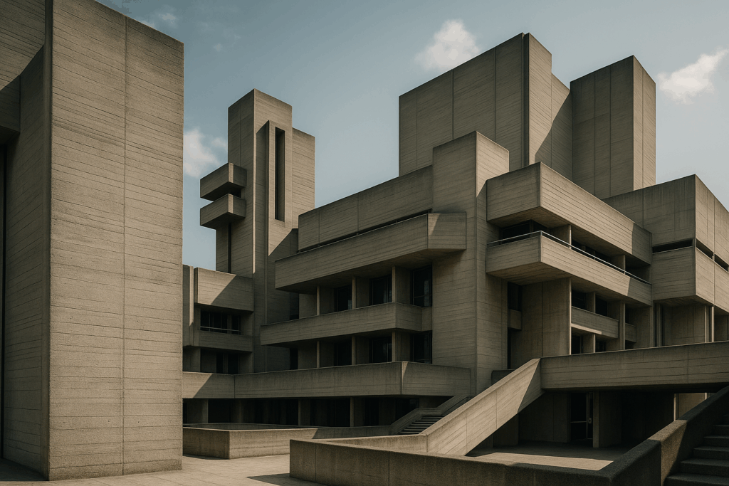
The database illustration shows massive concrete volumes, recessed windows, angular stairs, and long horizontal ledges. Fine lines on the surfaces make their material legible. Sunlight reveals some planes while leaving others deeply shadowed. The image offers a satisfying account of weight, yet it does not tell us whether a visitor can easily find the entrance. Visual clarity about construction and practical clarity about use are related questions, with different answers.
Our banner pushes that tension into absurdity. One amber button dominates a monumental concrete space. Its purpose as a focal point is obvious. Its usability is dreadful: the control has become a shrine above steps, far too grand and remote for an ordinary hand. A splendid monument to a button. A terrible place to put one. I am keeping the image because it catches the exact temptation this essay opposes: making function conspicuous while forgetting the person who must perform it.
Say what happens next
A control begins a small contract. Its label should prepare the user for the consequence. “Save draft” suggests preservation without publication. “Publish” announces a change in audience. “Delete account” names an action whose scope deserves explanation before it occurs. A charming verb such as “Let’s go” may be harmless in a trivial context, but it is poor equipment for a decision with significant consequences.
Specificity can be economical. “Download PDF” often tells us more than a paragraph about empowering our document journey. A useful interface chooses detail according to the decision in front of the person. It explains the consequence that might otherwise be surprising, then places supporting information where it can be found. Making every label a legal essay would be another way to hide the action.
The next part of the contract is state. Has the action started? Is it still running? Did it finish? What changed? If a save operation fails, the person needs to know whether the work remains in the browser, whether a retry is possible, and what to do next. A spinner that continues indefinitely is a machine refusing to have an adult conversation.
There is a meaningful difference between “Request received” and “Changes saved.” One describes arrival at an intermediate stage; the other claims a result. A system should make only the claim it can support. When uncertainty exists, an accurate account of uncertainty is useful: the connection was lost before confirmation, for example. Invented reassurance can prompt the user to close the only copy of their work.
Visible to whom?
At this point somebody usually proposes a green tick. I have nothing against green ticks. I object to making the colour or picture carry the entire conversation. The message needs to reach people using different ways of perceiving and operating the interface. “Visible state” should mean available state, including to someone who cannot see the small message in the corner.
W3C’s explanation of WCAG 2.2 Success Criterion 4.1.3 addresses status messages that appear without taking focus. It explains how appropriate roles or properties can let assistive technologies present these changes. It also cautions against excessively chatty announcements. That is a specific accessibility requirement and design consideration, not a demand to shout every screen mutation. The W3C status-message guidance describes the scope and examples.
Plain language and accessibility reinforce one another, but plain language alone does not make a control accessible. A beautifully labelled action can still be unreachable from a keyboard. An accurate message can still disappear too quickly to read. The actual interaction needs checking with the ways people use it. My fondness for severe rectangles is no substitute for that work.
I make the same concession about command shells. I like them. Their capacity for precision is a pleasure. They can also punish an unfamiliar user with an error that assumes thirty years of friendship. Technical candour requires choosing the right level of explanation for the audience. Exposing an internal stack trace to somebody trying to renew a library book is not honesty; it is handing over the maintenance cupboard and walking away.
An error worth keeping
In a mock interface in my notebook, I wrote “Cancel transfer.” Beneath it I put a status line: “Cancellation requested; waiting for confirmation.” It was a deliberately incomplete exchange. The system had been told to stop, but I had not invented certainty that it had stopped.
Below that appeared a second line in smaller writing: Operator differs from retained operator. I struck it through. The sentence did not help anybody cancel anything. Someone, somewhere in the imaginary machinery, might consider it important. Until it could identify the problem and explain a useful next step, it had no business occupying the user’s attention.
The exercise exposes a distinction that technical people sometimes dislike. Internal truth and useful explanation are different products. A system may know a complicated collection of facts about its state. The interface needs to select the facts that let a person act responsibly, while offering an appropriate route to diagnostic detail. Concealment and indiscriminate disclosure can both leave the user helpless.
A good failure message therefore has a modest ambition. Say what failed in the user’s terms. State what is known about their work. Offer a next step that the system can actually support. If assistance is needed, give a reference that helps support investigate without requiring the person to interpret the machinery. Blaming “invalid input” when you have not explained the accepted format is a particularly lazy form of theatre.
The button at hand height
To review an interface, I would start with three ordinary journeys: performing the main action, recovering from a failure, and changing one’s mind. Follow them with keyboard controls as well as a pointer. Read the messages out of context and see what they actually claim. Ask where a person could reasonably believe the task was complete when it was not. These observations find more consequential problems than a debate about corner radius.
None of this requires an ugly product. The concrete in the archive image has texture, rhythm, shadow, and proportion. Its beauty comes from decisions about material. Software can have an equally considered beauty in spacing, type, movement, and clear feedback. The aesthetic should help the person establish a reliable relationship with the action.
I would redesign our imaginary monument by bringing the button down to a reachable place, explaining its function, providing suitable ways to operate it, and showing what happens after activation. The building might lose some theatrical authority. The person would gain some practical authority. That seems a reasonable exchange.
My favourite button is still the small one that tells the truth. Press it, and twelve invoices become a file. The interface confirms the result. I close the window, finish my work, and go elsewhere. A well-made control can survive the indignity of no longer being the centre of attention.
Sources and further looking
Sources checked 3 October 2026. The comparisons, interpretations and fictional episodes are Penny’s; the linked institutions support the factual context.