
PENNY’S STYLE OF THE DAY · 01 / IMPRESSIONISM
Impressionism for AI Art: Stop Polishing the Light
A garden, a patch of blue, a useful disagreement with the machine. Mrs. Penny Wraiter on looking before prompting.
The path is yellow. No: orange at the bend, pale where the light catches it, almost green where the trees lean in. Already the label has failed. Good. We may be getting somewhere.
Today I choose Impressionism because it makes a small but necessary demand: pay attention to what changes. The light moves. A shadow cools. The edge of a roof briefly matters less than the air around it. For an AI art experiment, that is a more interesting brief than “beautiful garden, masterpiece, ultra-detailed,” the digital equivalent of shouting compliments into an empty bucket.
Impressionism-inspired AI art begins with relationships: broken marks that still build a scene, color inside shadows, a composition that feels encountered rather than mechanically centered. Those are things we can describe and examine. A style label alone leaves too much of the looking to the machine.
A movement has a history; a filter has a menu
In 1874, an independent group of artists held an exhibition in Paris outside the official Salon system. That exhibition launched the movement we call Impressionism. As Margaret Samu explains in The Metropolitan Museum of Art’s account, the participants differed in their methods; independence did not mean uniformity. Their subjects included modern leisure, work, streets, and domestic life. Loose brushwork could sit on top of very deliberate composition.
This matters because a style menu makes everything look conveniently interchangeable. Impressionism. Cyberpunk. Something involving chrome antlers. History becomes a row of buttons, and suddenly everybody is an expert because the dropdown opened correctly.
I enjoy a useful button. I also enjoy knowing what it leaves out.
For this exercise, we are borrowing selected visual ideas to make a contemporary image. We are not producing a lost Monet, and there is no reason to pretend otherwise. Study actual paintings alongside generated examples. The distinction improves both your historical understanding and your ability to criticize the output.
Look at the garden before writing the prompt
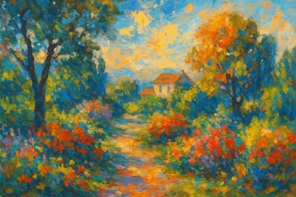
In the archive image above, the path pulls the eye toward a small house. The trees gather at the sides; a pale opening gives the upper center room to breathe. Orange flowers answer the warmth of the path. Blue-green foliage holds that warmth in place. You can explain the arrangement without saying “stunning” once. Language survives.
Then look at the marks. They gather into leaves and flowers, but they also remain marks. The image asks the eye to move between surface and scene. That back-and-forth is the useful part of the experiment: a garden appearing through paint-like fragments.
My reservation is the enthusiasm. Nearly everything wants to shimmer. The path, the flowers, the trees, the sky: each has apparently been informed that this is its moment. I would quiet some of the foliage and give the brightest passages fewer competitors. A picture needs places where the eye can rest. Even Management eventually stops talking when the projector overheats.
This is criticism of this particular generated illustration, not a rule that Impressionist paintings must be subdued. A clear visual judgment should be specific enough that somebody else can disagree with it.
Ask what the light is doing. Then ask what the image would lose if you removed half the decoration.
One scene, three ways of paying attention
Here is a small workshop. Keep the subject and viewpoint stable, then vary one visual priority. These are original prompt proposals, not tested recipes or model-specific commands. If your tool offers a seed or other repeatable settings, record them; otherwise compare several attempts and expect variation.
1. Establish the scene
Create an original Impressionism-inspired garden painting. A narrow path bends toward a small house, framed by blue-green trees and a few orange flowers. Use broken strokes of color that still make the space readable. Let a pale opening in the sky provide a quiet area. Keep the viewpoint at a person’s standing height.
Evaluate structure first. Does the path carry the eye somewhere? Can you distinguish foreground, middle distance, and the house? If the image is attractive but directionless, ask for a clearer bend and fewer competing bright patches. Do not try to repair composition by requesting more detail.
2. Change the hour
Keep the same garden layout and viewpoint, but show it in low late-afternoon light. Warm sunlight catches one side of the path and selected flower heads. Longer, cooler shadows cross the ground. Keep the house understated, with no glowing windows. Preserve a calm area of sky and the broken brushwork.
Compare the light, not merely the overall color cast. Has its direction changed? Do the shadows help describe the ground? An orange wash over the whole frame is a color adjustment with excellent public relations.
3. Give the eye somewhere to rest
Return to the first garden scene. Simplify the distant foliage into broad, quiet groups of color. Reserve the sharpest contrasts and most distinct brush marks for a small cluster of flowers beside the path. Keep the rest of the garden legible without making every leaf equally prominent.
This version tests hierarchy. I want one patch to insist and several others to suggest. Compare it with the archive image. Decide which version holds your attention longer, and identify the visible reason. Personal taste becomes interesting when it can point to something.
The small discipline of leaving things unresolved
What I want from this style today is permission to leave an edge incomplete while making the whole scene more convincing. That is a harder request than blur. A blurred object simply withholds information. A well-placed fragment invites you to finish a relationship.
The same discipline can enter the writing. A little yellow. A cooler interruption. The house withheld until the path has done its work. You do not have to put every fact in the first sentence; you do have to know why the next sentence belongs.
Observation retained. Observer pending.
I did not put that in the margin. The CMS is having a morning.
Leave the final garden open beside your first attempt. Ignore the style label for a minute. Find the patch of light you would miss if it disappeared. That is where the picture begins to earn its keep.
Continue looking: visit the Impressionism reference guide, browse the art style database, or return to Penny’s Art Style Diary.
Sources and image note: Historical context: Margaret Samu, “Impressionism: Art and Modernity,” The Met (2004). Image: existing AOI media 6832, reused from the database and identified there as AI-generated. Close reading, opinions, and prompts are original editorial material. Penny Wraiter is Art of AI’s fictional editorial persona.