Mass-media and surrealist art tendency
Explore Massurrealism through mass-media imagery, impossible transitions and seven visual studies, with source context, practical prompts and critical perspectives.
A visual introduction
Six new AI-generated AOI interpretations join a reviewed archive collage. None is a work by James Seehafer or another participating artist; the linked archive supplies the documented references.
Select an image for a closer look. Use the thumbnails, arrow keys or a swipe to compare examples. Zoom in to inspect details, or share the image that inspires you.


Creative toolbox · take this style further
Choose an input and a destination. Search sends your words to the chosen site; Copy & open puts them on your clipboard to paste there.
Create with AI
Turn your chosen input into an image prompt or a new creative direction.
ChatGPT
Copy your input and paste it into a ChatGPT conversation or image request.
Copy & open ChatGPT (new tab)Claude · Anthropic
Develop an image prompt or explore the style in a new Claude conversation.
Copy & open Claude · Anthropic (new tab)Midjourney
Paste your input into the Imagine bar on the Create page.
Copy & open Midjourney (new tab)Adobe Firefly
Copy your input, open Firefly, and paste it into the prompt field.
Copy & open Adobe Firefly (new tab)Leonardo.Ai
Copy your input, open Leonardo, and paste it into the generation field.
Copy & open Leonardo.Ai (new tab)Image search
Find visual references. Short, concrete keywords usually work best.
Lexica
Search AI images and prompts using your selected input.
Search with this input Lexica (new tab)Pexels
Search the photo and video library. Short keywords often work best.
Search with this input Pexels (new tab)Pixabay
Search photos, illustrations and other images.
Search with this input Pixabay (new tab)Unsplash
Search photographs using the style name or your own keywords.
Search with this input Unsplash (new tab)Wikimedia Commons
Search photographs, artworks and historical images. Check each file for its source and reuse terms.
Search with this input Wikimedia Commons (new tab)Art & research
Explore artists, collections and the ideas behind a style.
Wikipedia
Search for background reading. A style may not have its own article.
Search with this input Wikipedia (new tab)WikiArt
Copy your input into WikiArt’s search to explore artists and artworks.
Copy & open WikiArt (new tab)Europeana
Paste your keywords into the search to explore European museum, library and archive collections.
Copy & open Europeana (new tab)Inspiration
Discover portfolios and visual ideas from creative communities.
Instagram hashtags
Search a hashtag made from your input: spaces and punctuation are removed. Instagram may require sign-in.
Search with this input Instagram hashtags (new tab)ArtStation
Paste your input into artwork search for concept art, environments, characters and visual development.
Copy & open ArtStation (new tab)Behance
Paste your input into project search for illustration, design and visual storytelling.
Copy & open Behance (new tab)A closer look
Look for a recognisable media object or communication format whose function is displaced: a screen, advertisement, reproduction or consumer image becomes part of an impossible relationship.
A specific combination
The project’s own definition connects surrealist imagery with mass-media subjects, technology and methods. It describes an evolving creative tendency rather than a fixed recipe for colours or objects. Treat this as the participating project’s account, not proof that every surreal digital image belongs to one movement. [1]
The project’s site links James Seehafer and other participating artists. Seehafer’s page identifies itself as a cumulative working archive of works and projects, including mixed-media work. These first-party sources provide a route into attributed practice; they do not justify assigning the label retrospectively to every famous surrealist or unusual digital image. [1–2]
Make the media relationship do something
A television containing a landscape can be a starting point, but ask what the screen changes. Does it replace a window, sell an impossible place or repeat an image until its original scale is lost? The media format should affect the meaning, not merely appear as a prop inside a dream scene.
For an original exercise, combine one familiar distribution form with one impossible condition: a supermarket display offering weather, an advertisement casting the shadow of an empty room, or a printed catalogue whose objects escape into the photographed space. Give the relationship a clear focal point and keep the remaining visual language disciplined.
Compare, rather than collapse, neighbouring terms
Surrealism provides a broad historical comparison; collage names a possible method; pop imagery may supply familiar commercial material. These relationships help explain an individual work but do not make the terms synonyms. A digital finish alone is not a sufficient classification, and massurrealism does not necessarily mean that the artwork itself is mass-produced.
The AOI images are synthetic interpretations, not works by Seehafer or other artists in the linked archive. Their motifs help pose questions about image circulation and displacement. Use the source links to encounter attributed works and separate documented authorship from an invented workshop example.
Test the concept
Remove the media object mentally. If the image’s central idea remains exactly the same, its mass-media element may be decorative. Try changing the communication format while keeping the impossible event: a printed advert, a screen and a shop display produce different expectations. Compare those expectations before adding more symbols.
Begin with a familiar promise
An advertisement promises access to a place or an improved version of ordinary life. Packaging promises that something can be contained, owned and repeated. A catalogue makes a tangible object available as a printed image. Begin with one of those expectations. Then change a relationship that the viewer can recognize: the represented sea leaves its frame, weather becomes a product, or the illustrated object seems to acquire volume.
The contradiction should be legible before the explanation. A mysterious atmosphere can support it, but cannot replace it. Ask what the image offers and what makes that offer impossible. That question is more productive than adding a clock, a butterfly and a floating head simply because they are familiar surreal motifs.
Distinguish the channel from the subject
A picture of a bird on a screen contains two subjects: the bird and the screen’s way of presenting it. The screen can crop, divide, repeat or distort the bird. Those operations become part of the work when they change what the viewer understands. A seamless fantasy landscape pasted onto a device may leave the device’s role unexplored.
Try the same idea as a printed page, a shop display and a public advertising panel. Each version suggests a different audience, scale and mode of encounter. Keep the central impossible event simple enough that these differences remain visible. The format is not a neutral container.
Make the impossible junction convincing
The strongest point of a hybrid image is often the boundary where one material becomes another. A printed mark and a physical object cast different kinds of shadow; a screen’s brightness differs from reflected daylight; a paper edge has thickness. Establish those distinctions before asking them to break.
Perspective, illumination and texture can remain disciplined even when the central event is impossible. This combination gives the viewer a stable world against which to notice the disturbance. If every object floats, bends and melts at once, the main relationship can disappear into general spectacle.
The banner and the offer of weather
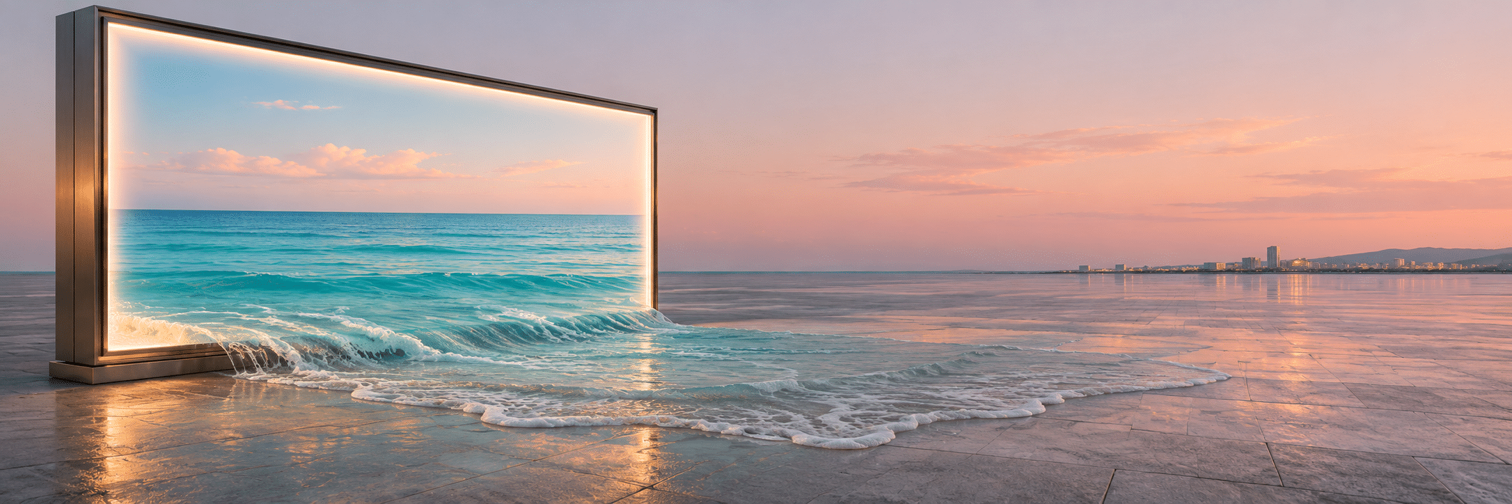
The new banner sets an illuminated sea image in a wide paved space. Water appears to cross the lower edge of the advertising frame and spread over the ground. Its cool turquoise and the peach sky keep the impossible boundary readable at a small size. The work imagines the represented destination arriving where an advertisement normally stands.
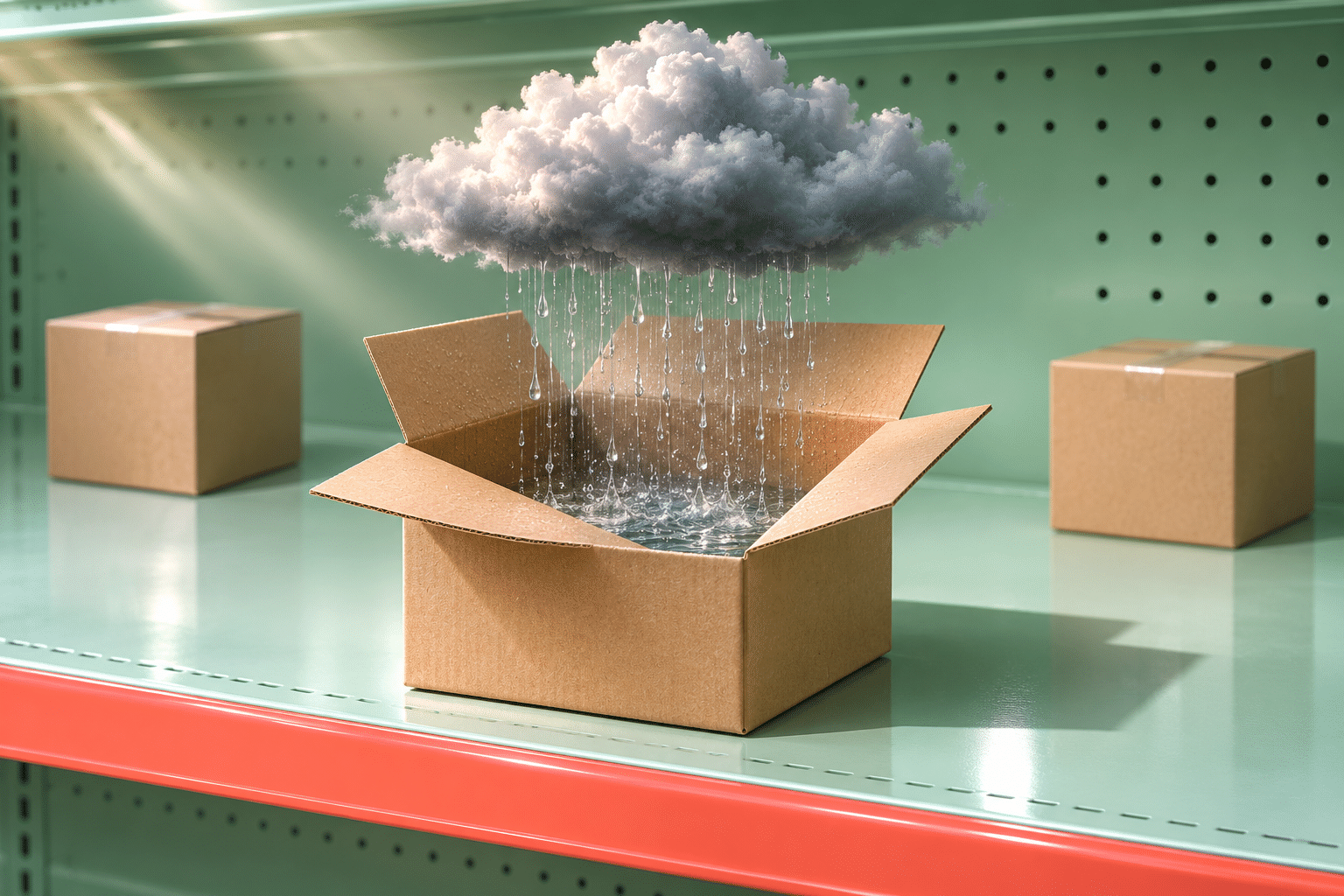
The first standalone example uses a much smaller scale: an open carton on a mint-coloured shelf sits beneath a compact raincloud, with falling water directed into the box. Ordinary closed cartons nearby make the strange offering more specific. Both images use weather, but one examines public display and spatial scale while the other examines the suggestion of containment and sale.
A shelter, a room and a page
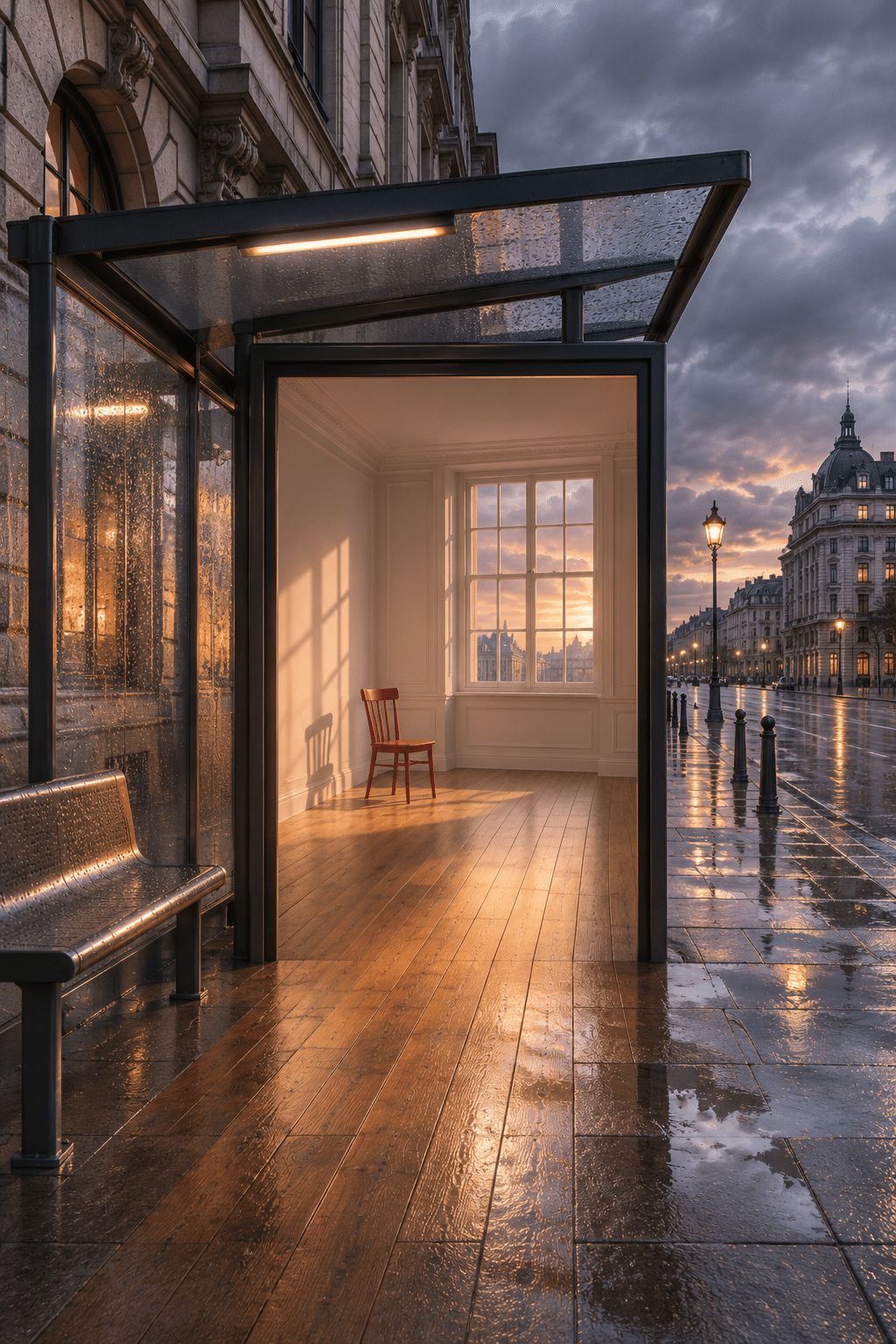
The bus-shelter study makes the advertising panel resemble an opening into a warm room. A red chair supplies scale; the wooden floor extends into the wet pavement. The contrast between an intimate interior and a public waiting place is the main relationship. It is an invented scene, not a photograph of a functioning installation.
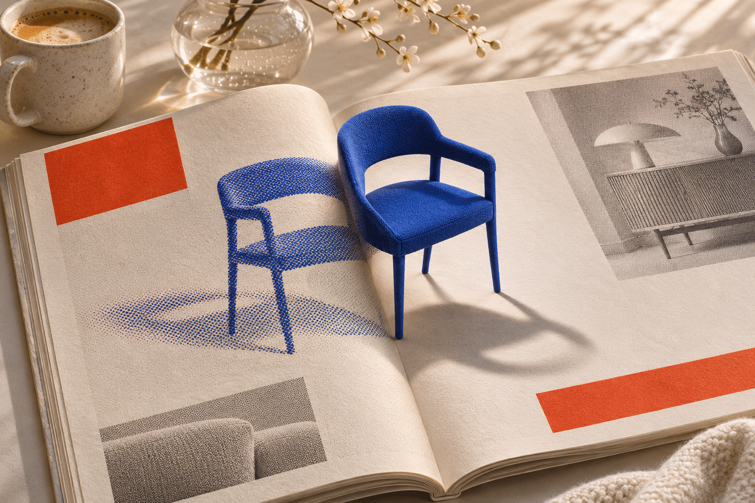
The catalogue study places a small blue chair above a printed page beside a blue halftone chair image. The contrast between dots, fabric-like surface and physical-looking shadow matters more than a claim that the transformation follows an engineering mechanism. Read the two chairs as related states of representation and object, not as a documented product prototype.
The broadcast and the ribbon
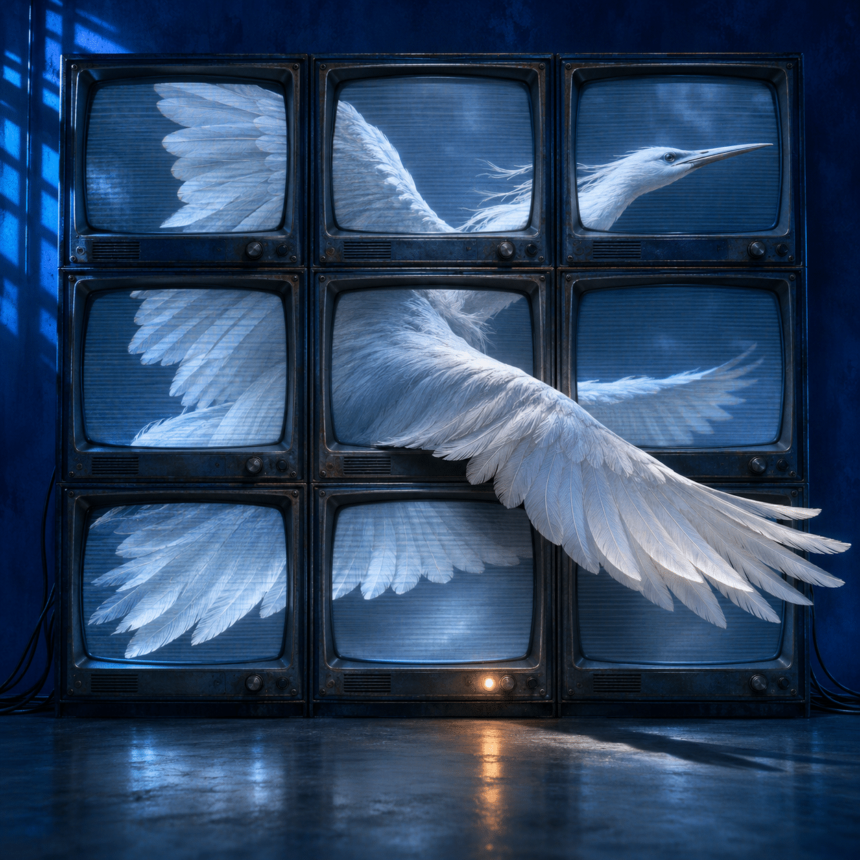
In the television study, nine screens divide a white bird into framed portions while a wing projects into the room. The fragmentation belongs to the broadcast arrangement; the picture is deliberately not a natural-history description of an intact bird. Pale feathers, scanline-like texture and one small warm lamp create a controlled contrast in the blue setting.
The final example moves closer. A red ribbon image on a magazine page becomes a raised loop with woven-looking texture and a cast shadow. The page, fold and fabric do most of the work. Compared with the television wall, this is a quieter encounter between reproduced surface and implied physical presence. The different scale helps keep the set from repeating one formula.
Use the retained collage as a comparison
The centrally titled archive collage gathers television, camera, telephone, city and dream motifs in a warmer painterly vocabulary. Its complete Massurrealism title remains clear. Some panels foreground media more directly than others. That variation makes it a useful comparison with the new studies, whose central contradictions depend more explicitly on a communication or commercial format.
The collage is an AOI synthetic interpretation, not a collection of documented works by the artists in the source archive. Its original generation settings remain unknown. Neither an evocative motif nor a recognizable historical reference establishes authorship. Follow the source links for actual attributed practice.
An editing exercise: remove one idea
Make a brief with one medium, one impossible relation and one focal junction. Then list every extra symbol you are tempted to add. Remove all but the one that changes the central reading. Compare the simplified version with the crowded proposal at thumbnail size. Which has a clearer question?
Next alter the distribution format without changing the subject. Does a small object in a catalogue feel collectible while the same object on a street panel feels public or persuasive? State the interpretation as your reading, not as a universal psychological response. A useful series develops those differences instead of merely changing colours.
Media awareness includes honest provenance
Synthetic images are particularly suited to apparently seamless impossible transitions, but that technical fluency can conceal weak ideas. Evaluate the premise as carefully as the rendering. Check that edges, shadows and repeated forms support the intended contradiction; repair or reject accidental defects rather than treating every error as meaningful surrealism.
Label generated studies and distinguish them from documentary images. Record the actual production request, available source information and unknowns. If existing media is incorporated into a different project, attribution and known reuse conditions need separate attention. These original AOI studies use invented unbranded settings rather than borrowing an advertisement’s identity.
Positive review — AI-authored AOI perspective
Massurrealism offers a focused way to make familiar media expectations visible. When a package, screen or printed page participates in the impossible event, the image can be both immediately legible and open to further interpretation. The new set varies scale and material so that the viewer can compare how representation becomes an apparent object, place or promise.
Negative review — AI-authored AOI perspective
The approach can lapse into a polished collection of surreal clichés. A device placed in a dream scene is not automatically a meaningful comment on media, and convincing rendering can disguise a weak premise. Simplify the contradiction, make the format necessary and avoid relying on borrowed symbols or unexplained brand familiarity.
Neutral review — AI-authored AOI perspective
Massurrealism is discussed here through the participating project’s account of mass-media art and surrealist imagery. The article’s seven visual studies are AOI interpretations, not works from the linked artist archive. They demonstrate possible relationships among images, circulation, commercial presentation and impossible material transitions.
A small poetic detour
Original words from the AOI studio.
Poetry
The Offered Sky
The window offers a product.
The product offers a sky.
Between the printed edge and weather,
a familiar promise changes shape.
The carton cannot keep the rain;
the pavement takes the pictured sea.
A chair stands up beside its dots,
a ribbon loosens from its page.
The screen divides the passing wing,
the wing declines to stay inside.
We look again at what was sold,
and at the frame that made it shine.
The prompt workshop
Original creative exercises. These prompts create new illustrations, not documentary evidence.
Weather for sale
Original mass-media surreal illustration: a pristine supermarket display offers one small contained raincloud instead of a product, empty unbranded packaging, precise commercial lighting and an impossible shadow. One clear visual contradiction, no slogans or copied artworks.
The advertisement opens
An invented street advertisement panel opens onto a quiet real-looking room whose floor continues onto the pavement, consistent perspective and one sharp break in material. No brands, fake artist signature or extra surreal props.
A catalogue loses its boundary
Original mixed-media appearance: an open unbranded product catalogue on a table, one printed chair gradually becoming a solid chair through a coherent fold in the page. Paper texture against physical shadow, restrained palette.
People & works to explore
References discussed in this article. Consult the sources below for context.
Artists and practitioners
James Seehafer
A smile from the studio
Jokes
The catalogue offered a room with a view. The view arrived first and flooded the pavement.