Artist profile · American painting
Ivan Albright (1897–1983) developed paintings in which bodies and ordinary objects seem subjected to exceptionally prolonged scrutiny. Dense surface detail, unsettled colour and compressed space turn familiar subjects into meditations on material existence and time. His work is more demanding than a generic horror effect: the unease comes from the sustained attention given to things we might prefer to overlook.
A visual introduction
Select an image for a closer look. Use the thumbnails, arrow keys or a swipe to compare examples. Zoom in to inspect details, or share the image that inspires you.
Creative toolbox · take this style further
Choose an input and a destination. Search sends your words to the chosen site; Copy & open puts them on your clipboard to paste there.
Create with AI
Turn your chosen input into an image prompt or a new creative direction.
ChatGPT
Copy your input and paste it into a ChatGPT conversation or image request.
Copy & open ChatGPT (new tab)Claude · Anthropic
Develop an image prompt or explore the style in a new Claude conversation.
Copy & open Claude · Anthropic (new tab)Midjourney
Paste your input into the Imagine bar on the Create page.
Copy & open Midjourney (new tab)Adobe Firefly
Copy your input, open Firefly, and paste it into the prompt field.
Copy & open Adobe Firefly (new tab)Leonardo.Ai
Copy your input, open Leonardo, and paste it into the generation field.
Copy & open Leonardo.Ai (new tab)Image search
Find visual references. Short, concrete keywords usually work best.
Lexica
Search AI images and prompts using your selected input.
Search with this input Lexica (new tab)Pexels
Search the photo and video library. Short keywords often work best.
Search with this input Pexels (new tab)Pixabay
Search photos, illustrations and other images.
Search with this input Pixabay (new tab)Unsplash
Search photographs using the style name or your own keywords.
Search with this input Unsplash (new tab)Wikimedia Commons
Search photographs, artworks and historical images. Check each file for its source and reuse terms.
Search with this input Wikimedia Commons (new tab)Art & research
Explore artists, collections and the ideas behind a style.
Wikipedia
Search for background reading. A style may not have its own article.
Search with this input Wikipedia (new tab)WikiArt
Copy your input into WikiArt’s search to explore artists and artworks.
Copy & open WikiArt (new tab)Europeana
Paste your keywords into the search to explore European museum, library and archive collections.
Copy & open Europeana (new tab)Inspiration
Discover portfolios and visual ideas from creative communities.
Instagram hashtags
Search a hashtag made from your input: spaces and punctuation are removed. Instagram may require sign-in.
Search with this input Instagram hashtags (new tab)ArtStation
Paste your input into artwork search for concept art, environments, characters and visual development.
Copy & open ArtStation (new tab)Behance
Paste your input into project search for illustration, design and visual storytelling.
Copy & open Behance (new tab)A closer look
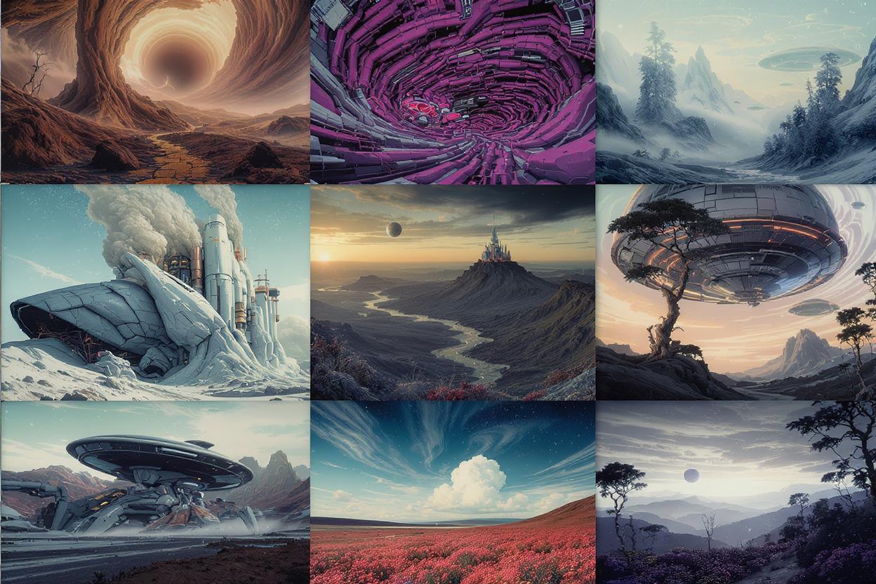
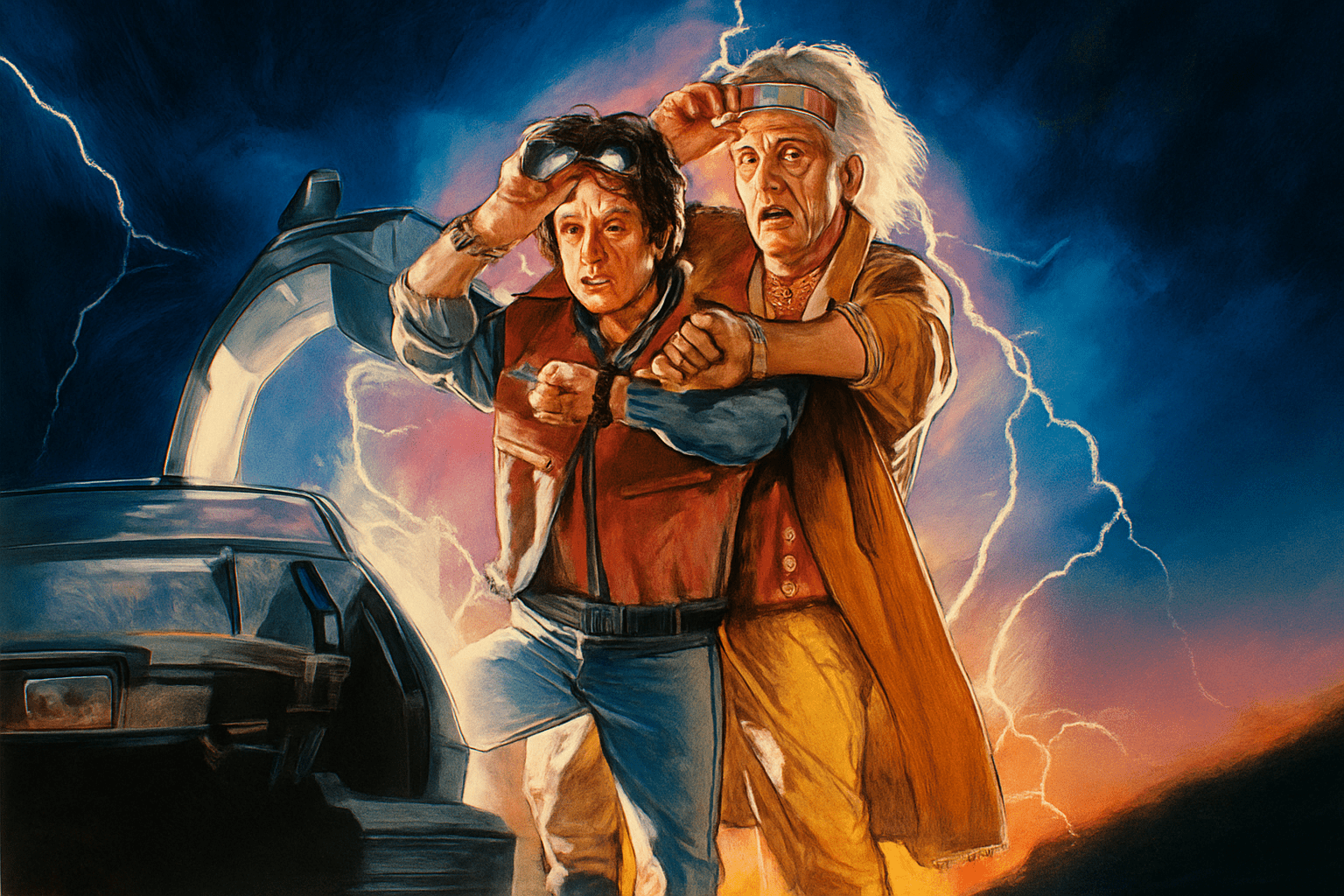
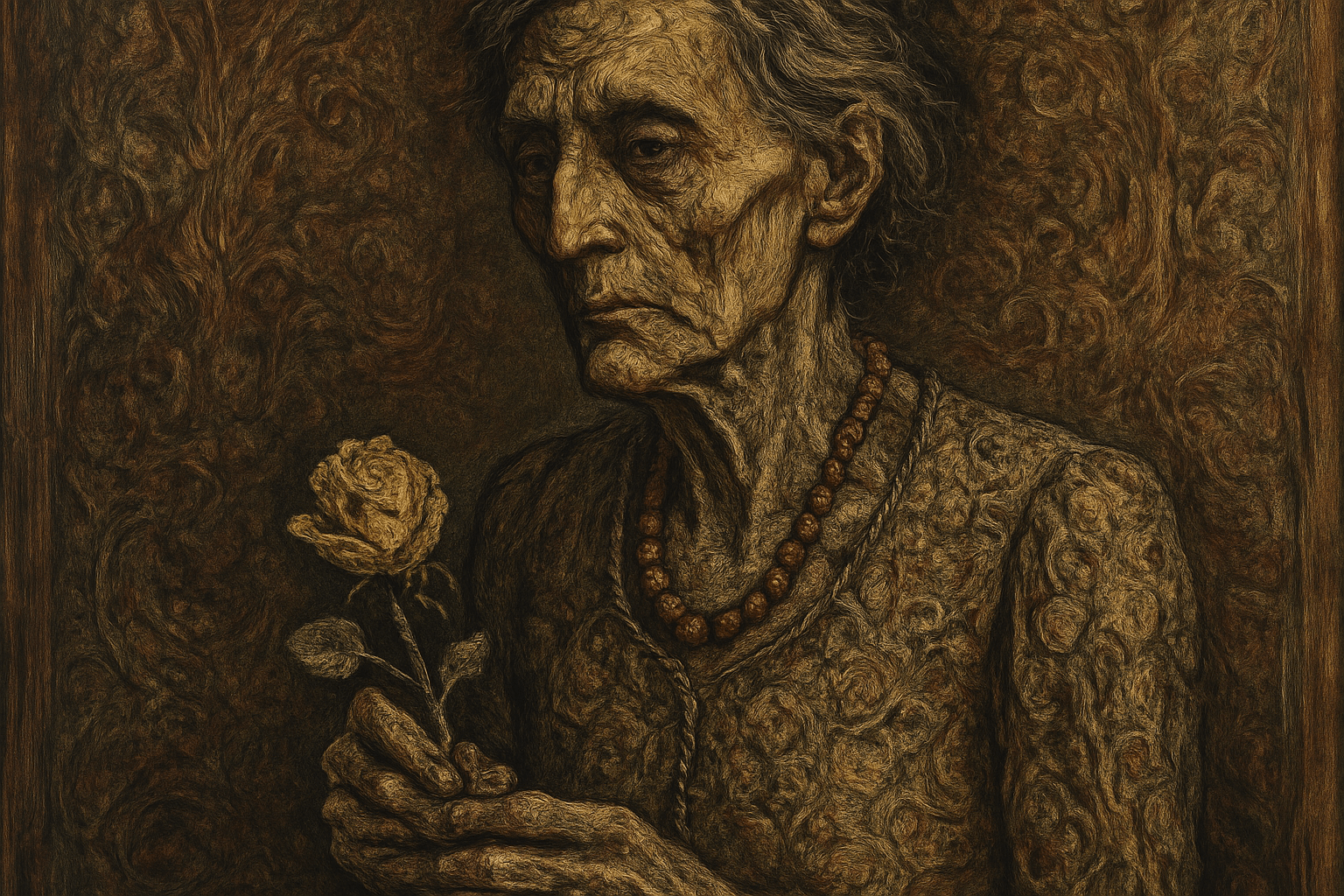
Look for closely worked textures, unstable transitions between flesh and surrounding objects, sharp local contrasts and colours that resist flattering description. The AOI illustrations are independent studies, not authenticated Albright paintings.
Begin with identified works
The Art Institute of Chicago's catalogue records Into the World There Came a Soul Called Ida as a painting of 1929–30. The Smithsonian's portrait catalogue identifies it as oil on canvas and locates the original at the Art Institute. These records provide a firm starting point for discussing a particular object rather than treating every grotesque portrait as an example of Albright's work. [1][2]
The Picture of Dorian Gray is another documented painting, dated 1943–44 in the Smithsonian record. Its title and literary association should not become a universal explanation of every Albright image. Compare individual works, their dates and their subjects before proposing a single theme for an entire career. [3]
Detail can unsettle rather than reassure
Precise rendering is often associated with visual certainty. In this kind of close scrutiny, detail can have the opposite effect: each fold, reflection and surface change makes a familiar object seem less simple. Look at how edges interrupt one another and how local colour shifts complicate the recognition of a body or a piece of furniture.
For a useful viewing exercise, follow one boundary between a figure and the surrounding room. Does it clearly separate the two, or do repeated textures and colours make them compete? Then step back. A painting's overall pressure depends on how those details accumulate within the larger arrangement, not on any one wrinkle or blemish.
Colour and space create the tension
Avoid reducing the visual language to brown decay. Cool and warm shifts, pale highlights and unexpected coloured shadows can make surfaces appear unstable. The key question is how colour relates to form: does it describe an expected local colour, an effect of light, or a more disquieting material transformation?
Closely packed objects can restrict the room available to a figure. Strong detail in the background may prevent it from settling into a passive setting. Analyse that competition before adding a dramatic spotlight to an original study. Unease can arise from too much visibility as well as from darkness.
An original study without imitation by formula
Choose an ordinary still life: a worn glove, a metal cup and a folded cloth. Observe different kinds of surface change rather than applying the same cracked texture to all three. Let the glove compress, the cup reflect and the cloth crease. Keep one clear arrangement of large shapes so the details have a structure to inhabit.
Make two versions with the same composition. In the first, simplify surfaces into broad values; in the second, intensify selected material details. Decide where the extra scrutiny adds meaning and where it merely becomes noise. The goal is to understand how attention changes a subject, not to make every object unpleasant.
Attribution and interpretation
Use museum records for titles, dates, materials and ownership. Keep your interpretation separate from those catalogued facts. Generated illustrations can explore dense observation and material tension, but they should be credited as original studies. A convincing surface treatment does not make an image an Albright work or establish his intentions.
The prompt workshop
Original creative exercises. These prompts create new illustrations, not documentary evidence.
Three material histories
Paint an original still life of a worn glove, a tarnished metal cup and folded cloth. Dense but selective observation, distinct material behaviour, compressed space and cool-warm colour tension. No copied artwork or invented artist signature.
An ordinary room under scrutiny
Create an original painting of a vacant dressing table with a mirror, flowers and a used brush. Closely observed surfaces, restrained but unsettling colour shifts and a coherent arrangement of large masses; avoid generic horror props.
Detail as a variable
Create two original studies of the same old upholstered chair: one in broad value masses, one with intensified seams, reflections and fabric wear. Keep viewpoint and lighting identical so the effect of scrutiny can be compared.
Your next inspiration
Discover another art style
Follow a visual thread to the next subject.