
Digital drawing technique
Isometric pixel art makes a small world readable through parallel spatial axes, deliberate pixel clusters and a controlled palette. Many familiar game-like examples use a 2:1 dimetric grid rather than mathematically exact isometric projection. The practical challenge is to make every object obey the same construction rules while keeping the scene inviting at its intended display size.
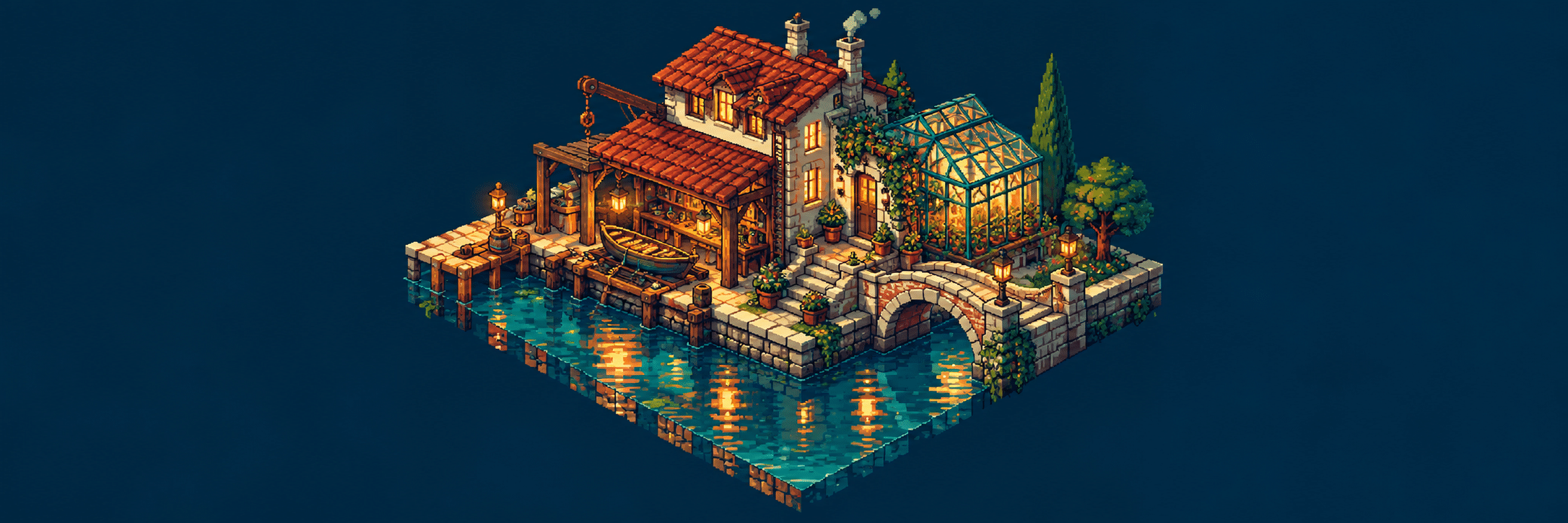
A visual introduction
Select an image for a closer look. Use the thumbnails, arrow keys or a swipe to compare examples. Zoom in to inspect details, or share the image that inspires you.
Creative toolbox · take this style further
Choose an input and a destination. Search sends your words to the chosen site; Copy & open puts them on your clipboard to paste there.
Create with AI
Turn your chosen input into an image prompt or a new creative direction.
ChatGPT
Copy your input and paste it into a ChatGPT conversation or image request.
Copy & open ChatGPT (new tab)Claude · Anthropic
Develop an image prompt or explore the style in a new Claude conversation.
Copy & open Claude · Anthropic (new tab)Midjourney
Paste your input into the Imagine bar on the Create page.
Copy & open Midjourney (new tab)Adobe Firefly
Copy your input, open Firefly, and paste it into the prompt field.
Copy & open Adobe Firefly (new tab)Leonardo.Ai
Copy your input, open Leonardo, and paste it into the generation field.
Copy & open Leonardo.Ai (new tab)Image search
Find visual references. Short, concrete keywords usually work best.
Lexica
Search AI images and prompts using your selected input.
Search with this input Lexica (new tab)Pexels
Search the photo and video library. Short keywords often work best.
Search with this input Pexels (new tab)Pixabay
Search photos, illustrations and other images.
Search with this input Pixabay (new tab)Unsplash
Search photographs using the style name or your own keywords.
Search with this input Unsplash (new tab)Wikimedia Commons
Search photographs, artworks and historical images. Check each file for its source and reuse terms.
Search with this input Wikimedia Commons (new tab)Art & research
Explore artists, collections and the ideas behind a style.
Wikipedia
Search for background reading. A style may not have its own article.
Search with this input Wikipedia (new tab)WikiArt
Copy your input into WikiArt’s search to explore artists and artworks.
Copy & open WikiArt (new tab)Europeana
Paste your keywords into the search to explore European museum, library and archive collections.
Copy & open Europeana (new tab)Inspiration
Discover portfolios and visual ideas from creative communities.
Instagram hashtags
Search a hashtag made from your input: spaces and punctuation are removed. Instagram may require sign-in.
Search with this input Instagram hashtags (new tab)ArtStation
Paste your input into artwork search for concept art, environments, characters and visual development.
Copy & open ArtStation (new tab)Behance
Paste your input into project search for illustration, design and visual storytelling.
Copy & open Behance (new tab)A closer look
Look for repeated diagonal step patterns, parallel receding edges, distinct top and side planes, and silhouettes that remain clear at native resolution. Crisp geometry and carefully grouped colours matter more than the quantity of tiny objects.
Isometric, dimetric and perspective
In an orthographic axonometric view, parallel edges stay parallel instead of converging towards vanishing points. True isometric projection gives the three spatial axes equal foreshortening. Pixel artists often prefer a convenient two-across, one-up diagonal, producing the familiar 2:1 ground diamond. That convention is commonly called isometric in game art, although dimetric is the more precise geometric description.
Choose a convention and keep it visible in the construction. A table whose far edge converges while the floor grid remains parallel will appear to belong to another camera. Rotated objects are possible, but rotation needs a deliberate construction rather than a new arbitrary slope for each chair.
Start with a footprint and a silhouette
Draw the ground diamond first. On a 64-by-32-pixel tile, the dimensions describe a useful 2:1 footprint; they do not require every object to be exactly one tile tall. Establish wall height, door scale and the size of a person before adding decoration. A simple block should already explain what can be entered, climbed or walked around.
For a room, arrange the largest masses as flat silhouettes. Leave a readable path between the entrance and the focal object. Furniture that fits geometrically can still make a poor composition when its outlines merge. Test the scene in two or three flat values before introducing texture.
Pixel clusters are drawing decisions
A cluster is a purposeful group of neighbouring pixels that describes a plane, edge or texture. Build with clusters rather than sprinkling isolated bright dots everywhere. Repeated diagonal runs should have a stable rhythm. An accidental one-pixel notch can make a clean architectural edge appear dented; an intentional notch can suggest a chipped brick.
Work at high zoom when placing pixels, then return frequently to native size. A stair pattern that looks elegant when enlarged may become visual noise in the actual image. Dithering can suggest a transition with limited colours, but repeated checkerboards across every surface flatten material differences. Reserve it for a specific tonal problem.
Palette and light explain the volume
Assign the top and two visible side planes distinct value families under one light direction. The darkest outline need not surround every object uniformly: selective dark contacts can separate an object from the ground while a lighter exposed edge lets it breathe. Small shifts in hue can distinguish warm light from cool shade without multiplying colours unnecessarily.
A useful test is a three-value version of the scene. If the roof, wall and doorway become indistinguishable, extra texture will not solve the structural problem. Bright accents belong where the viewer should look first, not on every corner. A window can be the strongest accent while the rest of a night scene remains legible through grouped silhouettes.
Tiles, overlap and implementation
When building a reusable tileset, distinguish the ground footprint from artwork extending above it. A tall tree occupies one ground location but overlaps other tiles on screen. Tiled's documentation explains that map orientation and tile dimensions establish the grid; the editor does not turn a rectangular drawing into finished diamond-shaped art. [1]
Render order must respect what stands in front of what. Split complex structures into appropriate layers when a character needs to walk behind one part and in front of another. Test seams by repeating tiles in a larger patch, and test occlusion with a moving placeholder before painting every decorative detail.
Export without losing the pixel structure
Keep an editable source and inspect the exported image at its final size. Nearest-neighbour resampling preserves hard pixel boundaries; smoothing methods introduce intermediate colours. Integer enlargement usually keeps pixel cells uniform, while arbitrary scaling can produce uneven widths. Aseprite's documentation distinguishes nearest-neighbour resizing from smoothing alternatives. [2]
AI-generated concepts can suggest layouts, palettes and atmosphere, but a convincing thumbnail may contain inconsistent diagonals or several apparent pixel sizes. Treat such output as a concept that needs inspection and, where necessary, manual reconstruction. Prompting for pixel-perfect art is not a technical validation.
A controlled practice sequence
Build one empty shop on a fixed grid, then add a counter, a doorway and a single light source. Save that readable version. Add stock only where it clarifies the shop's identity. Compare both at native size: the richer version should communicate more, not merely contain more pixels. Finally, reuse one wall or floor tile in another scene to test whether the construction rules are genuinely consistent.
Read the new studies as design problems
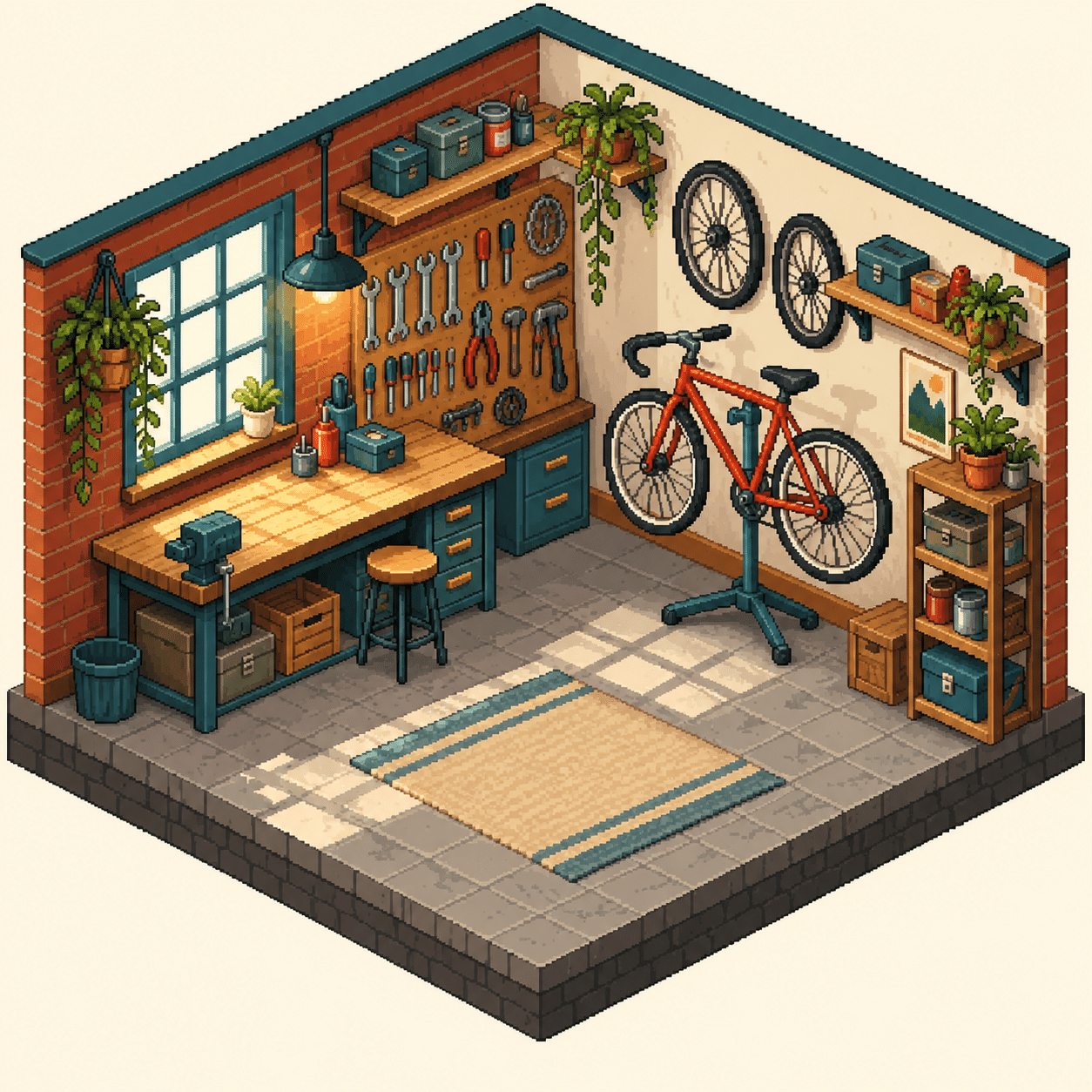
The workshop study asks whether a cutaway room remains readable when shelves and tools are added. Follow the floor edges first, then check the counter, wall thickness and furniture against the same projected axes. A believable atmosphere cannot compensate for contradictory construction.
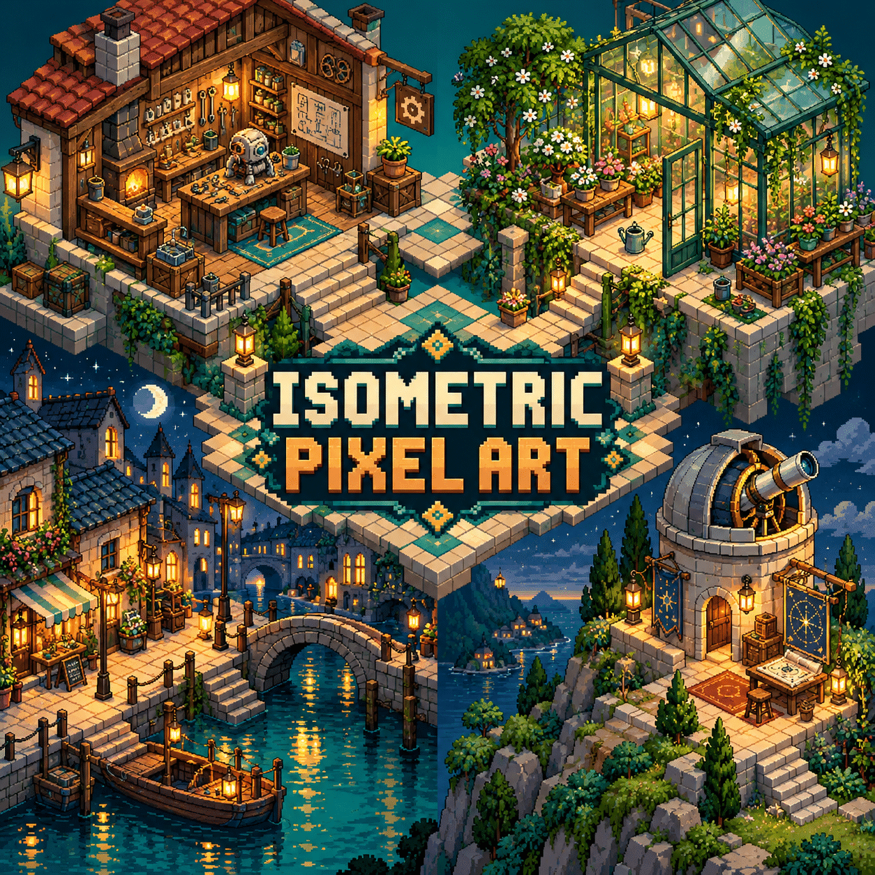
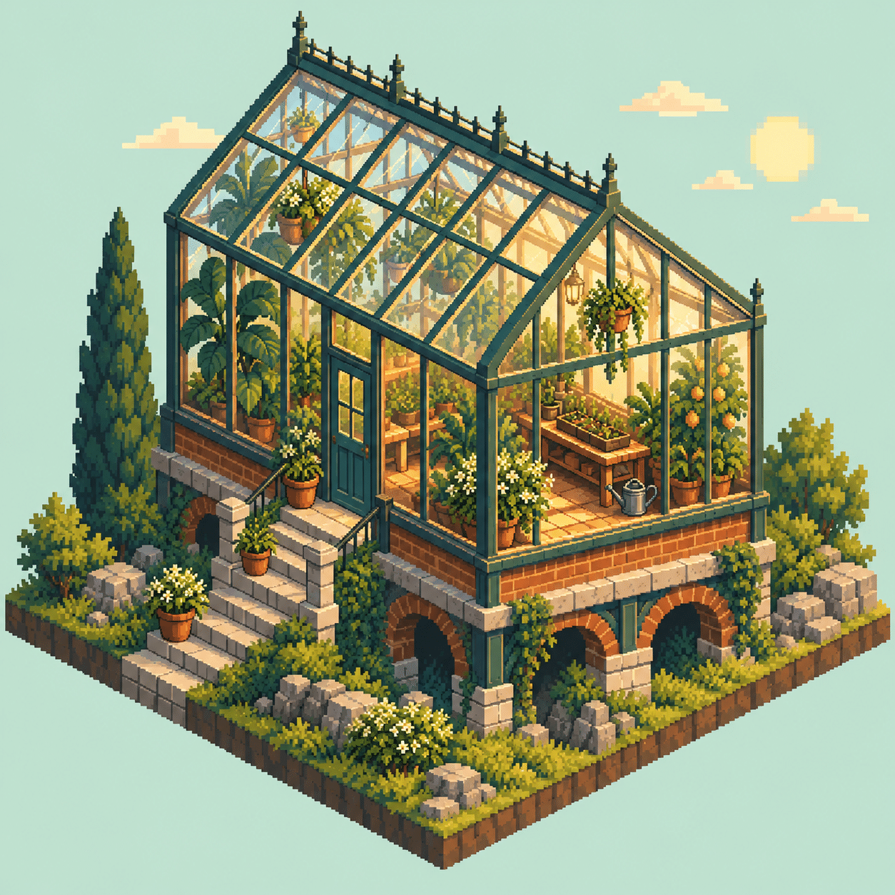
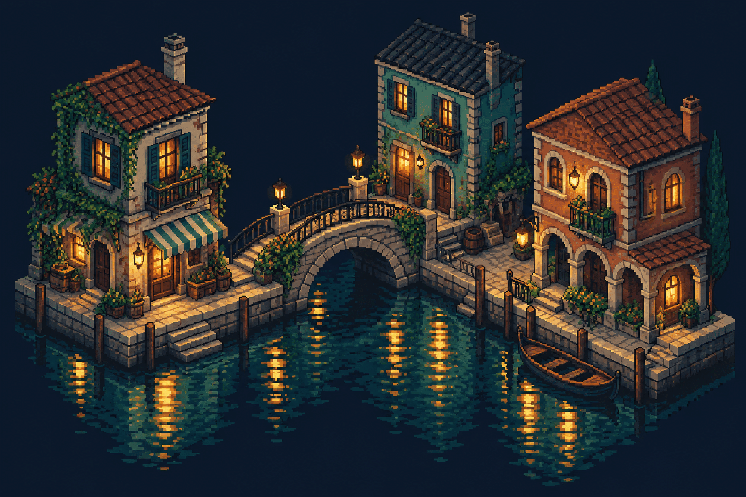
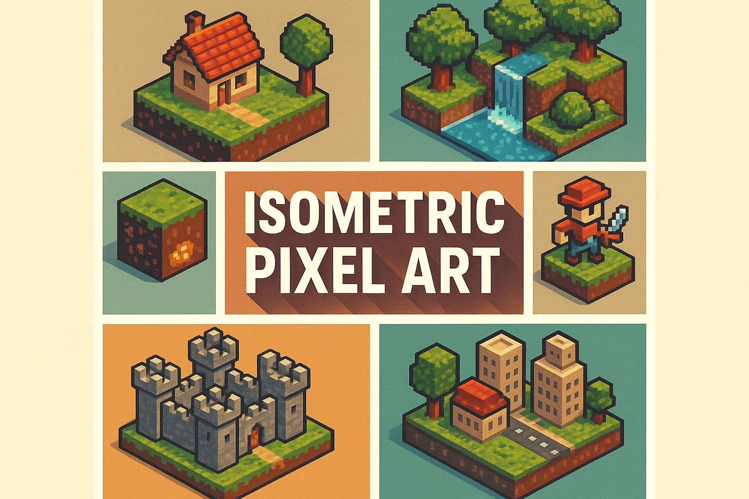
The greenhouse study shifts attention from rigid architecture to plant silhouettes. Group leaves into larger readable masses instead of treating every leaf as an isolated highlight. In the canal district, repeated buildings and reflections test whether a larger scene can keep one clear focal area. The new banner introduces the wider world; the collage compares motifs rather than serving as a production tileset.
These images are AI-generated visual studies, not verified game assets. They demonstrate composition, palette and the appeal of miniature spaces. Their apparent pixel size and individual diagonal steps may require manual rebuilding before animation, tiling or engine use. Keep that distinction visible when showing a concept to a client or collaborator.
A small poetic detour
Original words from the AOI studio.
Poetry
Small Address
Two steps across, one upward turn,
a window keeps its square of light.
The roof remembers every edge;
the canal carries blue through night.
A little room, a careful door:
leave space for someone on the floor.
The prompt workshop
Original creative exercises. These prompts create new illustrations, not documentary evidence.
One readable shop
Design an original pixel-art repair shop on a consistent 2:1 dimetric grid. One counter, one doorway, one work lamp, clear walking space, limited eight-colour palette, grouped pixel clusters, parallel receding edges, no blur. Treat the result as a concept for manual pixel cleanup.
A reusable street module
Create an original dimetric pixel-art corner bakery with a 64-by-32 ground-tile convention, clearly separated top and side planes, repeatable pavement, a single warm window and readable roof silhouette. Keep scale and diagonal steps consistent.
Change only the light
Make two concept views of the same small dimetric pixel-art greenhouse, identical geometry and camera: overcast daylight and one warm interior lamp at dusk. Keep pixel size, object locations and silhouette fixed so the lighting comparison is clear.
Your next inspiration
Discover another art style
Follow a visual thread to the next subject.


A smile from the studio
Jokes
The tiny architect approved the building, then rejected the chair for using a different camera.